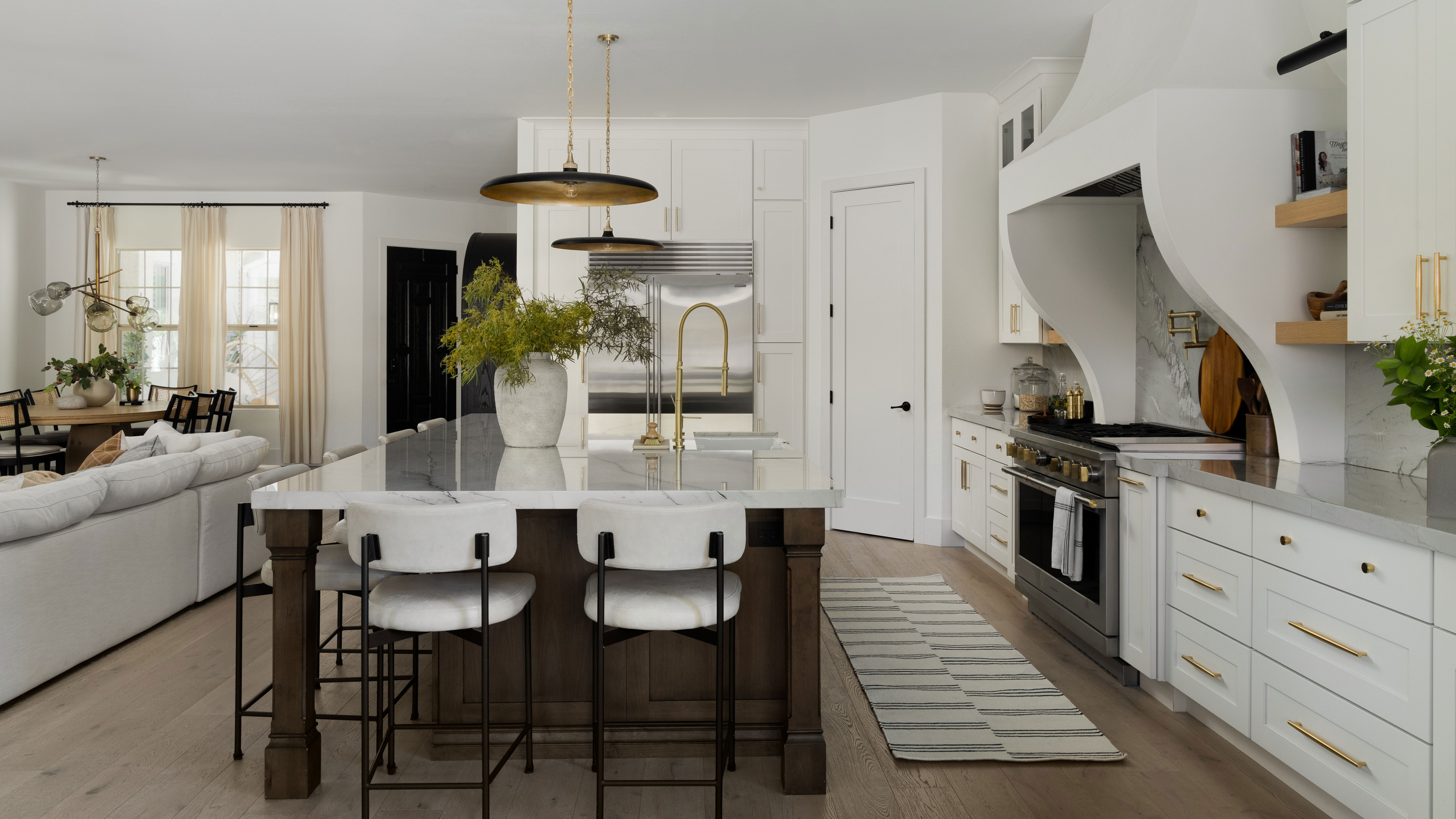
Designing a home should be about creating the best space for you. For the owners of this modern take on a Spanish Mission-style property in Arizona, it meant one big change to the kitchen as interior designers Brittny Smith and Jenna Curiel tackled the remodel and layout of the home.
While it was already a generously sized space, the proportions were all wrong for its new owners. The kitchen felt too small, the island not large enough to anchor the space, while an 'eat-in kitchen' felt superfluous given the floorplan.
The designers' answer? "By extending the cabinetry into the old kitchen area, and elongating the island, we made this kitchen feel twice as big," Brittny tells us. This also left room for a fun feature that connects indoors to outdoors, and makes the home an even better entertaining space.
Below, the designer gives us a tour of this modern home.
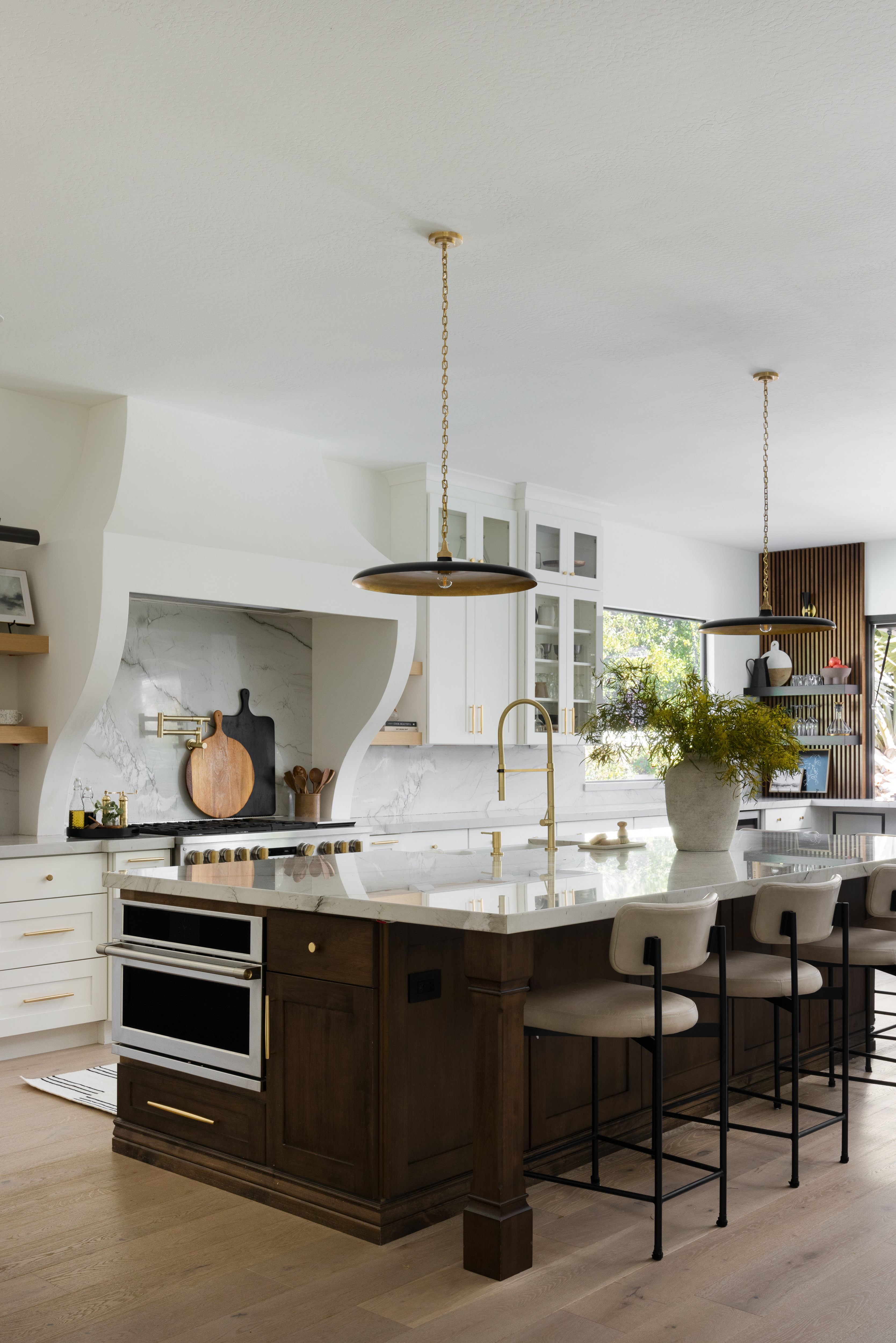
The kitchen is a simple, pared-back design, leaning on transitional style to bridge the gap between the differing styles of the owners, John and Breianna. "John loves contemporary design and Breianna wanted a more traditional look," Brittny explains. "The kitchen cabinets, hood, and countertops all have a very classic, timeless vibe to them but with contemporary pendants, plumbing trims and streamlined counter chairs, the balance felt just right."
The materiality echoes this balance, too. While the island is a darker wood, more synonymous with more traditional schemes, the Mont Blanc quartzite adds a sleeker touch to the modern kitchen. "We chose this slab for its soft and subtle grey veining that adds so much visual interest and movement to this kitchen as the backsplash to the feature hood," Brittny says. "The polished finish gives it a clean contemporary feel next to the more traditional cabinetry and hood."
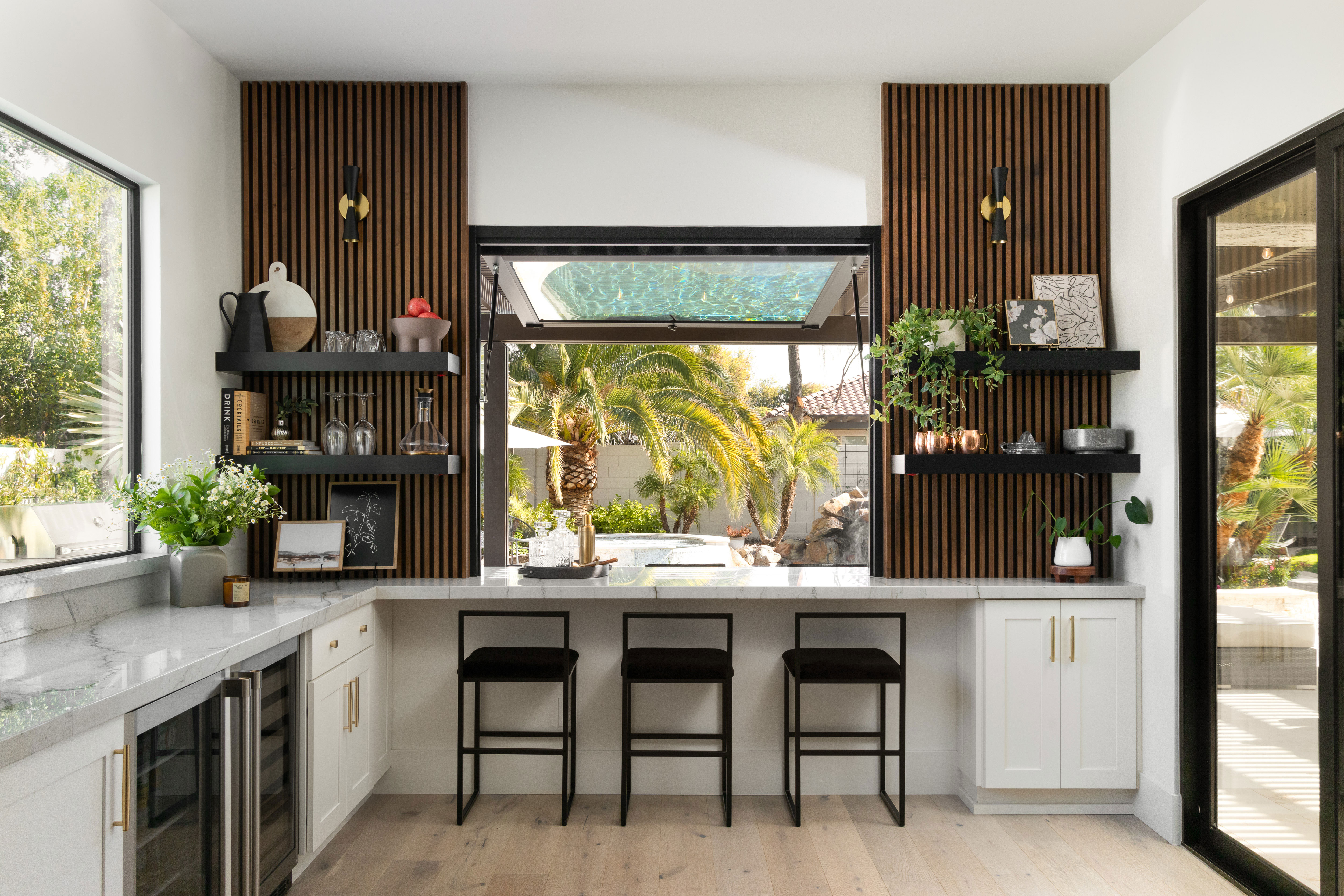
With the client eschewing the need for a kitchen table, it opened some of the floorplan to use for something a little bit different. "To fill this small alcove next to the kitchen, we extended the cabinetry and island to enlarge the kitchen footprint, while adding a bar with the pass-through window to add additional seating to this space," Brittny says. "While it feels related to the kitchen, the bar area has its own purpose."
Whether sat at the island, or the bar with a view out onto the backyard, it's still an eat-in kitchen in many respects, and you're not short for somewhere to perch for a more informal dining experience.
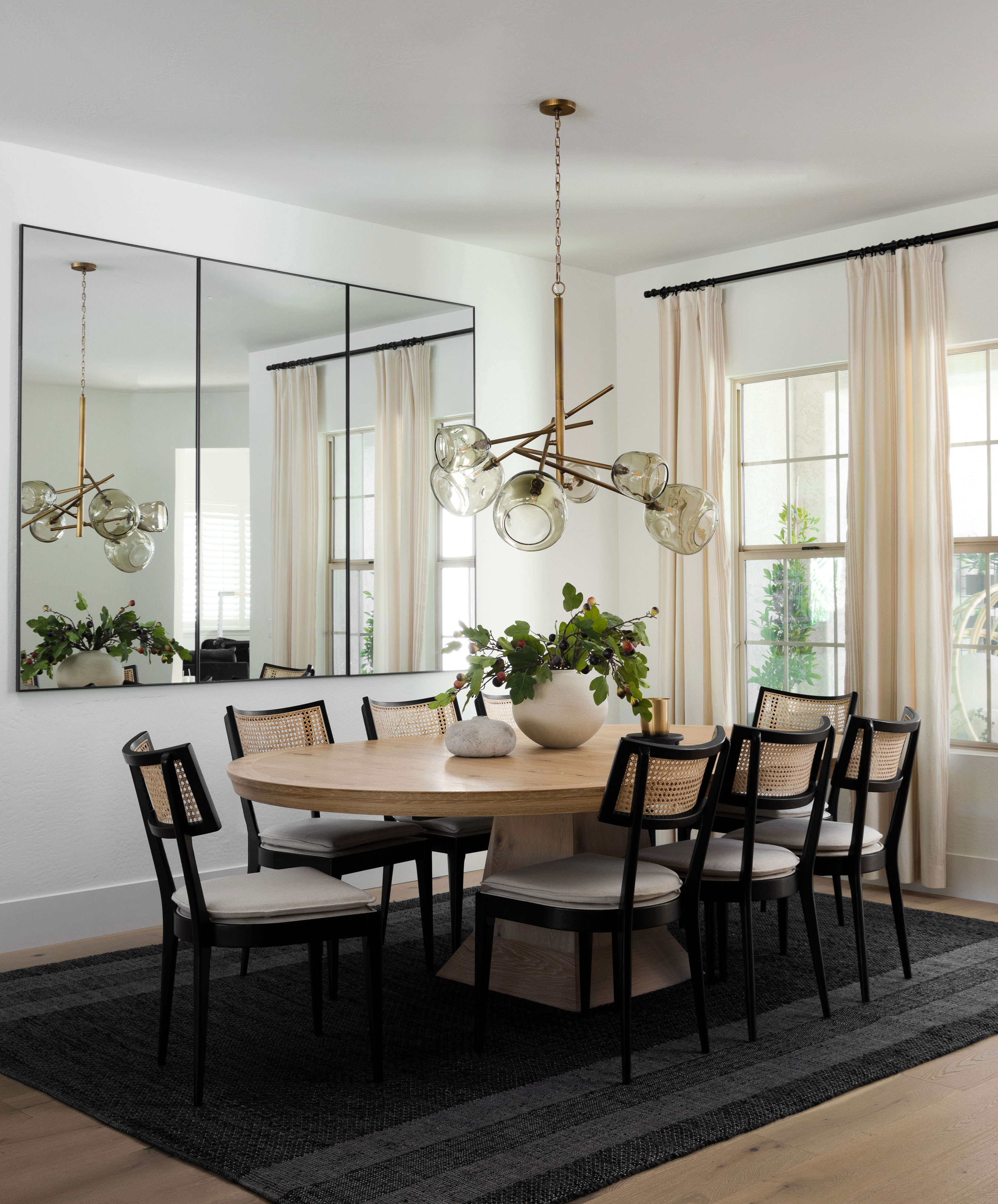
For sit-down dining, the open-concept living and cooking space still has a dining area, too, cleverly grounded in the wider room by a rug, mirror and dramatic pendant light. "We were really intentional about the lighting pieces we chose for this project," Brittny tells us. "The lighting reflects John's more contemporary aesthetic, which is juxtaposed with more traditional elements like the cabinetry and feature hood for Breianna. Each space we designed needed a good mix of traditional pieces and contemporary flare."
This fixture the designers chose for the dining room lighting, the Molten Chandelier from Regina Andrews available on Lumens, is a piece of art and the wow factor.
Shop the Design
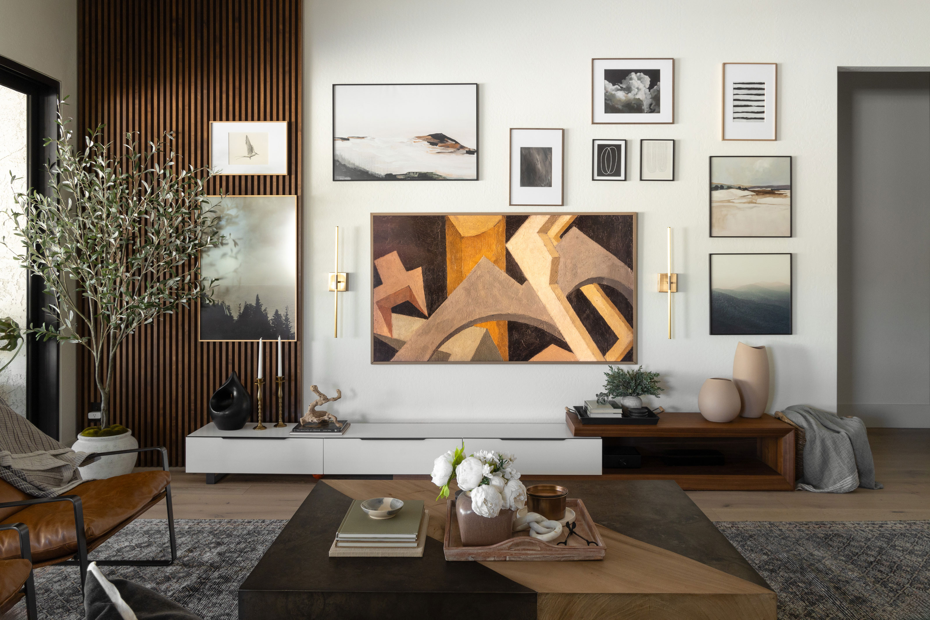
The slat wall finish that flanks the bar continues to the living room's media wall — a gallery wall that disguises a TV among its contemporary wall art picks.
"It was important that a big black TV wasn't the central character of our open concept space," Brittny tells us, 'so we designed this gallery wall around a Samsung Frame TV to be indistinguishable from the other art pieces we sourced for this room."
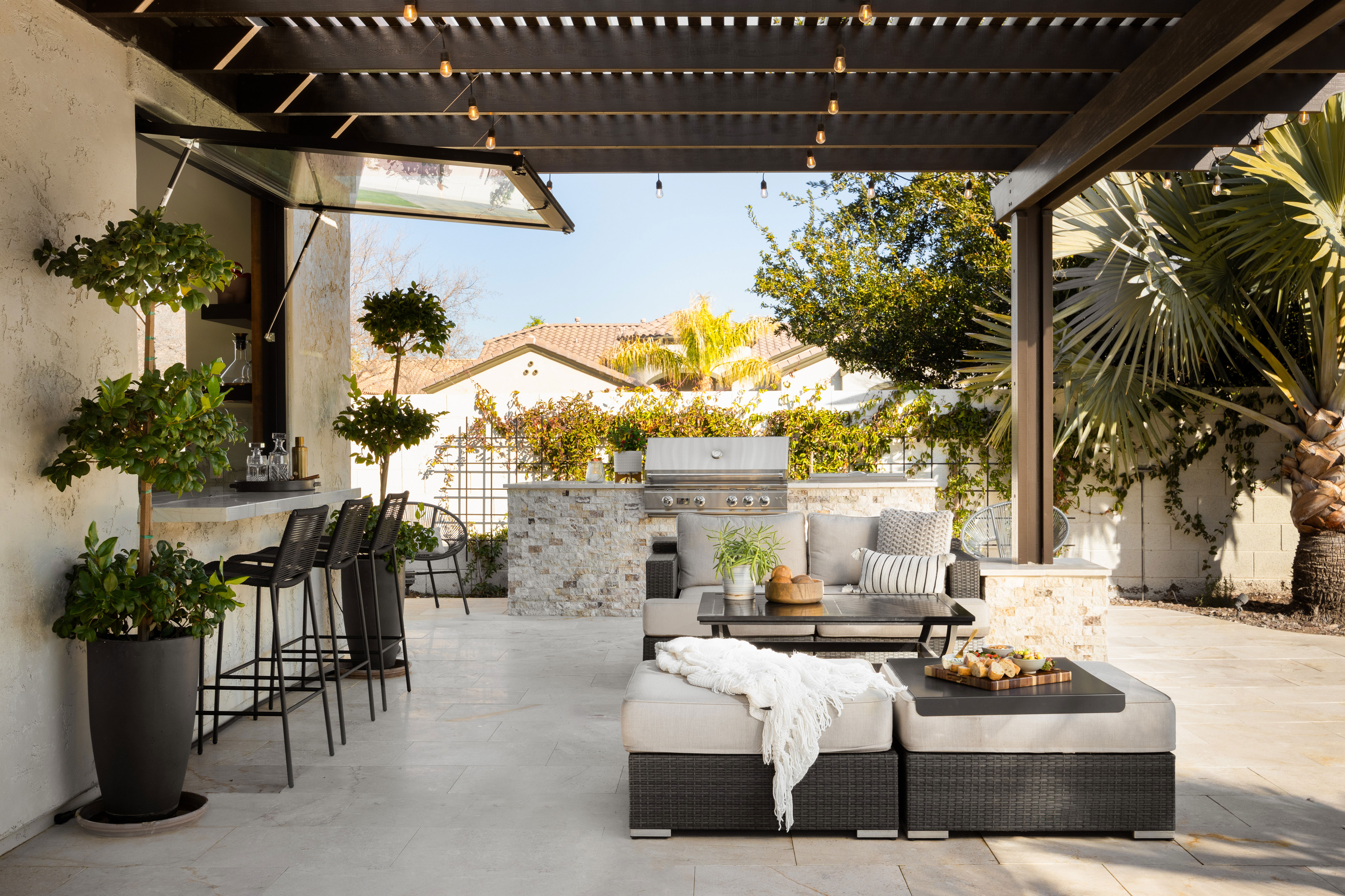
A wall of doors leads from the living space out to the patio, joining up the kitchen bar. "With the window wall and bar window fully opened, it's difficult to distinguish where the indoors stops and the outdoors begins," Brittny says. "That's exactly how we like it in Arizona where outdoor living is a part of life."
"The furnishings were chosen with casual comfort in mind,' the designer adds. "With two kids, a family dog and lots of friends and family, this space had to feel accessible and cozy."
Brittny and Jenna's design for this home straddles the difficult gap between its owners' aesthetics with ease. Where you might expect there to be a sense of compromise in the design, it's an expression of old meets new that feels easy — and it reflects a breath of fresh air for this laidback, Arizona home.
!["Once the [Rainbow Flag] Cat Is out of the Bag, the Ball Game Is Over"](https://images.inkl.com/s3/publisher/cover/212/reason-cover.png?w=600)


