When MAC opened in Kolkata in 2008, it was “marketed as make-up by professionals for professionals and of professionals”, remembers make-up artist Abhijit Chanda. The Canadian brand was the first to boast of a make-up studio, where one could by appointment have a makeover done. With gleaming all-black interiors and supercilious make-up artists, MAC felt luxe but almost intimidatingly so.
Chanda and content creator Bianca Contractor (also daughter to celebrity make-up artist Mickey Contractor, who was director of make-up artistry for MAC in India) also agree that that was the ‘vibe’, and perhaps deliberately so.
Cut to 2024, SS Beauty has opened its largest store in India in an expansive 9,000 sq.ft. space in Kolkata’s Quest Mall. Known as the city’s only “designer” mall with international labels on the ground floor, from Gucci, Burberry, Michael Kors to Jimmy Choo, the multiple-brand beauty store occupies the first floor of the RP Sanjeev Goenka Group-owned mall.
A diverse range of brands from global powerhouses like Dior, NARS, Armani Beauty, Laura Mercier, Givenchy, Clarins, Lancôme, Kiehl’s, Shiseido, Jo Malone, and Tom Ford to Indian cult favourites such as Forest Essentials, Kay Beauty, Colorbar are available at the store. From make-up to skincare, fragrances, grooming for men and haircare, the store feels designed to include rather than exclude.
Pink, a new obsession
Brands like Purplle, Nykaa, Tira Beauty, Tata Cliq Pallette, Sephora and SS Beauty are all using colours to carve out a certain brand identity in this booming retail category. “Purplle uses its design and colour distinctly,” says Manju Sara Rajan, editor of Beautiful Homes.
Not just that, pink is Nykaa’s and SS Beauty’s favourite crayon too. Both multi-brand beauty chains use a bright fuchsia pink in their design language. SS Beauty’s store in Quest uses the shade more sparingly however with the dominant theme of white, black and gold, and only accents of pink. Its ceilings covered in gold mesh, golden spotlights, gilded fascia and hot pink accents are in sharp contrast to Shopper’s Stop usual monochrome colour palette.
“It felt so grand. And I loved all the gold and the pink,” says social media influencer Preeti Sarkar. Sarkar’s other favourite is the neighbourhood Nykaa store which she believes is a game-changer in the world of beauty. Fast translating its online sales during the pandemic into brick-and-mortar format, Nykaa inaugurated its 175th store in Mumbai’s Bandra recently. Their ‘rani pink’ logo on black, infinity mirrors and shimmery pink interiors offer a softer take. Unlike SS Beauty’s gleaming marble and granite floors, Nykaa’s plain cream tiles indicate a more utilitarian approach.
But “black wonderland” Sephora will always be the OG when it comes to buying make-up. The chain which opened to snaking queues in 2015 has a cult following among influencers and MUAs.
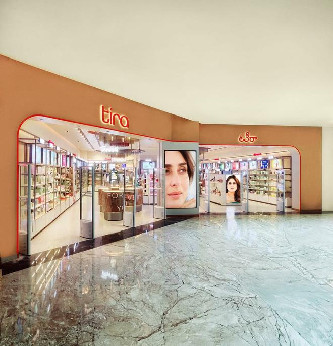
Telling a different colour story is the hip new Tira Beauty. Owned by Sephora’s new distribution partner Reliance Retail Ventures, Tira sets itself apart with its design language. “It’s interesting because they have chosen an entirely different palette, which makes sense because they have to be able to stand out in an already crowded market. And an offline store, especially after the pandemic, is important as consumers want to try out and get a feel of the product,” adds Rajan.
Done up in ivory and cream offset with metallic shades in gold and copper and sparse pops of orange, the Tira effect is “young, sexy and fun”, says Rajan.

Intelligent design
Designed by London-based studio Dalziel & Pow, known for their work with renowned brands such as Google, Chloe, and Toyota, Tira’s thoughtfully planned layout has an ‘inviting and non-intimidating ambience” that is already wooing make-up enthusiasts across the board.
Both Mickey and Bianca Contractor love Tira for the experience of the store.
“I felt like I had a lot of room to browse and try out the products,” says Bianca. No wonder since Tira makes it a point to keep a “minimum of four-five ft. distance between aisles to allow for customer movement”.
The counters feature a stone marble finish made out of solid acrylic material and terrazzo countertops display the products. The façade features muted natural colour tones with a clay texture finish and the metallic fascia features bronze and nickel PVD coating. “I don’t know how to explain it. It felt like being in Candyland but for make-up,” says MUA Vatsala Bhagat. Meanwhile, SS Beauty uses smart backlit mirrors and spotlighting for the perfectly Instagrammable selfie. The single treatment room is a calm mint green that can be a pampering oasis. Wide aisles allow for enough movement, especially for influencers to twirl for the camera.
At SS Beauty, the Fragrance Bar that occupies a long stretch along the aisle. Green marble countertops showcase a selection of perfumes from Hugo Boss, Carolina Herrera, and Tom Ford as examples of perfume signatures, whether floral, fresh or woody.
The Fragrance Bar that occupies a long stretch along the aisle gives you enough room to discover and browse. Green marble countertops showcase a selection of perfumes from Hugo Boss, Carolina Herrera, and Tom Ford as examples of perfume signatures whether floral, fresh or woody. Individual brand-specific counters then follow for shoppers to explore further.
Sephora too makes it a point to always consider “lighting and HVAC (heating, ventilation, and air conditioning) designing” as a focal point but the standing-room-only store perhaps is more geared towards the shopper who knows their mind.
“When you enter a store, it’s like you’re entering the brand world, every touchpoint sort of builds up to that moment. So rather than replicating a formula, if each step can be a layered experience, the customer would be keen to stay on. A lot of science and data is applied to product placement, lighting et al so that buyers have the correct experience,” says Anahita Kayan, Founder & Creative Director of The Space At 9/2, a multidisciplinary design studio in Kolkata.


