Just when everybody was complaining about how the Nothing Phone 2 was incrementally more expensive than the original model, the company’s reappeared to redeem itself with its latest Android-powered phone. The Nothing Phone 2a is out to make its presence known among the best cheap phones out there with its stylish design — and even lower cost.
I’m in love with everything I see on paper with the Nothing Phone 2a, including how it retains the brand’s identity with its peculiar design and iconic Glyph Interface. In a sea of slates, its design is a refreshing one made better by the fact it’s under that $500 threshold of what most consumers deem as budget phones.
Frankly, the Google Pixel 7a and iPhone SE (2022) — two phones I’ve spent a great deal of time using as my daily drivers — should be afraid. In my Nothing Phone 2a review, I’ll tell you how this phone stacks up against Google and Apple's competitors, and what changes it has compared to the Nothing Phone 2.
Nothing Phone 2a review: Price and release date
Similar to Google’s Pixel A-series, the Nothing Phone 2a serves as a lower-cost alternative to its flagship phones. Pre-orders begin for the 2a on March 5, where it’ll be available in two colorways (black and milk) — with general availability in most global markets coming on March 12.
What’s interesting here is that it’s priced much less than the original Nothing Phone 1 and Nothing Phone 2 at £319 for the 8GB/128GB version. If you need more storage, the 12GB/256GB model will set you back £349.
In the U.S., the Nothing Phone 2a will be available for $349 for the 12GB/256GB version. However, it’s going to be available through its Developer Program rather than regular retailers. It’s unknown if we’ll see broader availability much like the Nothing Phone 2. I certainly hope so, because the original Nothing Phone 1 was heavily criticized for not releasing it in the U.S.
Nothing Phone 2a review: Specifications
Nothing Phone 2a review: Design
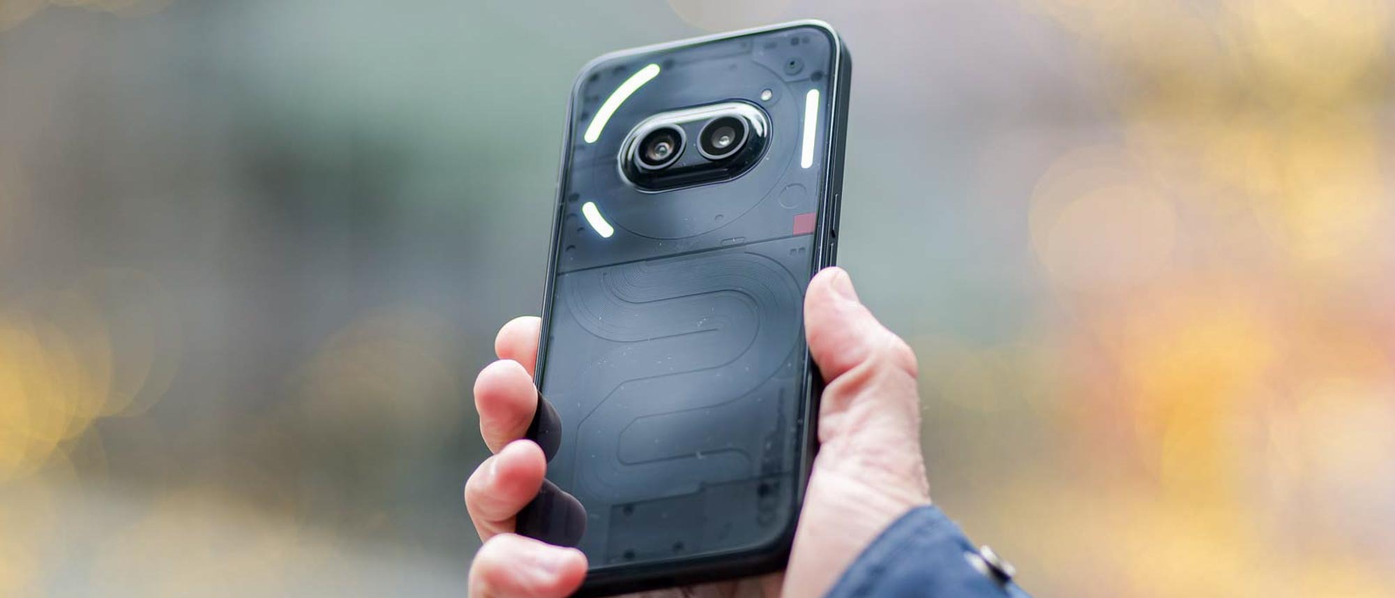
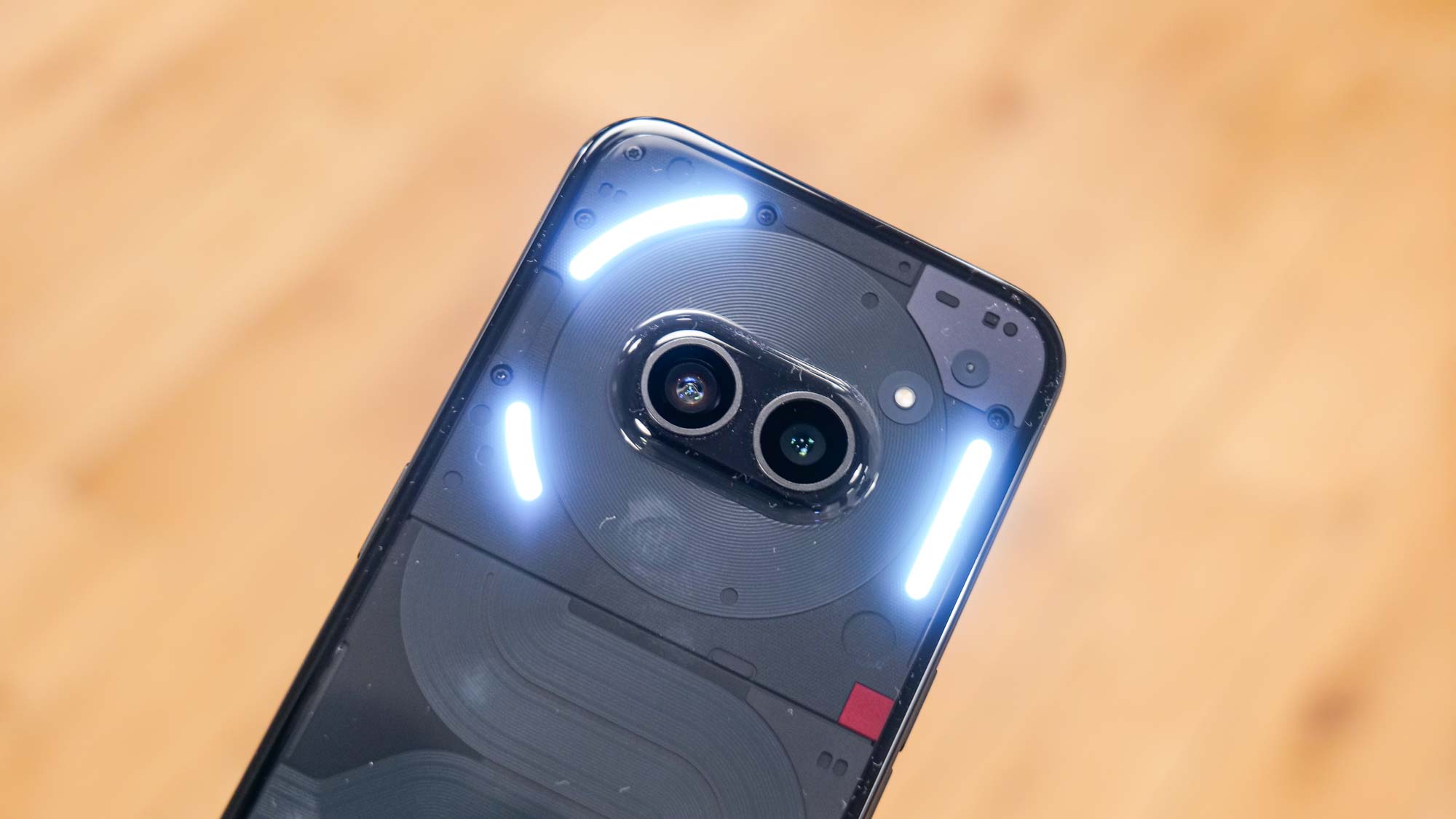
I really don’t know how Nothing is able to get away with making such a low-cost phone look premium. Yet, the Nothing Phone 2a is proof that cheap phones can still look and feel premium in every way. Sporting the same translucent casing as its big siblings, you can see inside the phone and admire small details like its wrapped coils, micro-sized screws, and the Nothing name etched into the back.
While the glossy cover of the rear casing is a nice touch, it makes the phone incredibly slick — so much so that it has slid off my lap every single time I put it down. As much as I’m a proponent of phone cases, a phone this beautifully designed begs to stay naked, but you’ll just need to pay extra attention to how it’s handled.
Due to its lower cost, Nothing has to make compromises here and there in order to get it within budget. That’s why the Glyph Interface on the back is pared down to a few LED strips around the camera. But just as before, it lights up to correspond to different notifications that can be customized. I can appreciate this alternate method of showing notifications, but it’s tougher to differentiate how the Glyphs light up than on the Phone 2 because there are fewer on the 2a.
Nothing Phone 2a review: Display
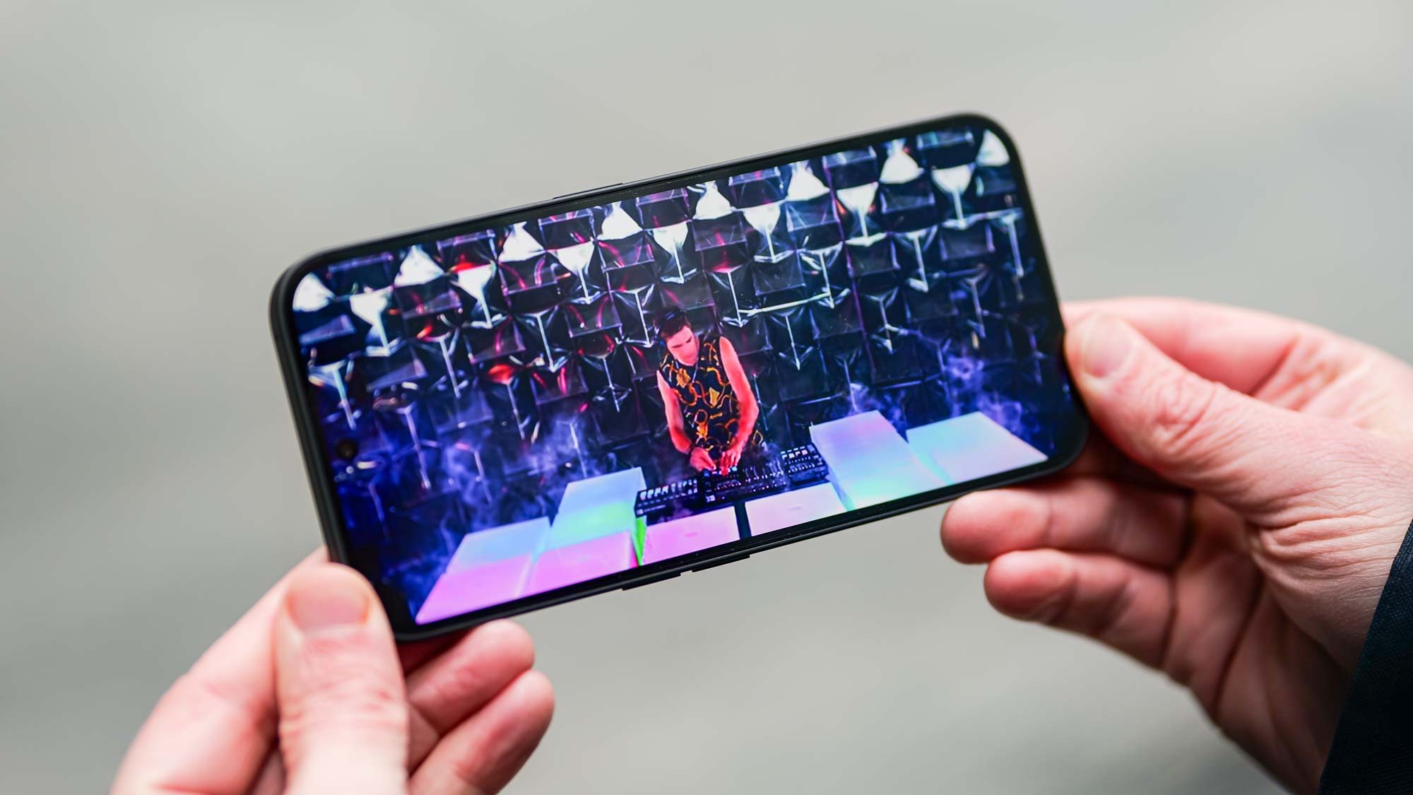
Another satisfying area where Nothing doesn’t make huge compromises is the display. That’s because it features a similar 6.7-inch AMOLED display, reaching a peak brightness output of 990 nits — which is a smidge brighter than the Nothing Phone 2’s maximum of 960 nits. I watched the same HDR video on YouTube on both phones and love how the Nothing Phone 2 doesn’t disappoint with its deep blacks, iridescent colors, and wide viewing angles.
Add to that, it also has a 30-120Hz adaptive refresh rate that adds just that right amount of fluidness to videos and movie trailers — while also working wonders on keeping mobile games I play religiously super responsive to the tough. Typically I’d expect a display that’s nowhere near as bright with slightly worse viewing angles, but there’s no compromise here with the Nothing Phone 2a.
Nothing Phone 2a review: Cameras
Now comes the part that I’m most interested in: the cameras. In my experience, this is where I see the biggest difference among phones — more so when I compare two completely different classes of phones.





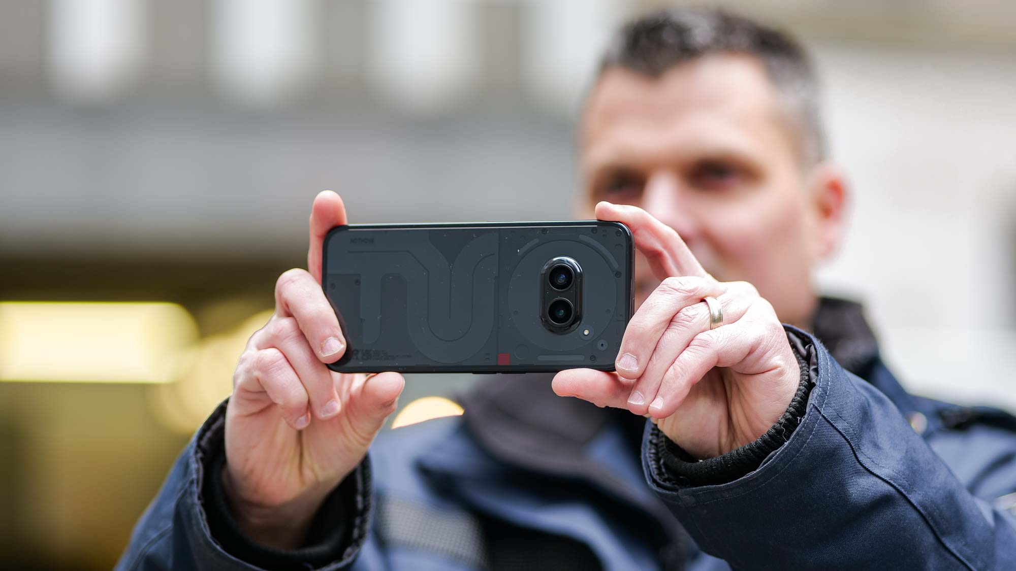
Around the back and ever so slightly protruding from the main body, there’s a dual-camera system that consists of 50MP main and 50MP ultrawide cameras, with a single LED perched nearby. It’s accompanied by all the usual shooting modes you’d expect, like time-lapse, pano, slow-mo, but the camera snob in me loves how there’s an ‘expert’ mode with manual controls that let me adjust the ISO, shutter speed, focus, and more. There’s even an option for capturing in RAW for those who want to get more out of their photos in post.
I really can’t complain much about the main camera, especially when I compare it to the Nothing Phone 2. The dynamic range performance of the Nothing Phone 2a surprises me because it does exactly what it’s supposed to do, which is to balance out the exposure in the shot between the shadows and highlights — resulting in Moynihan Train Hall having an even exposure. Although, the Nothing Phone 2 produces the more realistic, true-to-life shot with its stronger contrast.
Likewise, that same excellent dynamic range performance is also on display in this other ultrawide shot at this corner building across the street. I’ll admit again that the stronger contrast look of the Nothing Phone 2 gets my vote, but the Nothing Phone 2a’s dynamic range is much better by boosting the highlights of the building’s facade to make it more pronounced.


The Nothing Phone 2a can still pull off decent portrait photos by applying just enough of that out of focus effect to the background, but my skin tone looks pale in comparison to a snapshot I took with the Nothing Phone 2.
Low light, however, is the single area where the Nothing Phone 2a struggles. I’ve seen worse, but the underexposed look of my detached garage in my backyard makes details nearly impossible to discern — whereas the Pixel 7a and Nothing Phone 2 are noticeably brighter.

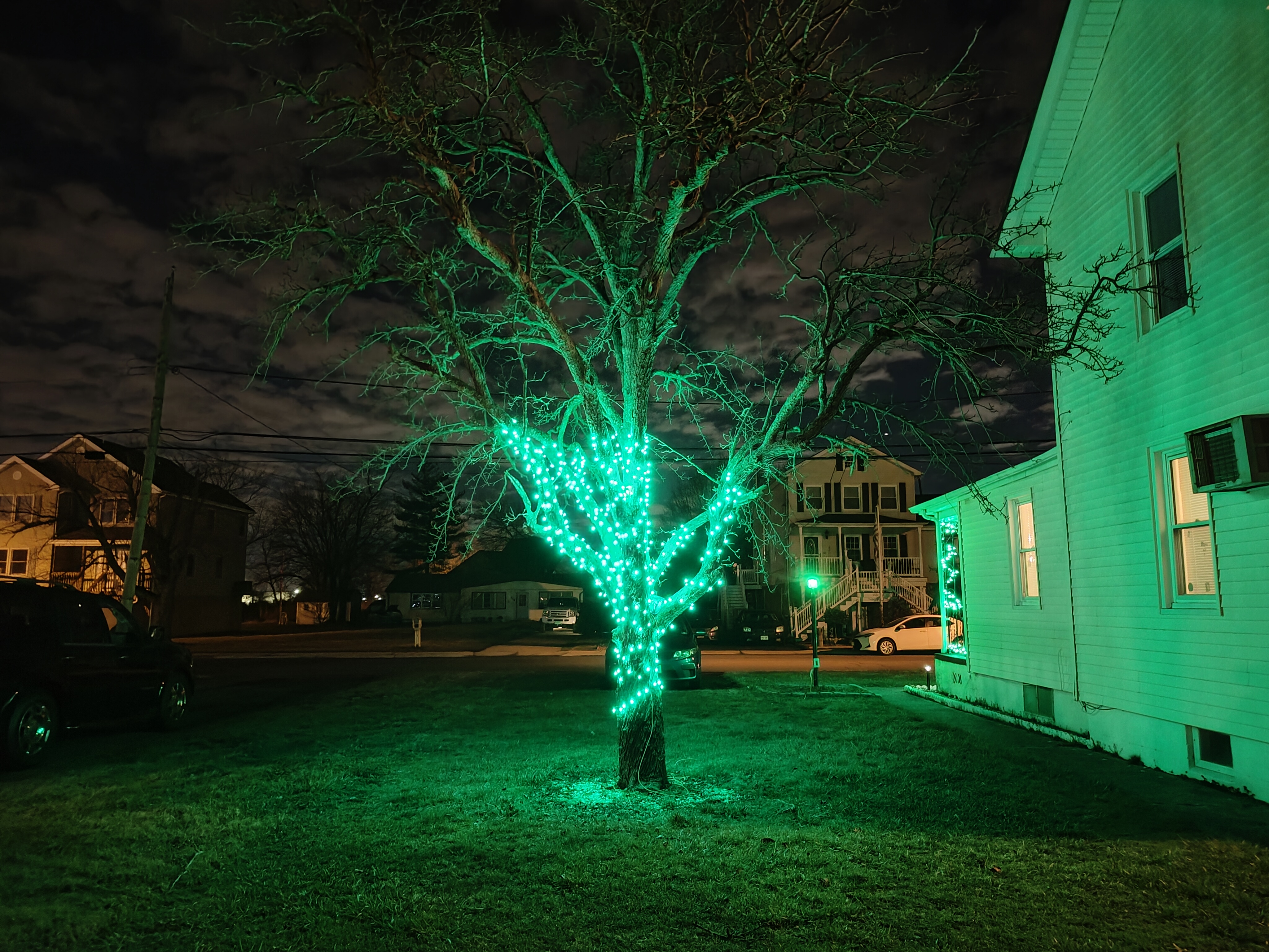
I’m also inclined to say the same thing here with this shot of my pear tree covered in twinkly string lights. The brightness of the LED lights blows out the highlights and the surrounding areas of the pear tree, while they’re better retained and look more defined with the Nothing Phone 2.
Over on the video recording side, the Nothing Phone 2a tops out at 4K 30fps. My only complaint is that you can’t switch between the two cameras once you start recording, which is annoying because it means stopping and restarting each time you want to go from the main camera to the ultrashould be afraidwide.
Otherwise, the video recording performance is passable with its sufficient details and moderate exposure adjustment. There’s a little bit of noise in the shadows, but it’s not as noticeable under bright conditions. I only wish for a 4K 60fps option because fast-moving subjects tend to look jittery through the Phone 2a's lens.
Nothing Phone 2a review: Performance
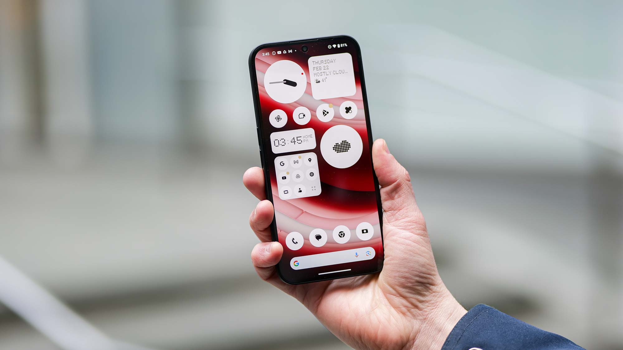
In true A-series fashion, the Nothing Phone 2a opts for a MediaTek Dimensity 7200 Pro chip for its muscle power. On the surface, I’ll say that it doesn’t disappoint with how the phone responds to basic operations such as surfing the web, watching videos, and running apps. It rakes in scores of 1,103 and 2,586 with Geekbench 6 single-core and multicore tests respectively, which aren’t anything worth bragging about.
At the same time, it’s no gaming phone with its choppier frame running 3DMark’s Wild Life Extreme test. When I say choppy, I’m talking about 25.46 fps choppy — or a score of 4,251. In comparison, the same tests on the Nothing Phone 2 results in a better 58.9 fps rate. I can tell the latency isn’t as spot on as other phones as I play Ages of Origin and Modern Combat, but that’s the trade-off with many of these budget phones.
Nothing Phone 2a review: Battery life
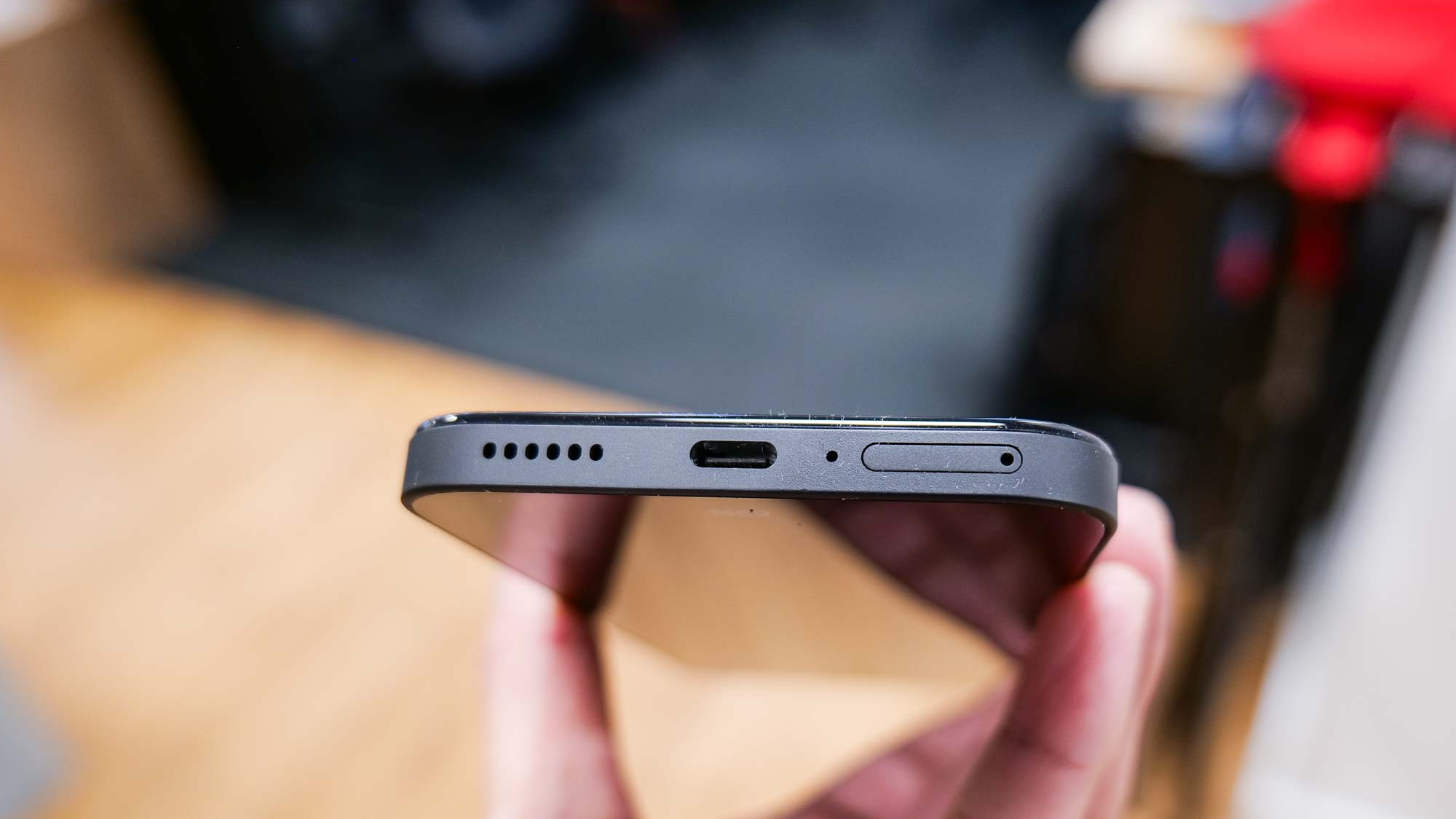
For this review, I made sure to keep the Nothing Phone 2 within arm’s reach to compare everything about both phones. What’s really interesting is how both the Nothing Phone 2 and 2a are nearly identical in size, yet it’s the 2a with the larger 5,000 mAh battery cell.
In Tom’s Guide battery benchmark test, it’s able to reach a maximum time of 15 hours flat — and that’s with the refresh rate set to high. That’s better than the 14 hours and 21 minutes that the Nothing Phone 2 lasted set on high as well. Of course, the larger battery certainly helps out here, but it’s really astounding that a phone this cheap gets to the 15 hour mark. Few phones, including flagship caliber ones, ever reach this threshold, so it’s nice knowing that the Nothing Phone 2a has excellent endurance.
I also appreciate how it has 45W wired charging, which is an uncharacteristic feature you’d find in cheap phones. Now, in order to take advantage of this, you’ll need to supply yourself with a charger because it doesn’t come with one. If you do have one lying around, then you can expect a fully charged phone in 59 minutes. But unlike the Nothing Phone 2, it ditches wireless charging to reach its budget cost.
Nothing Phone 2a review: Software
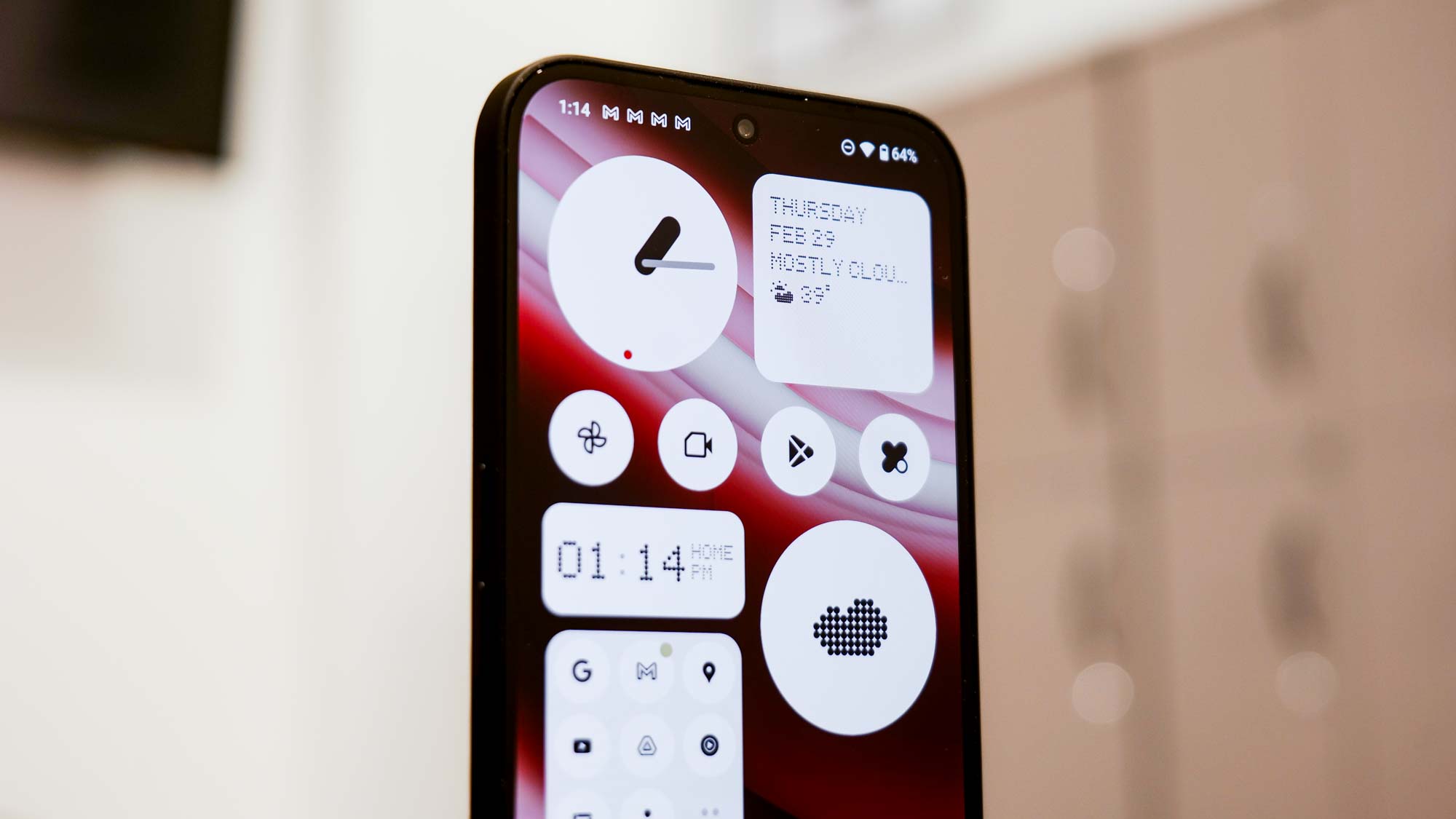
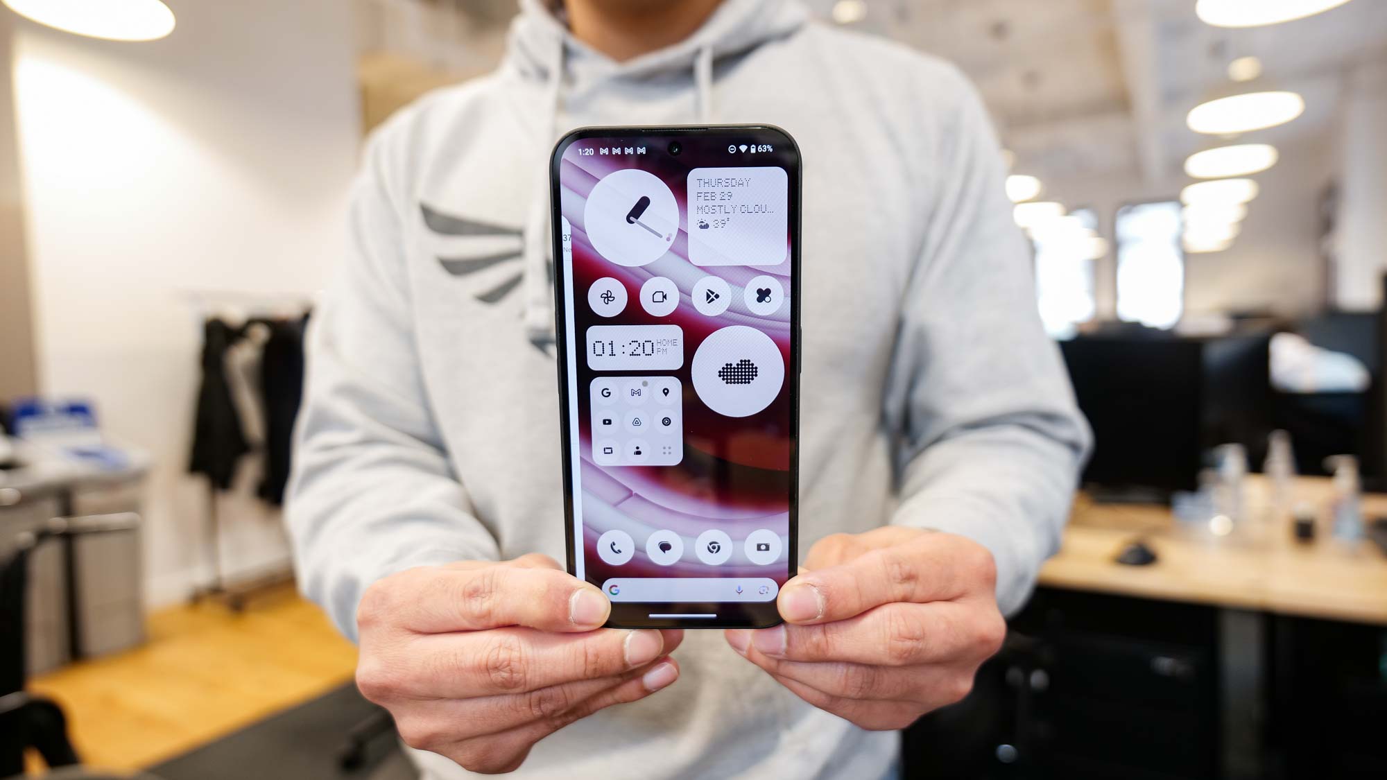
Every Android phone released today tends to stick with a mostly stock experience. Sure, there are minor aesthetic changes that technically make them different, but nothing is more unique looking than the minimalist look of Nothing OS 2.5 running on top of Android 14.
Small details like the dot matrix style of the font and circular sized icons make Nothing Os 2.5 vastly different from other Android phones I’ve tested. Best of all, it doesn’t try to overwhelm the experience by adding redundant features I find in other phones.
Not surprisingly, the Glyph Interface amplifies the experience for those who want that extra visual flare. Just as before, you set different tones and lighting patterns for specific apps and notifications, but since it has fewer light strips, you don’t get the same charging meter found with the Nothing Phone 2. It’s not a terrible loss, but an omission worth pointing out.
Nothing Phone 2a review: Verdict
First and foremost, I really hope that if we do indeed get a consumer version of the Nothing Phone 2a for the U.S., it should keep the same $349 starting cost. It’s unbelievable and undercuts many of its main rival, while its cost in other markets like the U.K. is already attractive enough to make it a worthwhile phone that offers a lot of value.
I’m glad it ended up exceeding my expectations, especially because it matches the more expensive Nothing Phone 2 in areas like the display, battery life, and software experience. Nothing has crafted a genuinely premium phone for a budget price, made better by the fact that it’s also got a unique design that few phones in its price range can match.
Just when we were all getting comfortable at $500, the Nothing Phone 2a’s arrival should make other phone makers on alert. Because smartphone buyers are now going to expect much more at this price point.


