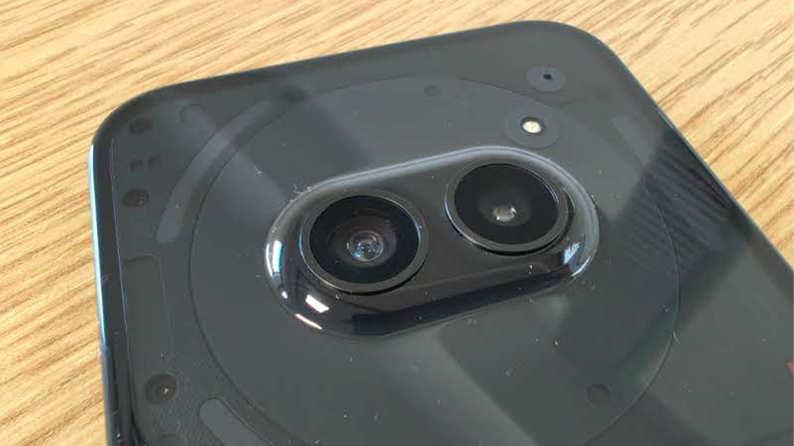
Nothing Phone 2a could be my favourite entry in this brand's roster – the literal face of the next generation of product design. This reminds me phone design needn't be boring or safe; there's room for personality in products and Nothing Phone 2a manages to capture that special something to transcend being just another iteration on an idea.
To be clear, I own Nothing Phone 1, which I bought day one, and Nothing Phone 2, which I use every day, so I'm already onboard with this design-first, disruptive brand. Why do I love the Nothing Phone 2a? Because it's the perfect balance of affordable, good tech and quirky design.
Much has been made of Nothing's design-first approach that echoes the ideas of Teenage Engineering (read up on this brand's Playdate gaming handheld); the innards are visible on rear of the phone, turning tech into art and the Glyth LED system aims to change how we interact with smartphones - less screen time aims to deliver anxiety free tech. Nothing Phone 2a is the entry that massages those ideas into a design that puts fun ahead of tech and price ahead of over-leveraged specs.
Nothing Phone 2a review: specs

Processor MediaTek Dimensity 7200 Pro
Clock speed 2.8 GHz
Cores 8
Benchmark (Antutu v10) 741,999
Main camera 50 MP
Ultra-wide camera 50MP
Front camera 32 MP
Display 6.7-inches, AMOLED, Gorilla Glass 5, 30 - 120Hz, 1,100 nits
Bezel width 2.1mm
Battery size 5,000 mAh, 45W
Weight 190g
Size 161.74 mm x 76.32 mm x 8.55 mm
Price £319
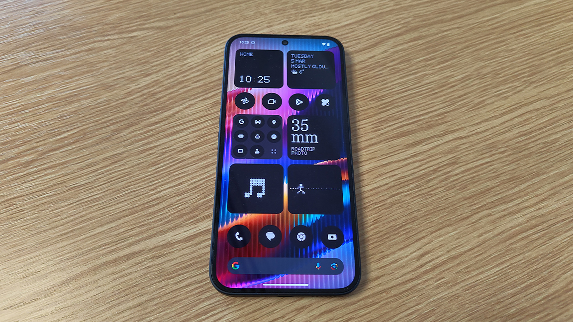
Nothing Phone 2a is a replacement for Nothing Phone 1, which released 2022, and is going to be priced similarly, so expect to pay around $350 / £319 for this new budget smartphone (at the time of writing this reviewing the price is still unknown).
In almost all areas Nothing Phone 2a tops its predecessor, and in some areas even pips the more expensive high-end Nothing Phone 2, for example its 6.7-inch AMOLED display features Gorilla Glass 5. Overall though, Nothing Phone 2a is pitched at the budget end, and here looks to deliver a solid performance.
This new phone features the popular MediaTek Dimensity 7200 Pro processor as you'd find in budget phones from Xiaomi and Motorola. This offers a speedy 2.8GHz and eight cores. Nothing has worked with MediaTek to create a customised chip and hardware solution that offers a fast and smooth experience, for example a RAM Booster feature uses your unused memory as virtual RAM to maintain multiple apps and a smooth experience.
There's also Smart Clean AI, developed by Nothing, which regularly cleans the phone of unused and fragmented files when charging to strip the phone of data junk without you needing to fiddle around with settings. (It doesn't delete anything important.)
Generally Nothing Phone 2a is a revamp across the board: the main camera is 50MP, (the same as Nothing 1 and 2) but the front 'selfie' camera is now 32MP (Nothing 1 is 16MP); the display is now a larger 6.7-inches (same as Nothing 2) but with a slimmer 2.1mm bezel; peak brightness is 1,300 nits, higher than Nothing 1; at 5,000 mAh the new battery is larger and lasts longer; and finally Nothing Phone 2a weighs just 190g.
Overall Nothing Phone 2a is a step above Nothing Phone 1 and a welcome replacement as overall it out-specs its predecessor. This budget end of the phone market is getting increasingly crowded, with phones like the Google Pixel 7a, Realme C35 and Samsung Galaxy A54 proving popular. But Nothing Phone 2a matches many of these phones for tech, or betters them, but mostly Nothing impresses because it has two unique offerings - design and UI…
Nothing Phone 2a review: design
In many ways Nothing Phone 2a is closer to the concept than previous releases, despite pairing back the Glyth LEDs and restricting these to the 'head' of the phone. This design choice leaves more room to showcase the curves of the phone's innards, its flexible circuitry, connecting the motherboard to the display, SIM card and USB type C port, wiggles up the middle of the phone towards that head, or 'brain'.
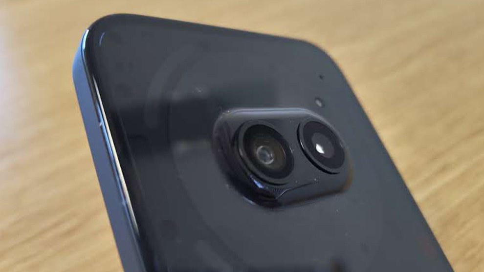
I've previously written on how Nothing Phone 2a's design feels fun and adventurous, its dual-camera placement set within the phone's NFC coil resembles a 'face' and genuinely brings a sense of personality to what is usually a forgettable block of tech. Nothing Phone 2a has an anthropomorphic design that is both endearing and innovative; set against the mire of smartphones that all riff on iPhone this product design is a wink towards a new direction.
It even feels, particularly with the choice to move the cameras from the top corner, the norm of phone design, to the central space, that Nothing has chosen a design-led approach. I'm pretty sure this one choice led to a lot of head scratching to balance components, which are laid out in a circular design around these cameras, the Nothing Phone 2a's 'eyes'.
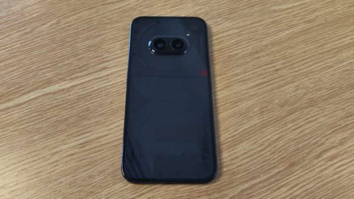
One unique design feature that could go unnoticed is an industry-first, the phone has a 90 degree angled unibody cover, this wraps the phone's back edge to edge in softly pillowed plastic. The Nothing Phone 1 had a straight glass back, the Nothing Phone 2 a curved glass rear cover, so Nothing Phone 2a's approach is very different. Using a clear plastic is not only strong but lighter than glass, while remaining smooth and tactile.
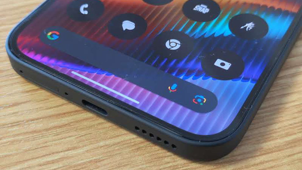
The combination of the matt finish edge trim and smooth, curved rear ensures the Nothing Phone 2a feels nice to hold - it's also noticeably lighter than previous models. Placing the two cameras centrally at the top of the phone also makes it more stable on a flat surface, and less likely glide off smooth surfaces (an issue I raised in my Nothing Phone 2 review). Though, realistically, the way Nothing Phone's are designed around the Glyph system, you'll have it face down so this advantage is mute.
Nothing Phone 2a review: Glyphs and UI
A recap on the Glyph system: this is Nothing's bespoke anti-screen notion, that uses a panel of LEDs on the reverse of the phone to light and flicker in time and patterns to incoming calls, notifications, and more. It's a unique feature and one that has both been limited and enhanced with Nothing Phone 2a.
This sounds like a fudge, but this new model's setup is actually a nice middle ground between the previous two releases. This model has fewer LEDs, restricting the device to three at the 'head' of the phone, but this now also includes the timer Glyph used by third-party apps that isn't found on Nothing Phone 1 (but is on Nothing Phone 2). This feature ties the Glyph into some apps, and can be used, for example, to monitor food deliveries without needing to constantly check the screen or app. Linked to Google Calendar, I use this feature daily to signal and time down to upcoming meetings and events, so I'm kept in the know without constant screen checks.
Nothing Phone 2a launches with Android 14 and the latest version of Nothing OS, which also means more widgets and new features not found on other Nothing phones.
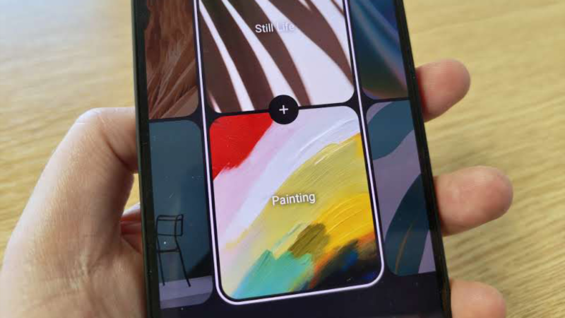
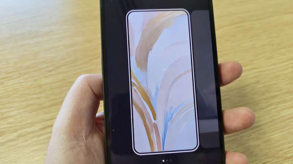
There are new Camera and Media Player widgets at launch, as well as a new AI Wallpaper Generator that enables you to create artwork for the phone's lock screen and backgrounds. Other new features absent on Nothing Phone 1 but available on the more advanced Nothing Phone 2 include the dot-matrix Weather App and the Glyph Composer to craft personalised LED patterns.
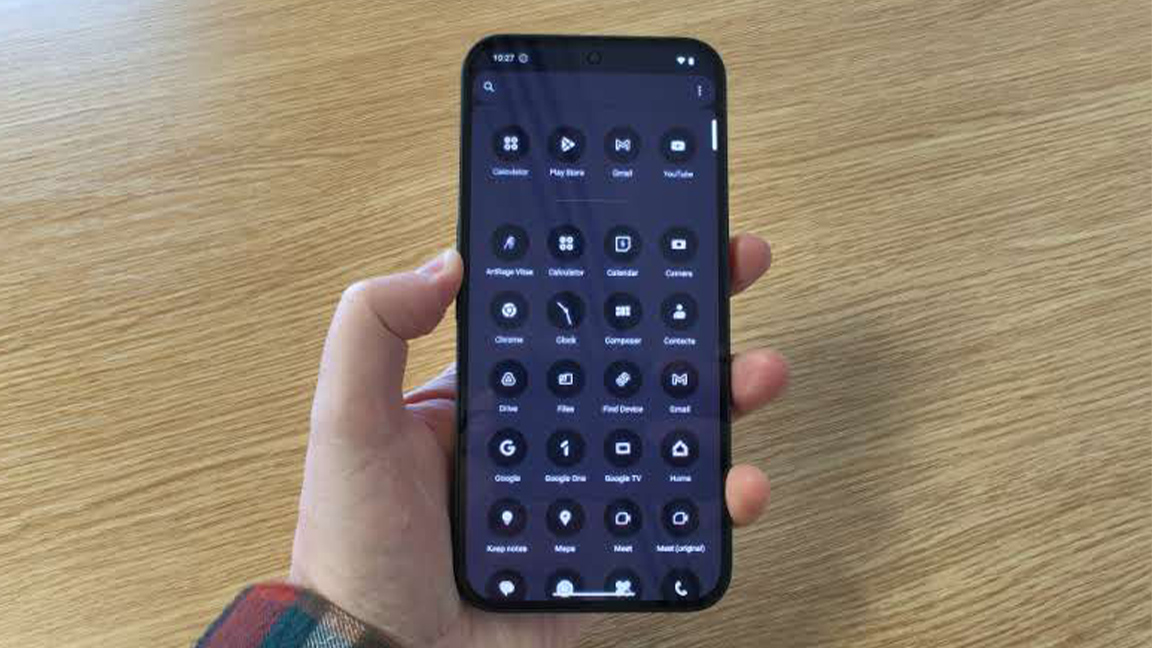
Again, there's the choice to replace all the app icons on the phone with Nothing's own simplified two-tone dot matrix designs. The idea is to destress the experience of using a screen, removing the colour and clashing icons with a unified UI. I like it, but I can imagine some finding the colour-limited roster of icons hard to get used to.
Nothing Phone 2a review: performance

In use I can say Nothing Phone 2a is a joy, and there's a lot happening behind the scenes that makes this a smooth experience despite not having the power of higher-spec smartphones. Clearly new features, such as Smart Clean, are doing something to improve performance.
I test out Nothing Phone 2a using general Google apps, including Docs and Sheets, as well video calls, and the MediaTek Dimensity 7200 Pro didn't miss a beat. This review model has 12GB RAM and 256GM of storage, and performs well, particularly when streaming video and music - it's swift and there wasn't any apparent battery drain.
I tested it on a number of games, including Marvel Snap on its highest graphics settings, and there was no noticeable lag for, what is, an animation-heavy game. Art apps such as ArtRage Vitae and Sketchbook were less impressive and visibly laggy, particularly with a drawing tablet attached (in this case the Xencelabs Pen Tablet Small) but you can't really expect more from a budget phone.
To test the battery life I used Nothing Phone 2a for a day constantly, for gaming, video streaming, productivity apps and web browsing. I first charge the phone from dead, which takes 50-55 minutes, so slightly faster than Nothing Phone 1 and on par with Nothing Phone 2. After a day of use there's still just under 50% charge left, the phone's larger battery, bigger than both previous Nothing models, proves this has value.
Nothing Phone 2a review: the camera

Nothing Phone 2a's camera matches that of the more costly Nothing Phone 2, and in doing so trumps the original Nothing Phone 1. There are more budget camera phones around these days, but you'll be a hard pressed to find one with a 50MP camera for less than $350 / £319, like Nothing Phone 2a. The closest is perhaps the Samsung Galaxy A54, but you're getting a downgrade in RAM, memory and display size. (See how list of the best budget camera phones for more specialist mobiles.)
The camera has a f/1.88 aperture lens and 1/1.56-inch sensor size, meaning you get excellent macro and portrait results as well as good image quality in low light. Particularly, the 1/1.56-inch sensor size is large for a budget phone, and compares to mobiles twice the cost, such as the older Samsung Galaxy S22+, Honor Magic 3 Pro and Xiaomi 12.
Nothing Phone 2a also has a super-wide 114 degree field-of-view, which places it in good company with the smartphones like OnePlus 12 and Vivo X100 Pro, for a fraction of the cost - these phones cost in the region of $799 / £849.
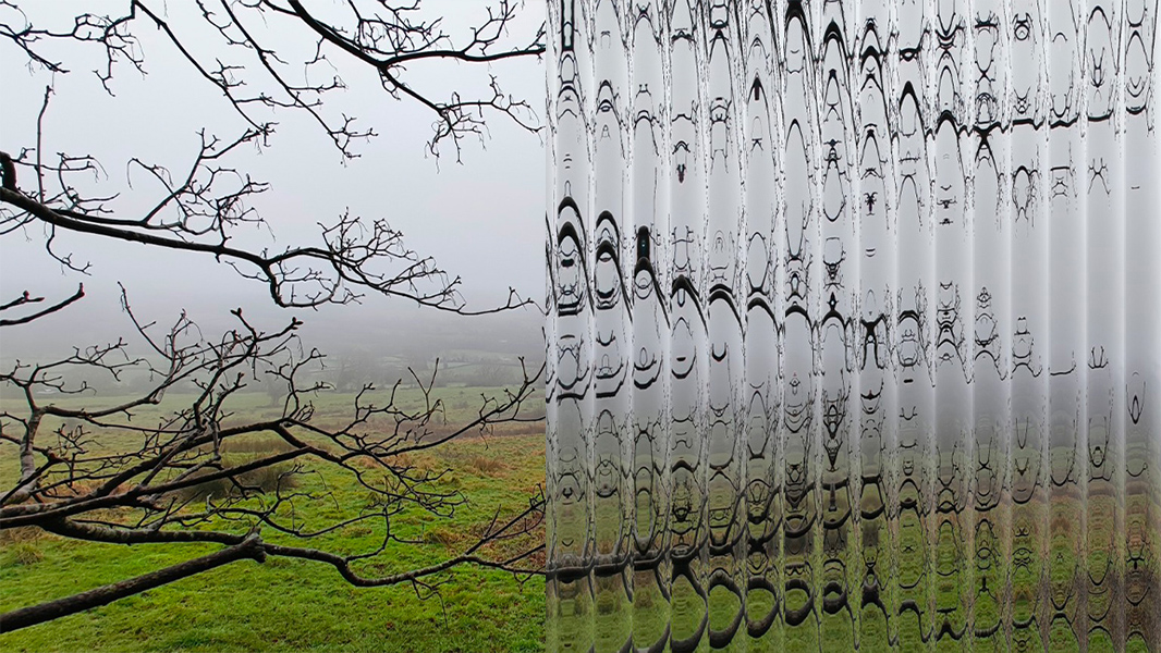
Results are excellent and sharp, the camera pulls detail from subjects easily. I test it out and about in low light, early morning and love the final photos. The colours are excellent. It's worth noting the Nothing Phone 2a doesn't feature a separate Macro mode, so you need to manually adjust settings in the Pro menu, but it's not difficult to get good results.
This phone does feature a Wide Angle mode for capturing more in the frame, which the newer Nothing Phone 2 doesn't offer. Other modes, including Panorama and Portrait perform well and Nothing has its own set of filters to play around with, including its own patterned window-like style.
Nothing Phone 2a review: should I buy one?
How much you love Nothing Phone 2a can come down to how bored you are with the norm and a desire to want something a little bit different. The paired back use of the Glyth LEDs actually wins out here, enabling the visible circuitry and rear design cluster to breath a little whilst giving personality to the 'face' of the phone.
Behind the clever design is a solid smartphone, powerful enough to handle most apps and uses, from streaming video to gaming and fitness, but it does struggle with more complex uses, like digital art (but really, for £319 I'd expect no less).
A real winner here is the expansion of Nothing's own apps and interface, to include new Camera and Media Player widgets in the dot matrix style, as well as the AI Wallpaper Generator that sucked up far too much of my time. I expect Nothing to continue expand its own apps and widgets, making more use of Android 14 too.
There are more power smartphones, larger smartphones and more expensive smartphones, but there aren't too many with real personality like Nothing Phone 2a. The future of smartphone design has a new face, and I'm sure its winking at me.


