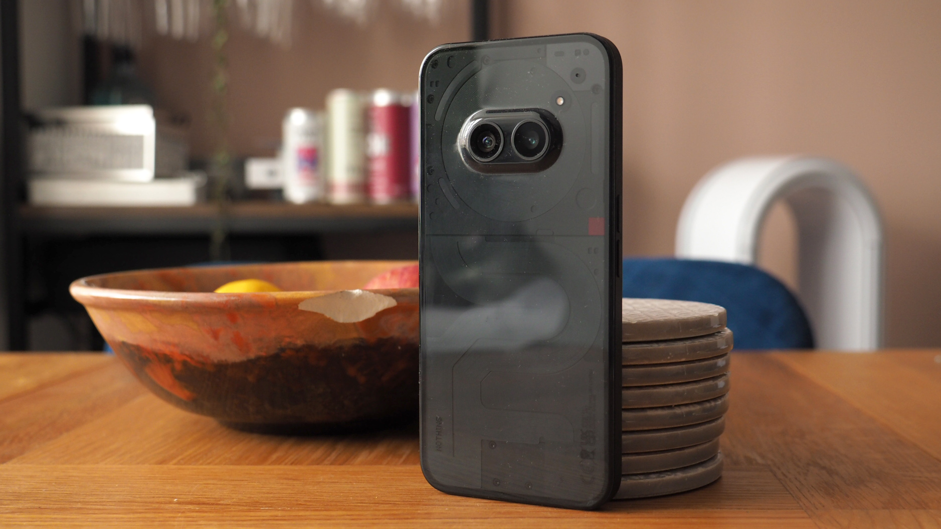
Nothing wants you to know everything about the Phone (2a). You probably already do, to be honest, because the drip-feeding of the company's day-by-day teasing in the run-up to its launch event, well, it left nothing to the imagination. So we knew exactly what we were going to get: an affordable, quirky-designed mid-range Android handset. The kind of handset likely destined for T3's best affordable phones list.
What we didn't get to know in advance, of course, was just how successful Nothing's attempt at winning the mid-range section of the Android market would be. But I've had very high hopes, as someone who loved (and continues to love) the flagship Phone (2). I've held back on reviewing the Phone (2a) until beyond the official embargo was lifted, in part to not to rush the whole process and get to know the handset all the better.
I've been using the Phone (2a) for nine days and counting at the point of publishing this review, and while I was initially unsure regarding certain aspects about this device – as penned in my 5 Things I Wish I Knew Before Buying A Nothing Phone (2a) feature – I've come around and now think it's among the best Android phones you can buy for less cash. Which is no small feat among a sea of Google, Samsung and Motorola competition.
Nothing Phone (2a): Price & Availability
The Nothing Phone (2a) is priced from £319 in the UK (with 8GB RAM and 128GB storage; there's a 12GB+256GB for just £30 more), with pre-orders open now for an on-sale date of 19 March. It's $349 in the US, except you can't actually buy one – as it's part of a developer's programme. Other regional pricing I'm yet to receive, so no official word for the Australian market just yet.
But for context: the Samsung Galaxy A54 and Google Pixel 7a launched at £449 apiece. Nothing's price point is well below that, so even with prices having dropped since it's by far and away the lowest price against its key competition – yet doesn't cut corners to excess to make that happen.
Nothing Phone (2a) review: What's new?
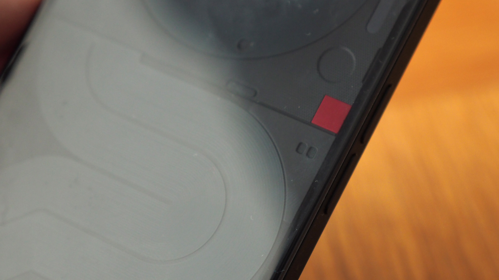
When writing about the Phone (2a) for its launch, I noted that this lower-spec model actually has some surprise upgrades over the full-fat Phone (2) model. Namely: the screen has a smaller bezel surround; the edges are 'softer' for a more comfortable hold; and there's a larger battery capacity (at 5,000mAh) without adding additional weight compared to the original Phone (1) model.
Not that the Phone (2a) is better than the Phone (2). After all, the whole point of this lower-spec model is to deliver a lower price point, which has been achieved by making some sensible choices in design and feature set. Most prominent is the move away from glass to plastic, which makes the rear a bit of a fingerprint magnet that's also very prone to attracting dust by static magnetism (I suspect my Black finish review model will show that up more than the White or Milk options though).
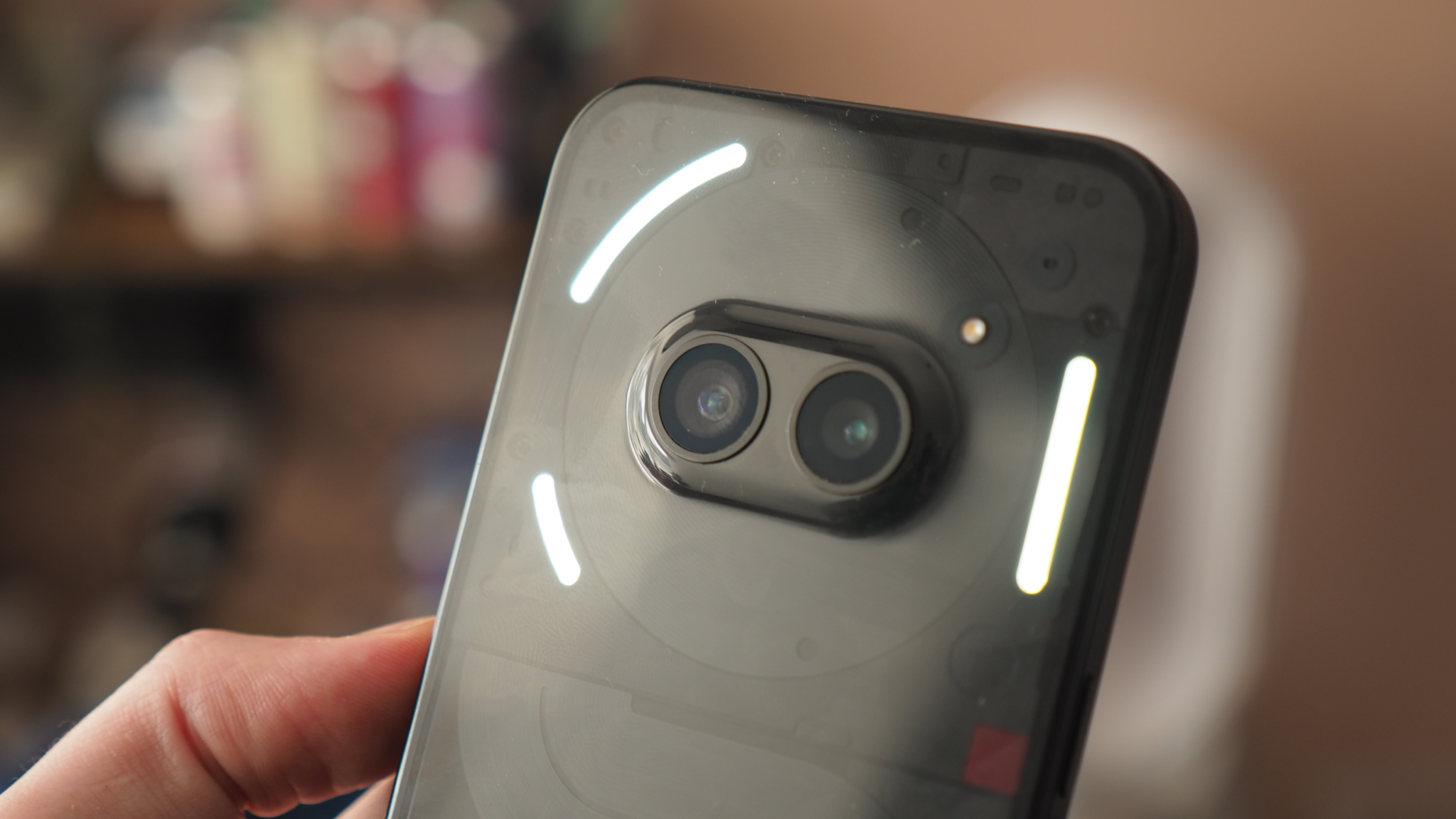
One of Nothing's calling card features is the inclusion of Glyphs, a series of rear-positioned lights that can alert you in various ways – in a flashing sequence, for example – and while these do appear on Phone (2a), the arrangement is pared down. That means a trio of Glyph lights, all positioned towards the top of the device, and no charging Glyph to the lower portion of the phone – which, as per the flagship, would otherwise show you progressive charging, represented by the Glyph light 'filling up'.
Otherwise, the Phone (2a) isn't a dramatic step down – indeed its spec sheet in places reads like a device far more premium than its price suggests. Take the MediaTek Dimensity 7200, for example, which is steps above what you might expect at this level. The screen, too, really isn't scrimping: it's 6.7-inches, has minimal bezel as I've mentioned, features a 120Hz refresh rate, and a decent maximum brightness too. So while it's stripped back and more affordable, in many respects the Phone (2a) redefines what you can expect from an Android phone for this kind of money.
Nothing Phone (2a) review: Design & Display
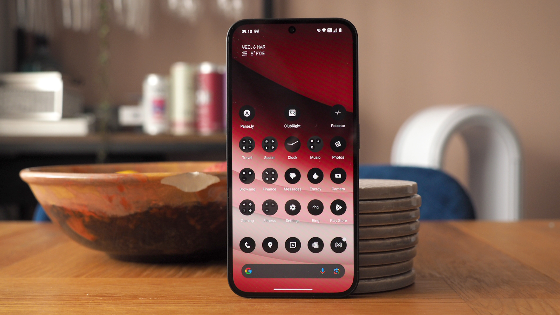
Nothing has a very distinctive software style too – if you activate it anyway. By default out of the box the Phone (2a) looks like pretty much any core Android phone. But go into customisation and activate Nothing's Icon Pack and, like the phone's Black/White/Milk finishes, every icon turns black and white. It's bold, but it's kind of barmy too – as my eyes default to colour recognition, especially for Google's array of similar-looking icons, having this activated just slows me down. It does look very cool though and, y'know, sometimes that takes precedence.
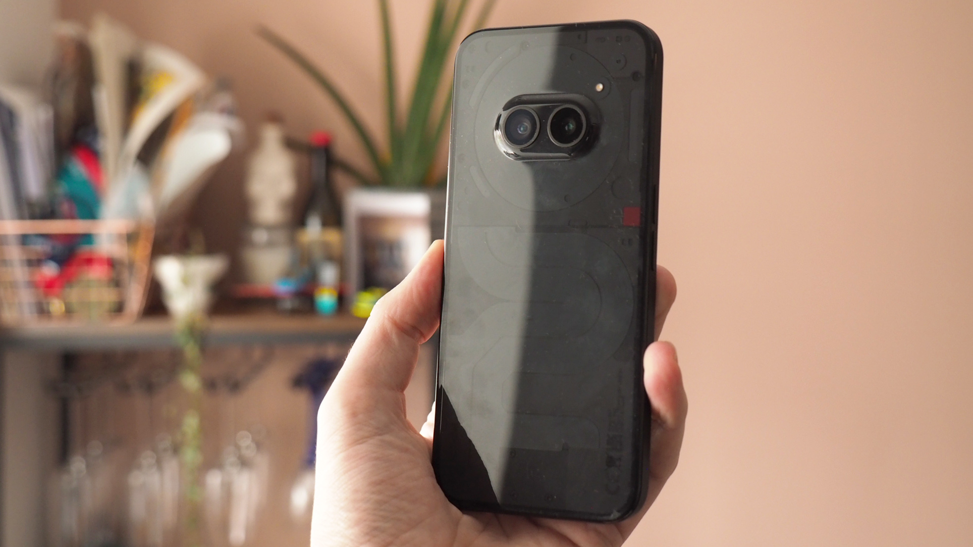
But the real jump-out feature of the Phone (2a)'s visual aesthetic regards its rear panel. Or, more to the point, what lies beneath it. That's because this transparent plastic acts as a window inside, adding design flourishes to the functional sections within. There are curves, bends, exposed screws, but a unifying visual palette that's subtle, distinctive yet eye-catching overall. If you really look up close there's a lot of fun in the details.
Thing is, there's a divisive design feature on the rear that will split the crowd: that dual camera lens hump. Some people I know think it looks cute, like a cartoonish character's oversized eyes. Some people think it looks altogether silly, like an afterthought. I can see both perspectives but – and while Nothing references it in relation to the initial Phone (1) design sketches – from a practical point of view I've found the protruding lenses often get grubby (the Camera app fortunately warns you of this). Again, it's distinctive, it's like nothing else out there and, well, that makes it very Nothing, doesn't it?
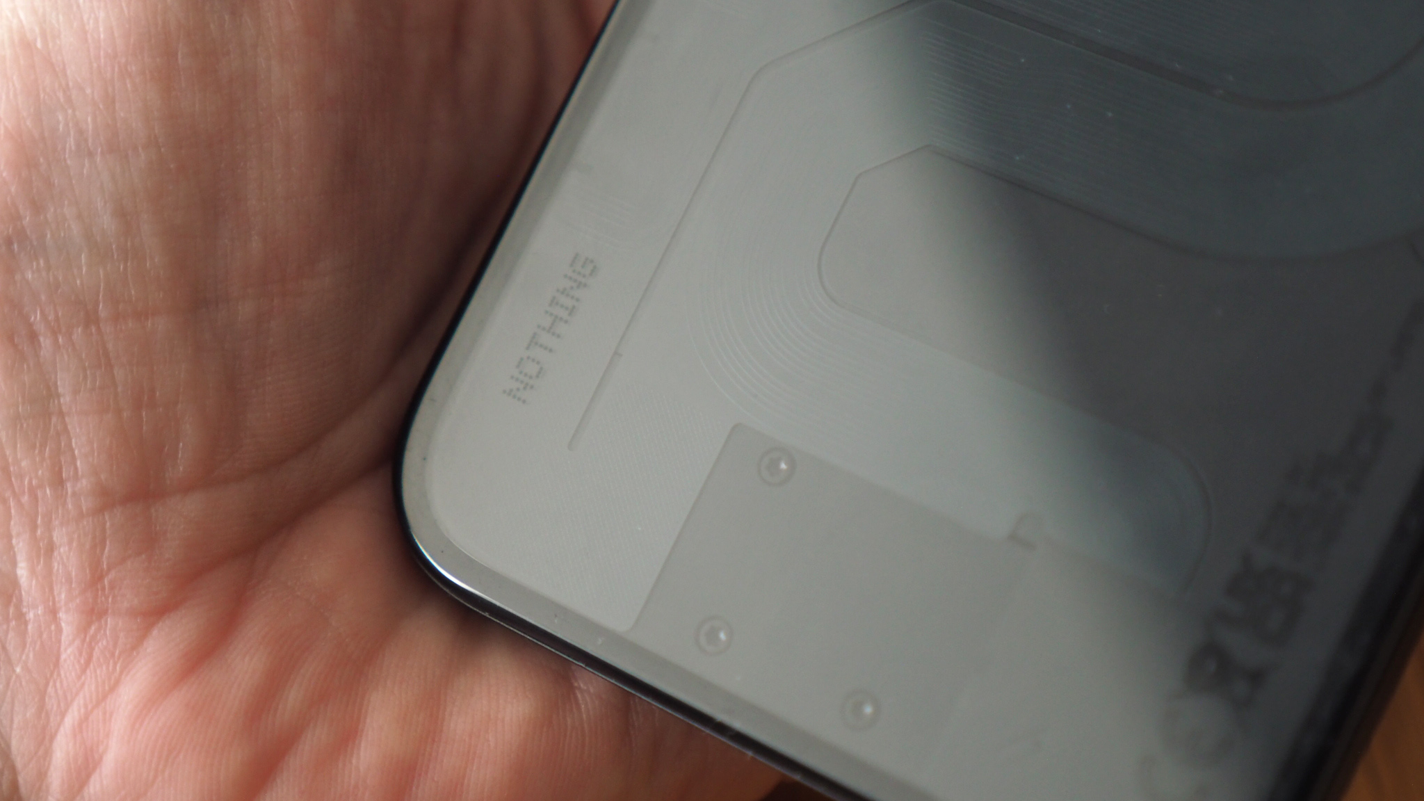
The screen holds up very well for this price point too. I've found its brightness ample, with auto-brightness that's generally well behaved, and a colour palette that benefits from OLED's contrasty visuals. Motion is are fluid thanks to a 120Hz panel and there's not much difference between this and many of the best phones' displays at the top-end of the market right now.
There are some minor exceptions, however, as the coating is fairly reflective – just as can be said of the rear – and the scratch resistance from the Gorilla Glass 5 on the front (not the rear) is a few generations behind the very best. Don't want a scratched-up screen? Keep the included screen protector present and correct, unlike me!
Feature-wise the screen benefits from an Always-On Display option if you activate it, including shortcuts – such as Glyphs, Hotspot, DND and much more – that you can assign. These can be toggled on or off without the screen even needing to be unlocked, should you select the additional setting to permit this – but I'd avoid doing so as it's far too easy to activate various settings by accident. Still, another Nothing software proposition that's largely positive.
Nothing Phone (2a) review: Performance & Battery
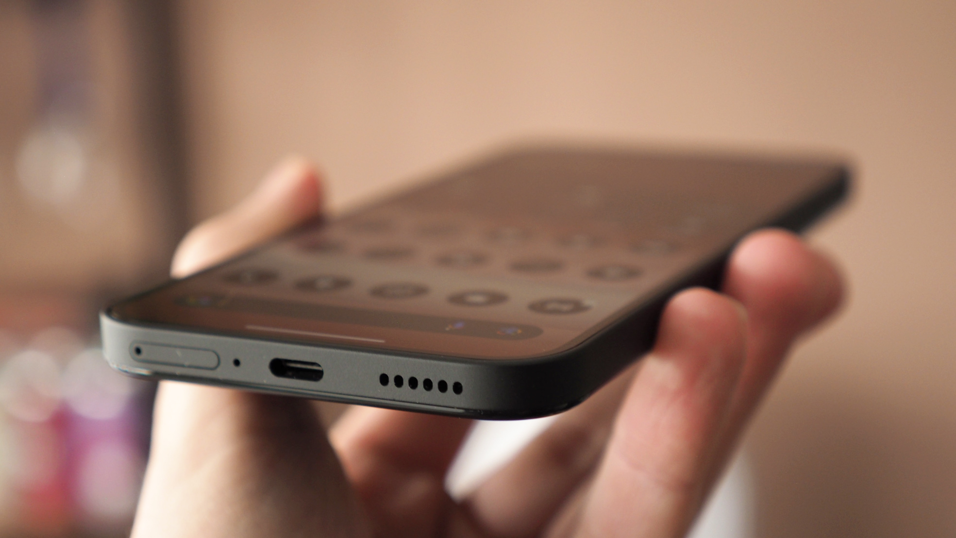
Speaking of software, Nothing OS 2.5 runs over an Android 14 framework, delivering a light, responsive and easy-to-use interface. As I've said before: it's familiar Android stuff, with some cool additional features, including Glyph Composer and more. Some of the small touches are particularly great, such as camera shortcuts that you can setup with pre-selected focal lengths, for example, as customised widgets, for super-easy quick-fire activation.
The smooth software experience is matched by solid hardware, thanks to MediaTek's Dimensity 7200 processor. I've been watching MediaTek rise for a number of years now – the brand produces fantastic processors that are competitive to Qualcomm. Nothing's door is clearly open, too, offering some prime real estate for the Taiwanese chip-maker to show off its potential. As someone who uses flagship phones aplenty, I've found little to no lacking from this processor.
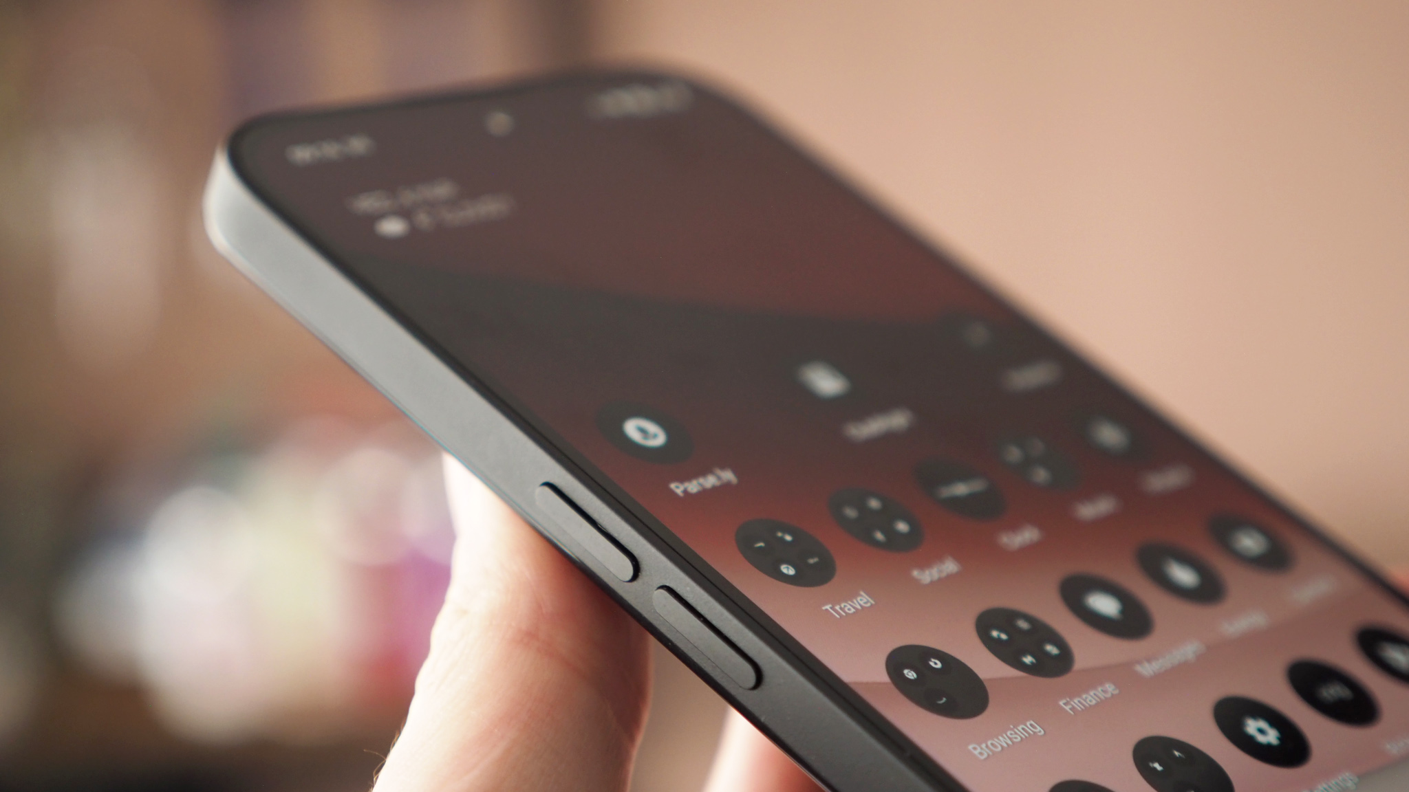
Better still, the plastic panelled rear, in combination with this processor combination, doesn't get hot – even during prolonged use, where I've not seen throttling become an issue either. All that benefits the battery life, which thanks to a 5000mAh cell lasts for a decent innings – I've been getting an easy 16 hours per day without hitting the red zone. It's only when hotspotting extensively I've found the battery to be less favourable. Recharging is quick, too, and while there's no plug in the box – just a fancy-looking Nothing-branded USB-C-to-C cable – it's compatible with 45W.
Nothing Phone (2a) review: Cameras
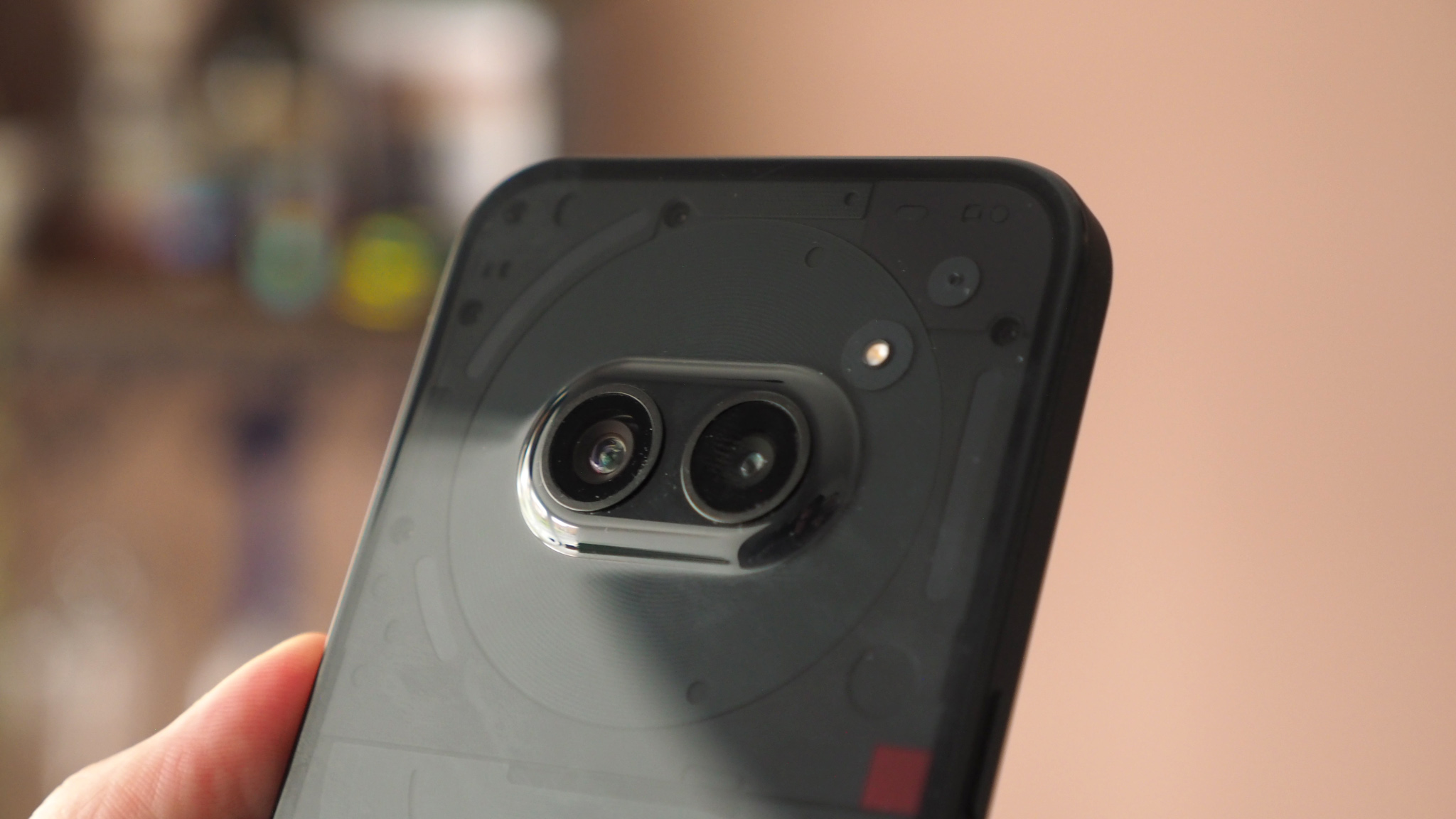
Those bug-eyed cameras in that protruding rear hump are a pair of 50-megapixel snappers, catering for your typical wide-angle and super-wide fields of view. No zoom here, as such, except for a 2x digital zoom that crops into the frame – which, at 50MP in raw terms, is perfectly acceptable.
That's my overall sentiment about the Phone (2a)'s cameras really. They're perfectly acceptable, arguably pretty exceptional at this kind of price point. There's no extra guff thrown into the mix for no measure (such as a pointless macro sensor or black-and-white sensor). You just get the basics and the basics are well catered.


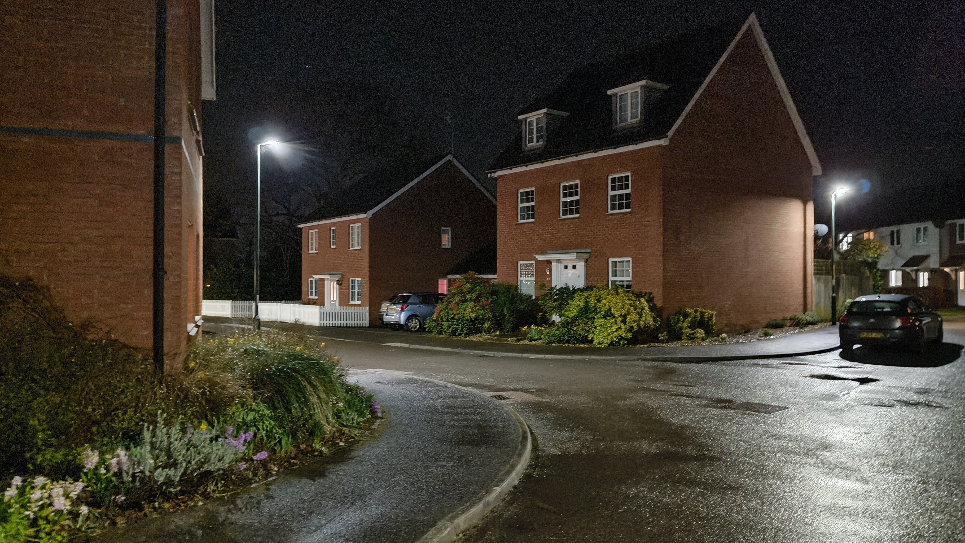
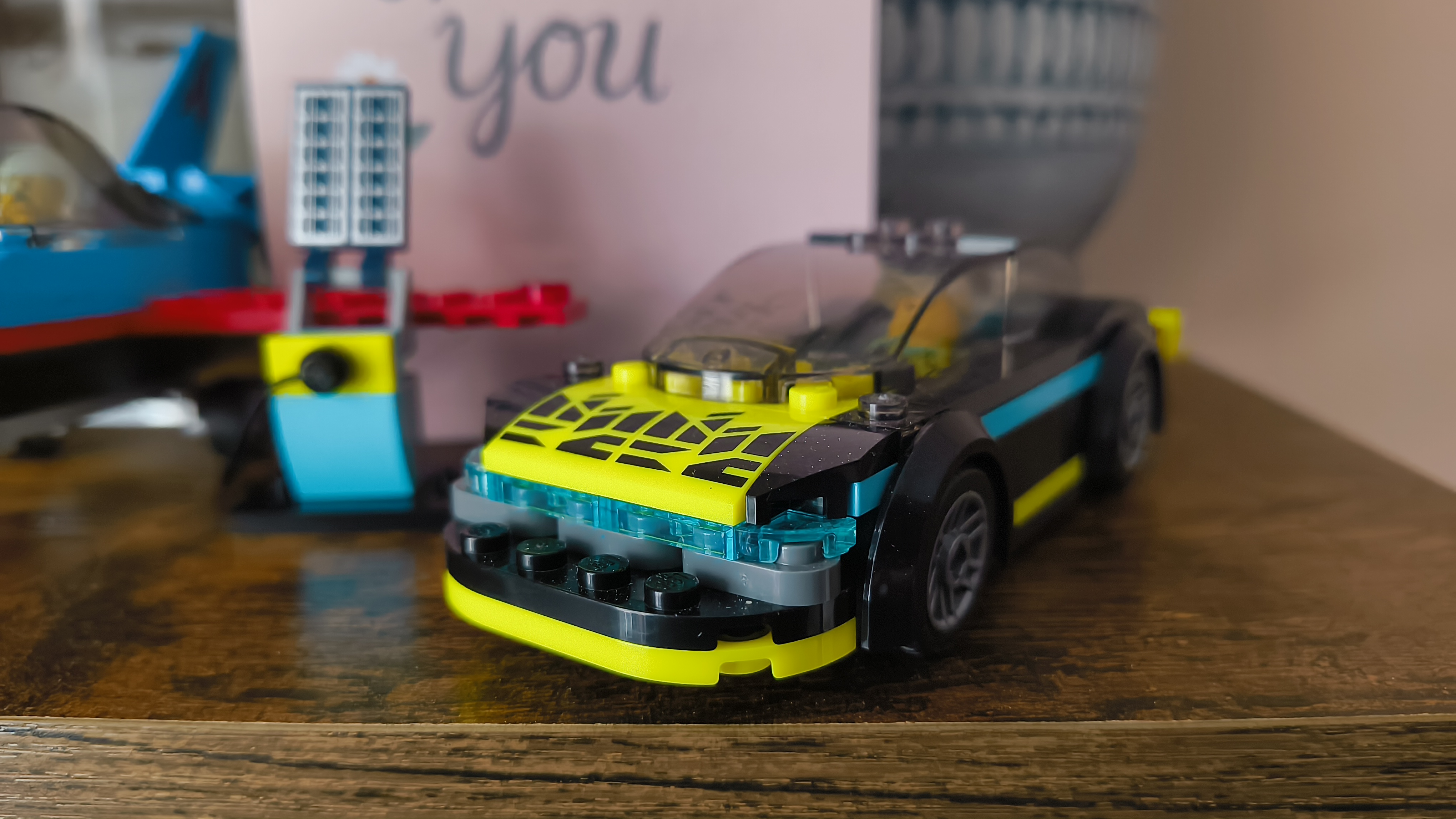


That said, the results are a little oversaturated and the high dynamic range (HDR) has a hard finish to its look, as you can explore in the gallery above. Still, images are sharp irrelevant of the settings used, and with low-light shooting perfectly plausible from handheld capture too, it's hard to complain.
Think about it in context too: there are plenty of £300/$350 phones out there, most of which have cameras that are just a tickbox exercise. The Nothing Phone (2a), at this price point, features cameras a step above plenty of pricier competitors, with its super-wide's super-high resolution a particular surprise.
So while the Phone (2a) couldn't be called a camera master, nor is its feature set widely extensive, for this kind of money it's actually really well balanced. Which is reflective of how I feel about the phone as a whole, ultimately.
Nothing Phone (2a) review: Verdict
While the Nothing Phone (2a) hasn't blown me away quite as much as the flagship Phone (2), it's still got pretty much everything going for it – especially when considering the competition – as there's no major downfall in its day-to-day fluidity, battery life longevity, or overall performance.
As someone who is typically spoiled by all the latest flagship phones, moving to Nothing's mid-range device hasn't really felt like step down – indeed, I could easily call the Phone (2a) the new mid-range standard. So long as you're on board with the googly-eyed look of the cameras and avoid the Black finish's fluff-magnetism, you'll be pleased as punch with the new cheap phone champion.
Also consider
I've already hit on the key competitors in this article and they are the most obvious options to consider: the Google Pixel 7a will deliver a better overall photography experience, while the Samsung Galaxy A54 keys into that more accessible visual and software appeal. But both cost more than the Nothing Phone (2a).


