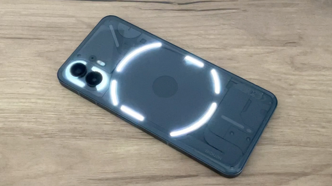
Nothing Phone 2 revels in being different. If good design is about disrupting the status quo and challenging how we think about using technology, then this unique minimalist smartphone is already doing everything right.
Of course, Nothing Phone 2 grabs headlines because of its clever Glyph UI just as the previous model did, and you can read what we thought of that in our Nothing Phone 1 review. The Glyph UI is designed to make using the phone easier and stress free, and this second gen edition takes things further, and includes a customisable Glyph ringtone and light display.
Behind the buzzy UI is actually a powerful smartphone that runs on the Qualcomm Snapdragon 8 Plus Gen 1 and features enough RAM for most tasks. Nothing Phone 2 is comparable to the Apple iPhone 14 and Google Pixel 7, but costs far less. For once, you needn't feel like you're losing out just because the price is lower; Nothing Phone 2 is a dapper smartphone that can find a niche outside of the bluster of Apple and Samsung.
Below I go into more detail about Nothing Phone 2, covering its core specs and design features as well as how I've found it to use; in my review I've been using my Nothing Phone 2 for six weeks everyday to get a proper grasp of how it works and feels, because its UI is quite different to the norm I've felt the extra time has enabled me to really understand what this brand is aiming to achieve.
Norhing Phone 2 review: the specs
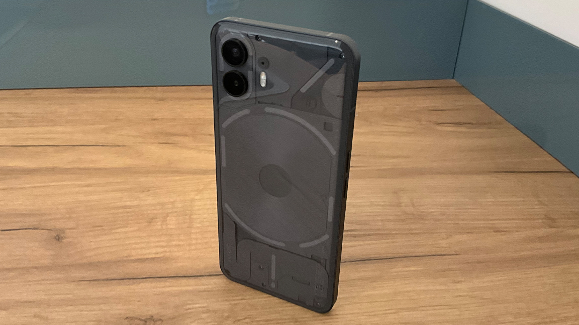
While Nothing Phone 2 can be securely placed in the 'budget' category of smart phones, this time around the brand isn't skimping on the tech inside its neat little mobile. For starters, Nothing Phone 2 is powered by the Snapdragon 8 Plus Gen 1 mobile platform from Qualcomm, which first launched late in 2022.
Dimensions 161.2 x 76.4 x 8.6 mm
Weight 201.2 g
Screen 6.7-inch LTPO OLED display, 1600 nit brightness
Resolution 2412 x 1080 pixels
Refresh rate 1-120Hz
CPU Qualcomm Snapdragon 8 Plus Gen 1
RAM 8GB / 12GB
Storage 128GB / 256GB / 512GB
OS Nothing OS 2 with Android 13
Rear Camera 50 MP, f/1.9, 1/1.56", 1.0µm, PDAF, OIS
Ultrawide camera 50 MP, f/2.2, 114˚, 1/2.76", 0.64µm
Front Camera 32 MP, f/2.5, 1/2.74", 0.8µm
Battery 4700 mAh
Charging 45W wired; 15W wireless; 5W reverse wireless
Colours white or grey
While this chipset has been surpassed earlier this year by the Snapdragon 8 Plus Gen 2, which powers the Samsung Galaxy S23 Ultra, for a sub-$600 / £600 smartphone this still packs a punch.
The 6.7-inch LTPO OLED display is excellent and one of the best around in this price range; it has a 2412 x 1080 pixel resolution for sharp and bright imagery. If you are browsing, playing games or using Nothing Phone 2 to write and send notes, it's excellent. (There is an issue I have with the Nothing Phone 2's display, one that only rears its head with long-term use, and I go into below in the Daily Performance section.) What it does do well is save you on battery life; the LTPO technology adjusts the display's refresh rate to save energy.
With two RAM configurations - 8GB and 12GB - Nothing Phone 2 is nicely covered. For daily tasks the lower 8GB RAM is fine. 12GB RAM is only needed if you're running newer games or streaming movies, and is actually over-specced in this price range. You will notice the phone runs smoother with more RAM and this will also future-proof your Nothing Phone 2, so it's worth considering.
Nothing Phone 2 review: the design
Nothing Phone 2 is slightly slimmer than the previous model and only a few millimetres taller. At 201.2g it barely weighs anything and can easily fit into a pocket or bag unnoticed, but is heavier than a Pixel 7. Overall, Nothing Phone 2 is about the same dimensions as a Pixel 7. It has a similar button layout to iPhone and each has dual uses depending on how much pressure you apply.
The rear of my Nothing Phone 2 is very different to the previous model, not only because it's packed with more LEDs but because it features a smooth rounded glass case. As before, the rear glass exposes a series of shapes and components that make up the Glyph LED system. This is a striking design that catches the eye and is unmistakingly modern and artistic (there are Easter eggs to find, like seeing animals in cloud formations).
On other smartphones a curved back could be an issue, I'd imagine it sliding off desks and tables easily, but Nothing Phone 2 is designed to be used differently - its back is basically its front. When not in your hand place the mobile is placed screen-down to let the Glyph UI do all the work. It takes getting used to, because it's the opposite of how we've been trained to use smartphones.
From back to front Nothing Phone 2 is designed inside out, in reverse. It's clever and different, and turns heads when you put it down and its Glyphs shimmer and vibrate. One note, because Nothing Phone 2 features two higher-specced cameras you will need to buy a new case if you're a Nothing Phone 1 user aiming to upgrade.
Nothing Phone 2 review: the Glyth UI
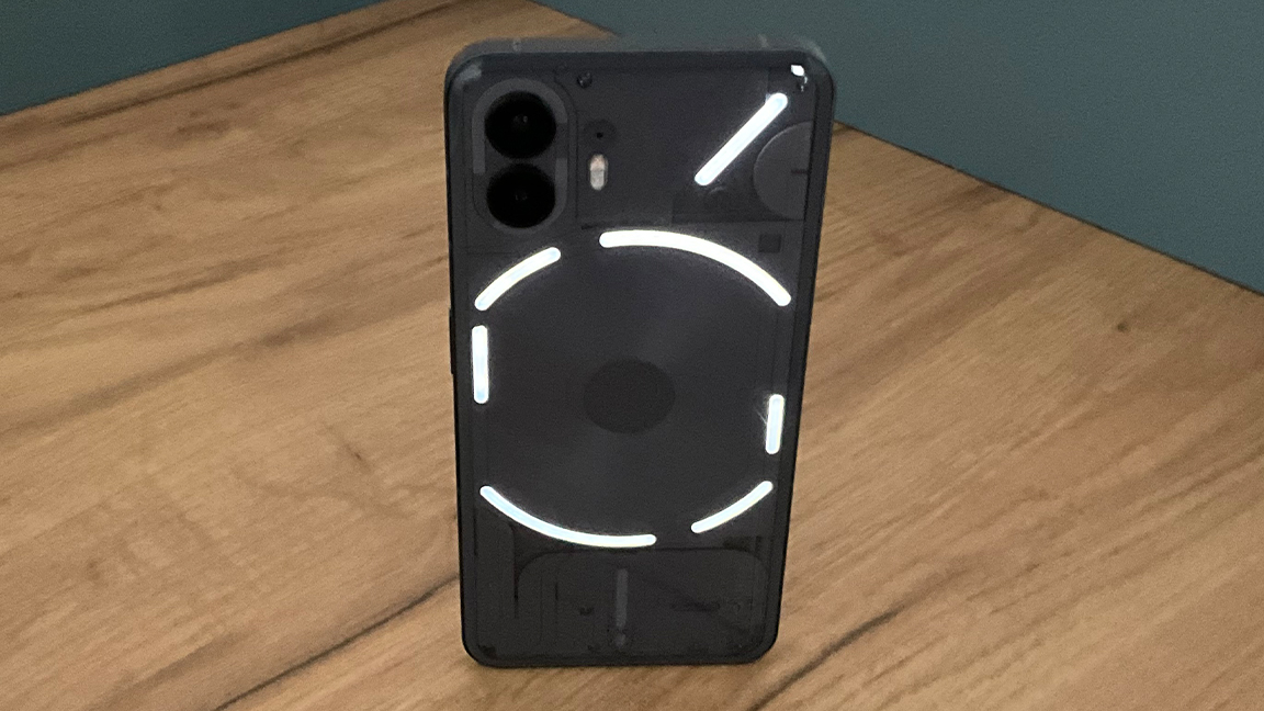
The star of Nothing Phone 2 is the Glyph system, the cluster of LED strips that pulse and glow on the rear of the phone, combined with vibration and new features such as gradient effects, these lights are designed to pulse in patterns to reveal who is calling or messaging, which app is being used and more.
The number of LED lights has increased from five to 11 from Nothing Phone 1, and now third-party app developers can access the system for new uses. For example, a new timer feature is used by Uber to reveal how far away your driver is; the light bar ticks away to show how far away your car is. This can be used as a timer too, and opens up numerous uses for other apps.
The goal of Glyph, and Nothing Phone 2 in general, is to stop us from constantly looking at our screens. And it works, in my weeks of use I've become accustomed to leaving the phone face down and only engaging when those LEDs tick and glow.
The LEDs can be customised and tailored to your liking too; there are multiple presets to select from or you can enter the Glyph composer to create your own ringtones and LED patterns; the goal is to craft personalised Glyphs so you know who is calling or messaging. Nothing has a DLC pack of sound files created by Swedish House Mafia at launch and plans to release regular packs with other musicians.
Nothing Phone 2 review: the UI
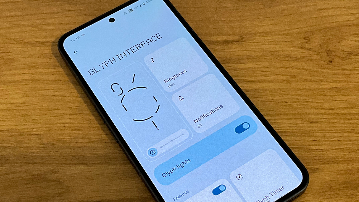
The impact of Glyph and other quirks of Nothing Phone 2 only become apparent after sustained use; you need to retrain how to use the phone because its whole identity is designed to reduce screen time.
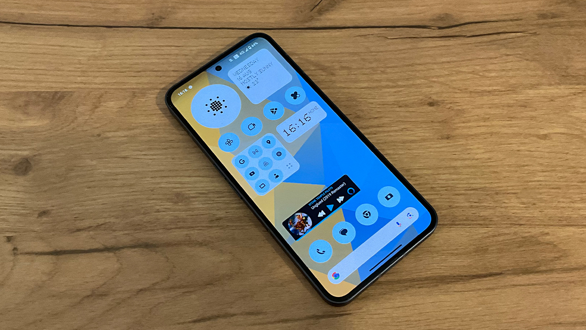
Nothing Phone 2 has been created with mindfulness in, well… mind. At some point you do, naturally, have to pick and begin swiping the phone's screen and here you'll find another divergence from other smartphones. The UI is monochrome and built around Nothing's own font, a retro-style dot matrix that resembles NDOT 45, but has been created by Nothing itself.
The dot font stretches to various icons on the home screen, for example I love being up to date with the weather so I get a little dot-cloud or do-sun. As standard every icon is monochrome, so even familiar apps have their colour removed. You can even remove the names of apps, gather like-apps into a grid and enlarge your most used app or apps, which makes sense.
The goal is to remove the stress from a busy, colourful phone screen; to reduce the noise and tailor the use to those apps you really need. There's even an option to separate work from personal life by, for example, dividing Google mail accounts. This is a lovely touch, and in my time with the phone really helps to remove the hidden stress of seeing those pesky work emails in the evening.
The UI's monochrome design takes some getting used to, but after a time I found it clean and restful; it also highlights how little I use many of the apps stored on my phone. (You can opt to view the UI as a standard phone, full-colour and all, if needed.) The UI is completely customisable too, whether that's deciding which apps to place on the home screen, their size and colour or replacing the wallpaper and refining the style of various widgets.
Nothing Phone 2 review: daily performance
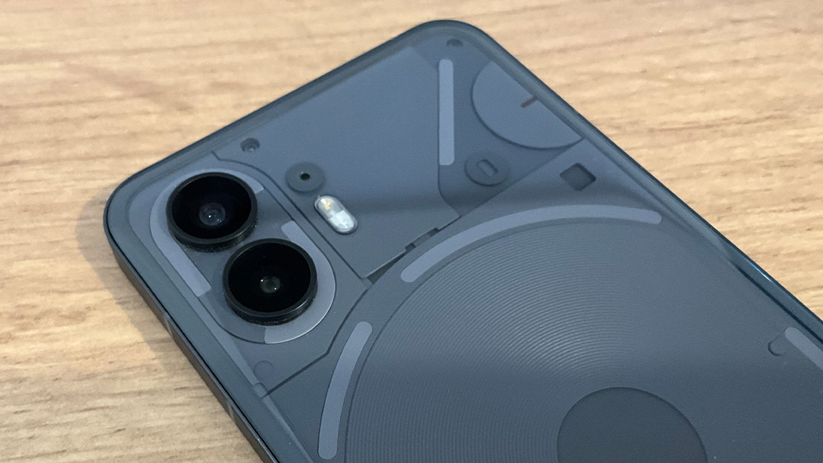
For my Nothing Phone 2 review I've been using the phone every day for more than six weeks, and have found it's surprisingly adaptable and accomplished. The Snapdragon 8 Plus Gen 1 chipset is one of the best around and really places this smartphone above many of the similarly-priced smartphones around.
I've been playing the latest games, streamed video and music, used multiple docs and apps at once and found it never slows or stutters. My review mode has 12GB RAM and 256GB of storage, making it not the most expensive build but mid-point in the Nothing Phone 2 offering.
The battery lasts me well in my use, a full charge takes less than 50 minutes and will last around three days - this obviously diminishes if you use the camera more, play energy-sapping games or stream video. The Nothing Phone 2 lasted a day of constant web-browsing, messaging, music streaming and some gaming (Football Manager 2023) and still had 20% battery left the following day.
One slight issue that came about the more I used Nothing Phone 2 is how easily its display scratches. After six weeks of use there are two or three marks across the screen. This is solved by buying a case, so it's easily solved. And I actually think the case, while bulking out the design, does suit the phone - it's clear so as to ensure the Glyphs are visible.
Nothing Phone 2 review: the cameras

There's not too much to separate Nothing Phone 2 from the previous model when it comes to its cameras, they both have a pair of 50-megapixel cameras. But there's a slight upgrade, as this new model has a Sony IMX890 sensor built into the main camera, offering improved autofocus and optical image stabilisation. The front-facing selfie-camera has been upgraded, this is now a 32 MP camera.
Where Nothing Phone 2 really improves is in its software. The camera app features all the options you could wish for, from standard shots to macro, portrait and panoramic. There's a grid system to help with composition and tapping the screen tracks and focuses on the areas you need.
Is it as good as a $1500 / £1500 Samsung, Google or Apple phone? Maybe not, the colours are vibrant and the shots crisp but in some situations I noticed blacks are either blown-out or overly dark. There's certainly an issue with the dynamic range, but for everyday use, selfies, detailed macro shots and colourful holiday snaps it's great. You can overcome some of the camera issues by going into Expert mode, which enables you to manually adjust the exposure, focus and more to get those pro photos you may need.
Nothing Phone 2 review: should I buy one?

I'd recommend Nothing Phone 2 to anyone who wants a fast, well-specced smartphone without paying the premium of a brand like Apple or Samsung. There are certainly some corners cut to get this RAM and chipset for under $1000 / £1000, such as a good but unremarkable camera.
Yet, if you're looking for a budget, or mid-priced new phone that will last and feels different from the norm, this is it. The standout really is the UI and Glyph system, it may take some getting used to but Nothing Phone 2 really does change the way you use a smartphone, limiting needless time spent swiping around and I love how it forces you to rethink which apps are useful, good or needed.
Nothing Phone 2 is priced well; the 8GB / 128GB model is $599 / £579, the 12GB / 256GB build is $699 / £629 and the 12GB 512GB version $799 £699. As you can see, even at its most costly Nothing Phone 2 comes in way under its rivals with similar builds, such as iPhone 14. Value for money and clever design? Nothing Phone 2 is recommended, just buy a case too.


