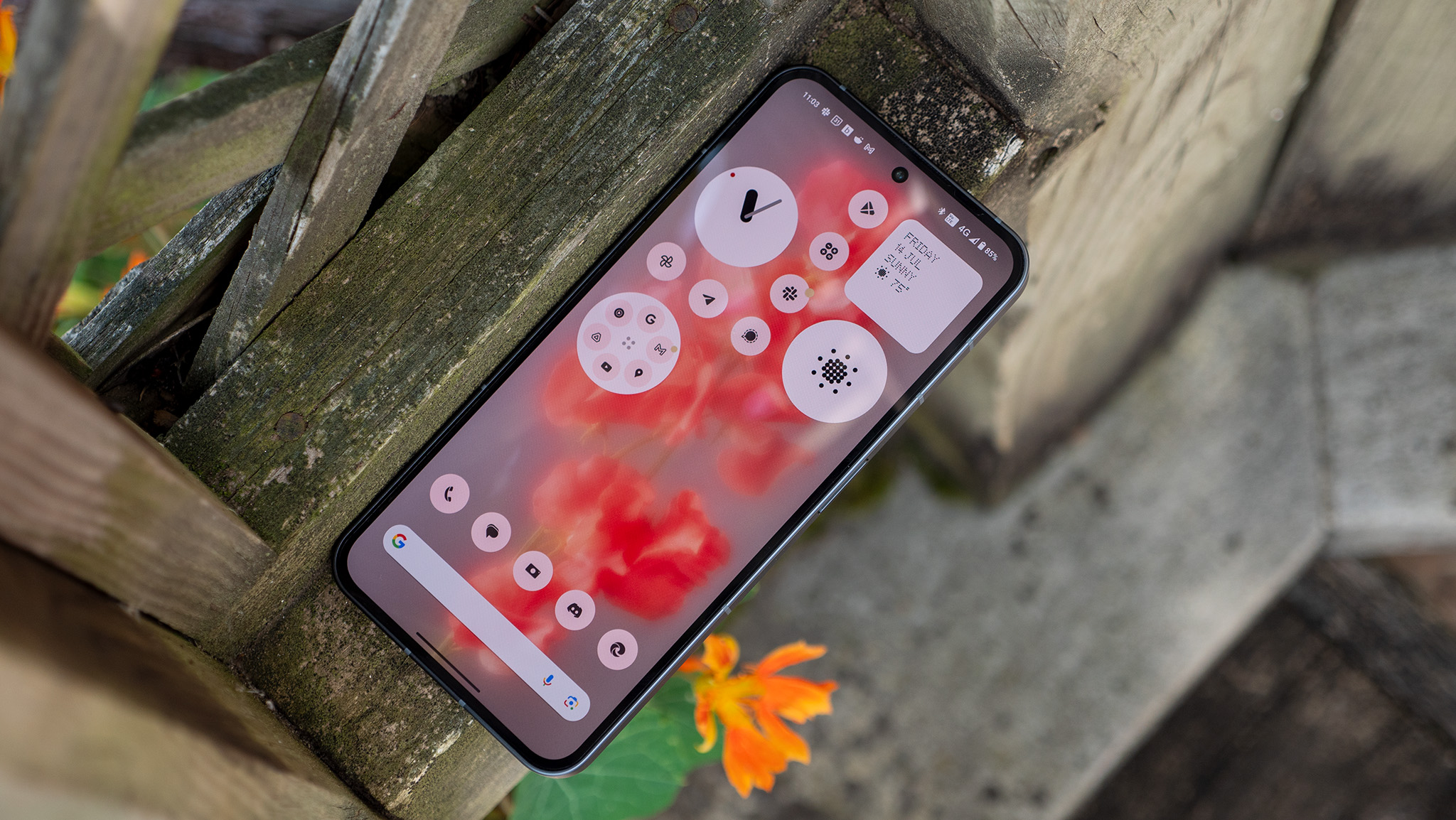
Nothing’s Phone 2 is turning heads with its striking design and unique lighting effects, but is it worth the price they’re asking for? Most reviews, including the one by Android Central’s very own Nicholas Sutrich, say yes, so if you’re looking for a new phone, you can’t go wrong with the Phone (2).
I’ve personally been using the Nothing Phone (2) for over a month now, and in that time, I’ve become intimately familiar with Nothing OS 2.0. Nothing has blended the best parts of stock Android 13 with Google Mobile Services (GMS), but they’ve gone above and beyond most OEMs when it comes to integrating Google apps and services. And even though Nothing made a ton of changes to stock Android, Nothing OS 2.0 doesn’t stray too far from stock Android where it really matters, like the base features, design, and system behavior.
Nothing OS 2.0 stands out as a shining example of how Android OS customization should be done, and in this review, I’m going to cover every key feature and change in it to demonstrate why it’s so good.
Nothing OS 2.0: Glyph Interface — Making the most of something
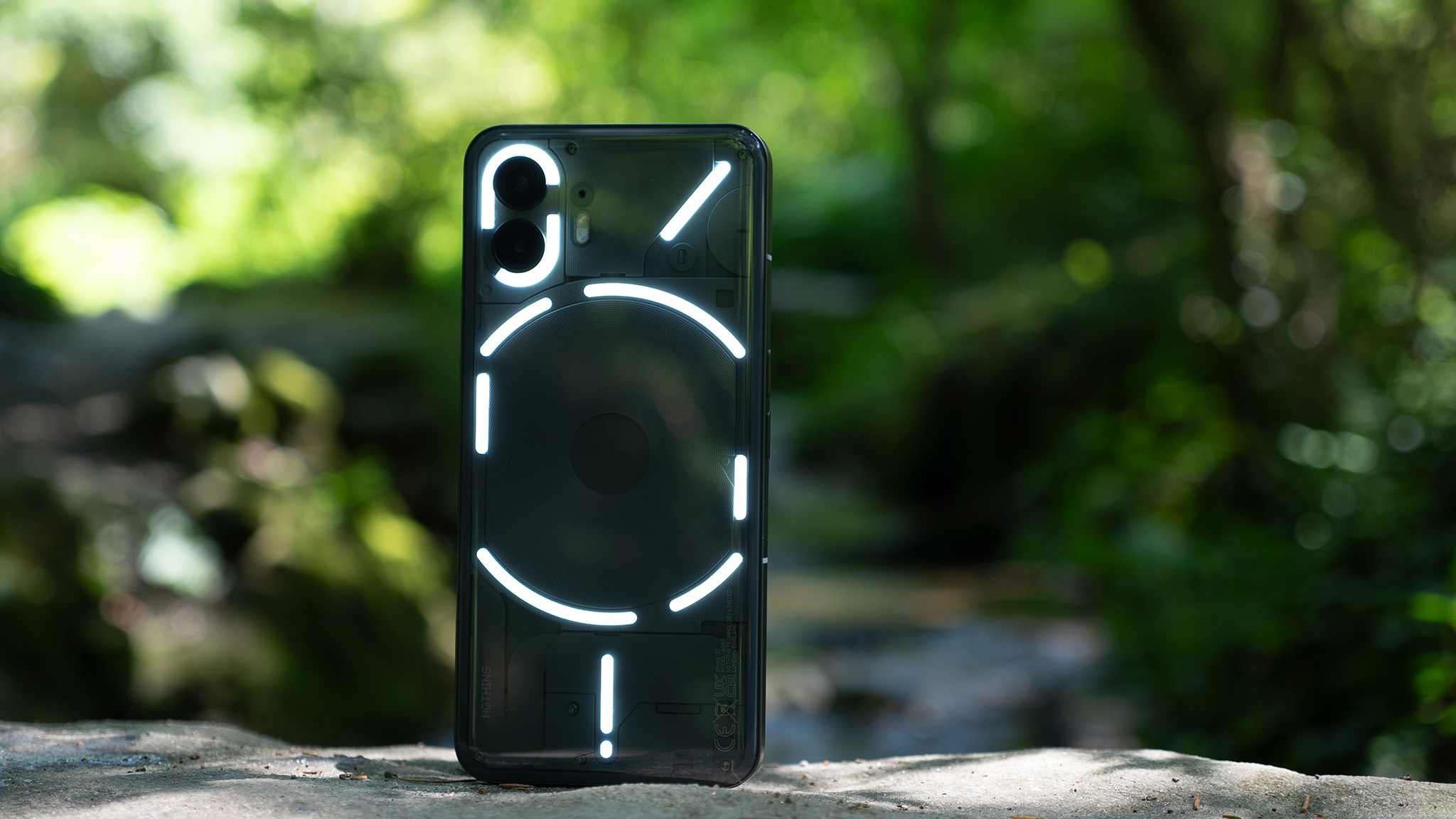
Calling a smartphone feature a gimmick suggests it has little utility, and that’s usually true when a smartphone packs something that only serves a single purpose. The Nothing Phone (2)’s Glyph lighting isn’t a gimmick because of how tightly it’s integrated into the phone’s design and OS, but whether it’s actually useful is a matter of opinion.
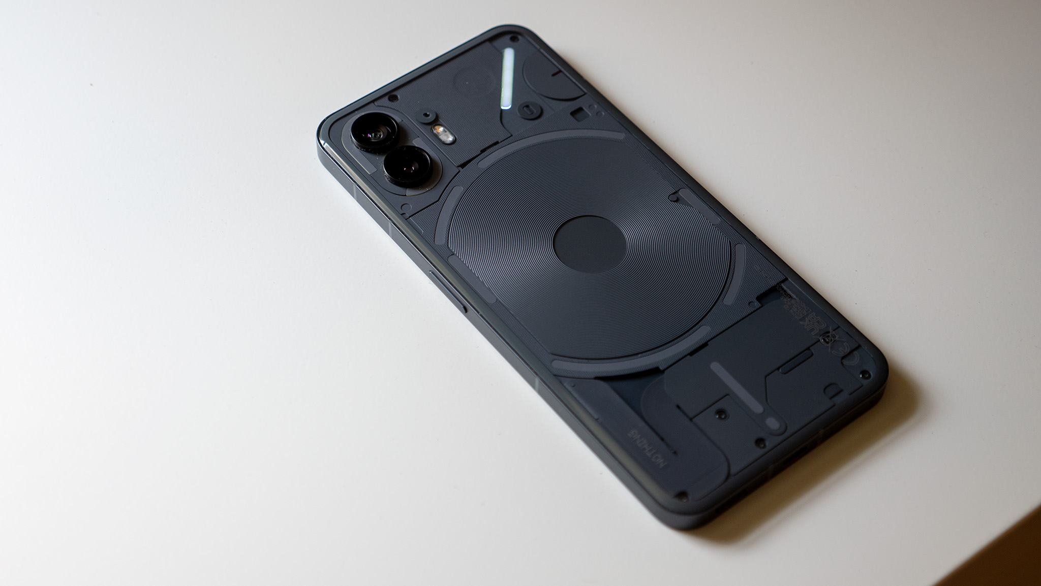
The Nothing Phone (2) has 11 individual LED strips with a total of 33 addressable zones. At a surface level, the Glyph lighting system is nothing more than a glorified notification LED. However, because there are so many of them, Nothing OS 2.0 can offer more useful information at a glance than a traditional notification LED can.
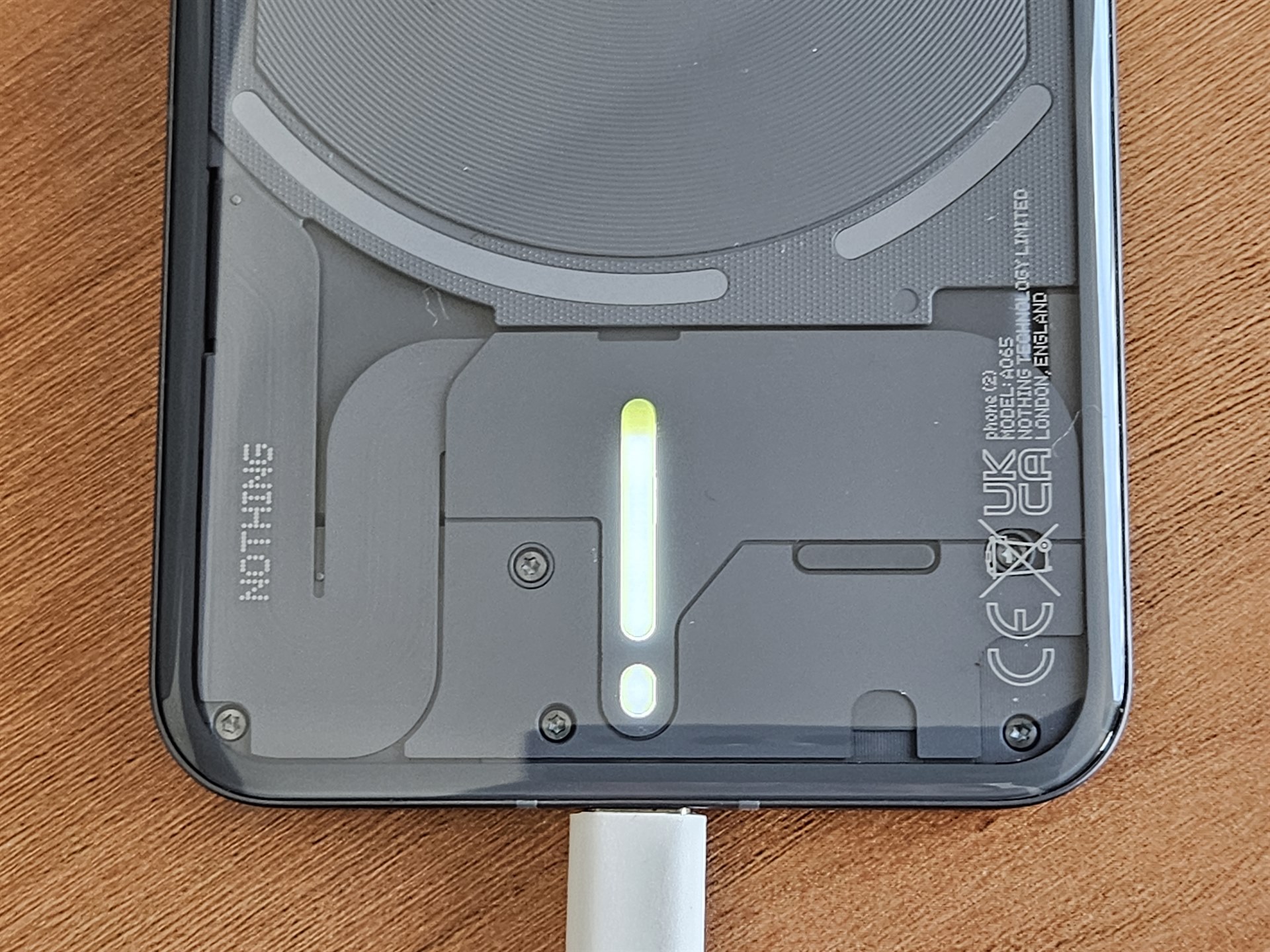
For example, while most notification LEDs on smartphones double as a charging indicator, they can only tell you if your phone is charging or fully charged. By contrast, Nothing OS 2.0 lights up the bottom two LEDs to reflect the approximate battery level, giving you a better idea of how much your phone has charged. The light doesn’t stay on the whole time while the phone is charging, but you can wiggle the phone a bit to get it to show up at will. This is obviously not a groundbreaking feature, but it’s one example of how Nothing turned what was previously a simple indicator into a more complex progress meter.
Another example is how the LED strip on the center-right lights up with changes in volume. This lets you see the volume level while the phone’s facing down with its screen off, which can be useful if you want to listen to music from your phone without getting distracted. However, this feature doesn’t work with cast sessions, so you’ll have to rely on either the OS’s visual indicator or the Cast device itself to show the volume level.
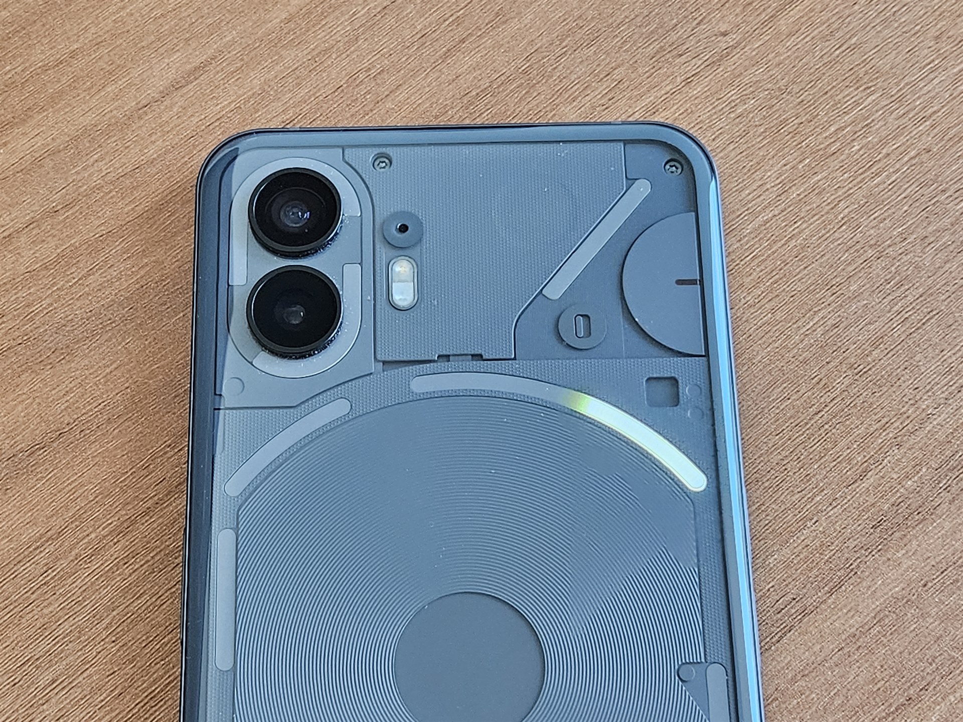
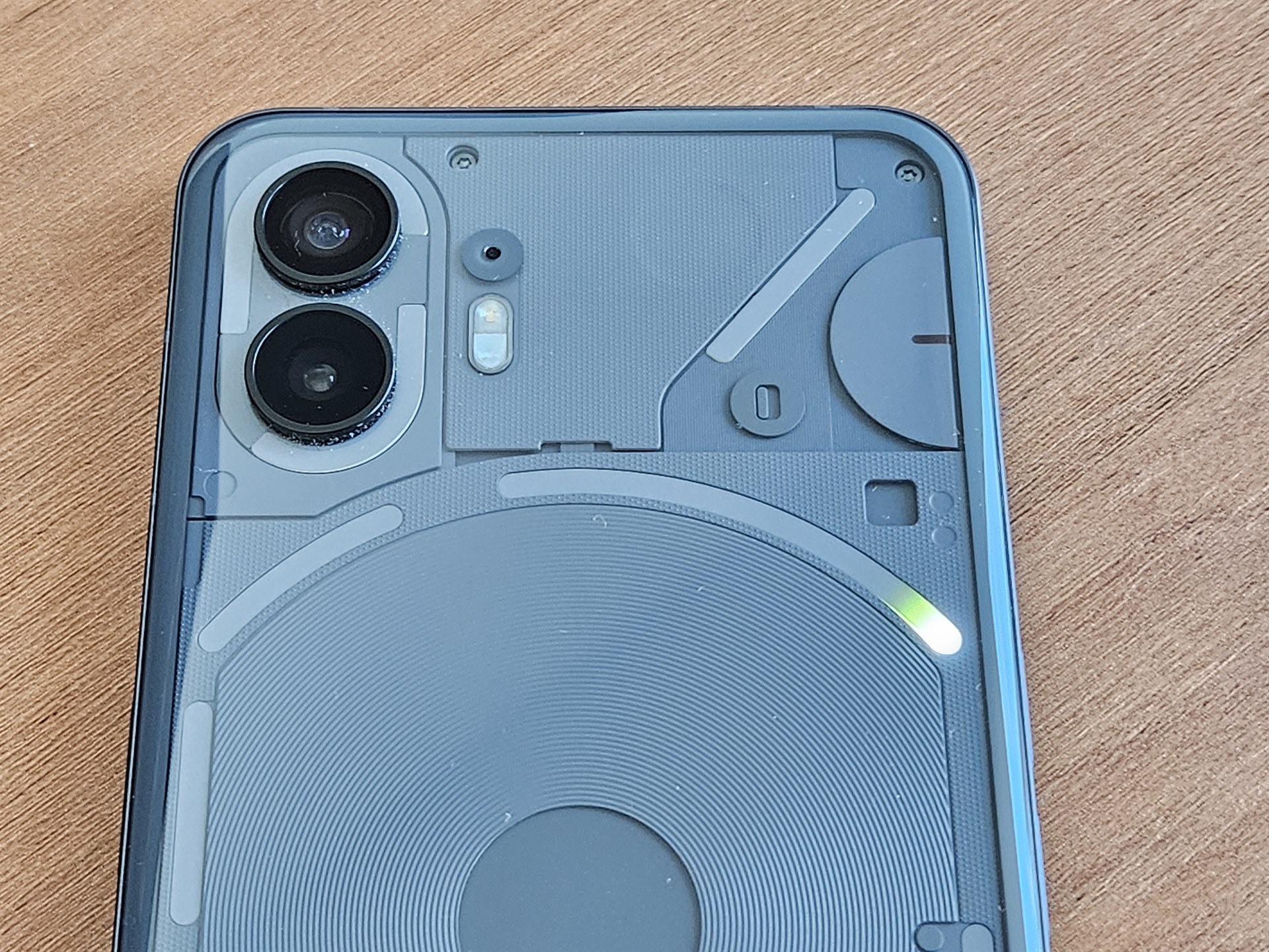
The most notable example of how Glyph lighting can be used as a progress bar is with Glyph Progress. Glyph Progress provides an estimate of your rideshare/delivery driver’s arrival by progressively lighting up the center-right LED strip. It only works with Uber and Zomato at the moment, though it’s worth noting that neither app actually supports it directly, as Nothing doesn’t provide a Glyph lighting API. Instead, the Glyph Progress app in Nothing OS 2.0 uses Android’s Notification Listener API to parse the notifications that the Uber and Zomato apps post to provide an estimate of your driver’s arrival.
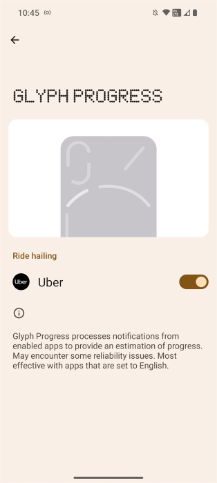
This implementation isn’t bad — Google also does things this way to provide ridesharing details in the Pixel’s At a Glance widget — but it does mean that expanding support to other apps will be difficult. That’s because Nothing would have to add separate handlers for each app they want to parse notifications for, assuming that app even provides them. Even then, each app could change how its notifications are shown, breaking the integration in the process. Plus, the notifications may appear differently based on language, which adds further complexity. That’s likely why the Glyph Progress feature warns that it’s “most effective with apps that are set to English.”
Even if Nothing releases a public API for Glyph lighting, it’s unlikely many major apps will integrate it. While the Phone 2 is talked about a lot online thanks to Nothing’s stellar marketing, it (as well as the Nothing Phone (1)) hasn’t sold in nearly enough numbers for most developers to justify adding support for Glyph lighting. That’s unfortunate because there could potentially be some really cool and useful ways that developers could take advantage of this feature.
Developers of digital wellness/clock/timer apps could, for example, show how much time is remaining through Glyph lighting. In fact, Nothing OS 2.0 has a “Glyph timer” feature that provides a visual countdown of a timer. The timer has to be manually set through Settings > Glyph Interface > Glyph Timer or through a Quick Settings tile, though. It would be nice if the Glyph timer could automatically activate when you set a timer through Google Clock. (When you set a timer in Google Clock, it posts an ongoing notification showing the remaining time, so it should be possible for Nothing to parse that notification as they do with Uber and Zomato for Glyph Progress.)
Nothing OS 2.0 was designed with the philosophy of “intentional smartphone usage,” which basically means it wants you to use your phone to do what you intended to do when you picked it up rather than getting sidetracked by an app that wants you to sink time into it. Some of the previous Glyph features can clearly help you reduce how often you pick up your phone, but the two Glyph features that do the most to improve “intentional smartphone usage” are “essential” notifications and custom Glyph patterns for contacts.
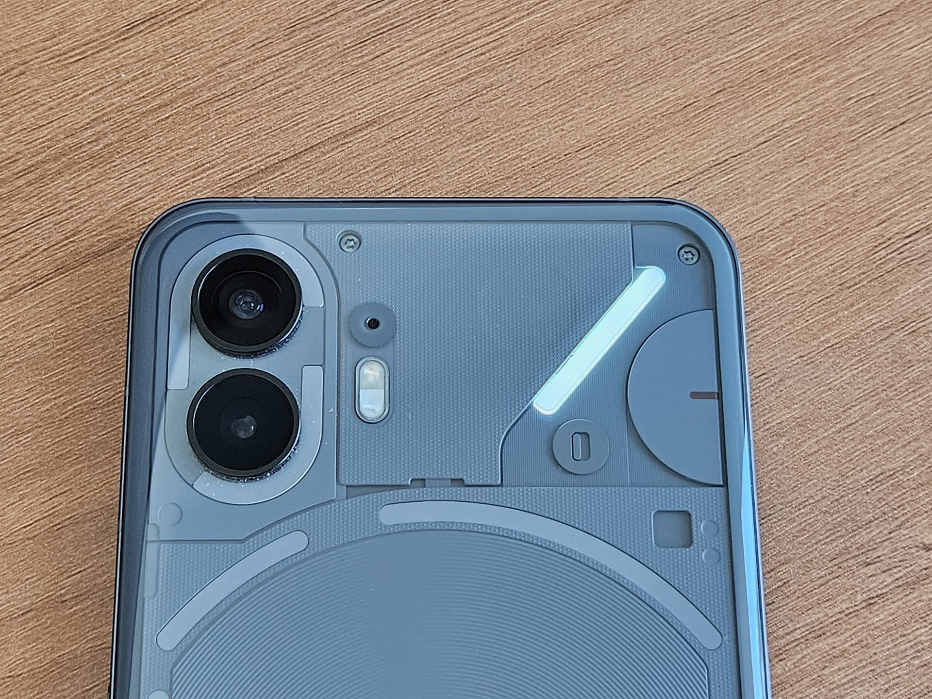
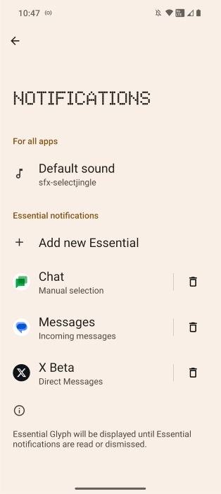
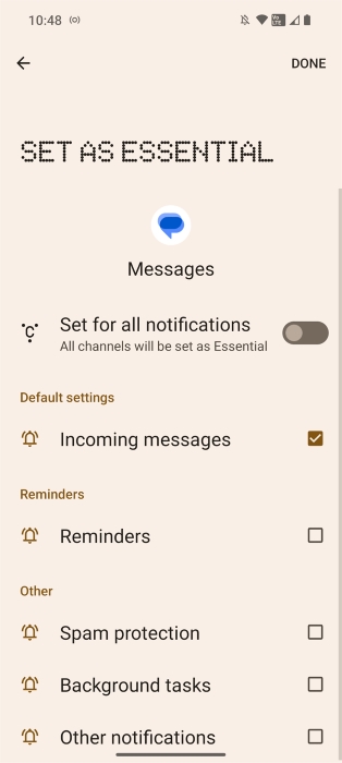
An “essential” notification is one that causes the OS to light up the top-right LED strip on the back of the Nothing Phone (2) until the notification is read or dismissed. Notifications can be marked as essential either through Settings > Glyph Interface > Notifications or by long-pressing on any notification in the notifications panel and then toggling “Essential Glyph.” It’s impossible to tell which app an “essential” notification came from, though, because the OS doesn’t let you customize the lighting. That means you need to choose which notifications you mark as “essential” carefully. Otherwise, you’ll be tempted to turn your phone over more often than you need to.
Android already basically lets you mark certain contacts as essential by letting the calls and messages of your chosen “starred contacts” interrupt you while in Do Not Disturb mode. Nothing OS 2.0 takes this a step further by letting you create a unique ringtone plus Glyph light show for each contact. You can do this through Glyph Compose, which is available under Settings > Glyph Interface > Compose.
Each ringtone you create can then be set for the contact(s) of your choice under the “Ringtones” section of Glyph Interface settings. Nothing partnered with Swedish House Mafia for Glyph Compose, so the resulting ringtones you can create are actually quite cool.
The last two wellness-related Glyph features I wanted to highlight are “flip to Glyph” and the visual response for Google Assistant. The former is basically the Pixel’s “flip to Shhh” gesture but with a Glyph lighting twist. Flip your phone face down, and it’ll go silent, only lighting up for notifications and calls.
Like with most Android phones, when the Nothing Phone (2)’s screen is off, you can still summon the Google Assistant by saying, “Hey, Google.” But when other phones are on their back, you won’t know if the Assistant heard you when your phone is silent. The Nothing Phone (2), however, will light up when the Assistant is triggered, so you can leave your phone face down while talking to Google.
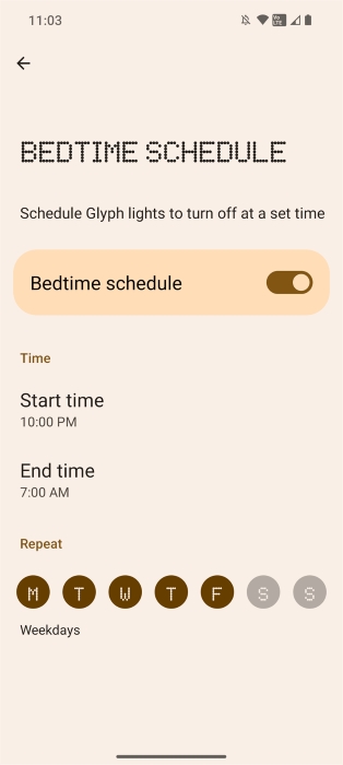
Minimizing light exposure at night can help with sleep, which is why Nothing OS 2.0 lets you set a bedtime schedule for the Glyph lights. You can choose the start and end time as well as what days to schedule Glyph lights by going to Settings > Glyph Interface > Bedtime Schedule.
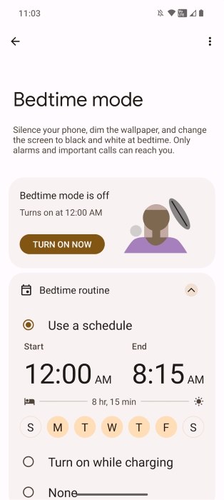
It’s unfortunate that Nothing couldn’t tie Glyph’s bedtime schedule to Digital Wellbeing’s. It would be nice if the existing bedtime mode also turned off Glyph lighting so you don’t have to set two different bedtime schedules in two different places. However, Google made it so third-party apps can’t track when Digital Wellbeing’s bedtime mode is activated.
Before I move on, here are a few final tidbits about Glyph lighting on the Nothing Phone (2). First, by default, the phone uses its ambient light sensor to adjust the brightness of the LEDs, but you can change the brightness from the Glyph Interface settings. Second, you can use the Glyph lighting as a flashlight by long-pressing on the flashlight Quick Setting tile. This turns on all the LED strips at the back and sets them at max brightness. The Glyph lights aren’t as bright as the camera LED, but that can be helpful when you actually want less light.
Lastly, Nothing OS 2.0 has a hidden music visualizer feature that makes the Glyph interface light up in sync with music played through the speakers. The music visualizer isn’t available by default but can be surfaced by creating a contact named “Alakazam” and then giving it a custom ringtone.
Nothing OS 2.0: Where it builds on stock Android 13
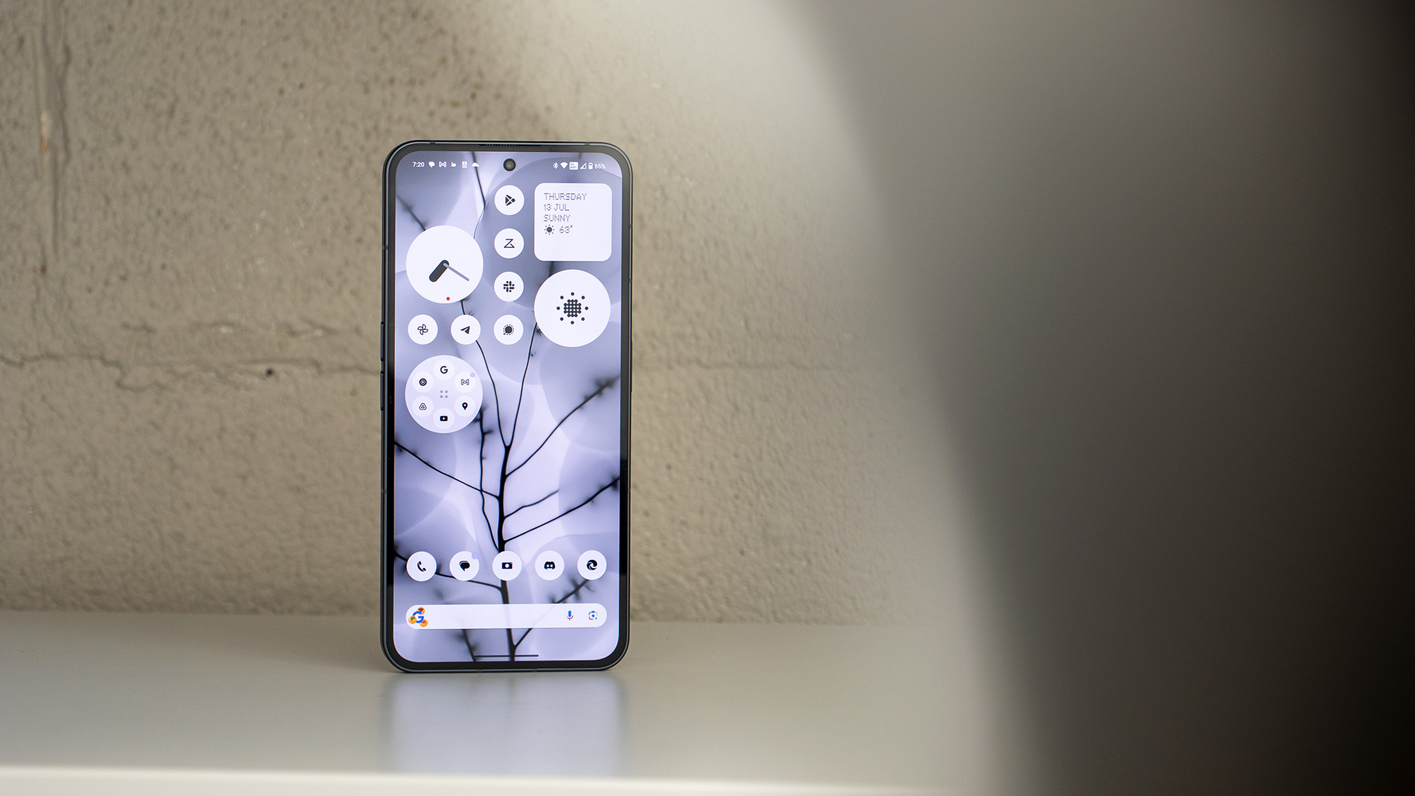
Nothing OS 2.0 should feel right at home for anyone who’s used to Pixel’s Android, as Nothing kept the general look and feel of stock Android intact. It did inject its own unique design into several parts of Android as well as improve upon several of its base features, though.
Home screen
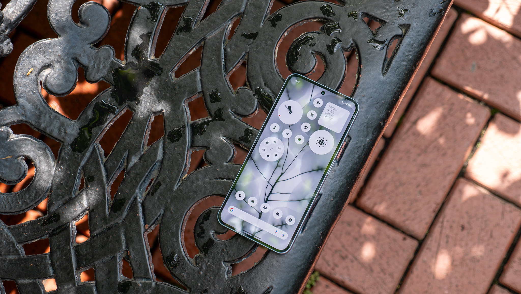
Many reviewers have commented on how good the home screen is in Nothing OS 2.0, and that has a lot to do with how subdued it is. Nothing made the smart decision to extend Android 13’s themed icons feature by turning every app icon monochromatic but stopping short of actually theming them. This isn’t enabled by default, however, as it requires downloading an update to the Nothing Icon Pack.
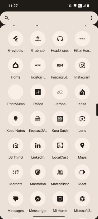
Since this icon pack forces app icons to become monochromatic, it doesn’t work well for some apps. The iPrint&Scan app, for example, becomes completely blank when Nothing’s Icon Pack is enabled. Generally, though, I’ve had no problems with icon visibility. This feature makes it less tempting to open distracting apps, and it’s something I want to see Google bring to Pixel.
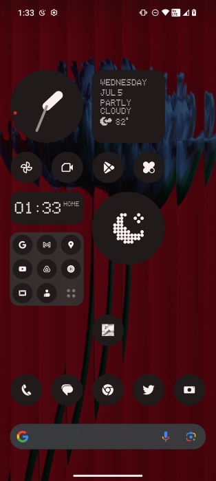
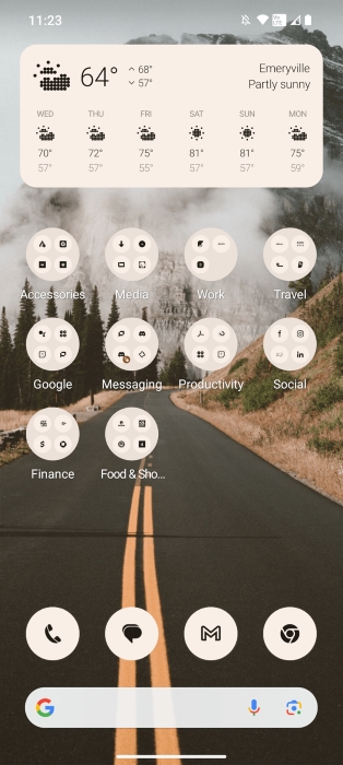
In contrast, the way themed icons work in stock Android 13 is that the OS takes the monochromatic icon supplied by each app and applies a background and foreground color that’s pulled from the color palette the OS generates based on the user’s wallpaper. Since this feature relies on developers providing a monochromatic icon, a lot of apps just don’t support the feature at all, turning your home screen into a hodgepodge of themed and unthemed app icons.
In Android 13 QPR2, though, Google added a flag that forces themes on every app icon. Android’s forced themed icons feature seems to be a one-off experiment, though, as it’s not available yet, even in Android 14. Nothing built on that idea, but by only forcing the app icons to become monochromatic but not applying a theme to them, the result ends up looking better.
If you prefer your home screen to have a bit of color, it’s possible to enable stock Android 13’s themed icon feature by changing the Icon Pack to “Color,” though you’ll then run into the problem I mentioned before since not all apps supply a monochromatic app icon.
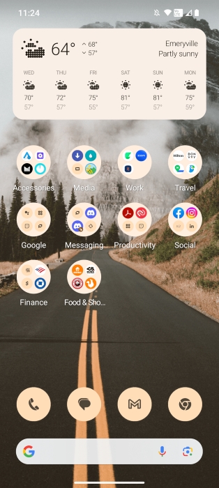
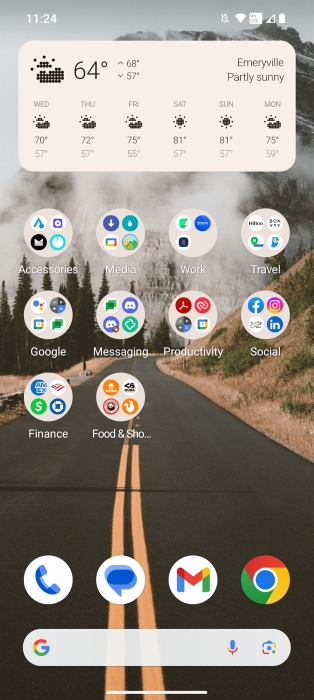
The rest of the changes Nothing made to the launcher aren’t as significant, so I’ll quickly go through them. There are eight “Nothing” widgets, three of which are clocks, two of which tell the date and weather, and the remaining three act as quick settings shortcuts. Nothing’s Weather app also provides four of its own widgets, which each show differing amounts of weather information. They all show the current weather condition as a dot-matrix icon, though, which I think is really cool.

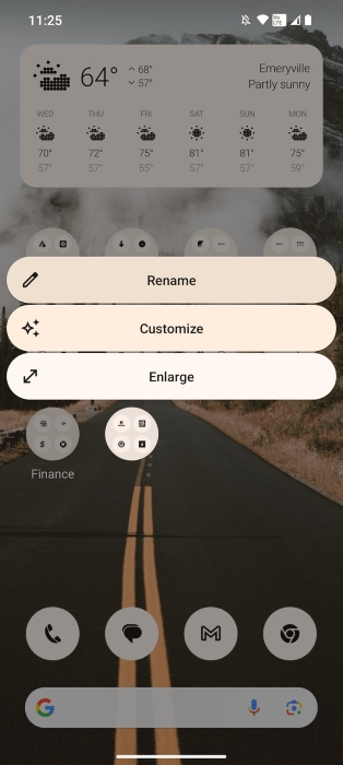
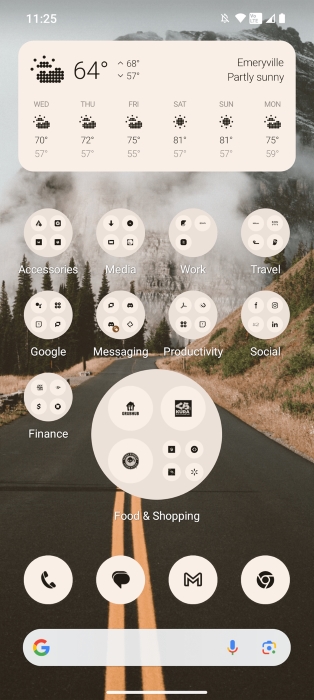
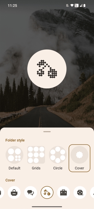
The Nothing launcher lets you enlarge folders which, when combined with one of the provided cover icons, makes them simultaneously more and less tempting to open. The number of cover icons the launcher provides is small, though, so I didn’t bother adding them to most of my folders. Unfortunately, you can’t hide apps or create folders in the app drawer, so if you have a ton of apps installed, the app drawer will feel a bit cluttered.
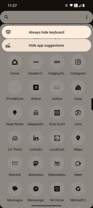
Speaking of the app drawer, I do like that Nothing kept the option to always show/hide your keyboard when you open the app drawer, as it’ll make opening the specific app you want easier. I’d like to see them eventually implement the “quick launch” feature that Google is still working on so that you can open apps even faster from the app drawer. I’d also like to see Nothing implement the universal search bar that Google added to Pixel, which uses Android’s AppSearch framework to index and surface search results across apps.
System font
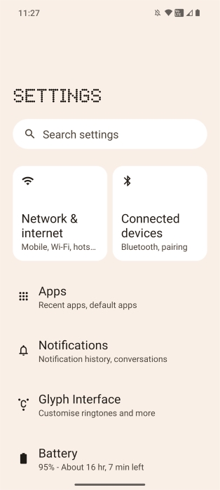
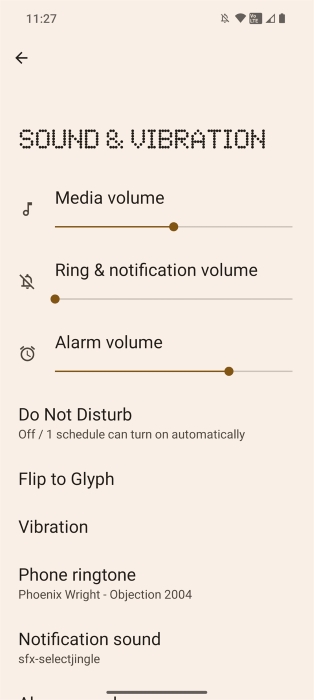
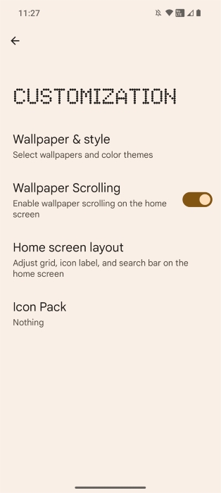
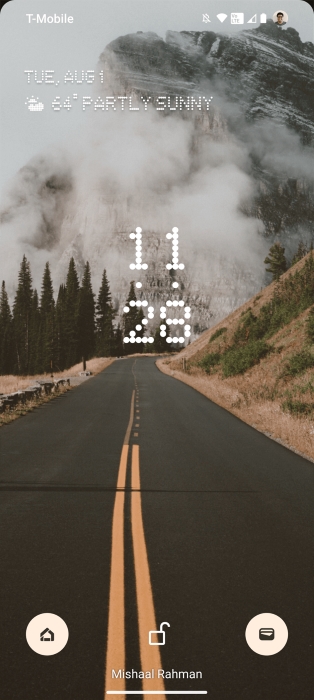
There’s not really much to talk about here since it’s just a font, but Nothing made the bold choice to use its dot-matrix NDot font for titles/headers. You’ll see this font used on the lock screen, in Nothing’s apps and widgets, and on most pages in Settings. Personally, I don’t mind the font choice and, in fact, am quite a fan of it, but I’ve seen some users who strongly dislike it. While it’s good for Nothing to express its brand identity through a custom font, I think it wouldn’t hurt if they provided a toggle to use a more neutral font.
AOD/Lock screen
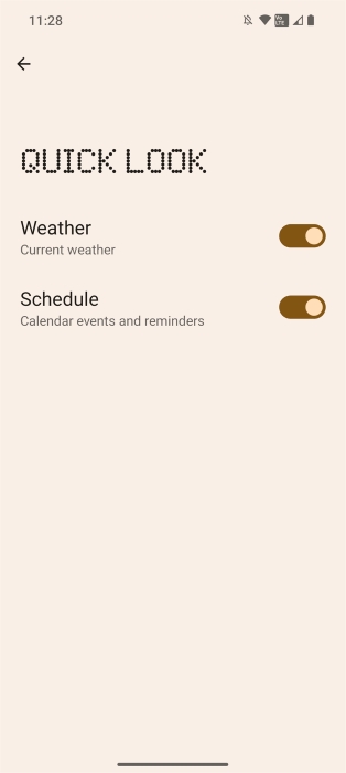
Visually, the lock screen doesn’t look that different from stock Android. The only major differences are the font and the lack of the fingerprint icon when the always-on display is active. Pixels have a smarter widget on the top of their lock screens (Google’s At a Glance widget) compared to Nothing’s “Quick Look” widget, which only shows the date, weather, and calendar events.
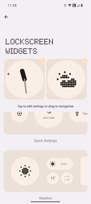
Unlike the Pixel’s lock screen, however, Nothing supports adding widgets to it… sort of. Nothing only lets you put the company’s own widgets on the lock screen, which means you’re picking from mostly clock/weather widgets. Given that this info is already shown on the lock screen, though, that’s not very useful. It would be nice if you could add any widget to the lock screen, but such an implementation would have to be carefully crafted because you don’t want a misbehaving widget to somehow crash the lock screen.
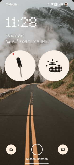
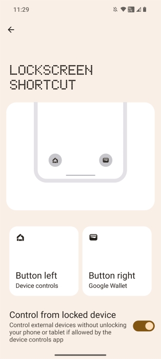
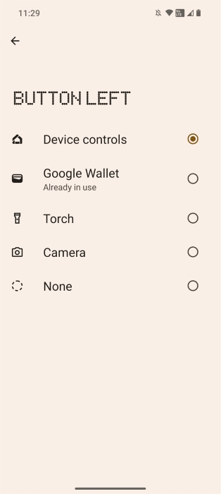
Nothing OS 2.0 supports lock screen shortcuts like the Pixel, though it offers fewer shortcuts and doesn’t provide an entry point from Wallpaper & Styles. You can add a shortcut on the left or right for Device Controls, Google Wallet, Torch, or Camera in Nothing OS 2.0, versus the additional Do Not Disturb, Mute, and QR code shortcuts in AOSP. Nothing could add these additional options by shifting to AOSP’s lock screen shortcuts implementation in Nothing OS 3.0, which would also bring along with it integration with the Wallpaper & Styles app.
Quick Settings
Nothing OS 2.0’s Quick Settings implementation is one of my favorite aspects of the OS. It retains the general UI and element placement of stock Android but with two key differences.
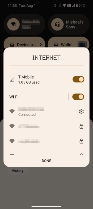
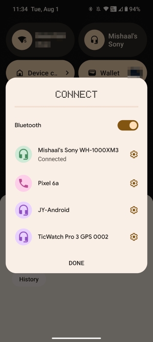
First, the Internet and Bluetooth tiles have been enlarged and permanently affixed to the top of the panel. This makes them more prominent and able to show more information, like the amount of mobile data used that month. The larger size also allows them to be scrolled when the panel is expanded. The Internet tile can be scrolled to switch between showing the Wi-Fi and mobile networks, while the Bluetooth tile can be scrolled to switch between showing the active Bluetooth device details (assuming one is connected) and general Bluetooth information.
Both tiles also support turning off their respective radios by tapping their icons, something that used to be possible in older versions of Android. Tapping outside the Wi-Fi/mobile data icon opens the Internet panel, which was added in Android 12, while tapping outside the Bluetooth icon opens a dialog where you can scan for and connect to nearby Bluetooth devices.
The latter is awesome as it saves you from having to dive into settings to connect to a Bluetooth device (Android had this before but sadly removed it in recent releases). The former is not as great, as it removes some functionality from its stock Android counterpart: You can’t switch between your connected Wi-Fi and mobile data networks without turning off the other radio. You can switch which SIM to use data from here, though.
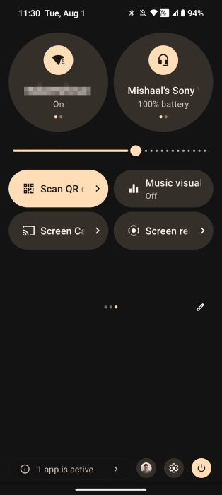

The second great change that Nothing made to the Quick Settings panel is moving the brightness slider. Nothing put it below the Internet and Bluetooth tiles, making it easier to reach with one hand.
Security
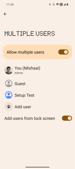
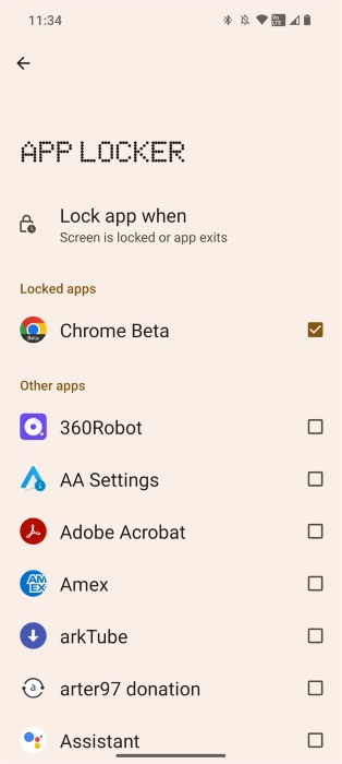
Nothing OS 2.0 supports Android’s multi-user feature, so you can create additional users as needed, up to a total of four. These can include a full secondary user with its own lock screen and data, a work profile, and a guest user. If only partial isolation is needed, then you can use the Google Photos app to hide images or videos, Files by Google to hide any file, or Nothing’s App Locker to hide apps.
When you try to open an app locked by App Locker, Android’s Biometric Prompt will ask you to unlock the app using your biometrics or primary credential. In App Locker settings, you can choose between locking apps when the screen is locked or immediately when you exit the app. The only downside is that locked apps aren’t hidden from the launcher or app drawer, so if the mere existence of an app is something you want to keep hidden, then this feature won’t help you.
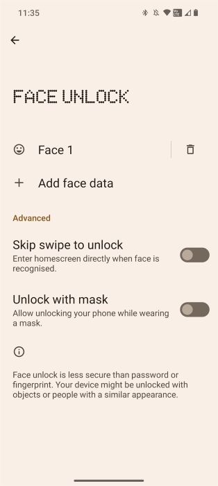
Although the Nothing Phone (2) supports face unlock, it cannot be used for Biometric Prompt, i.e., to authenticate within apps or for contactless payments. Similar to the Pixel 7, the Nothing Phone (2)’s face unlock uses the RGB front camera to scan your face. This is not as secure as 3D face unlock, hence why it’s only allowed to be used to unlock the device.
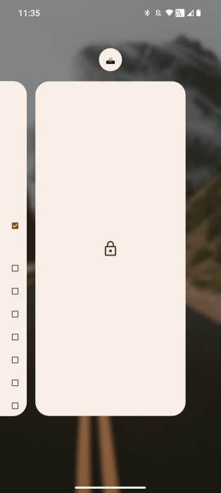
The last security-related feature worth mentioning is something that Google themselves have only finally gotten around to adding in Android 14: auto-pin confirmation. Nothing OS 2.0 doesn’t show an “enter” button on the lock screen during PIN entry; rather, the phone unlocks as soon as you enter the correct PIN.
Multitasking/Navigation
Android has supported freeform multi-windows since version Nougat, but the feature is still disabled by default in AOSP. While Nothing OS 2.0 doesn’t enable freeform multi-window mode support out of the box, it offers a mode that I think works better for smartphones: pop-up view. This mode can be enabled for any app by entering the recents screen, long-pressing on an app icon, and then tapping “pop-up view” in the dialog.
The pop-up view window behaves similarly to picture-in-picture windows in that only one can be visible at a time, they float on top of all screens, and they’re anchored to either the left or right side. They can’t, however, be “stashed” to either side to partially hide them from view, and dismissing them involves sliding the window to a “remove” target at the top of the screen.
When the pop-up view is minimized, the app is visible but can’t be interacted with. Single tapping the window enlarges it, while double tapping the window opens it in full screen. When the app is enlarged, a drag handle appears at the bottom that can be used to minimize or full-screen the app. Swiping up minimizes the window, while swiping up makes it full screen.
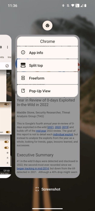
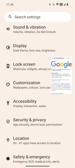
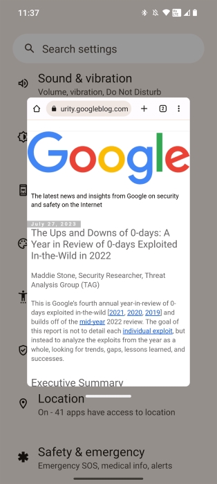
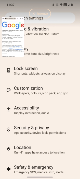
Overall, I think the pop-up view is a useful multitasking feature that works better for smartphones than freeform multi-windows, because there’s just not enough screen real estate on most phones to make use of multiple app windows. The pop-up view is focused on putting one window on top at all times so you can, say, quickly reference information from a Wiki article in Chrome while playing a game.
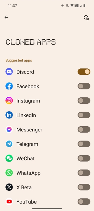
Earlier, I said that up to four users can be created, including the main user. In actuality, it’s possible to have five users total, as Nothing OS 2.0 creates a hidden “clone” profile when you enable its Dual Apps feature. App cloning is a feature Google is working on for Android 14, but Google’s version of the feature restricts what apps you can clone to an OEM-provided list. In contrast, Nothing OS 2.0 lets you clone any app installed on your device, though it hides the full app list behind a separate menu since not every app gracefully handles running in a secondary profile.
Experimental features
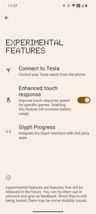
Under “Experimental Features,” Nothing offers three features: “connect to Tesla,” “enhanced touch response,” and “Glyph Progress.” I’ve already talked a lot about Glyph Progress, but I’ll briefly summarize the other two. “Connect to Tesla” lets you control some features of Tesla vehicles (A/C, doors, battery status, trunk) from a Quick Settings tile. “Enhanced touch response” improves the phone’s touch responsiveness “for specific games” (it’s unclear which ones, and I wasn’t able to find the list in the OS files/apps I looked at).
Nothing OS 2.0: Everything Nothing borrowed from Google
Most Android phones ship with Google apps, so you might think there isn’t anything really special about the Google app situation on the Nothing Phone (2). However, the Phone (2) is categorized as a GMS “Premier” tier device, which means that Nothing signed an agreement with Google to make additional changes to Nothing OS and distribute some apps that are “optional.” In exchange, Nothing gets some undisclosed monetary benefit, the exact terms of which are only known to both companies.
Thus, I wanted to highlight what Google apps and features Nothing OS 2.0 has that aren’t also available on every Android phone with GMS out there.
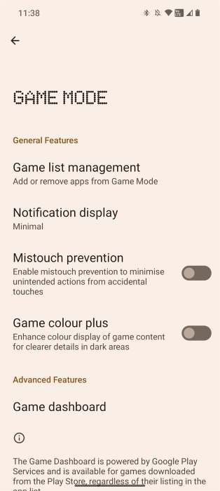
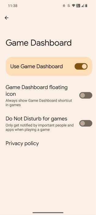
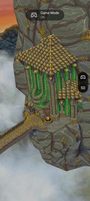
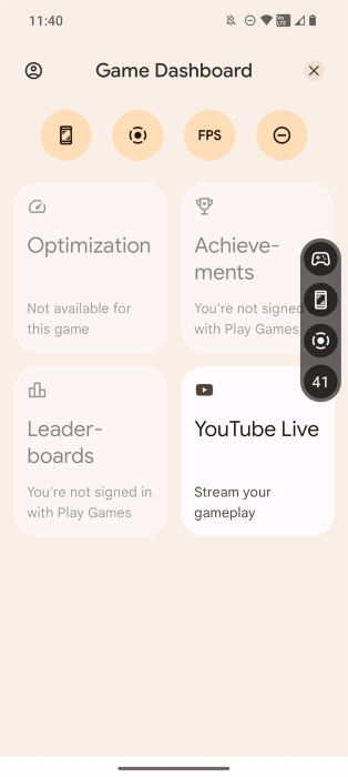
Game Dashboard: The GMS Game Dashboard feature is enabled by default in Nothing OS. The Nothing Phone (1) gained support for this feature with its Nothing OS 1.5 update, making the Phone (1) the first non-Google phone to include this feature. Unlike on Pixel, though, Nothing OS offers additional gaming enhancements on top of the GMS Game Dashboard. These include a “minimal” head-up notification UI, mistouch prevention, and “game colour plus.”
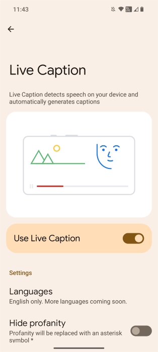
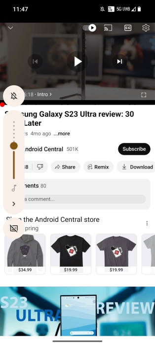
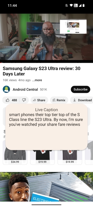
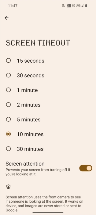
Private Features: The Nothing Phone (2) ships with the “Private Features” version of the Android System Intelligence app, which powers app suggestions in the launcher, screen attention, and Live Caption. Notably, this OEM version of Android System Intelligence does not have many of the features that the Pixel version does, such as face-based rotation, among many others.
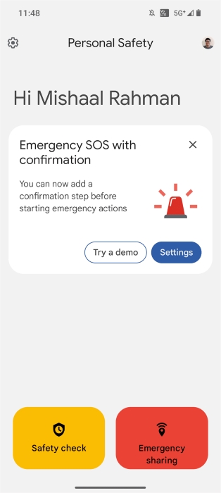
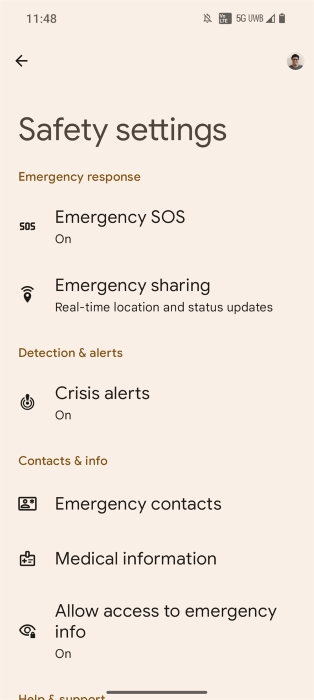
Personal Safety: Google’s Personal Safety app is preinstalled on the Nothing Phone (2). This brings features like emergency sharing, crisis alerts, and emergency SOS, but it does not enable Google’s car crash detection as that would require additional work to support. (Though the emergency SOS gesture is enabled by default on the Nothing Phone (2), you shouldn’t have to worry about accidentally calling 911 call since the gesture doesn’t trigger a call to emergency services by default.)
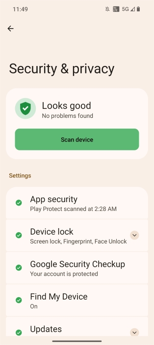
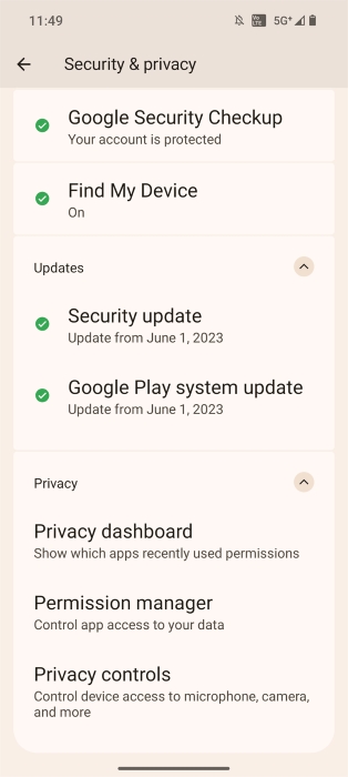
Safety Center: The unified Security & Privacy settings page is enabled in Nothing OS 2.0. Google launched this feature with the Pixel 7 and later shipped it to other Pixels with the December 2022 feature drop, but they said it would come to other Android phones “soon after.” Nothing’s Phone (1) also got this feature with its OS 1.5.4 update.
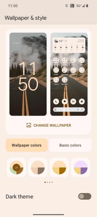
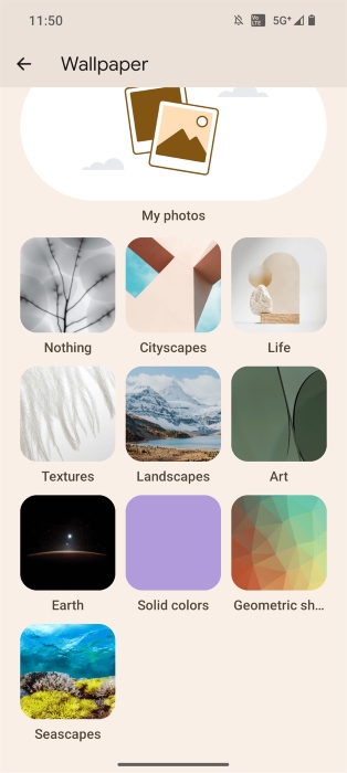
Google Wallpapers: Nothing is shipping the same “Wallpaper & Style” app found on Pixel phones. Most OEMs don’t ship Google’s app directly, instead forking AOSP’s ThemePicker (which Google’s app is itself based on). Shipping Google’s app limits what Nothing can customize, but it means they don’t have to create nearly as many first-party wallpapers since Google’s app includes a bunch of options.
Health Connect: The Play Store version of the Health Connect app comes preinstalled on the Nothing Phone (2) like it does on Pixel. This means that users won’t have to manually download the app to take advantage of its health data aggregation capabilities.
Google Lens integration: Nothing’s camera app integrates Google Lens so it can automatically recognize QR codes. This was added back in Nothing OS 1.5.2.
Google Phone with call recording: If you’re looking to record a phone call on the Nothing Phone (2), the Google Phone app it ships with has that functionality built-in. However, the call recording button is deactivated in some regions, like the U.S., so your mileage may vary.
Streaming apps to Chromebooks: Select Android devices running Android 13 or higher are capable of streaming apps to Chromebooks. Google’s official support document says that only the company’s own Pixel 4a and newer and the Xiaomi 12T and 13 series support this feature, but the Nothing Phone (2) should be able to support this as well.
Nothing OS 2.0: What I hope to see from Nothing
I’ve talked about pretty much every relevant change to Android 13 and unique features that Nothing made, but for this final part, I wanted to run down a list of things that I want to see Nothing fix or improve upon. These include missing features, bugs, and design decisions that I find issue with. In no particular order:
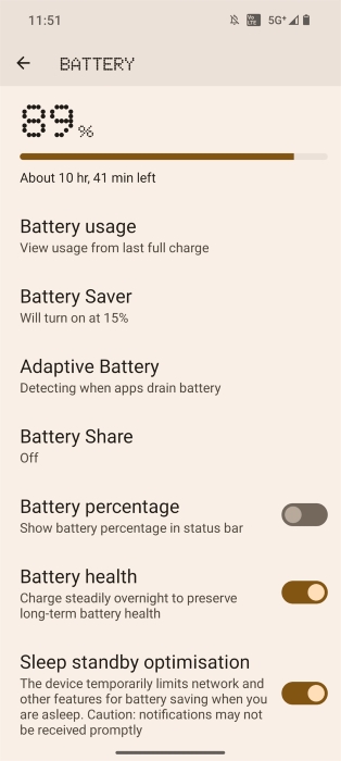
Disable sleep standby optimization:
Nothing OS includes a battery-saving feature under Settings > Battery called “sleep standby optimization” that “temporarily limits network and other features for battery saving when you are asleep.” The feature may result in “notifications not be[ing] received promptly.”
While it’s great that Nothing only (as far as I know) has a single background app management feature that isn’t a part of AOSP, it’s not great that this feature is enabled by default. OEMs shouldn’t, by default, enable features that interfere with how apps work in the background, as this causes headaches for both users (who may not be aware this feature exists) and developers (who have to deal with angry users).
Fortunately, turning this feature off should result in stock-like background app behavior, as my Nothing Phone (2) scored a 100 in an eight-hour run of the DontKillMyApp benchmark. (The good news is that Google is starting to work with OEMs to improve how apps work in the background across devices. Hopefully, Nothing gets on board with this initiative.)
Make a Nothing Tips app:
Nothing OS has so many different features that I think it’s worth creating a “Tips” app to helpfully describe (with visuals) how to use key features of the device. Google’s Tips app is quite helpful in this regard, as it keeps users up to date with all the existing features of their devices and any new features they add in their quarterly Pixel Feature Drops.
I’ve seen other OEMs like ASUS replicate this model for their devices. Nothing does offer a text-based user guide webpage, but it isn’t as effective at teaching users.
Let us hide some status bar icons:
I don’t need to know that VoLTE is active all the time, because in the U.S., all three major carriers have phased out their 3G networks already. Obviously, that’s not the case for many other countries, which is why I think Nothing should let us hide some status bar icons. Fortunately, Android already offers a built-in status bar icon blocklist mechanism that Nothing could tap into.
Bugs/Issues:
- Even though my phone’s language is set to English (United States), Nothing OS 2.0 still shows some British spellings/conventions in the OS. For instance, under Settings > System > Game Mode, the feature “game colour plus” should be “game color plus.” Under the lock screen shortcut settings, “torch” should be “flashlight.” In Glyph light’s bedtime schedule page, the first day of the week is set to “Monday” instead of “Sunday.” These are all very minor issues, but other apps/parts of the OS handle the locale changes correctly, so these areas should be fixed as well.
- The share sheet and clipboard overlay both offer a way to edit images. The former shows an “edit” chip when an image is being shared, while the latter shows a preview of the image that can be tapped. Pixels include Google’s markup app, which can handle the intents these send. Nothing, however, does not. Instead, these intents are sent to the default gallery app, which is Google Photos. Google Photos fails to launch in either case, either saying that “no media [is] provided” or “editing is not supported for this image.”
Nothing OS 2.0: Verdict
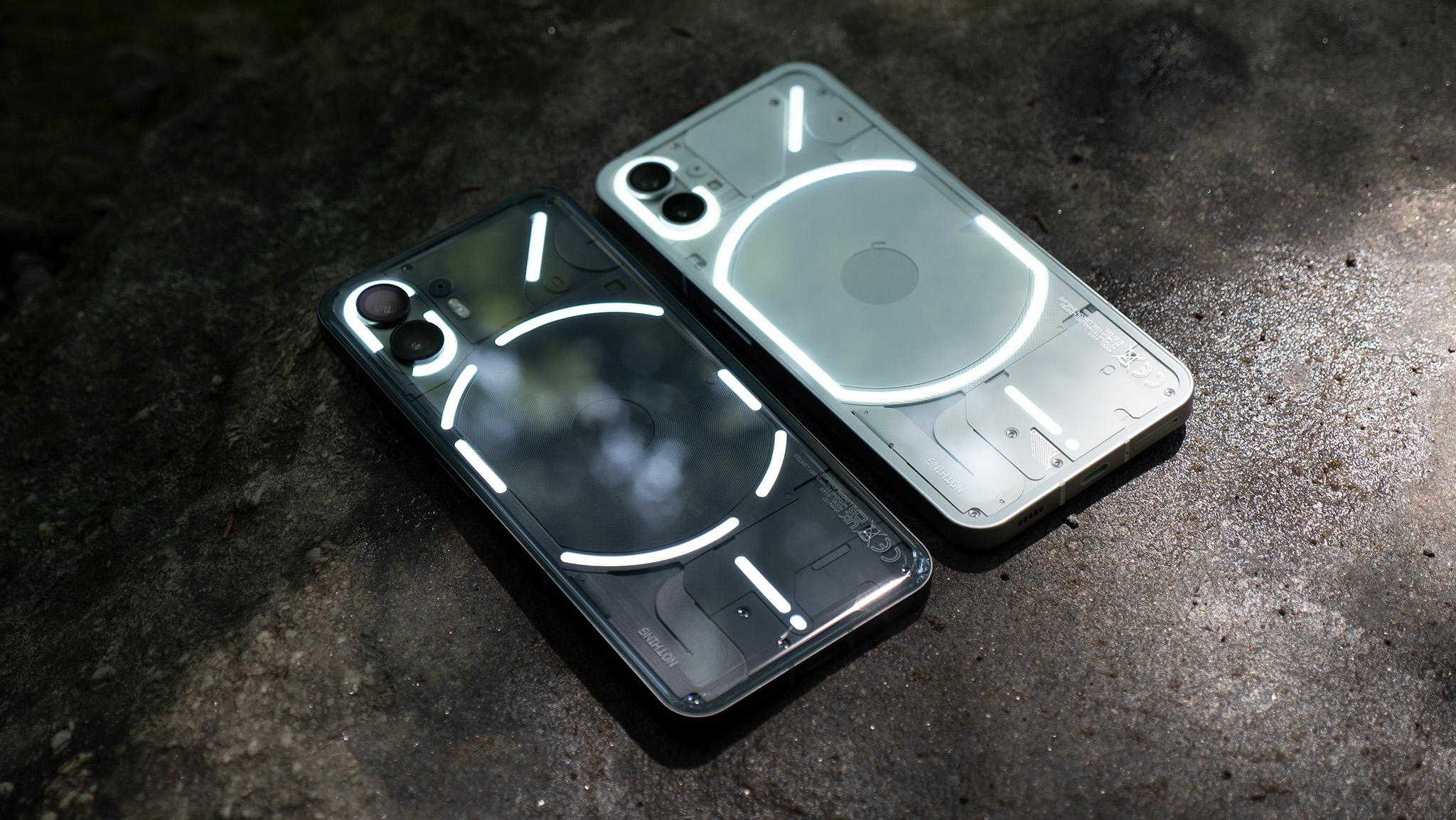
Even if you find yourself using Nothing’s Glyph lighting features sparingly, if you consider yourself a fan of what many people call “stock Android,” then I’m confident you’ll enjoy using Nothing OS 2.0. It not only retains the overall look and feel of Google’s version of Android but also improves upon it in many ways.
From the fully monochromatic home screen to the revamped Internet and Bluetooth tiles and the pop-up view windows, Nothing OS 2.0 has a lot of clever changes to stock Android that I wish Google would adopt. And even if it may not be strategically advantageous for Nothing to integrate so many optional Google apps and features in the long run, fans of Pixel software will love that Nothing OS 2.0 has so many of Google’s best features.


