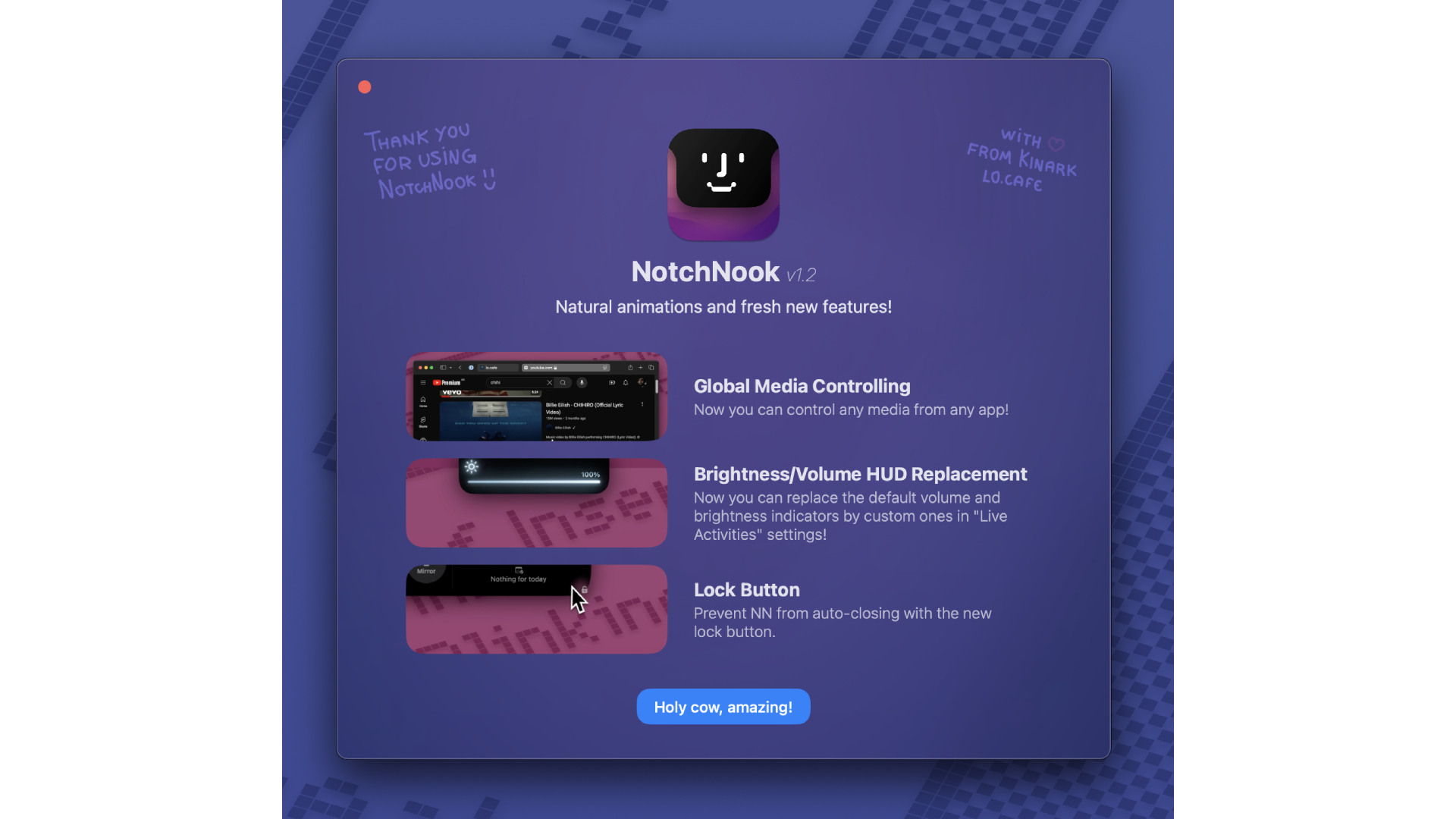
NotchNook, an app that transforms a MacBook’s notch into a Dynamic Island, has been updated to display when volume and brightness settings have changed, along with a few new features.
Announcing the 1.2 update to one of the best Mac apps in their Discord server, the NotchNook team explained that any media playing on your Mac will now show up in Dynamic Island. This includes watching videos on YouTube, VLC Player, listening to music through SoundCloud, and even podcasts on Spotify. The media will display just like on an iPhone with a Dynamic Island, complete with cover art and a small wavy line to indicate it’s playing.
But that’s not all that 1.2 features. In previous versions, users had to manually arrange widgets to fit across the width of the Dynamic Island. This meant that if you wanted to add or remove any more, you had to do this manually. In 1.2, you can add as many widgets as you want, and the Dynamic Island will automatically adjust, allowing you to scroll across to Calendar, music controls, and more.
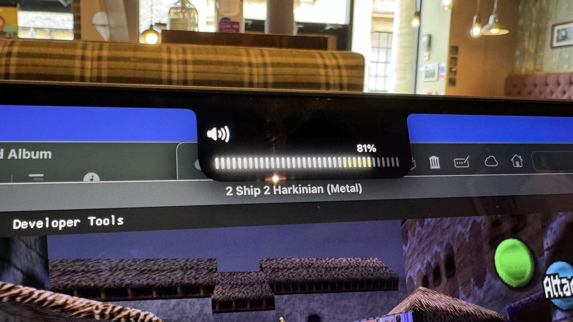
The highlight of NotchNook’s 1.2 update is how it replaces the brightness and volume displays. Previously, changing one of these in macOS resulted in a frosty square appearing, showing the levels of brightness and volume. However, these square windows would usually obstruct something, such as when you’re watching a video in Safari. This annoyance was similar to the volume toggle on the iPhone before it was moved closer to the volume buttons. Now, when you change the brightness or volume with NotchNook 1.2, the indicators are in the Dynamic Island, finally getting rid of a big annoyance of macOS that’s been present for years.
If you haven’t tried NotchNook yet, we strongly recommend it. The app is free to download for a three-day trial and can be bought as a $3 per month subscription or for a $25 lifetime fee.
The team behind NotchNook is just getting started - iMore’s take

NotchNook gives the best Macs a feature you didn’t expect would work so well. I’ve had the app installed since I first heard about it in early July, and it’s made tasks like controlling music and checking Calendar so straightforward, that I’m puzzled Apple hasn’t added something similar to macOS already.
To mark the 1.2 update this week, I reached out to the NotchNook team to see what else they were working on. It turns out that updates like moving the brightness and volume indicators to the Dynamic Island are just the beginning, according to Igor Marcossi, NotchNook’s main developer and designer. “NotchNook's main feature is still to come: Pipelines. The app will allow the creation of custom "drop actions" that will be able to run terminal commands behind the curtains, which will virtually allow any type of interaction with the files,” Marcossi reveals. “ You can drop files here to zip/unzip, drop files here to get a public link, and drop files here to resize them. Those are called Pipelines and users will be able to share their own Pipelines.”
Marcossi is very excited about Pipelines’s potential in NotchNook. “It's the biggest feature we have planned for NotchNook. We plan to release it in a few months!” Hopefully, we won’t have long to wait to see how Pipelines can manage our files. In the meantime, we recommend giving NotchNook a try, even if you have a Mac that doesn’t have a notch. Having a virtual Dynamic Island may surprise you with how useful it can be on macOS.


