Decent typography design spins more plates than you might realise. The best examples are legible as well as impactful, and in some cases can even draw an emotional response. But when it comes to typography inside cars, there's another concern: safety.
Tesla has already fallen foul of this challenge, finding itself forced to recall a bunch of cars after a font was deemed unsafe due to legibility concerns. But Volvo thinks it has the answer, in the form of its new typeface: Volvo Centum.
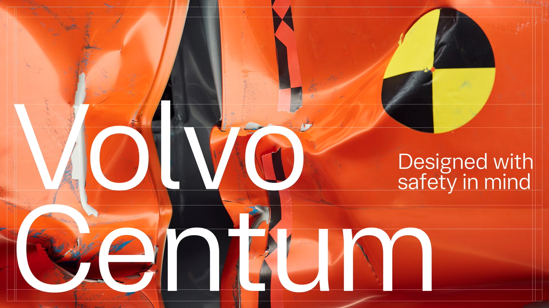
Designed in collaboration with Dalton Maag, Volvo Centum is a bespoke typeface "designed to make reading faster, attention sharper, and the driving experience calmer."
"This isn’t just a typeface," Volvo announced. "It’s a quiet innovation in automotive design. Every curve, every terminal, every spacing decision was engineered to reduce visual noise and let drivers focus on what matters – safety, clarity, simplicity. Think of it as Scandinavian design for your eyes in motion."
“Designing for motion and glance-based reading requires a different mindset. This is typography engineered to perform under pressure, across languages, and at 100 km/h”, said Zeynep Akay, Creative Director at Dalton Maag.
The typeface is set to make its debut in the upcoming Volvo EX60. Its name, Centum, is a reference to Volvo Cars' upcoming centennial in 2027.