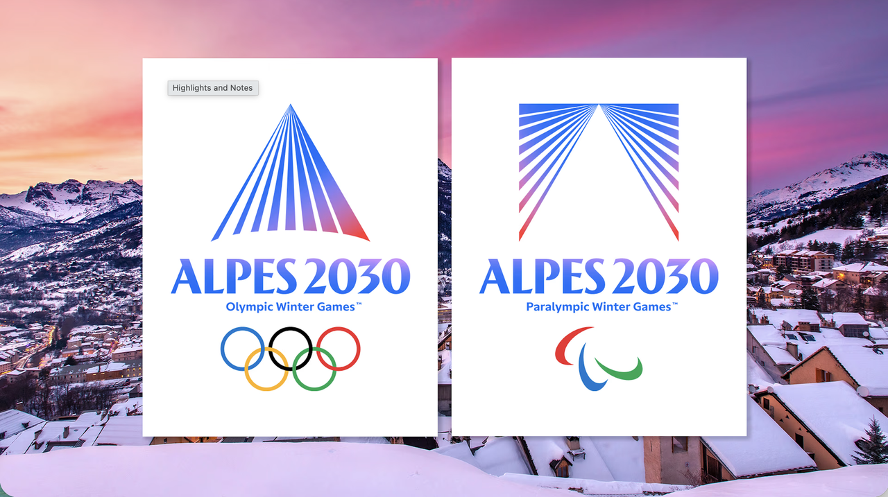
There are few harsher tests for a logo than the internet's collective first impression (as we've found with all past Olympic logos). Within minutes of the Alpes 2030 Winter Olympics unveiling its new identity, designers were admiring the execution, branding enthusiasts were dissecting the symbolism, and other people were wondering if they'd accidentally downloaded a new banking app.
That's not because the logo is bad. Quite the opposite. The mark unveiled for the Olympic and Paralympic Winter Games is elegant, confident and highly contemporary. A series of radiant lines converge into a mountain peak, rendered in gradients of alpine blue and sunset pink. It's clean, memorable and technically accomplished. I very much like it.