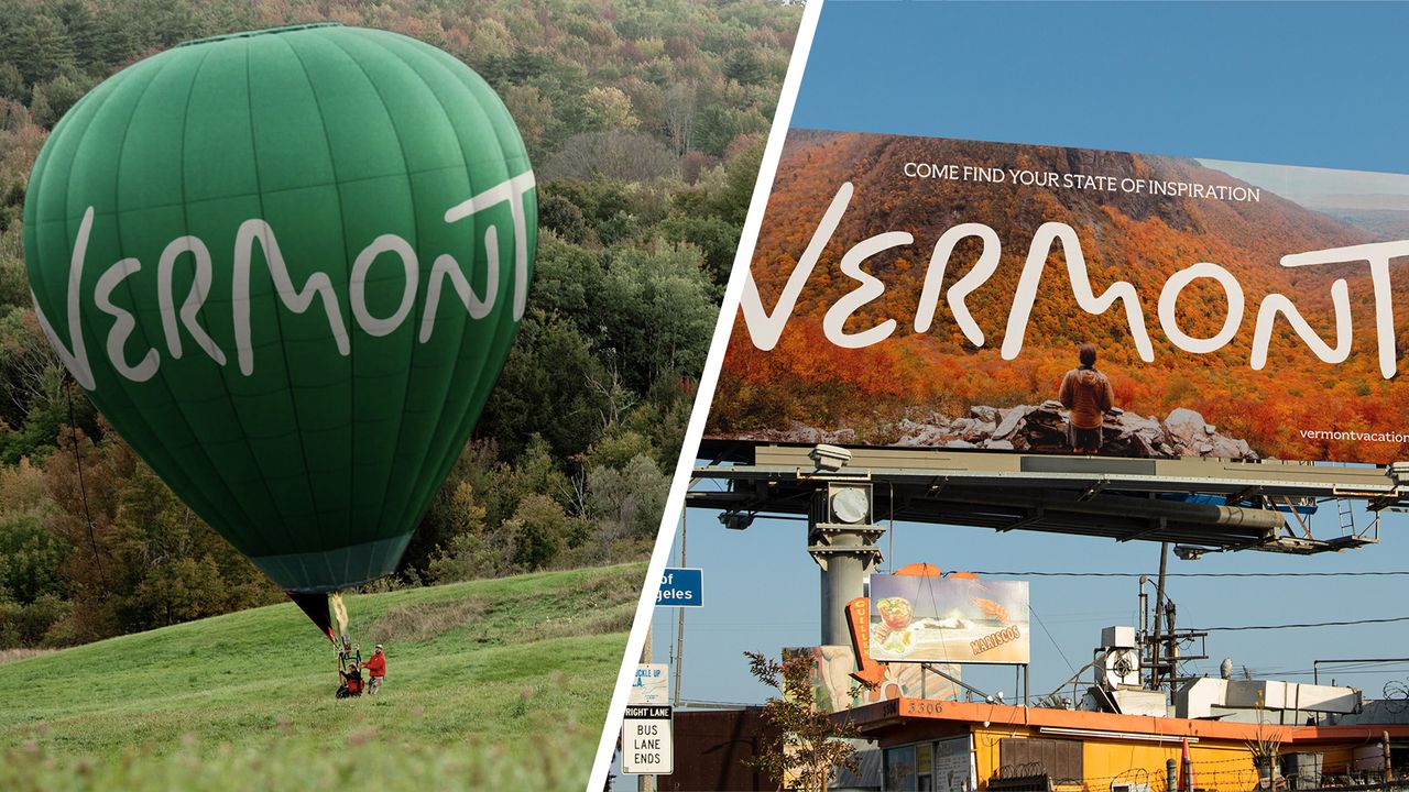
Tourism logos can be difficult to get right. They brand not a company or organisation but a physical place where people live and work. They have to evoke wanderlust and communicate the distinct appeal of (hopefully) myriad attractions to potential visitors while avoiding overly generic symbolism, and ideally not upsetting residents.
The Visit Arizona logo crams in a bounty of detail with its many icons, while the Dubai logo sacrifices easy readability for a multilingual approach. The first dedicated Vermont Tourism logo goes a different route, with a clear, welcoming wordmark that looks simple but takes inspiration from the state's natural and cultural attractions – and no, it isn't Comic Sans!