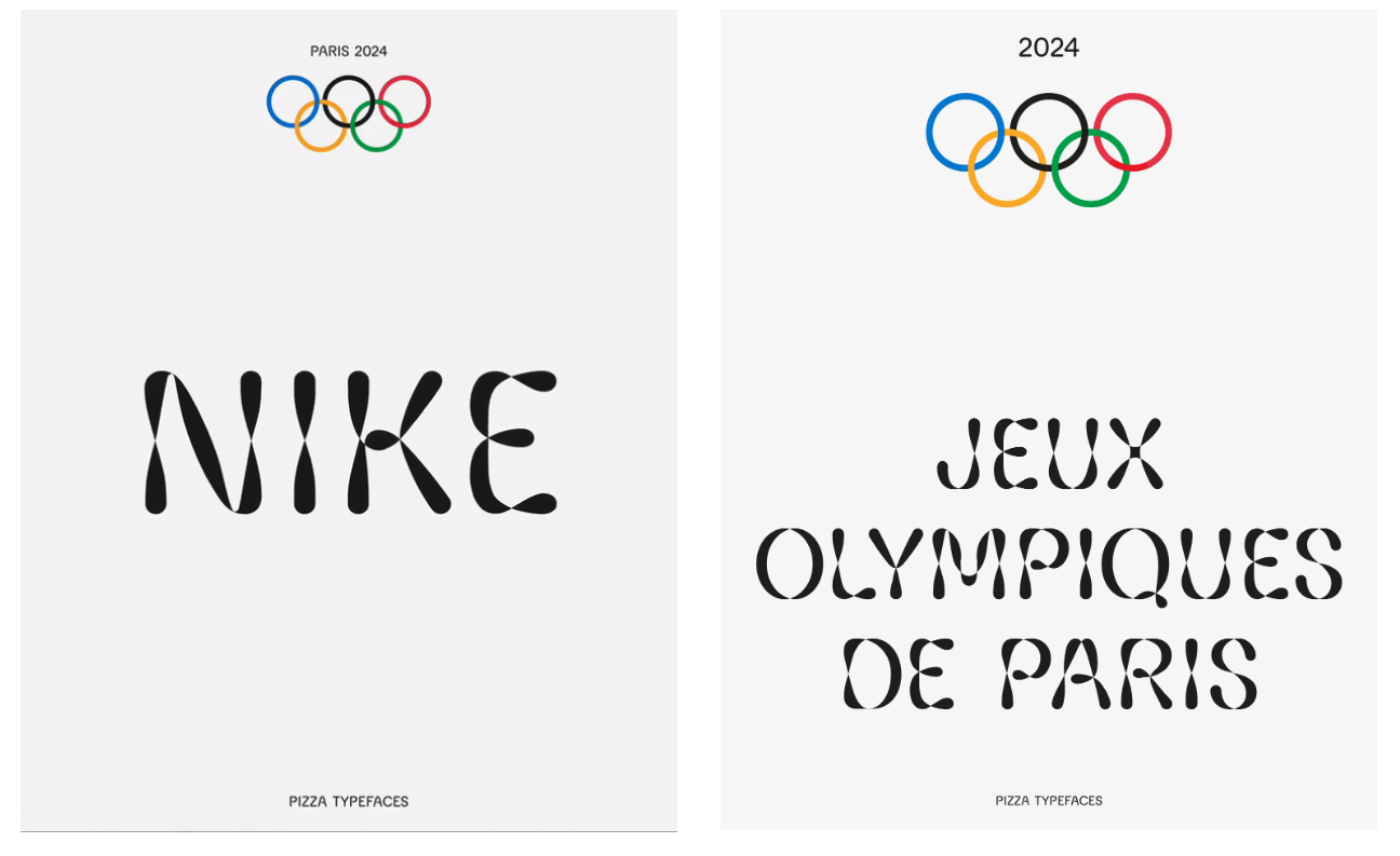
A typeface for Olympic team kits needs to be versatile. It has to be legible on a wide range of sports clothing for training and at the Olympic village, and it also needs to have character to appeal to fans.
How to cover all bases? The solution for Nike was a variable font that can be adapted to a wide range of products with letter ends that twist and curves that intersect to move between states (see our pick of the best free fonts to expand your collection of typefaces for your own work.)
Adrien Midzic and Luc Borho’s Pizza Typefaces turned took inspiration from Futura to create slightly rounded letters that bulge like athletes' muscles and also recall the roundness of the Olympic rings.
"The idea was to break the conventions of bold fonts to promote unity and movement," the French type design studio says. The result is hard to categorise, since the typeface feels solid but also soft and flexible. In short, it's the versatile font Nike needed.
For more on Olympics branding, see the history and meaning of the Paralympic Games logo and our pick of the best Olympics logos of all time.