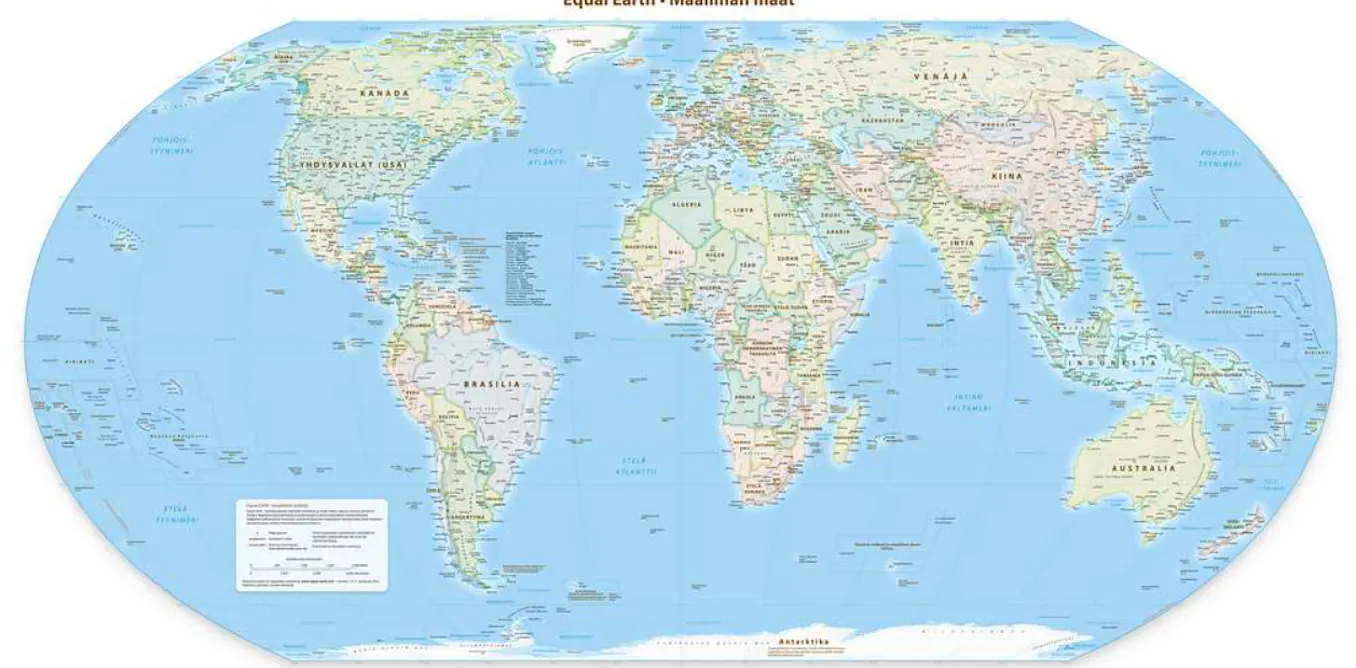
The UN has passed a non-binding resolution to endorse the Equal Earth Projection, a map which more fairly represents the true size of the Earth’s landmasses. The current commonly used projection, called the Mercator Projection, greatly exaggerates land towards the north and south poles, which makes Africa look much smaller. In the Mercator projection, countries near the north and south pole can be anywhere from two to 14 times their true size. In the Equal Earth projection these distortions are minimised, making Africa look larger in comparison.
We asked Jack Swab and Derek Alderman, cartographers and geographers who study the social and communicative power of maps, to explain what’s going on.