Utah is set to host the 2034 Winter Olympics, and to celebrate the occasion (perhaps a tad too early, I'd say), we've been given a brand new logo. While I'm all for thinking outside of the box and swaying from tradition, the logo's contemporary design has caused quite a stir online, with the contemporary look not proving popular.
Sports logos are notoriously difficult to nail, especially with fans often flocking to socials to share their candid opinions. While I commend the risk-taking behind the new 2034 Winter Olympics logo, the icy response leaves me wondering if fans will eventually warm to the design. (I guess we've got the next 9 years to find out.)
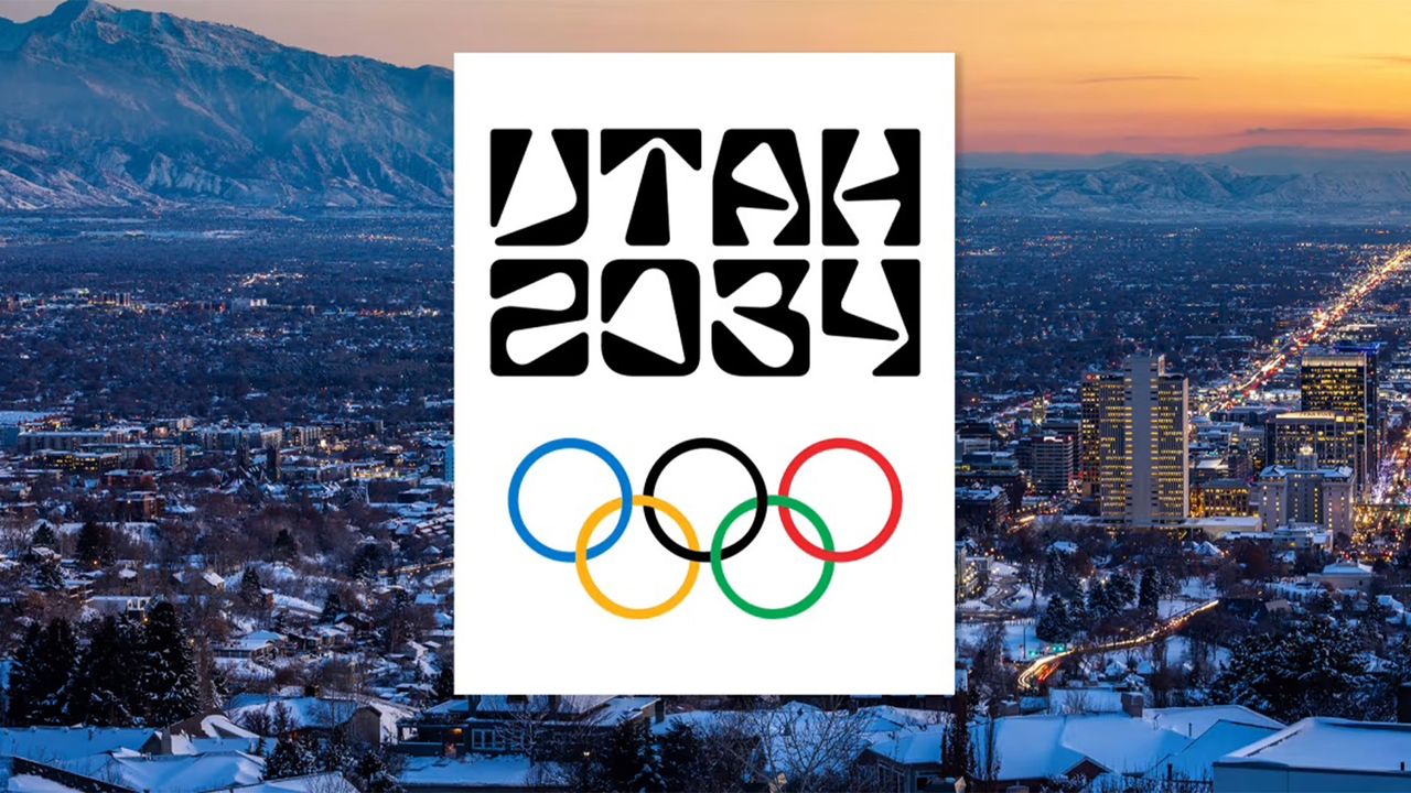
INTRODUCING UTAH 2034 🇺🇸Designed to embrace and unite all communities across the state, we are coming together as one Utah as we celebrate 3000 days out from the 2034 Olympic and Paralympic Games. #Utah2034 pic.twitter.com/ceudZpMbqnNovember 24, 2025
Featuring a strong contemporary wordmark, the Utah 2034 logo was designed to "embrace and unite all communities across the state," commemorating 3000 days out from the games. With an abstract, angular typeface finished with soft corners, the design embodies the natural shapes found in Utah’s geography and iconic petroglyphs.
Despite the bold, creative direction, Redditors over on the r/graphic_design subreddit were clearly divided by the new logo. "Looks like one of those psychedelic Canva fonts. Didn’t get the landmark connection from it at all," one user wrote. "Maybe it's because I am hungry, but it's giving Chinese restaurant font," another added, while one user chose to see the positive side, writing, "This will bring the world together, one ick at a time. Bad publicity is good publicity."

Others were more positive about the design, commending the new logo. "I'm neutral on it. I can read it, and it's not boring, which isn't an easy thing to do in 2025," another critic wrote, while one added, "I like it. It’s interesting; not bland."
Despite all the fuss, most critics will be pleased to know that the design is merely a transitional placeholder until the official 2034 Winter Olympics logo is revealed in 2029. As far as sports logos go, this doesn't hold a candle to the dumpster fire that was the controversial new Six Nations logo, so for that, we must be thankful. For more design news, check out this football team’s new logo that's pure fan service (in the best way possible).