What you need to know
- The improved experience is rolling out on Google Docs, Sheets, and Slides.
- Users can find and organize comments more easily.
- A curated “For You” list will allow users to focus on comments directed at them.
If you’re one of the many users who take umbrage with Google Workplace’s comments feature, then you’re in luck because comments have received a massive overhaul. The update, which is rolling out to rapid-release domain users, will impact Google Docs, Sheets, and Slides in a positive way.
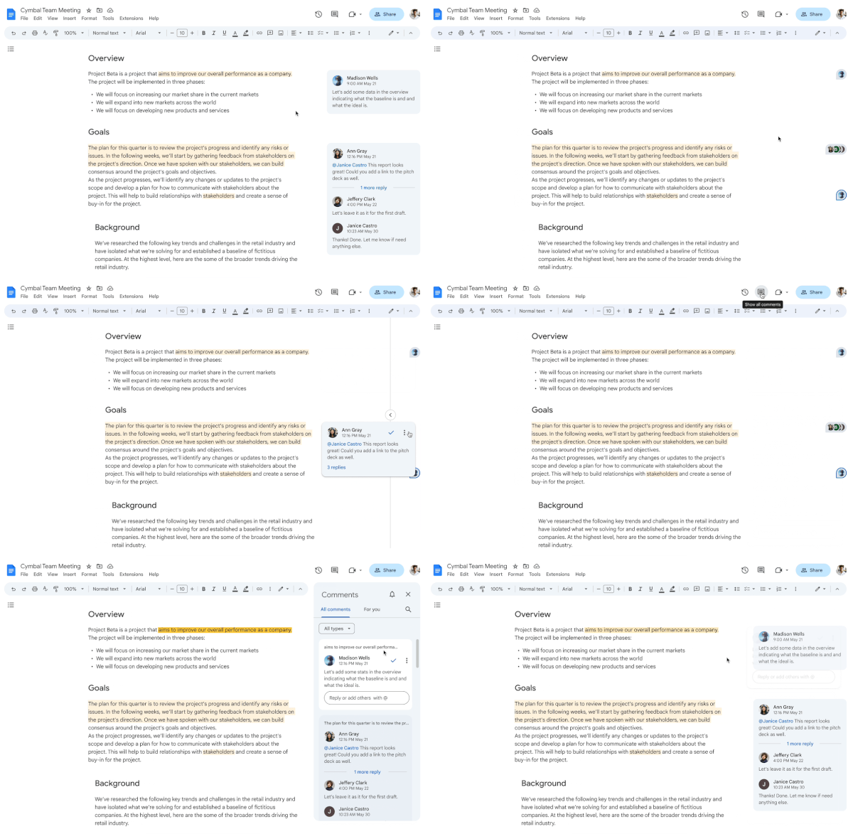
Here’s how things are changing. Moving forward, comments within Google Workspace apps will become easier to navigate. Therefore, you will be able to find, organize, and take action with ease. Not only is the experience for comments changing but so are features like comment cards and icons, per Google’s Workspace Updates blog.
The biggest feature of the bunch is the new curated “For You” list. The list, which is housed in the larger comments tab, separates comments based on ones that you specifically need to take action on versus all other comments, which may be directed at other users within a collaborative document. As a result, clutter will be eliminated as the document will only showcase what you have been tagged with.

From there, users will be able to take advantage of a new feature in expanding comments. By clicking on a comment, users will be able to expand the text, and it will float next to the content that it is being targeted toward. While “For You” is available across all three Workspace platforms, expanding comments will only work through Docs and Slides.
Users will also be able to minimize comments altogether through this new update. So, if you’ve had trouble focusing on the document at hand, you’ll be able to reduce the view of comments to simple icons. The icons will take the shape of the commenter via their initials or profile picture, depending on how their Google account has been modified.
Users then need to simply hover over the icon in order to preview the information at hand. Hovering over the icon will showcase the comment, and from there, you can take action, including marking it complete or replying. Simply moving your mouse past the designated icon will once again hide the comment, and if you’ve taken action, then all you need to do is click away to go back to a more focused view. Note that this feature is only available for Google Docs and Sheets.
Finally, users will be able to hide comments altogether across Docs, Slides, and Sheets, thus returning the content to its “original” state, one without any markings.
All of these features make up the robust update, which is now being rolled out to rapid-release domain users. A full rollout will commence on March 1, with plans to have all users onboard within 1-3 days.


