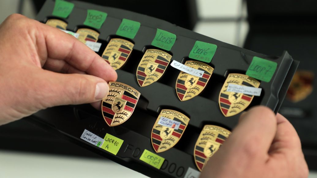
We've seen plenty of brand new car logos over the last few years, with the likes of BMW, Kia, Nissan and Rolls-Royce adopting new designs. These have ranged from full rebrands to minor tweaks; often a flattening of the existing design. But Porsche may have just revealed the most subtle redesign yet – and it only took three years.
The car brand has revealed a "modernised Porsche crest", a cleaner and slightly more minimal take on the current design, with a few textures removed – although the word Stuttgart has been reintroduced to the centre of the crest. But other than that, it looks very, very familiar. (Looking for design inspiration? Check out the best logos of all time.)