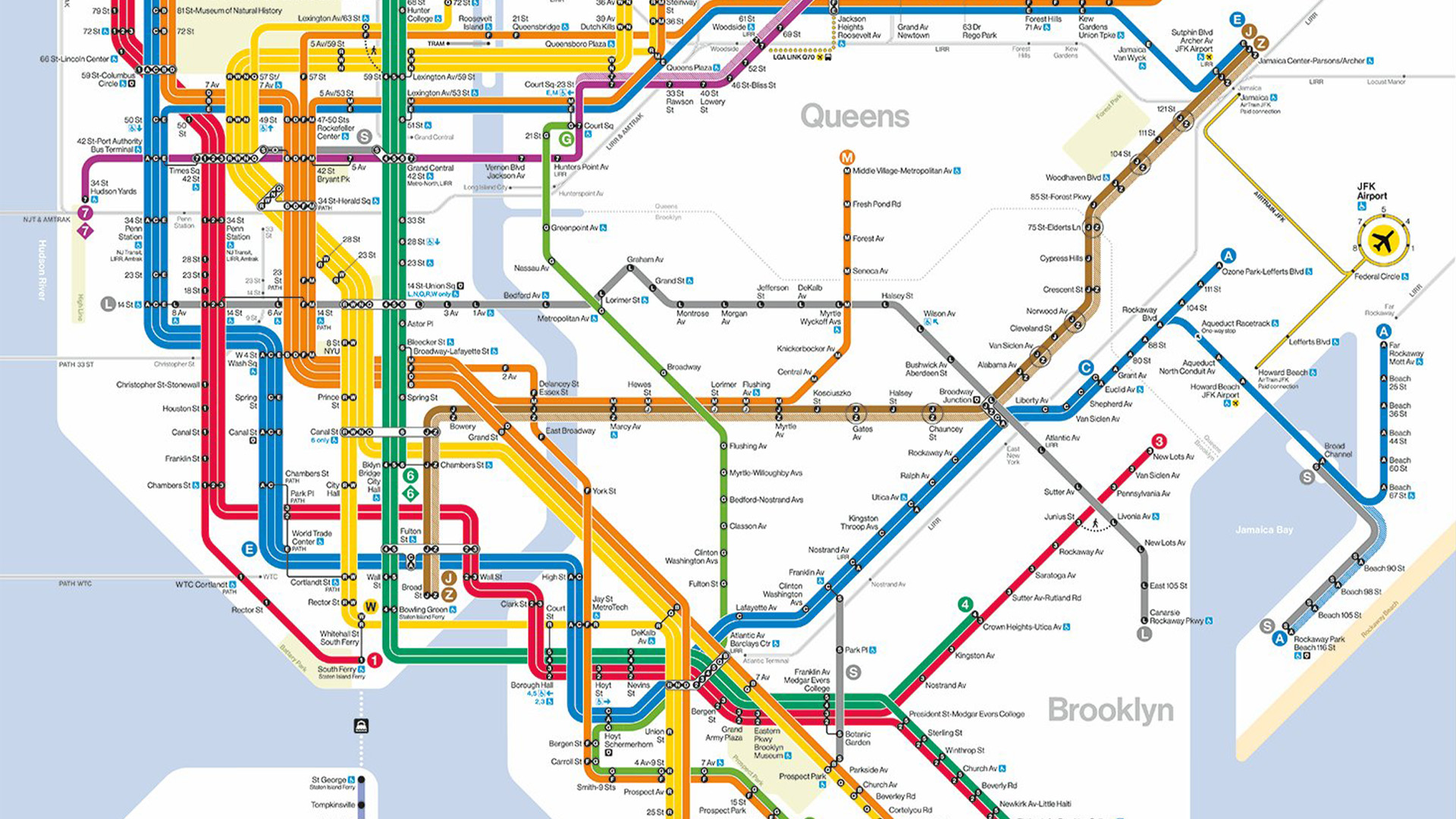
The MTA has unveiled a brand new map for the NYC subway, and while some commuters are a little hesitant about the change, design fans are delighted by the new look. The new map has been praised for its bright colours and graphic appeal, doing away with the divisive 'spaghetti diagram' map created by Michael Hertz in 1979.
The best map designs are typically bold, bright and simple, but that doesn't mean they can't be stylish too. Taking inspiration from the beloved NYC subway map design of the late 60s, the new map has an underlying retro feel that expertly balances traditional design with clean contemporary visuals.