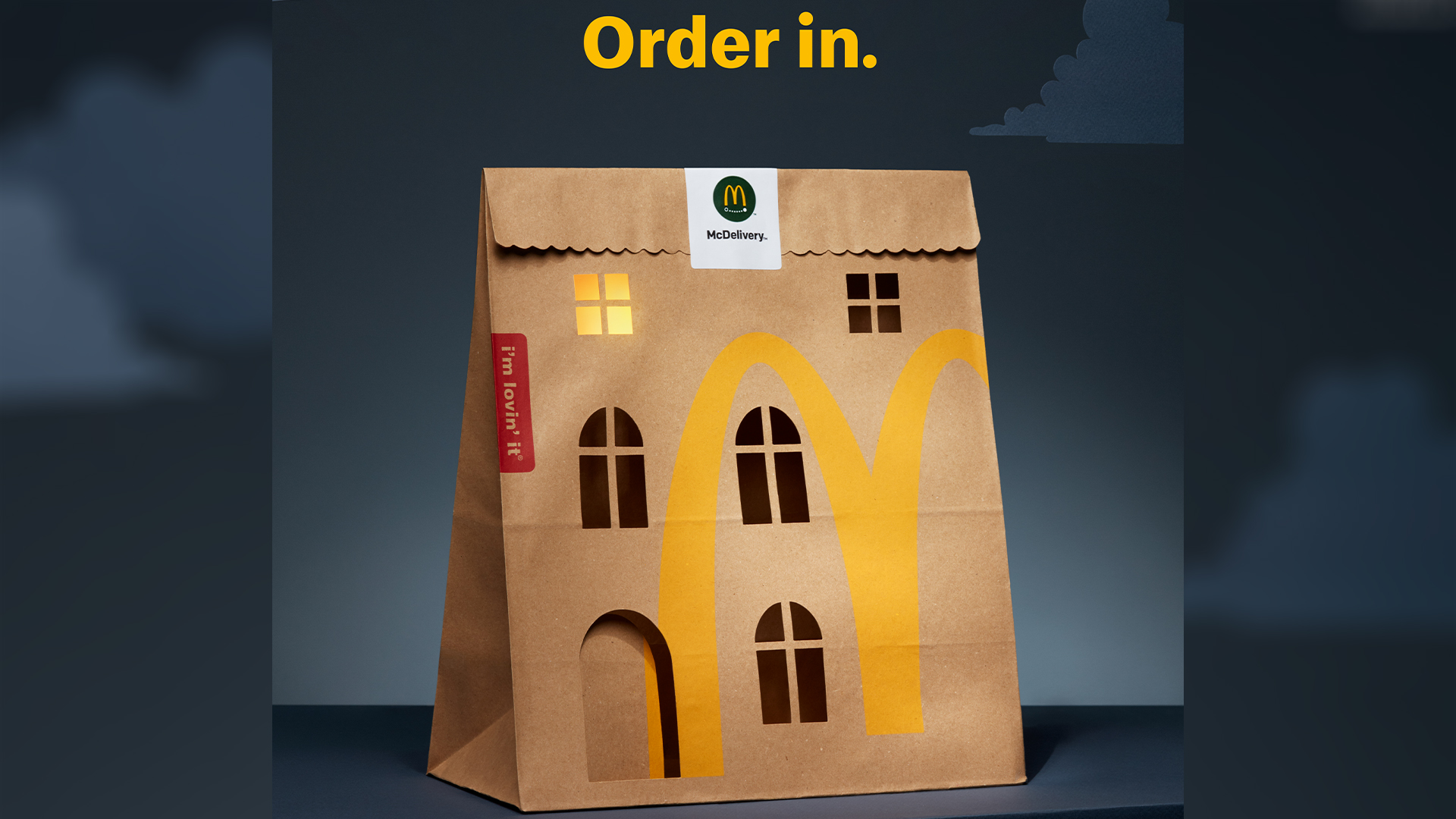
It's a hard task to reinvent something as plain as the humble paper bag, but McDonald's Norway has given it the ultimate makeover in its latest ad. To promote its McDelivery service, the company has created a cosy campaign that celebrates the simple pleasures of eating in.
As we've seen in some of the best print ads, sometimes simplicity is best, and this minimalist campaign is certainly a satisfying bite of classic creativity. Nowadays, rarely do we see brands creating ads that go back to basics, but this beautifully crafted campaign expertly shows that simplicity can be striking.

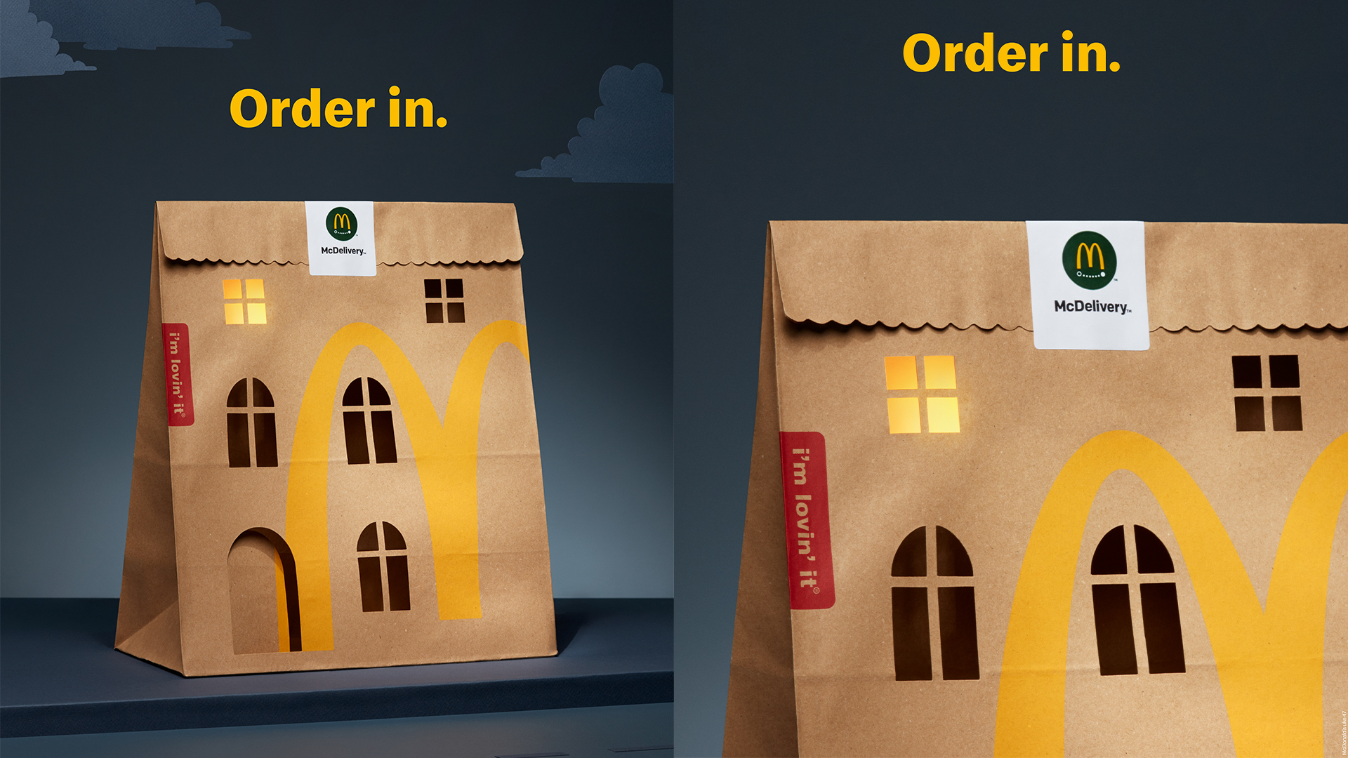
The delicate papercraft was created by Julie Wilkinson of Makerie Studio. The campaign's simple visuals feature a McDonald's paper bag with strategic cutouts that imitate the windows of a classical Norwegian apartment complex. The sleek design is elevated using the curvature of the 'M' logo which frames the arched windows, creating a stylish and intimate feel.
The paper artwork takes on a domestic cosiness with the help of a single illuminated window, which aims to capture a sense of comfort that home diners will feel upon indulging in McDelivery. The artwork was photographed by Catharina Caprino and was captured solely in camera, letting the traditional artistry of the piece shine through.

Reportedly, Norwegians prefer to consume their McDonalds in restaurants or cars, so the campaign needed to capture the unique comfort of home dining. NORD DDB Oslo, the creatives behind the campaign, shared with Creative Bloq that "The craft needed to complement the idea without overtaking it. We aimed to maintain the right equilibrium, ensuring the McDelivery bag was recognizable as a building while retaining its iconic appearance."
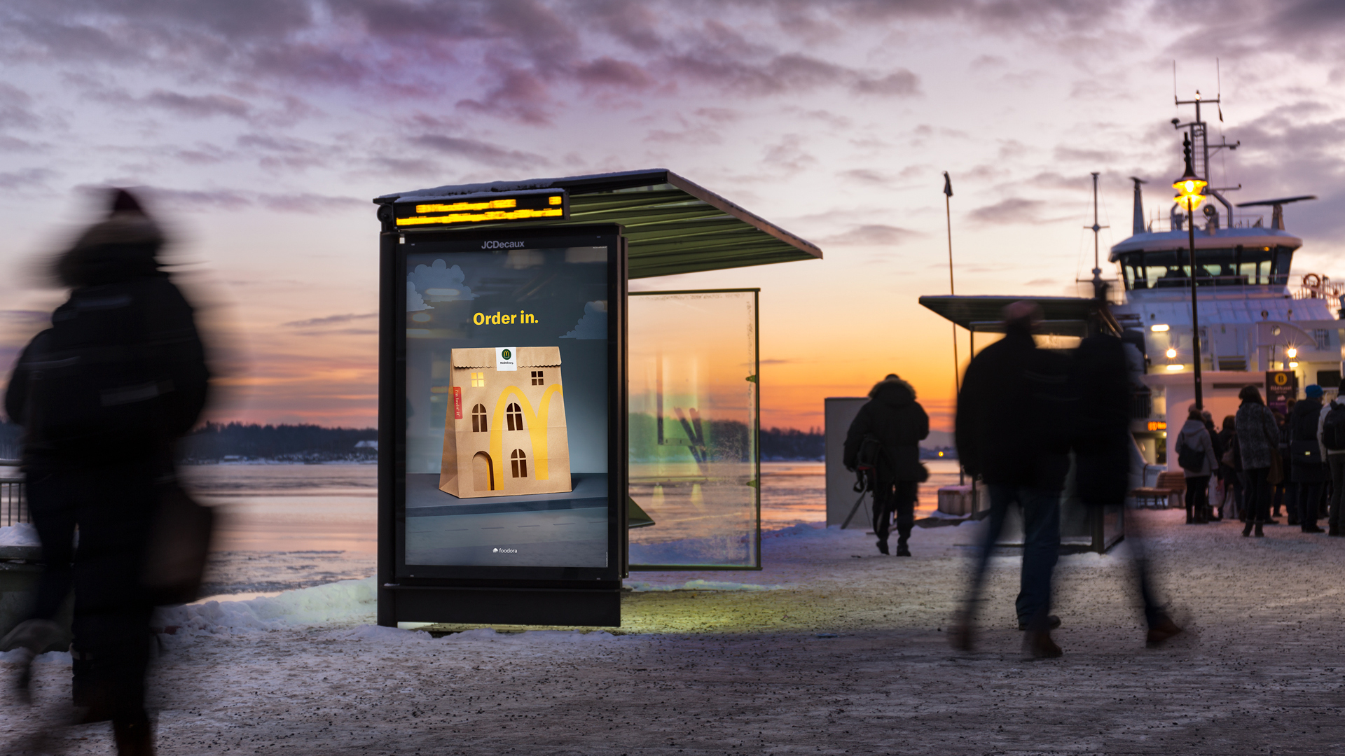
The campaign will feature across social media and appear throughout the largest Norwegian cities this winter. For more clever campaigns check out the McDonald's Christmas ad that's raising some eyebrows, or take a look at the new spin-off restaurant that's out of this world.


