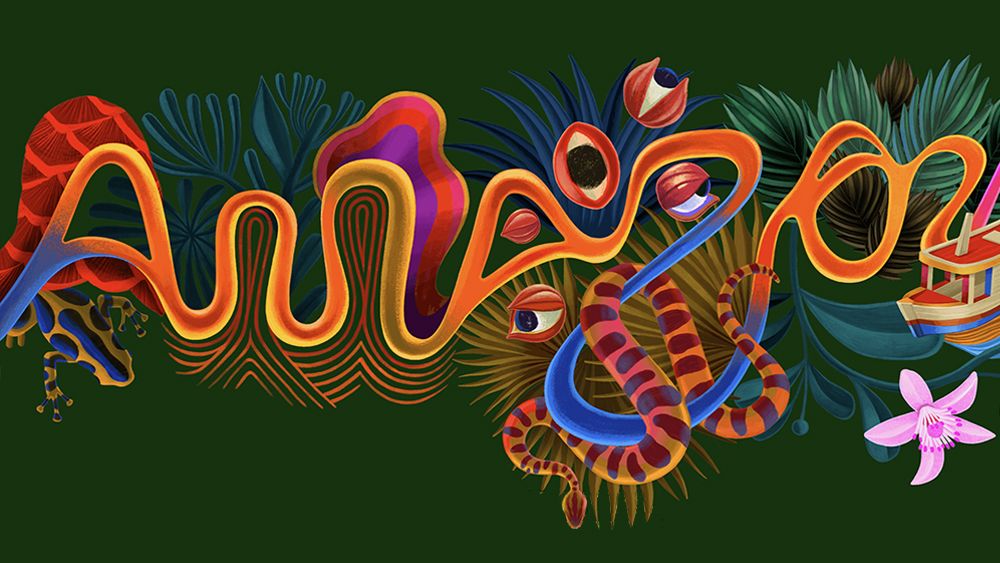
We've seen some creative tourist board logos over the years, but Amazonia may have set a new standard for striking destination branding. The first unified branding for the largest socio-geographic division of Brazil, includes a vibrant logo design that takes inspiration from the region's famed rivers to represent individual states.
Legal Amazon is a huge region covering around 60% of Brazil and comprising nine states in the Amazon basin. It is, of course, also home to the world's largest tropical rainforest, making it one of the most diverse place in terms of wildlife.
The new Amazon brand identity was created by FutureBrand São Paulo as part of a project led by RAI (Integrated Amazon Routes) and the Brazilian tourism promotion agency Embratur. It's the result of a series of studies conducted with engagement with residents, workers and artists across the region.
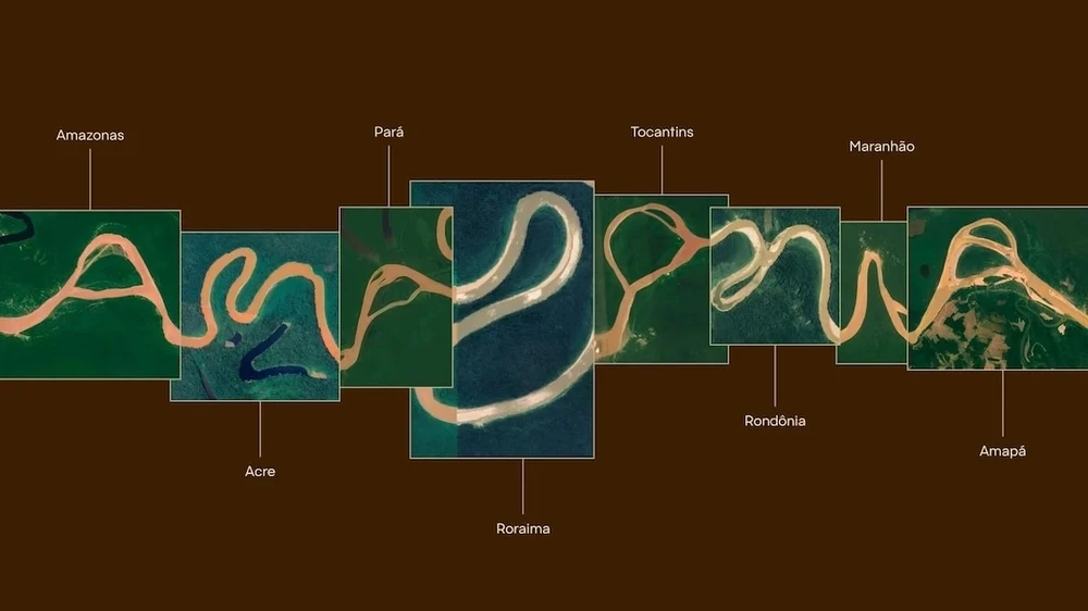
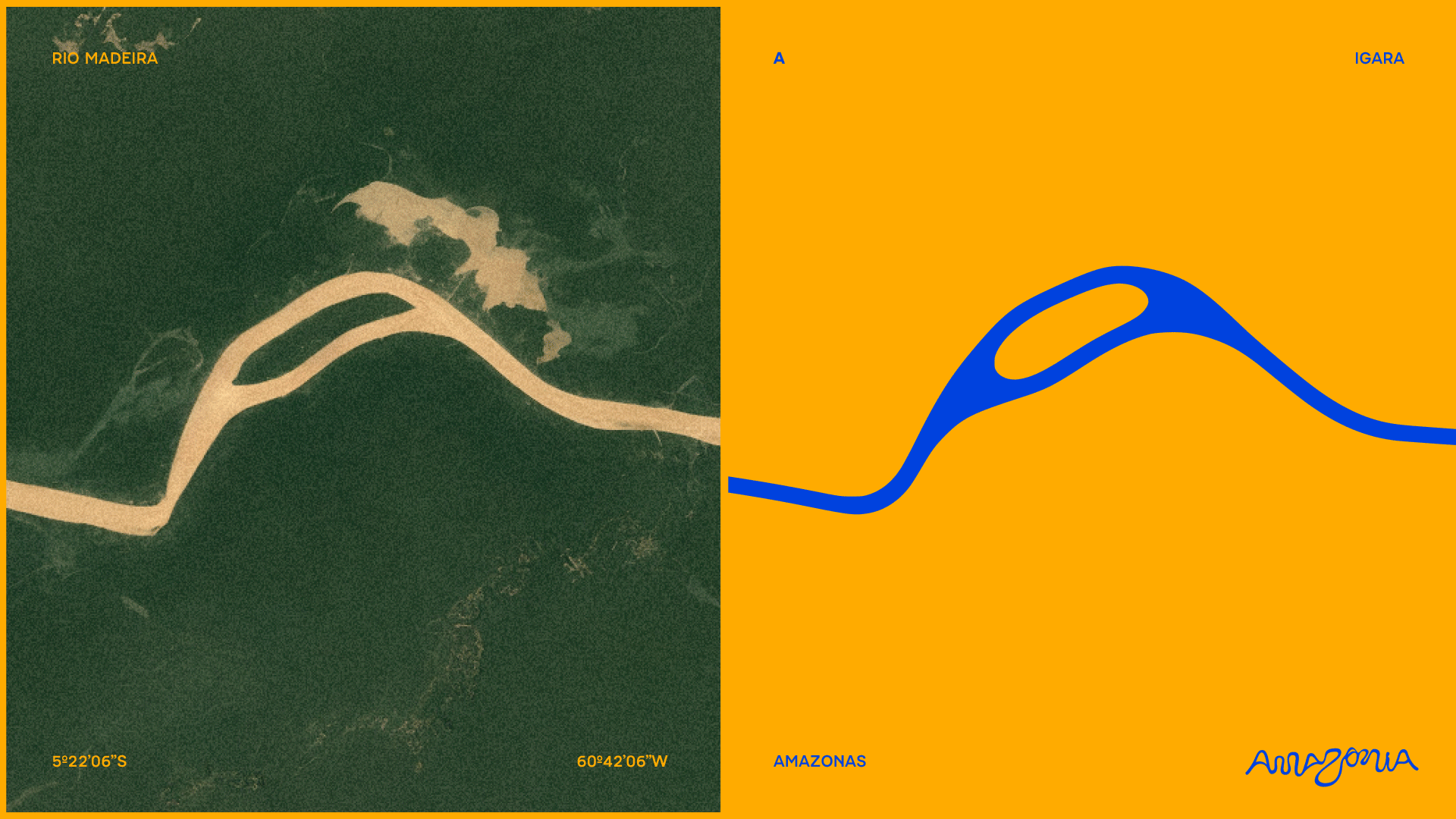
The aim was to present the states of Acre, Amazonas, Amapá, Maranhão, Mato Grosso, Pará, Rondônia, Roraima and Tocantins under a single brand in place of fragmented identities, while still respecting their individual character. Each letter of the snaking logotype is based on the shape formed by a river in one of the region's states.
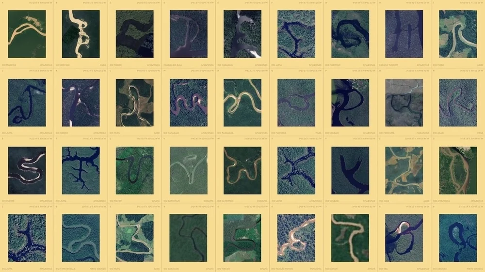
Legal Amazon has 25,000 kilometres of navigable waterways, including the Amazon itself and its tributaries. Real coordinates were used to find the entire alphabet (and the numbers zero to nine) in satellite imagery. These were then used to craft a "living logo" with a series of colours and illustrated elements, such as fauna, flore and culture, which allow the identity to change according to the region and occasion.
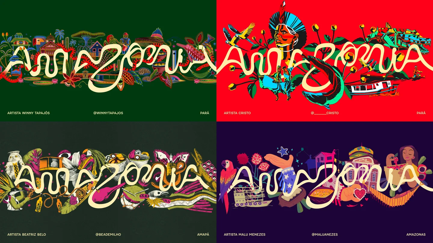
Enhancing the cross-region ethos, the project involved professionals and artists from the different Amazon states. On the lettering side, Instituto Letras que Flutuam, an association that seeks to preserve the decorative lettering of the Amazon, contributed to along with letterer Odir Abreu.
Illustrators Cristo, Winy Tapajós, Malu Menezes and Beatriz Belo took part along on the illustration side, while photographers Ori Junior and Bob Menezes worked on imagery and the audiovisual production to present the project was overseen Marahu from Pará.
The initiative, which is supported by the website visiteamazonia.com.br, aims to unify the region and promote it not only as a tourism destination but also a business ecosystem, generating value for its businesses and artists.
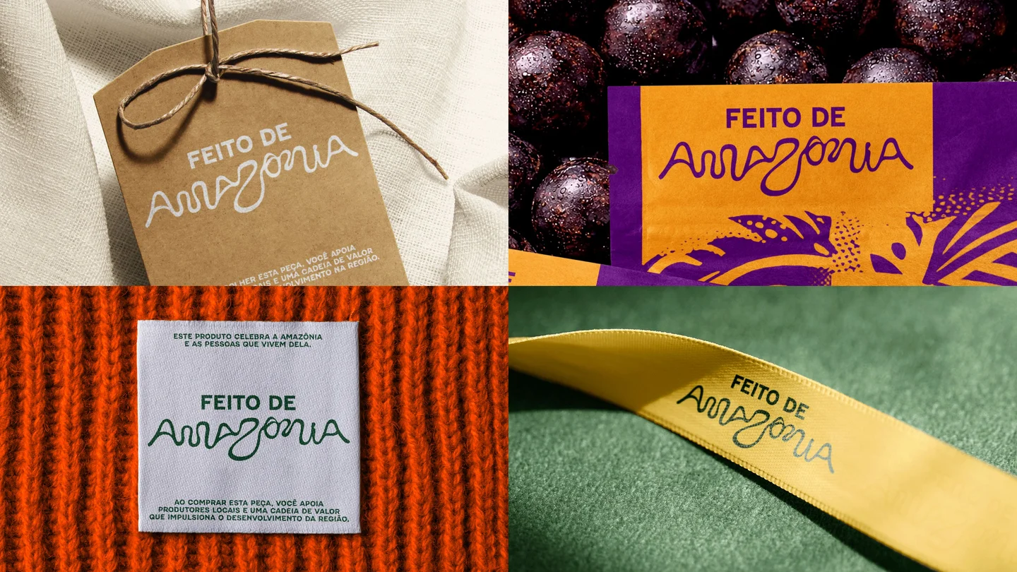
A new 'Feito de Amazônia' ('Made of Amazon') seal can be applied to local produce, from crafts to gastronomy and music, to signal Amazonian origin and strengthen the region's visibility both in Brazil and internationally.
The clever logo design succeeds in the challenging task of uniting a large multifaceted region with a coherent concept. It communicates the richness, diversity and vibrancy of the Amazon region through a striking, memorable design crafted from its own resources.
For more inspiration, check out the map of tourism logo fonts.