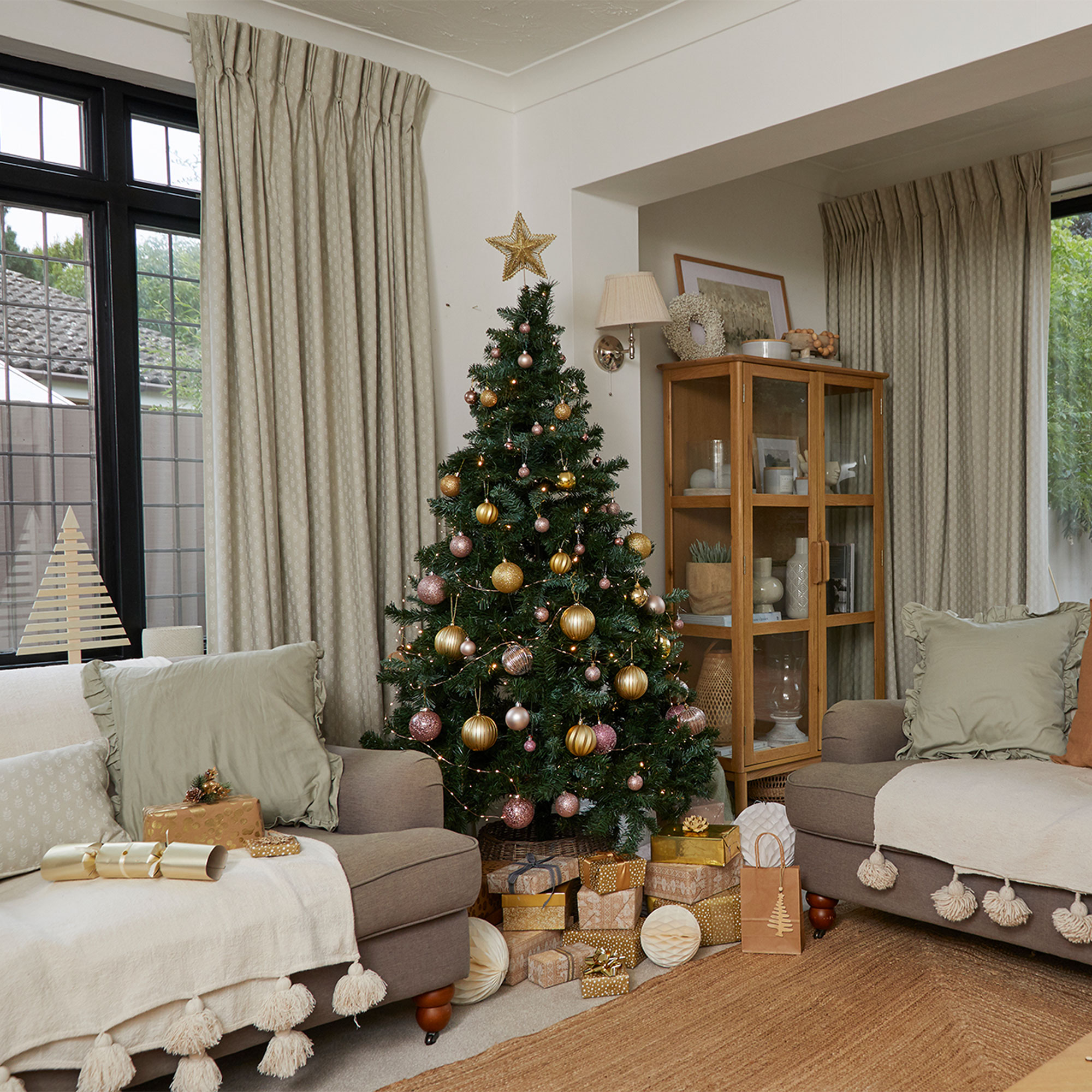
This elegant 1930s detached home in Cambridgeshire with its relaxed decor and considered styling is the perfect setting for festive family celebrations, but turn the clock back a couple of years and it was a different story.
‘The house was pretty ugly when we first moved in in 2022 and was completely rundown and unloved,’ says the home owner. ‘The previous elderly owner had neglected the place and every room was in need of an update. But we saw past that and knew that it had the potential to become a beautiful family home and, to be perfectly honest, we couldn’t have afforded a house this size that was already done up.’
Relaxed living room scheme
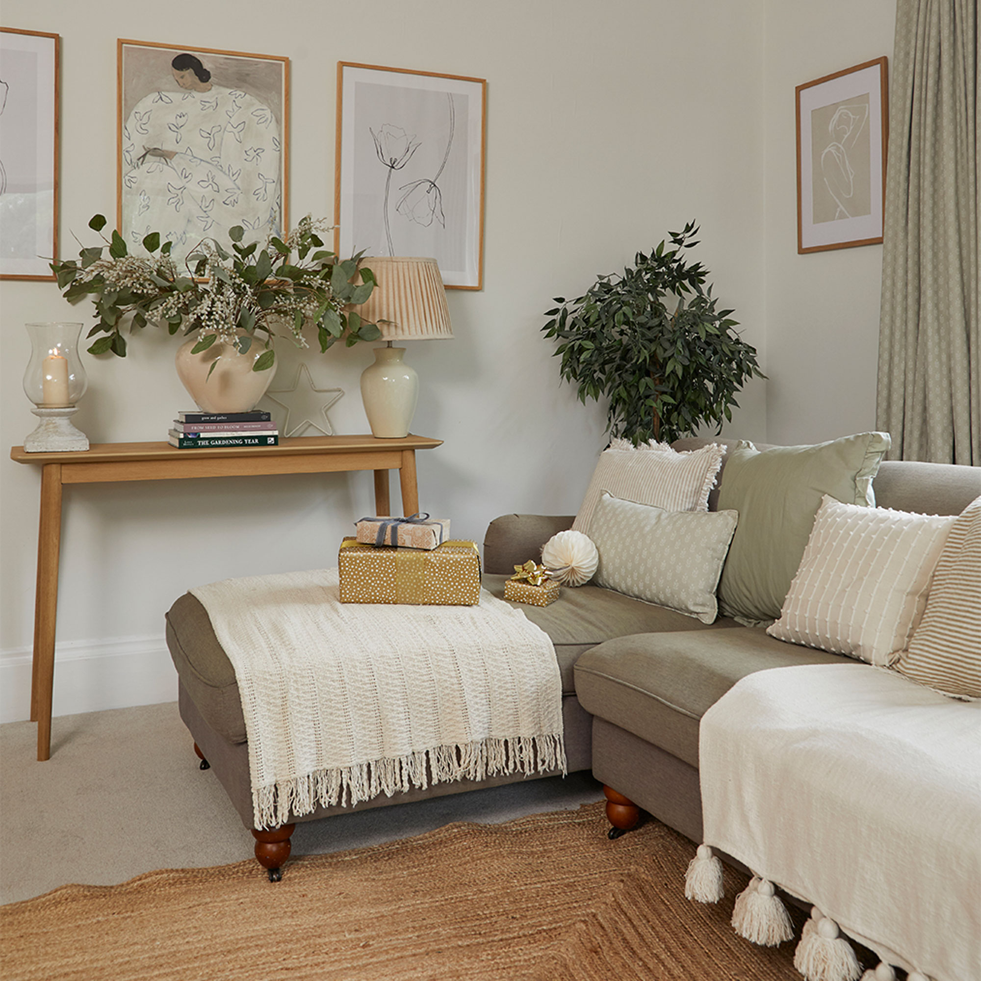
Part of the reason that the couple weren’t daunted by the massive undertaking is that they had already completed a renovation on their previous home, making it over completely and learning some serious DIY skills along the way.
‘Our other house wasn’t in as bad condition as this, but we did completely update every room, including replacing worktops, tiling, and installing a new bathroom. It meant we knew we could tackle most of the work here ourselves and create a beautiful forever home along the way.’
Easy fireplace update
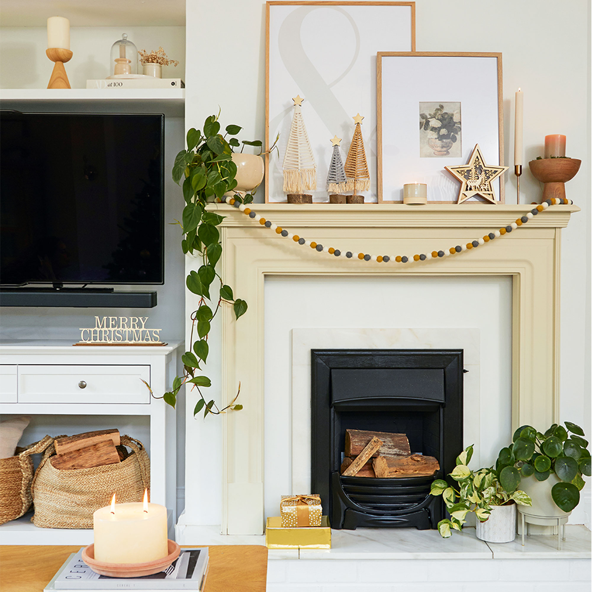
‘In the living room I gave the fireplace a stylish update by replacing the original ugly surround with a £10 bargain mantelpiece from Facebook Marketplace. I also painted the brass fire with heatproof black paint and gave the brick hearth a quick lick of white.’
‘The house really lends itself to Christmas and this year I added a bit of gentle colour, choosing soft pink decorations to complement the warm golds, both of which work well against a neutral scheme.’
Kitchen transformation
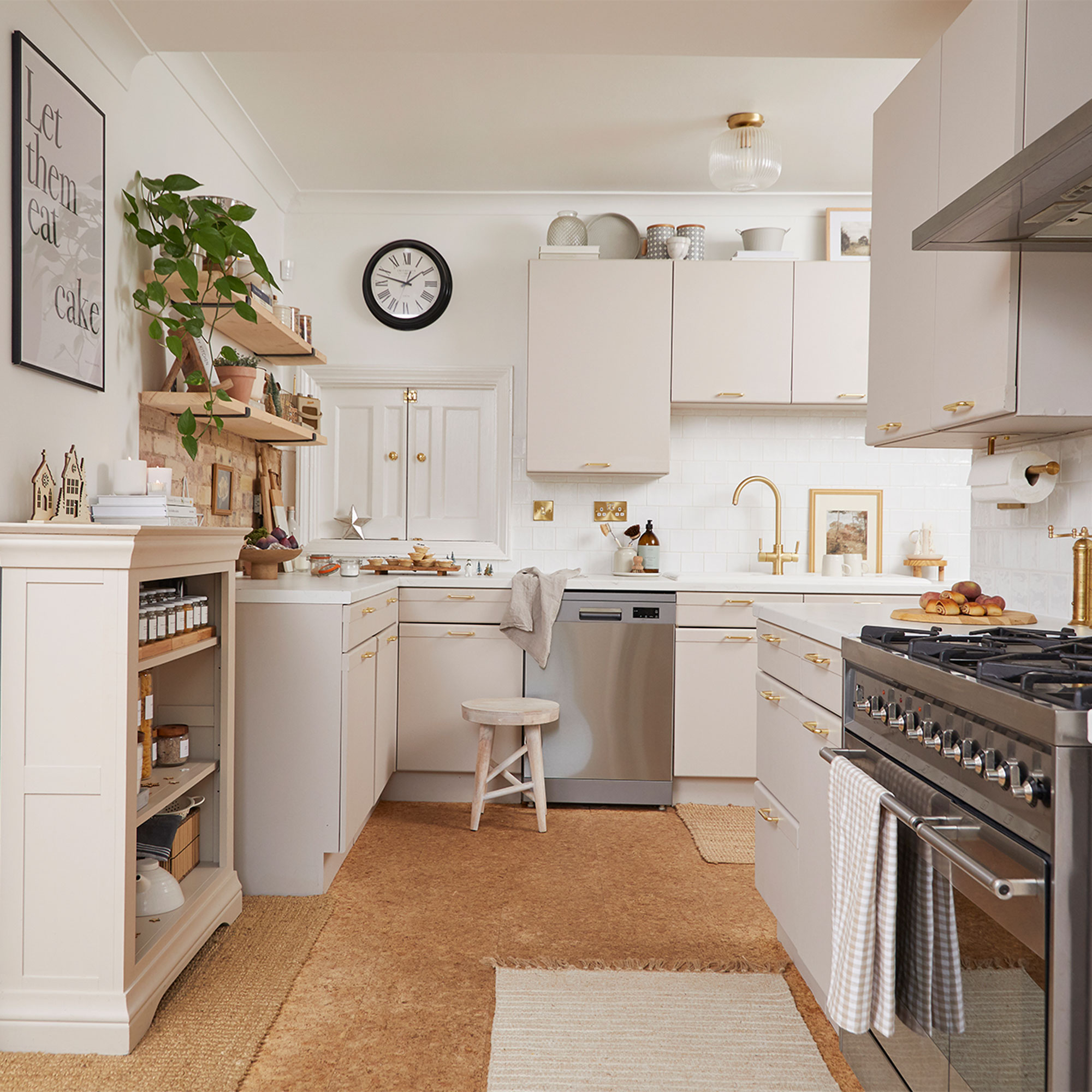
‘We started our reno with the kitchen, painting all the walls and the ceiling in cheap trade white paint, as that room had the worst nicotine stains. And although I would have loved to rip out the ugly blue cabinets and start from scratch, I know my dream kitchen will be a big project that needs careful consideration, and of course we need to save for it, so we decided to give the space a budget-friendly glow-up as a temporary fix.’
Rustic brickwork backdrop
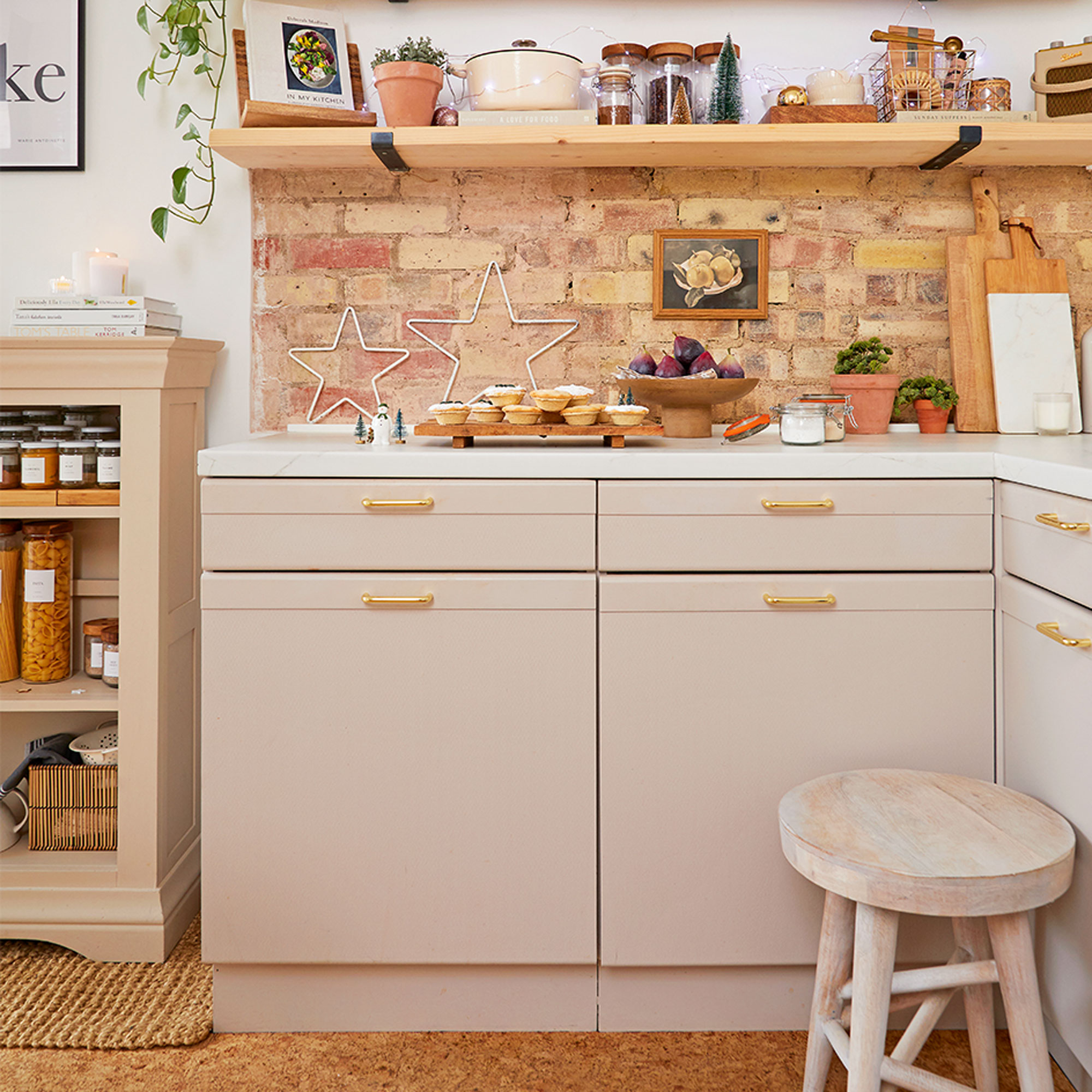
‘The exposed brick wall was a happy accident! The plaster fell off when we were attaching the scaffold shelf from Wickes, but after giving the bricks a good clean we decided to keep them as they add a rustic touch which buys into the cottage feel of our home.’
Practical kitchen paintwork
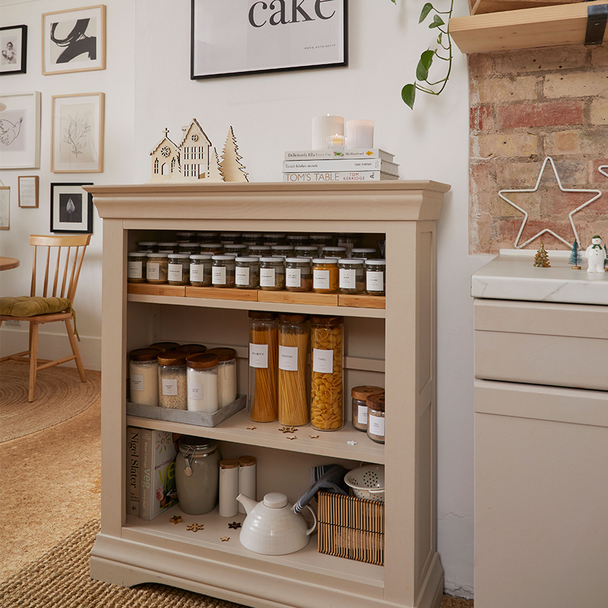
‘Having painted kitchen cabinets in our last home, we knew how effective the transformation could be so we gave the doors a good clean and sand, and then gave them a refresh with specialist kitchen paint.
‘We chose Frenchic’s Cool Beans to paint the cabinets. It’s a specialist paint designed for kitchens which is self priming and self sealing, so the makeover only took a couple of weekends. We also managed to keep the original cork floor which just needed a bit of TLC to make it look good again.’
Hanging storage rail
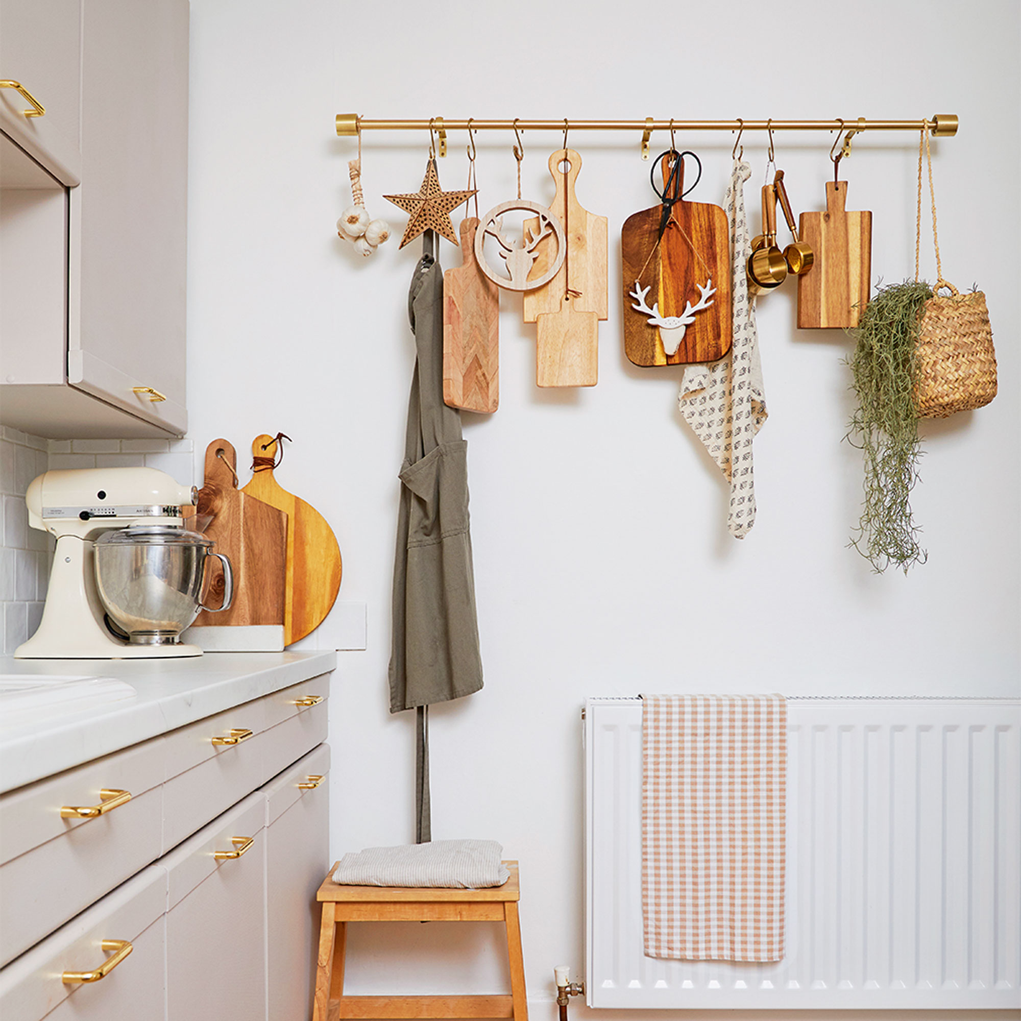
‘We also replaced the ugly brown worktops with a budget-friendly marble-effect laminate which was a real game changer as it completely elevated the look of the space. Choosing square white tiles with a rippled effect modernised the look and also made the transformation look more expensive than it really was.’
‘The long run of wall was a dead space so I attached a John Lewis curtain rail and use it to hang my collection of chopping boards and kitchen accessories. It makes brilliant extra kitchen storage.’
Cosy spot to sit
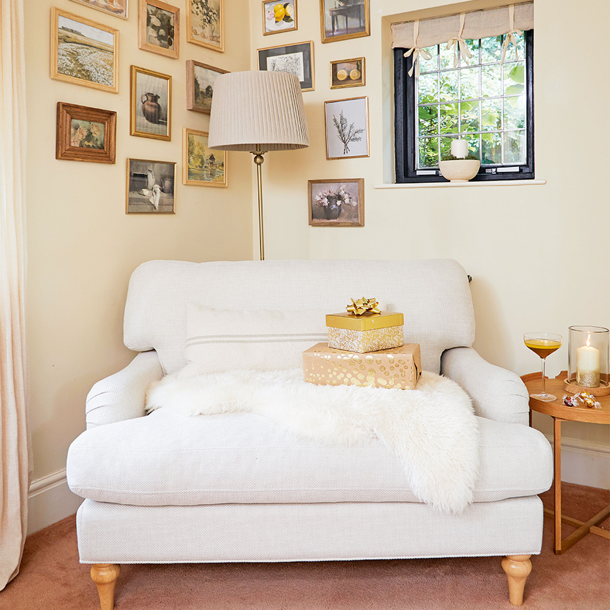
‘People often say it’s harder to add interest to a neutral home, but I don’t agree; I love creating a calm, relaxed look, and I’ve chosen soft beiges, caramels and white tones.’
‘Adding layers of natural texture using blankets, cushions and wooden accessories makes adding interest to the look easy, and being thoughtful about the window treatments always gives the rooms a finished look.’
Corner gallery wall
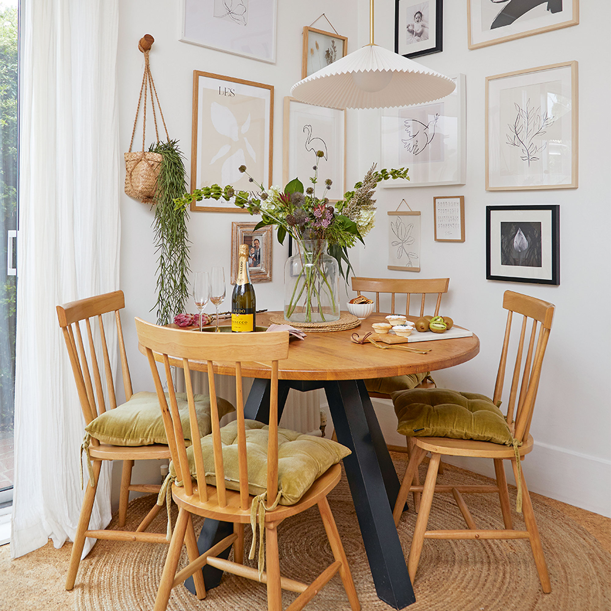
‘I hate spending money if I don’t need to and have lots of secondhand or upcycled pieces of furniture, but if we really want something we are equally happy to splurge.’
‘I wanted to modernise my gallery wall by wrapping it around the two joining walls of this room, and it gives a focus to the corner, the perfect home for our round table.’
Built-in bunk beds
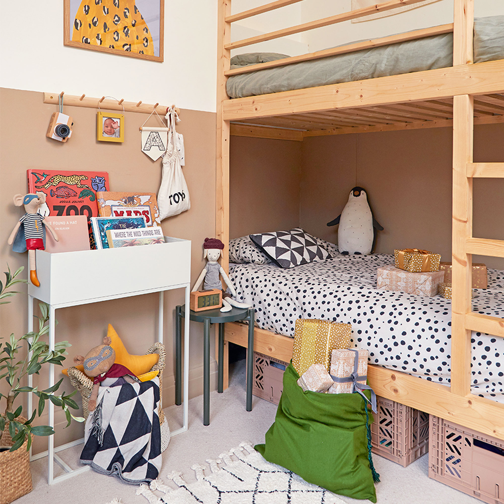
‘We tend to decorate one room at a time because it’s easier to contain the chaos – and since our son had been sleeping on a mattress on the floor for the first six months, we felt his boys bedroom needed to be the one of the first we tackled.’
‘I knew the alcove in his room would make the perfect spot for bunks but annoyingly it was slightly too narrow for a standard bed. Not one to be fazed, I decided we could make our own, so I drew out a design and my husband built a bespoke bed to fit perfectly.’
Painted wall feature
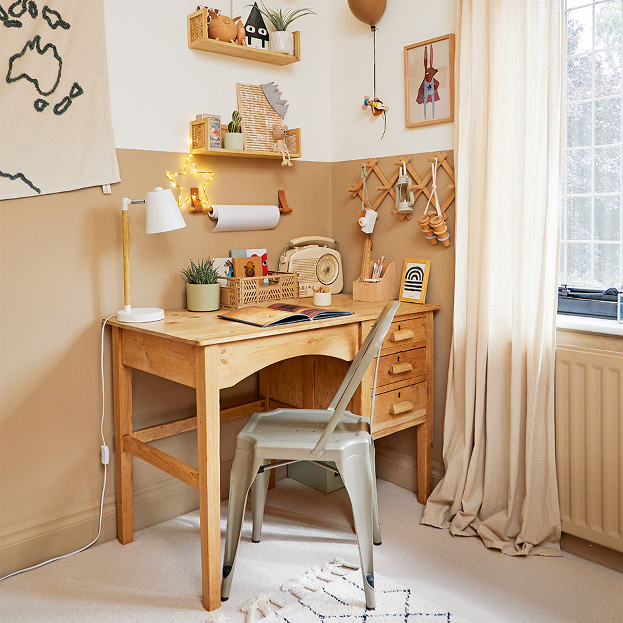
‘I’ve painted a colour-block wall before and loved the effect so thought I’d replicate the look in here as an easy way to add some pace and interest to the walls. I chose Lick Beige 2 to add some warmth to the room’
‘The desk was a Facebook Marketplace bargain and didn’t need any attention which was a real win after all the DIY and upcycling we’ve done in our home.’
Pretty girl's bedroom
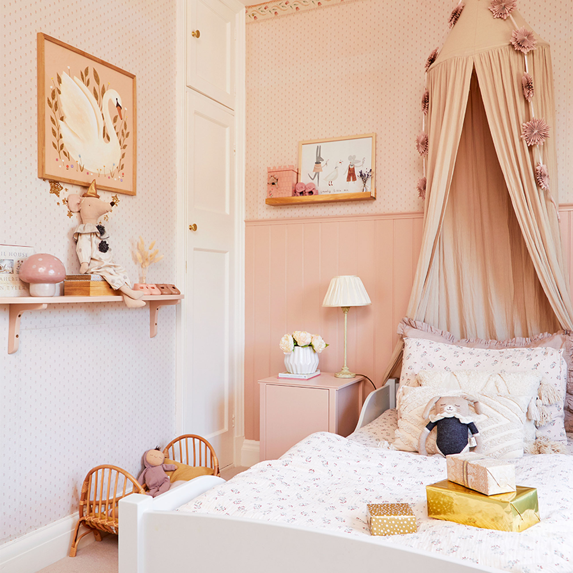
‘We both work so we have to manage all the DIY at the weekends between spending time with the children – which is why it felt like a win when our daughter’s bedroom turned out to be a quick fix.’
‘I was expecting to have to strip off the beautiful vintage Laura Ashley wallpaper as it was so stained, but I decided to try and save it and all it actually needed was a wash. There are still a few faded areas but nothing that spoils the effect and I’ve covered up the worst parts with pictures.’
Fun kids' storage
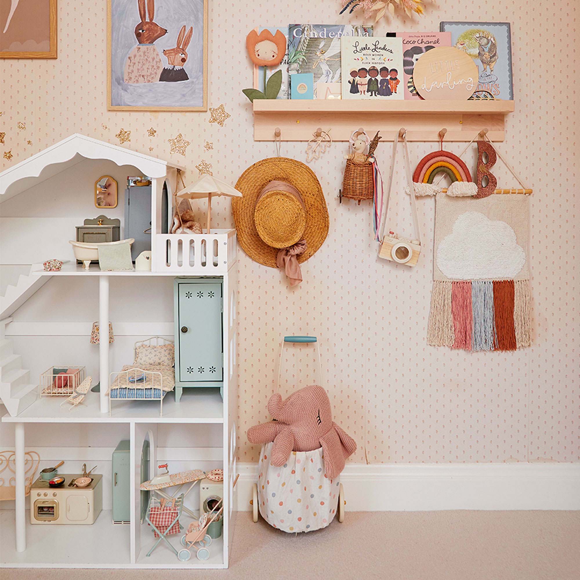
‘I sanded and then repainted the original fitted wardrobe in this room as it’s useful storage and injects some original charm to the space. ’
‘There are so many beautiful toys and accessories available nowadays that it makes it fun to create the children’s rooms and I love faffing with them.’
Calm bedroom scheme
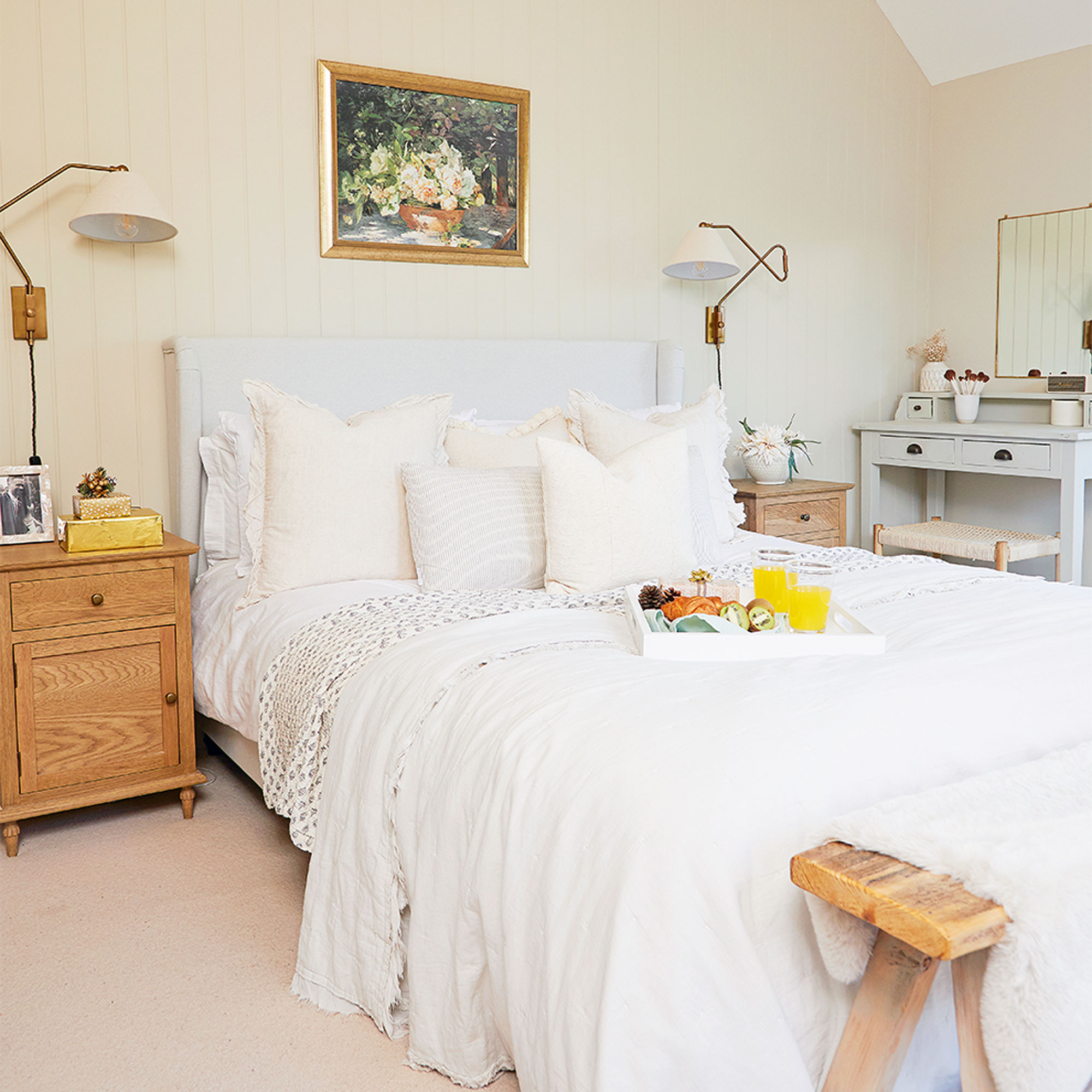
‘Our bedroom was a bigger job than we initially expected as there was a damp problem so we had to remove the plaster back to brick and the whole room was re-plastered. I painted the walls in Lick’s Beige 3 emulsion and we also updated the look of the sliding doors and windows by painting them black.’
Stylish dressing area
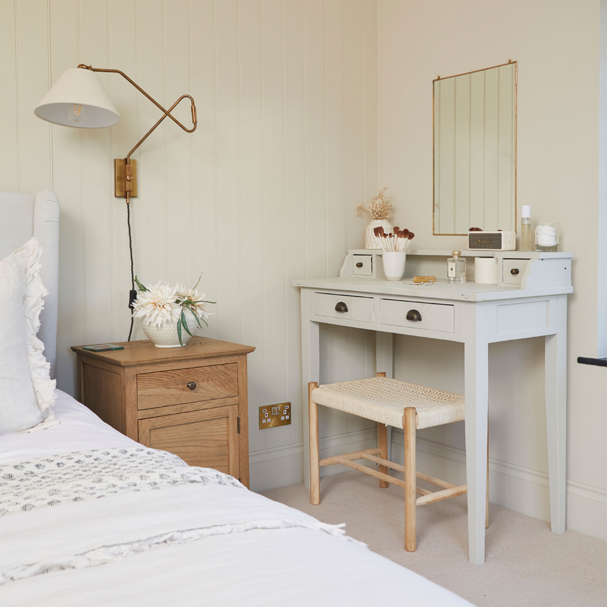
‘However, the room didn’t quite feel finished so I thought floor-to-ceiling panelling would add the interest the room needed. My husband wasn’t initially keen, as sourcing single lengths of wood that long is tricky, and it was hard to cut because of the sloping ceiling. But even though it wasn’t easy, the finish looks so effective that I stand by the decision to do it and as soon as it was on the wall he loved it too thankfully!’
‘The dressing table was from Next but I pointed it in Lick Greige 2 to complement the rest of the room’
Spacious dining room
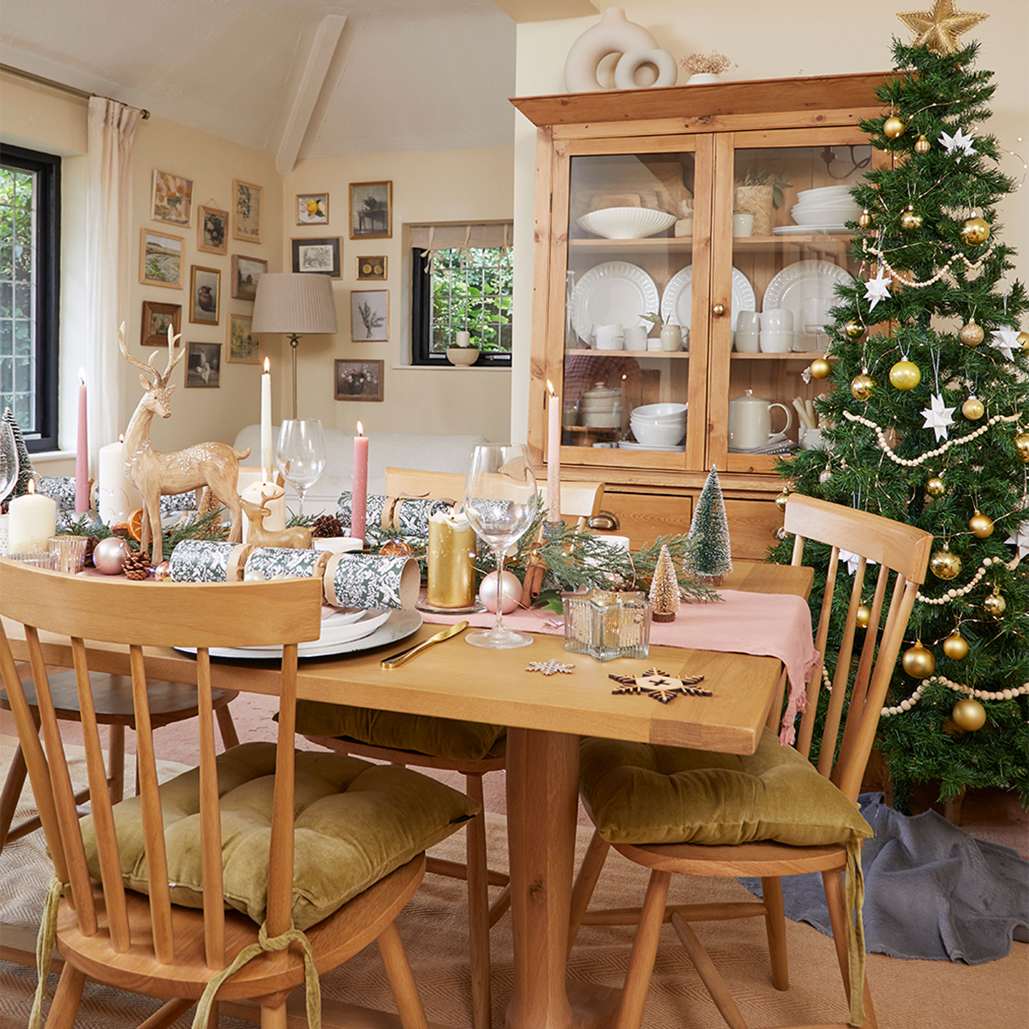
‘The dedicated dining room comes into its own at Christmas. Last year we had 12 adults and four children on the day so it’s fun to be able to go all out with decorations.’
‘This house really was in such a state of disrepair when we first moved in that at moments I have seriously questioned our decision to buy it, but looking at what we’ve achieved so far (and by ourselves), it’s unrecognizable. It’s slowly but surely becoming the beautiful family home we always knew it could be!’


