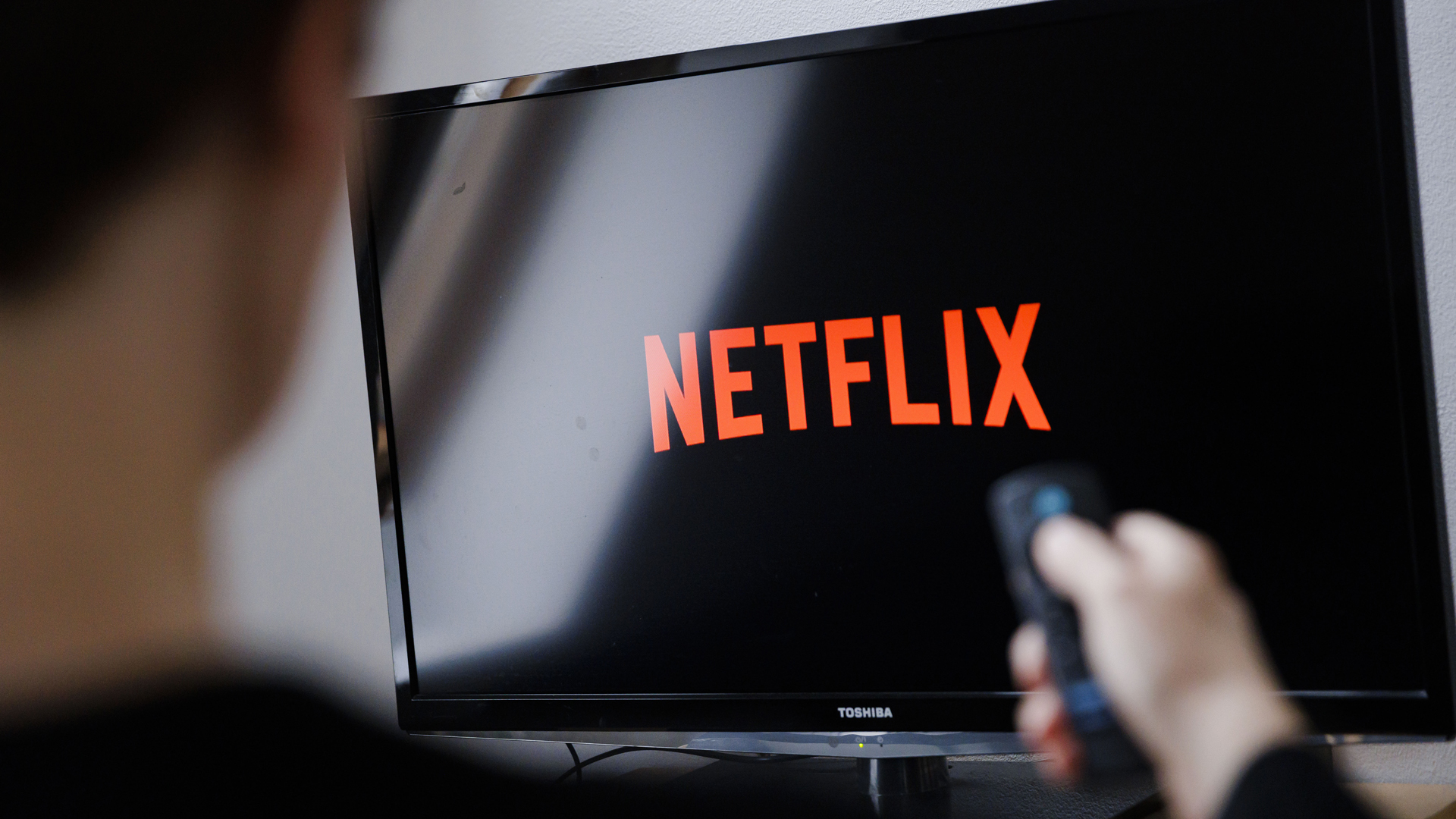
Netflix is trialling a new simplified homepage that replaces those static rows of movie and TV show tiles with boxes that extend as soon as your remote lands on them. These have all the information you need to hand including synopsis, age rating and runtime – you know, all the important stuff.
This is great news for all of us who land on a movie that looks good, then realise we don’t have two hours to watch it and would have preferred a 90 minute title instead. Or the disappointment we feel hovering over a series and seeing there’s 10 seasons, when a mini-series would have been far better. After all, you can’t binge watch 200 episodes unless you’re able to freeze time.
Netflix has acknowledged that we’ve grown tired of the constant clicking around and scrolling, which is why it’s testing a newly designed homepage.
No more doom scrolling, hopefully
Netflix plays a key role in our relaxed evenings at home. You’re comfy on the couch, you’ve got a takeaway, you’re ready to watch something good on the best streaming service but therein lies the problem, as many of us admit to taking way too much time scrolling through everything, wasting precious viewing time. I know I’m not the only one who gets tired of constant scrolling, which is why Netflix’s simple redesign could really help impatient viewers like me find exactly what I’m looking for.
Speaking to The Verge, Pat Flemming, Netflix’s senior director of product said: “We often see members doing gymnastics with their eyes as they’re scanning the home experience. We really wanted members to have an easier time figuring out if a title is right for them.”
The refresh also gets rid of the menu that pops out from the left side of Netflix’s homepage, replacing it with streamlined options at the top of your screen, including search, home, shows, movies, and My Netflix.
This all sounds very positive but right now it’s still only available to a small number of consumers using the best TVs and other streaming devices. However, if it is well received, Flemming added that it could expand to more members.
“If this goes well, which we are enthusiastic and hope that it will, then we would love to share this with most of the member base in the coming months and quarters,” he said.
You might also like
- Netflix is leaving your older Apple TV
- Netflix has a plan to fix its Meta Quest 3 app… abandon it and use the browser
- Netflix being weird? It could be your VPN
Want a TV upgrade? Our top 3 picks for all budgets

The best-value elite TV on the planet is the S90C OLED TV: its pictures are stunning, it's got every key gaming feature, it's got all the streaming smarts, its sound is good, and it looks gorgeous. Here's our full Samsung S90C review.

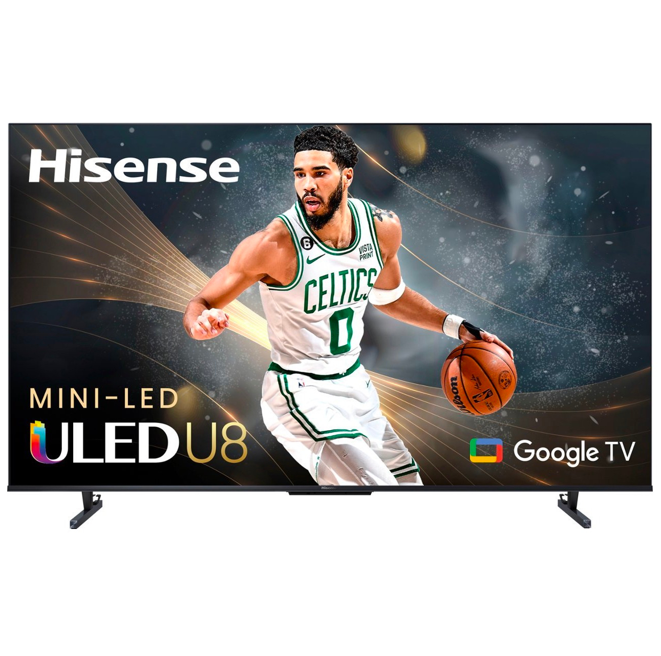
Premium pictures for a much lower price tag. The Hisense U8K is bright enough to be ideal for sport, has great contrast for movies, as future-proofed for gaming, and is unbeatable value. Read our full Hisense U8K review.

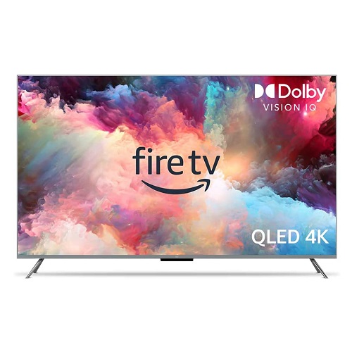
Get this on one of its regular sales and its a steal. Excellent detail comes with rich, accurate colors, and an easy-to-use smart platform. It's even good for gaming. See our full Amazon Fire TV Omni QLED review.


