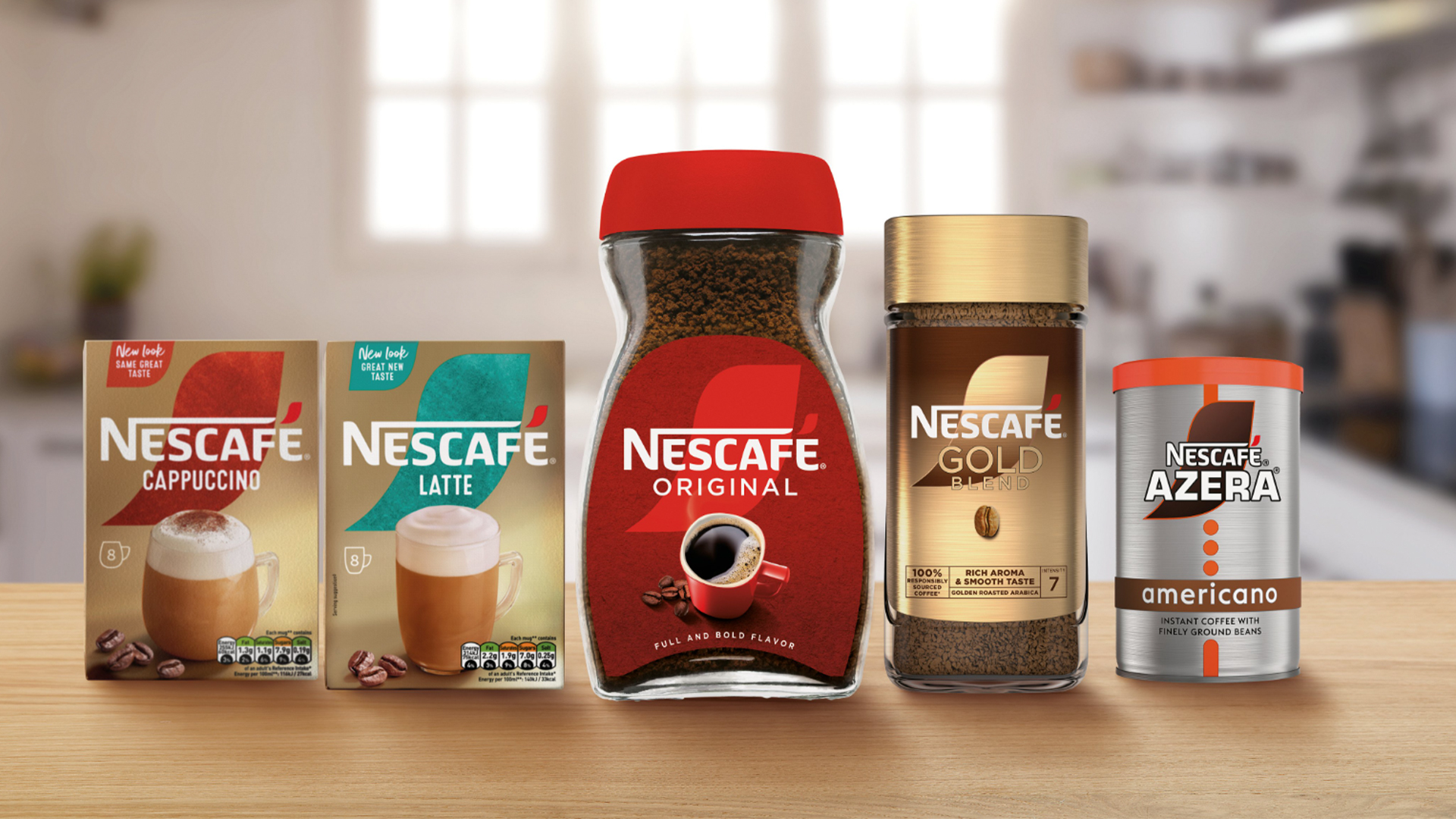
Nescafé has unveiled what it claims is a "major rebrand" but with the only released image showing minor design tweaks, I hold my reservations. With its timeless yet conventional design contending in a climate where coffee packaging is trendier than ever, can a major brand like Nescafé keep up with the competition, and is its caffeinated heritage enough to keep it afloat?
While we've seen our fair share of the best (and worst) rebrands in the past year, Nescafé's new look feels somewhat understated compared to the latest trends in coffee packaging design. With smaller brands opting for a more bespoke, illustrative approach, is Nescafé's brand constrained by its instant appeal?
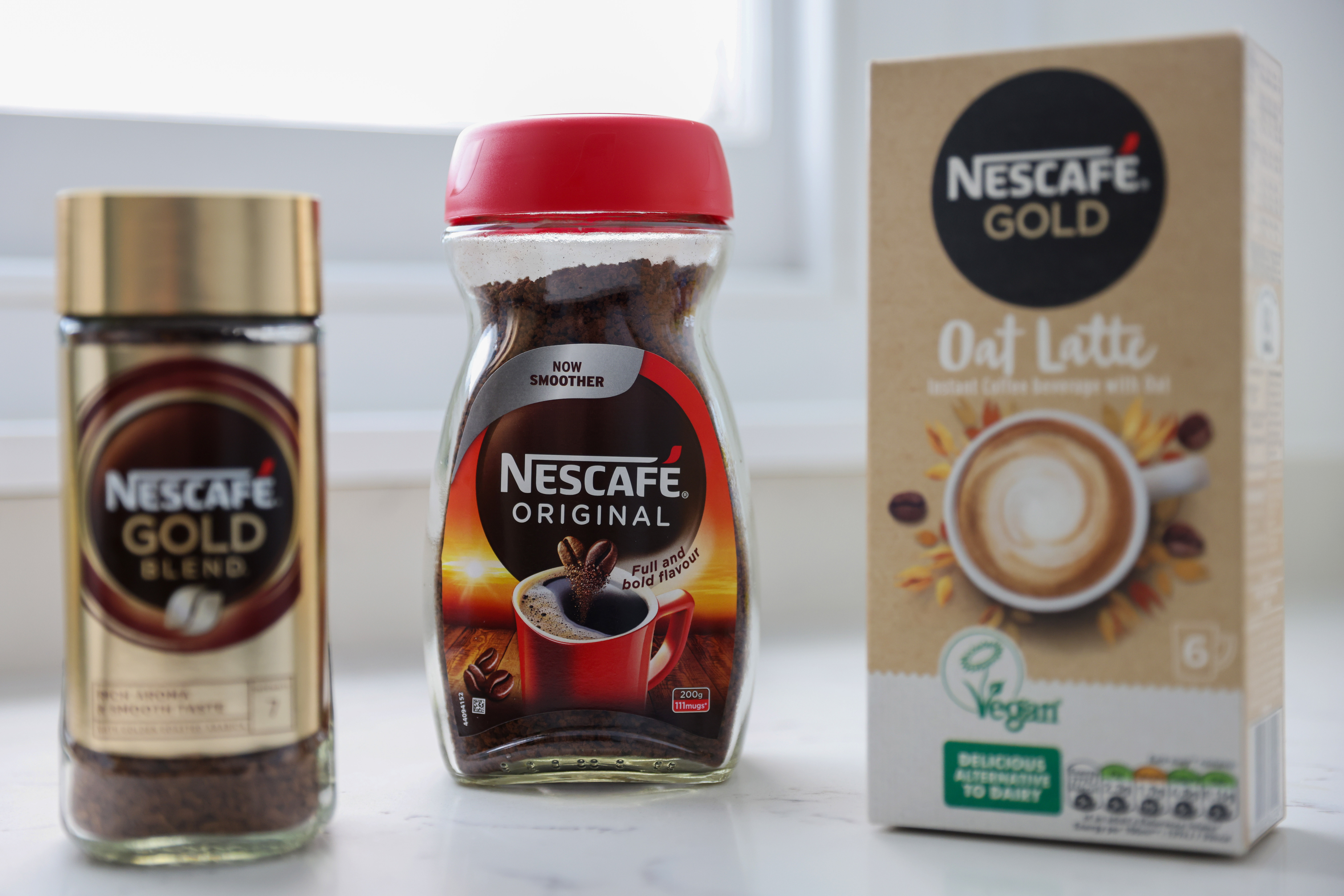
The focal point of Nescafé's new look is a fresh design motif which places the accent of the 'é' behind the logo. The rebrand also features more frequent coffee bean imagery, taking a more literal approach to product packaging. While the logo font (which looks like a blend of Friz Quadrata Bold and Angie Black) has remained unchanged, the bolder visuals feel tastefully refreshed without detracting from Nescafé's safe, reliable brand identity.
However, in a recent press release, Nescafé claims that the rebrand aims to "evolve and stay ahead in the ever-changing coffee industry," – a statement that feels a little bold given the current coffee branding trends. As we've seen in recent times, the coffee industry has taken a much more independent turn, and as a result, packaging design has taken a contemporary and stylised turn that focuses on niche flavour profiles and exclusive creative packaging.
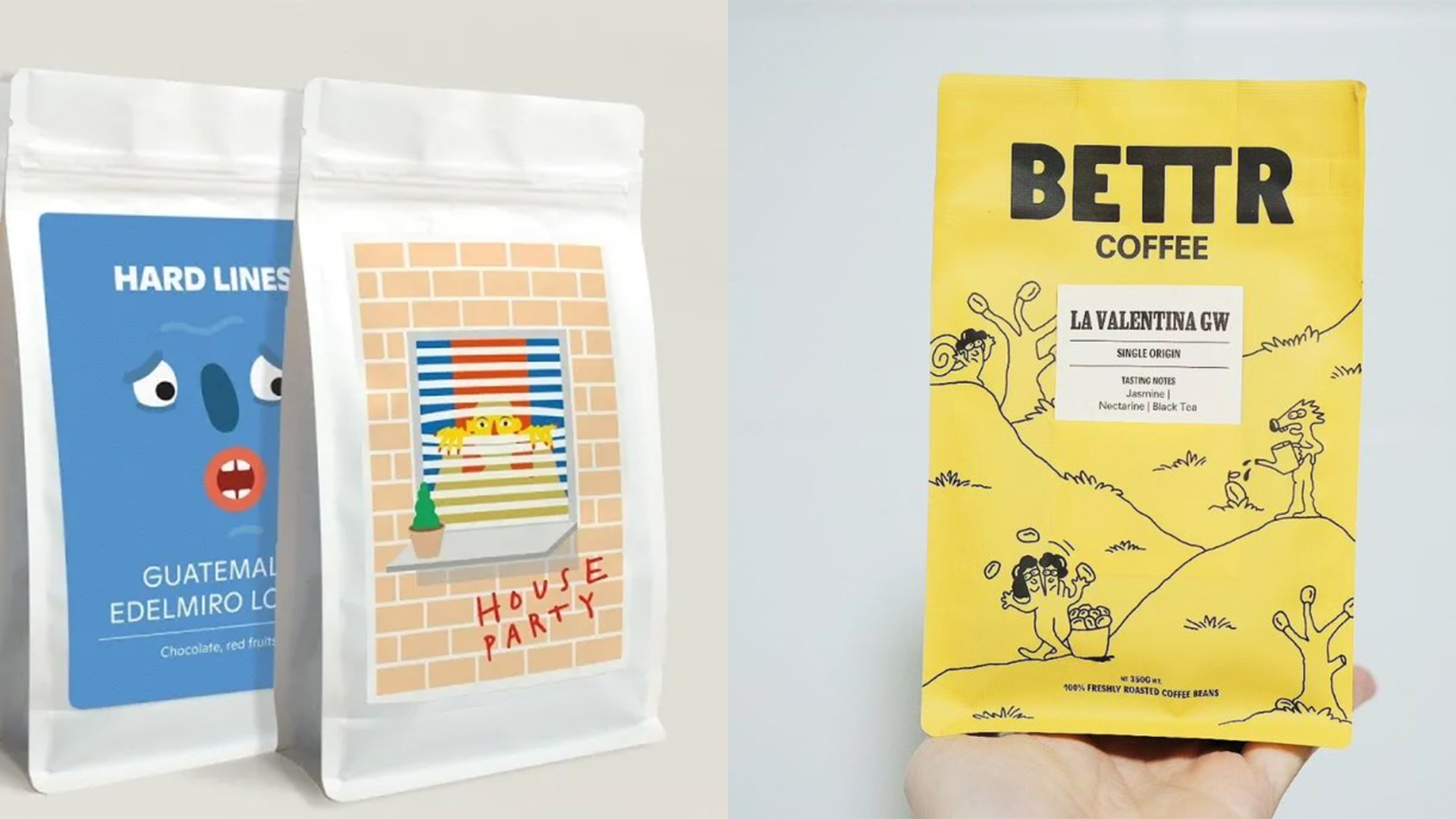
As we can see with contemporary coffee brands such as Bettr and Hard Lines, the packaging speaks for the product, instantly communicating that the brand is modern and playful through the illustrated packaging. Even with more simply designed popular brands such as Grind, the plain baby pink packaging gestures to a timeless modern design that's adaptable to its range of products and design collaborations.
Maybe it's the way that we consume coffee that makes Nescafé feel like an afterthought designated for hotel rooms. With coffee bags, biodegradable pods, Aeropresses and moka pots changing the way that we consume our coffee, perhaps Nescafé's biggest flaw is the lack of personability – a touch of handcrafted prestige that is lost in instant coffee's function and packaging design.
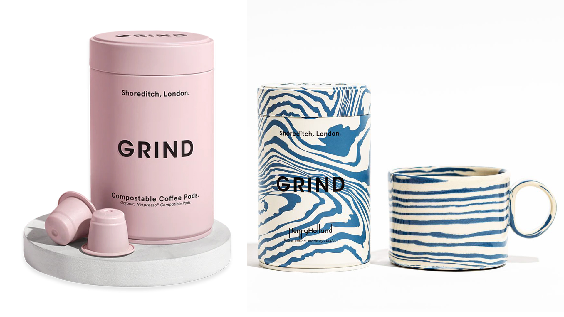
While Nescafé's rebrand attests to its timeless reliability, the design feels sterile and impassioned against emerging coffee brands. Until we see the brand move away from the safety of its conventional appeal, it will be tough to keep up with the design competition of its fresh competitors.
For more design inspiration take a look at the stylish functional design of this humble tin of fish. If you're after some creative tips, take a look at our day in the life of a product designer at Figma.

