It was the classic 1970s-style Dallas ranch. Single story, with a split-level, sunken living room and a challenging and sprawling floorplan, the house design and original footprint lent itself to a much more inspiring reinterpretation. The homeowners, originally from Mexico, had spent many years in Brazil and were looking to inject their new US home with some of the warmth and richness they'd loved in South America.
Interior designer Joshua Rice was entrusted with transforming the home, opening it up, bringing in the light, and creating the perfect backdrop for their vibrant artworks and modernist furniture and furnishings. He shows us round, picking out some of the highlights below .
'The clients wanted a home with generous space and lots of light similar to modern structures in Brazil,' says interior designer Joshua Rice. 'Even though the original house they first saw pre-renovation was much more closed in, they could see the potential it had due to its sprawling, single-story layout which wrapped along a creek; something very unusual for Dallas.'
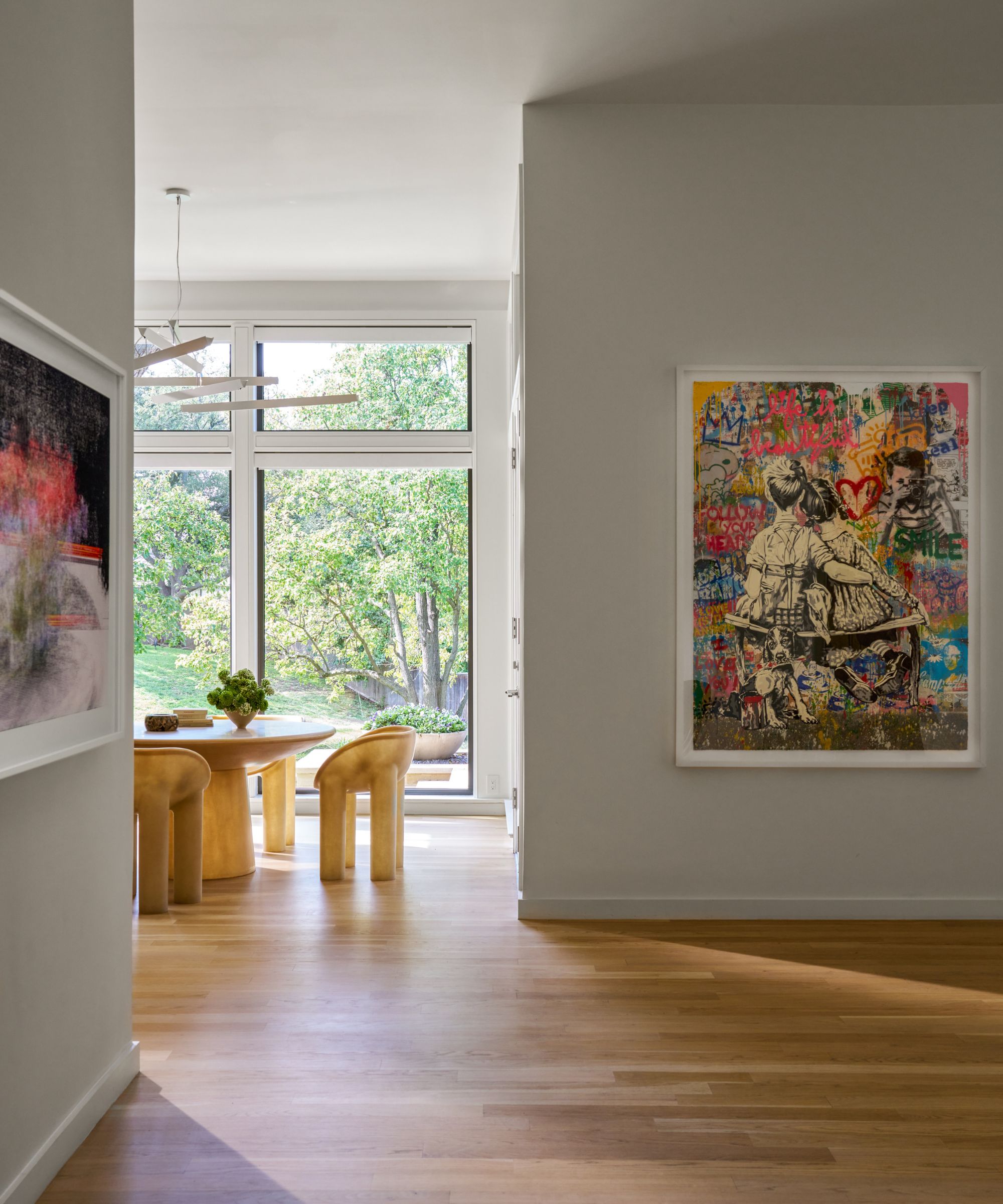
Entryway ideas are light and spacious, and with a view to the kitchen beyond there's a sense of connection with the rest of the home from the get-go. Displayed on neutral walls, the artworks by Pago Mann (left) and Mr Brainwash inject welcome color and a sense of fun.
'The floorplan of the original house was not well organized; there just seemed to be one room after another and you could literally get lost,' recalls designer Joshua. 'By strategically removing a few walls, we were able to make a 150-ft long visual connection, almost from one end of the house to the other. This way, whenever you come out of a secondary room, you understand exactly where you are in the house.'
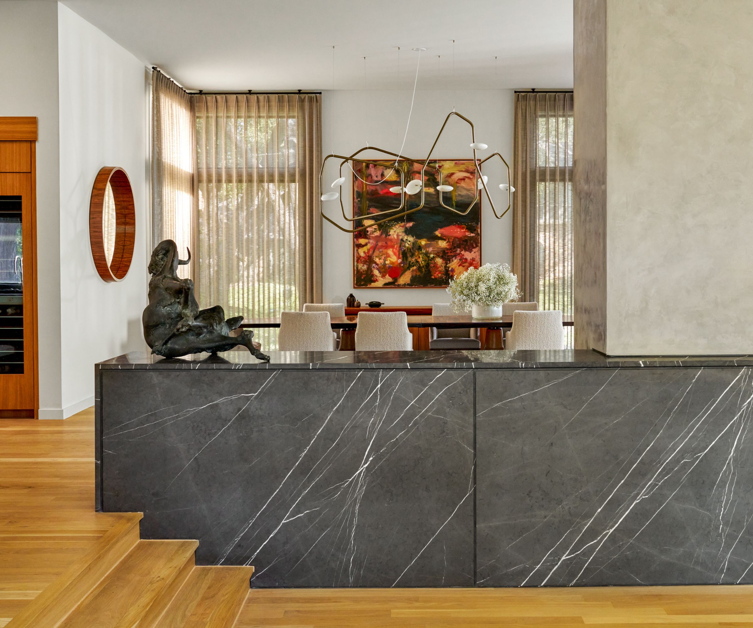
The designer talks about the layout mistakes of the original home as though they were of little consequence but actually the beautiful simplicity of his solutions belies the magnitude of the original problems. This stone half-height wall being a case in point.
'Part of the long series of spaces were the two living rooms. Originally, a zig-zag of 3-steps was between them; but their location made them a dangerous fall hazard. We needed to physically separate the lower from the upper while keeping them connected spatially,' Joshua explains. 'The idea of a simple stone box quickly came to mind, but the material and detailing would be critical with such a plain form. So the tops waterfall down to become the ends while the faces have reveals to articulate the thickness of the material and the size of the slabs. The Pietra Grey stone itself does the "work" of being beautiful.
'The elegance of their detailing combined with their deft ability to both separate and connect the two living rooms really makes the overall space work correctly. A complete improvement over the original architecture of the house.'
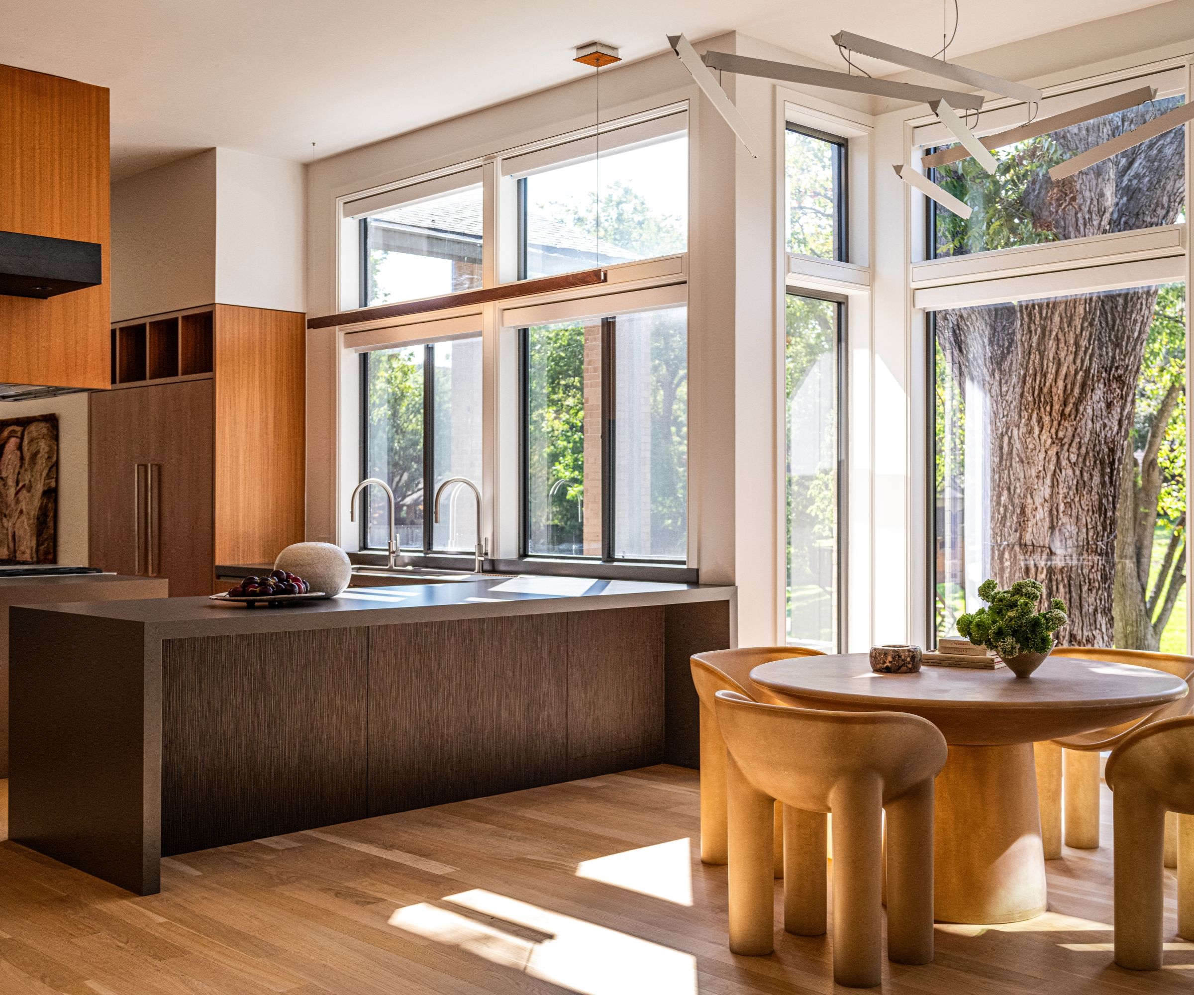
Natural materials and colors were key in this renovation. Eat-in kitchen ideas consist of Faye Toogood's Roly Poly round table and dining chairs, which soften the hard edges of the main kitchen.
Kitchen ideas include concrete engineered quartz countertops by Santamargherita on cabinetry in teak with bronze accent panels by Forms & Surfaces, all of which give the space warmth, and a touch of midcentury modern style.
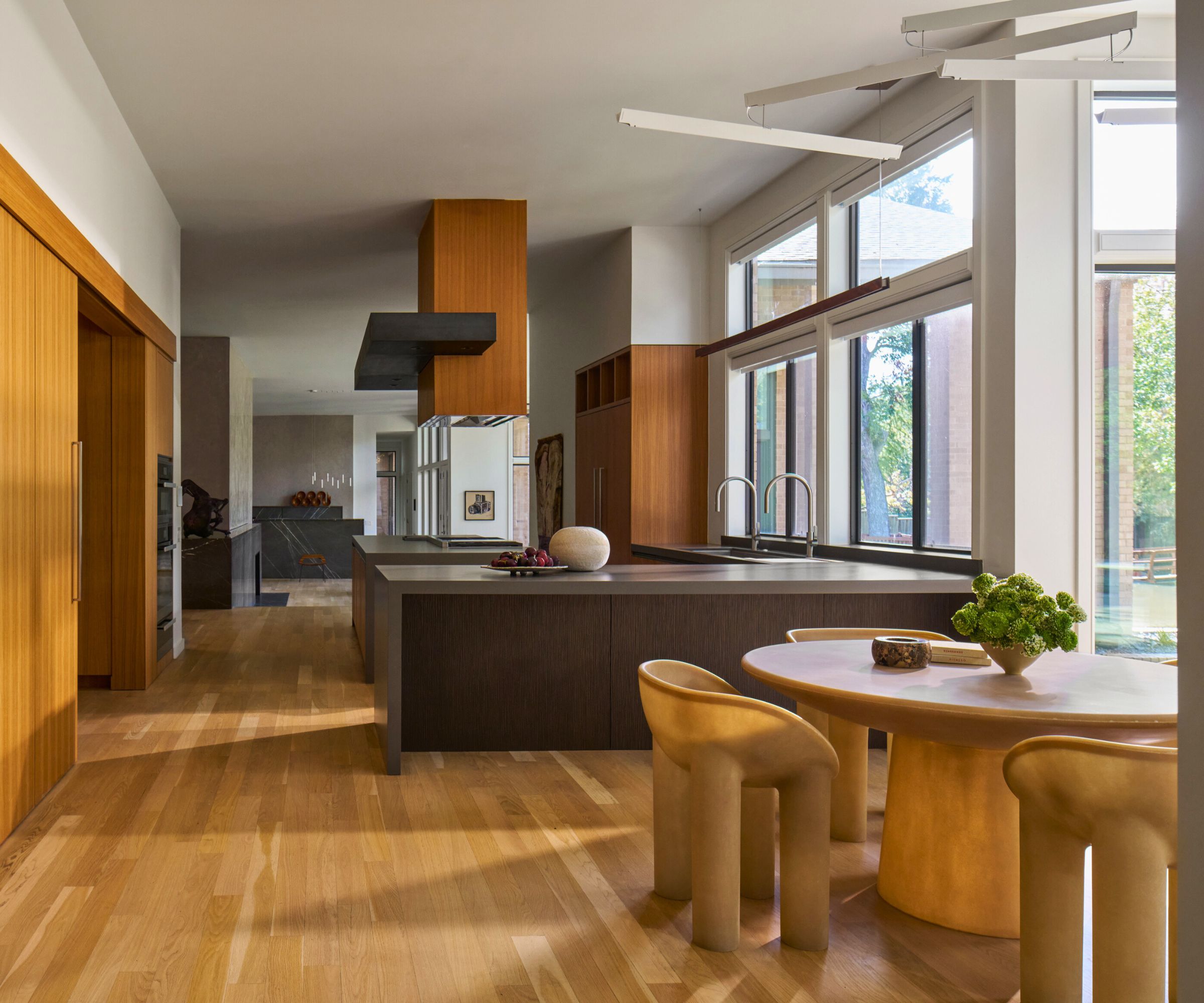
Anyone looking for practical kitchen flooring ideas to continue through an open floorplan should consider this hardwearing and beautiful white oak flooring which flows through the main rooms. The custom vent hood combines the teak finishes with blackened steel for true modernist appeal.
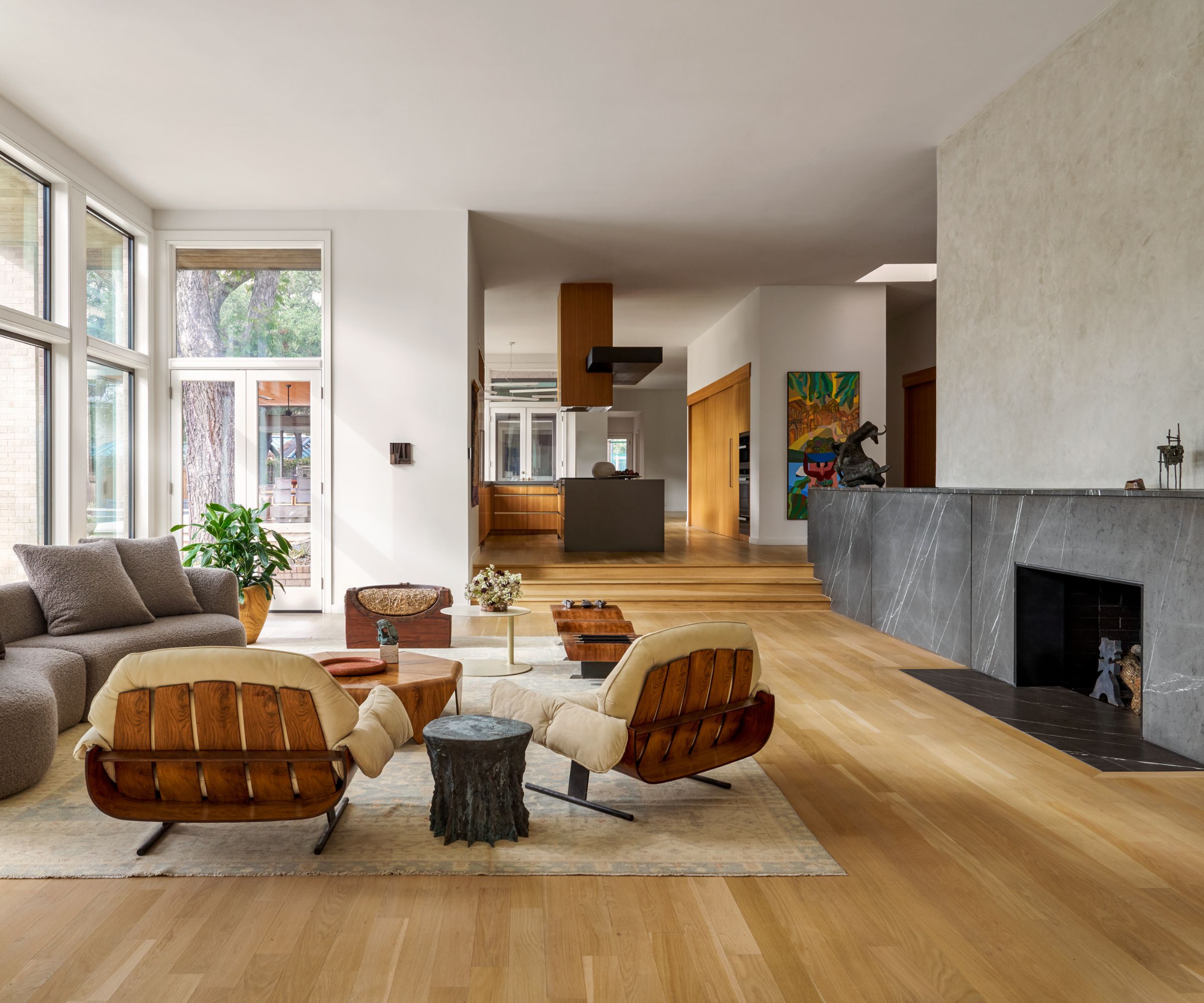
Living room ideas include some very fine and rare vintage pieces that are perfectly in tune with the midcentury and modernist Brazilian aesthetic the owners wanted to create. Two iconic Presidential armchairs, a 1959 design in hardwood and leather by Jorge Zalszupin's L'Atelier Brazil, are the scene stealers here, along with the vintage Oushak rug and cast bronze table by Jojo Corväiá.
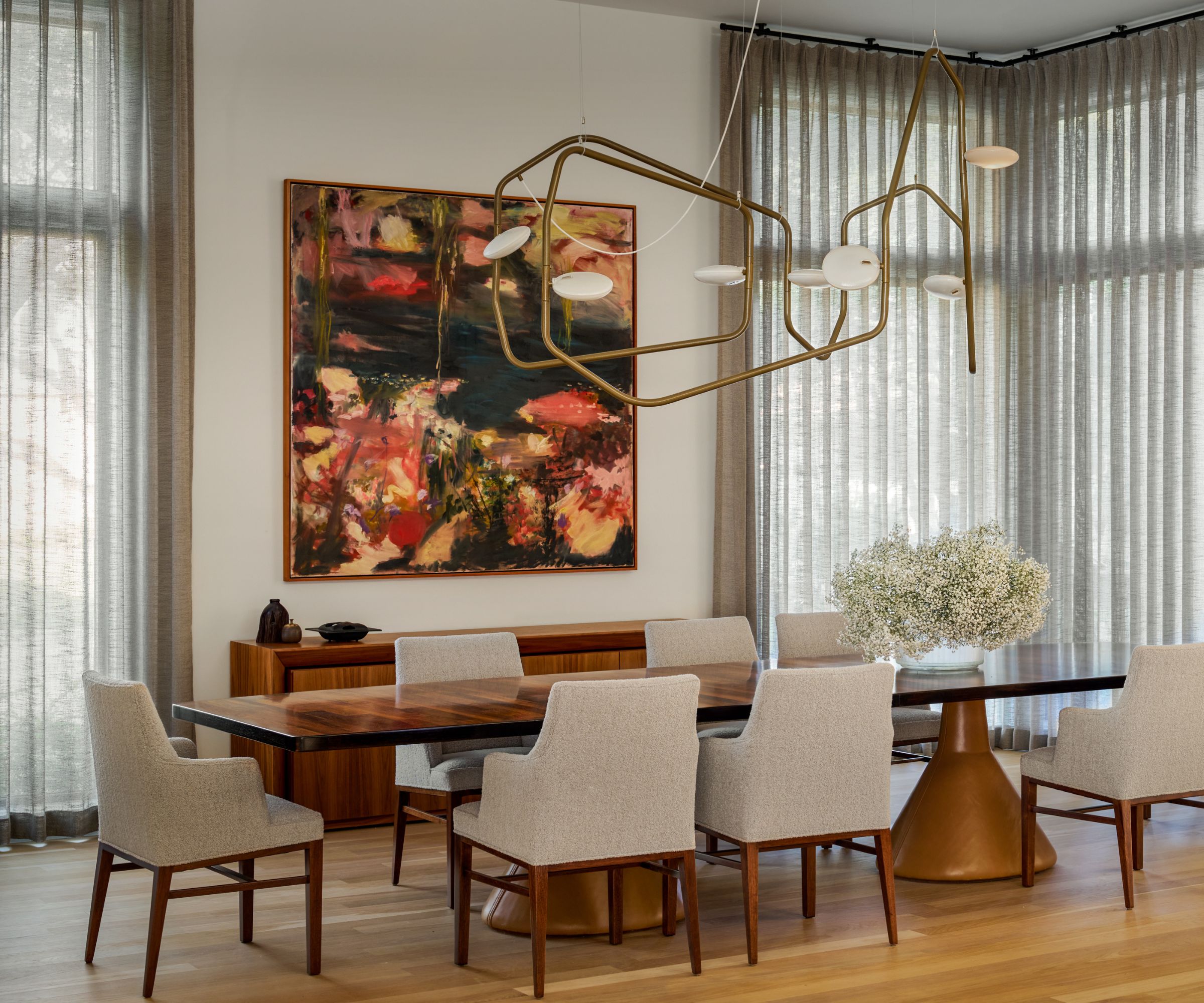
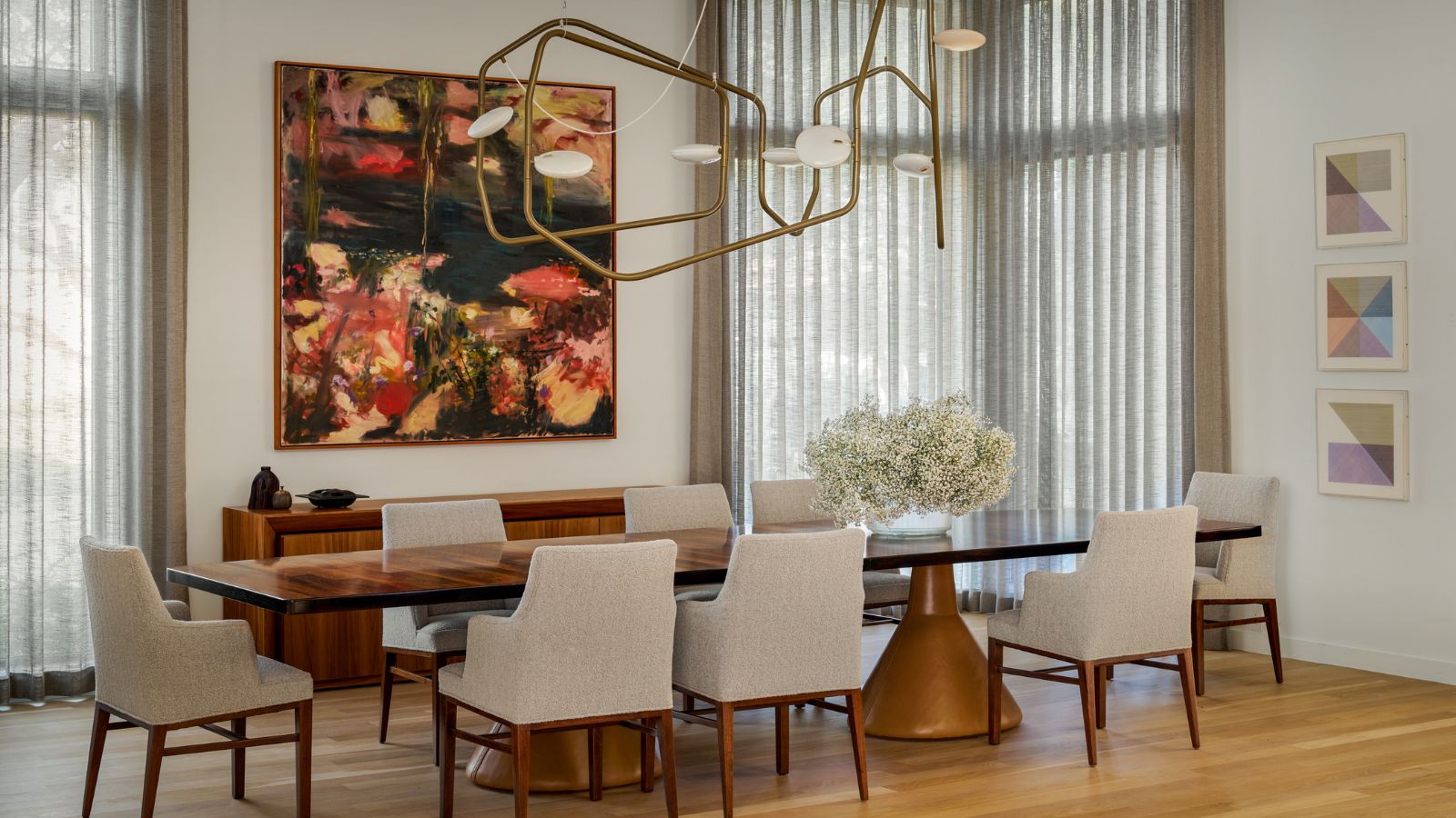
Dining room ideas are about creating an intimate space for entertaining at the heart of a very open setting. Drawing it all together is another vintage Brazilian masterpiece by Jorge Zalszupin, the 1959 Guanabara rosewood table. Above it is the Palindrome light by RBW.
Fiona Weedon's Tears and Flowers 1993 oil on canvas adorns the Venetian plaster walls, while the drapery in an open weave linen allows light to softly filter in.
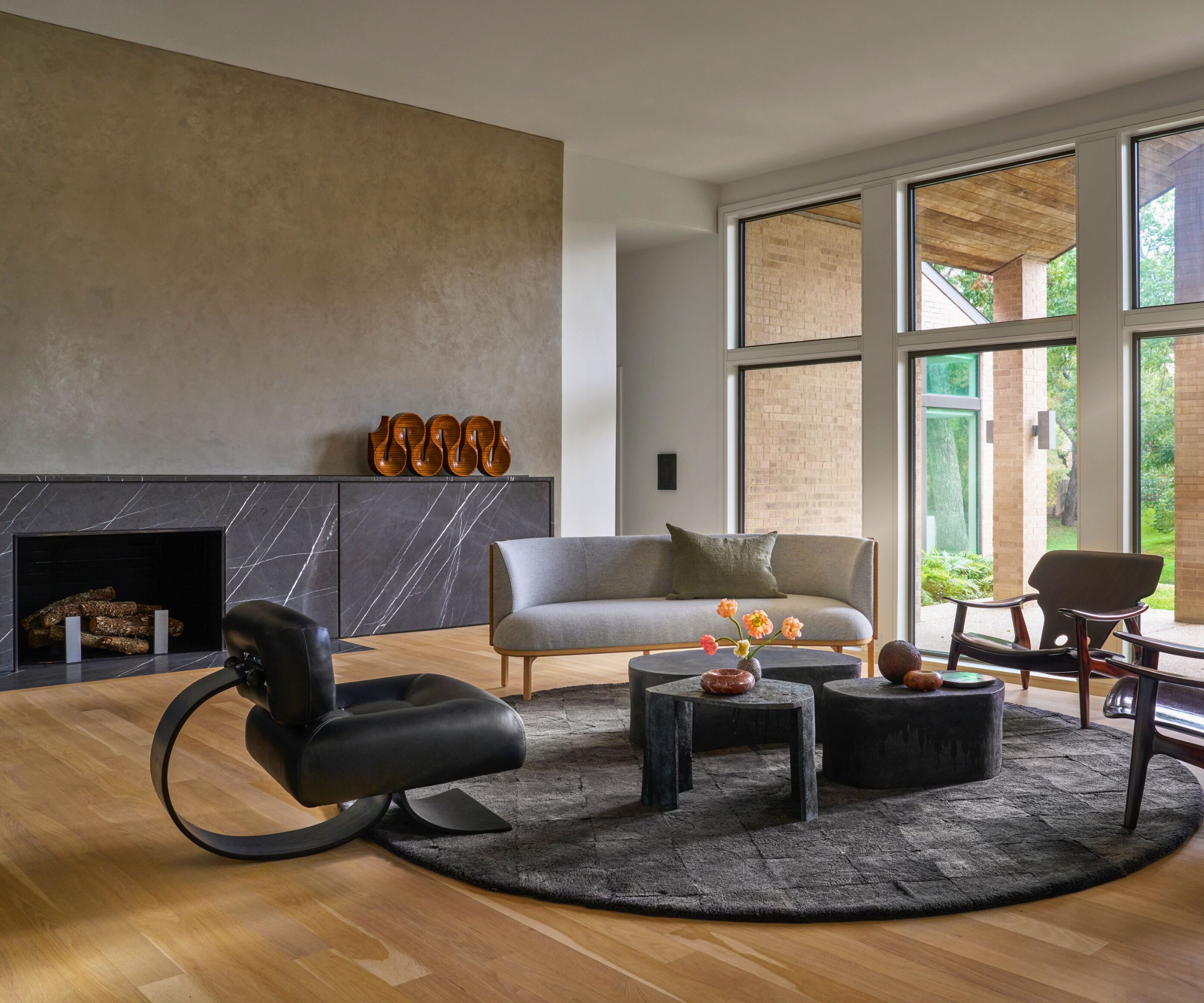
Family living room ideas in the upper living room focus around the Pietra gray stone fireplace which itself is a continuation of the 'boxes', described above, that mark the change in levels.
We see the same white oak floors, and Venetian plaster walls as in the other living room and dining room but here a Sideways sofa by Rikke Frost for Carl Hansen, a vintage Alta lounge chair by Oscar Niemeyer, and a two vintage 'Diz' chairs by Sergio Rodriguez are the key pieces.
Three more cast bronze and ceramic tables by Jojo Corväiá are grouped in the center of the round rug. On the mantel is a rare Brazilian sculpture, the Movimento by Joaquim Tenreiro, dating from around 1950.
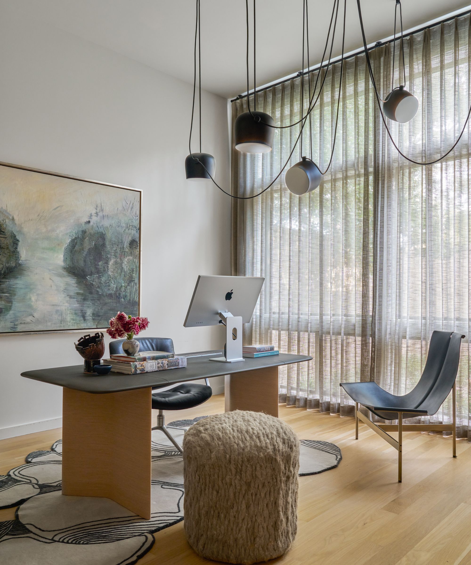
Because every good home office deserves a 9-5 take on a chandelier, the Aim lamps by Ronan and Erwan Bouroullec for Flos are the perfect solution: glamour with an urban edge.
Flying the flag for midcentury modern are two vintage classics, the Preben Fabricius and Jørgen Kastholm model swivel chair and bronze TG-15 lounge chair by Katavolos, Littell and Kelley, both sourced from Sputnik Modern. The desk is from Poltrona Frau. The striking rug is by Atelier Agahzadeh and the Linen pouf is by Pauline Esparon.
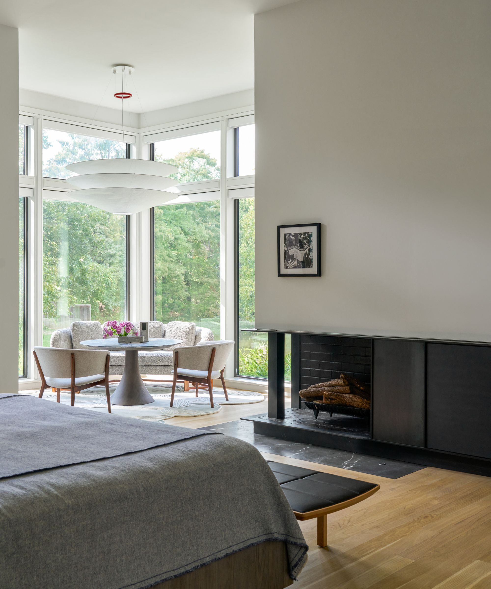
Bedroom ideas do a brilliant job of emphasizing the sense of space in the main bedroom. A bright window alcove accommodates a table and chairs, while into the cozy heart of the room, a blackened steel fireplace creates ambiance. The striking Floatation lamp is by Ingo Maurer. The vintage sofa and lounge chairs were sourced through Sputnik Modern, Coccoloba rug by Atelier Agahzadeh, Buni chat table by Jader Almeida.
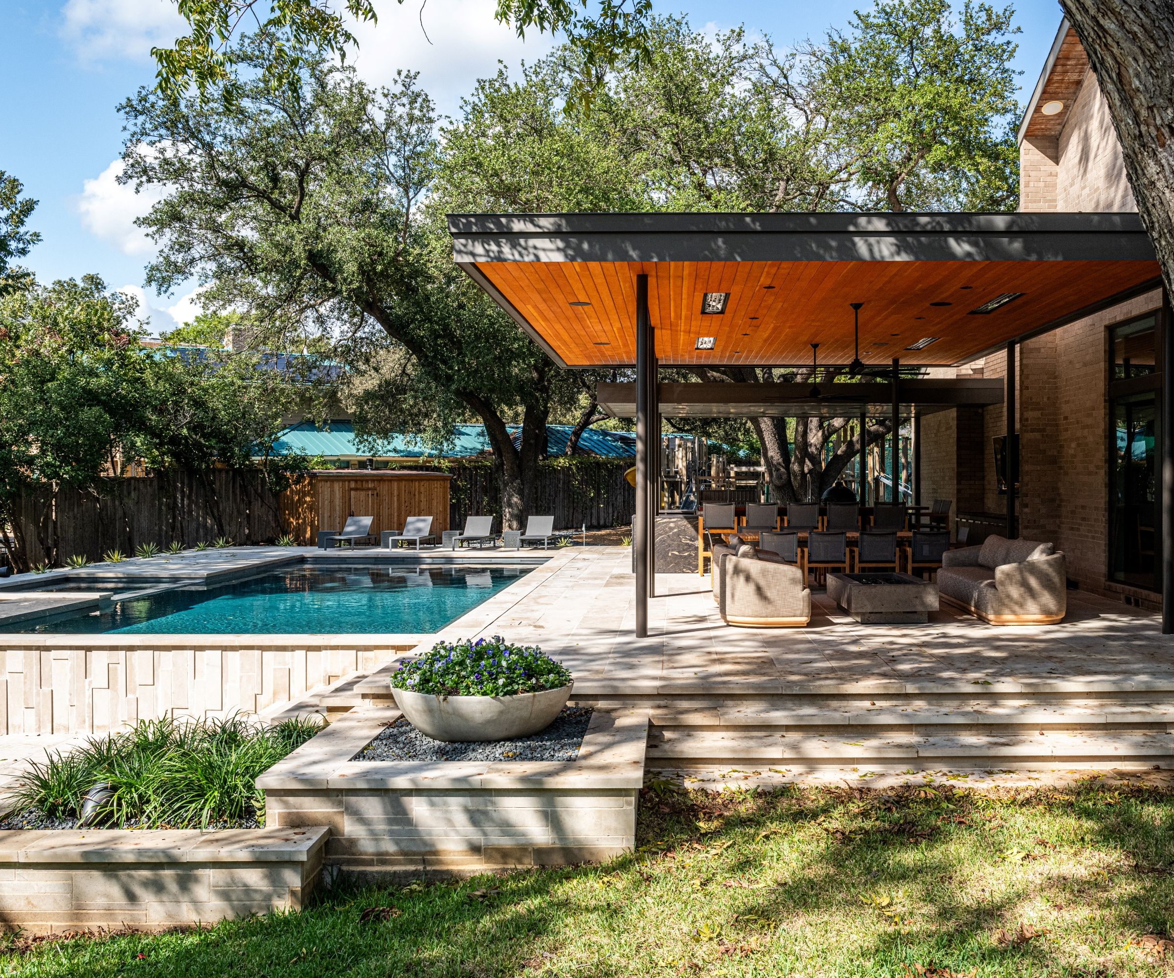
Looking back on the project as a whole, what were the challenges and the highlights of the renovation we wondered? 'Working with the architect and client to encourage the embrace of richer materials, sometimes at a premium cost was key,' says designer Joshua Rice. 'The architecture of the house after the renovation was somewhat simple and plainer. Incorporating rich, textural materials throughout the house, helped define the spaces and raised the pedigree of the finished product. It also made the home similar to the modern houses in Brazil that the client originally favored. I am very satisfied with the finish product.'
And for the project's architect, Mark McCollum: 'The main thing I learned was that even though the overall floor plan was much more convoluted than if I had designed the house new, by opening up the house and then carefully crafting the connections between the spaces, the house could be both grand and gracious. There is nothing I would change.'
Interior design: Joshua Rice Design
Architecture: Marc McCollum
Art Consultant: Temple Shipley
Contractor: Mark Siepiela
Photography: Nathan Schroder & Robert Tsai


