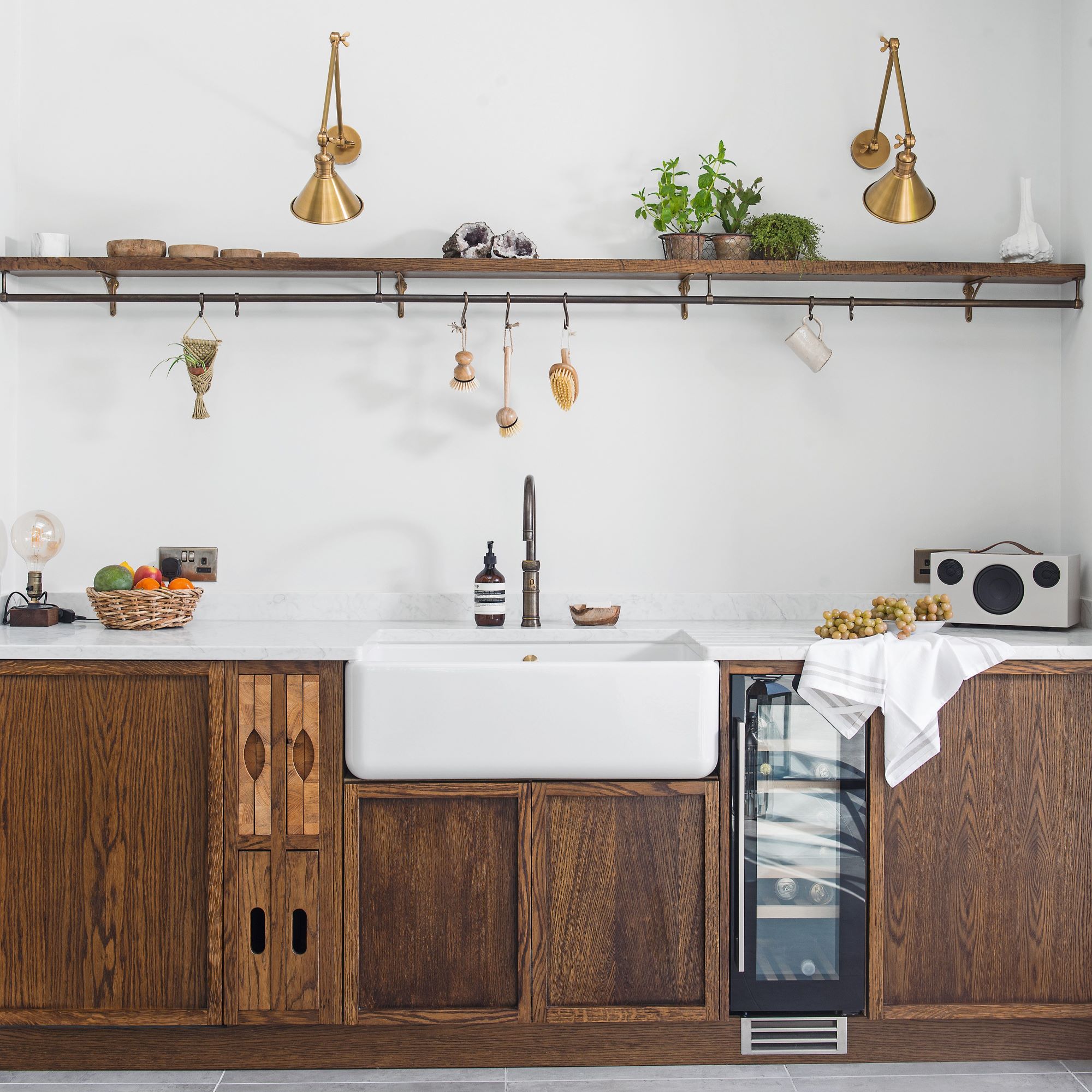
When Liz Willingham moved to her home over 20 years ago, the kitchen was a far cry from the light, open-plan space you see today. The existing space had a dark and narrow kitchen-diner with worn-out fittings and an impractical layout.
‘The layout had never worked,’ remembers Liz, ‘and eventually the cupboards and appliances were falling apart. The room overlooks the garden and I wanted to harness more natural light, and for the kitchen itself to be tranquil, minimal and in tune with my Edwardian house, but with top-spec gadgets as well.’
Liz embarked on a mission to transform the kitchen into the space she wanted it to be. £60,000 and a lot of design decisions later, she can confidently say it was worth it. Here's a closer look at her kitchen renovation in detail.
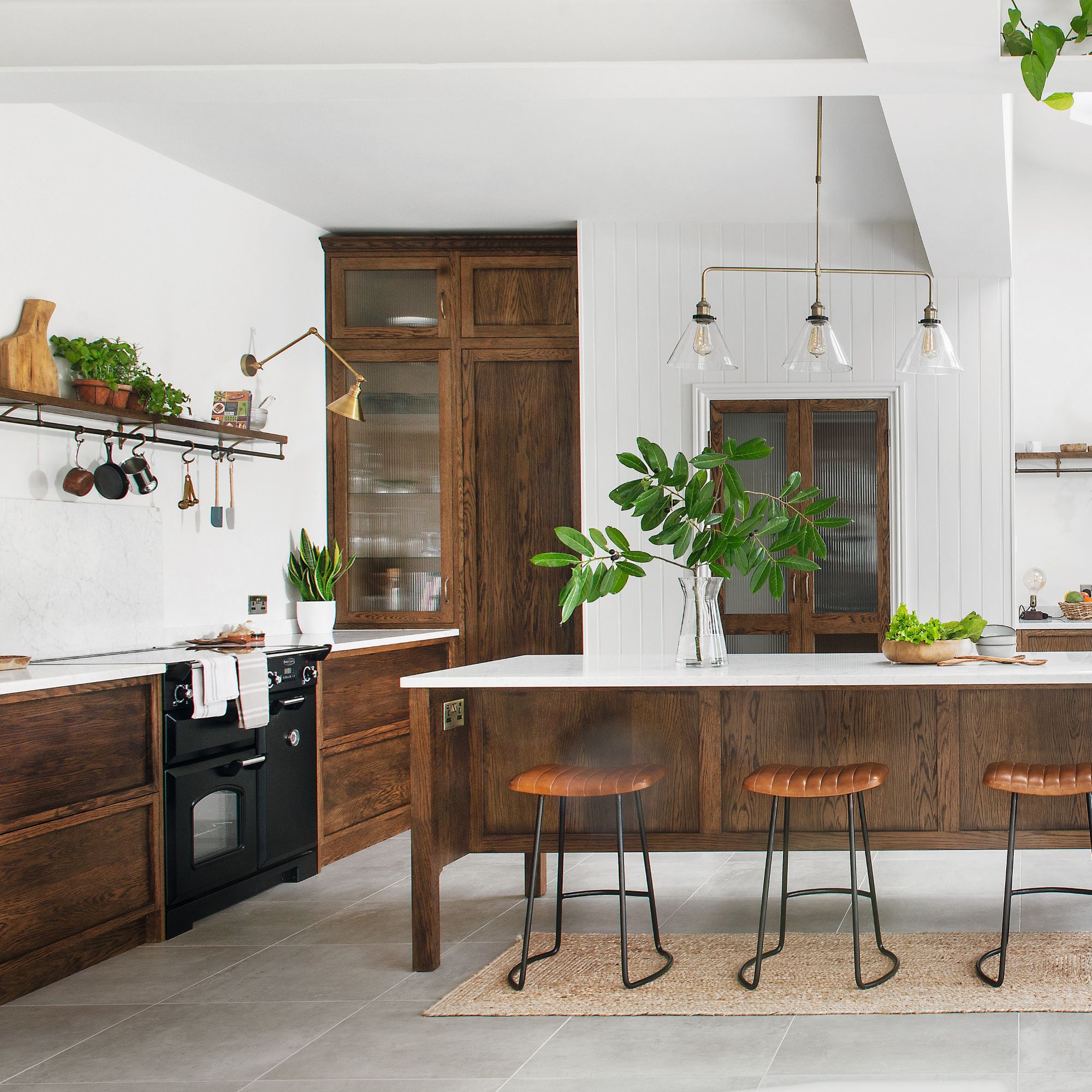
The kitchen layout was reimagined with expertise from KTM Design and Now Architecture. Light and space were priorities, so the old kitchen was extended by about two metres.
‘The room was made wider, with glass bifolds fitted along one side to maximise light and garden views,’ explains Liz. Then the kitchen was relocated to the other end, closer to the utility room, which improved flow. ‘To promote that “inside-outside” idea,’ she says, ‘I chose concrete-effect porcelain tiles that work in the kitchen and on the patio. These were more affordable than natural stone and easier to maintain.’
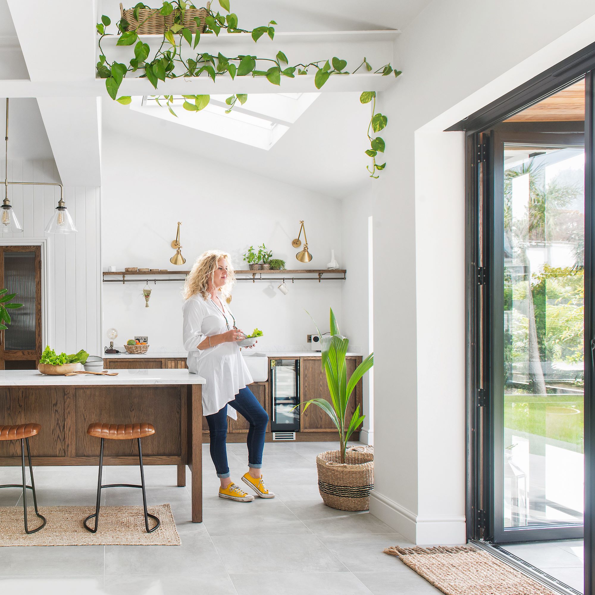
It’s not just the layout that has been updated, however, as Liz explains: ‘I chose simple, dark-stained oak furniture, white work surfaces and beautiful, aged-brass fittings, with lots of leafy plants for energy.’
Apart from the range cooker and wine cooler, there are no appliances on show, which keeps the space streamlined. In line with this, the units are mostly handleless to continue that understated feel. A false wall extends the existing utility into the kitchen, creating a separate pantry.

‘I have great kitchen storage,’ says Liz, ‘so the work surfaces stay clutter-free, which includes the hidden pantry area. I’ve extra fridge space in there, as well as small appliances like the coffee machine and toaster,’ says Liz. ‘I would have loved Carrara marble worktops but they were expensive. I’m pleased with the quartz I chose - it gives the look, but it’s practical and more affordable.’
‘I wanted a traditional ceramic sink, and a singlebowl design is ideal for large pans,' Liz tells us. 'This run includes a lot – the bins and dishwasher are hidden either side of the sink, there’s a nifty wine cooler, and the beautiful integrated tray slots and chopping boards.’
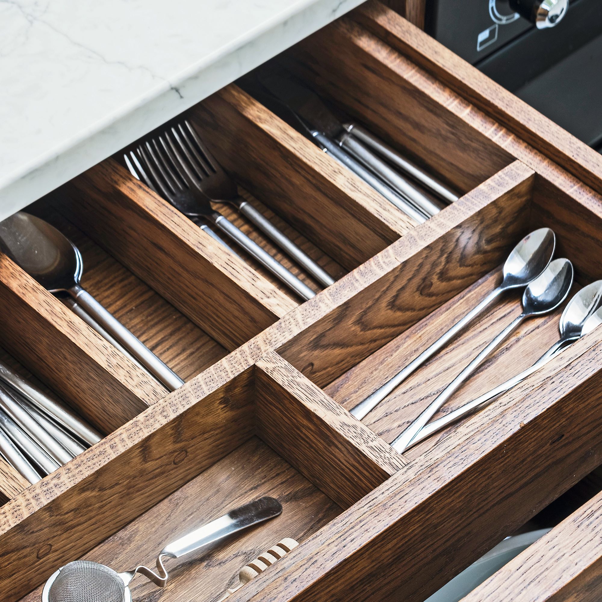
‘I love how this cutlery drawer sits within the deeper drawer so no space is wasted', Liz says. ;The kitchen furniture was all made to measure and the quality of workmanship is very impressive.’
Everything in the space was carefully selected, including the kitchen lighting ideas. Liz decided on pendant lights above the island, which were fitted to work with structural ceiling joists.
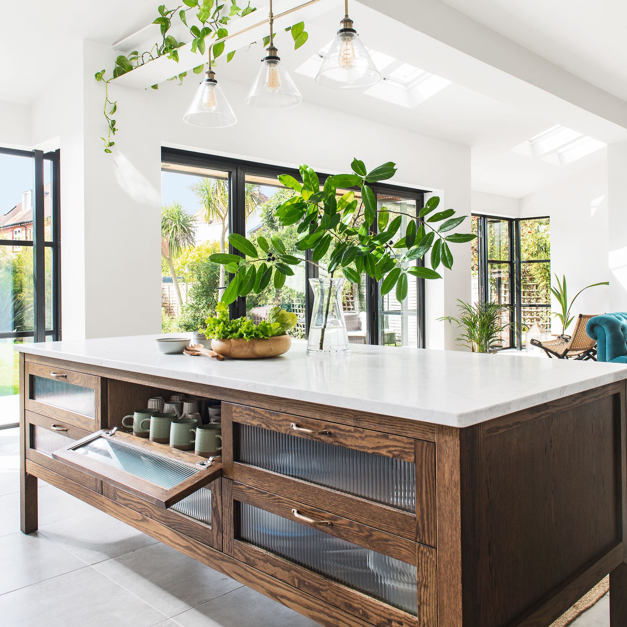
‘The kitchen island is a favourite piece,' Liz tells us. 'I’m pleased with the neat brass handles, and the reeded glass detail looks cool and disguises the contents if they’re not perfectly tidy.’
When we ask her if she has any regrets, Liz says that she wishes she hadn't thrown her old dishwasher out. 'It was still fine, and could have been useful in the utility room.'
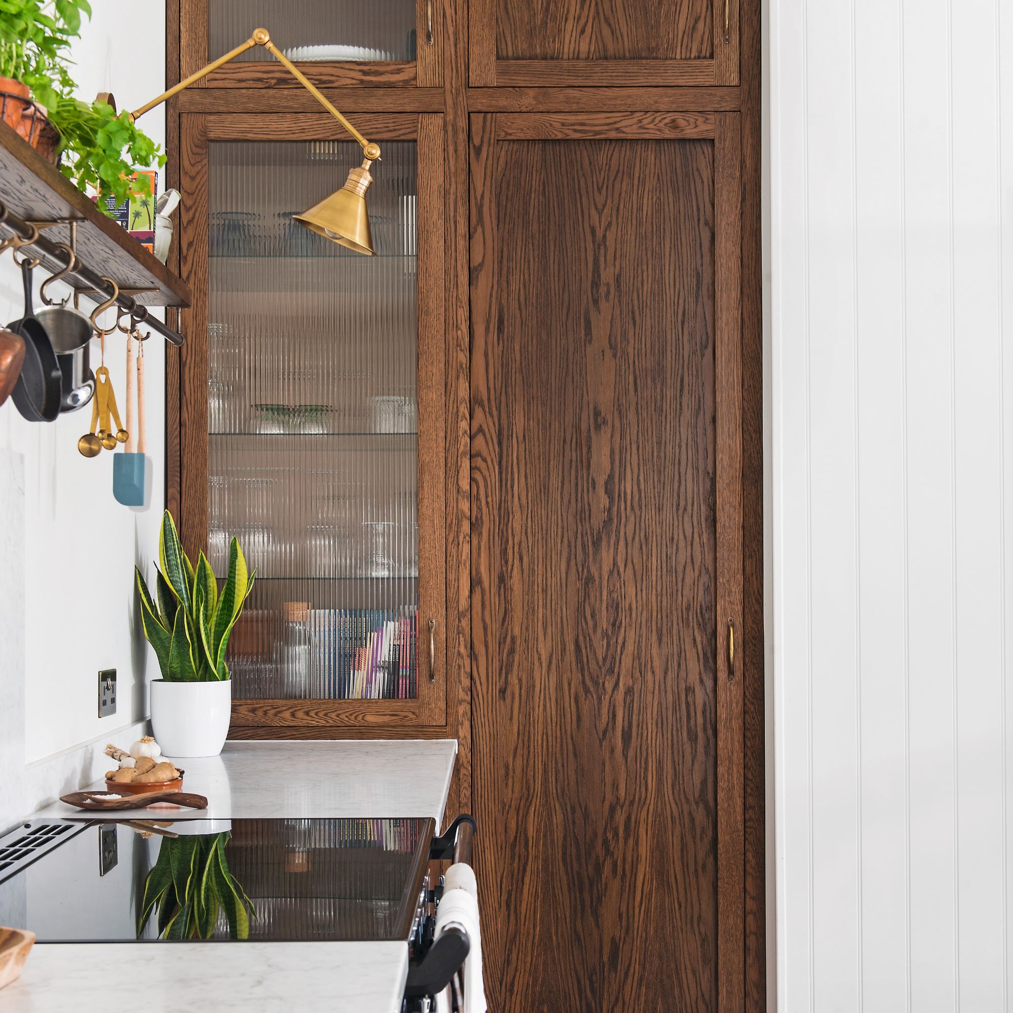
Beautiful oak doors conceal an integrated fridge and glassware storage. Online reviews helped Liz select her range cooker, which has a sleek, easy-clean induction hob.
Project-managing the work was the most challenging part of the renovation, but fortunately Liz had helpful suppliers. ‘I was lucky to have some fantastic people on board and I’m really proud of what we’ve created.
Get the look
To make a statement with your kitchen lighting, opt for this gorgeous 3-light bar pendant light from Laura Ashley. With a body of antique brass, it's perfect for invoking country farmhouse vibes in the kitchen.


