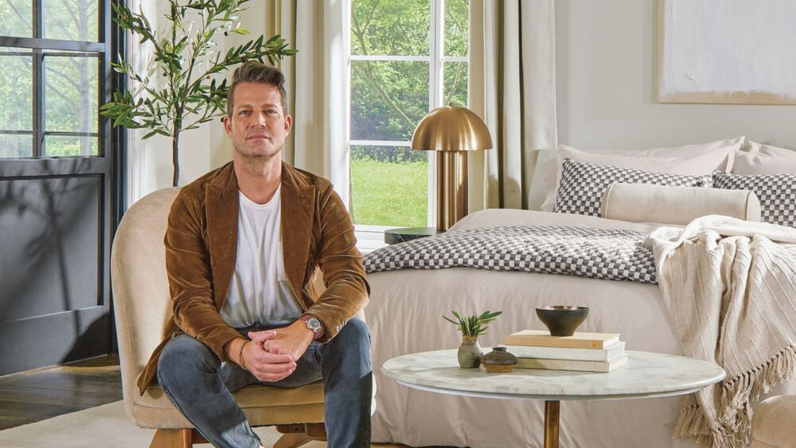
World-renowned interior designer Nate Berkus is known for his timeless, anti-trend style that draws from modern style and historic charm. And while he's got all the design fundamentals down to a tee, he isn't afraid to break a few rules.
It's easy to write ideas off because we've been taught they just won't work, but Nate proves that an open mind can take you (and your home's design scheme) a long way. In fact, the designer just took to social media to share how you too can look beyond some of the most commonly held design misconceptions.
Whether you've shunned white sheets in fear of dust or stains, or kept your rental update-free in fear of your landlord's wrath, Nate's got you covered with seven interior design myths you'll be better off leaving behind.
7 design myths, debunked by Nate Berkus
Nate's made a habit of dispelling interior design myths that hold homeowners and designers back on a daily basis, and these seven tips are incredibly helpful additions to his longlist of tips. Here's all you need to know about mixing wood tones, how a white sofa works with kids and pets at home, and so much more.
1. You can only use a single wood tone
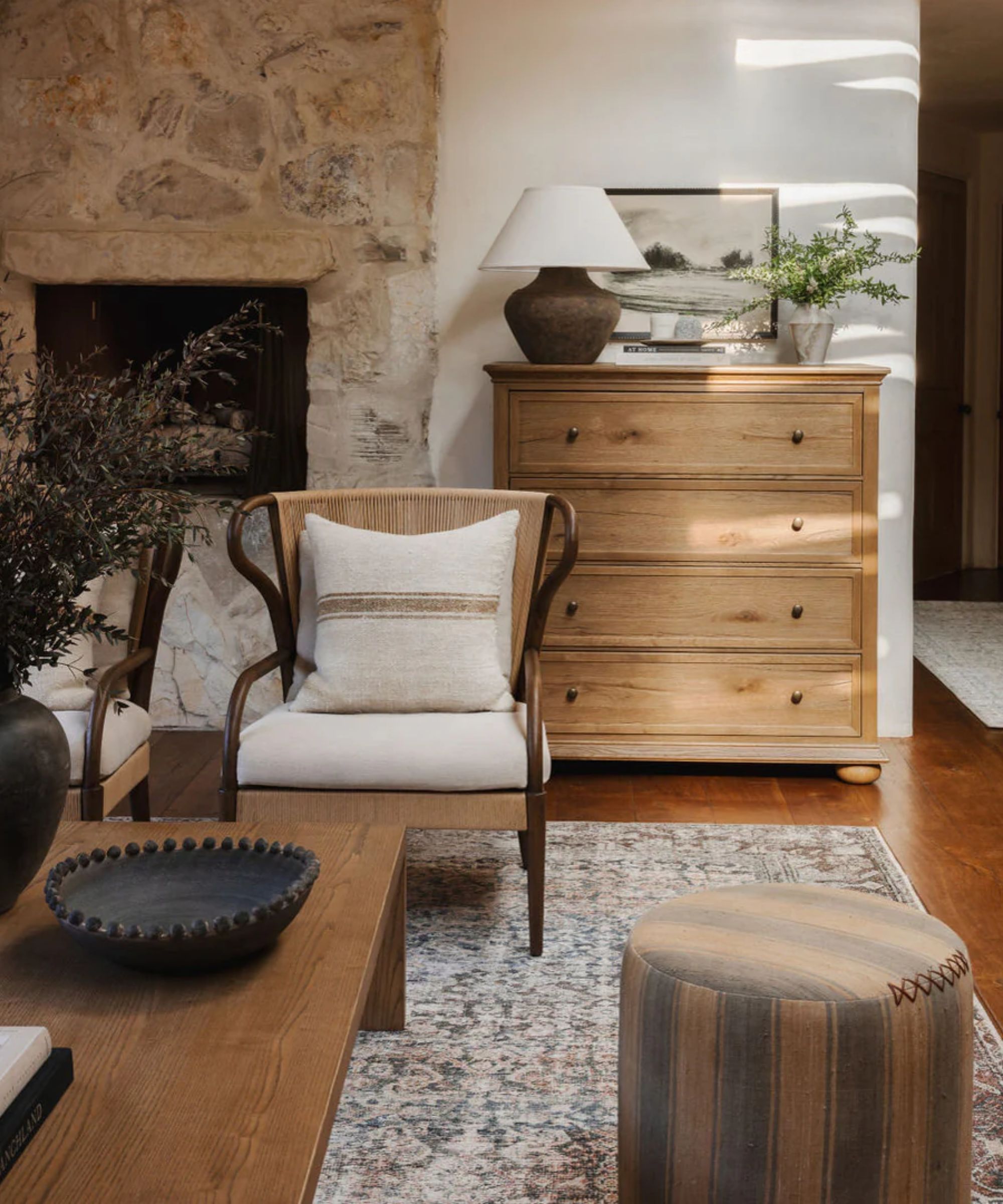
Nate starts off with the commonly held belief that mixing multiple wood tones within a single design scheme is a recipe for disaster. According to him, this simply isn't true. Nate believes that, actually, it's 'so much more interesting' to design with a variety of wood tones, types and finishes. Opening your mind to a wider selection of materials will leave your space looking more exciting – plus, you'll have much more room to experiment with vintage furniture trends that will prove timeless.
'Old pieces and vintage pieces never match – they're never going to match your new floor. The character of different colored wood and different species of wood and different finishes – even if it's oak, you can have cerused oak or bleached oak or dark oak or blackened oak. And I think that that's what brings a lot of life and energy to a space. So, that is a lie,' Nate says in the video.
2. Painting small rooms white will make them feel larger
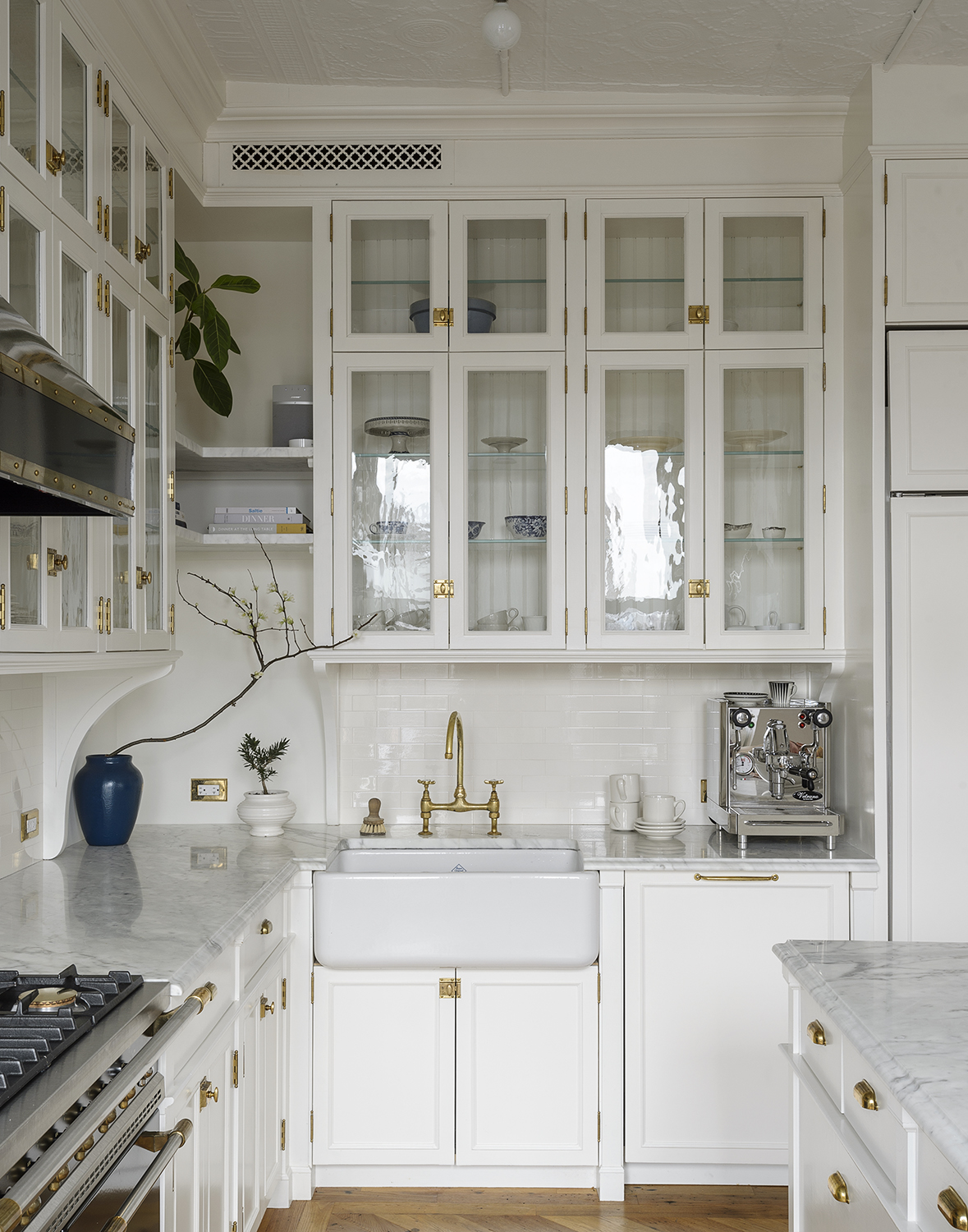
When faced with painting a smaller room of the home, it's easy to default to simple shades of the best white paint in hopes that the space won't feel quite so cramped. And while Nate says it's true that white (or light-colored) paint makes a small room look bigger, he adds that we might be better off giving this tenet a second thought.
'The problem is that you have to make the decision as to whether or not you want the room to feel larger. Like, what's the point? If it's a powder room or an entry, sometimes there's something really interesting in design when you actually go with the worst quality about the room,' says Nate.
He explains that smaller rooms often benefit from a darker shade, whether for the whole room or just an unexpected surface, like the ceiling. These design decisions 'could embrace' the smaller square footage and 'make it really dramatic and really interesting,' he says.
3. White bedding is too high maintenance
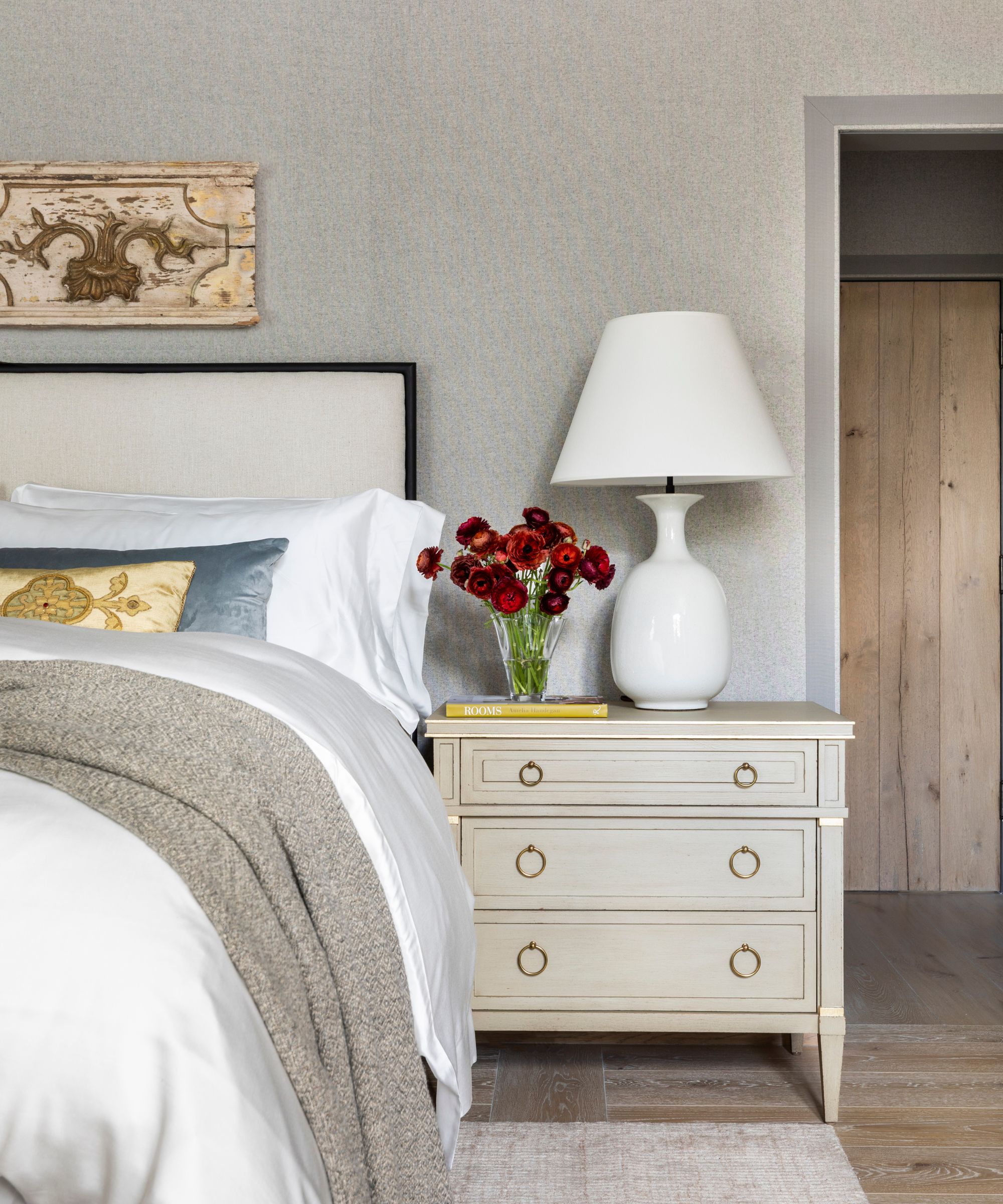
Many of us steer clear of white bedding – in case of spills or the inevitable accumulation of dust and pet hair, it can feel a lot easier to stick with darker colors. But Nate firmly asserts that 'white bedding is not high maintenance.'
'And let me tell you something, my friend: You want to see if your sheets are dirty, OK? I like to climb into bed that's all white and know there's nothing on the sheets,' he says.
According to Nate, it's better to know up front whether your sheets are dirty or clean – with white bed sheets, you won't be guessing whether you're due for wash day.
4. Symmetry is the foundation of good design
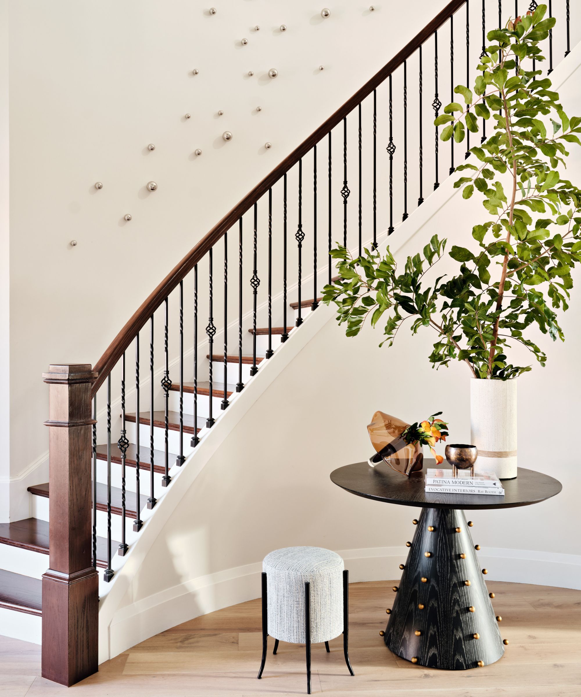
'Symmetry can be the foundation of good design, but balance, which is not the same as symmetry, is also as important,' says Nate.
While it's easy to select two of the same side tables or lamps and place one on either side of a bed or sofa, creating symmetry in interior design isn't always the best approach, according to Nate. Instead, he suggests creating 'visual balance.' Nate shares that if you've placed an item 'that takes up a lot of visual space on one side of the room,' it's a good idea to experiment with 'something that has a little bit less energy or noise on the opposite side.'
'I'm usually a fan of symmetry, especially in architecture, but in furniture, I think it's more fun to just kind of try moving things around a million times until to your eye, it feels like you are calm. And sometimes that's with a pair of something, and then sometimes that's with an odd number,' he says.
5. It's not worth updating a rental home
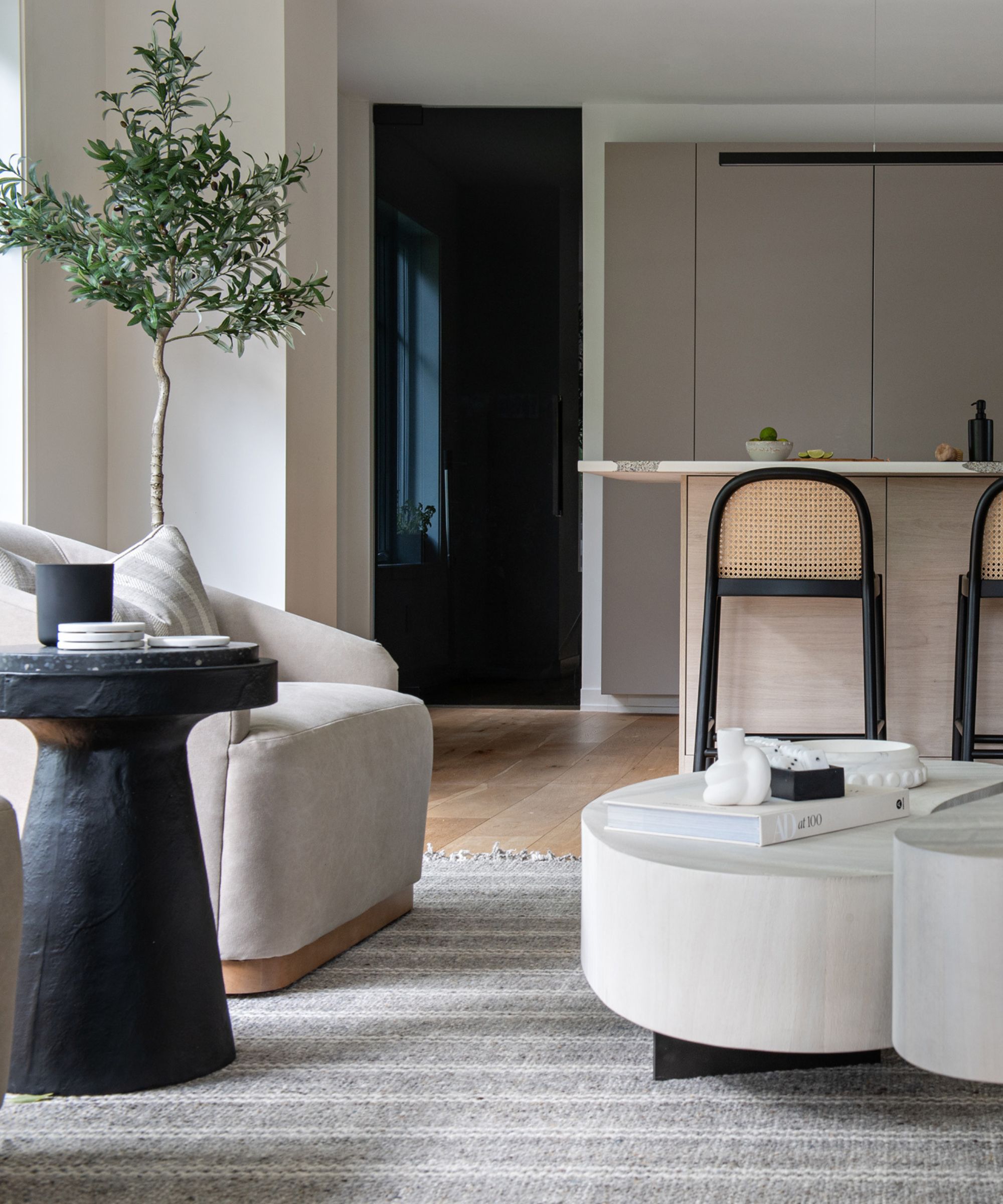
Especially when you know it's temporary, living in a rented apartment or house often means compromising on style. But Nate says this never needs to be the case, calling this myth 'so not true.'
'Everybody deserves to live beautifully, even if you're renting – especially if you're renting. So, take a little bit of your budget and do something that really makes you feel great about a rental,' he says. 'Maybe it's just buying that one antique chest of drawers that sits on the wall in the living room, and every time you look at it, you know you've invested in something that you'll have forever.'
Even if it's a simple addition of temporary wallpaper, or an organizational makeover in the closet, Nate maintains that 'it's worth it to invest in a rental.' No matter where you're living or how long you're there, it's important to make your rented house feel just like home.
6. You can't have a white sofa when you have kids or pets
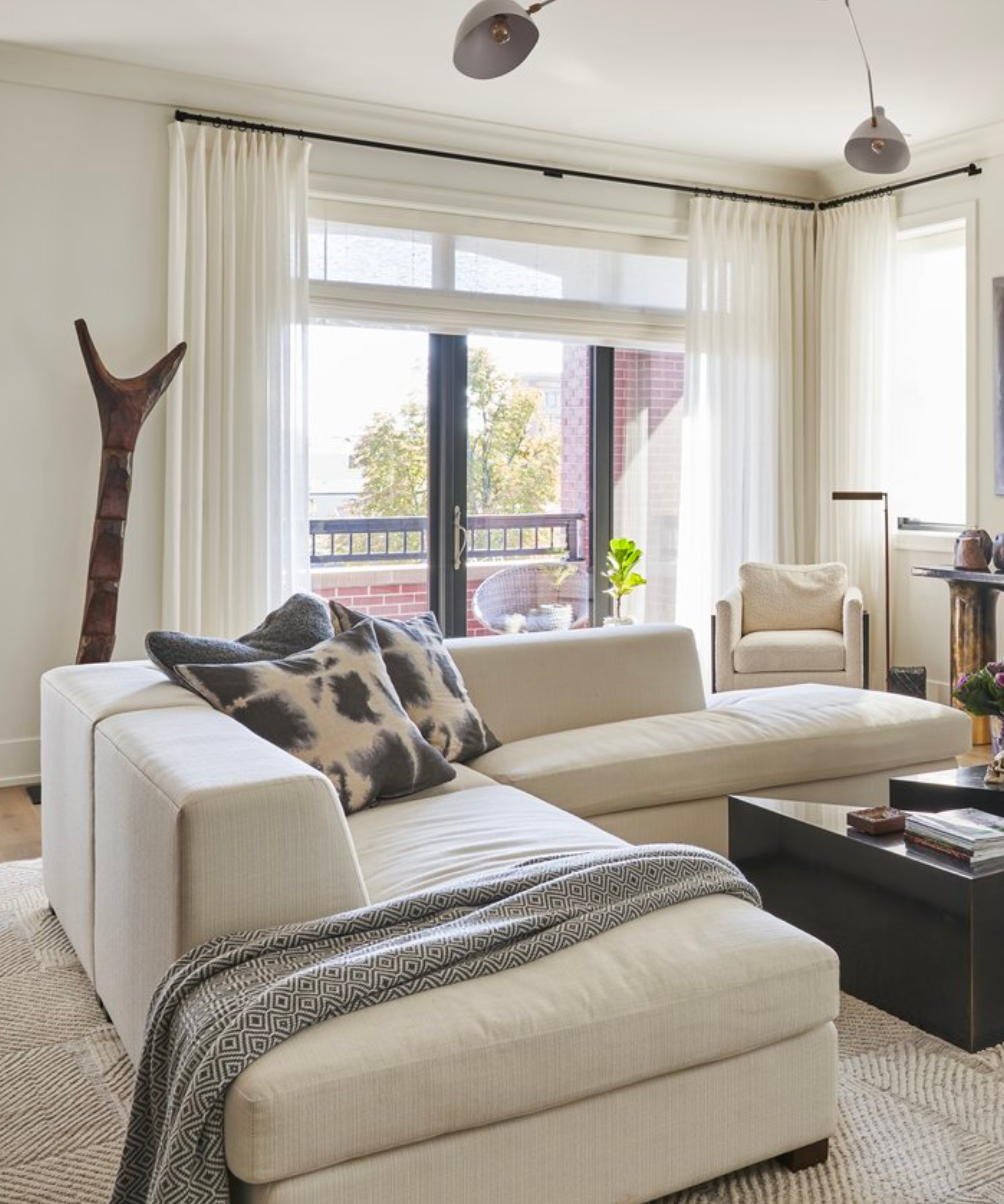
Is a white couch a good idea? Though the designs are often sleek and appealing, the prospect of bringing a white sofa into a household with children, pets or both prevents many from making the jump. But Nate, a father himself, says there's no need to fear a white couch, no matter the makeup of your family.
'There are so many fabrics – performance fabrics, white fabrics that are wipeable, washable, spongeable. Living with white can be complicated with kids and pets, but buy a lint roller and buy the right fabric if that's really what you want,' he says.
7. Large empty walls must be filled
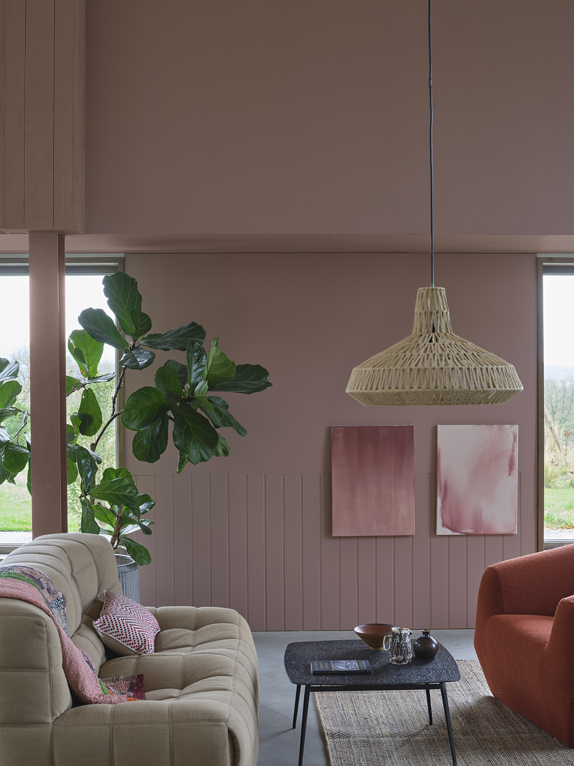
Gallery walls are well and good, but sometimes it's best to let a blank wall be, says Nate. Though empty areas of your home might call out for a bit of decoration, he urges people to fill walls with a healthy amount of restraint.
'Sometimes it's really nice to be in a space where you leave some walls completely blank, especially if you want the things that you do hang to feel more important,' he says. 'In general, like how most of us live, I like one great thing on a wall, maybe two. That's it. The negative space is as important as the positive space.'
'Can we just take away the pressure that every wall has to have something on it? Because that's just not true,' he continues.
With these seven myths debunked by one of interior design's biggest names, your decorating possibilities have only grown. Let blank walls be from time to time and lean into your white bedding instead of falling back on design misconceptions without resistance.


