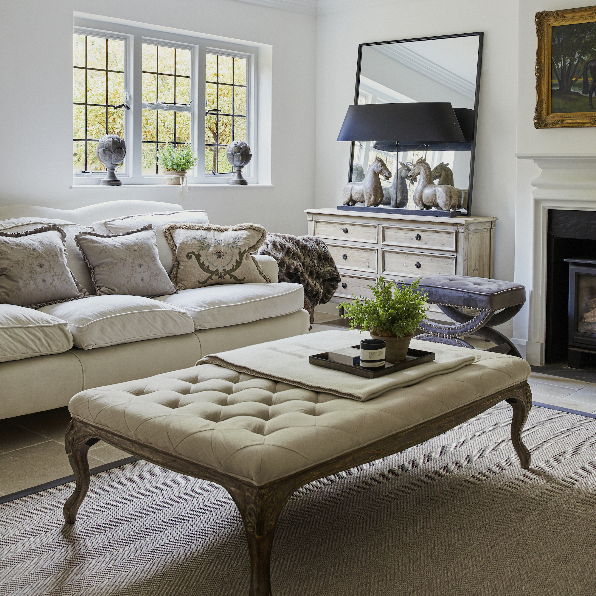
Every house has a story to tell – and this cottage belonging to interior designer Jo Brown has, over the years, clocked up quite a few.
Situated at the foot of the Surrey Hills, it is in an area of outstanding natural beauty with picturesque villages, bridleways and footpaths giving way to views that stretch for miles.
‘Since I first moved in, the cottage has endured a few tragedies,’ Jo says, detailing the horror stories of a fire, a flood and even a lightning strike!
‘The lightning strike eight years ago took off the ridge tiles, then a fire six years ago devastated the top floor, so I lived in a rental for a year while the work was being done, including new ceilings and windows.
Most recently, the flood last year meant I had to move out for 12 months to have the house totally gutted.’ It’s hard to believe now, given the sense of calm that prevails throughout.
From tragedy to triumph
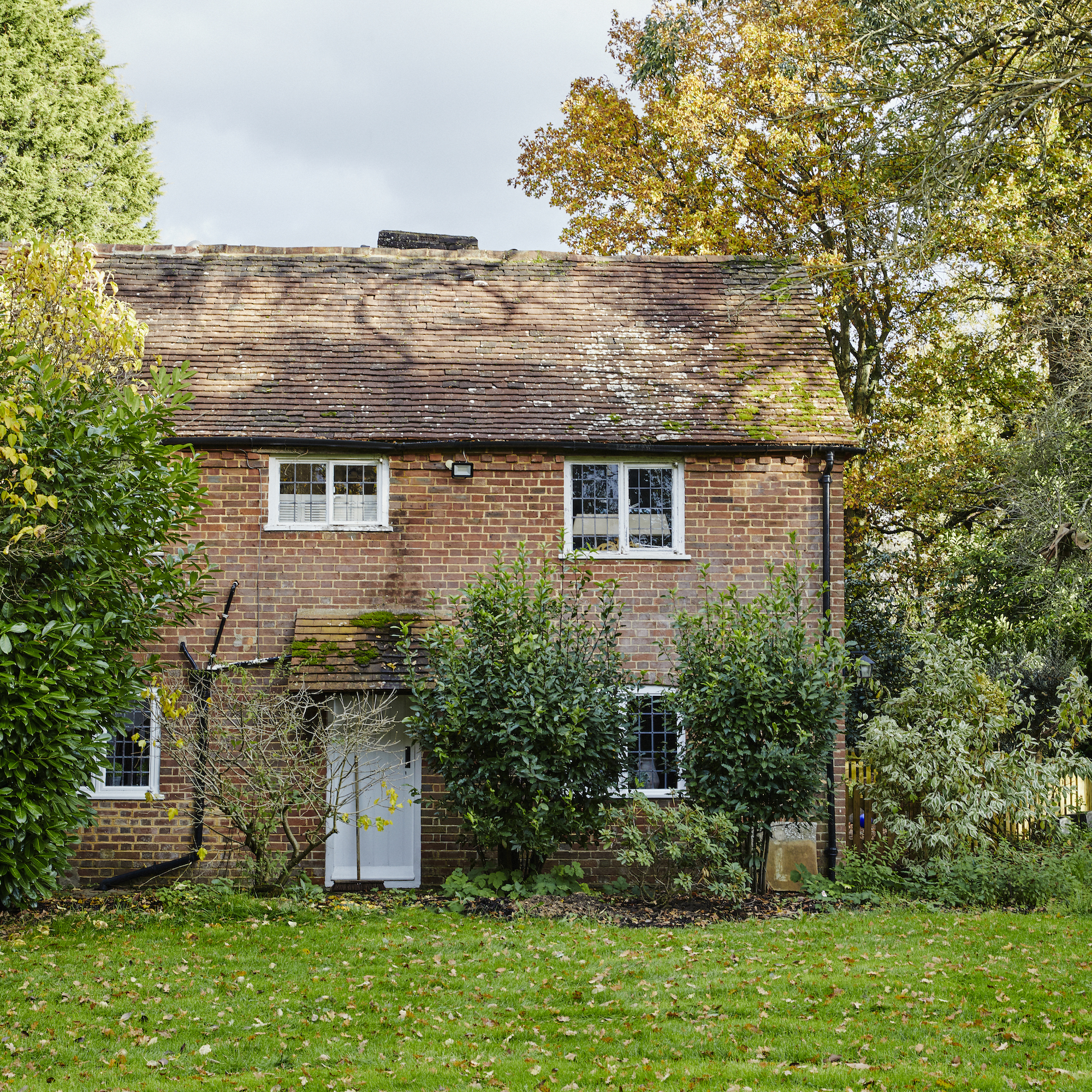
After the flood, the house underwent extensive renovations. ‘I had diggers in the house excavating down to the foundation and rebuilding all the layers in the ground (seven to be exact) to make the house strong again,’ Jo says. ‘The whole of the downstairs is tanked and watertight now!
Dating back almost half a century and built as a humble two-up two-down, the cottage had maintained its original brick façade and cosiness inside. It also boasted an intriguing history. ‘It was used as a smoker’s house, where all the local meat was cured and smoked,’ Jo explains. 'When I moved in, the giant pulleys for the meat in the fireplaces were still in place!’
Natural sophistication
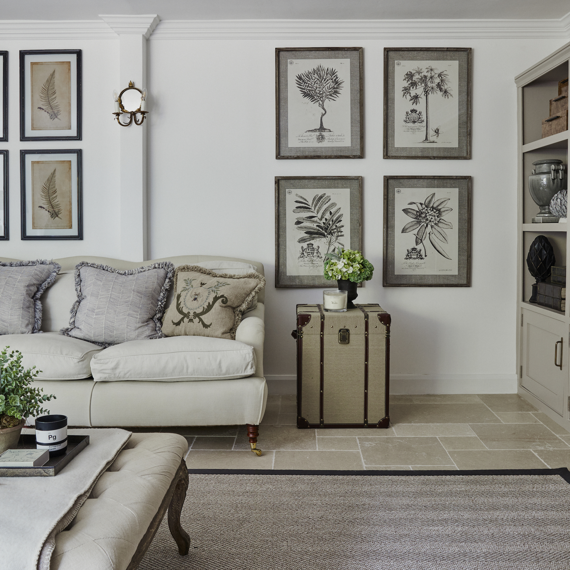
A sophisticated interior scheme consisting of neutral tones and natural textures dominates throughout. ‘I love the outdoors and love using natural products in my interiors, such as tumbled limestone flagstones in the whole of the downstairs, pure wool loop carpets upstairs and mosaic marble in the bathroom,’ Jo says. She employs the same approach in her professional work, as founder and managing director of Tilehouse Studio.
Creating a sense of flow
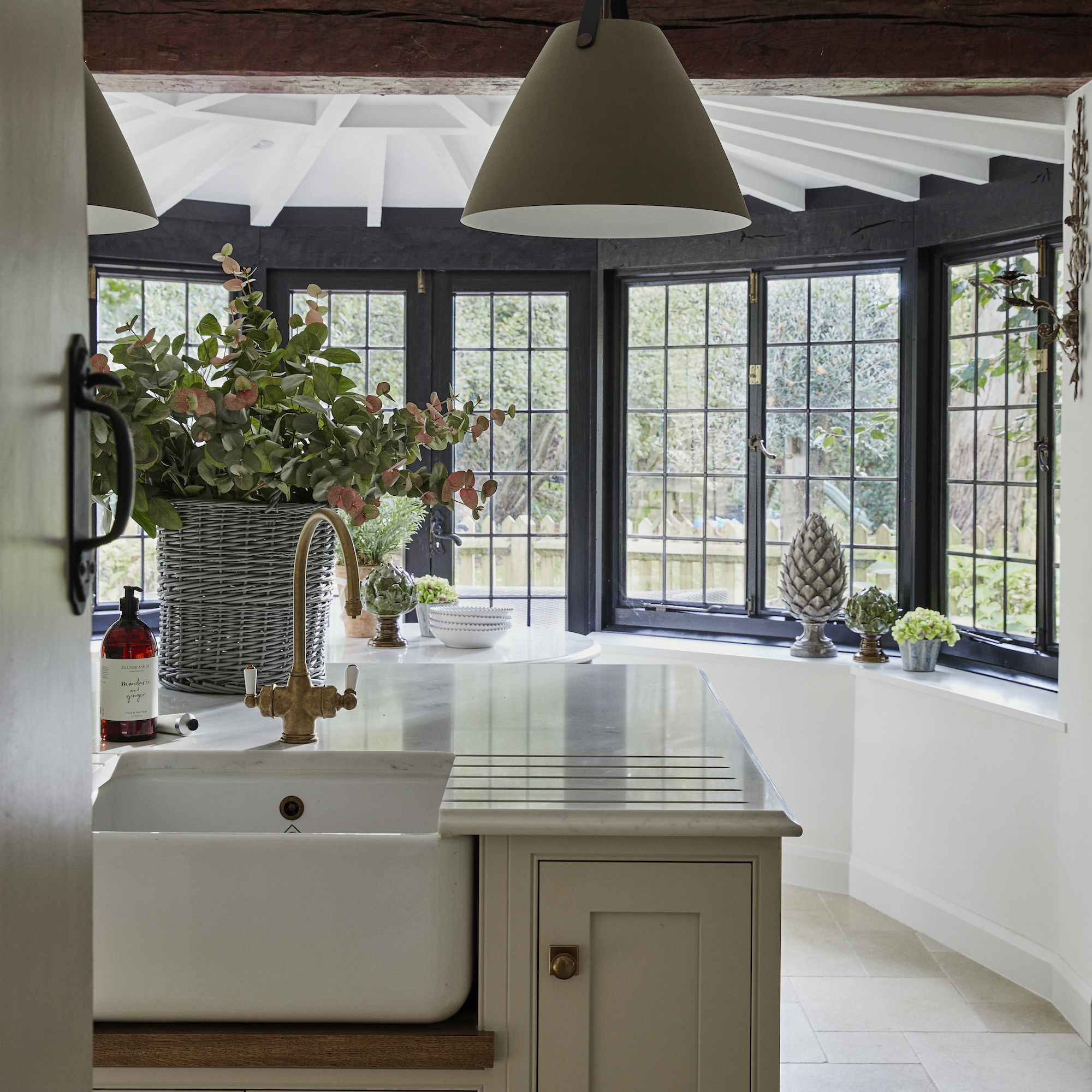
Jo had already made improvements to the original layout when she first moved in. The kitchen was in the smallest room in the house and there were two good-sized living spaces.
‘It didn’t make sense to me. It was a big deal to move the drainage, gas and utilities into the larger room but it was worth every penny and worth every headache that came with that decision,’ Jo affirms.
Now, a stunning Charles Yorke kitchen takes centre stage, leading onto a light-filled conservatory. It’s a sociable area of the house, that works perfectly for Jo’s requirements. ‘I love to cook and entertain,’ she says.
Respect the past, invest in the future
Jo’s advice to anyone facing major renovations of a period home is to look for a really good builder and also to respect a property’s heritage to give something back in the process.
‘I always encourage people to invest in very good products that do not age. Houses were built so well back then and the fact that we are in a position to restore them and bring love back into them is a very satisfying and rewarding thing.’ Every house deserves a story with a happy ending.
Hallway
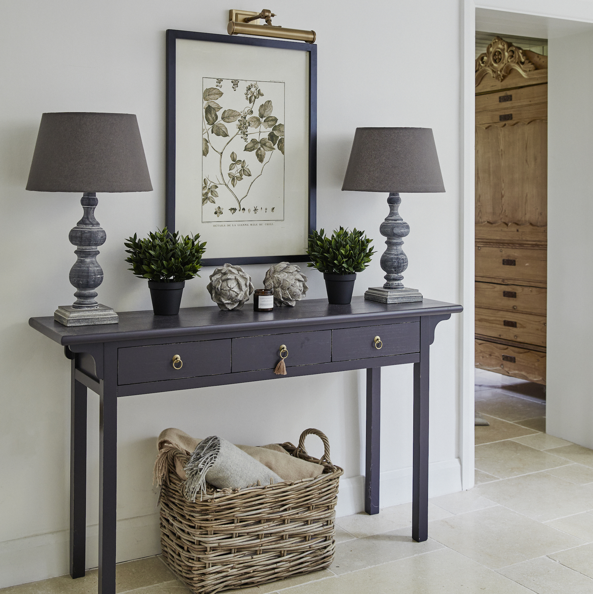
Jo’s love of natural materials and simple colours is evident in the hallway with an all-white colour scheme, limestone floor and lots of rustic textures.
Home office
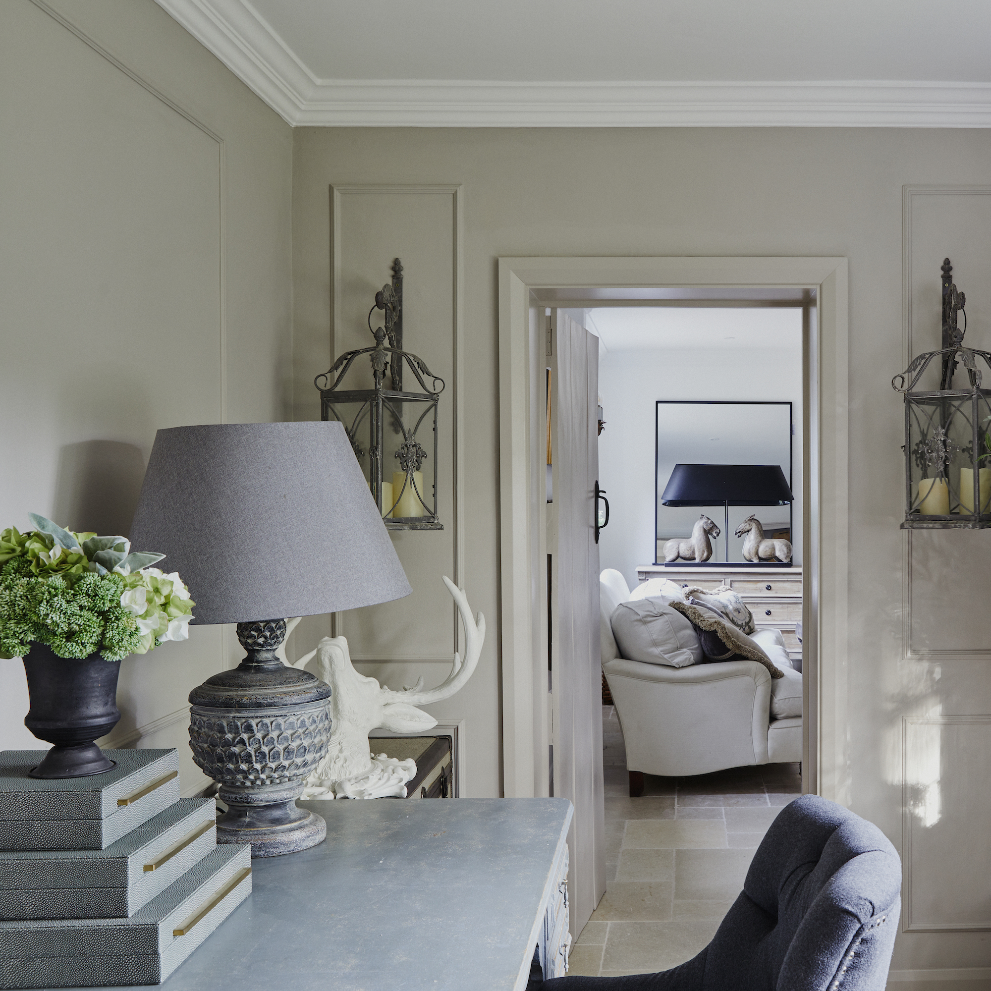
Jo’s home office is a quiet space away from the main living hub of the home. Classic furniture and period panelling create a sophisticated look. Elegant box files create useful home office storage that's easily accessible.
Living room

The living room is a sizeable space which is ideal for socialising. When deciding how to arrange living room furniture, Jo chose a symmetrical placing of furniture and artwork, combined with large comfortable sofas, to create an air of relaxed formality.
Snug
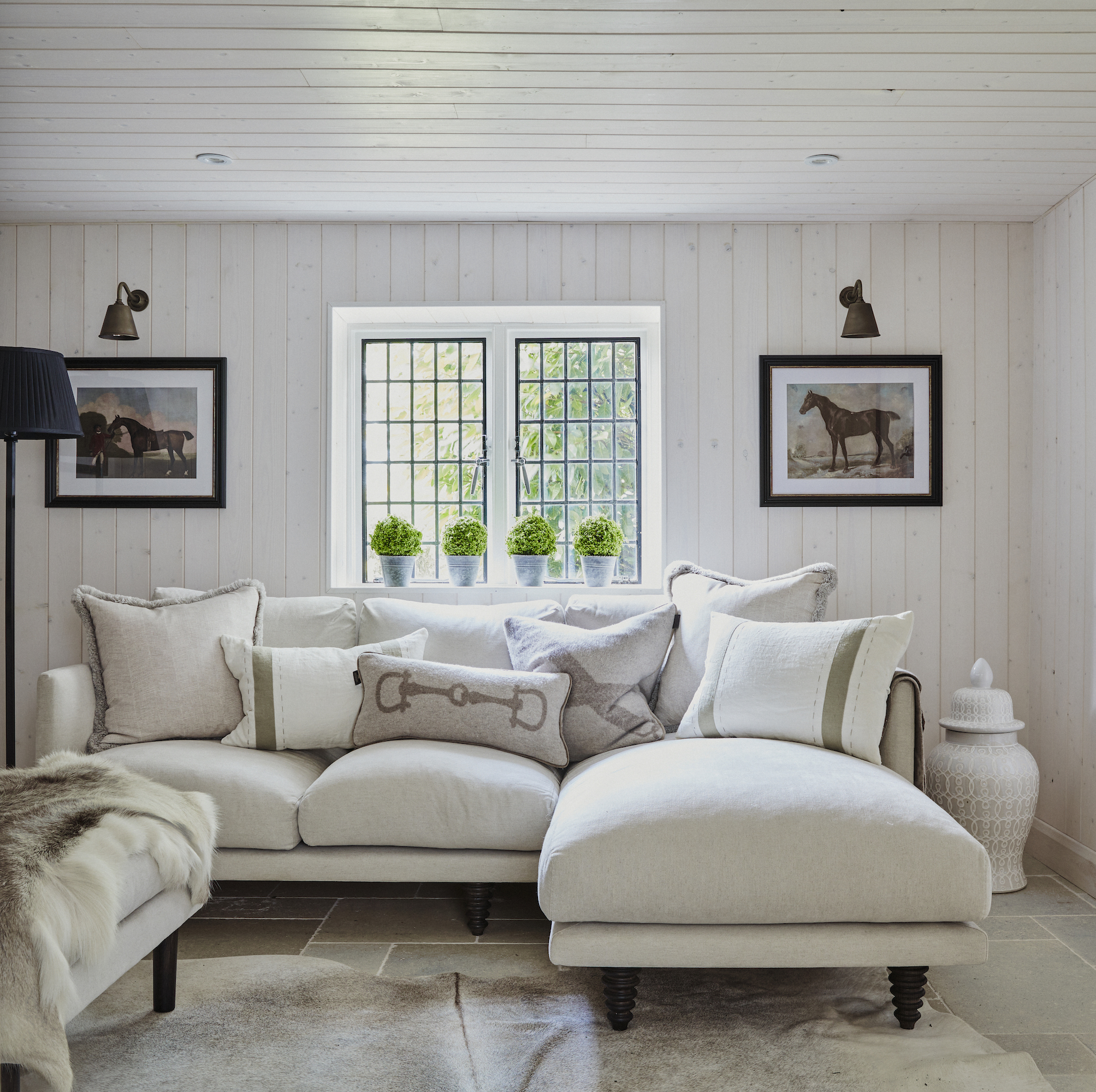
Tongue-and-groove panelling on the walls and ceiling and a barn-style door add a dash of country charm in the snug. It's a great approach, that makes the space look bright but still creates a cosy living room vibe.
Dining room
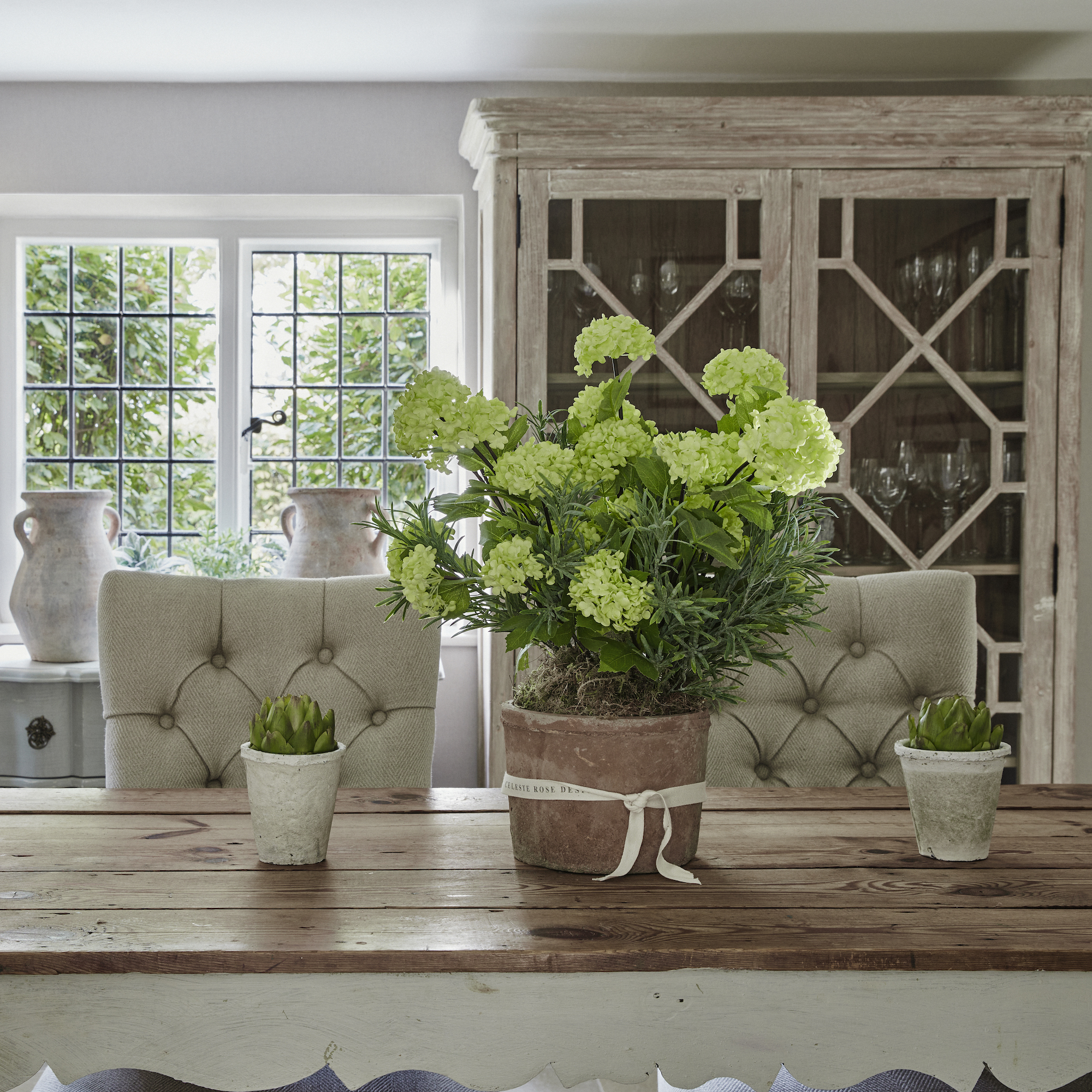
A scrubbed-top, country-style antique dining table is teamed with high-backed buttoned and upholstered chairs to create a relaxed take on formal style in the dining room. Glass fronted display cabinets in a limed wood effect and classical-style framed prints further complement the look. Stacks of classic English blue and white antique plates, tureens and jugs make a pretty display.
Kitchen
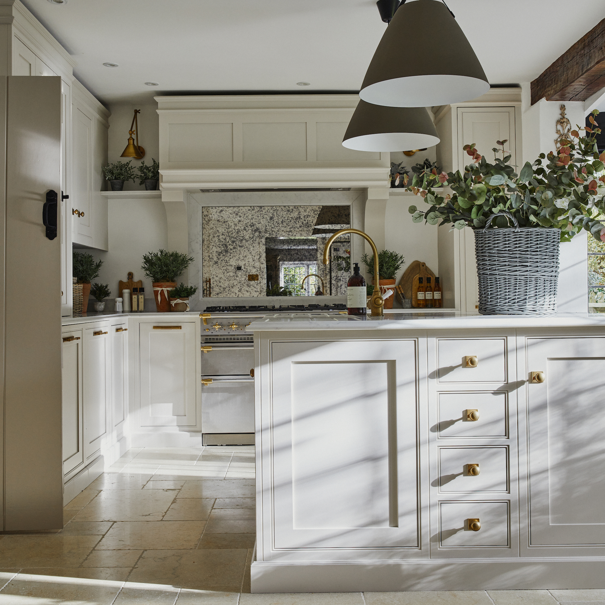
Jo loves to cook and entertain, so a custom-designed kitchen was installed, providing plenty of storage, worktops with some lovely period detailing such as a butlers sink and classic countertop cupboards.
Conservatory
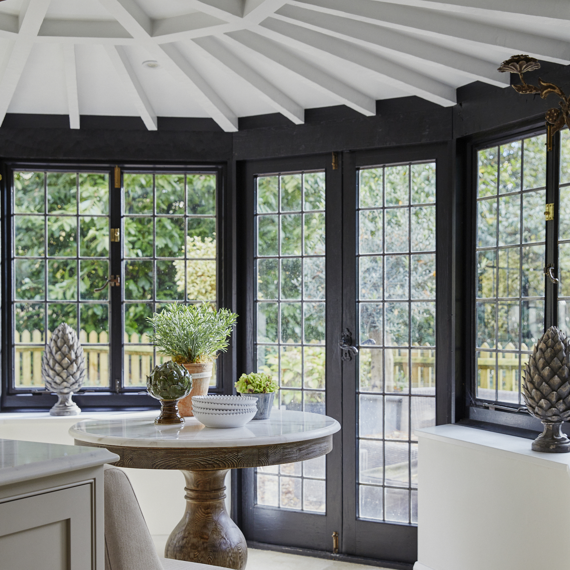
The conservatory leads off the kitchen and provides additional space for sitting and entertaining with friends.
Bedroom
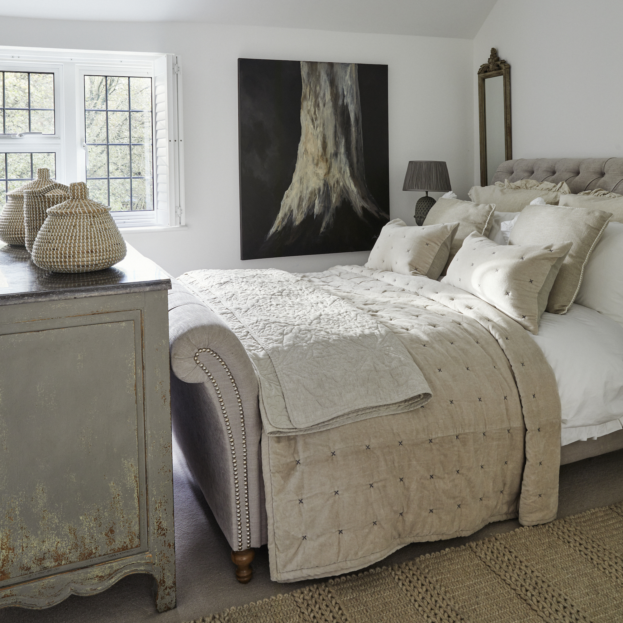
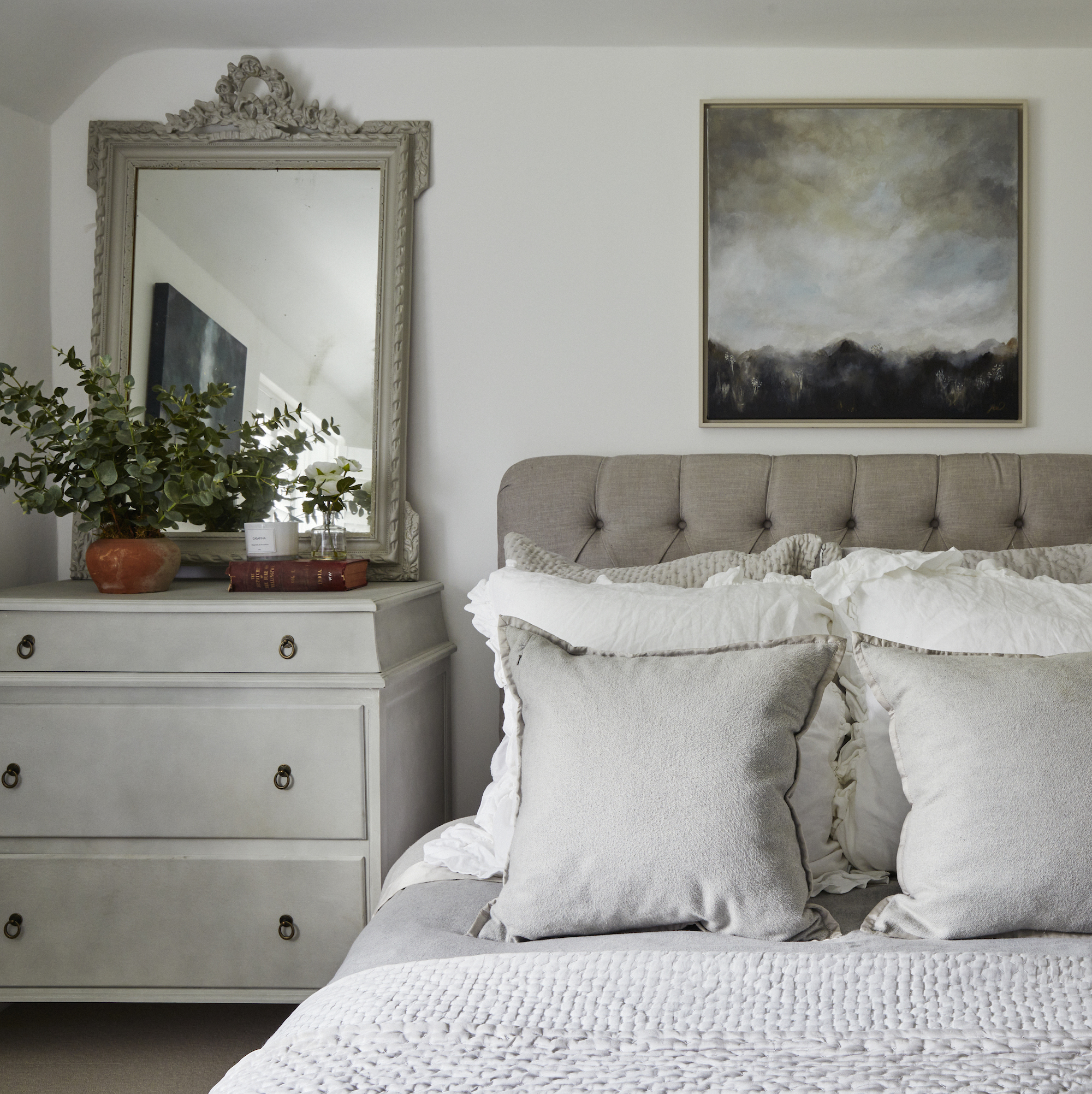
Jo’s aim for the interior design of her home was simple and earthy. In the bedroom, shades of putty, taupe and French grey are beautifully teamed with landscape paintings in moody neutral tones and also plenty of rustic textures.


