It's Typography Week here at Creative Bloq, and we've been catching up with graphic designers around the world to talk all things type. Every designer has a favourite font or typeface (although let's be honest, it's likely to keep changing). For more typographical inspiration, take a look at our guide to the best free fonts.
Brian Cho is a graphic designer based in San Francisco, California, working in tech with a focus on art direction and brand identity. His work blends creativity with strategic thinking, focusing on crafting compelling visuals that resonate across diverse platforms. Whether developing brand identity, art direction, or refining the nuances of typography, he aims to create designs that connect with audiences and elevate brand narratives.
What's your favourite typeface?
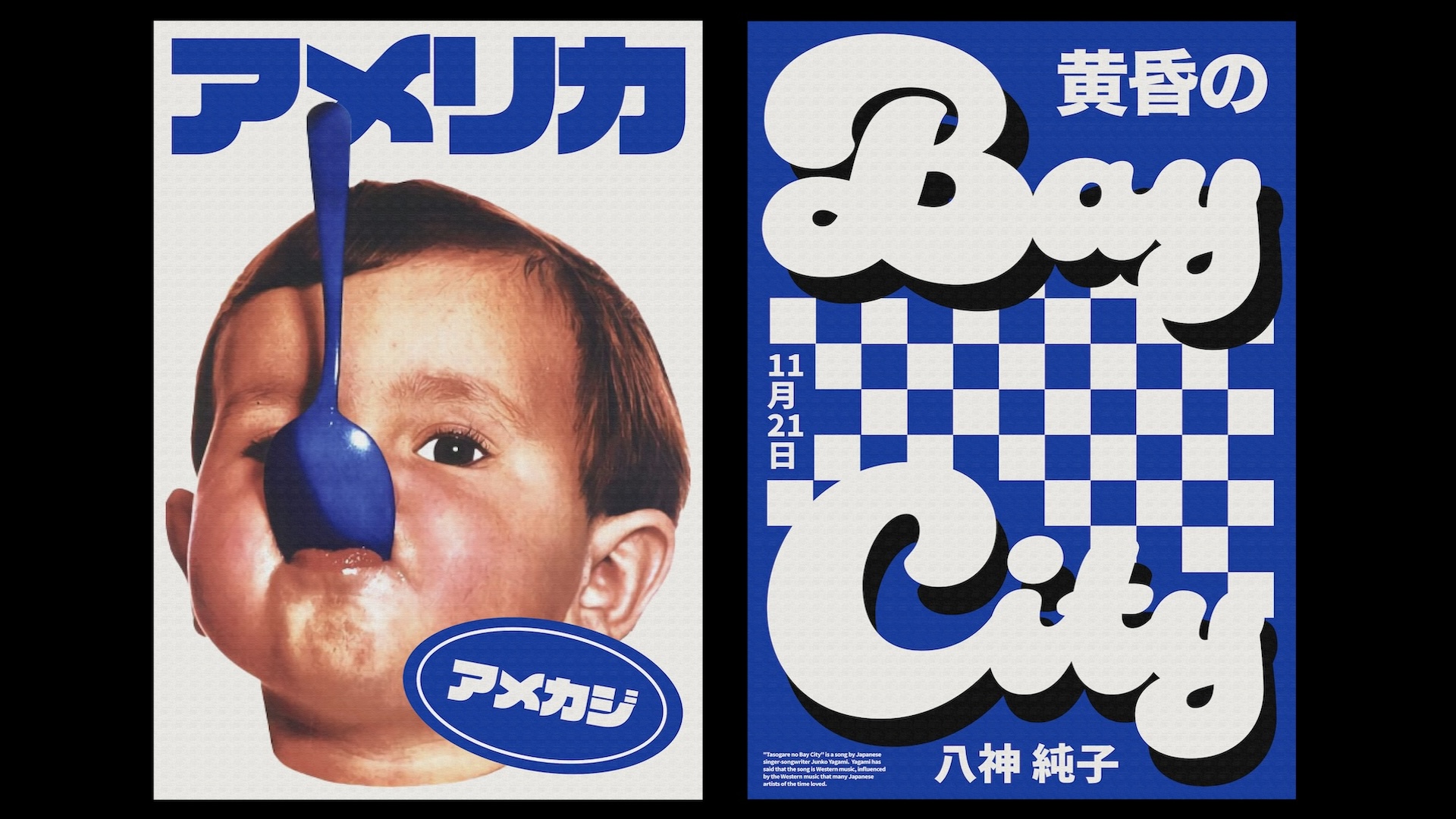
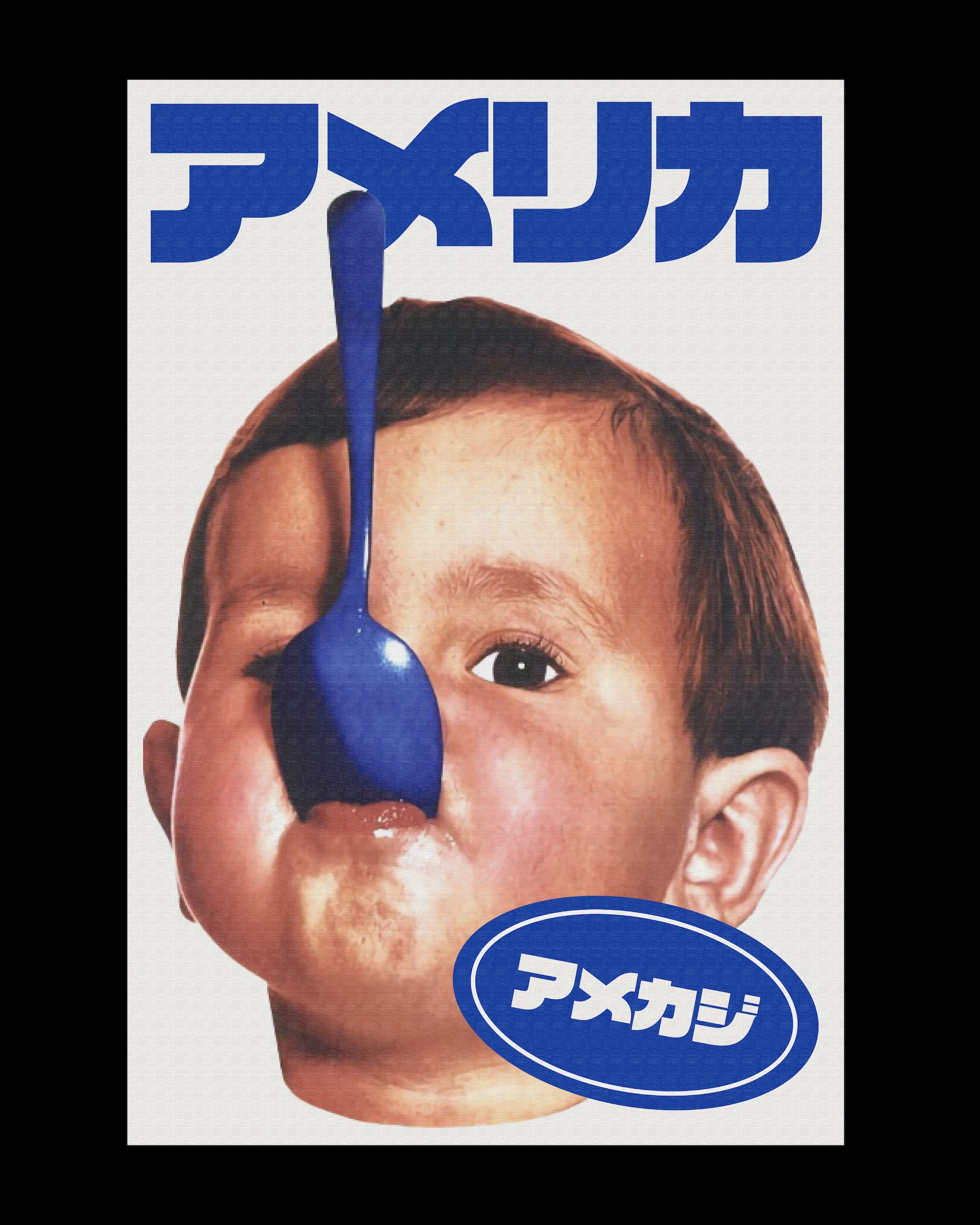
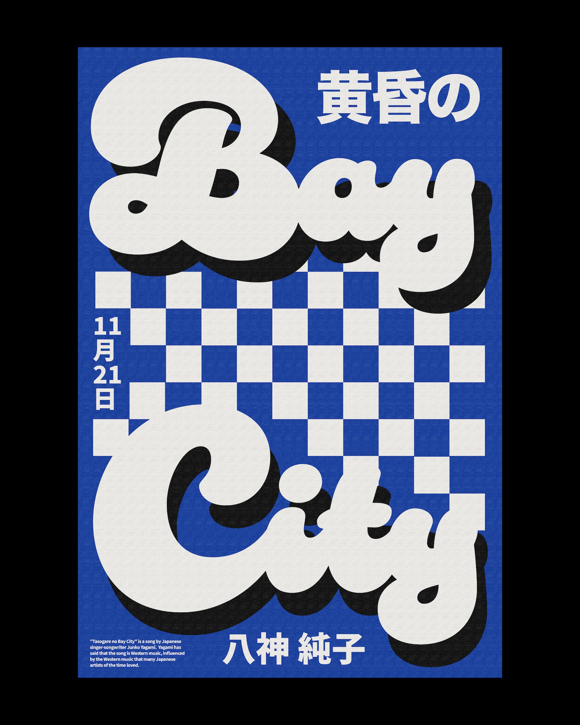
Tough question.. To be honest, my go-to has always been Helvetica—not just because it’s readily available and “works” for everything, but because I’ve always been a big fan of Massimo Vignelli’s work from my design studies. My love for Helvetica is kind of engraved in my brain. But lately, I’ve been really enjoy trying out VDL ロゴJrブラック BK and Duckie for my recent poster series inspired by Twilight Bay City by Junko Yagami.
Can you tell us about a project you've used it for?
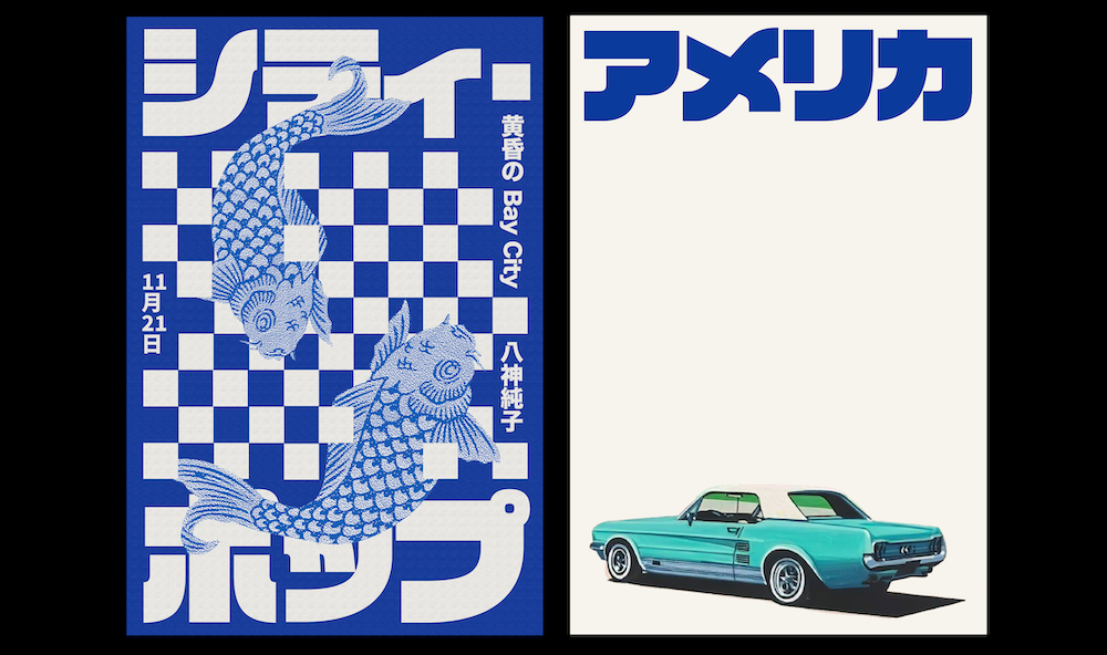
I recently visited Tokyo and instantly fell in love with the way Japanese typography looks and made me feel, so I’ve been experimenting with it ever since. I used those typefaces for a poster series inspired by one of the most iconic City Pop songs, Twilight Bay City by Junko Yagami. One thing I noticed when visiting Japan was their appreciation for American culture, and I wasn’t sure why but I found the dualism between Japanese and American culture fascinating. The contrast between Japanese typography and “Western” imagery evoked a certain feeling I really couldn't explain. I really wanted to highlight that through these posters.
What makes this typeface unique?
While searching for the right font, I stumbled upon Duckie. I especially liked it not only for its airy feel but also for its bold quality, which I thought perfectly represented the song. From the start, I knew I wanted to incorporate the square pattern I saw everywhere in Japan, and I felt that a script typeface would nicely contrast the edgy graphic elements with its rounded forms.
How would you describe its personality?
Airy, playful, and bold.
What kind of response do you think it elicits from the viewer?
My goal when designing the posters was to capture the feeling I get when listening to Twilight Bay City. However, by the end, I realised the posters became a reflection of how I view Japan overall—where modernity and tradition coexist beautifully. I’m not sure how viewers interpreted them, but my hope is that they saw the beauty of typography, especially in Asian languages.