With spring slowly creeping up, I've got redecorating and interior refreshes on my mind. How can I make my space feel more lively for the new season? A fresh coat of paint on the walls would certainly do the trick. And, the colors of the season? If Earthborn's just released 12 new paint shades are anything to go by, it's the year of blue and green.
In stride with the paint brand's commitment to eco-conscious paint, this new collection offers a variety of calming blues and greens, with a few vibrant shades mixed in. "They're colors that feel just as right in a family kitchen as they do in a bedroom, providing versatility, timelessness, and joy," explains Cathryn Sanders, head of creative at Earthborn.
"This new palette includes colors we've found to be in high demand from Earthborn fans, new takes on classic shades, and bold new colors with an Earthborn twist," explains Cathryn. However, there might be more to it than just that. 2025 was a year we saw warm tones everywhere — terracottas, beiges, rich dark browns. Every new color trend tends to be a reaction to what came before, so if 2026 does see us embracing cooler, more refreshing color palettes, that might be the reason why.
The paint colors in this new collection are all inspired by shades you can find in nature, but done with a contemporary twist. Do you need a calming blue to set the tone of your sleeping space? Or a bright pop of yellow to warm up a north-facing living room? Earthborn's new range merges exciting pigments with colors that you can actually live with.
They're vibrant and versatile, as Cathryn puts it. Below, I've shared a little bit of background on each color, along with advice on where to use it.
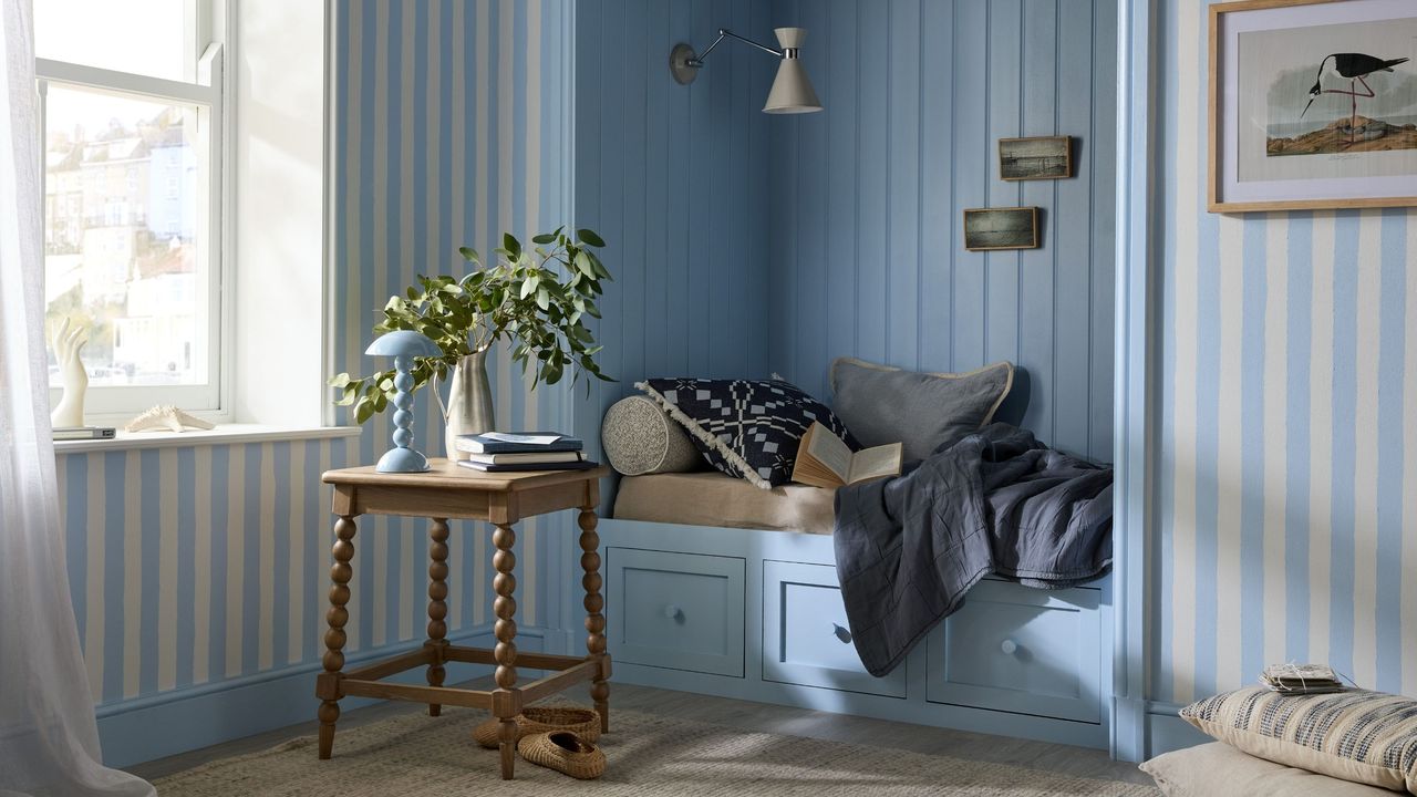
Everyone needs a good blue in their interior paint color collection. Avery's sky is a delicate blue with hints of green that promotes calmness and focus (a great sensory-conscious paint color), making it well-suited for rooms that reflect this feeling in the home. Think home offices or bedrooms. Plus, Earthborn says it's a paint color that works effortlessly in north-facing spaces.
Fresh Air was born from being one of the brand's most requested colors for bespoke orders. And it's easy to see why it's so universally loved. This shade of white paint has a whisper of blue, giving a fresh and airy feel to a room. Also interesting to note is that the cooler undertones can help add balance to south-facing rooms.
Earthborn calls Little Sprout the brand's most versatile green. The warm yellow undertones add a bit of warmth, helping such a bright green feel more grounded in nature and thoughtfully modern. This shade is another great option for north-facing rooms or works well as a pop of color while still staying calming.
Bright spring color palettes need a moment of balance, and Mr. Mole, a rich, earthy charcoal gray, offers just that. Adding more depth to Earthborn's range of grays, Mr Mole still won't feel too overpowering thanks to its warm undertones.
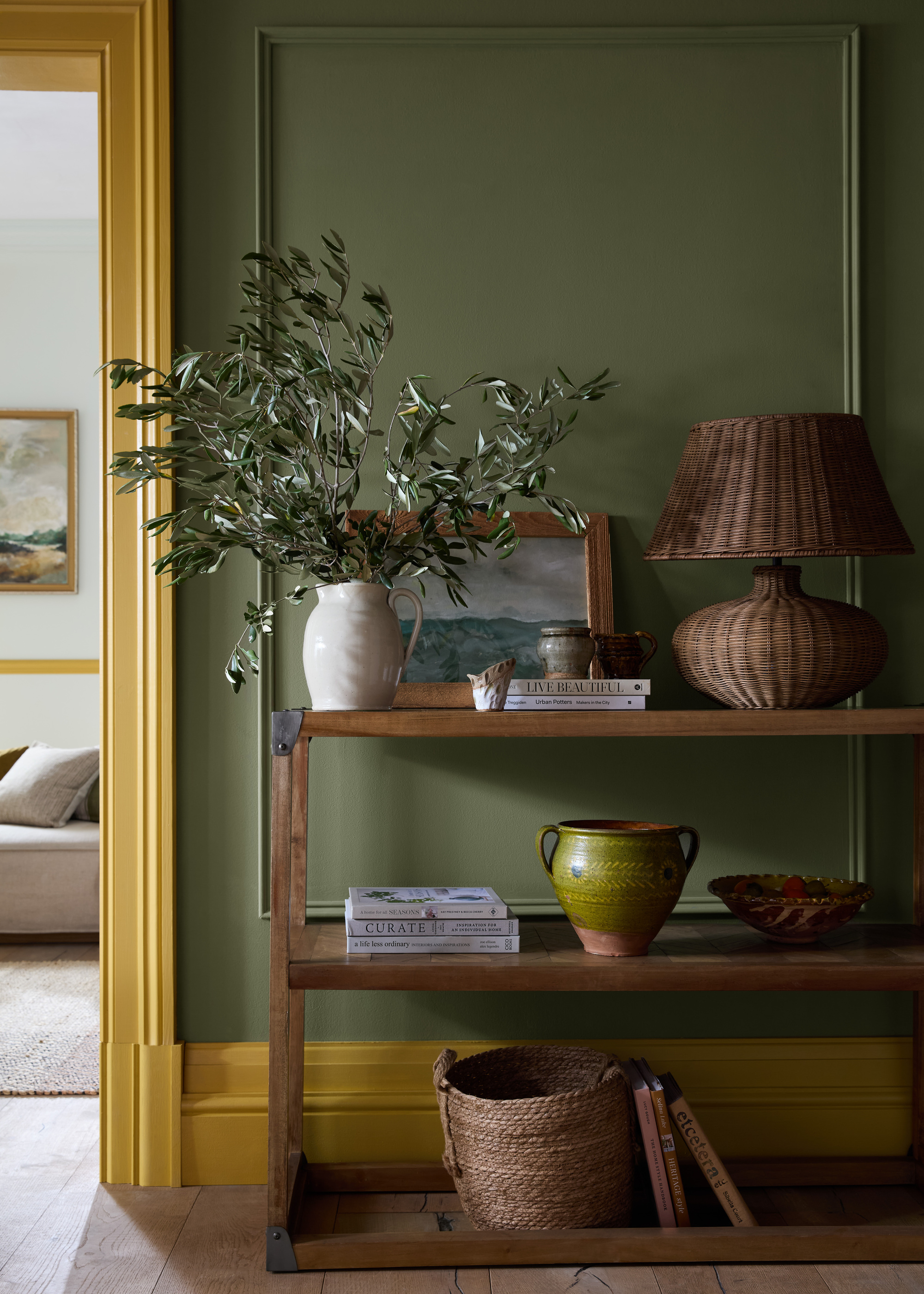
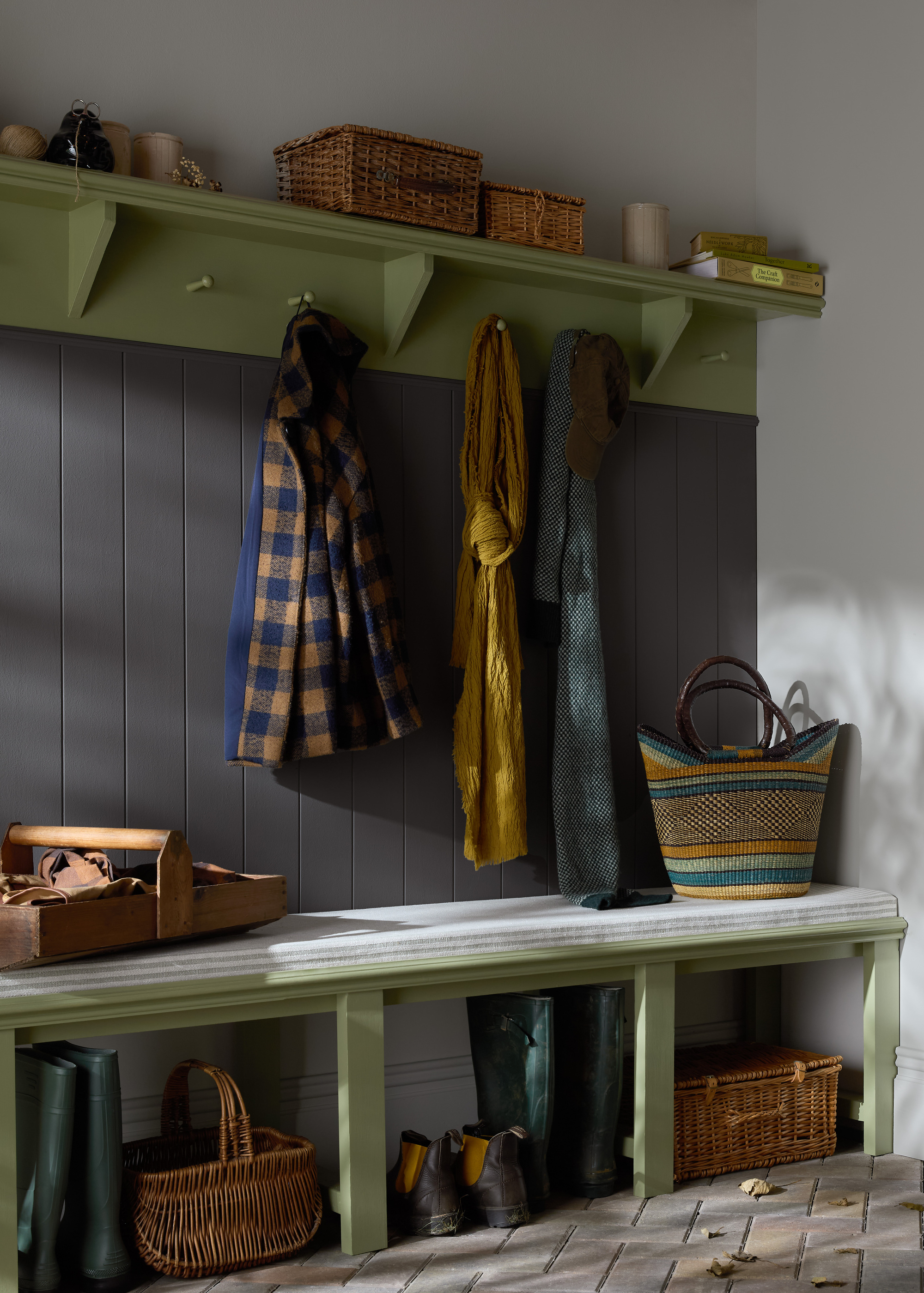
Oliver Twig is the natural, yet fashionable olive green that we all want somewhere in our homes. It creates a striking contrast with the other neutrals in the collection, like grays and whites. This shade is perfectly balanced between color trends like chartreuse and more timeless paint colors, perfect for living rooms or dining rooms. I'm obsessed.
Inspired by an apple core, Pale Pip is what Earthborn is deeming "a contemporary alternative to the brand’s always popular white shade." Its subtle green undertone adds a fresh, clean feel to any space.
For a green paint color that's a livelier, Poppet is refreshing yet soothing. This color would work beautifully in a tonal scheme with other greens and whites. Plus, Earthborn says this shade is great for balancing harsh yellow light in south-facing rooms.
Baby blue is one of those colors that will never go out of style. Quick Dip is bright while keeping a calming tone. I instantly picture this soft blue in a relaxing space like a bedroom or bathroom, but it's timeless enough to work in a high-traffic area like the kitchen as well. Try complementing it with greens, other blues, rich browns, and or even pinks.
Ragdoll is a super soft sage that feels grounding and natural. Predicted to be one of Earthborn's most in-demand shades, it proves that decorating with sage greens can evolve into something that feels more contemporary. This almost-beige green works well in neutral color schemes.
Not afraid of decorating with color? Riverbank is a vibrant, high-energy green inspired by lush waterside foliage. You may not want to put it everywhere, but Earthborn says this bold addition to the palette works well when paired with whites, aqua blues, and pale yellows.
Earthborn describes this color as "a grown-up yet playful blush pink with a thimbleful of yellow," and it makes for a surprisingly light, warm, and versatile shade. I have never been the biggest fan of peachy-pinks, but the warm undertones make it a more neutral-leaning shade that pairs well with other earth-tones.
The 'goldilocks of colors', Three Bears sits 'just right' between yellow and brown on the color wheel. Yes, it's definitely a bright, energetic color, but the more golden and mustard yellow tones make it a little more sophisticated. Try this color in both north and south-facing rooms.
You don't have to buy all new decor or spend a ton of money to make your home feel new. Sometimes, a fresh lick of paint makes even your oldest pieces feel refreshingly revived.