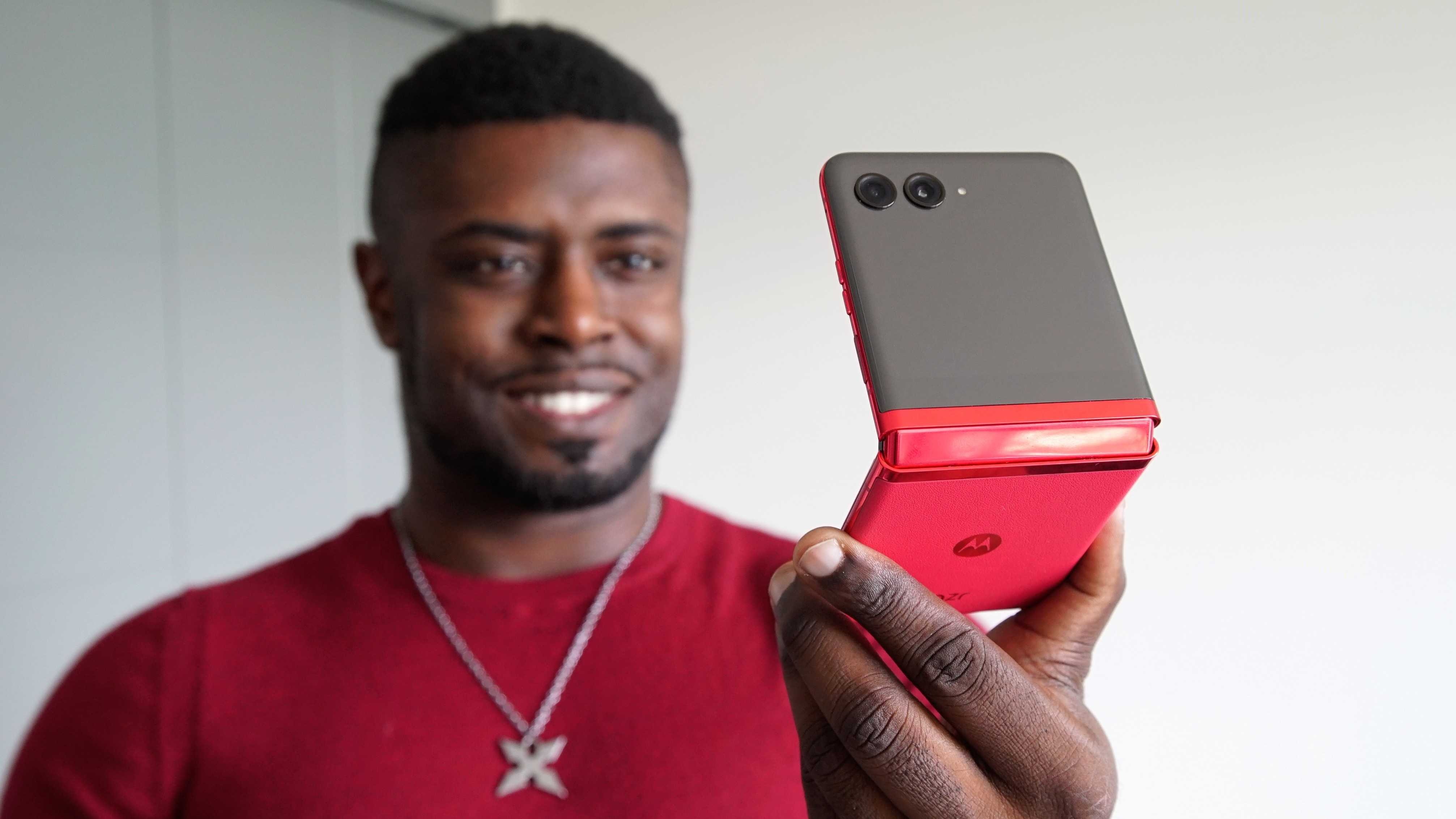
After years without a new foldable from Motorola, the company launched the fresh new Razr+ in North America, also known as the Razr 40 Ultra in international markets. The phone is a complete reimagining of the Razr foldable lineup, which previously banked on nostalgia to entice consumers. However, with the foldable market in a completely different place now, with Samsung's Galaxy Z Flip lineup topping sales, Motorola can no longer rely on nostalgia. This has resulted in a phone that is probably best suited to take on Samsung's best-selling foldable and those from other OEMs.
Aside from its new, more modern design, the main selling point of the Motorola Razr+ is the large 3.6-inch cover screen, which is the largest of any clamshell foldable phone available today. Motorola is leaning heavily on the idea that this pocketable phone will enable new experiences for consumers who may have not owned a foldable phone before, allowing you to do almost anything from the smaller panel without needing to open the phone.
It's an interesting idea and one that clamshell foldables have tried to capture with their ever-growing displays. However, while impressive, phones like the OPPO Find N2 Flip still fall just short of those experiences.
As the first foldable phone I've ever used, I was definitely curious to see whether or not the Motorola Razr+ could live up to the hype. Not just the hype around the phone but the growing hype surrounding foldable phones, which are becoming more prevalent and accessible each year. After all, this is the company that launched the first commercial foldable phone back in 2019.
Motorola Razr+: Price & availability
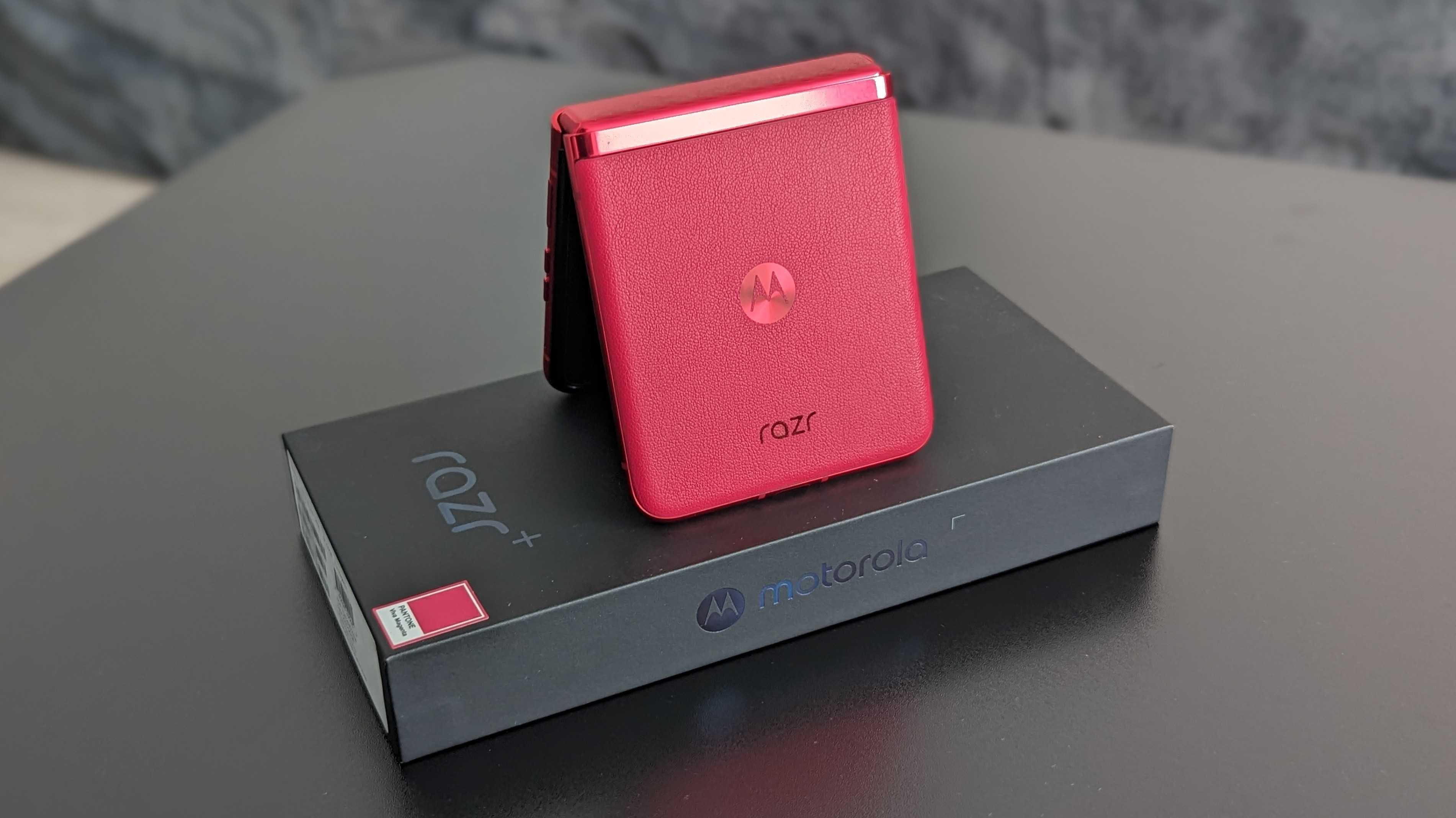
The Motorola Razr+ was launched on June 1, 2023. The phone retails for $999 and goes on sale on June 23 in North America. In Canada, the phone retails for $1,299.99 and will be available through Motorola.ca and various carriers and retailers. In Europe, the phone is available as the Razr 40 Ultra, retailing for €1,199/£1,049.
The Razr+ has three available color options: Infinite Black, Glacier Blue, and Viva Magenta. The latter option can be purchased at Motorola.com, Amazon, and T-Mobile in the United States.
In the United States, the phone can be purchased unlocked from Motorola.com and retailers such as Amazon and Best Buy. It will also be available through carriers such as AT&T, T-Mobile, Spectrum Mobile, Google Fi Wireless, and Optimum Mobile.
Motorola Razr+: Design & display
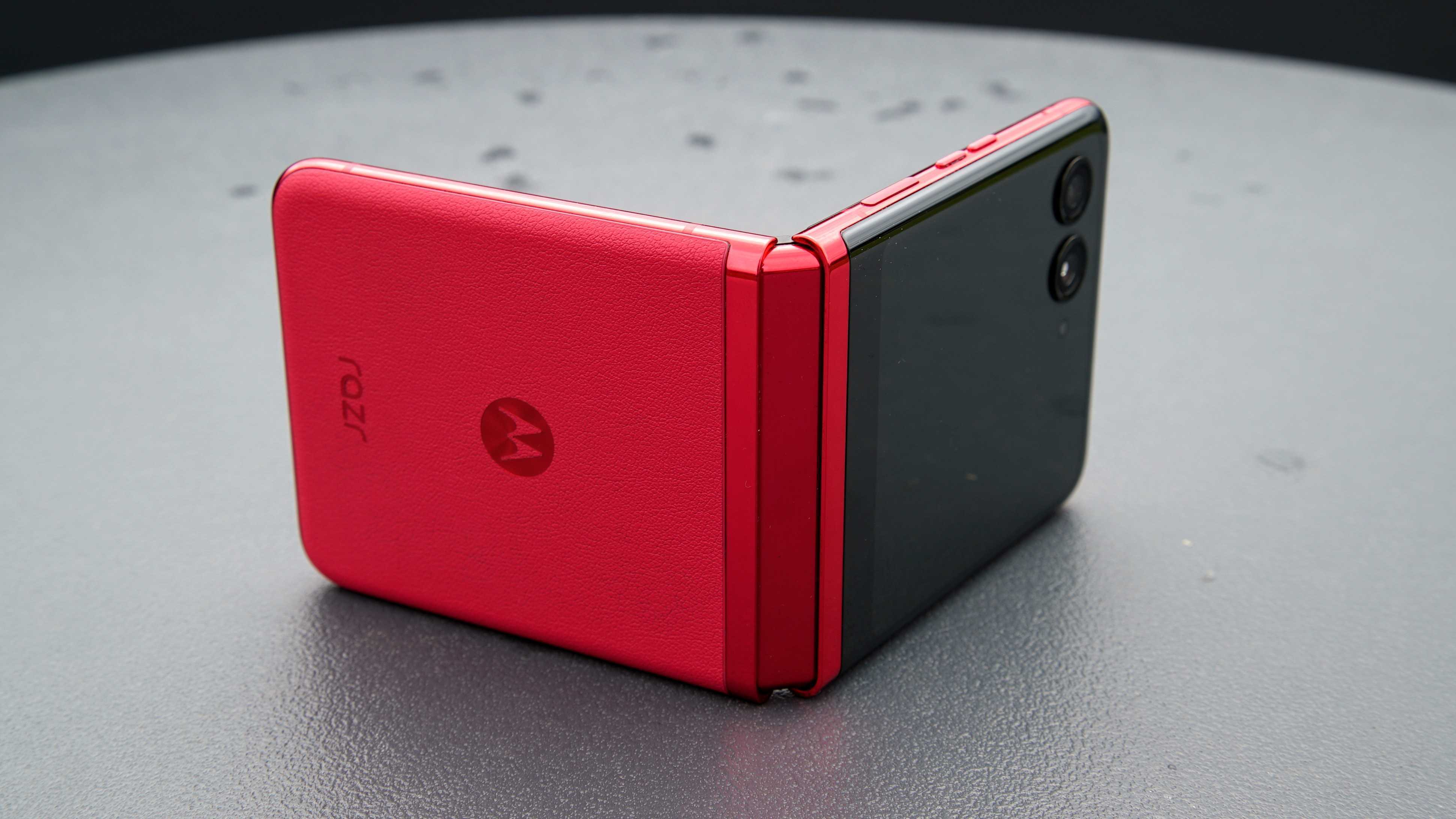
If you're familiar with the previous Razr foldables and even the older Razr flip phones, you'll see that the new Razr+ looks quite different. Like the Razr 2022 that was released only in select markets, the Razr+ ditches the large, protruding chin for an all-display design that matches just about every other clamshell out there.
However, unlike its biggest competitor, the Galaxy Z Flip 4, the Razr+ embraces curves, with the rear panel seamlessly flowing into the frame, which is also rounded. The result is a phone that's quite comfortable to hold, devoid of any sharp edges digging into my fingers.
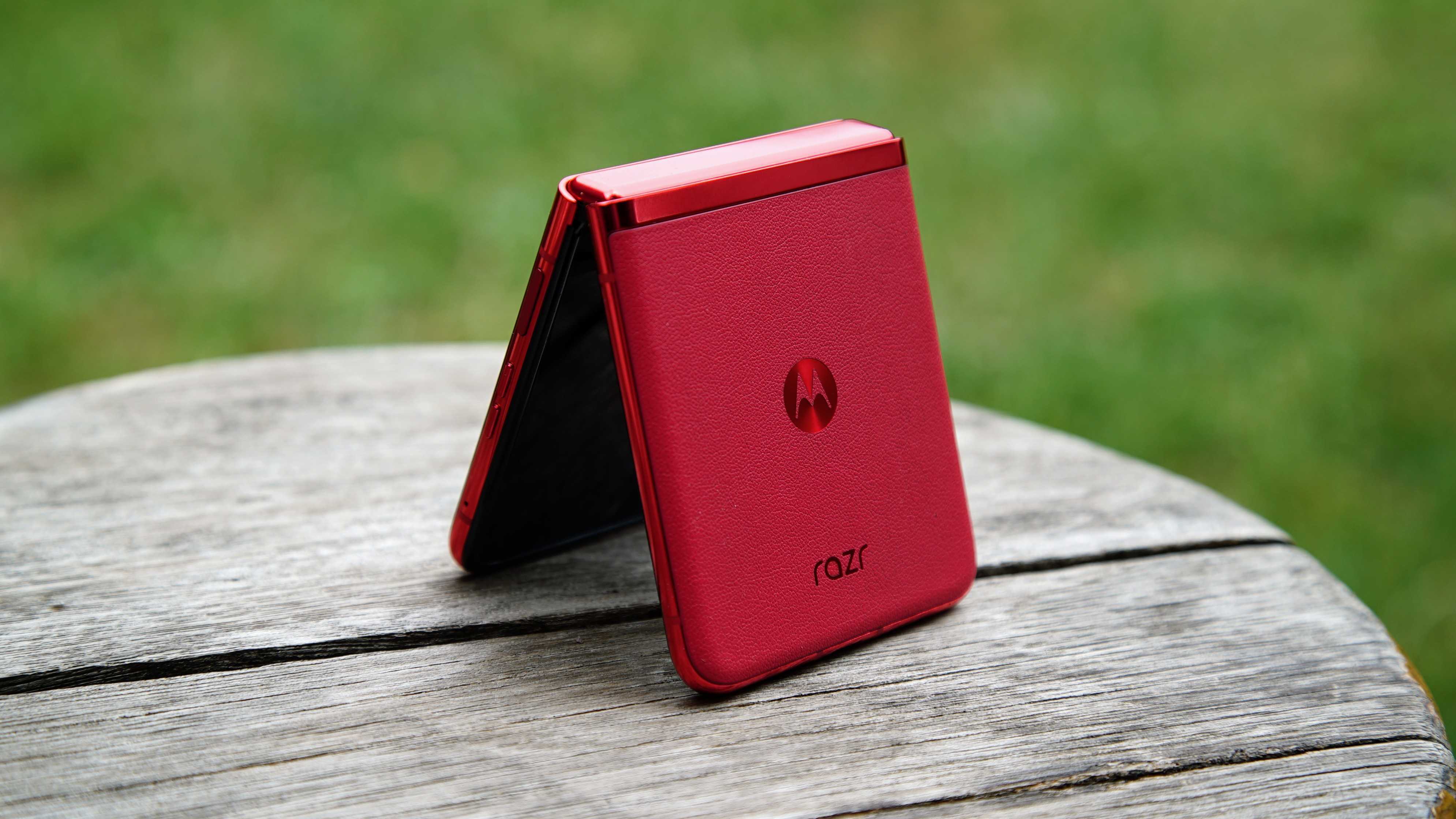
I also have the Viva Magenta colorway, which can be purchased at Motorola.com, Amazon, and T-Mobile in the United States. Of the three color options, it's the only one with a faux leather back, adding a nice soft texture to the phone. I wouldn't say it feels premium, but it's definitely different from the all-glass or plain plastic phones I'm used to. Given that I've already dropped this phone on a hard surface, I'm definitely glad it's not glass, although I would absolutely recommend picking up a Razr+ case.
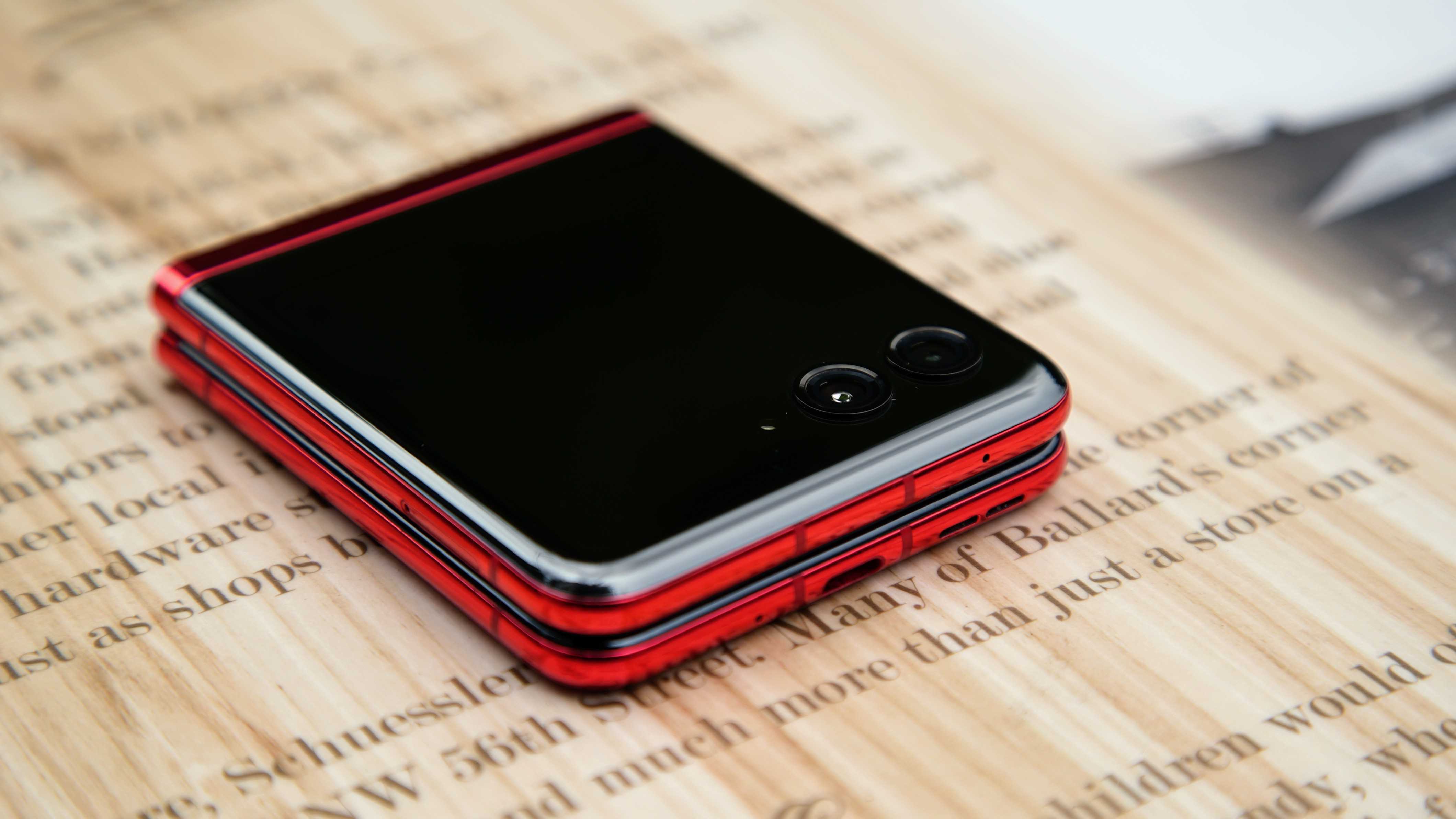
Aside from the faux leather back, the phone is quite glossy, which makes it look more crimson than magenta and reminds me of the red LG G8. It's a beautiful phone that will surely stand out, especially if you can snag this colorway.
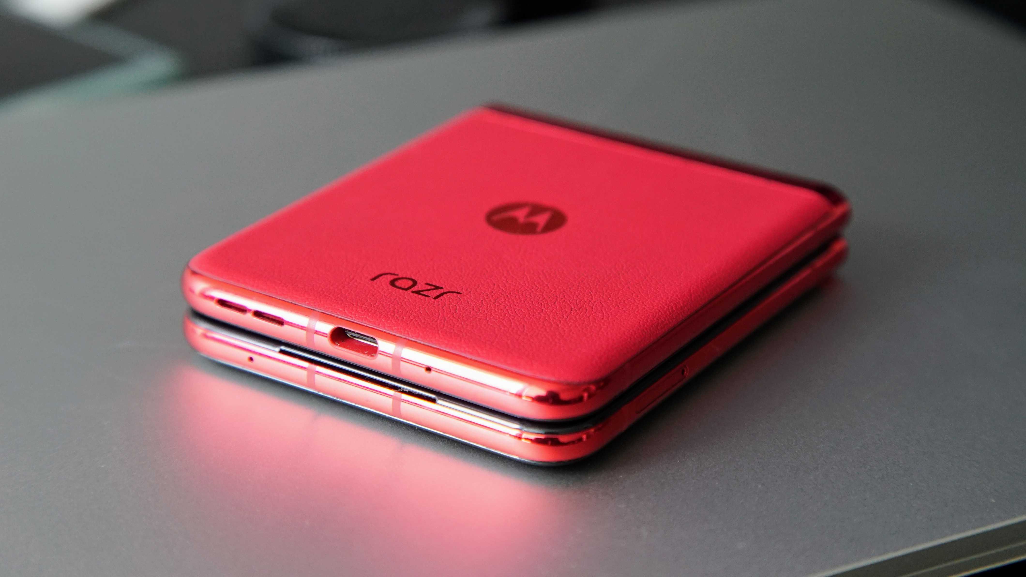
At just 6.99mm, the phone is fairly thin when open, and doesn't feel too bulky when closed, even when shoved into my pocket. It's also a fingerprint magnet, at least on the cover panel's mirror-like finish. I feel like I'm constantly wiping it, as it can look pretty grimy after a while. That said, I'm also pretty vain, so the glossy panel doesn't bother me that much since I can use it like a mirror. Silver lining.
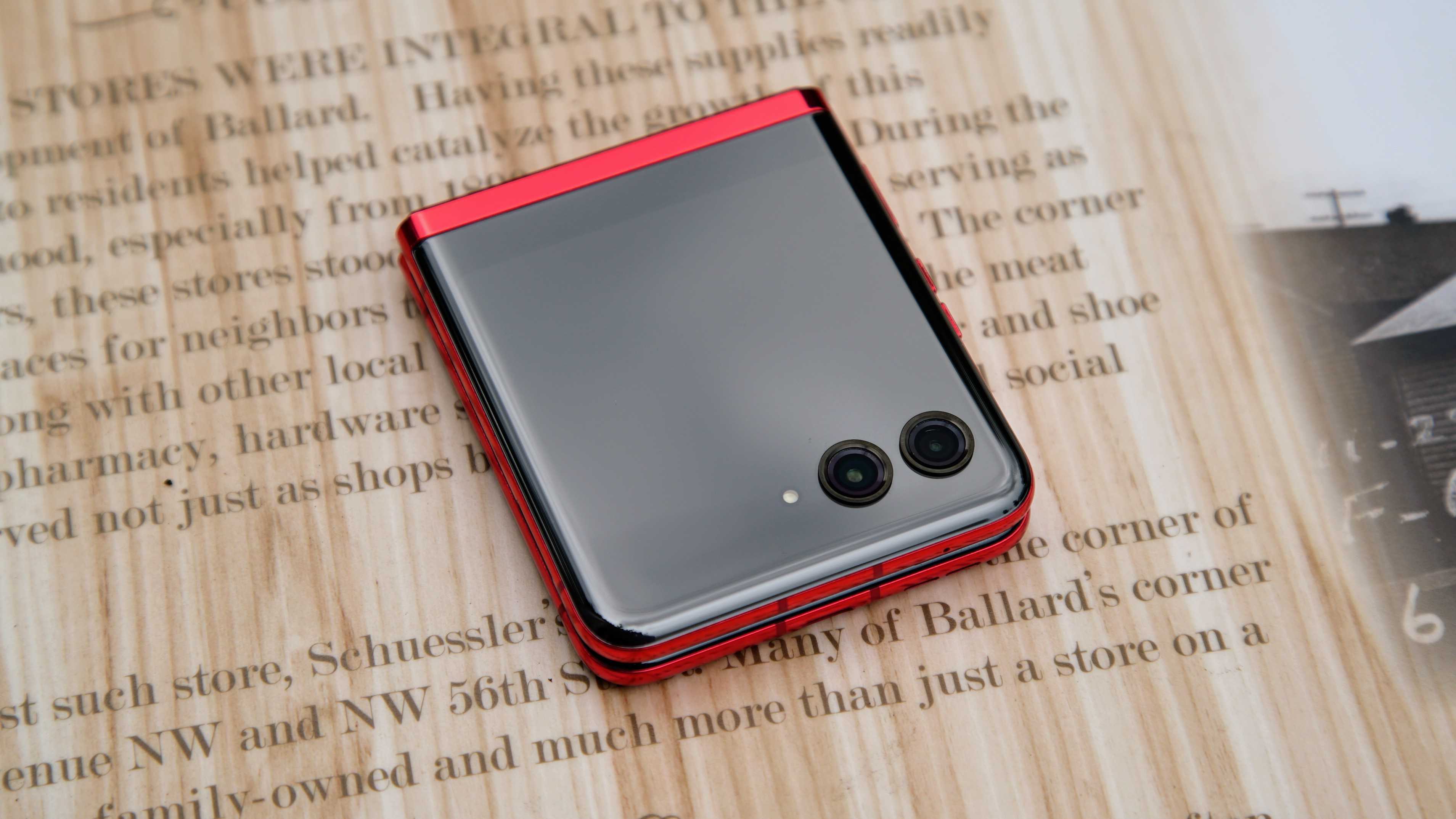
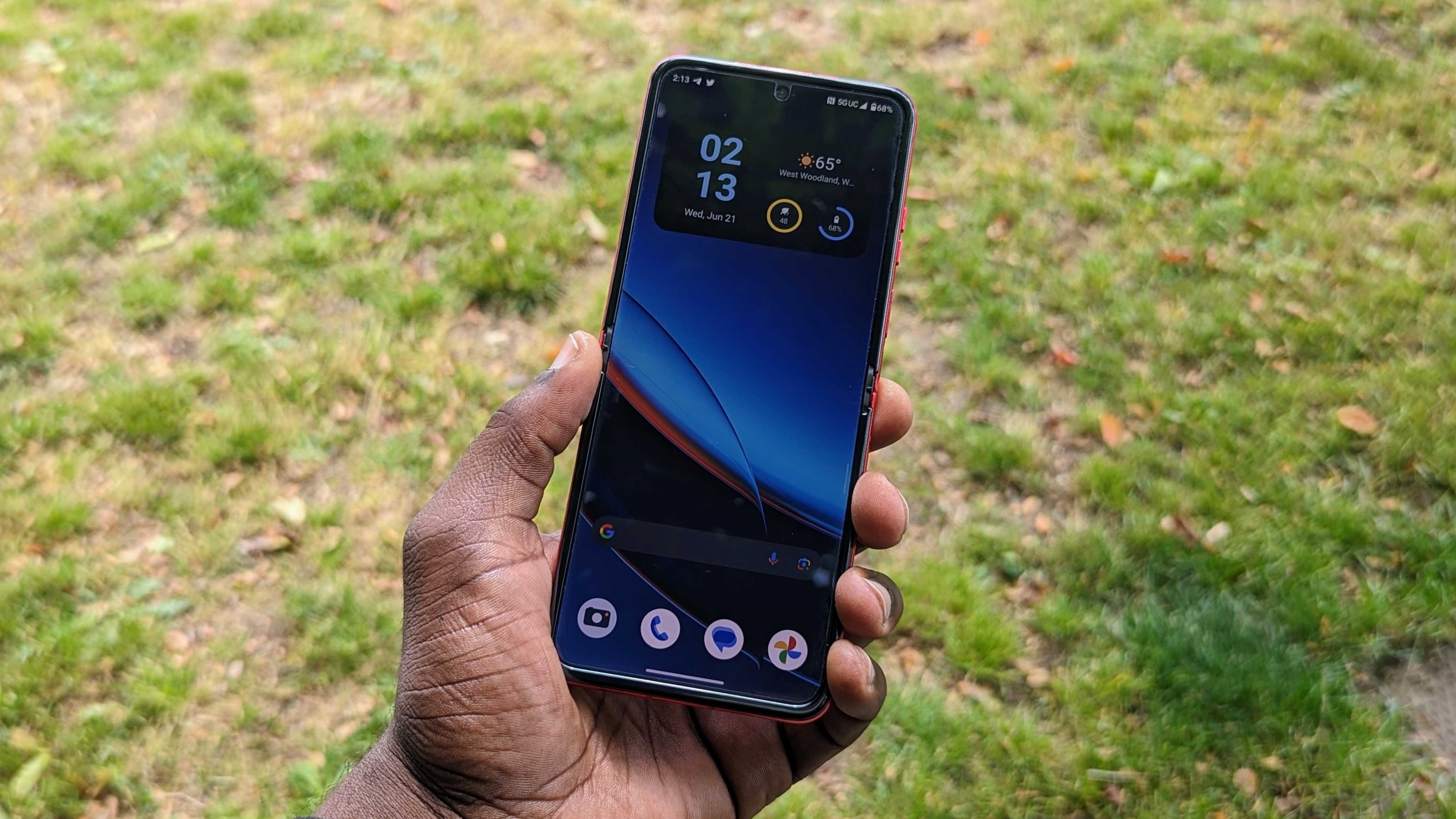
The internal display is a 6.9-inch panel with a tall 22:9 aspect ratio. It makes the phone a bit long, which I'm not a fan of since some UI elements are kind of difficult to reach with one hand. Otherwise, it's a nice pOLED panel that looks perfectly fine indoors. It's sharp and vibrant enough, and the 165Hz refresh rate is also buttery smooth, making everything look and feel incredibly responsive.
However, things start to fall apart outside and in direct sunlight, and the 1400 nits of peak brightness just don't seem to be enough, as I sometimes find myself straining to see the display.
The main display on the Razr+ is rather nice. That is, until you step outside.
Then, there's the crease. As I mentioned before, this is my first time using a foldable phone, so I've never really experienced the display crease for myself until now. And while I can't compare it to the likes of the Galaxy Z Flip 4, I will say that the teardrop hinge mechanism on the Razr+ seems to do wonders with the crease. It's not nonexistent — tilt the phone just right, and you'll definitely see it — but it's not as jarring as I expected it to be.
It took a second to get used to the feel of it as my finger glided across the screen in my initial use, but I've since become accustomed to it.
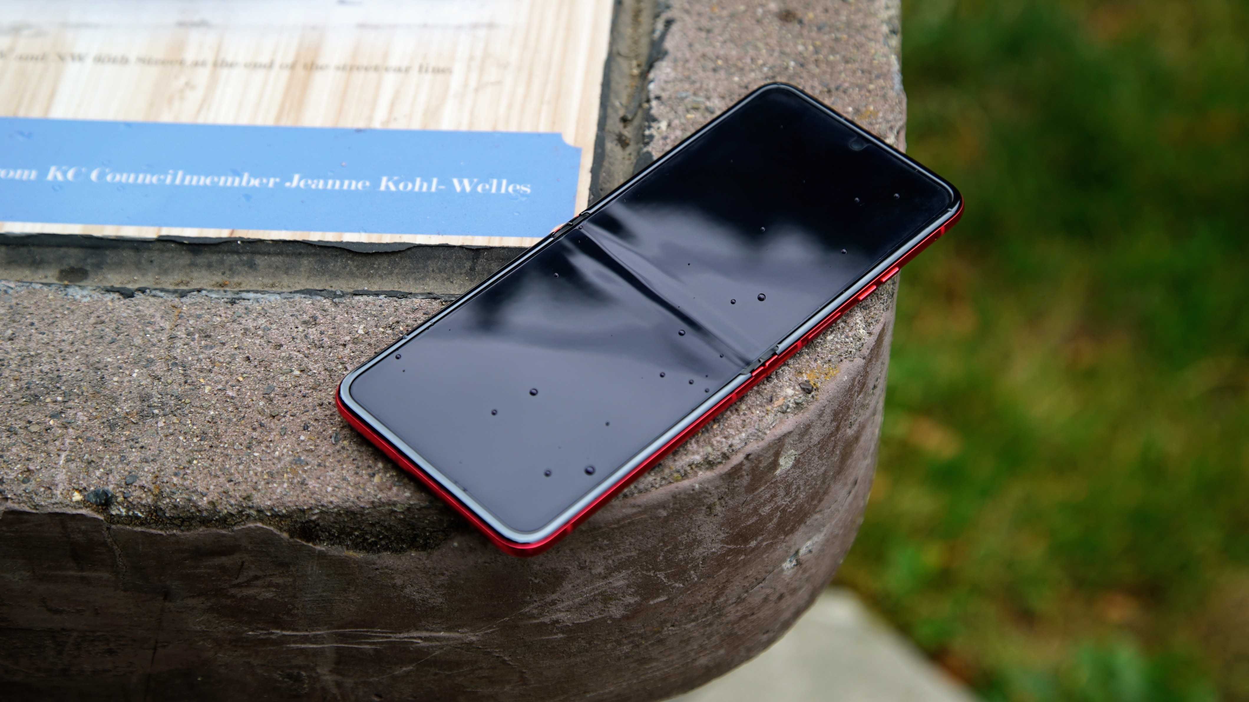
I also had to get used to the fact that the phone doesn't open exactly flat. It's not as pronounced as the Pixel Fold, and in fact, it's extremely subtle — maybe less than a degree and barely noticeable if you aren't paying attention. Fortunately, the cameras keep the phone from dramatically rocking about when set on a flat surface.
Interestingly, I've had multiple friends separately refer to the Razr+ as a Game Boy Advance SP in smartphone form, which seems surprisingly apt.
Motorola Razr+: Cover screen
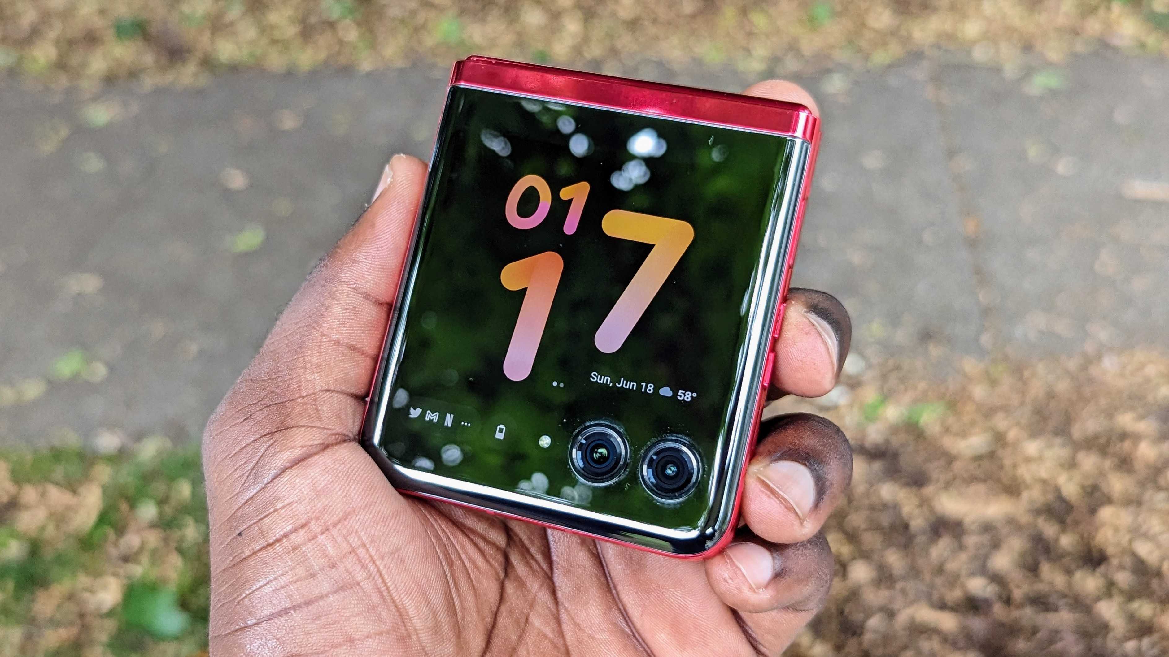
Of course, the cover screen is the star of the show here, and it's the main selling point for the Razr+. The 3.6-inch OLED display hides in the reflective back panel of the phone to the point where you wouldn't know it's there until you tap it or unlock the phone. It's an interesting take on a cover display, which doesn't even try to avoid the dual cameras and instead features three cutouts for the sensors and LED flash unit.
After using the phone for a couple of weeks, it makes sense that Motorola is really focused on the outer display because I really love using this thing. A lot. While it's not the brightest display on the block, it is very responsive, and the 144Hz panel, while overkill, keeps everything looking just as smooth as they do on the main display. I do wish there was an option to bring it down to 90Hz or something because I feel like anything beyond that is wasted on a relatively small display, but I digress.
What I love about the cover screen is that it makes it incredibly easy to use the phone while closed. Motorola has a series of "panels" that are essentially like widgets for the display. These give users access to up to nine different functions and can be arranged to your liking:
- Apps
- Calendar
- Contacts
- Games
- Google Fit
- Google News
- Spotify
- Weather
The Home panel is pretty basic, and the Calendar panel, while handy for quickly checking upcoming events, doesn't really do anything besides cycling through the schedule and month view, which feels like a missed opportunity. The Weather panel lets you cycle between an hourly view and a weekly view, and tapping on any forecast will provide more information, which I like.
Unfortunately, there aren't as many panels as I would like, and I wish there was an option for YouTube Music instead of Spotify since I don't use the latter. But that's where the Apps panel comes into play, and it's the reason why I love using the cover screen so much.
Thanks to the Apps panel, you can open nearly any app on your phone without actually having to physically open it. No YouTube Music panel? That's okay. I'll just open it from the Apps panel and browse my music there. Want to quickly Shazam a song? Just tap the app icon. Need quick access to your gym membership card or transit pass? Just open the respective apps on the cover panel and go on your way. It's super convenient, and you can include nearly any app you want on the panel.
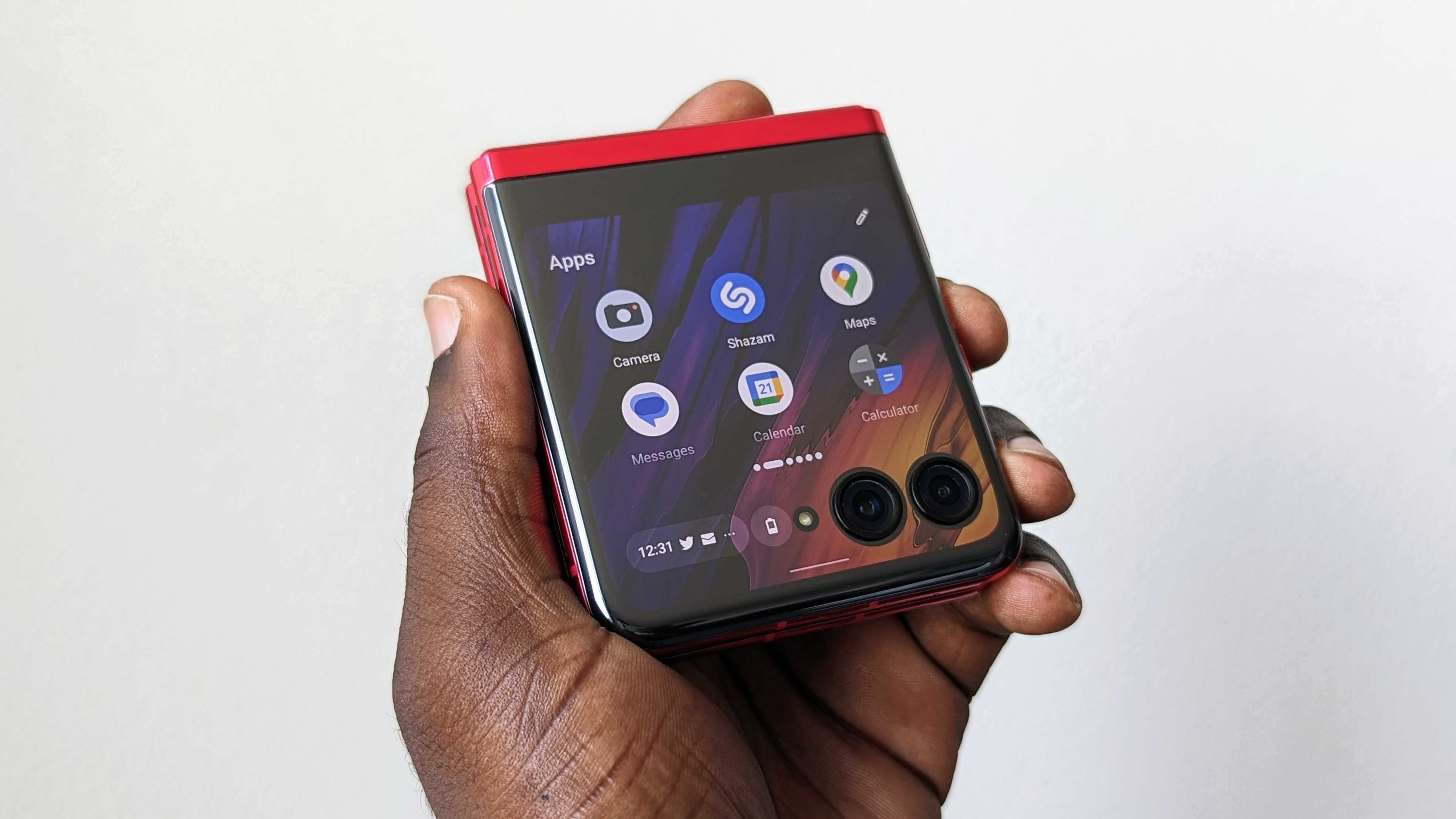
And while none of these apps are really optimized for the smaller display, many of them are surprisingly easy to use, although it can be hit or miss. For instance, TikTok will work just fine, but Instagram is a little wonky when posting a story. Everything is scaled down, so using many apps can be awkward at first. Motorola makes it easy to shift apps up and away from the camera sensors in case they're blocking some important UI elements, which requires you to press and hold the navigation bar at the bottom to cycle between views.
Motorola is practically begging you to use that large cover display, and it's hard not to.
Additionally, when using an app on the main display and closing the phone, you'll sometimes be prompted to continue the app you were using with a notification in the corner. Tapping it will open it on the cover screen, which is a nice touch. You can also set apps to always continue this way without the prompt or to just never open on the cover screen if you prefer.
Alternatively, opening the phone while using an app on the cover screen will open it on the main display, making for some nice app continuity. Watching videos on the cover screen is also surprisingly comfortable.
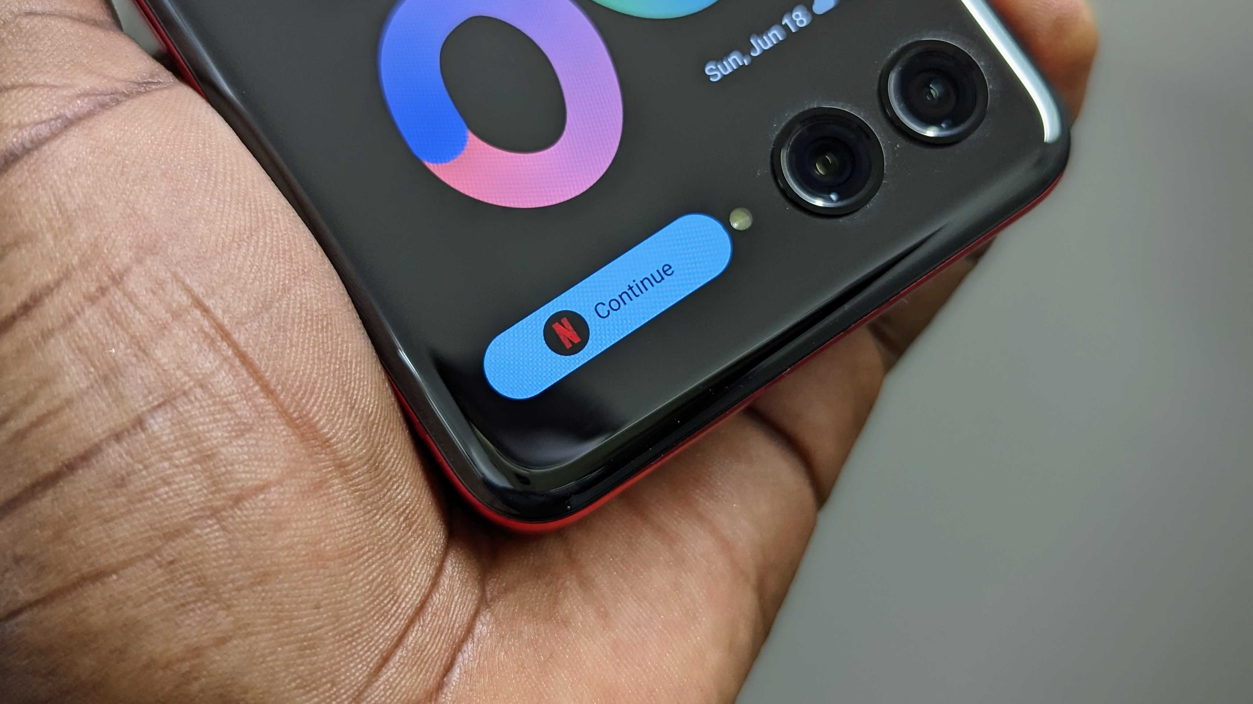
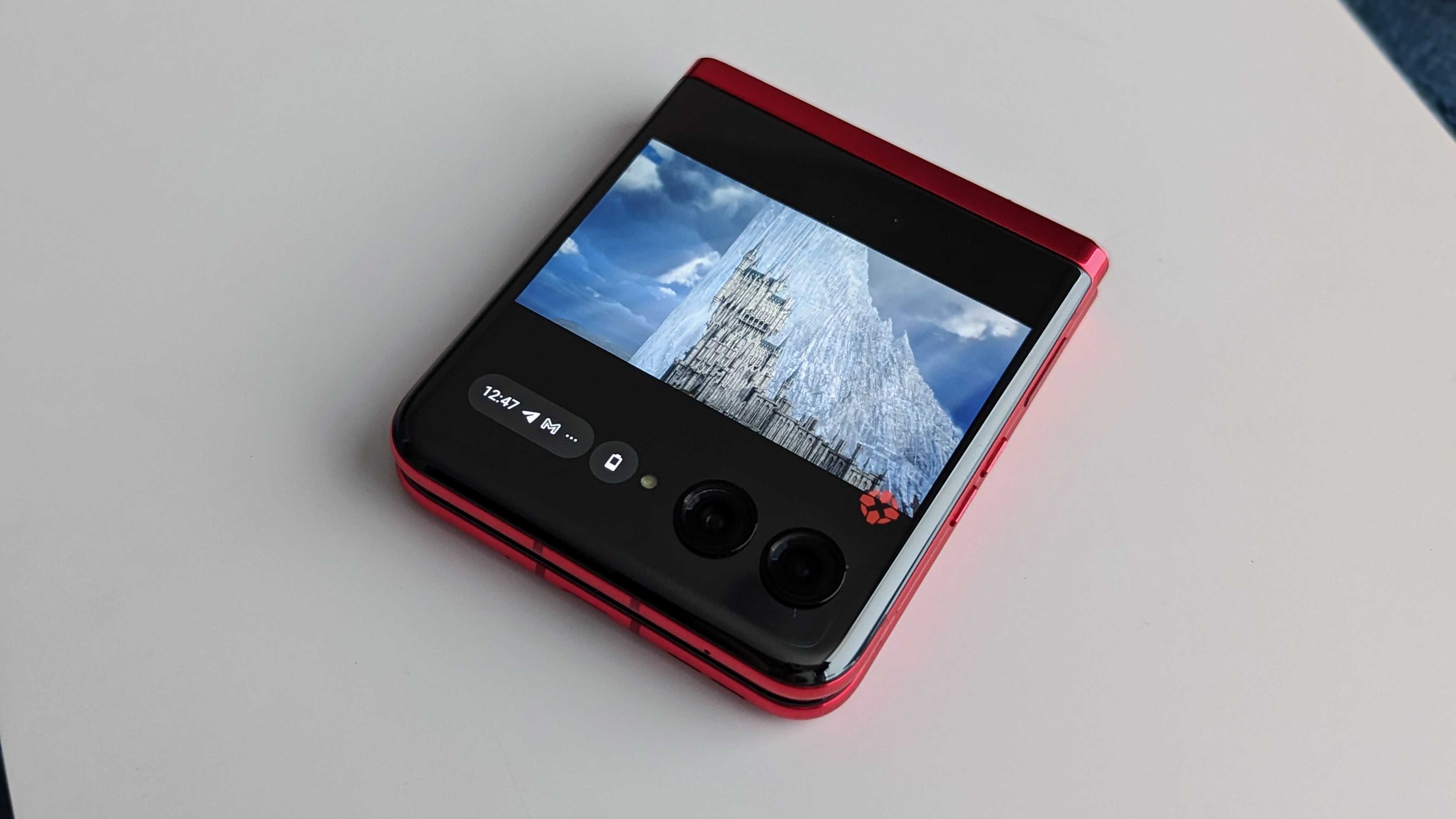
The keyboard works well enough, although you can only use Gboard on the cover screen. I would suggest adjusting the height a bit, as the keyboard takes up just about the entire screen and can obscure the actual text preview.
You can also play many of your regular games on the cover panel, which will attempt to scale accordingly. Again, it's not perfect, but it's workable. But beyond that, Motorola has a Games panel with some perfectly optimized games that can easily cure you of boredom. And to be honest, this is a great way to showcase the cover screen, and some of these games are pretty fun, especially Marble Mayhem and Stack Bounce.
When using the cover screen, a pull-down from the top will reveal Quick Settings, brightness, and a virtual power button. Pulling up front the cover screen will reveal the app switcher. The small area next to the cameras is reserved for the battery icon, which will expand to give you the battery percentage, an occasional weather icon, and notification icons. It can seemingly squeeze three notifications into a small area, but tapping it will display a full-size list on the display, where you can interact with them just as you normally would.
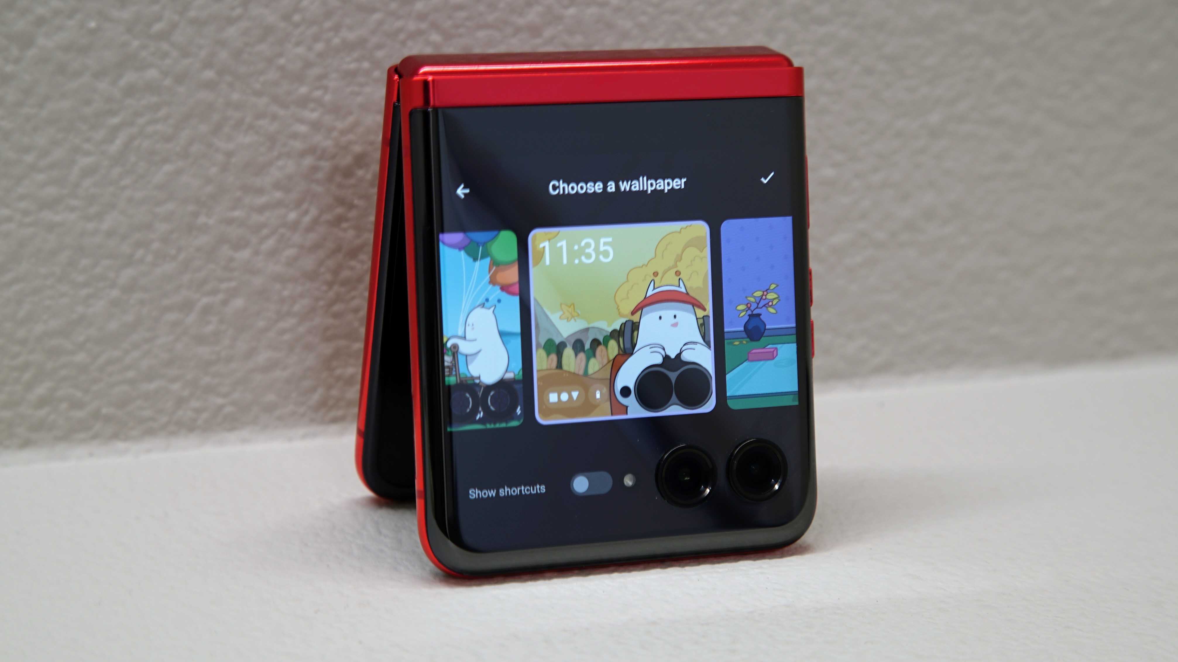
There are also plenty of wallpapers and lock screen clock styles to choose from, so you can make the cover panel your own.
Motorola Razr+: Hardware & specs
The Motorola Razr+ is powered by the Snapdragon 8+ Gen 1, a chipset that launched toward the second half of 2022. It's nearly a year old, but the chip is still quite good and brings some solid performance to the Razr+. The phone doesn't struggle at all when juggling apps, thanks to the 8GB of RAM, and will give you the kind of performance you'd expect from any of the best Android phones available today.
The phone is pretty good at handling games like Honkai: Star Rail at the highest settings, which makes for a great gaming experience. You can also give the phone a performance boost using the built-in gaming mode, but the phone can get quite warm when playing graphics-intensive games, particularly on the top half. This is the only time I even notice the phone heat up, which seems pretty standard and doesn’t really concern me much.
The Snapdragon 8+ Gen 1 may be last year's chipset, but it works perfectly fine in 2023.
The fingerprint sensor on the side is incredibly quick and responsive, unlocking the phone whether it's open or closed. The phone also benefits from incredible audio with dual stereo speakers, Dolby Atmos, and Snapdragon Sound. Unfortunately, the phone only has an IP52 water and dust resistance rating, and Seattle weather is temperamental this time of year. The dust resistance is a nice touch, especially as it's something even Samsung has yet to include with its foldable phones. There's also NFC for mobile payments and other functions, which you can use while the device is closed.
Despite the somewhat underwhelming IP rating, this phone is built to last and is still plenty durable, which is a big concern with foldable phones. It uses Gorilla Glass Victus for protection and 7000 Series aluminum on the frame, which should help keep it intact if you ever drop it. The hinge mechanism has also been tested to withstand up to 400,000 folds, which is double Samsung's claims for its foldables.
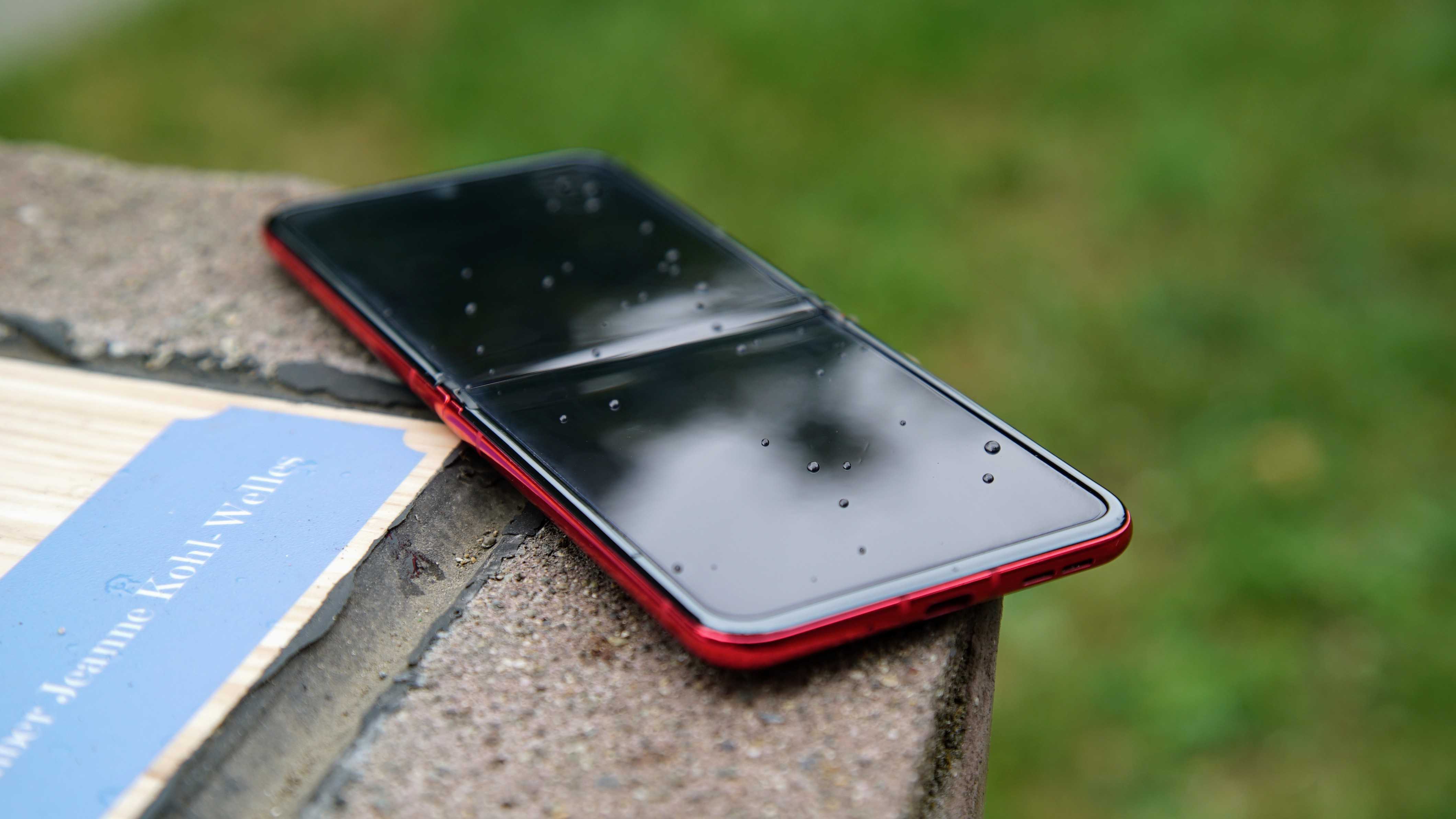
Speaking of the hinge, it's one of my favorite things about the phone. Opening the phone is admittedly not as easy as I'd like if you're trying to do it one-handed, but it's not impossible. That's likely because the hinge can hold the phone at various angles, from 45 to 130°, which can be used for taking photos, videos, or viewing content. It's not too unlike the Flex Mode on the Galaxy Z Flip 4.
But the beauty comes when closing the phone, which is incredibly smooth and culminates in a very pleasing sound that I frankly can't get enough of. It's not really the same loud snap I remember from the days of flip phones, but it's something much softer. I can't really explain it, but it makes the phone a joy to close.
Motorola Razr+: Software
The Razr+ runs Android 13 out of the box with Motorola's usual My UX on top. It's largely "stock" Android, which admittedly isn't my favorite flavor of Android (yeah, I prefer Samsung's One UI). Fortunately, Motorola improved on the experience with some goodies sprinkled throughout the software. Gestures are still here and can even be used while the phone is closed. That means I don't need to open it to enable the flashlight or turn on the camera. That makes it easy to take selfies from the cover screen, which I'll get to later.
Motorola also has a separate menu to personalize the cover screen, which lets you adjust how apps behave on the cover screen, change wallpapers, access display options, and more. You can also adjust the call behavior to either keep the call going or disconnect the call when closing the phone. But who doesn't like the feeling of slamming the phone shut to hang up on someone?
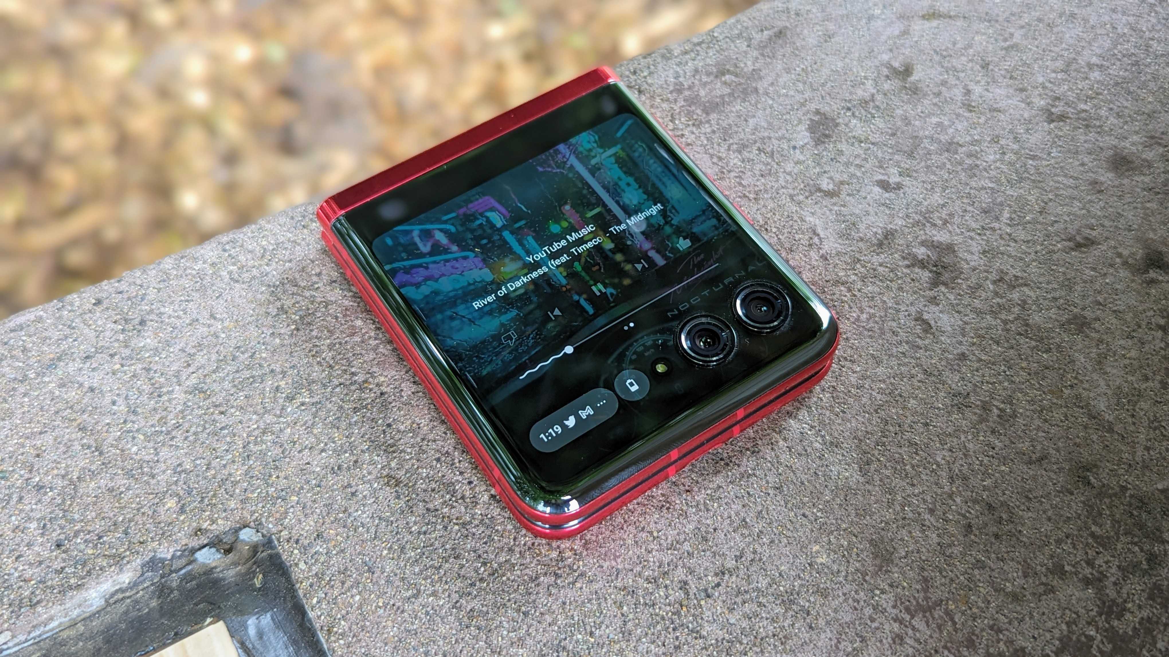
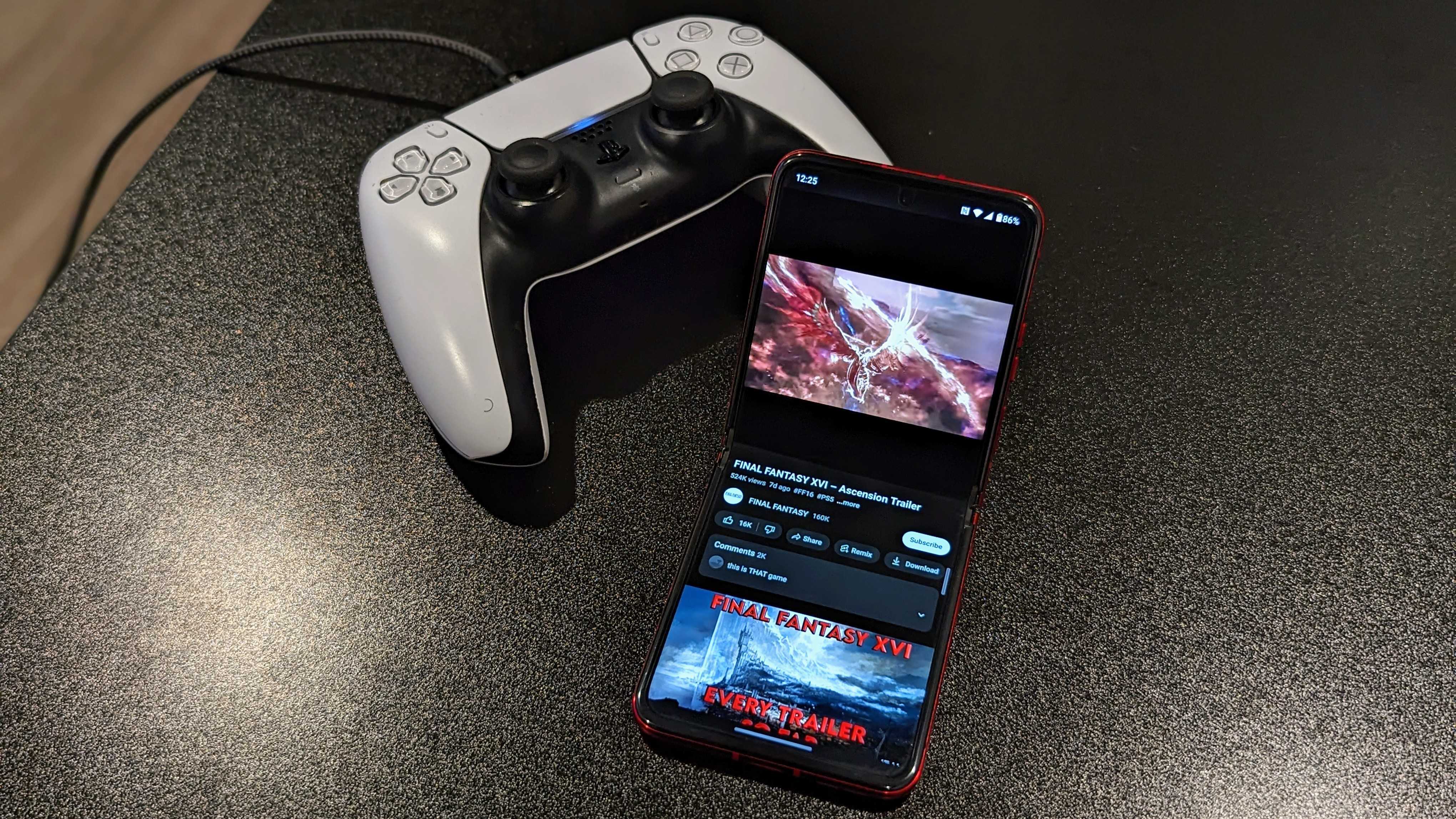
With the phone's flex mode, some apps like YouTube will adjust their UI to better take advantage when the phone is at an angle. The inner display also takes advantage of features like Peek Display, which I always find incredibly handy on Motorola phones. Admittedly, I don't find myself using this as often as I would since I've gotten into the habit of closing the phone when not in use. Fortunately, I can still access notifications from the lock screen on the cover panel, and if I'm listening to music, I can swipe from the lock screen to quickly access playback controls.
The phone supports wireless Ready For, which is a neat way to connect to PCs or cast your smartphone display and content with a PC-like UI without worrying about wires.
Motorola has also stepped up its game when it comes to software support, particularly on its flagship phones. The company promises to support the phone with three OS upgrades and four years of bi-monthly security updates, which is great for a phone that costs this much. Let's just hope Motorola can actually live up to the promise.
Motorola Razr+: Cameras
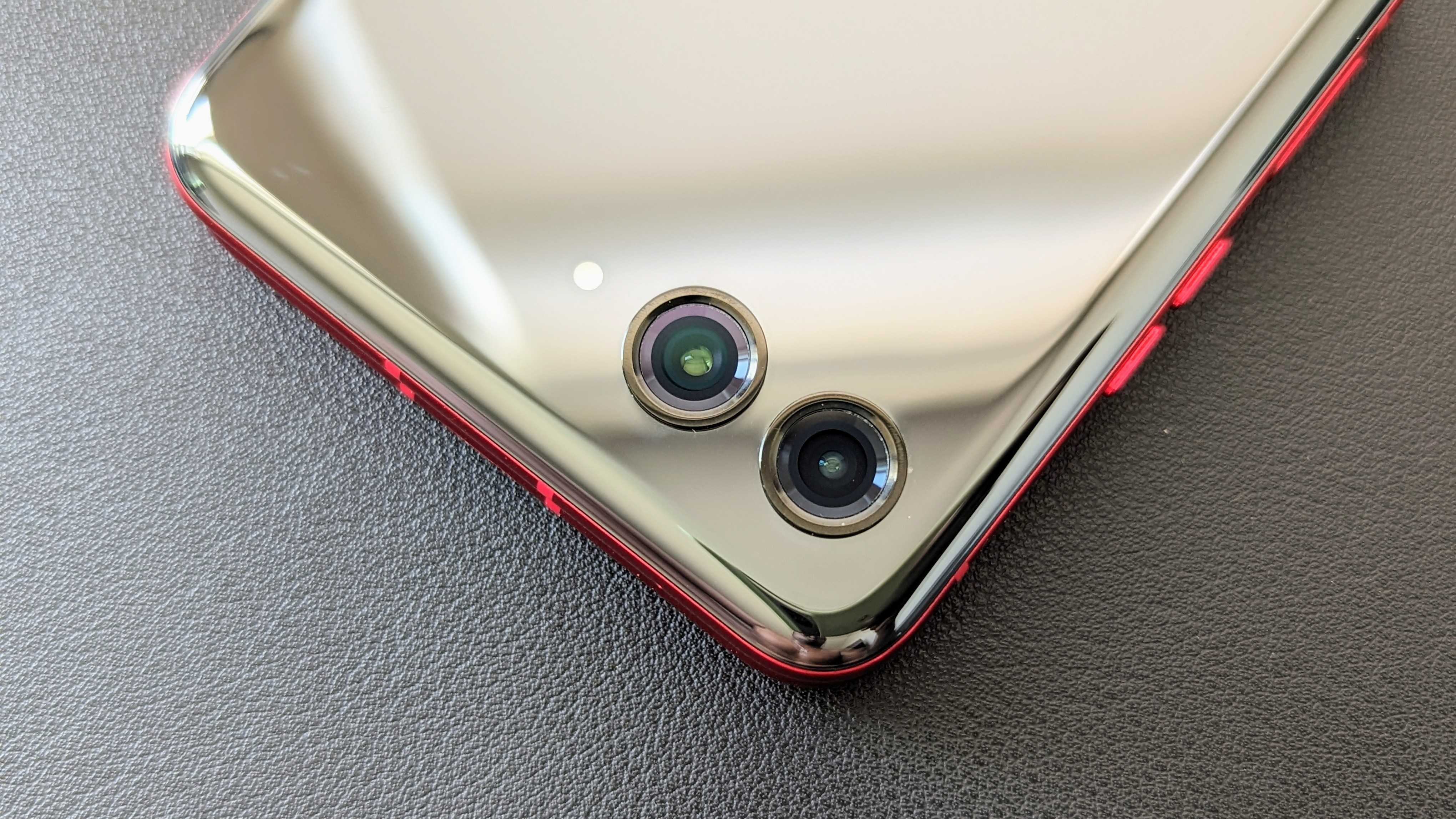
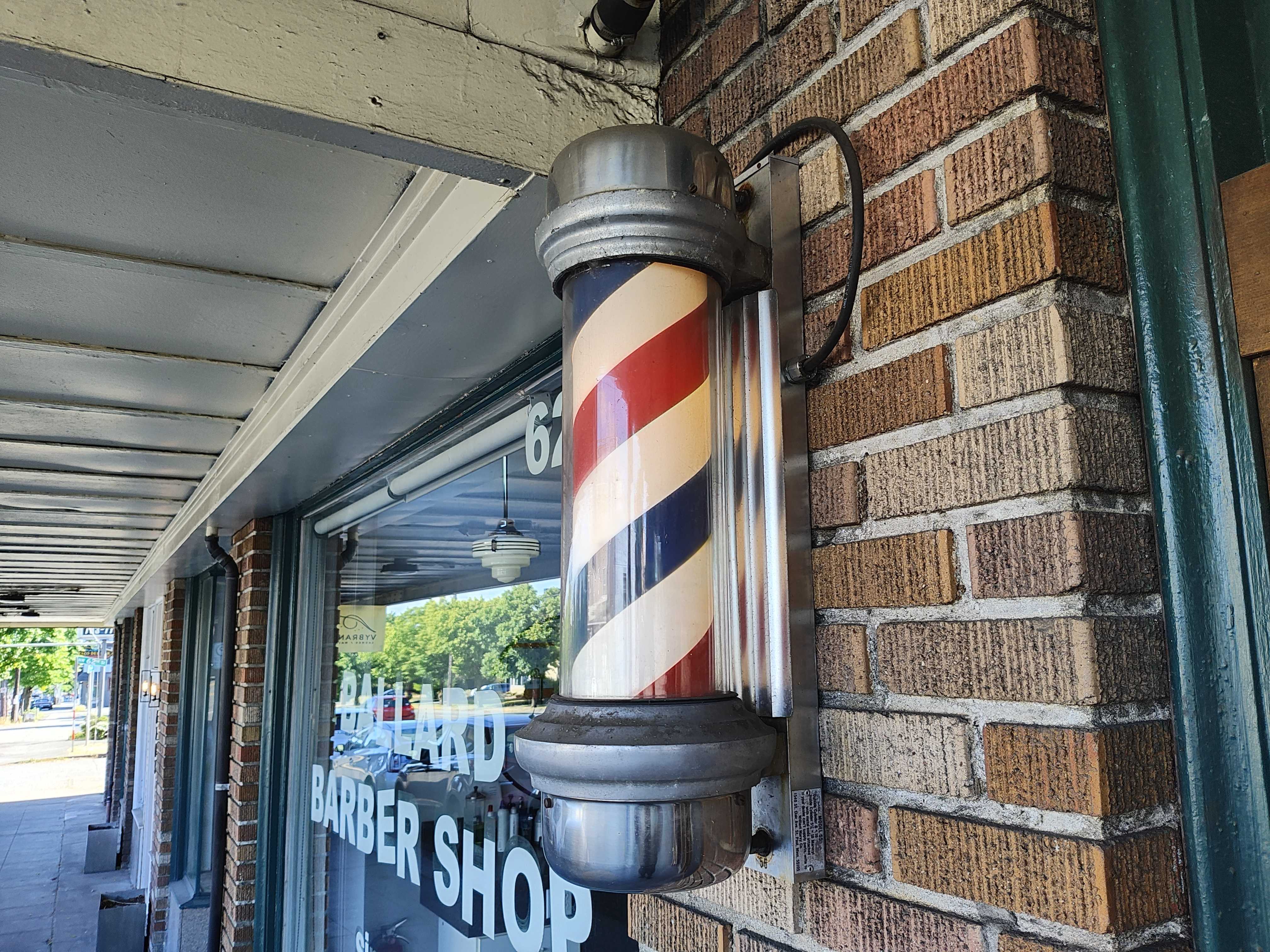
When it comes to cameras, well, let's just say the Razr+ won't be winning any blind camera comparisons. Don't get me wrong, the phone has a decent set of cameras, with a 12MP primary sensor and a 13MP ultrawide. and the Razr+ doesn't take bad photos. It just doesn't take the best photos either, which, unfortunately, is par for the course when it comes to clamshell foldables.
Photos from the Razr+ are generally... okay and are fairly balanced, although they feel a bit muted for my liking, like there's something missing. I definitely wouldn't mind some punchier colors, and images tend to be on the brighter side, likely due to the rather wide aperture. That said, images from the Razr+ cameras are pretty unoffensive, even from the ultrawide sensor.
Low-light and nighttime images are actually pretty decent, and that wide aperture manages to pull plenty of light from rather dark scenes. The phone also takes decent portrait and macro shots, doing a good job (most of the time) of separating the subject from the background or getting really close up to a subject.



When it comes to selfies, the Razr+ gives you the option to use the 32MP sensor on the display or the primary cameras on the back. I was prepared to really like the selfies on the phone, especially those taken with the primary camera. However, more often than not, images take on a sepia-like tint when I take a selfie with the phone closed and use the cover screen as the viewfinder. The effect varies in intensity and is sometimes very subtle, while other times, it's quite noticeable.
The 32MP hole-punch selfie camera does this occasionally, but it doesn't occur when I take a "selfie" with the phone open while using the primary camera, so I'm not sure what's going on here. If you can manage to keep the phone from doing this, the Razr+ takes fairly decent selfies.


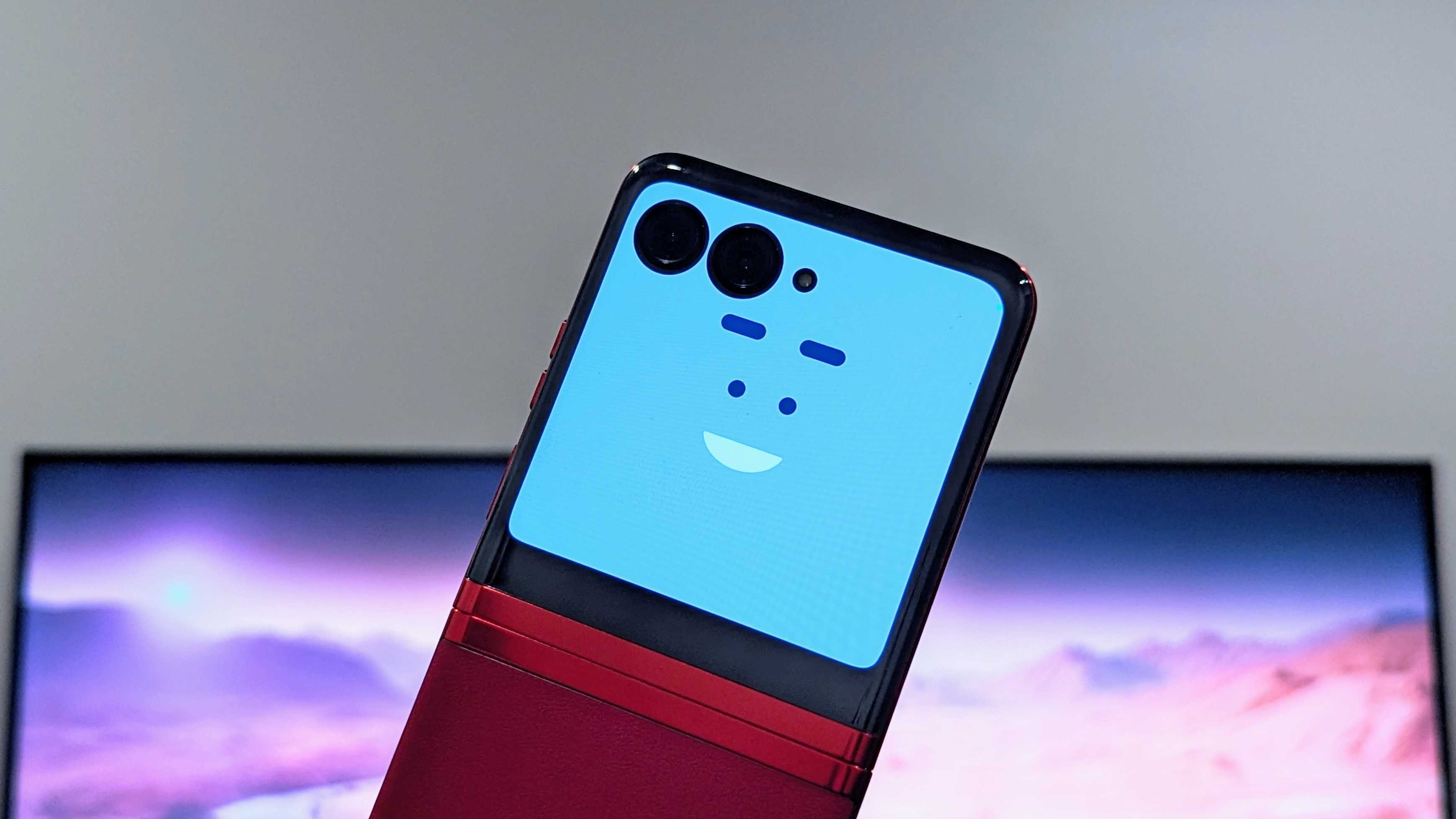
With the cover screen, Motorola adds a few camera goodies that can help aid in capturing photos. For example, you can enable a cover screen preview to appear so your subject can have a better idea of how they look and adjust themselves. And for those of you with fussy children, you can even turn on a Camera Cartoon that makes animated faces to try and grab their attention.
The external display also has some interesting functions when using the phone closed, such as a mirror mode that feels pretty redundant, given how glossy the cover panel is. There's also a fun photo booth mode that lets you take a series of selfies in a row after a set amount of time, similar to an actual photo booth. Unfortunately, it doesn't arrange them into a collage after they're taken — another missed opportunity.
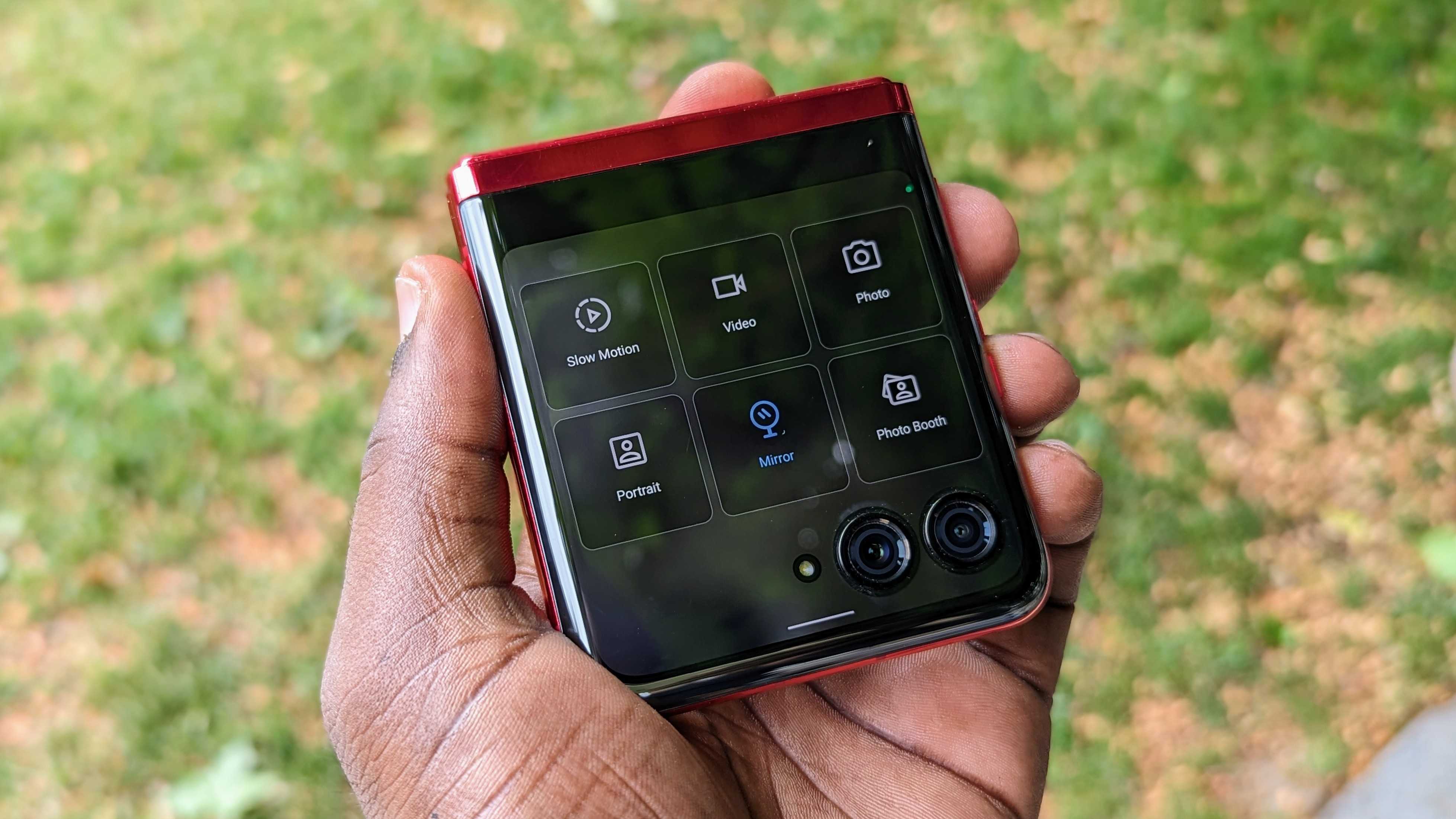
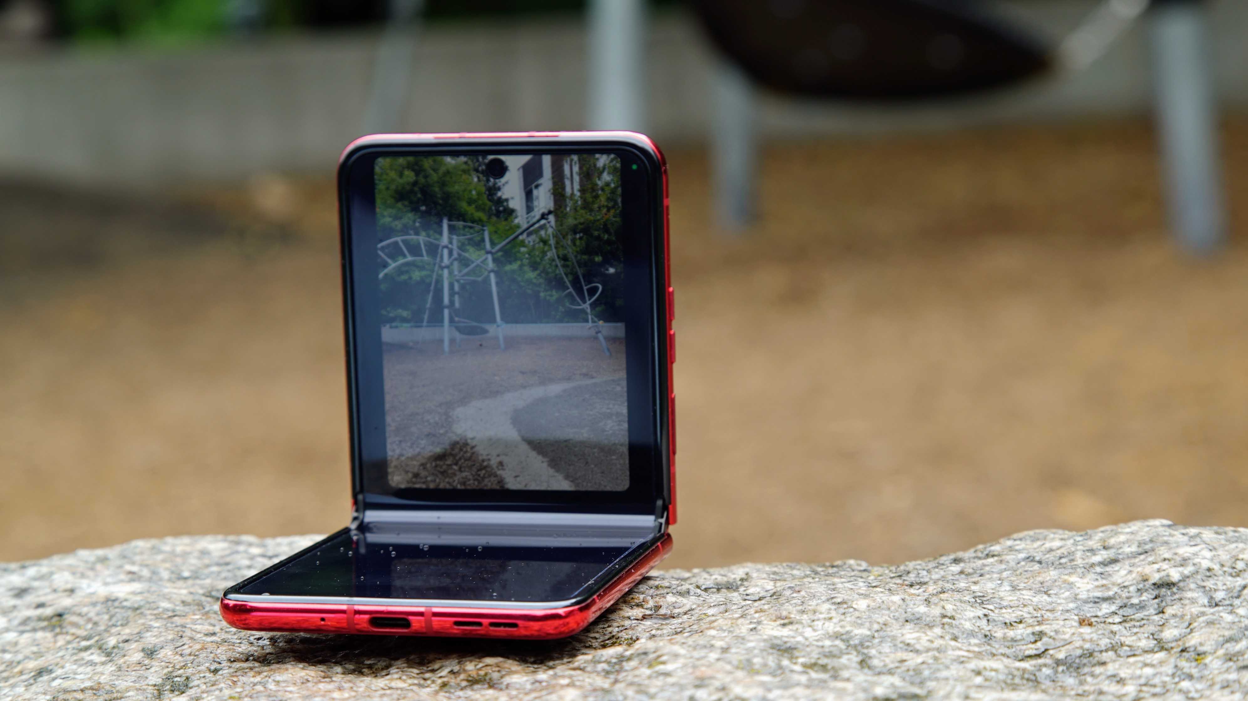
Interestingly, taking images with the cover screen limits the aspect ratio to 1:1 or 3:4, so they’ll come out in portrait orientation unless you place the phone on its side. Video is also limited to 1:1 or 9:16, showing that this phone is really trying to cater to the TikTok generation, which I am not. On the plus side, you can easily leave the phone propped up to capture images or video. The hinge also makes it possible to get a better grip on the phone when taking photos or videos.
The phone also supports the neat Horizon Lock feature we saw on the Motorola Edge+ (2023), and both the primary and selfie cameras support 4K video at 60fps. Video is okay, but nothing exceptional here either, although the Night Vision feature is also a cool trick for getting more light out of a dark scene.
Motorola Razr+: Battery life
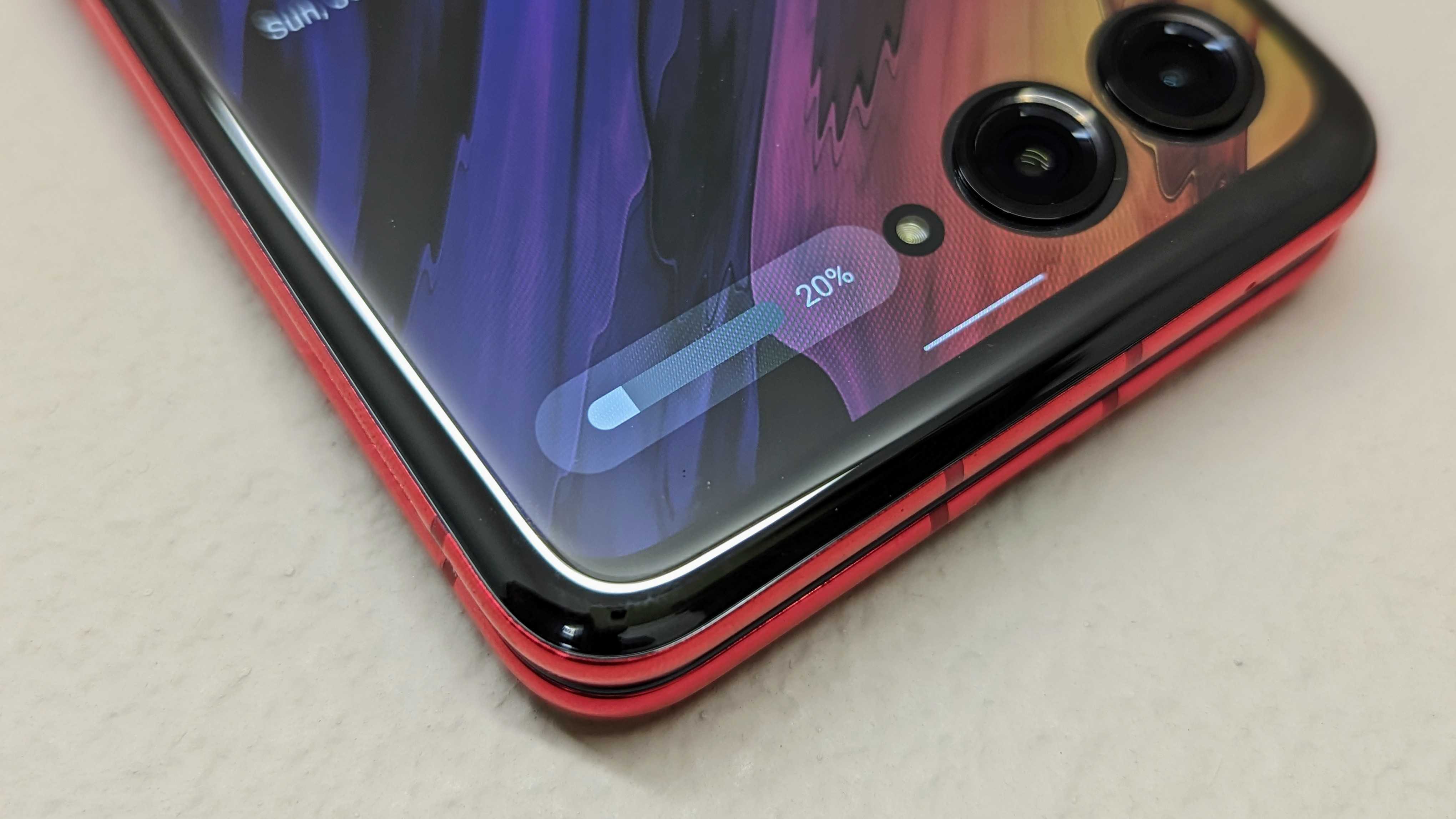
I'll just say it now: battery life isn't great. It's not really a surprise, given the relatively small 3800mAh battery. The phone struggles to get through an entire day on a single charge, despite Motorola's claims, so if you're a power user, be ready to charge the device at least once during the day and perhaps even twice within 24 hours. That's been my experience, and while it doesn't feel as bad as the Galaxy S22, it's still less than ideal.
I guess Motorola is banking on users utilizing that cover screen more, which should use less battery power. And while it can definitely help stretch the battery life, that doesn't seem to help as much as Motorola probably thinks it does. I can't help but feel this is another reason why a 90Hz refresh rate should suffice for this panel if battery life is a concern, but once again, I digress. With battery saver mode turned on, the panel drops down to 60Hz, which is fine.
The saving grace here is the charging speed. It's not the fastest at 30W, but it's still plenty fast and still beats out most of Samsung's best phones. Unfortunately, the charger doesn't come in the box, meaning you'll have to pick up one of the best USB-C chargers.
Motorola Razr+: Competition
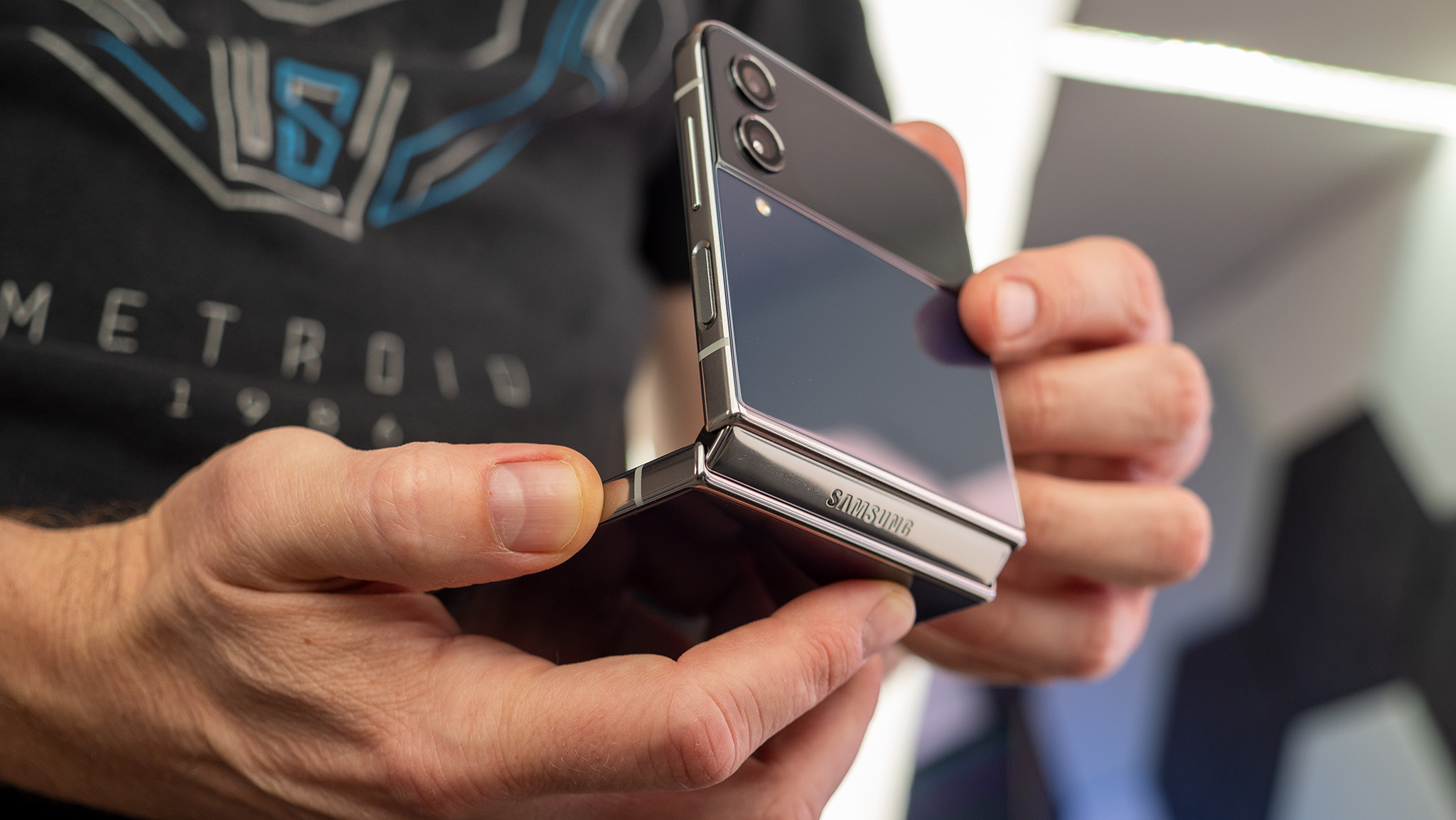
The biggest competitor to the Razr+ is the Samsung Galaxy Z Flip 4. As Samsung's latest clamshell flip phone at the time of writing, the phone has similar specs to the Razr, including the Snapdragon 8+ Gen 1, 8GB of RAM, and a 12MP primary camera. The phone is a great option that comes in a variety of color options and combinations, and Samsung's great software support keeps it up to date each month. It also has better water resistance, which is great for durability.
That said, the Razr+ has an edge over the Flip 4 with a slightly larger battery, starting storage size of 256GB, and dust resistance. Of course, the biggest benefit to the Razr+ is the much larger cover screen, which is much more functional than the 1.9-inch panel on the Flip 4.
Outside the U.S., OPPO has one of the best clamshell flip phones with the Find N2 Flip. Android Central's Harish Jonnalagadda heralds the phone as his favorite flip phone, thanks to its great design, large battery, and large cover screen.
That said, there are a few downsides to the Find N2 Flip, one, in particular, being that it's not available in the United States for those who might be interested. Additionally, the cover screen has limited uses, which seems like a wasted opportunity, and the phone lacks 4K60 video recording and wireless charging.
Motorola Razr+: Should you buy it?
You should buy this if...
- You want a clamshell foldable but not one from Samsung
- You like the "stock" Android 13 experience
- You like to use social media apps like TikTok to make content
- You like the idea of having an external display to interact with apps and notifications
- You like mobile gaming
You should not buy this if...
- You want a phone with all-day battery life
- You want exceptional cameras
- You need a phone with strong water resistance
- You want a consistent update experience
After years of falling behind Samsung with its foldable efforts, Motorola finally seems like it has the upper hand with the new Razr+. Sure, the company doesn't have a large-screen foldable like the Galaxy Z Fold 4, but the Flip series is the best-selling foldable lineup and has been virtually the only option for U.S. consumers until now.
The Razr+ may not be perfect, but it's pretty darn close. I used to be skeptical about foldable phones, but I feel like the Razr+ does a good job at making a case for itself, and I implore anyone even remotely curious about the form factor to head over to the closest retailer or carrier to give it a try. The cover screen is incredibly useful, pretty well thought out, and just so fun to use.
Competition is a good thing, and as much as I love Samsung's phones, I'm glad it finally has a worthy competitor for the Z Flip, especially since Google opted not to make a Pixel Flip. And Motorola really makes a case for itself by essentially giving you two phones for the price of one.
If you're interesting in buying a foldable phone but you prefer the compact, flip-style phones, look no further than the Motorola Razr+. Thanks to a powerful Snapdragon chipset and large cover display, this phone lets you juggle notifications, open apps, play games, and take selfies without even opening the phone.


