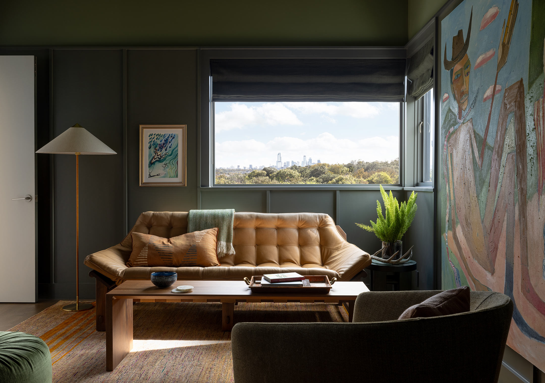
The popularity of shaker paneling has shown no signs of slowing down and it’s easy to understand why. Arranged in its distinctive lattice pattern, these panels bring texture and structure to schemes. While the traditional format is a tried and trusted method, some exciting alternatives are worth considering.
From contemporary oak panels that wrap around your room to brutalist-inspired concrete paneling and playfully curved moldings, designers are pushing the boundaries with their creativity. We’ve spoken to a curated selection of interior designers to help you decipher the world of wall paneling, the dos and don’ts, and everything in between.
1. MAKE A MODERN STATEMENT WITH SQUARES
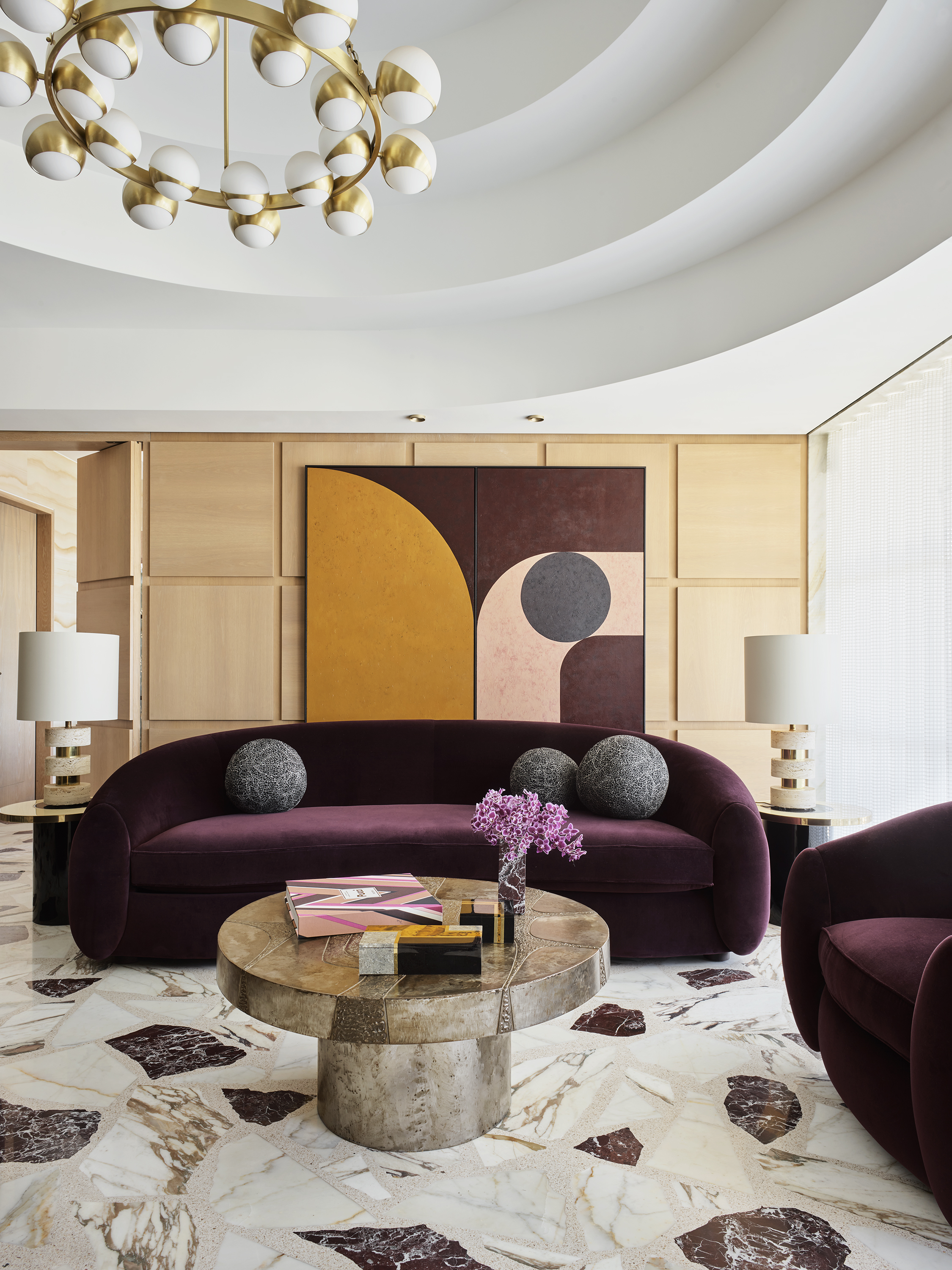
Preserving the distinctive form of shaker panels whilst exploring a contemporary iteration of traditional paneling, this design from Greg Natale’s Mosman feels wonderfully balanced.
The wooden living room paneling introduces a subtle pattern to the scheme that complements the other colors and shapes within the room. 'For decorative wall paneling that is less ornamental than the classic Shaker panels, a pattern of elevated squares arranged in a grid brings geometry and visual interest to a space that feels contemporary and new,' says award-winning interior designer, Greg Natale. 'In this residence, the square panels contrast the curved ceiling coffers and repeated circular motifs in the decor for a stylish modern look.'
2. Color drench the panelling
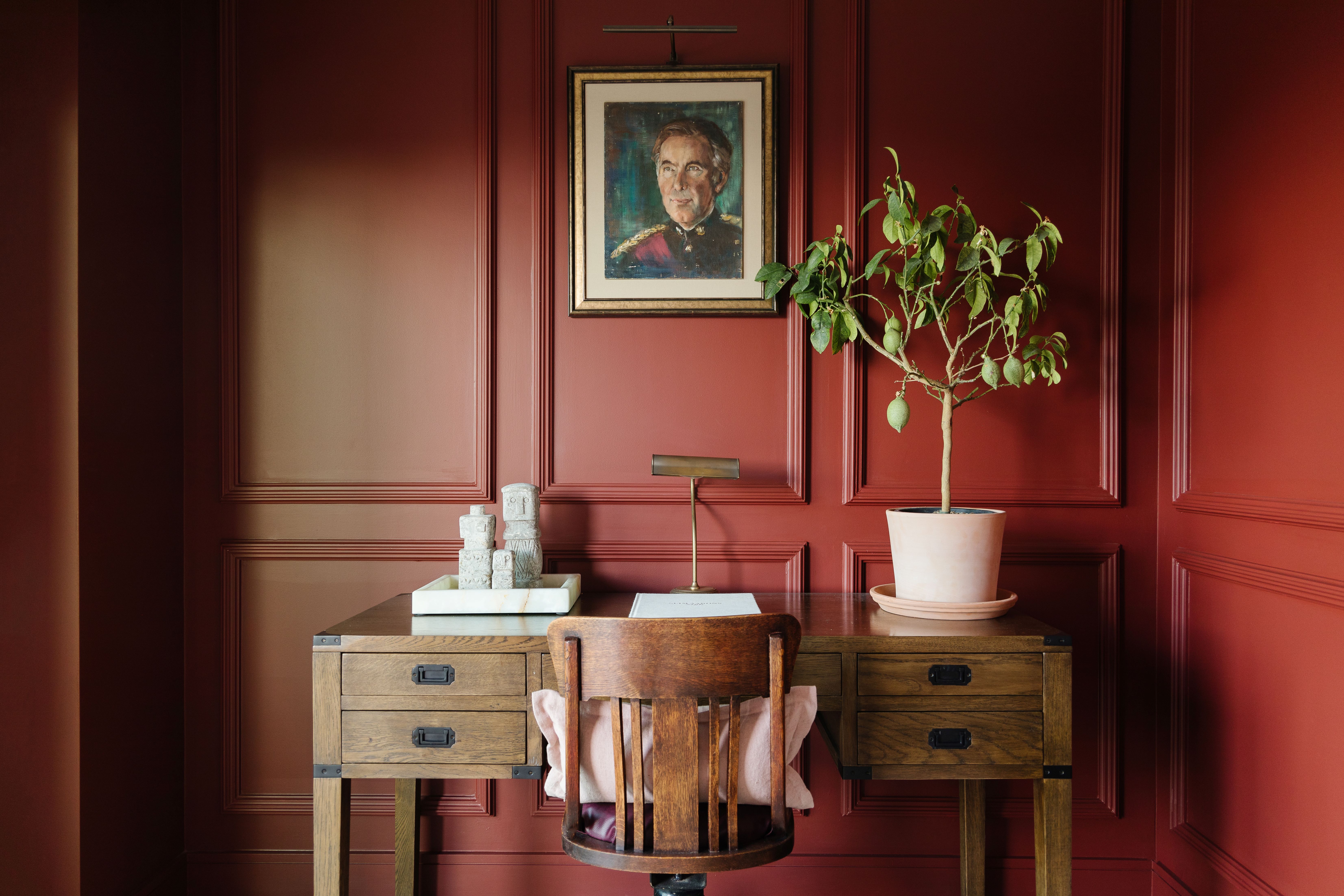
This ruby red study and home office perfectly highlight how traditional panel beading can introduce all of the structure of shaker paneling to your room but with an added dose of drama.
'There are many DIY versions available for homeowners wanting to add paneling to their walls,' shares Christopher Dezille, founder of Honky. 'These come in kit form and can be easily cut down and modified to suit the space. Some versions are a simple beading detail that can be fitted but be careful of mitering the corners as this needs to be done properly to achieve a perfect edge. On the market are various companies producing moldings that are lightweight and easy to handle and that can be painted easily — check out Orac.'
3. CREATE A MINIMAL EFFECT WITH LARGE OAK PANELS
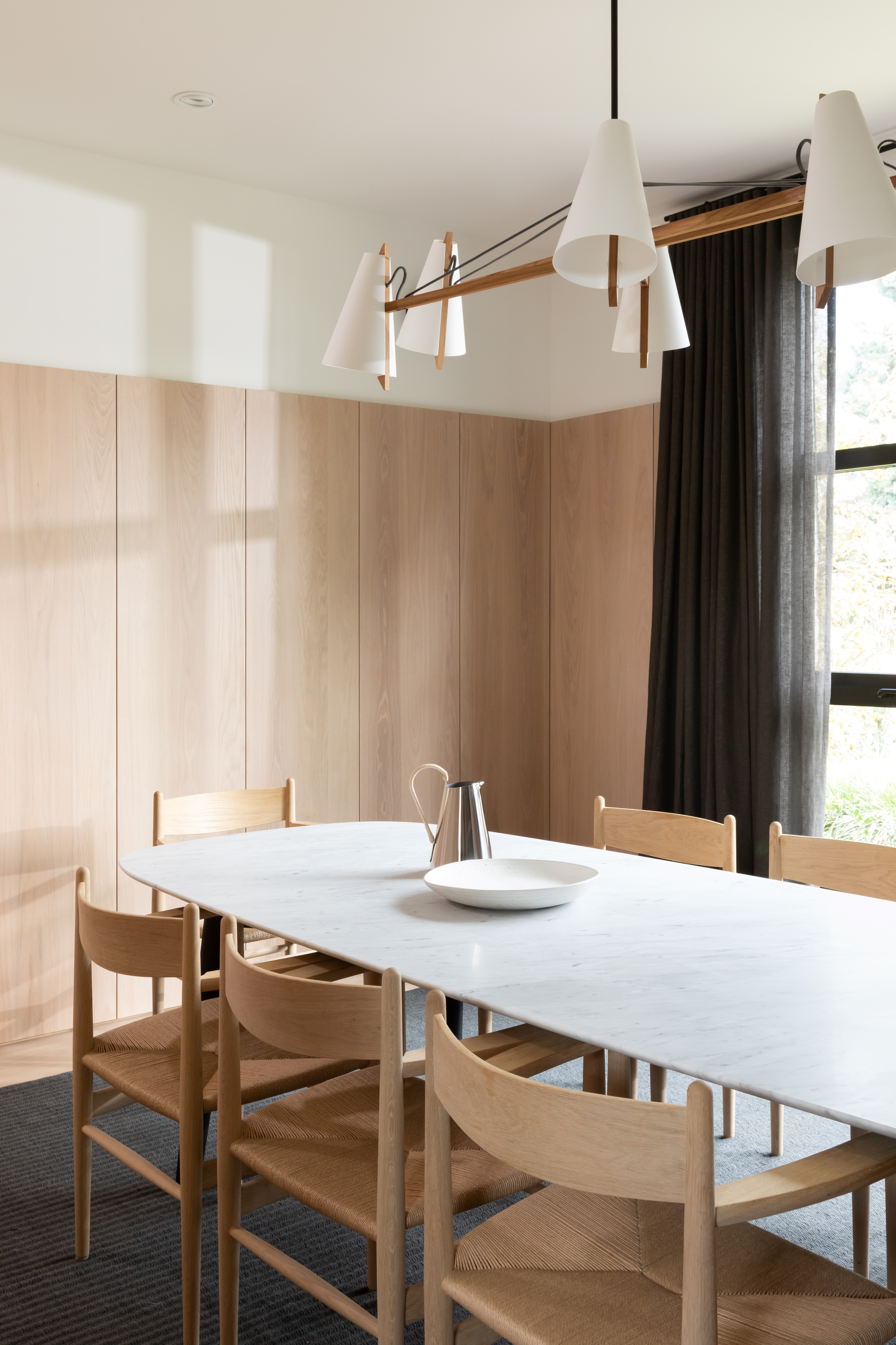
Rather than keeping the walls bare, designer Sophie Burke opted for wide oak panels that run around the dining room wall. The result is a room that feels open and airy but still soothing and welcoming for each of its guests.
'Minimal paneling such as the wide oak planks that we used in the project allows us to add texture to the walls and add the warmth of wood onto the vertical wall surface without it feeling overly busy and fussy,' says Sophie Burke, founder of Sophie Burke Design. 'By stripping back the ornamentation that you typically see on wood paneling we were able to create a fresher more contemporary look and feel.'
She also highlights the importance of choosing a paneling style that fits your style and answers your needs. 'It's important to consider the feeling that you are trying to evoke,' says advises. 'Are you looking to create a traditional space? Something detailed and layered? Something rustic? Or fresh and simple? These considerations will help you determine whether your paneling should be shaker style, with or without decorative bead details; classic beadboard; wide plank; painted, or natural wood.'
4. INTRODUCE SOME EDGE WITH CONCRETE PANELING
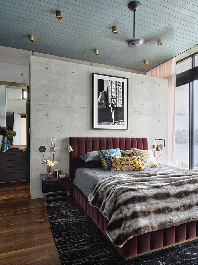
Concrete may not seem like the obvious choice for bedroom wall panels but it can create a modern statement in your home. Along with its durability, concrete panels in soothing grey tones are perfect for those seeking a minimal edge within their schemes.
'Panelling is a great way to utilize the decorative potential of walls,' says interior designer, Greg Natale. 'A different alternative to classical Shaker panels, exposed concrete slabs can create beautifully paneled walls. In this residence, concrete plays an important part in the layering of the house, taking on a decorative role beyond its structural significance. For a modern look inspired by brutalist architecture, off-form concrete slabs arranged in a grid-like appearance emulate the look of wall paneling but with a completely different effect. When styled with mid-century furniture and warm heritage colors, concrete really comes into its own on the walls of a house’s interior.'
5. ADD JOY WITH CURVED WALL PANELS
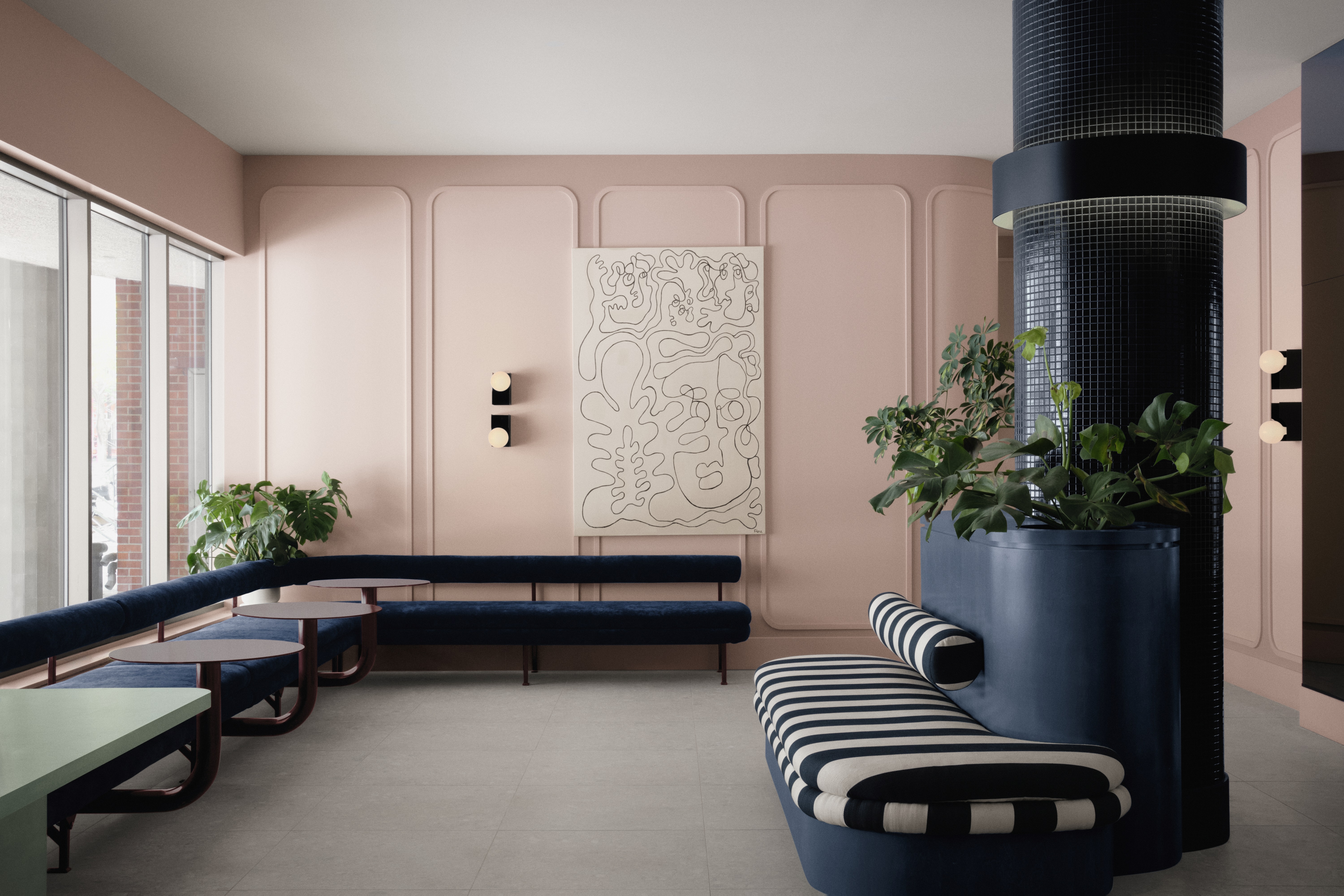
Playfully curved paneling decorates the walls of this effervescent entryway lobby design. The powder pink walls are contrasted by sleek inky blue seating. The paneling emphasizes the joy of this space and presents a more approachable alternative to the sharper edges of traditional shaker paneling.
'Aimed towards a younger audience, the color palette is a bit more whimsical than the average apartment lobby,' shares Philip Staszewski, one of the founding partners of Montreal design collective, IVY STUDIO. 'Inspired by the building’s extravagant concrete marquise (unique to its entourage), the interior resembles one more likely found in Miami or LA. The navy velvet, striped linen, burgundy steel, and faded green wood all serve merely as a complement to the “three shades of pink” elephant in the room. Residential-like moldings plaster the colored walls, follow their curves, and dissimulate the doors, providing a more playful atmosphere.'
6. GO FOR A HIGH-SHINE FINISH WITH LACQUERED PANELLING
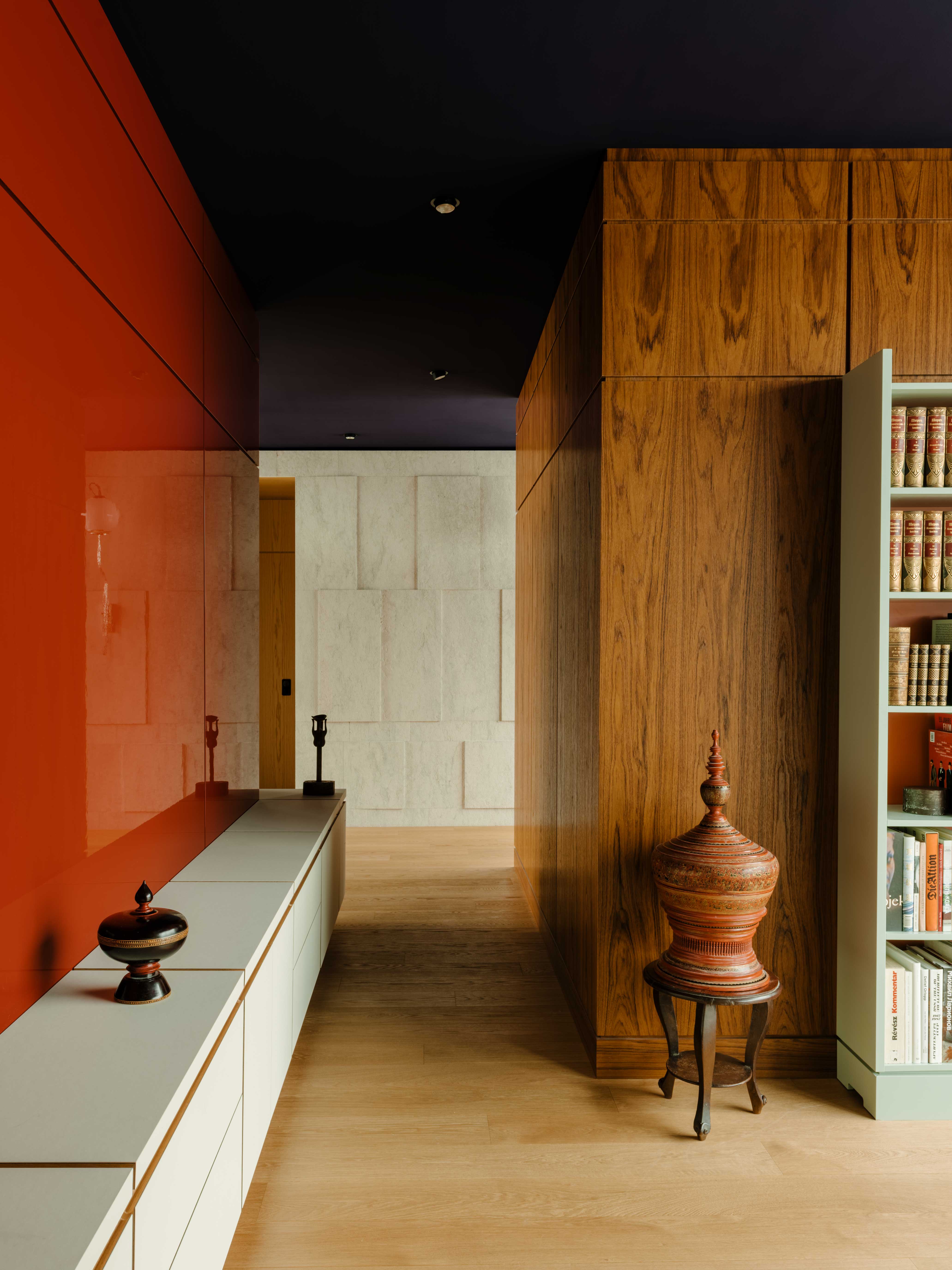
Glossy surfaces are great at capturing the imagination, their colorful and slightly reflective surfaces give interiors an instant touch of glamour.
The same applies to Californian designer, Gisbert Pöppler’s project. The lacquered panels draw the eye in and structure the room, all while adding a vibrant dose of color.
'The red lacquered wood accent wall has this beautiful glossy surface that is hard but at the same time, delicate in appearance,' says architect and interior designer, Gisbert Pöppler. 'The mix of satin wood on one side, rough stone in the center, and shiny paneling on the other create a visual dialogue between the rooms making this a beautiful place. Each material has a special appearance or quality of depth.'
7. CONNECT THE INSIDE AND OUT WITH FIR WOOD PANELING
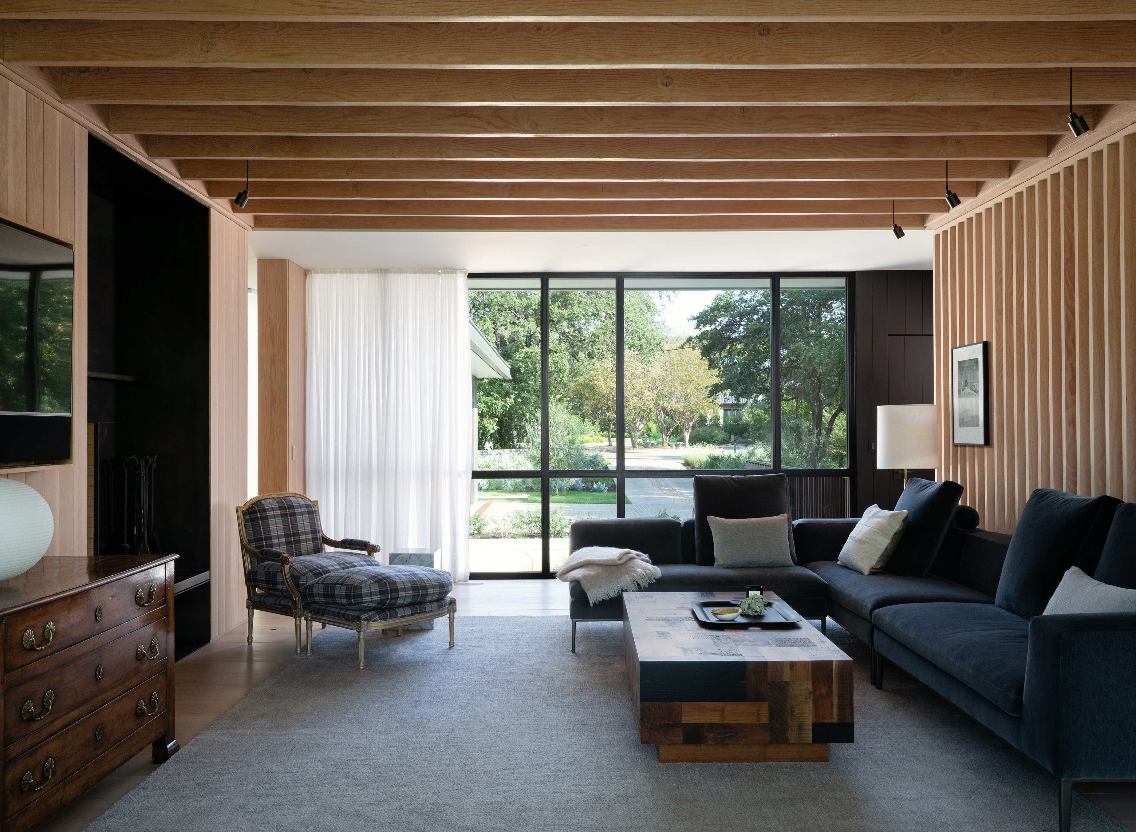
This modern living room showcases a beautiful marriage between contemporary furnishings and traditional paneling techniques. The soft wood fir panels adorn the wall and ceiling of this space, creating the illusion of a larger space while framing the lush green garden views that sit just outside.
'For this contemporary home, we used the same wood skin inside and outside,' says Tim Cuppett, founding partner of Cuppett Kilpatrick. 'The interior is clad with Fir finished with lye, while the exterior is left to weather.' The architect and designer makes a key point which is the relationship between the interior and exterior of your building. Take inspiration from the architecture and style and see how you can bring these two seemingly separate factions closer together.
8. EVOKE THE HANDMADE WITH CARVED OAK PANELS
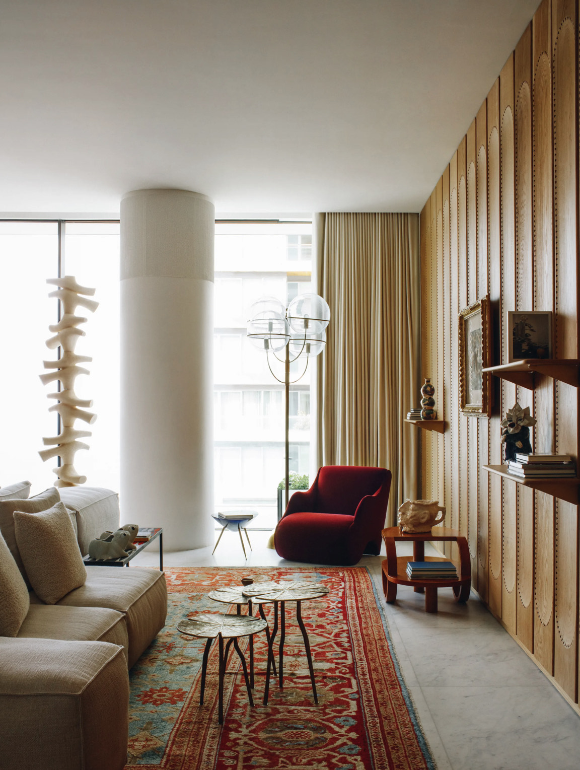
While shaker paneling can feel more formal in aesthetic, carved oak paneling celebrates a more laid-back and bohemian style. Lebanese design duo, David/Nicolas make the case for paneling that celebrates craft with their project. Detailed panels of caramel-colored oak decorate the walls and create a cozy living room aesthetic.
'This Project is the ANM Residence in Beirut where we designed the wooden French oak carved paneling system,' share David Raffoul and Nicolas Moussallem, founders of David/Nicolas. Imagined and realized by the design duo themselves, this project is the perfect example of seeking bespoke solutions that speak to the DNA of your style and needs. Speak to your contractor to see if there is a custom paneling solution that you can bring to life. Not only will it be a personalized result but with the right carpenter, you can create paneling that highlights excellence in craft too.
9. REVEL IN RYTHMIC STREAMLINED PANELLING

This olive and brown living room embraces escapism with its paneled walls. Painted in a greyish blue, the columns of slim wooden panels echo feelings of cocoon-like comfort, making this space more welcoming.
'The paneling in this home reinforces a repeating rhythm throughout a contemporary home,' says Tim. Though simple in its form, this picture-frame-like paneling offers a great way to ground your interior, pulling together each element in the room. Color is a key component of this so consider your choice carefully, as Cuppett demonstrates with his project – utilizing colors that are present in the landscape ensures even the darkest hues feel natural.


