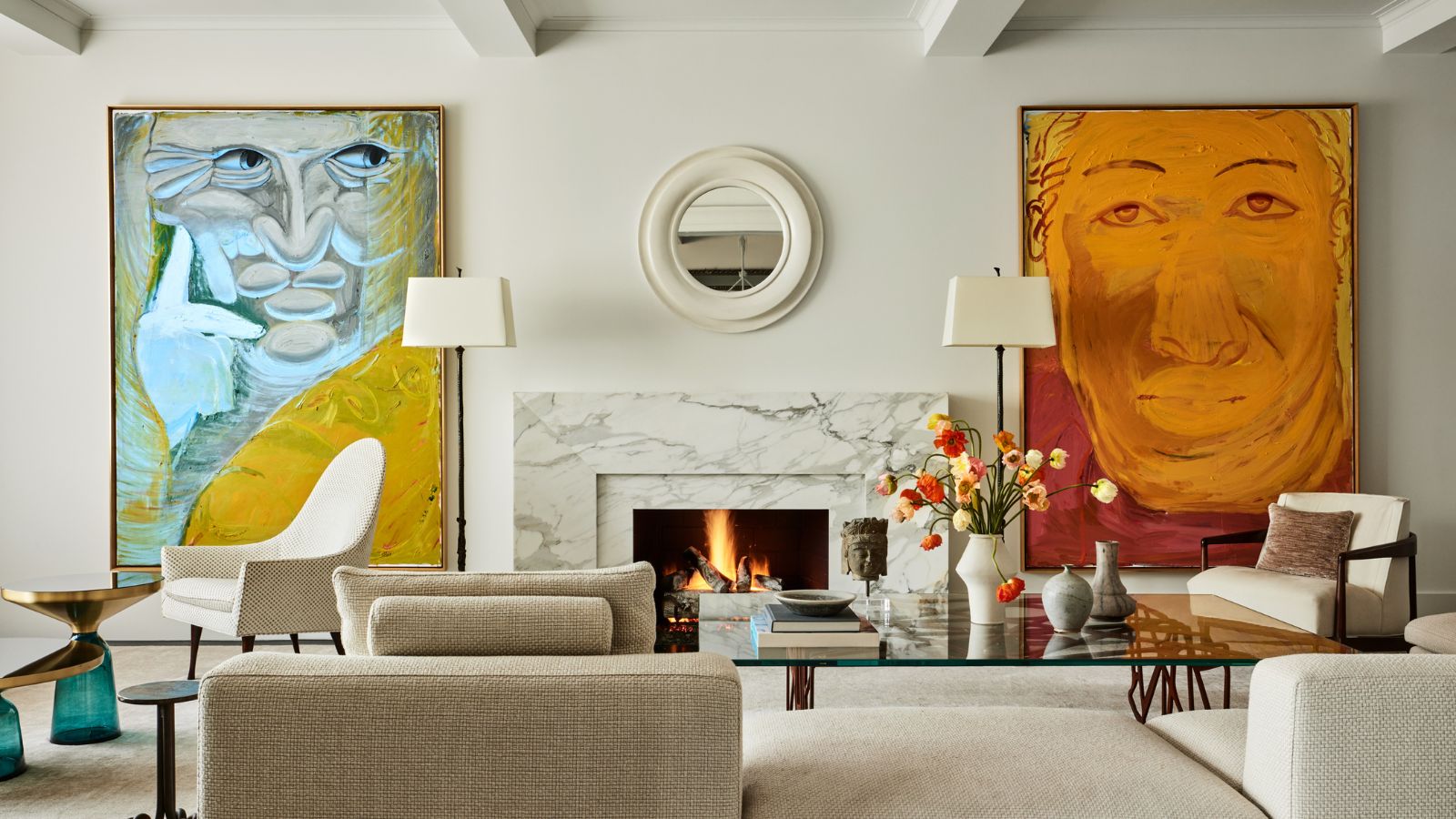
So often part of the finishing touches for a design scheme, art was the starting point for this home's interiors. Showcasing the work of aspiring young artists, the apartment has the proportions and appearance of an airy, spacious gallery. Yet the private residence on New York's prestigious Park Avenue is very much a home.
As its new owners began to consider their apartment layout ideas, they enlisted the help of Lilian Weinreich Architects, whose founder Lilian helped turn a fairly characterless space into a stylish and well-thought through base for city living, and the perfect backdrop for a multitude of bold, contemporary artworks.
The apartment is on the 16th floor of a 1930 Schwartz & Gross building. Many elements of the original structure required modernization and upgrading. Architectural designer Lilian Weinreich shows us round.
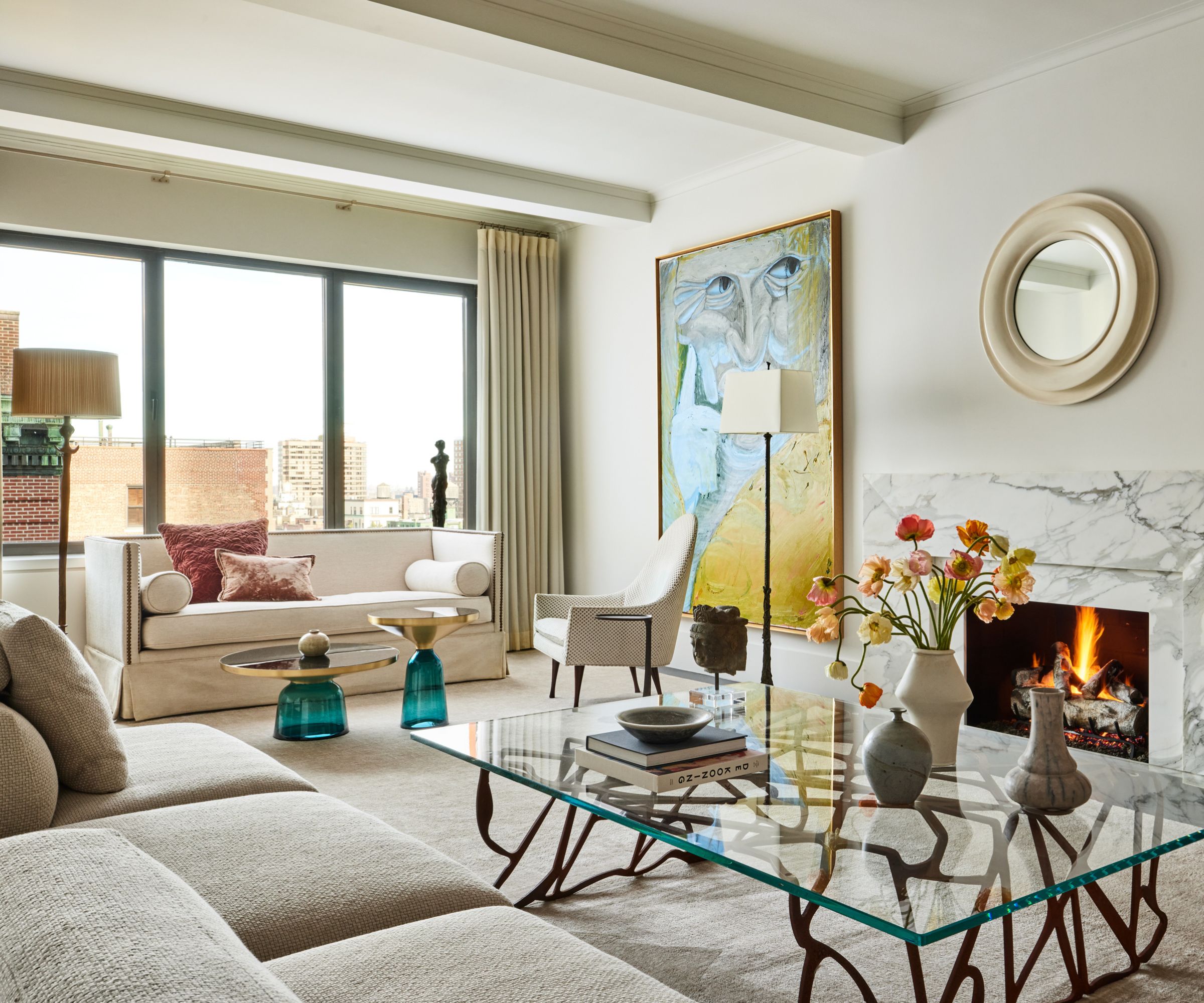
'With the art as the primary focus of each space, this apartment is visually clean and elegant with an edgy sophisticated urban New York City vibe,' says Lilian Weinreich. Living room ideas are simply executed, designed to enhance the large-scale artworks on either side of the fireplace. Large expansive gallery walls were created for the collection by eliminating closets, openings, and doorways.
The homeowners began their renovation wishing to modernize the 1930s-built apartment, but had a change of heart deciding to preserve some of the space's original features. The original herringbone pattern hardwood floors of the entrance, living room, and dining room were restored. The removal of a dropped ceiling in the living room revealed beamed ceilings with plastercrown mouldings, matching those of the entrance area and dining rooms.
The designer's task was to find a way of balancing these period features with contemporary touches and the new works of art sourced by the owners' son who recently graduated from art school. He made the web-shaped, bent rusted steel coffee table, which sits proudly in the middle of the main living room space.
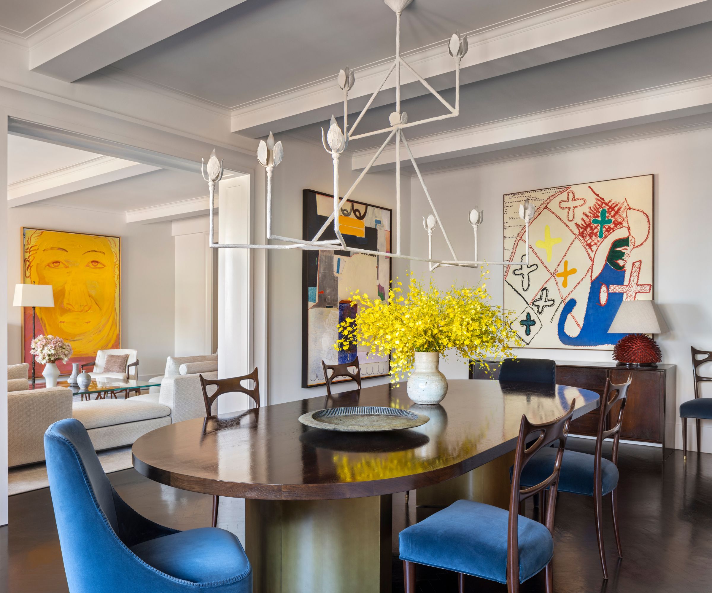
The unique solution to the mix of old and new styles was 'to provide a modern twist to the period detail with an innovative architrave trim around each of three enlarged portals,' explains Lilian Weinreich. 'The architrave profile is bespoke, bold, and intentionally over-scaled, it utilizes negative space with shallow centrioles to generate a sensuous shadowing effect.'
Dining room ideas include a mesmeric modern chandelier and, of course, more large artworks. It's no coincidence that the dining chair upholstery reflects the bright blue in one of the paintings. And as you sit at the table, thanks to the enlarged doorway, you can enjoy the view through to the artworks in the living room, as well as those in the dining space.
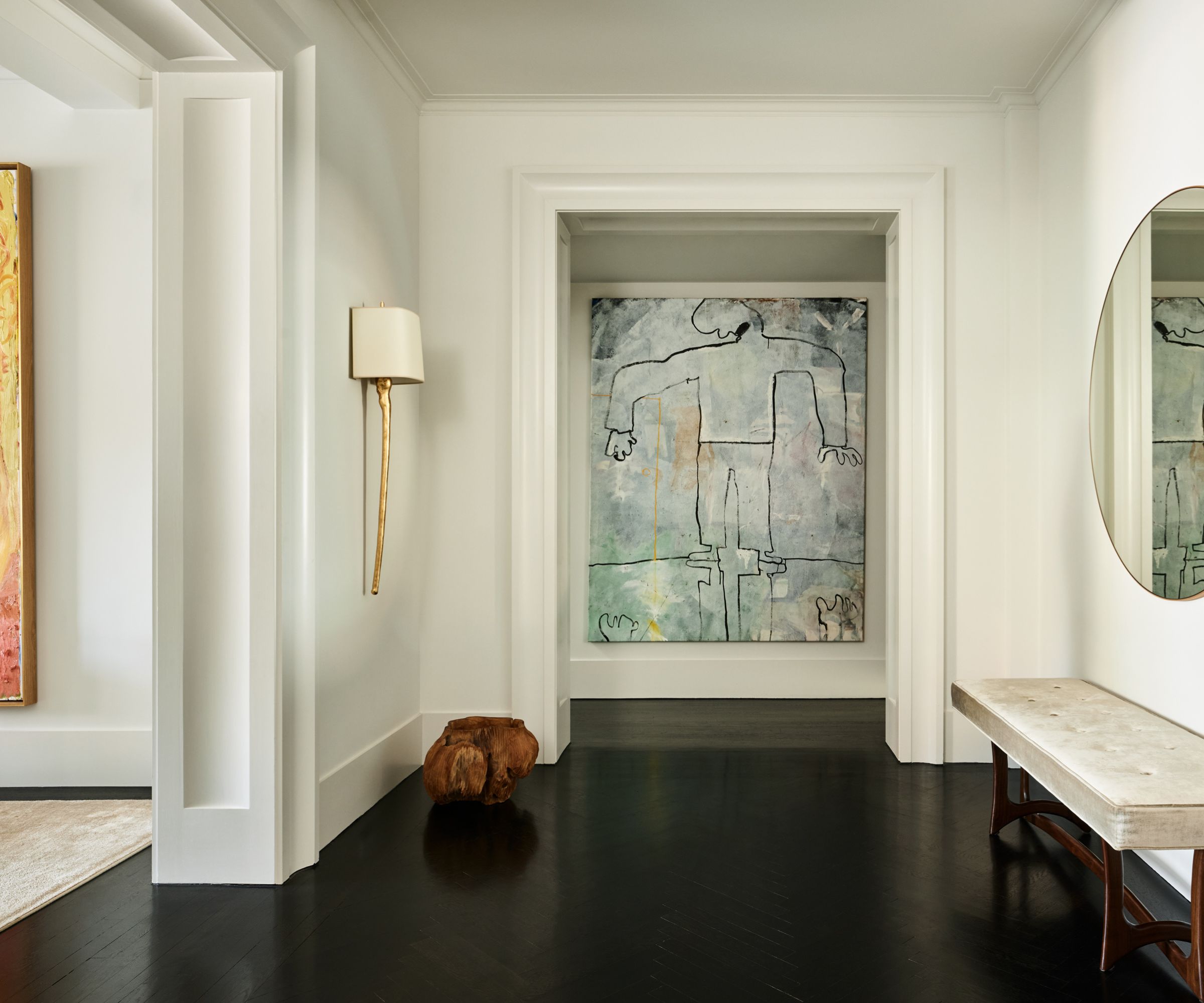
The architect's hallway ideas for the 2,700ft apartment are in perfect keeping with her vision of clean and elegant in design. This entryway provides a close-up of view of the architrave detailing, which elevates the apartment's public reception areas. 'These portals were treated as a series of grand gestures that frame internal vistas,' explains Lilian Weinreich.
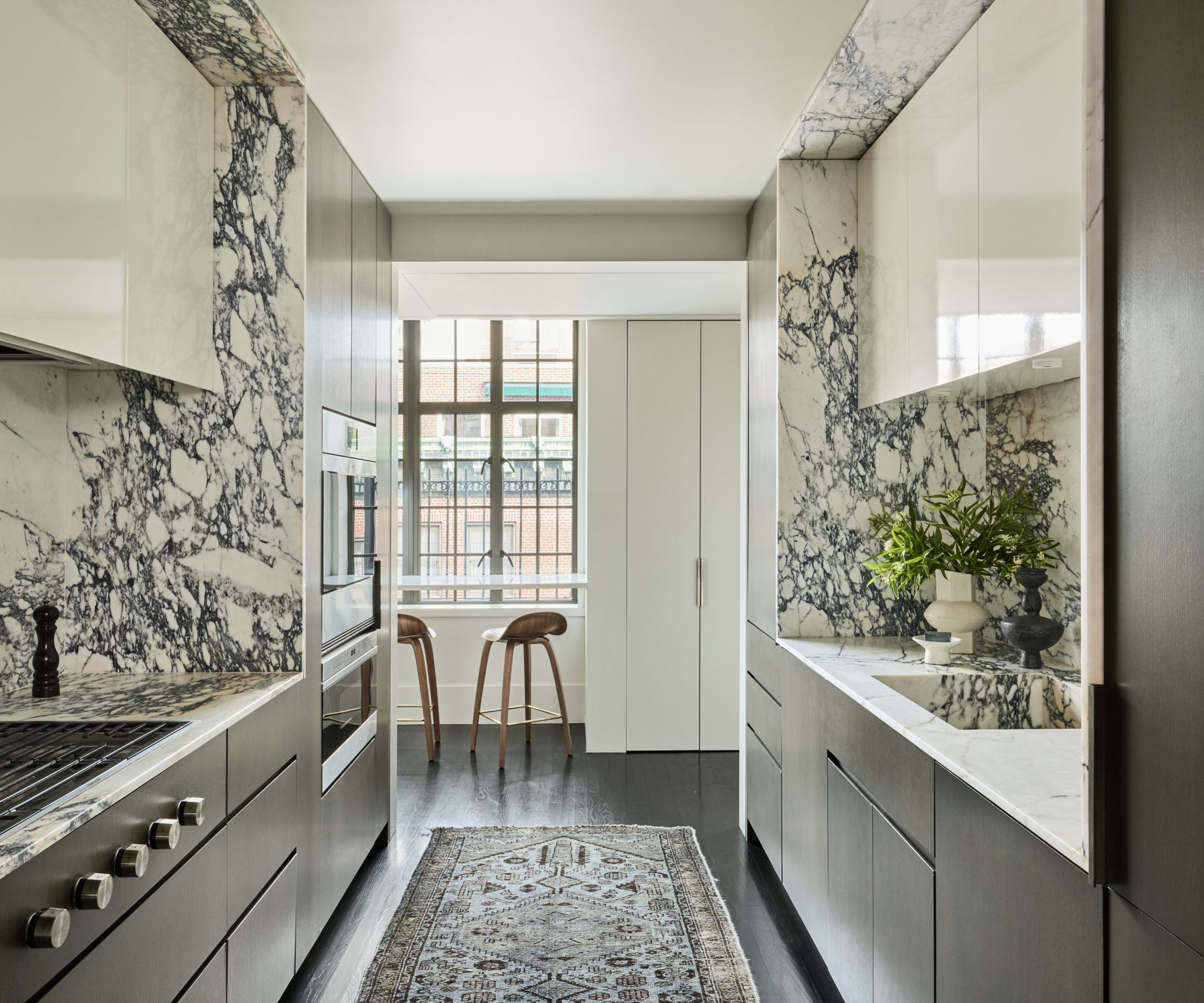
'The existing rear area apartment layout resembled a labyrinthine maze of a former kitchen, laundry, and servants’ quarters, typical in buildings of this era,' says Lilian Weinreich. The challenge was to simplify the rambling internal circulation of this area from a quagmire of existing pipe chases and building structure.
'An open passageway creates an elegant resolution permeated by natural light at the north-east window wall. The passageway became an ante space to the relocated galley kitchen (seen above), full guest/powder room, and a family/TV/bedroom,' adds Weinreich.
Kitchen ideas include cabinets faced in flat panels of treated wood veneer. The galley kitchen allows for a fluid circulation, and there are professional-grade appliances, generous workspaces and low-maintenance countertops in an informal arrangement. But the star of this space is the boldly veined Paonazzo marble, which wraps the walls and spills onto the ceiling to dramatic effect.
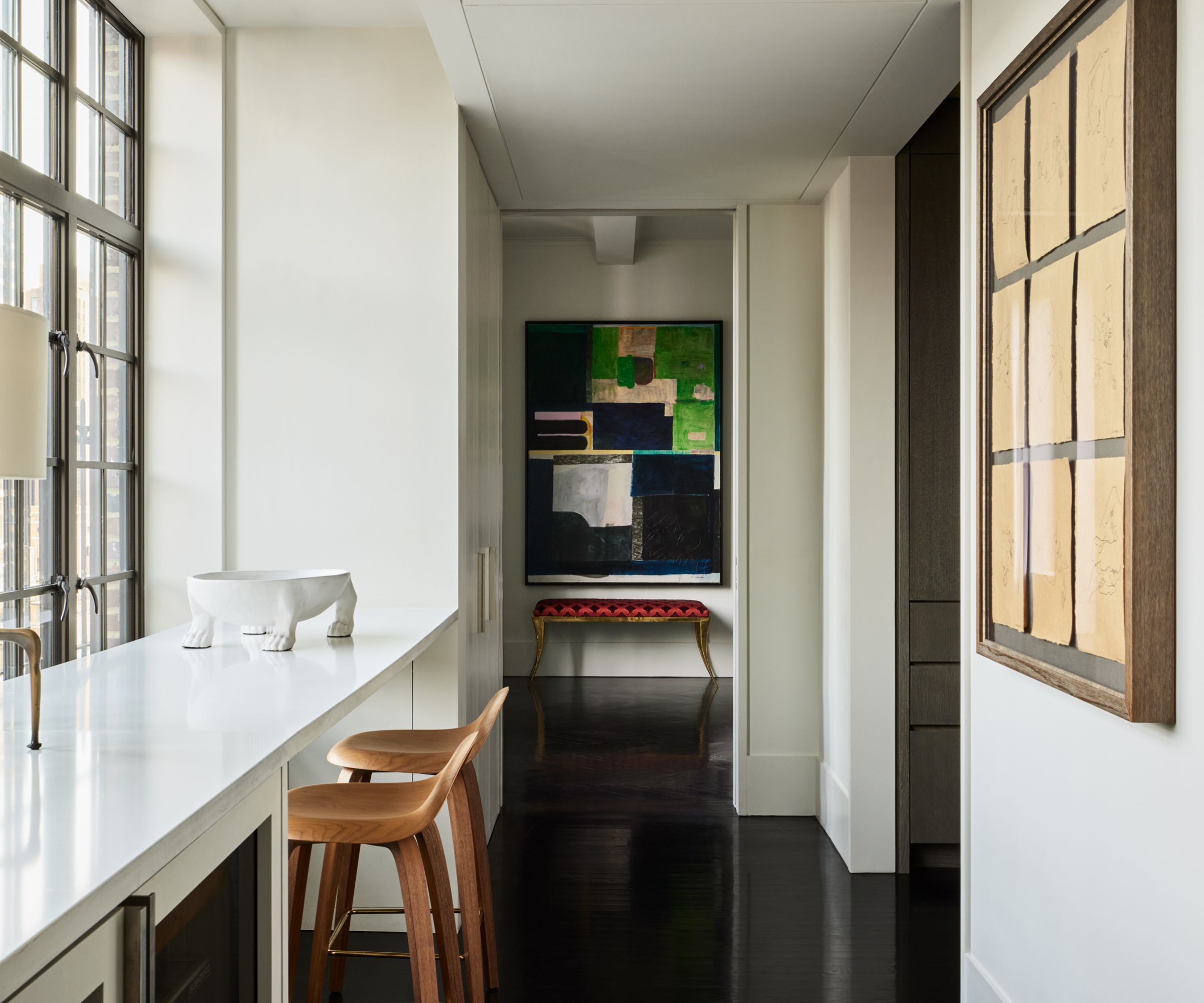
The galley-style dining nook next to the kitchen was created from one of the apartment's many passageways at the back of the home.
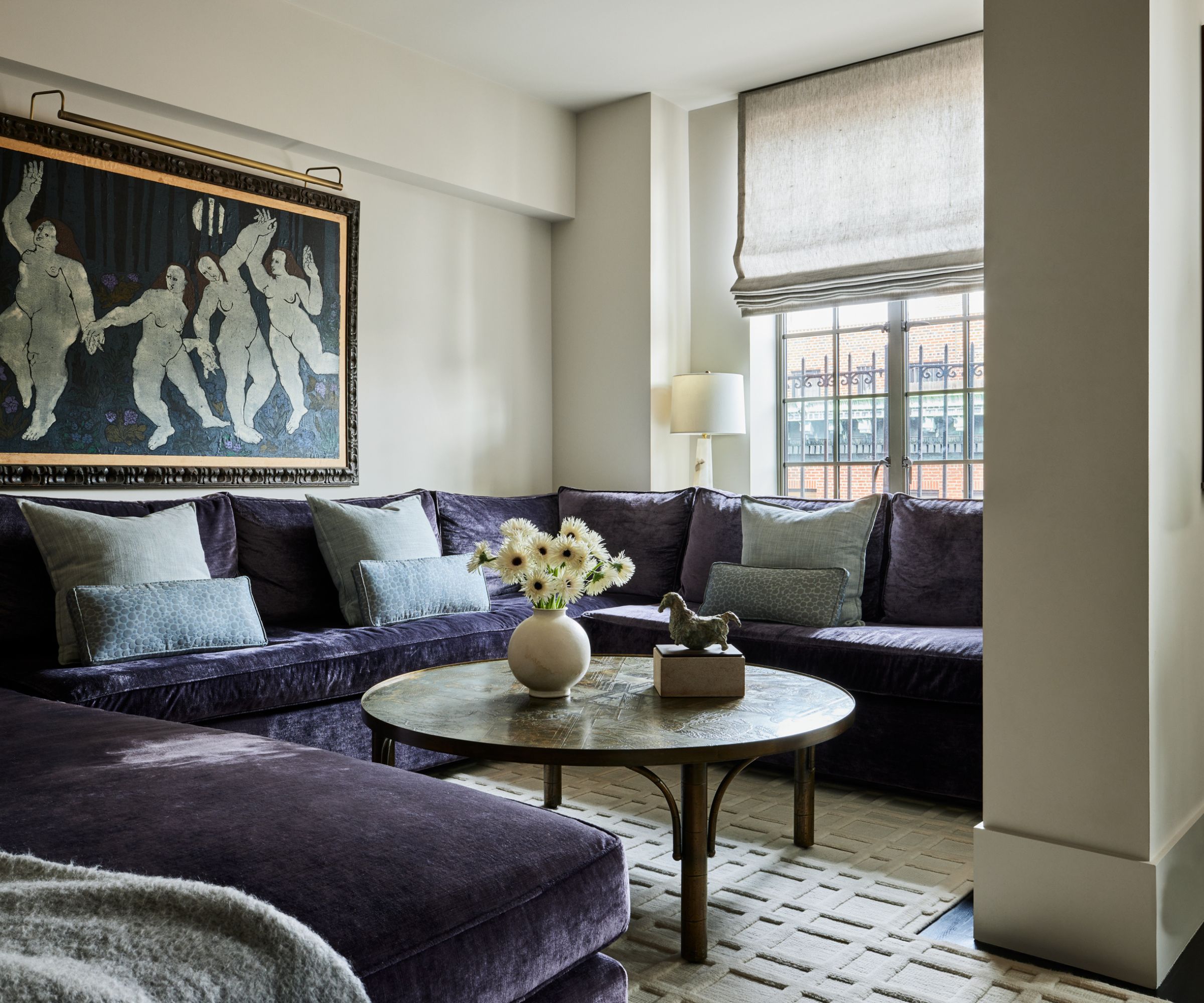
The homeowners were delighted with the addition of this flex-bedroom/TV room snug, created out of the former kitchen. It has become one of the most utilized rooms in the apartment.
Note how the décor takes its gray silvery cues from the artwork, with a rich mauve/gray sectional to complete the look.
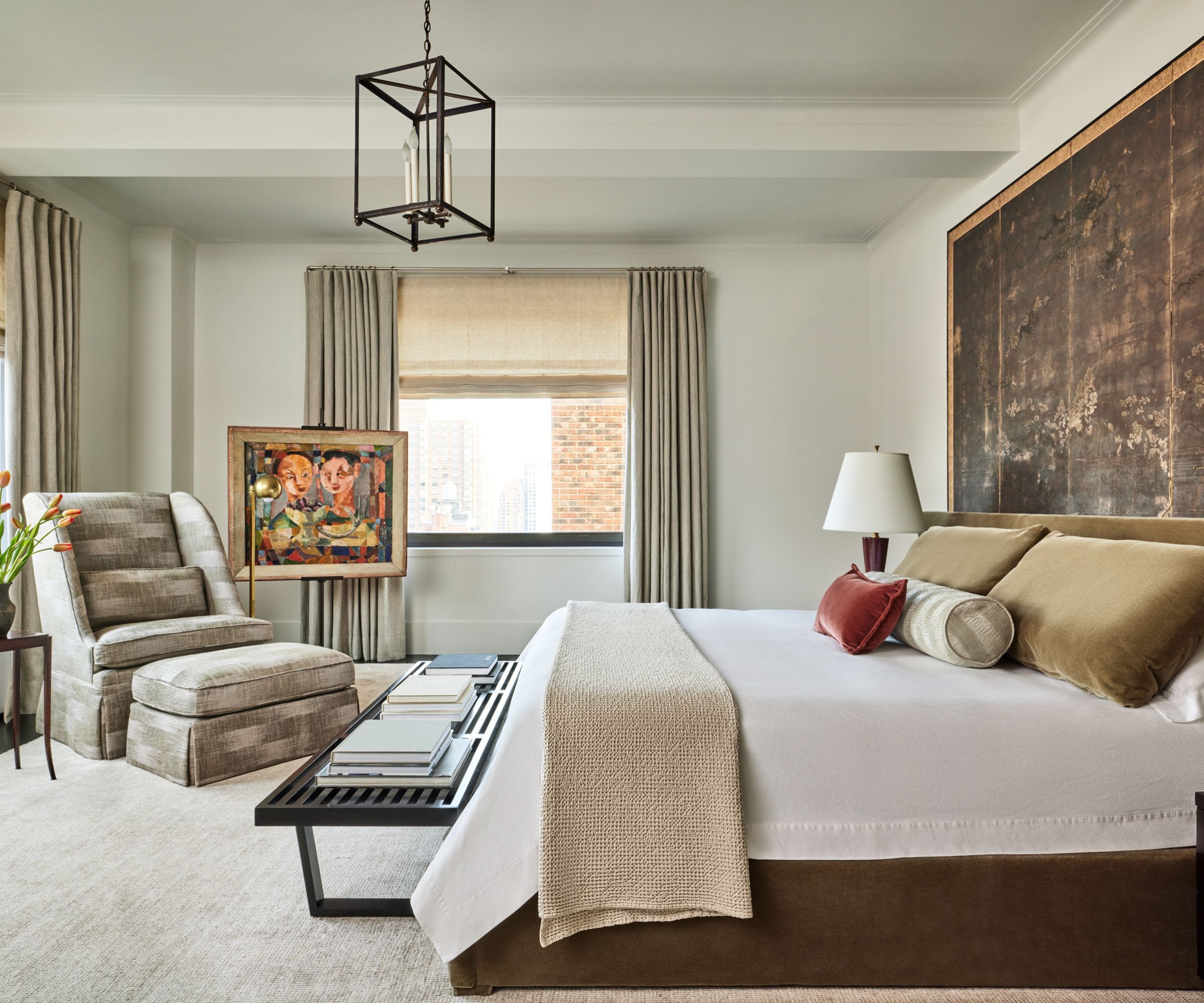
Bedroom ideas are pared back, neutral spaces, with more of an emphasis on texture rather than color in this, the main bedroom.
'In contrast to the historical character of the reception rooms, the clients wanted their private spaces to be distinguished with essential reductivism, attention to detail, and sensitivity to the intrinsic properties of building materials that distinguishes LHWA’s modern design sensibility,' says Lilian Weinreich.
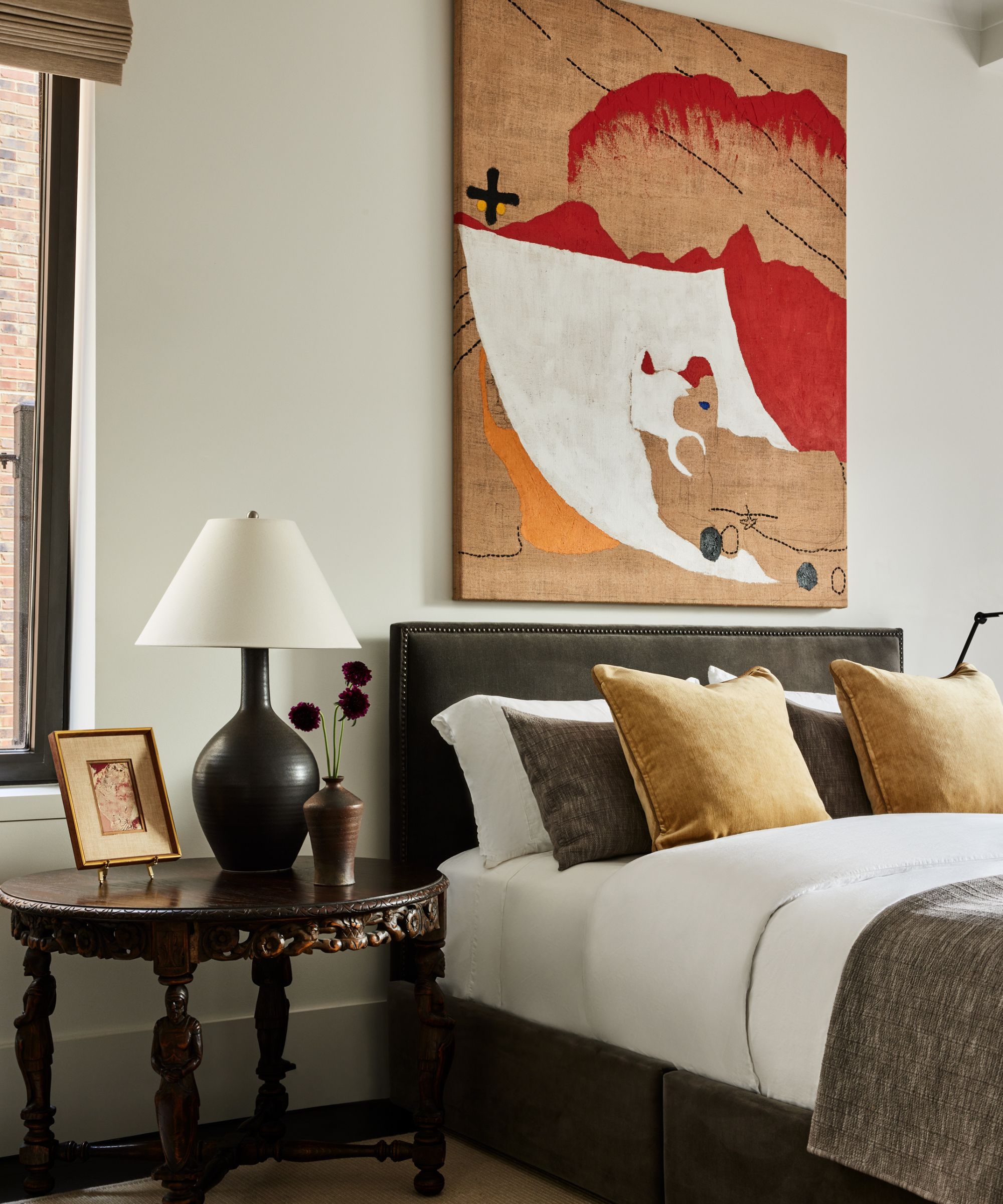
The guest room still layers up the textures, but borrows rich warm colors from the artwork at the bedhead, and combines modern, clean-lined furniture with heirloom pieces, such as the dark wood side table.
'The final design result represents an intangible sense of effortlessness, a spirit of casual serenity and delight in functional and aesthetic details that come together to facilitate the pleasures of lived spaces while also displaying contemporary art,' says architect Lilian Weinreich reflecting on the completed project. 'It is the culmination of decluttered spatial planning for displaying bold new artwork set within a historicist framework,'
Photography: Nicole Franzen (@nicole_franzen)
Stylist: Katja Greeff (@katjagreeff)
Photography (dining room image) Francis Dzikowski (@fdphotonyc)
Interior Design: Lilian H. Weinreich (@lhweinreich_architects)


