What you need to know
- The latest Windows 11 preview builds include early work for a new "all apps" grid layout.
- The layout takes inspiration from iOS's App Library, which groups apps into categories.
- Users will be able to choose between the traditional apps list or this new categorized grid view.
Microsoft looks to be working on a new layout for the all apps list in the Start menu on Windows 11 that takes some inspiration from the App Library found on iOS and iPadOS. On those platforms, the "all apps" list is automatically categorized and grouped by app type, rather than in a traditional alphabetical list.
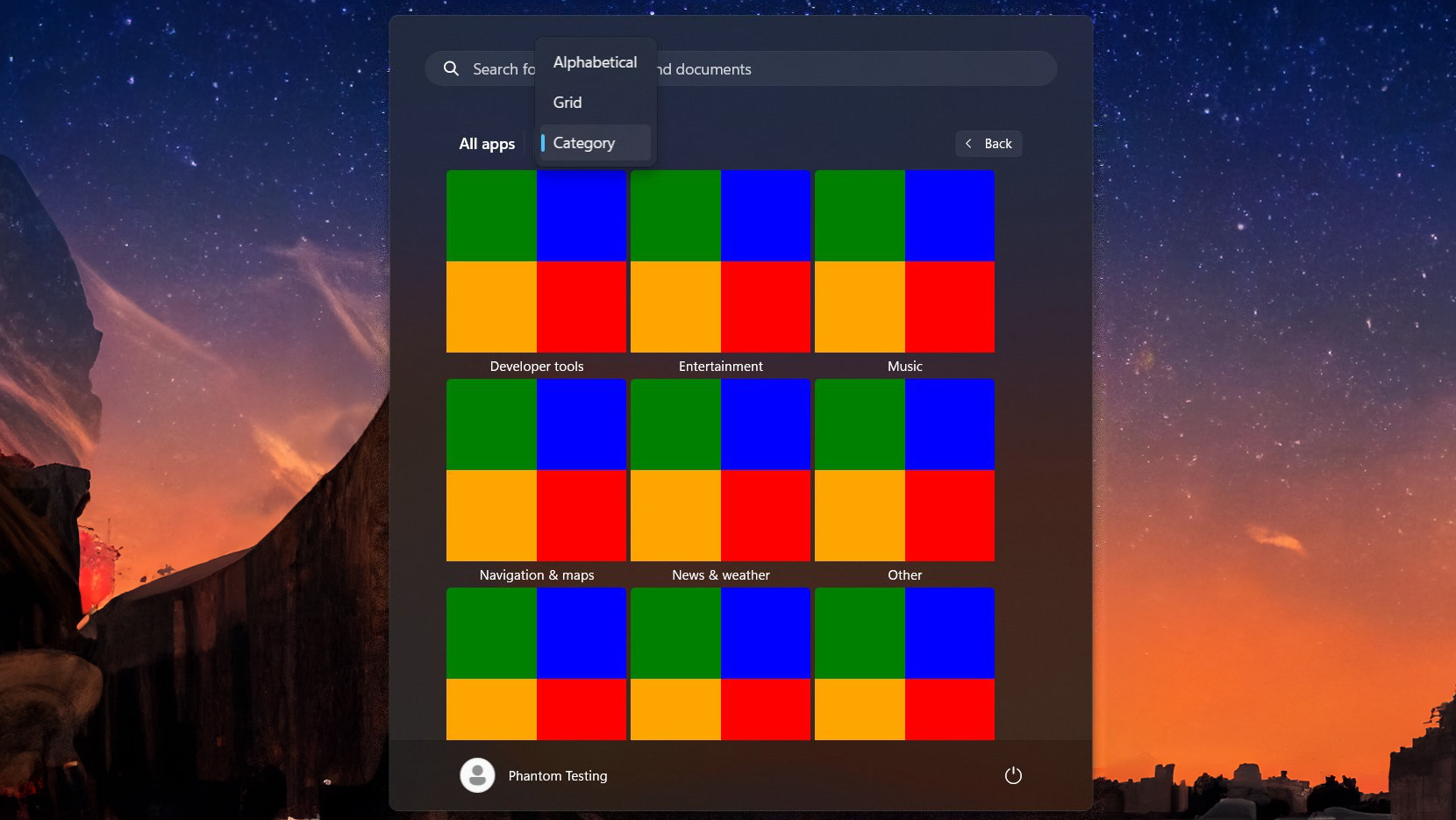
This kind of layout looks to be exactly what Microsoft is toying with on Windows 11, as the latest preview builds include early work for such a view, first spotted by phantomofearth on X. While not yet functional, we can see the layout will consist of different categories of apps, along with a preview of four app icons to represent each grouping.

Based on the findings so far, the Start menu will categorize apps into the following groups:
- Productivity
- Photo & Video
- News & Weather
- Entertainment
- Utilities & tools
- Navigation & maps
- Developer tools
- Music
- Other
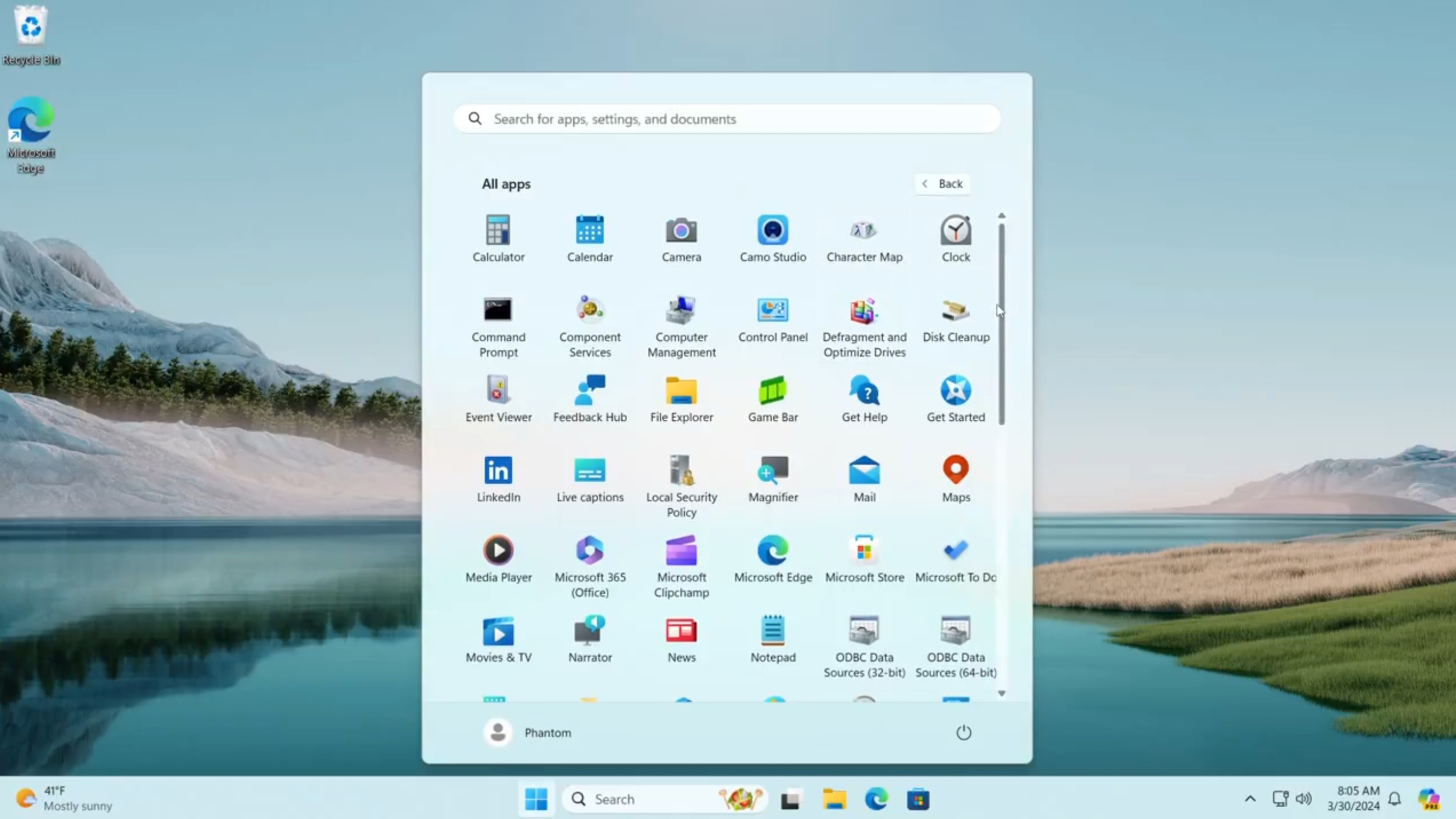
It seems Microsoft is working on multiple new layouts for all apps list in the Start menu on Windows 11. There's also an alphabetized grid view that doesn't group apps into categories, which appears to be in a much more functional state. This layout is more similar to the app drawer found on Android.

The Start menu will present a drop-down menu in the apps list letting you switch between each layout on the fly. You can choose between the categorized grid view, the alphabetized grid view, and the traditional all apps list if you prefer.
Microsoft is yet to officially announce these new layouts for the Start menu apps list, so they could still change or be canceled, but it is interesting to see Microsoft thinking about how it can improve or change the Start menu experience. The Start menu on Windows has remained much the same over the last decade, so it's good to see some potential improvements in the works.


