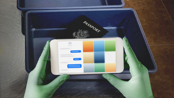
Microsoft Security has unveiled a slick new rebrand, taking a unique human approach to cyber protection. Avoiding cliched symbolism and dark, soulless colour palettes, Microsoft Security's new branding is a refreshing take on digital protection design, doing away with hostile cyber stereotypes for a brand that feels authoritative yet accessible.
In line with the best rebrands from across the decades, Microsoft Security's new look has a distinct sense of cohesion that tells a story through visuals alone. With slick motion design, clean typography and an adaptable colour palette, the new identity excels in its dynamic design, standing out from the crowd for all the right reasons.