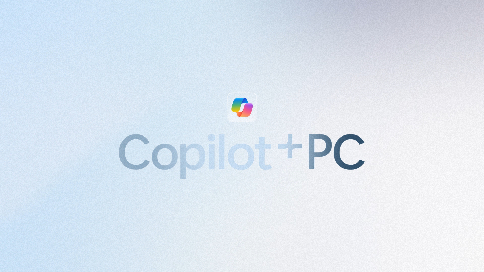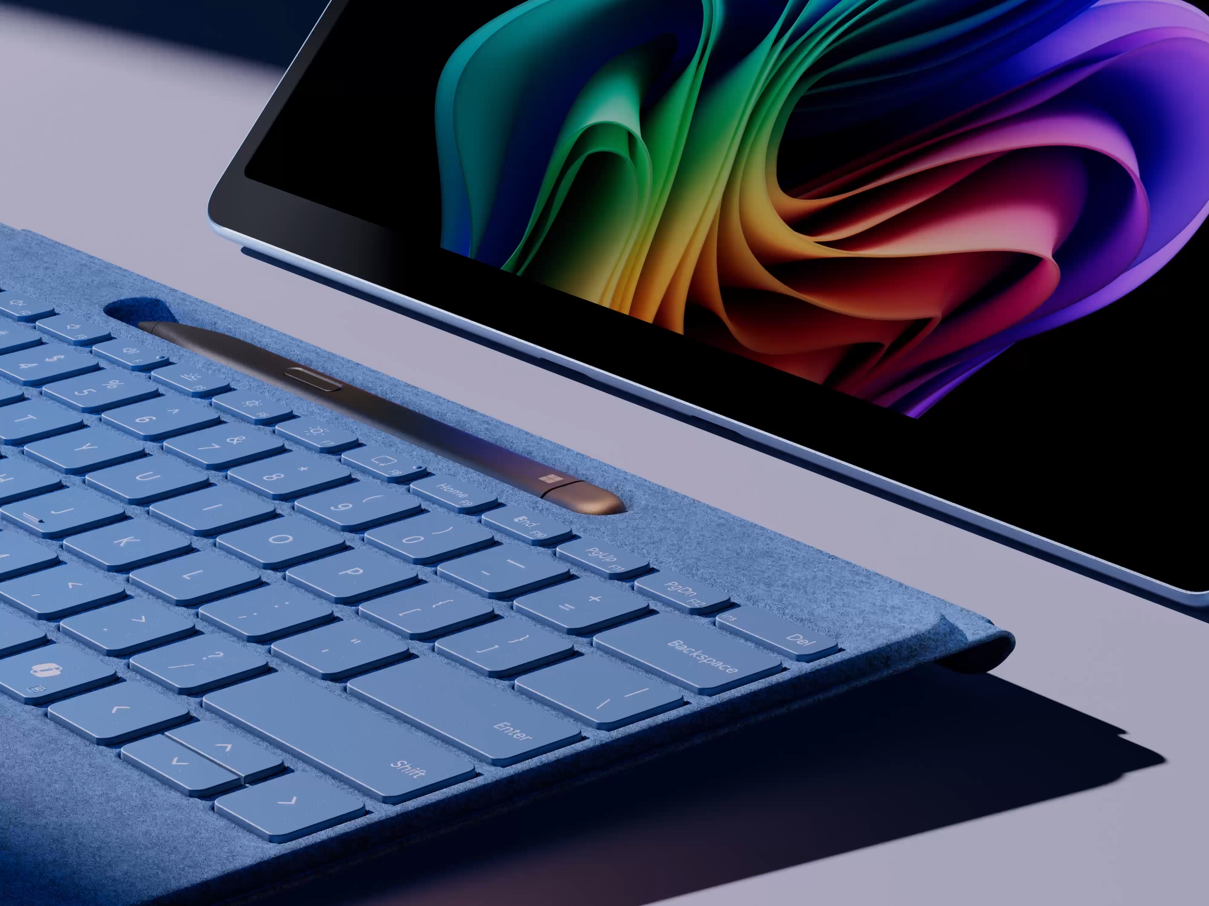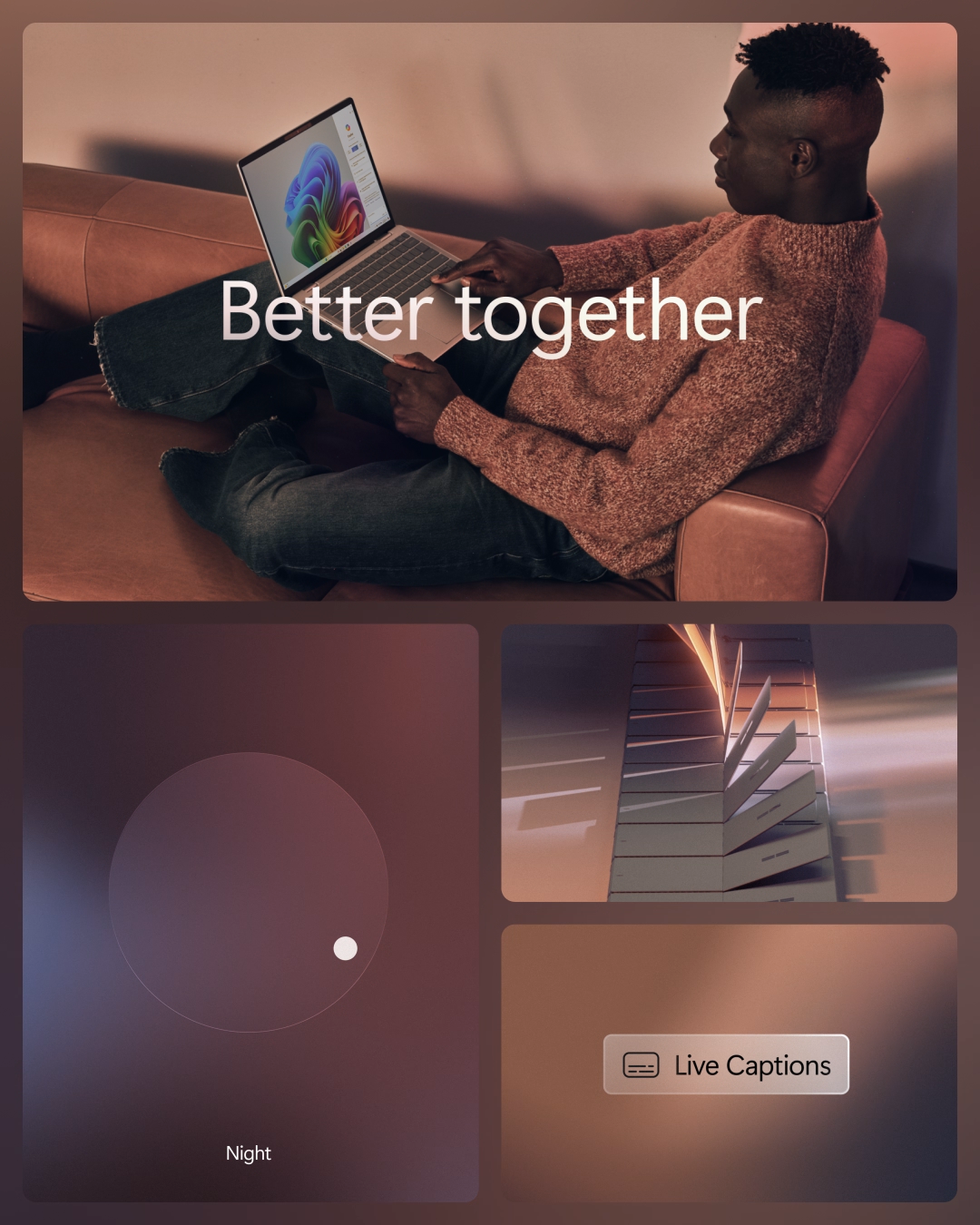
Digital studio Koto has revealed a brand new identity for the Microsoft Copilot+ PC range, designed to bring AI to life and reflect the "companionship between humanity and technology." Covering various Microsoft Surface Pro devices (which include some of the best AI laptops), the identity includes a new Copilot+ PC wordmark, unified colour approach and motion design system.
With AI built in, Microsoft Copilot+ PCs are equipped with Snapdragon X Series Processors for enhanced speed and all-day battery life, alongside a powerful Neural Processing Unit (NPU) that delivers up to 90% faster performance. The Microsoft Copilot+ PC brand champions the concept of "Illumination through AI," positioning the power of AI as approachable and seamlessly integrated into daily life. (If you're in the market for new gear, check out the best early Prime Day laptop deals.)

The new Microsoft Copilot+ PC logo (above) brings together the existing '+' symbol (designed internally by Microsoft), with a new wordmark by Koto. This is designed to represents the fusion of technology and humanity. Meanwhile, the colour scheme across the entire identity is notably warm and bright. "In a world where AI is often depicted with dark, heavy tones and evoking magic and mysticism," Koto announces in a press release, "Microsoft offers a different narrative. Copilot+ PCs aim to make life brighter: by lightening workloads, enhancing human creativity, and illuminating the day-to-day."
"The challenge with AI is: it’s going to be a big old waste of time, energy and resources unless people actually use it," Sam Howard, Creative Director at Koto, told Creative Bloq. "But, that has to start with education. AI, as much as we all talk about it on the industry side, is still quite misunderstood overall. So we knew we needed to create something that actually resonated with people and helped them understand the impact of this technology in their lives. Not paint an idealised, sci-fi feeling, tech-focused future."
"Instead, we focused on building a brand that puts people at the heart of the experience, by showing them the true power of Microsoft AI in elevating and enhancing daily life. And also doing that in a way that takes this complex, indescribable technology and turns it into something much more down-to-earth and approachable."

"Balancing the power of an emerging new technology with a sense of humanity and approachability is the biggest challenge," Howard added. "Gradients are something that already existed in the Copilot brand, and at the same time have also become a bit of a category convention, too. So with that in mind, we knew we could leverage this as a core element of the brand to really quickly signal that this is an AI product."
"However, this was part of a larger consideration: identifying which brand elements needed to fit into category conventions, and which ones need to be ownable and different, was top of mind for us. So rather than using computer-generated or synthetic-looking gradients that exist in space, we wanted to make sure our visual language felt grounded and down-to-earth."

"We drew inspiration from natural light and created a gradient system that captured that sense of intelligence and power, but in a way that felt innately real. And again, the goal was to communicate the way that this technology actually worked and felt in daily life. By reflecting the everyday world around us, this gave the brand a differentiated point of view that still feels recognisable as part of an emerging category."

From non-boring eco-friendliness to painfully gen z finance, we've seen Koto tackle some creatively complex briefs in recent months – and finding the human side of AI with Microsoft is certainly up there.


