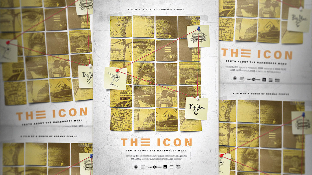
As the most famous burger in the world, the Big Mac is arguably an icon. And then there's the hamburger, which is, quite literally, an icon. One of the most ubiquitous UI symbols around, the 'menu' symbol featuring three horizontal lines is named after the food item it abstractly resembles – so it was only a matter of time until McDonald's had something to say about it.
As part of a clever new campaign, NORD DDB Helsinki has created a 20 minute mockumentary titled The Icon, in which two amateur detectives try to determine whether the icon, created in the 1980s, in indeed a Big Mac.
"Three little lines in the corner of every website - are they Big Macs?" Asks the video description. "We created a groundbreaking theory that the hamburger menu icon, which is on almost every website is actually a Big Mac. So what could we do, but fly to Dallas to find Norm Cox, the inventor of this menu icon and solve this mystery. Here’s our documentary about the journey."
This isn't the first time we've seen a burger brand create an authentic-looking investigative mockumentary in 2024. Last month, Burger King launched Whopper Island, a campaign to rename McDonald Island, a volcanic land mass between Madagascar and Antarctica.

And McDonald's own effort has proven a hit on YouTube. "It's clear how much fun everyone was having while making this, great work!" One user comments, while another adds, "Thanks for attempting to find out the truth."
It's certainly fun campaign, which accurately mimics the vibe of the many true crime documentaries that litter streaming services right now. And props to the designer who cleverly incorporated the hamburger icon itself into the title treatment on the poster.
From minimal billboards to anime crossovers, we've seen plenty of creative campaigns from McDonald's lately. Meanwhile, Burger King is still trying desperately to punch up at its biggest rival.


