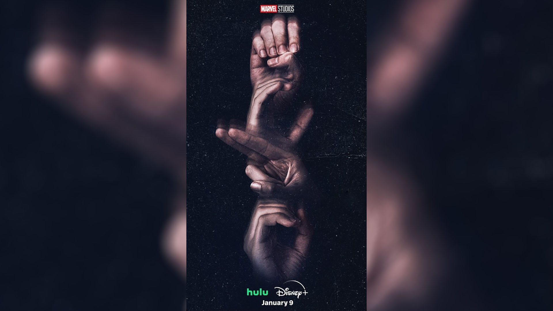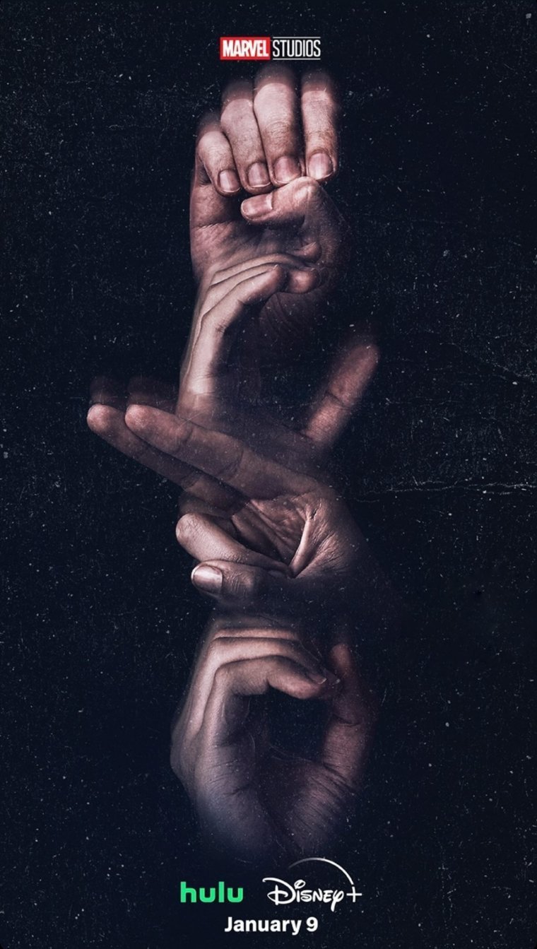
I'll admit that in the past I've been a little harsh about Marvel's movie posters but the most recent design to emerge from the MCU might have slightly swayed my opinion. To promote its new Disney+ series, Marvel has produced an ingenious poster design, using sign language to spell out the series title, Echo.
Not only is the poster a positive step for inclusivity but the design is both elegant and striking, creating a unique balance of functionality and style. However, while this might seem like a definitive sign that movie poster design is on the up, ASL (American Sign Language) signers have pointed out that the design might not be as praiseworthy as it appears.

The poster's accessible design references Echo's deaf protagonist Maya Lopez, yet TikTok creator Vera Goudie shared that the poster actually contains a 'typo' since the fingerspelling for the letter 'H' is the wrong way. While many non-signers have praised the design's accessibility, Goudie suggests that there could've been further consultation with a deaf graphic designer to avoid miscommunication.
While Marvel's design isn't faultless the effort to integrate accessibility into its design is certainly commendable. With a hard of hearing protagonist at the centre of its story, Echo's poster is not only an attempt at functional inclusive design but also a clever storytelling motif.
@veepats ♬ original sound - Vera Goudie
Attempts at inclusivity are always appreciated, but oftentimes it can feel stilted and unnatural, so Marvel's attempt to make ASL a design feature seemingly had positive intention. From a design perspective, it's great to see Marvel finally migrating from the floating head formula towards a more stylised design with considered imagery.
The poster proved most popular with Marvel fans on X, with one user calling it "genius" while another commented that the poster was "actually fire." Elsewhere, on Reddit, one user claimed that "Marvel Studios has stepped up their game" and another said that "instead of a floating heads poster, we got a floating hands one" – let's hope this isn't Marvel's latest design plague.
ASL on a poster for a Marvel project - sometimes it’s hard to measure progress, but this is truly something I didn’t think I’d see happen in my lifetime. pic.twitter.com/Ivpsml0cNXJanuary 6, 2024
Thats actually fire.January 6, 2024
Someone give a raise to whoever did that.January 5, 2024
2023 delivered us some of the best movie posters in recent years and the new year seems to be carrying on the trend (like the gorgeous poster for Zendaya's latest movie). Whatever design trends the new year brings, it's refreshing to see that even big studios like Marvel are embracing more creative poster design and I'm excited to see what's to come.


