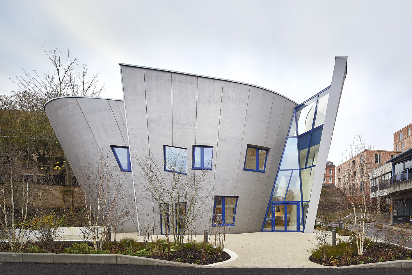
An awkward site in north London is the home of Maggie's Royal Free – the latest in the growing family of UK-wide, design-driven cancer support centres. The newly completed building was designed by New York's Studio Libeskind – a commission that came naturally, as its founder, Daniel Libeskind, is not only a world-famous architect with landmark schemes such as Berlin's Jewish Museum under his belt, but was also a personal friend of the Jenckses (the Maggie’s charity was set up by the late Charles Jencks and Maggie Keswick Jencks).
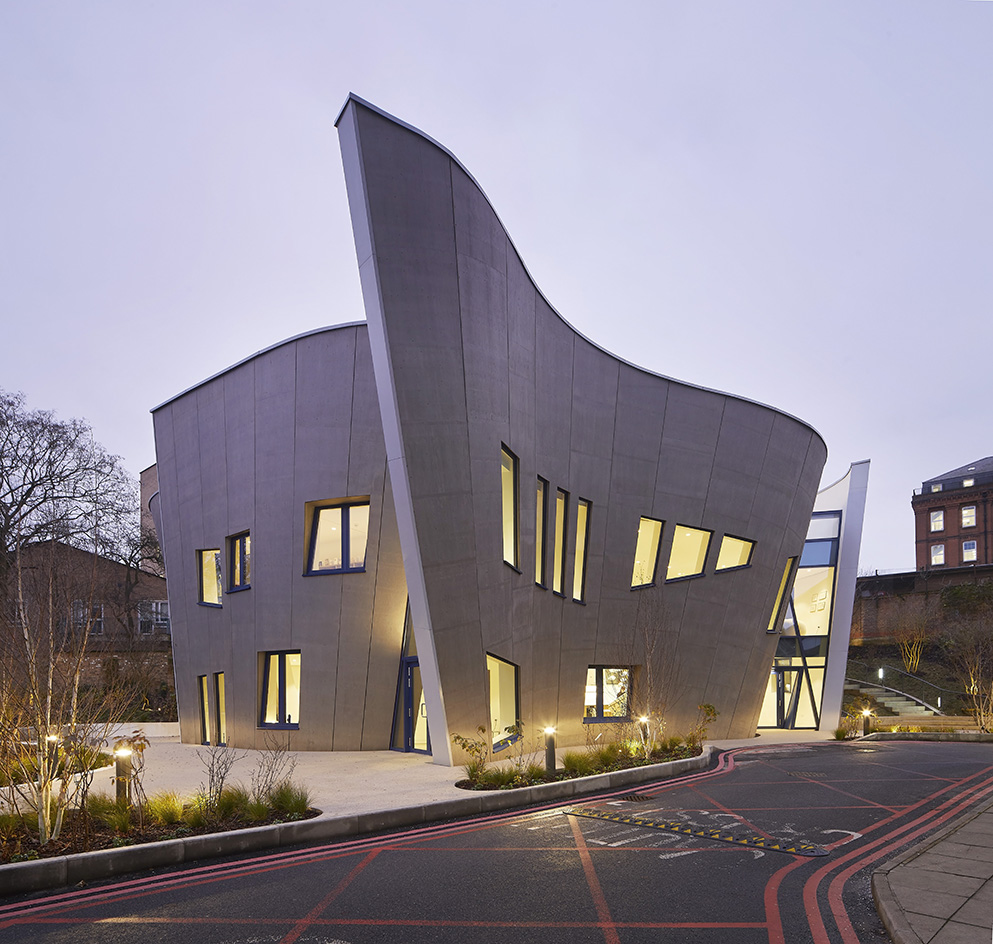
Maggie's Royal Free by Studio Libeskind
'I was one of the first, if not the first architect to be asked to do [a Maggie's],' Libeskind recalls. The opportunity presented itself with this site in 2017, and the firm was engaged formally for the design.
Maggie's chief executive Laura Lee says: 'Daniel was a great friend of Maggie's and we always wanted to work with him. We knew he was the right architect for this site's conditions.'
The Maggie's network comprises over 20 structures in its arsenal, all composed by leading names in contemporary architecture – OMA, Steven Holl and Zaha Hadid have all done one, and recent collaborators include Ab Rogers, who did Maggie’s Centre at the Royal Marsden, and Heatherwick Studio, the practice behind the centre at St. James’s University Hospital.
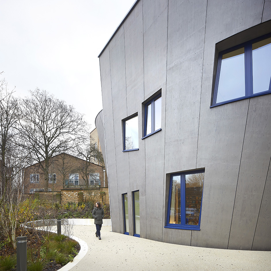
Here, Libeskind had to tackle a challenging plot – a small site tucked behind the main building of the Royal Free Hospital in Hampstead, almost unseen from the street and right next to a staff car park on one side, while bordered by taller blocks on the other. A steep incline on the terrain added further complications.
Libeskind was unfazed: '[It's an] unlikely site but that's what makes it interesting.' Maggie's more compact building typology presented its own challenges, but the architect embraced them. 'The smallest ones are often more difficult. Mies van der Rohe said that it's more difficult to design a chair than a city, and it's true,' he continues.
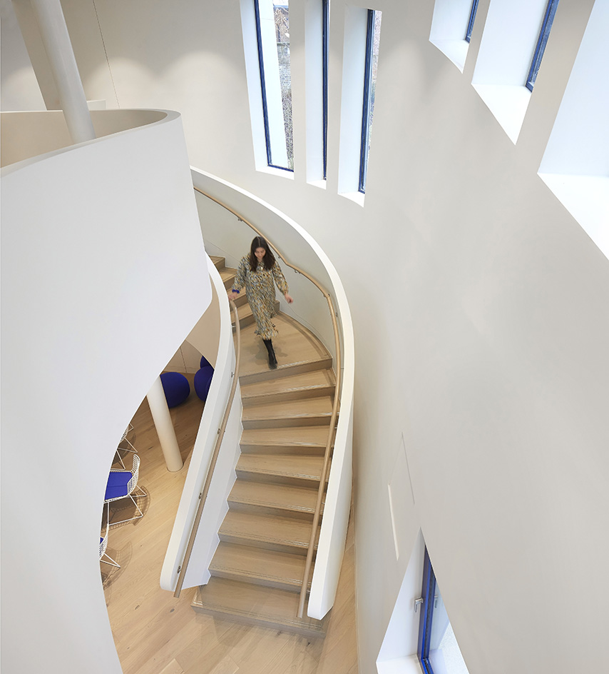
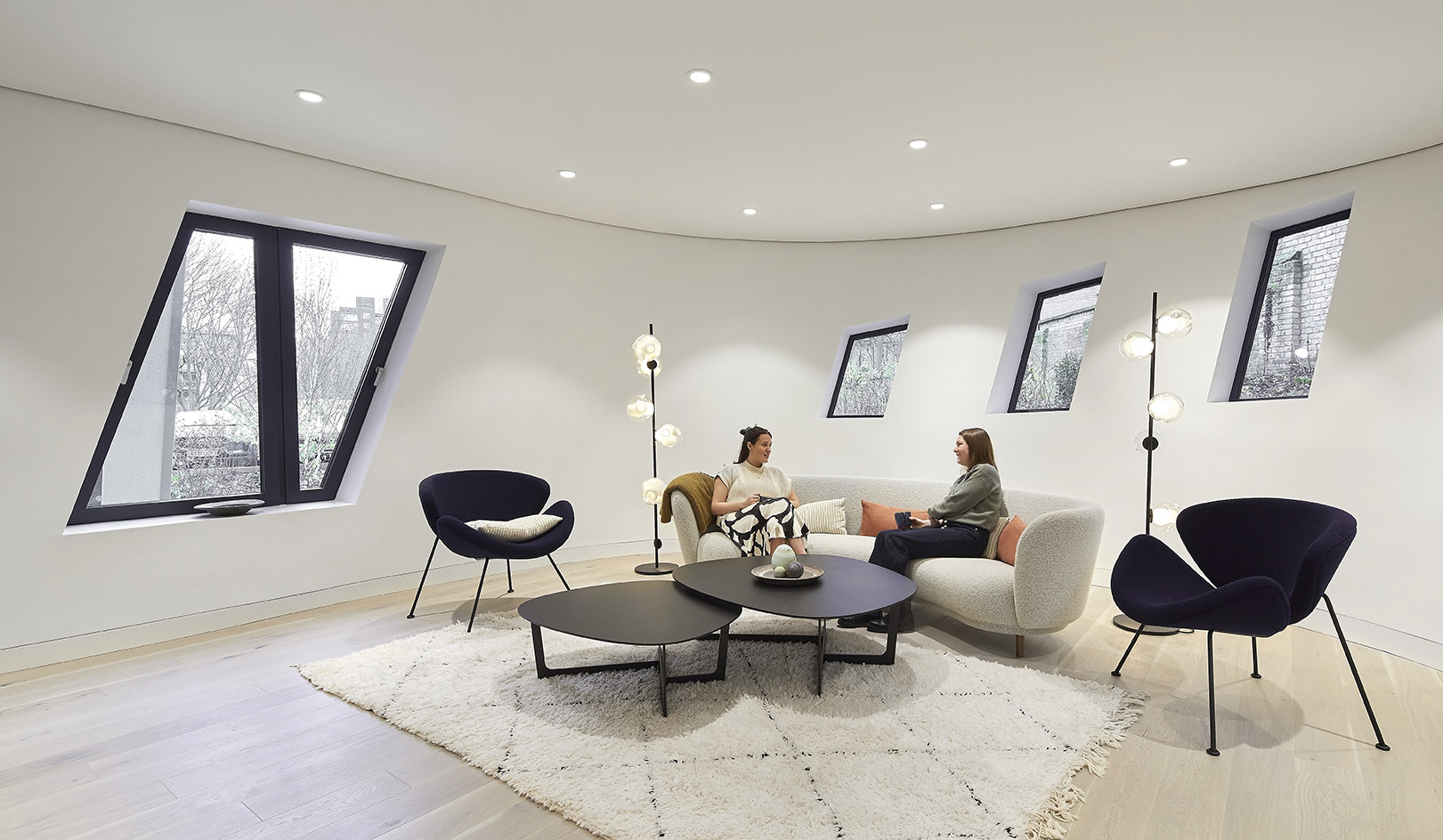
Studio Libeskind's approach was to craft a volume that sits on its narrow plot and ‘blossoms upwards’, increasing its volume with every storey. Said volume, a steel structure, is clad in Nordic spruce pine LVL panels attached to the frame through timber cassettes. It curves outside and in, which promotes an internal flow and helps carve a sense of space and generosity in the otherwise, relatively modest (at 4,886 sq ft) floorspace.
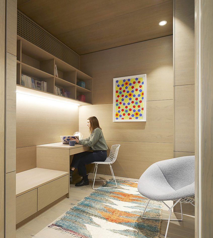
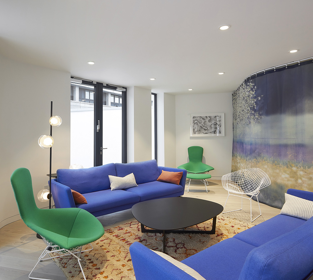
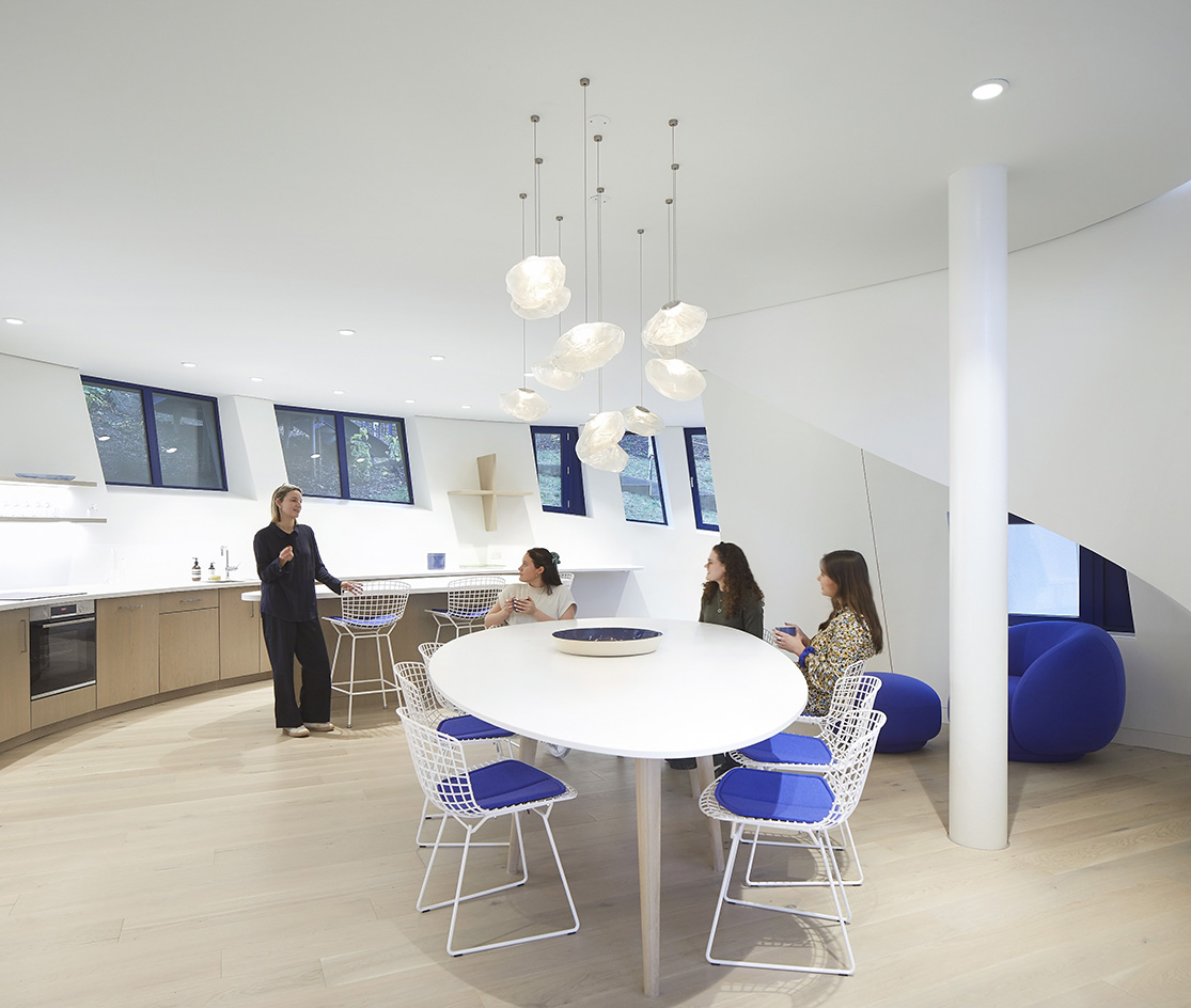
Inside, a kitchen hugging a large table is at the heart of the design, as is often the case with Maggie's centres. Off this central space is an arrangement of consultation rooms, workspace and flexible areas that can be multifunctional and separated as needed by drawing curtains that add colour and softness to the whole.
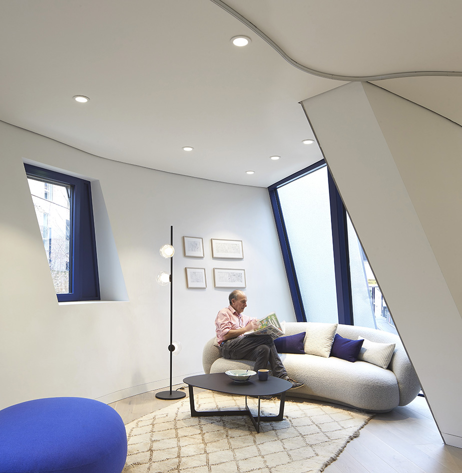
The main interior spans three floors with a partially planted green roof and a terrace – available for events as well as everyday use by its staff and visitors – that opens to the sky. This top-level creates a quiet escape, which the Studio Libeskind team hopes will provide further sanctuary for Maggie's guests – highlighting the centres' focus on wellbeing and a human-centric approach.
'Architecture is not about making a drawing,' Libeskind says. 'It's about capturing the spirit of the building. That has to come first.'
