Get all your news in one place.
100's of premium titles.
One app.
Start reading
Creative Bloq
Creative Bloq
Technology
Daniel John

Lyle's apologises for its Golden Syrup logo redesign as even the church expresses dismay

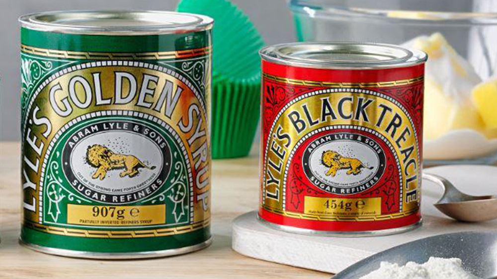
Lyle's Golden Syrup and Lyles Black Treacle tins showing the lion logo.

Poor old Lyle's. The golden syrup company probably wasn't expecting such a furore when it unveiled a new logo this week – its first new design in more than 140 years. But the rebrand seems to have infuriated several corners of the internet, and even the Church of England is upset.

The previous logo, featuring a dead lion complete with swarming flies, was a tad more macabre the most (read: all) of the best logos of all time. But it did have some religious connotations – which might explain why the Church has decided to weigh in on the rebranding of a confectionary brand. 

Sign up to read this article
Read news from 100's of titles, curated specifically for you.
Already a member? Sign in here
Related Stories
Top stories on inkl right now
One subscription that gives you access to news from hundreds of sites
Already a member? Sign in here
Our Picks
Fourteen days free
Download the app
One app. One membership.
100+ trusted global sources.