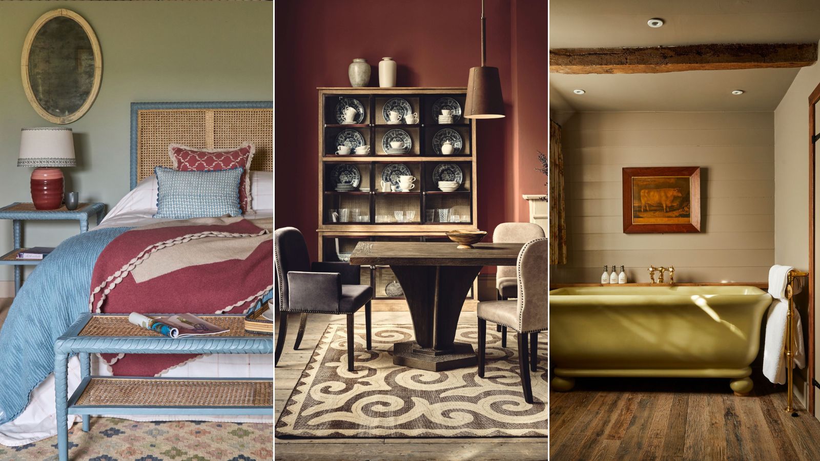
Farmhouse design remains one of the most beloved styles in the U.S., and it’s not hard to see why. This style is all about creating a liveable, welcoming space. With an emphasis on natural textures, lived-in decor, and a simplicity that feels both beautiful and functional.
As Helen Shaw, Director of Marketing at Benjamin Moore aptly puts it, 'Farmhouse style also has an innate liveability at its core, nodding towards the romantic idea of living in a remote setting.'
And it’s not an interior design style that needs to be confined to countryside homes. With the right considerations, even the most bonafide city dweller can embrace a little rustic farmhouse chic into their home. It doesn’t have to mean sticking to an obvious palette of creams, whites, and beiges either. Incorporating colors inspired by the natural world is the key to introducing a little more variance into the overall style.
If you want all the rustic charm but a touch more personality and a pop of color, it’s easier than you think to strike that balance. With that in mind, we’ve rounded up our favorite seven colors that work perfectly with the farmhouse aesthetic.
6 shades that work perfect with farmhouse style
Yes, there are a lot of white and cream farmhouse-style but they are not the only shades that can work with this iconic aesthetic. There are plenty of rich, bolder colors to try. And remember, with this look, texture is truly key too. As Laeticia Laurent of Laure Nell explains, ‘Matte or chalky finishes on walls create a softness, while natural materials like wood, linen, and stone bring depth. The goal is always balance, a home that feels refined yet approachable, lived-in yet curated.’
1. Ochre
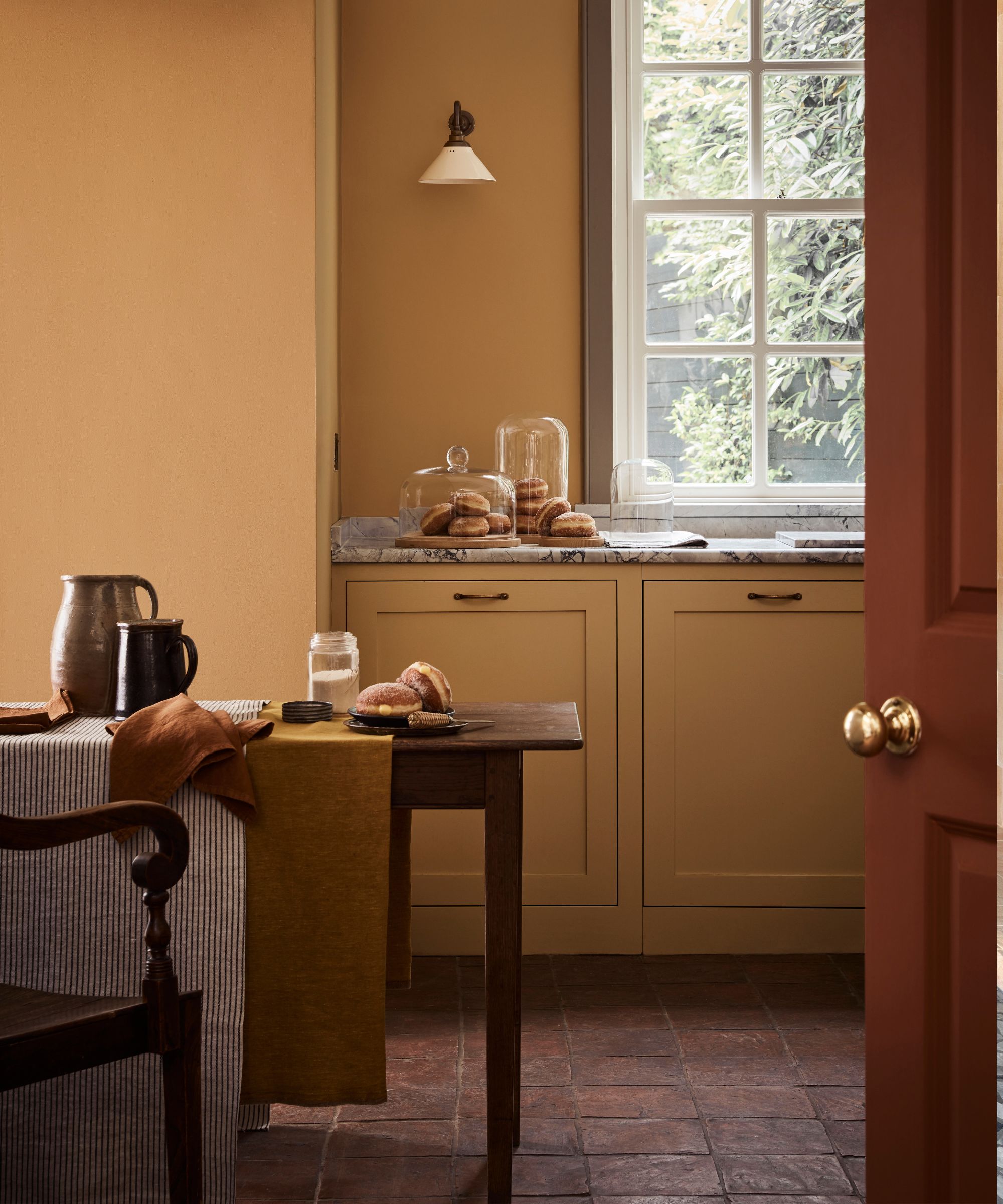
For those looking to inject a dose of warmth into a room but aren’t satisfied with creams or beiges, ochre is the designer's choice. With just enough pop from the yellow family, it brings undeniable warmth to a space while remaining livable thanks to its muted undertones and earthy, clay-like feel.
Interior designer Nina Lichtenstein perfectly sums up its appeal. 'A rich, golden yellow, ochre adds warmth and depth to farmhouse spaces. Its earthy undertones complement wood finishes and provide a cheerful pop without dominating the space. Ochre also pairs beautifully with light brown.'
Ochre’s connection to fall palettes makes it inherently cozy and inviting. It’s especially effective in smaller spaces. Instead of trying to make a small room feel larger, ochre lets you embrace its intimacy, and paired with other rich, earthy tones like burgundy and dark woods, this color truly shines.
It’s a natural fit for rooms such as a farmhouse kitchen, where textures such as terracotta and deep woods and stone are already in abundance. To achieve this perennially inviting look, try Little Greene’s Bombolne for a dash of warmth!
2. Light brown
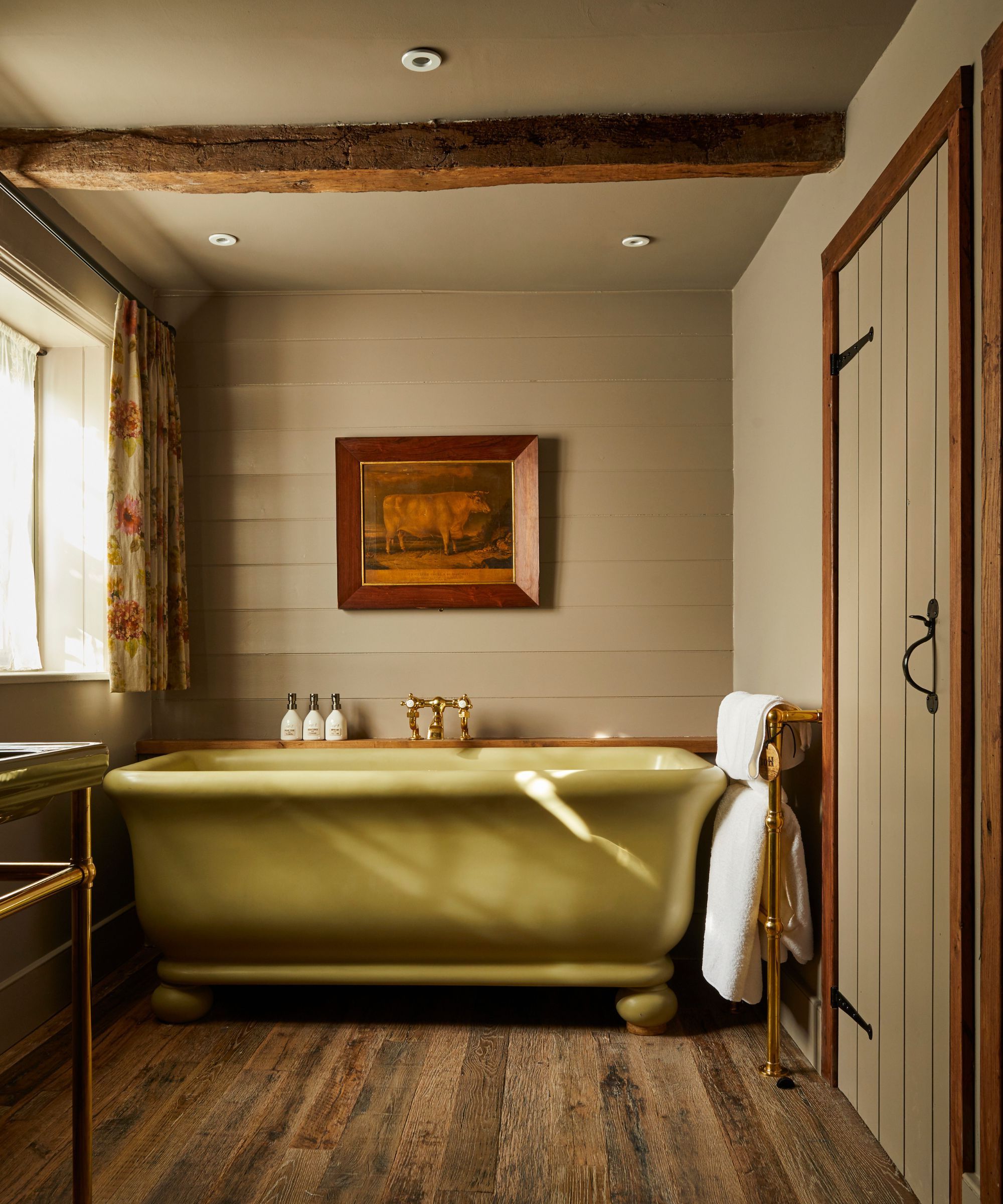
Decorating with brown has been having a moment in the spotlight, evolving from a once-overlooked ‘mud’ color to a design favorite.
As Nina Lichtenstein explains, ‘Light brown is the cornerstone of a farmhouse palette, echoing the natural beauty of wood, leather, and stone. This shade grounds the space and connects it to its rustic roots. Light brown also pairs well with nearly every other farmhouse hue, making it an essential neutral for this design.'
While not an obvious choice for a farmhouse bathroom, light brown actually works wonderfully when painted on wood paneling. Dark browns might feel too heavy for a relaxing soak, but a lighter brown, veering into taupe, can be just right for this small, light-filled room.
Paired with other natural tones, it becomes an incredibly livable shade that complements the original features of the home, almost as if it has always belonged there!
Try Jitney by Farrow & Ball for the perfect little tint of brown.
3. Burgundy
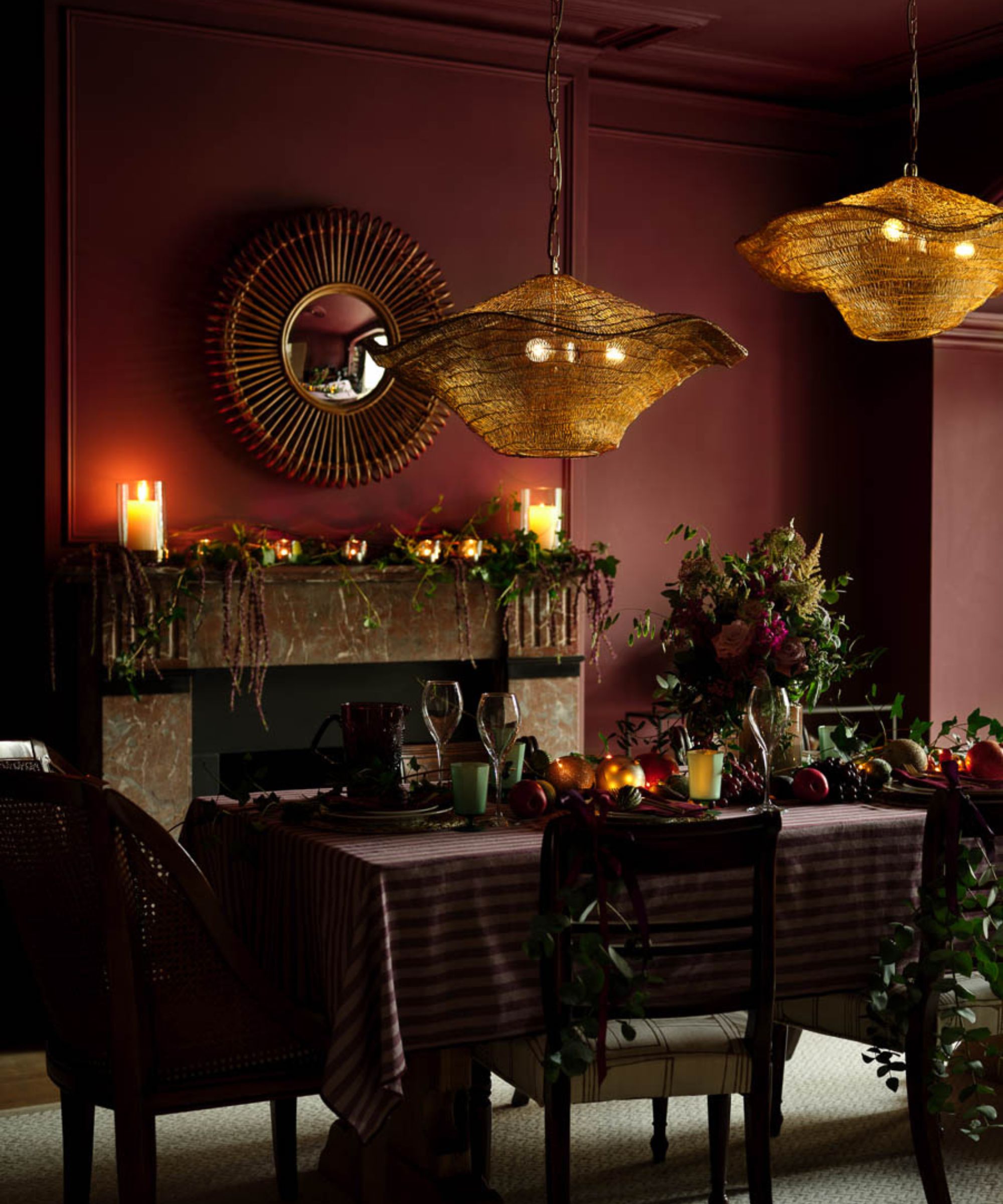
Farmhouse decor is often synonymous with calm, relaxed, and inviting spaces, but sometimes, adding a touch of drama is just what’s needed and the dining room is an ideal place to experiment with a richer shade.
Typically a space with ample light and room, the dining area can handle bold colors like Burgundy, making it the perfect backdrop for hosting late-night dinners and creating intimate atmospheres with family and friends.
Laetitia Laurent shares her perspective on incorporating this typically quite heavy hue. ‘Burgundy is that unexpected pop of drama in a farmhouse palette. It’s not for everyone, but when used correctly, it can ground a space beautifully’
In a larger farmhouse dining room, if you’re feeling brave, go the full hog with a floor-to-ceiling application or Farrow & Balls Eating Room Red. It’ll look stunning against a dark wood dining table, aged fabrics, and brass accents.
For those hesitant to go all-in, pairing burgundy with a warm cream and using it as an accent color is a worthwhile compromise.
4. Sky blue
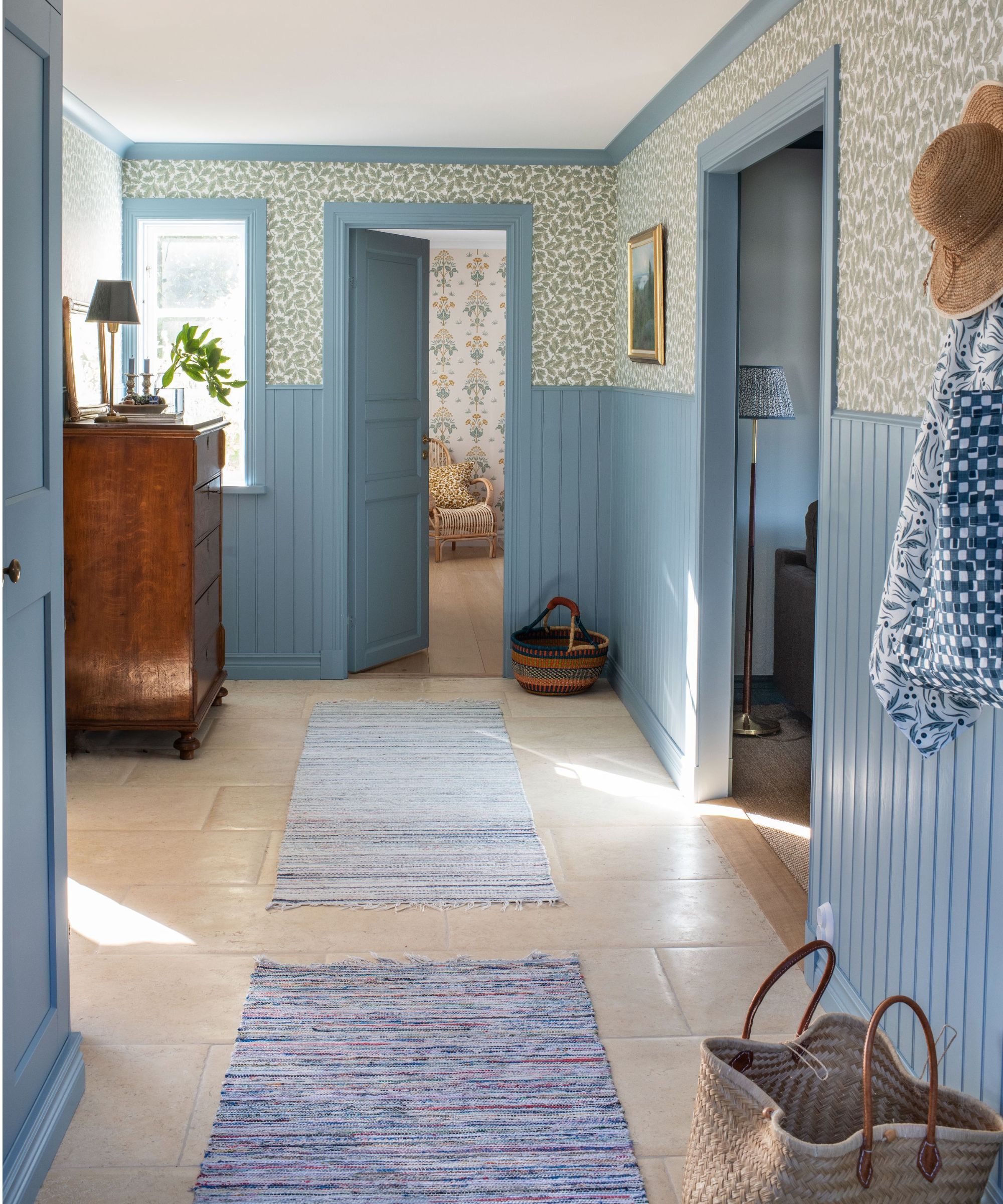
Shifting away from the rich and earthy colors, on the other end of the spectrum are the fresh, sunny shades that instantly uplift any space.
Laetitia Laurent of Laure Nell Interiors captures the appeal of pale blue perfectly. ‘There’s a lightness and airiness to pale blue that feels calming yet fresh, like a gentle reminder of the outdoors, giving the space that feeling of expansiveness without being overwhelming.’
Pale blue is a great match for farmhouse design, as it draws inspiration from the outdoors, the number one rule. Choose a shade with subtle grey undertones. While bright hues can be striking, they often clash with the relaxed charm of a farmhouse aesthetic.
Paired with wood elements, natural flagstone flooring, and aged materials, a soft milky, or muted sky blue is an excellent alternative to white.
Great for spaces like hallways, where abundant light reflects off the walls, or as an accent, a light blue such as Windy Blue by Sherwin Williams pairs effortlessly with other fresh tones like sage green, cream, and soft greys.
For a more playful touch, consider using it in a subtle patterned wallpaper or as a complementary color to add a pop of fresh spring without overwhelming the room.
5. Sage green
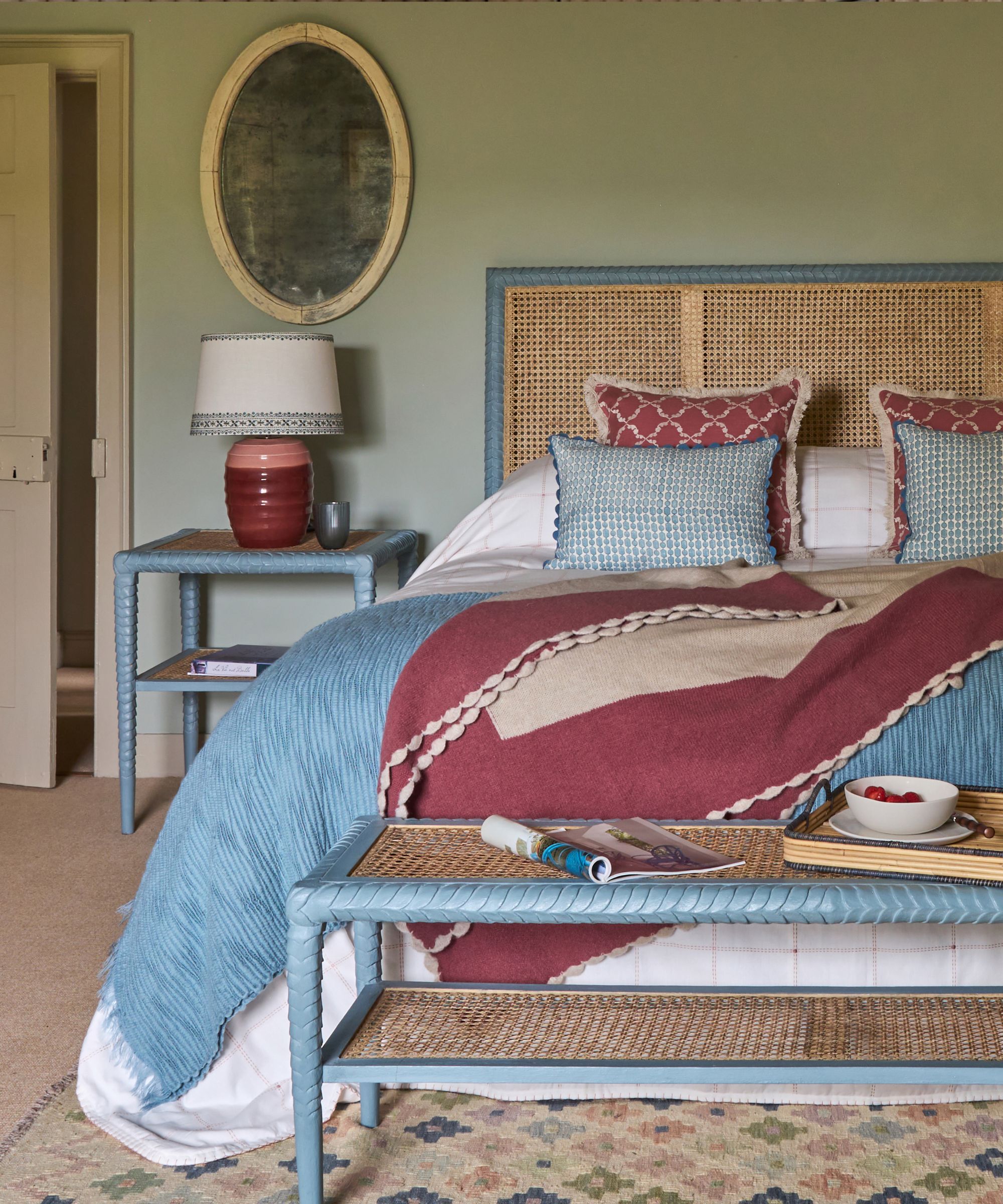
Often a classic staple in the kitchen, sage green is one of the most beloved and versatile shades in the green family. With its soothing, restorative qualities, it also makes an excellent (and obvious) choice for a bedroom, where its calming tones create the perfect environment for a peaceful night’s sleep.
Much like a light blue, sage green features grey undertones, giving it a more muted quality that is essential in farmhouse design. This subtlety avoids the boldness of brighter colors, that whilst have their place, just don’t work with this look.
Paired with natural elements like rattan, sisal carpets, linen, and wood accents (a cornerstone of farmhouse decor) a sage green such as Green 01 by Lick as a base wall color complements beautifully without even really needing to try!
Nina explains its appeal; ‘A perennial favorite in farmhouse design, sage green is calm, sophisticated, and versatile. This muted green shade can be used on cabinetry, walls, or furniture, blending beautifully with natural elements like wicker, rattan, and stone.'
6. Gray
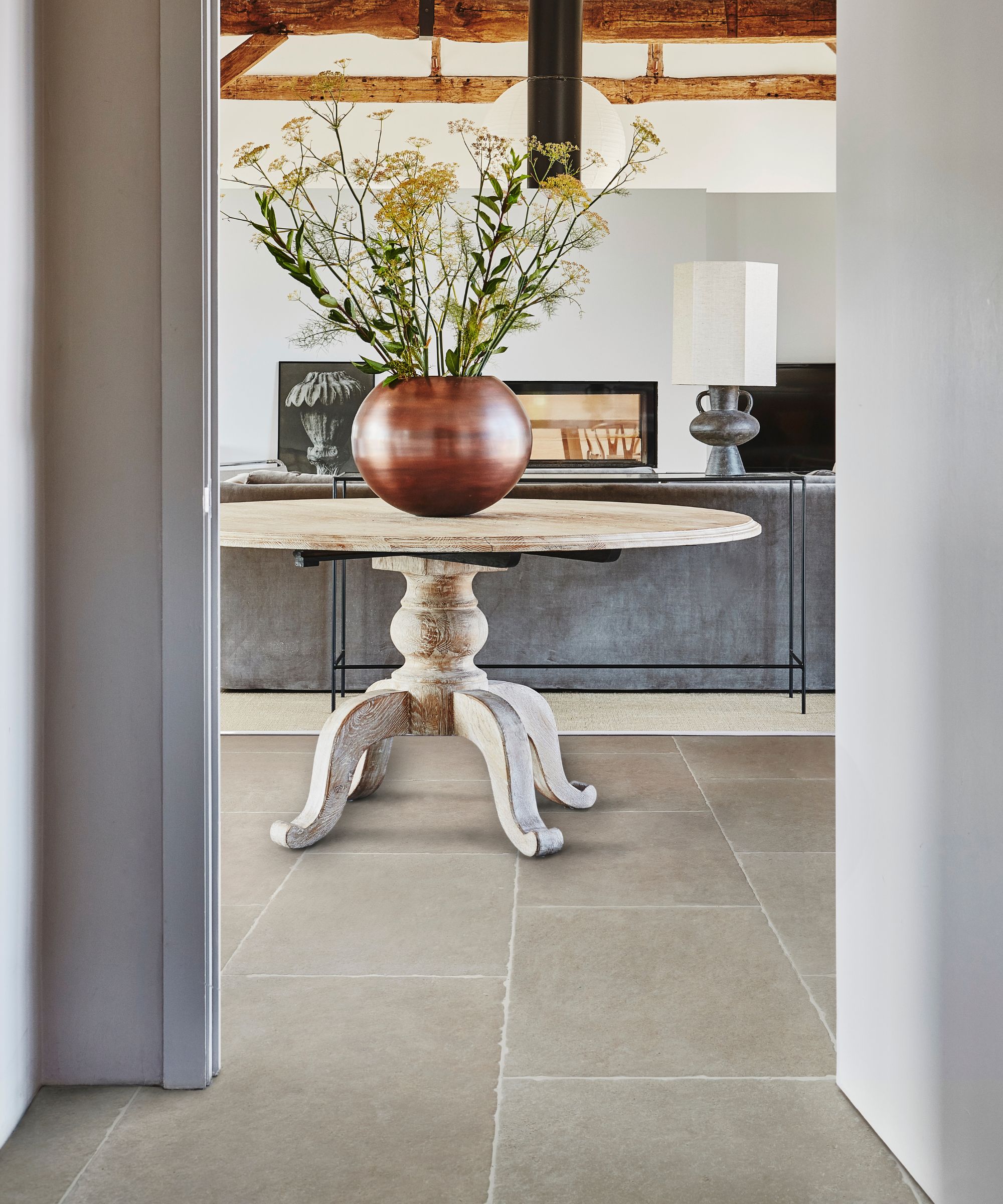
While some might argue that gray isn’t much of a ‘color’, it’s actually far more versatile than you’d think. For those hesitant to fully commit to bold hues but looking to move away from plain whites, embracing the grayscale is a perfect way to explore tonal layering in the home.
Found abundantly in nature (think stone as the obvious comparison!), it effortlessly works with natural elements like wood flooring and rustic hardware.
Lean toward slightly warmer grays with beige undertones, they harmonize better with warm woods and softer tones. Steer clear of cooler, steel-like grays that feel more at home in an industrial or utilitarian modern scheme.
As Nina explains, ‘Gray is the bridge between the rustic and the modern in farmhouse design. Its neutral, versatile nature makes it ideal for creating contrast or layering with other colors. Opt for warmer grays with beige undertones to soften the look. Gray is particularly striking when used on cabinetry, shiplap walls, or painted furniture.’
Soft grays such as Graystone by Benjamin Moore combined with warm whites and wood accents can act as the perfect starting point for layering color in a farmhouse scheme. Want to create even more contrast? Introduce a darker slate grey such as Scree by Little Greene as an accent for added dimension.
Gray is incredibly livable and timeless and it’s the quintessential neutral that will never go out of style.
Farmhouse style is all about the soft and rustic, which is perhaps why we so often associate it with neutrals. But you can introduce plenty of color to farmhouse interiors, just be sure to keep your choices earthy and tonal rather than anything too primary, you still want that softness despite the bolder color.


