The formidable tech giant that brought us "1,000 songs in your pocket" back in 2001 (with the iPod I still love today) can easily to sort out the weird, confusing layout of its music streaming platform, Apple Music, with iOS 17 in September, right?
Probably. To a degree.
Despite Spotify's recent TikTok-style revamp, it's no secret that many of us still prefer Apple Music for its vast array of Dolby Atmos and Lossless offerings – and for the same price as the big lossy green streaming monster.
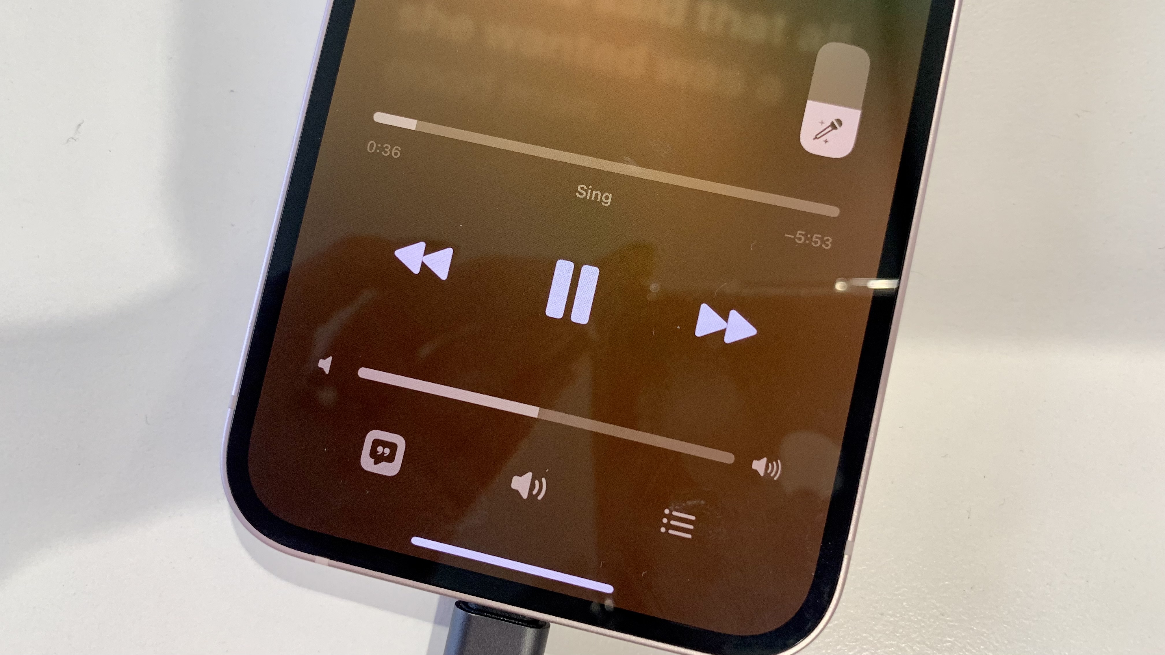
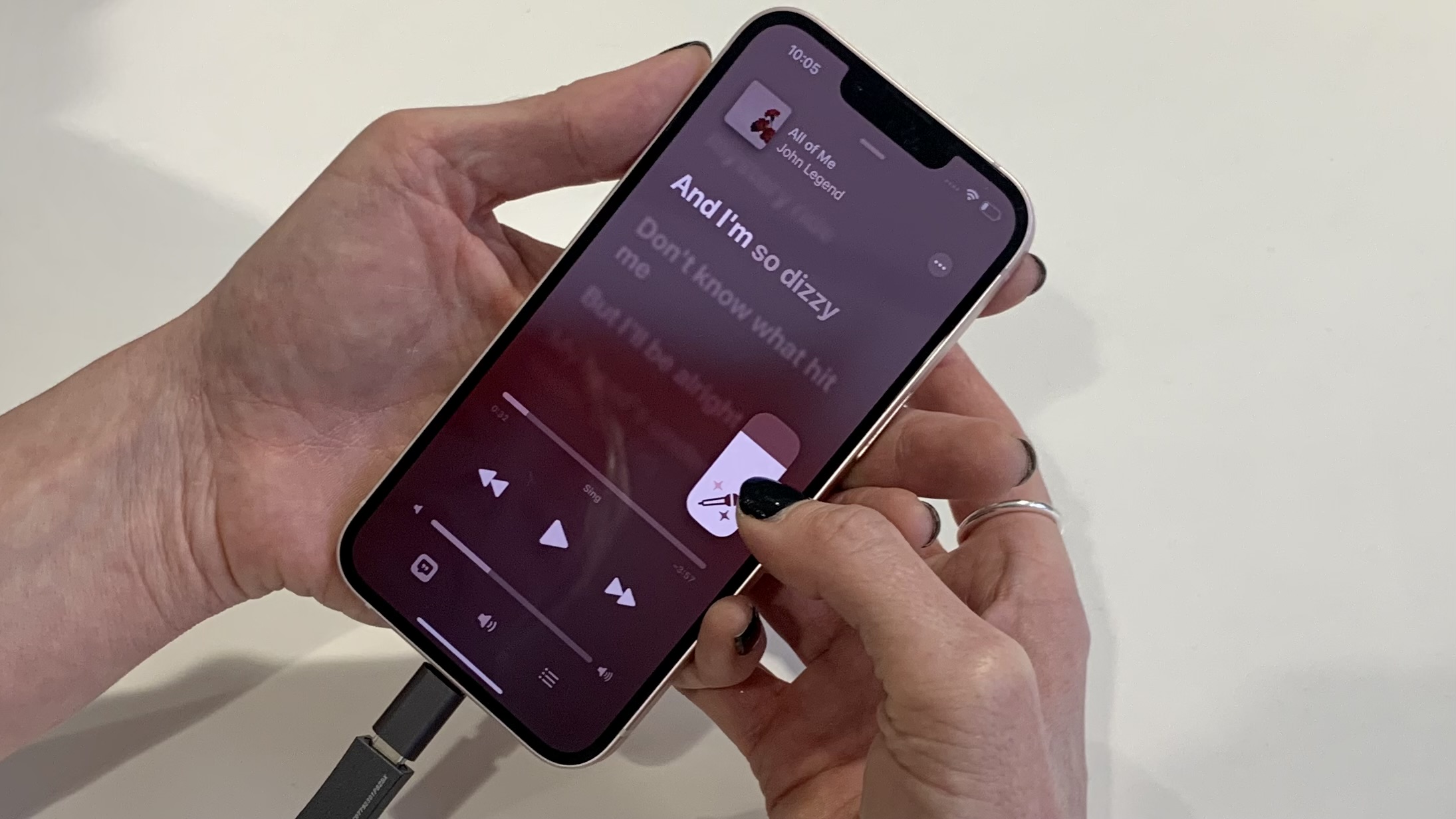
But the plain truth is that Apple Music needs a comprehensive revamp – and following the introduction of Apple Music Sing (which sort of just sits within a red band, hidden away in the Browse tab) and Apple Music Classical (a separate app but still advertised on Apple Music proper), it needs it bad.
So what's changing? Well, according to everything we know so far on iOS 17, improvements on the agenda for Apple Music with iOS 17 include the ability to view song lyrics directly on your phone's lock screen and crucially, a reduction in the amount of text in the Apple Music app in favor of new images and graphics.
The tweaks were suggested by a Weibo user in April, who also hinted at a series of cosmetic changes for the iPhone lock screen, Control Center, and App Library, as well as for Apple Music. Noted analyst Mark Gurman later wrote (in his revered monthly Power On newsletter) that he expects Apple to add app sideloading to iOS 17, a move necessitated by 2022 EU regulations which Apple has no choice but to adopt – although app sideloading on iPhone might only apply in Europe.
But what of Tim Cook's friendly Music app? Hopefully, we'll soon be able to see the woods for the Apple trees.
Opinion: a re-jig is good news, but I fear Apple Music still won't be the easiest music service to navigate

Look, I rate Apple Music's Dolby Atmos catalog as one of the best music streaming services out there. But it's not the easiest to use by a long way. No, no, that would be Tidal, followed by Spotify and Qobuz.
And if you're waiting for the 'but', here it is: Apple offers big things, then makes it really hard to find any of them.
Let's take Apple Music Sing as an example. There are over 50 diverse, multi-language Apple Music Sing genres and decade playlists if you scroll down from the Apple Music Sing section, in the Browse tab. I counted 33 playlists organized by genre and seven decade-curated playlists, but that's after the 13 'Made to Sing' offerings, including more generic 'Classical Love Songs', 'Iconic Duets', and the like.
Here's the rub: I always forget whether they're in the 'Listen Now' or 'Browse' tabs. And 'Radio', which sits centrally at the bottom of Apple Music's app screen at all times, I rarely use at all.
When I do use the 'Search' tab in Apple Music, it often thwarts me because I've forgotten to switch the slider underneath the search bar across to 'Apple Music' instead of 'Your Library' – and frankly, when you click the three dots (or ellipses) in the top right of a track, beside the plus icon, the number of text options that drops down is more than a little confusing – especially when none of them says 'Download' unless you have first traversed the 'Add to Library' phase.
Does anyone use those confusing 'share lyrics', 'love', or 'suggest less like this' drop-down tabs? And anyway, if we're talking about tracks, shouldn't that technically be 'suggest fewer like this'? Although of course, if we're doing away with words, that debate could soon be null and void.
Tidal's search tab, meanwhile, is a useful magnifying glass in the middle of the app's lower screen, where Apple Music's radio offering sits. Click it, and you see a list that starts with 'New', then 'Top', then 'Tidal Masters', 'Dolby Atmos', '360 Reality Audio'… it's all very easy to get the goods.
While I'd love Apple Music to take a look at what Tidal's done there and maybe take some notes, I don't think we're going to see a huge change with iOS 17.
It's OK, Apple, I still love those hi-res tracks (accessible in their full resolution only with wired headphones and one of the best portable DACs, which you still don't make) enough to do the work. I just wish I didn't have to.


