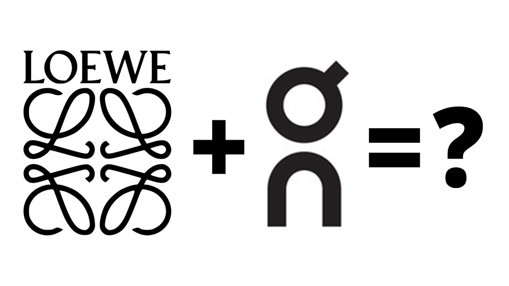
What do you get if you combine two of the best fashion logos? An illegible anagram is what. But it might just be the start of a new logo design trend.
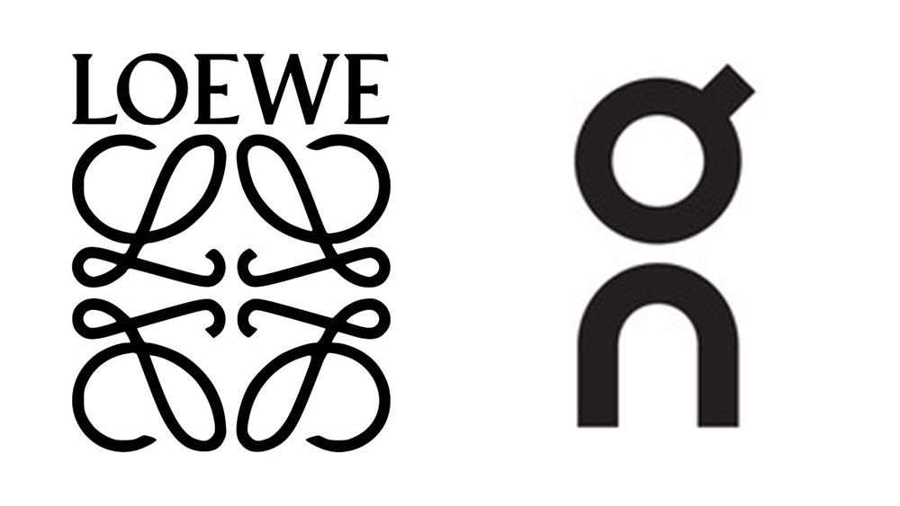
For their new collection, Loewe and On have not only mixed their fashion styles but they've also combined their brand marks to give birth to a strange hybrid logo offspring. The marks combines elements from each brand's identity.
Fashion collabs have been coming thick and fast in recent years as brands jump on the appetite for limited editions. You're not anyone anymore if you haven't partnered with another brand for a capsule collection: the more unlikely the partner, the better. Combining logos is the logical next step.
The Loewe x On logo combines two of the four mirrored Ls from the logo of the Spanish fashion house with the stylised O and the N from the mark of the Swiss sportswear brand. It's being used on Cloudtilt 2.0 sneakers ($550), tank tops ($290) and parkas ($2,350).
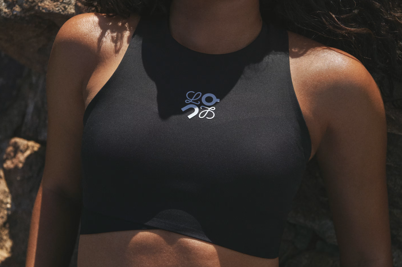
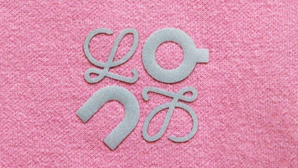
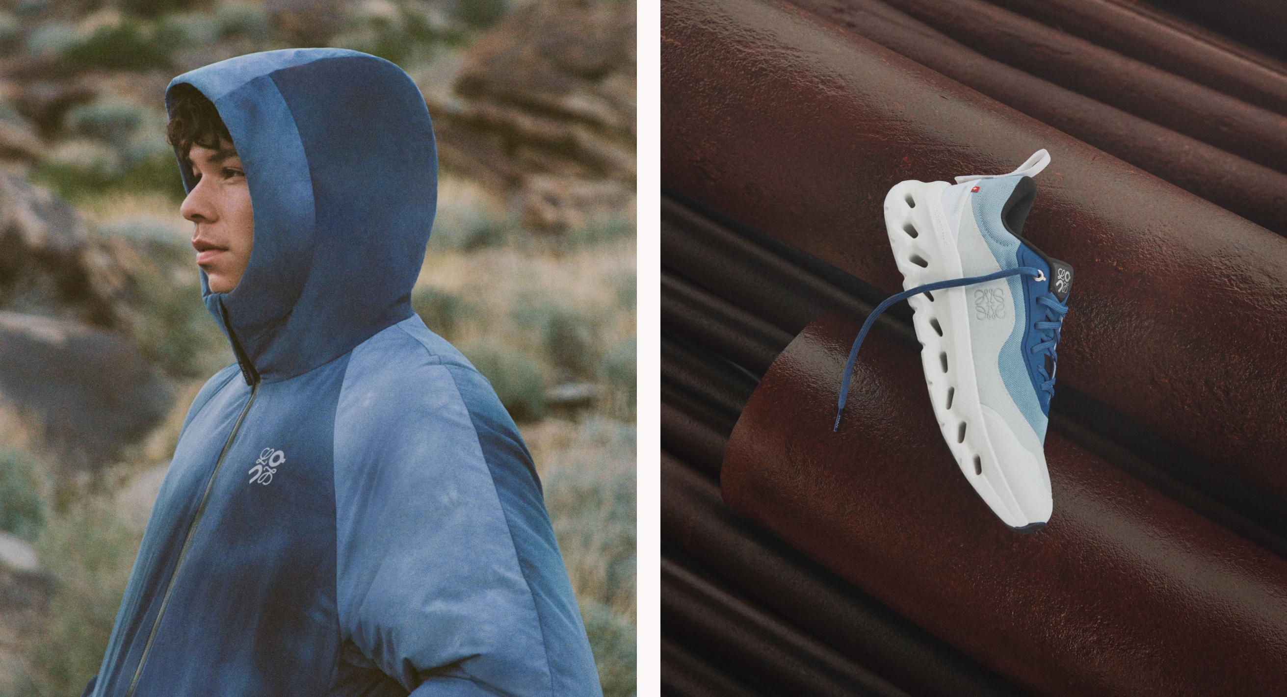
The result makes little sense. The shapes fit together, but the two logos are so different aesthetically, one featuring elaborate cursive letters, the other modern sans serifs, that they don't exactly gel together. And the new logo design also reads 'Lonl', although maybe that's not a huge problem since nobody can pronounce Loewe anyway.
But no matter how dubious it is, I wouldn't be surprised if we start to see more of this as brands look for ways to make their collabs stand out. Creating hybrid logos has mainly been off limits so far since brands still tend to be very precious over their brand assets, which are not to be altered any way. Pages and pages of brand manuals have been dedicated to listing all of the things that cannot be done with a logo, and taking it apart to merge it with another brand's is so far out that it doesn't usually even get a mention.
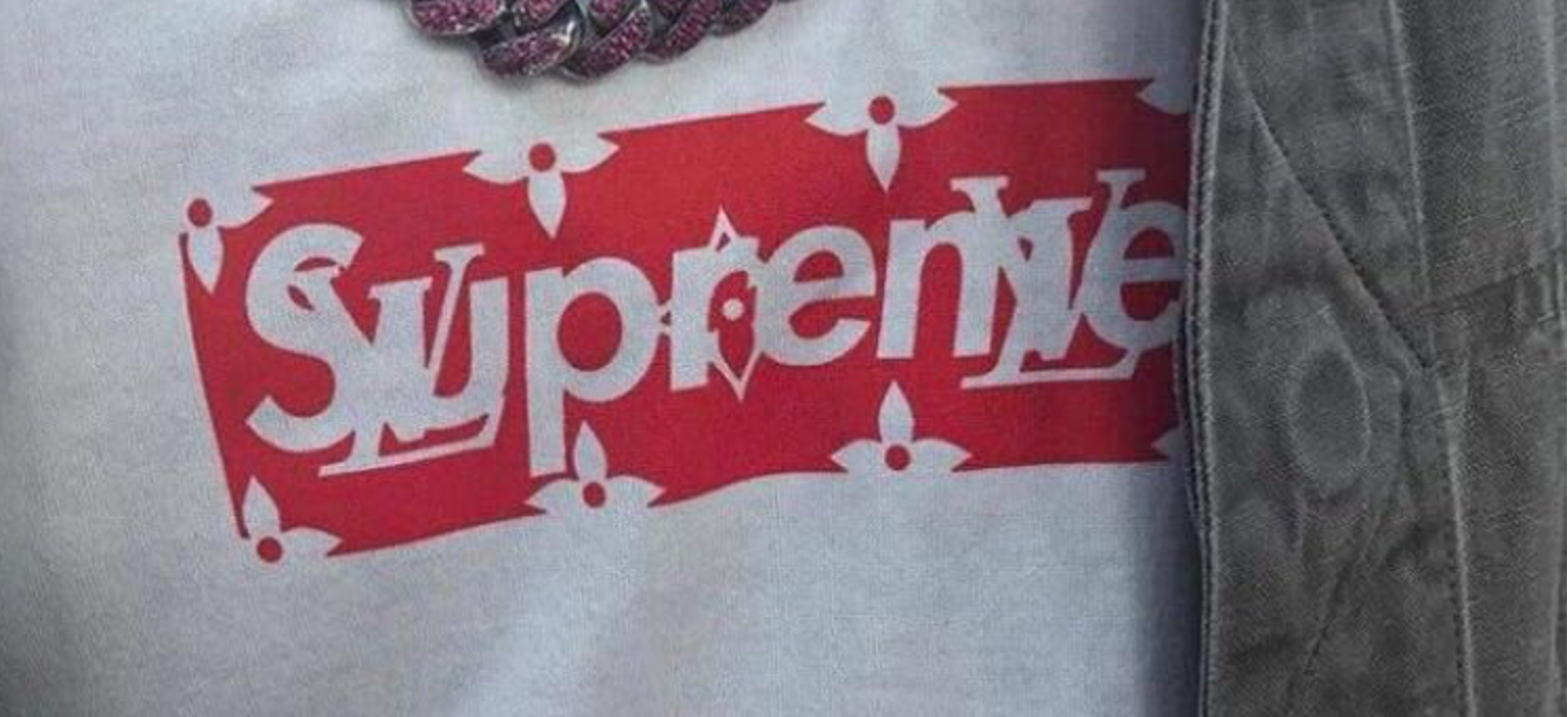
Generally, hybrid logos happen in cases of mergers and acquisitions – think DaimlerChrysler or AOL Time Warner. But there have already been some exceptions in fashion. Supreme, which seems to base the whole point of its existence on collabs, kind of made a half-hearted attempt to combine its red box logo with the LV monogram in its 2017 Louis Vuitton x Supreme collection (it simply superimposed them). Oh, and Ralph Lauren swapped its polo horse for a llama for its Fortnight logo.
But we’ve seen several big brands taking a more relaxed approach to their logos recently. Even Coca-Cola crushed its own logo to promote recycling. Current trends may also lead fashion brands to become more open to playing with their identities. The rise of dupe culture as something to be celebrated rather than hidden is making brands want to present themselves as less corporate and more open to treating their identity with humor (remember when Gucci replaced its social media avatar with a child's scrawl?)
But there are challenges, and risks. Combining logos isn't easy. The shape of Loewe's mark lent itself to swapping in a couple of letters, but even then it's questionable whether it works. Get it wrong, and it could result in dilution of the brand identity and lost brand equity.
For more logo news, see the new Spotify logo and the new Puig logo.


