The right colour scheme can really elevate a space and bring any room to life. This is especially true of the living room, one of the hearts of any home (perhaps second only to the kitchen). And if you’re looking for the perfect living room colour scheme, whether you’re moving into a new place and want to make it your own or are giving your lounge a colourful refresh, you’ve come to the right place.
There are certain timeless colour palettes and colour pairings that just simply work as living room ideas pretty much every time. Meanwhile living room trends and colour trends also play their part as certain colours can be incredibly popular for a few years and then people go off them – grey is the perfect example of this. But, of course, it’s also important to keep your own personal taste in mind and let your space reflect your style and your personality through your colour choices and more.
‘The best colours for a living room are those that balance light, comfort and personality,’ says Caroline Thornborough, design director of paint experts Thorndown. ‘Successful living room palettes usually combine one grounding shade with one or two supporting colours. This approach keeps the room feeling cohesive, and allows space for personal touches through furniture, artwork and soft furnishings.’
Living room colour schemes
With personalised interiors being one of the biggest home decor trends at the moment, it’s perhaps no surprise that people are embracing colour in their homes, and especially in their living rooms.
‘Many homeowners have stopped playing it safe with beige and grey tones in the living room, instead opting to use more colourful, experimental shades,’ says Becca Stern, co-founder and creative director of Mustard Made.
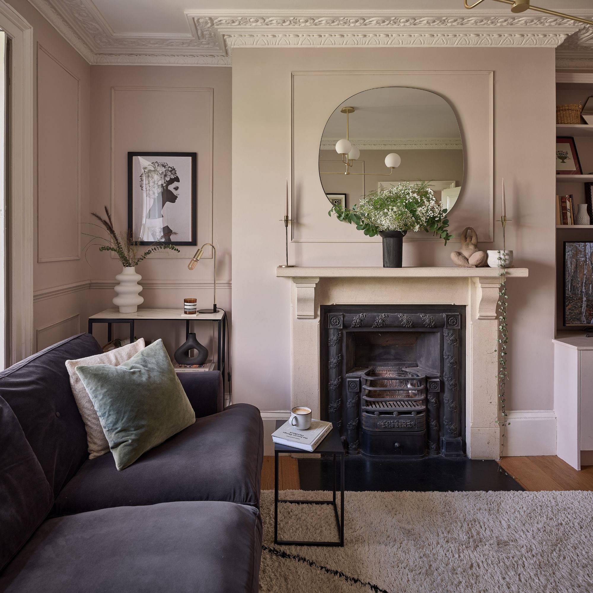
1. Opt for light neutrals
If you're a fan of calm interiors and don’t particularly love bold colours, you can opt for a neutral colour scheme. One made up of light shades like off-whites, light taupes and creams is set to be particularly popular this year as Pantone revealed Cloud Dancer as its colour of the year for 2026.
‘Lighter tones such as warm whites, soft creams and pale neutrals are incredibly versatile, helping spaces feel open and welcoming while reflecting natural light. They form a calm base that works in both large and small living rooms,’ Caroline at Thorndown says.
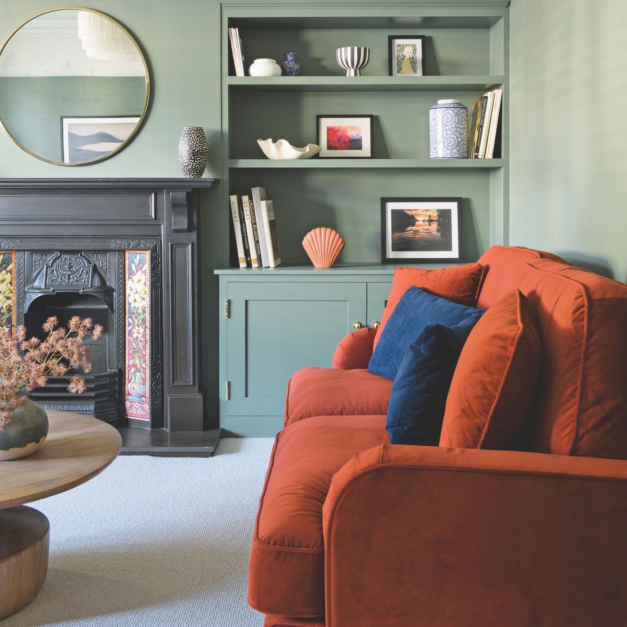
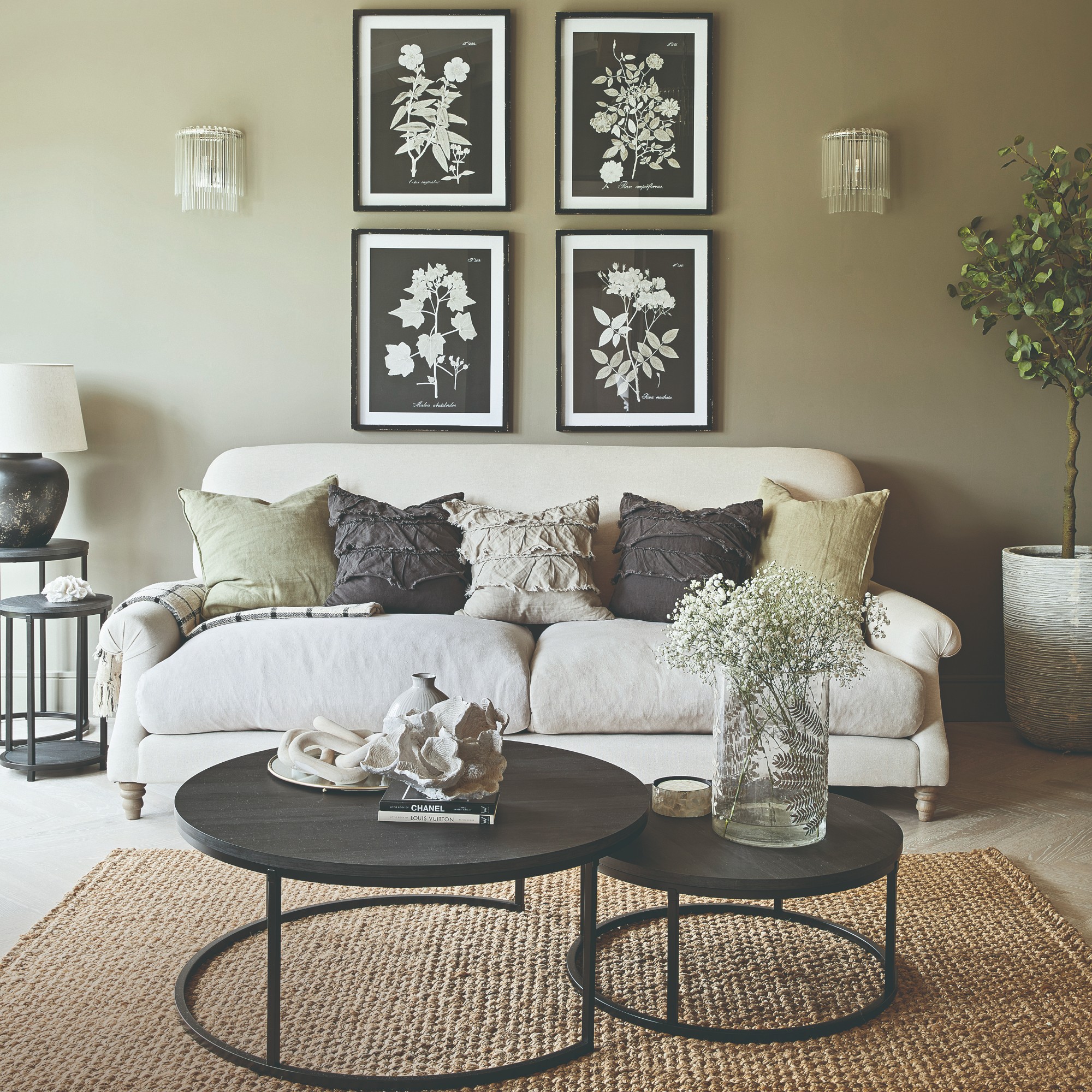
2. Feel grounded with browns and earthy shades
Even before Pantone’s colour of the year for 2025 announcement naming Mocha Mousse as the hot shade to watch, earthy and brown tones were popping up everywhere and rising in popularity. But Pantone’s COTY pick sealed the deal and earthy shades dominated by brown remain go-to shades even beyond 2025.
'Mocha has become the new neutral, bringing a sense of warmth and richness that cooler greys and stark whites often lack,' says Shelley Fish, creative lead at sofa brand Aurelo. 'Sitting somewhere between taupe and chocolate, it feels grounded, earthy, and quietly elegant. In the home, mocha works as a soft anchor. It doesn't demand attention, but it holds a space together with ease. It pairs beautifully with crisp whites and natural woods, but also complements deeper shades like sage, navy, or terracotta, which makes it a flexible choice for changing seasonal schemes.'
But there are also other grounding, earthy shades that you can incorporate into your space as Michael Rolland, managing director at The Paint Shed and paint expert, explains, ‘If you want warmth directly on your walls, earthy tones like terracotta, olive green, and rich browns can create a cosy, grounded vibe. Consider a terracotta accent wall or olive green curtains, paired with a beige or tan sofa and wooden furniture for an organic feel. Accent colours can also be introduced through smaller details, like vases, lamp shades, or even books on your coffee table. If you’re feeling adventurous, try a statement piece, like an armchair or a bold rug, to tie the room together.’
Large-scale artworks are one of the easiest ways to incorporate colour into a room. And this La Redoute art print is the perfect vessel for earthy brown shades, including Mocha Mousse.
Bring some colour, cosiness and texture into your living room with the help of throws. This faux fur-trimmed design from Habitat is the perfect option.
If you can't or don't want to paint your walls, your floor is your biggest canvas to splash some colour on. And to ground your living space from the literal ground up, we recommend a soft rug in an earthy tone like this one from Rugs Direct.
3. Find a heavenly match in pale blue and brown

‘A great calming option is a soft blue, like powder or sky blue. This shade has a serene, airy quality that helps to reduce stress and promote relaxation, making it ideal for a space where you unwind after a long day,’ Michael at The Paint Shed says.
And Tash Bradley, Lick’s director of interior design and colour psychologist agrees as she’s about to paint her very own living room in a pale blue shade. But she believes what elevates this lovely colour is pairing it with rich chocolate brown.
‘Blue and chocolatey brown! I would colour-drench the whole living room in our Blue 08, so it’s a really warm blue. And then bring in a really rich brown, velvet sofa. They are complimentary colours – blue and brown are like a match made in heaven. You see it in nature a lot, so you'll naturally be quite drawn to those two tones. But because you've got the warm blue and the warm chocolatey sofa colour, you should then add an accent of cool. So that's where the chrome comes in which just totally elevates the space. It's always really nice to have a mixture of warm and cool.’
Who knew there was such a thing as warm blue?! But there is and this is it - Licks' Blue 08 is a sky blue shade with warm yellow undertones that's perfect for a living room.
Cozmo makes one of our favourite modular sofas - the Float. And that's saying something, as we're big modular sofa fans here. And it happens to look particularly great in this dark chocolate brown velvet upholstery.
Chrome lamps and homewares have been trending since last year - and they will continue to do so. This sleek but slightly retro table lamp will look perfect paired with the pale blue and brown colour combo.
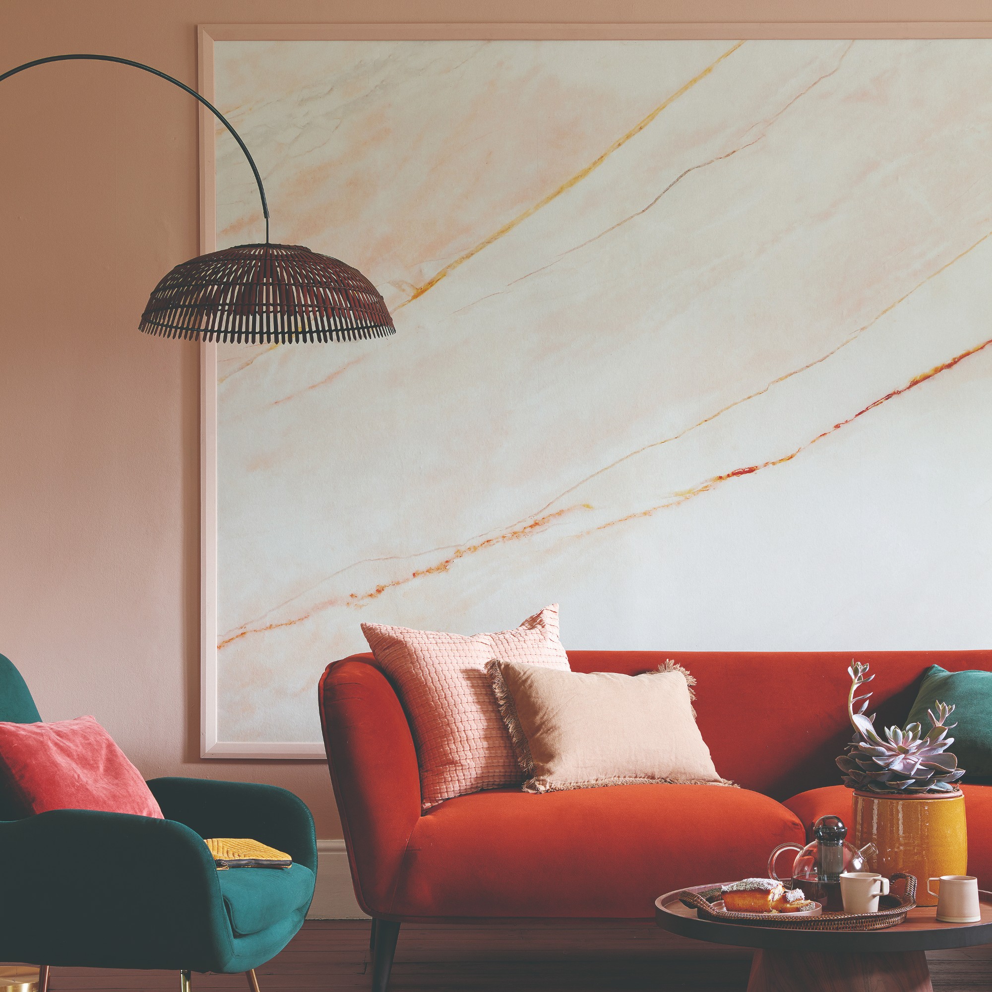
4. Put an earthy spin on pink and red
Couple of years ago, pink and red came out on top as one of the most popular and yet surprising colour combinations. But with the more cosiness-focused and grounded approach to decorating in 2026, earthy shades of pink and red, also known as terracotta, could be the better way to go.
‘These are your earthy pinks. Pinks and reds, on the earthier side, they physically soothe you. So instantly your shoulders drop. You feel very relaxed. It's like, almost like a warm hug,’ Tash at Lick says.
She adds, ‘The thing that I'd recommend is to try not to pick anything that has a really high saturation. So actually, colours that look lovely are those from a mid tone to an earthy tone.’
5. Swap beige for buttery yellow
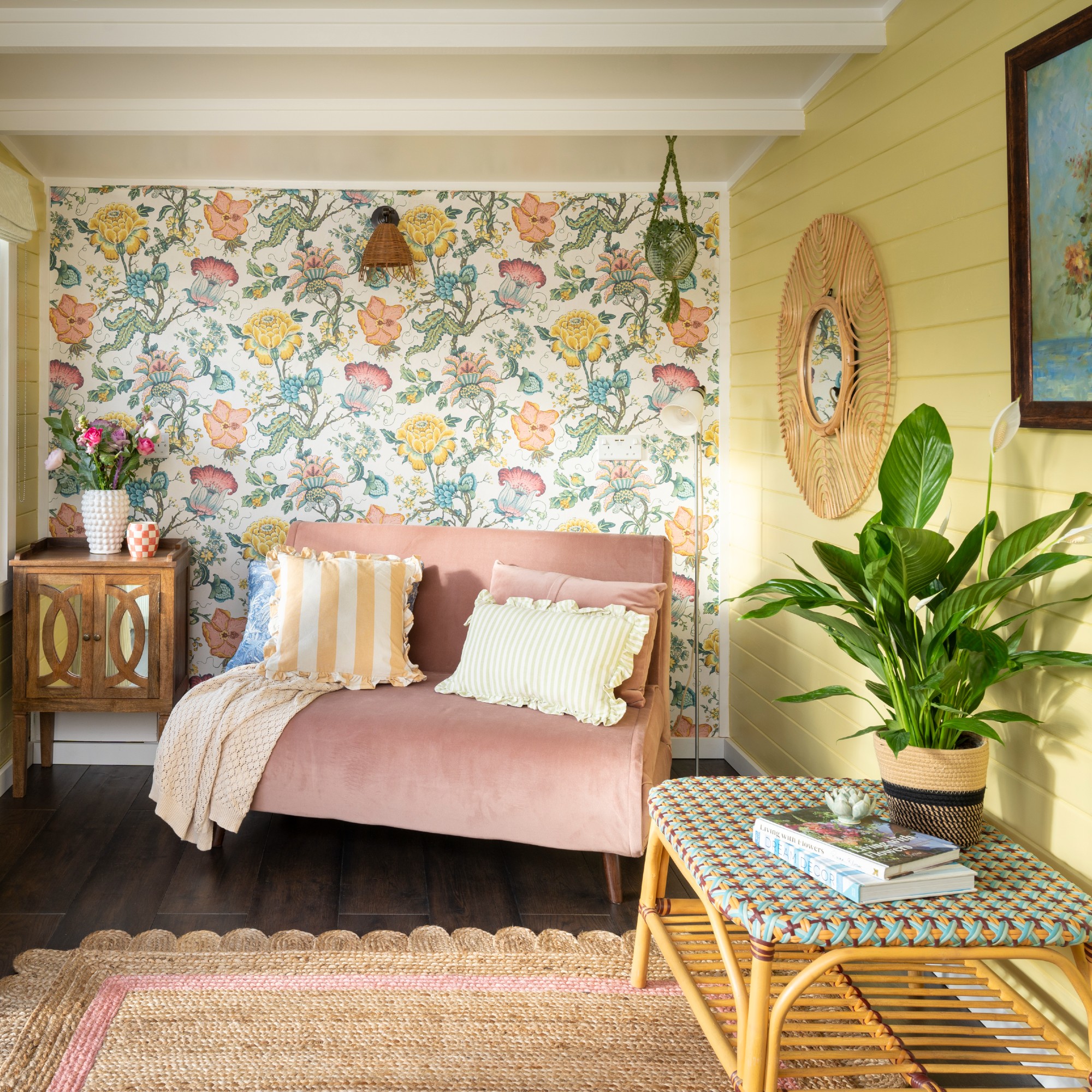
Neutral living room ideas are not as popular as they once were. Even the versatile beige is largely being replaced with more vibrant tones, one of which is buttery yellow.
‘Those buttery, earthy yellows are so welcoming. And I would put pink together with the yellow – you can't go wrong! Earthy pinks and yellows look really cool and look very striking. Done right, buttery yellow and brown sit really well together and it's got more punch to it than beige. Before, lots of people gravitated towards beige living rooms, whereas now, what I'm seeing is a really amazing buttery yellow everywhere,’ Tash says.
6. Go bold with sage green and Royal blue

When choosing your colour schemes consider the light that comes into your living room. A sun-filled room can cope with cooler shades, blue living room ideas are a good option in this case, team it with a warm green for balance.
'Usually at the front of the home, the living room gets plenty of natural lighting in the daytime, but with the busy pace of life, it ends up being a space to unwind and relax at the end of the day,' says Jo Plant, head of design at Pooky.
'This means that lighting and colour choices should complement each other. Green and blue is a classic combination that works well all through the day, natural lighting will bring out the energising qualities of the colours.
'At night though, highlighted by an ambient lighting layout, green will stimulate balance and tranquillity, while blue will emphasise that sense of calm we’re all looking for after a long day. For a fresher more unique spin try mixing different hues within this colour spectrum, sage green and a deep royal blue are currently particularly popular.'
7. Add forest green to a neutral scheme
Neutral living rooms get a bad press, they can be seen as safe and dull, but they can be really beautiful when chosen carefully.
You can perk up a neutral scheme with pops of colour, forest green is a good choice as a lighter green wouldn't gel so well. Add in wood for texture and for a modern scheme choose retro furniture such as some stylish mid-century modern pieces.
'Pair the neutral hue with a green colour palette, using subtle sage shades through to deep forest greens with furniture, accessories and foliage. The juxtaposition of the two colours together will create a beautiful cohesive scheme in the living room,' says Jon Flannigan, product manager at Kersaint Cobb.
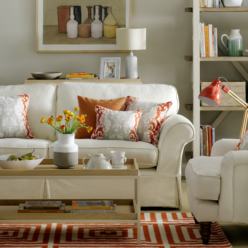
8. Pair burnt orange and sky blue for an unusual combo
Perhaps a colour combo that you wouldn't naturally think think of, sky blue and burnt orange work extremely well together.
'Although they are complete opposites, they complement each other perfectly adding that eye-catching contrast to the space,' says Emma Deterding, founder and creative director of Kelling Designs .
'Keep the orange in the highlights and brighter parts of the space, and bring in teal hints into the shadows to help create that all-important balance. Add pops of monochrome and metallic accents to bring the whole look together and add that all-important balance, taking you from day to night with ease.'
9. Pick yellow and blush pink for a stylish look
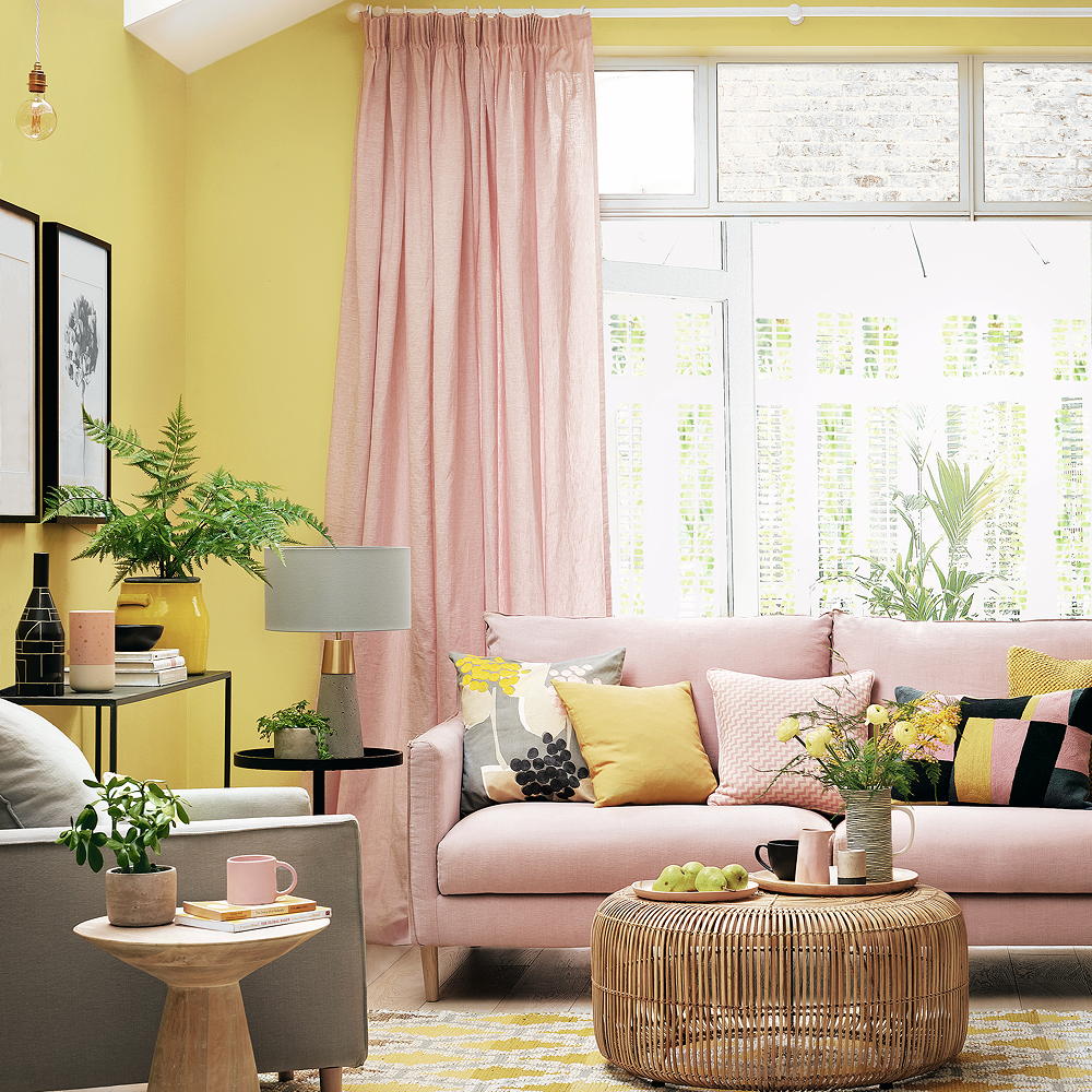
For absolute colour lovers who adore bright shades, a blush and saffron yellow combo will always banish any blues you may have.
'Your living room is the best room in the house to express your design ideas and create a colour scheme that echoes your taste,' says Punam Chada, carpet buyer at Carpetright.
'The most important thing in any design is to create a cohesive colour palette for your walls, floor and major furniture pieces and layer in complementary or contrasting colour, pattern and texture through textiles, decorative accessories and rugs.
To create a dramatic yet luxurious look, consider pairing jewel tones with softer shades. For example, select saffron as your leading jewel tone and opt for a wall colour in a more neutral shade such as blush to add depth to your space.'
10. Add warmth with coral and red
Is your living room north-facing? Then give it a cheery uplift with a tone tone application of warming shades together.
'Earthy pinks and vibrant reds, a colour clash of sorts but as they share underlying colour DNA they make a bright and cheery partnership bringing warmth and vitality to any room, whether kitchen cabinetry and walls or two tone sitting rooms with the stronger colour anchoring the room to dado rail height,' says Patrick O'Donnell, brand ambassador at Farrow & Ball.
11. Keep it subtle with blue and a pop of yellow

If you're a creative person then more obscure living room colour schemes will appeal to you. Choose colours that you adore and that set the scene for your style.
Retro furniture is a good starting point, its strong shapes and colours can often mean that walls need to take second place. A sky blue that adds a touch of colour will work, use pops of yellow as an accent for a thoroughly retro look.
12. Pair rust and forest green

If you love autumnal colours then this combination is for you. Rust and forest green go together like toast and jam – a perfect pairing that you can't go wrong with. Tim Walters, managing director of George Spencer Designs, explains:
'Two colours that are often found together in nature, rust and forest green are a wonderful colour combination for a living room: they bring the outdoors in and create a warm and welcoming ambience.
We often include these two shades in our fabric designs as they work well together in a wide range of designs, from plains to stripes to nature-inspired patterns.'
13. Embrace jade and ecru for a modern feel
Fresh and fancy, jade green teamed with a neutral like ecru gives enough of a punch whilst leaving you with a blank canvas on which to add in bright accessories and artwork.
Dark herringbone flooring grounds the look and adds warmth, this colour scheme can work with multiple other colours.
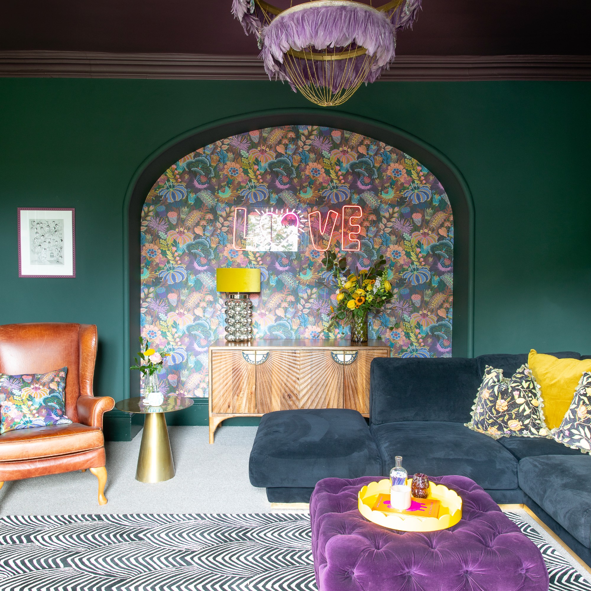
14. Dive in to dark and moody tones
Deep, dark greys and blacks were once rarely seen in living rooms, but they've been increasing in popularity thanks to their super chic finish and versatility. This family of colours work equally well in traditional homes and they do in ultra modern builds.
The trick to dark or black living rooms is to approach them as you would whites. Treat them as a neutral and forget about the colour, instead focusing on the base. Whether this is warm or cool will dictate if it can work in the space. As a rule of thumb, cooler undertones tend to suit south-facing rooms, while warmer tones work best with north-facing light.
'For a touch of drama, incorporate darker shades like deep navy or charcoal as accents; they add depth and sophistication without overwhelming the room,' Michael at The Paint Shed says.
15. Build on a neutral base
'If you're afraid of using all-out colour, then building on a neutral living room base is the way to go,' advises Emma from Kelling Designs. 'By opting for living room colour schemes in a base of beige, white and grey on key elements such as walls, floors and bigger pieces of furniture, you will create a timeless base.'
'This will allow you the flexibility to change up your look whenever you feel with smaller, more affordable accessories. You can also then play with colour on these accessories, opting for bold colours and prints elements such as textiles, lamps and decorative accessories.'
16. Think of pink as a new neutral
'Pink has become a popular alternative ‘new neutral’, offering a more contemporary finish,' notes Punam Chada, buyer at Carpetright. 'When used in a tonal scheme, it provides a serene and calming feeling.'
When it comes to maxing an impact with pink living room ideas the key is to mix both the coloured tones and the accompanying classic neutrals to avoid these type of living room colour ideas from feeling sickly and sweet.
17. Try the 'new grey'
'One new neutral on the block is muted green,' says Helen Shaw, director of marketing at paint company Benjamin Moore. 'Gentle and subdued, soft green hues add more interest to a scheme than a traditional neutral, such as off-white.'
'A pale sage green for example can take you from season to season, feeling fresh in the spring and snug in the autumn. Green living rooms have a strong connection to nature, creating a versatile foundation upon which to add textured furnishings and décor.'
18. Look to heritage tones
Hark back to the era of the bohemian Bloomsbury Group for on-trend living room colour ideas. The mix of statement shades might sound garish, but this look is all about choosing the more muted and duskier versions of the brightest and boldest tones.
If you're unsure of where to start with these, one option is to first choose your dream sofa. 'We are big believers in choosing your main sofa and building a colour palette around it as the first place to start for living room colour schemes,' says Patricia from Sofa.com. 'Some prefer wallpaper and paint first, but this may sometimes restrict adventurous sofa choices!'
19. Dip into navy blues
Create a brooding sense of intrigue by painting your walls and surfaces in a dramatic dark shade. On-trend darker shades of paint may feel like a risky move but, in the right context, shadowy tones come into their own. Hence why they continue to prove a popular choice for current living room trends.
Create an entire backdrop that blends in by painting a radiator and a wall of shelves to match or play it safer with a feature wall. When using accents of dark paints the key is to balance it with large areas of neutral.
20. Mix and match your greens

Take heed from your favourite mixed salad or bunch of foliage for trendy living room colour ideas. The colour spectrum for green encompasses everything from vibrant emeralds to gentle mints, and they all work together beautifully.
Have fun with mixing and matching different tones and shades of green throughout your space for a nature inspired finish that will offer just as much style cred as it does calm.
'When you want to bring the outside in, green wall paint is a great choice,' says Lucy Steele, paint and interiors expert at Valspar Paint. 'A green living room looks chic when it features plenty of natural elements such as wooden furniture, green plants and an earthy stone-coloured sofa. For a sophisticated and contemporary living room space, dark green offers the perfect wall colour.'
21. Add terracotta accents
Create different moods in a neutral living room with colourful accessories. 'Bold without being overpowering, shades of spice, rust and terracotta are design staples that lend themselves to a multitude of decors, from Scandi to mid-century,' says Gisela Lancaster, head of buying at Sofology.
'Although typically considered autumnal shades, when carefully accessorised, these earthy tones can add an element of warmth to a neutral scheme all year round.'
22. Pair up your pastels
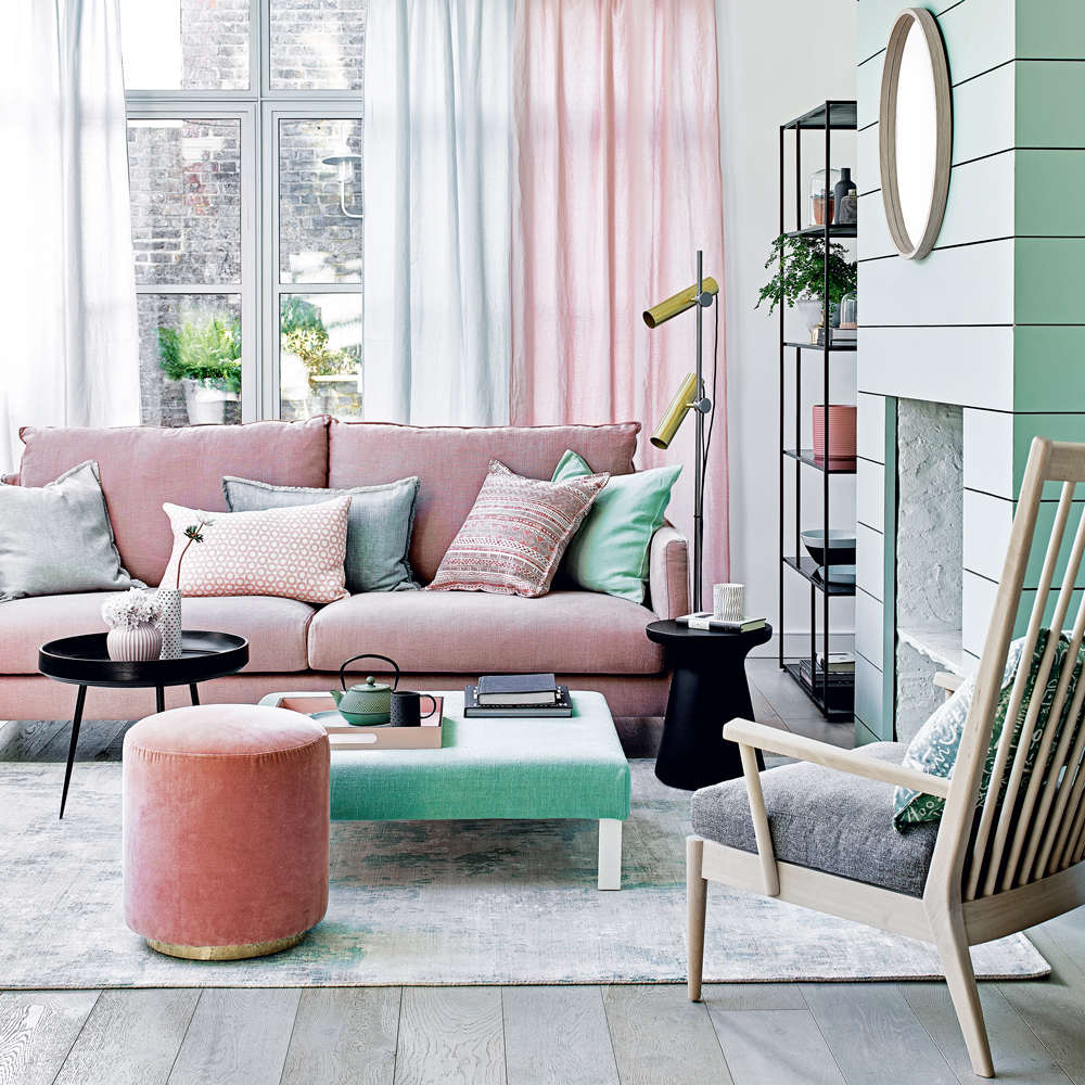
Opt for impact with a sugary shade. Decorating with pastels doesn't necessarily create childish living room colour schemes. Pair with furniture and accessories in a darker colour, which will serve to balance the lighter tones.
Use matt emulsion to create a fashionable low-sheen look - a velvety, almost chalky finish - ideal for uneven walls in the living area.
23. Go luxe with jewel tones
Deep turquoise, jade green, true pink, amethyst, citrine and emerald. This group of gorgeous colours work naturally together for a vibrant, non-clashy mix. Offset with black, grey and white to create a successful scheme. Walls painted in a flat steel grey let you use jewel tones fearlessly on fabrics and accessories.
'Now's all about richer, moodier tones and embracing individuality in design. Emerald greens are taking centre stage, transitioning from kitchens and bathrooms to living rooms. Wine reds and other jewel tones like sapphire blue will also be huge, lending a sense of luxury and depth,' Michael at The Paint Shed says.
24. Pack a punch with warming plum
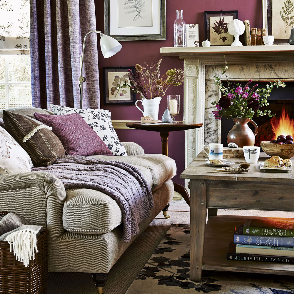
Warm up your living room in the colder months with plum tones. Combine shades of claret and dusky rose to create a toasty and snug purple living room ideas.
Colour-block the main wall with a port-wine red to introduce a rich, heritage element. Prevent the living room colour schemes from going into overdrive by using softer mauve-greys, browns and greys for accessories and other elements in the room.
FAQs
What two colours go well together in a living room?
There are plenty of fabulous options, but do remember, it's also about what sings to you the most too. If you love two colours together that might seem obscure to others, then go for it!
'Dirty greens and burnt orange, the drab grey green acts as your darker neutral allowing you to add hits of vibrancy through the heat of the spice tones, creating so whilst the overall impression if of elegant restraint there is fun and vitality injected with splashes of warmth,' advises Patrick O'Donnell, brand ambassador at Farrow & Ball.
How do I choose a colour palette for my living room?
'First, establish the look you want to achieve,' says Jon Flannigan, product manager at Kersaint Cobb. 'Do you want a calming space that blends into the current scheme without overwhelming the space, or do you want to make a statement with bold colours and texture.'
'When choosing flooring for the living room, we advise following the basic principles: to brighten up a small room, choose a soft, light coloured flooring to create the illusion of space, making the room look larger. However, opt for deep, rich coloured carpets in jewel tones will make a room feel more cosy.'
What colours make living rooms look bigger?
'The trick to make any room look bigger is to create the illusion of extra light and space,' says Helen Shaw, director of marketing at paint company Benjamin Moore. 'If the room is blessed with plenty of daylight, it’s a great help. But the effect can also be achieved by choosing a paint finish that reflects light well, for example a semi-gloss or gloss.'
'In terms of colours, using a clean white can also be hugely successful at opening a room up, as white - from all the shades on the colour wheel - naturally reflects the most light.'
Which beautiful living room colour scheme are you picking for your lounge?