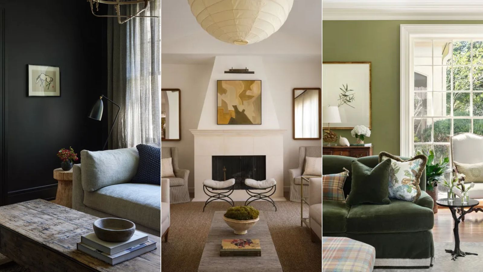
Decorating with color is one of the most effective ways to alter the mood and style of your home, and the living room is more than often one of the most frequented rooms, so it's an important space to get right.
Living room color ideas are varied – from enduring neutrals that provide a soothing backdrop to darker shades that help create a cozy feel, there's a whole host of trending hues to suit your style.
Looking ahead to 2025, we enlisted the expertise of interior designers to round up the top living room color trends expected to dominate. Whether you want to alter your color scheme by painting the walls or adding pops of color through the furniture, the following room color ideas will ensure a timeless space for the year ahead.
Living room color trends 2025
Understanding color trends lies at the root of all interior design decisions, and exploring the latest living room color trends, along with consulting the color wheel, basic color theory and recent paint trends will ensure that you choose the perfect palette for your space.
1. Use 'in-between' hues like lilac
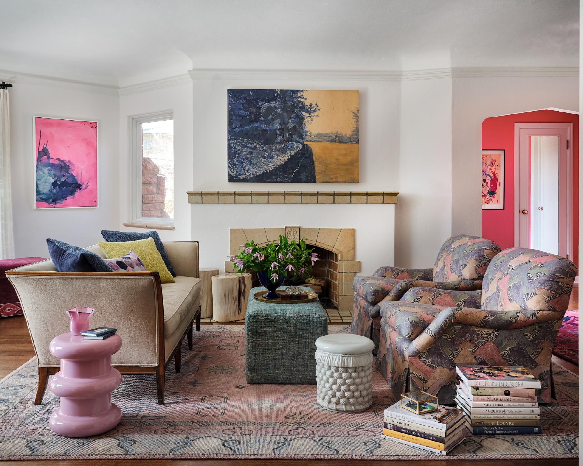
In-between colors have been gaining momentum lately, not least since Benjamin Moore's 2025 Color of the Year was unveiled as Cinnamon Slate, a brownish purple. In-between hues such as this have a calming quality – not too saturated, they're perfect for a relaxing living room.
'I have always gravitated towards the in-between colors,' says interior designer Nadia Watts. 'Lilac is the perfect in-between color; a bit pink, a bit purple with depth and richness. It pairs well with rich reds, deep blues, and aubergine, and it spans the gap between purple and pink, so it works well with both warm and cool tones.'
In this living room, Nadia incorporated the lilac color trend throughout the decor, while the white walls provide a light and airy backdrop. 'Lilac is a happy color, it’s playful yet sophisticated,' the designer adds. 'It adds elegance to your living room and evokes a feeling of calm.'
2. Create a cozy living room with dark hues
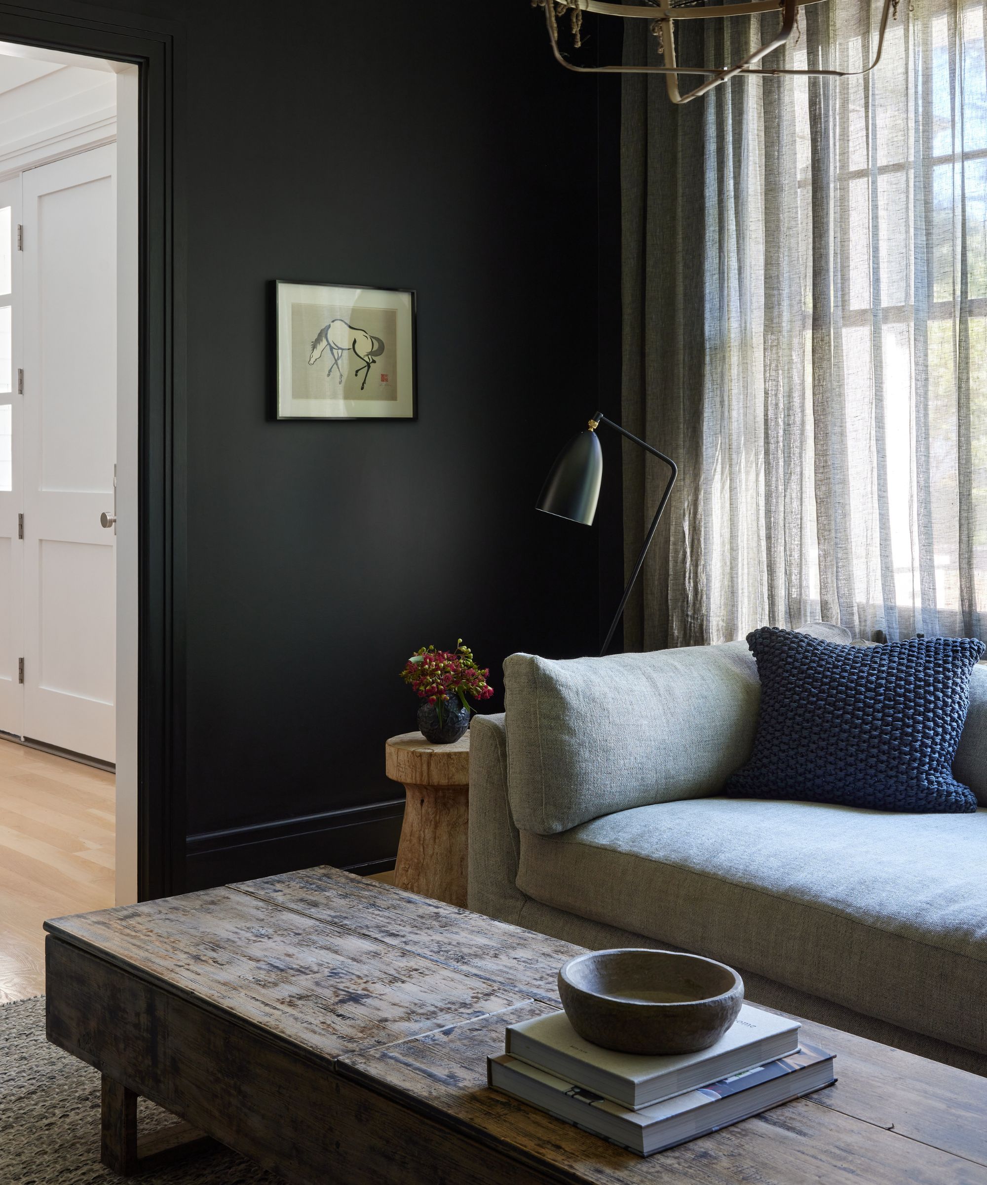
Dark paints are a great way to go if you want to create a cozy living room. Working especially well when used with color-drenching ideas in north-facing or small spaces, dark and moody hues are a stylish living room color trend for 2025.
'I love the feeling you get when you enter a dark, quiet living room,' says Steph Schlegelmilch, founder and creative director at Studio Seva, who embraced the darkest of all colors by decorating with black paint across the living room walls here.
'Farrow and Ball's Pitch Black is a sophisticated black that has just enough warmth without leaning too blue or too yellow,' the designer explains.
Whether you prefer dark and moody paint colors or something much lighter, gain inspiration for your room color ideas with this Farrow & Ball book.
3. Embrace the timeless appeal of green
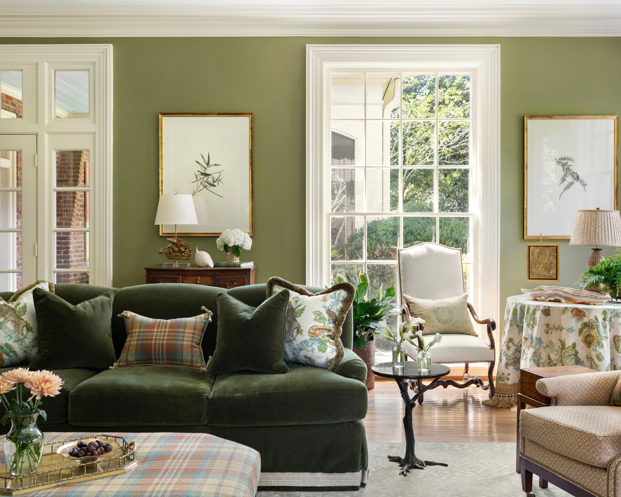
Decorating with green in the living room in 2025 is a great way to lean into the world of color while keeping things timeless.
'Hands down, my favorite color to use in a living room right now is green, like Sherwin Williams’ Basque Green,' explains Debbie Mathews, owner and principal designer at Debbie Mathews Antiques & Designs.
'Whether it's a soft, muted shade of green, or a richer, saturated green, I love the earthiness and elegance it can bring to a space,' adds Debbie. 'I have always felt that the use of green can help to blur the lines between the indoors and outdoors. And while the color green seems to be trending right now, it has always been one of my personal favorites and I have often told clients that I consider it a neutral color as it pairs well with so many other colors.'
4. Keep it classic with neutrals
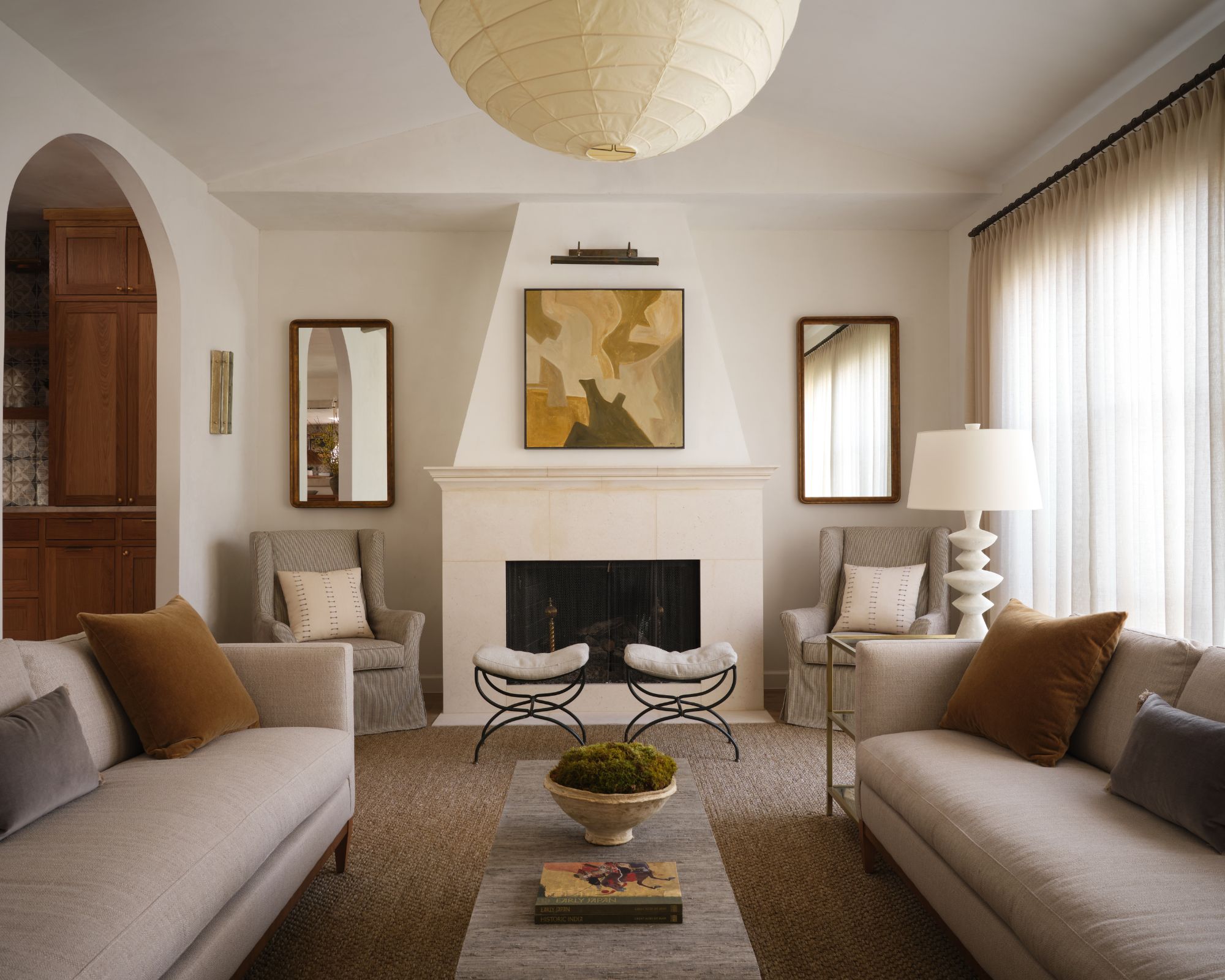
Decorating with neutrals will always be in style, and you can't go wrong with these delicate hues if you want to create a calming and airy feeling that transcends the latest trends.
'I love a deep and warm off-white paint color for living rooms because it sets a neutral backdrop for the space but is more interesting and grounding than a typical white,' says Courtney Hill Utt, principal designer and owner of Chu Interiors.
'I love to layer in richer earth tones like chocolate brown, mustard, and green and interesting textures to warm up the space and add dimension,' adds Courtney. 'The more neutral backdrop allows the space to feel calming, fresh, and timeless and also allows you the opportunity to add more punch and moodiness in the smaller, more secondary rooms like the powder room, bar, dining room, and library.'
5. Take inspiration from nature with a sky blue palette

Sky blue – this fresh hue comes in a range of beautiful tones to suit all interior styles, and it is slowly making its way from the bedroom to the living room this year.
‘Sky blue shades can add such joy to a space with their inherent freshness but just be careful they don’t appear too chilly as the natural light will have a big impact on their perception,' says Patrick O’Donnell, international brand ambassador, Farrow & Ball. 'It’s a wonderful shade for coastal living where it will respond to the light you get near the water.’
Interior designer, Pandora Taylor shares this enthusiasm for decorating with blue: ‘Joyful sky blues are perfect for using in spaces you spend lots of time in, such as the living room. If the room gets a lot of natural light the blue will appear quite pale, then when evening comes you get a stronger color developing, a bit like the perfect day-to-night outfit.’
‘Blue is the most wonderfully gender-neutral color,' says Nicole Salvesen, co-founder, of Salvesen Graham, who designed this blue living room above. 'Avoid using cold blues in north-facing rooms. Instead, find those that have some warm tones in them and they will be a brilliant backdrop for florals, patterns and plains.’
6. Soothe with gray-green
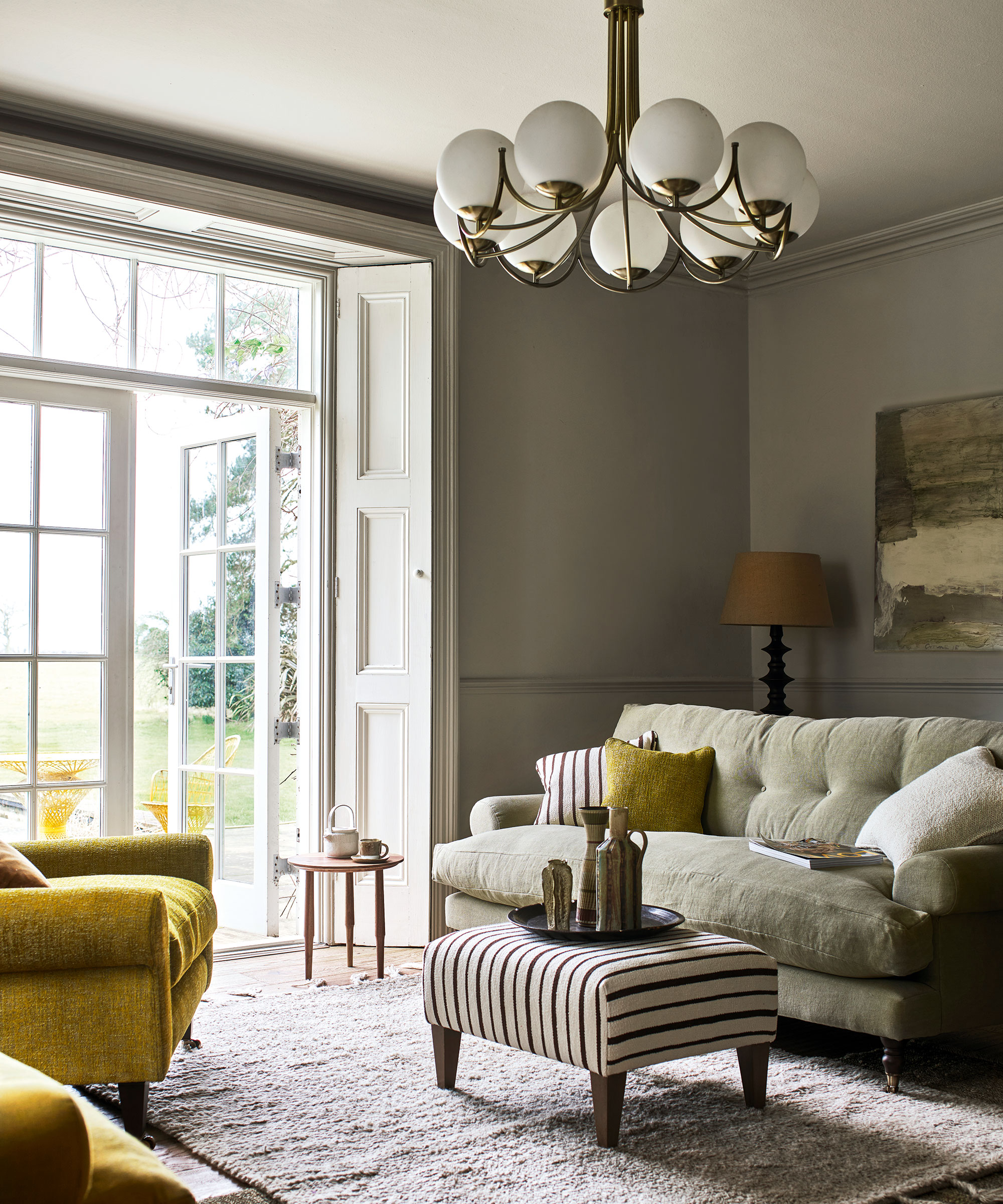
Uplifting and tranquil, the nature-inspired shade of greenish gray is only a step away from neutrals, making it the perfect choice for a restful living room scheme.
Many design houses have recognized that some muted shades are a good option to use tonally throughout a whole room scheme, and gray-green is one of these; strong enough to hold its own yet a considered color to pair with vibrant feature shades.
Here, sage green is used throughout the room, including a large painting and the central sofa, and is paired with a bold chartreuse. ‘Sage green has come to occupy a central spot in our signature palette. It’s a color that pairs so wonderfully with others, whether they are rich and earthy or punchy and bright. It helps to elevate those other hues and acts as a gorgeous glue holding the scheme together,’ says Michelle White, brand and marketing director at Arlo & Jacob.
7. Embody the rich hues of terracotta
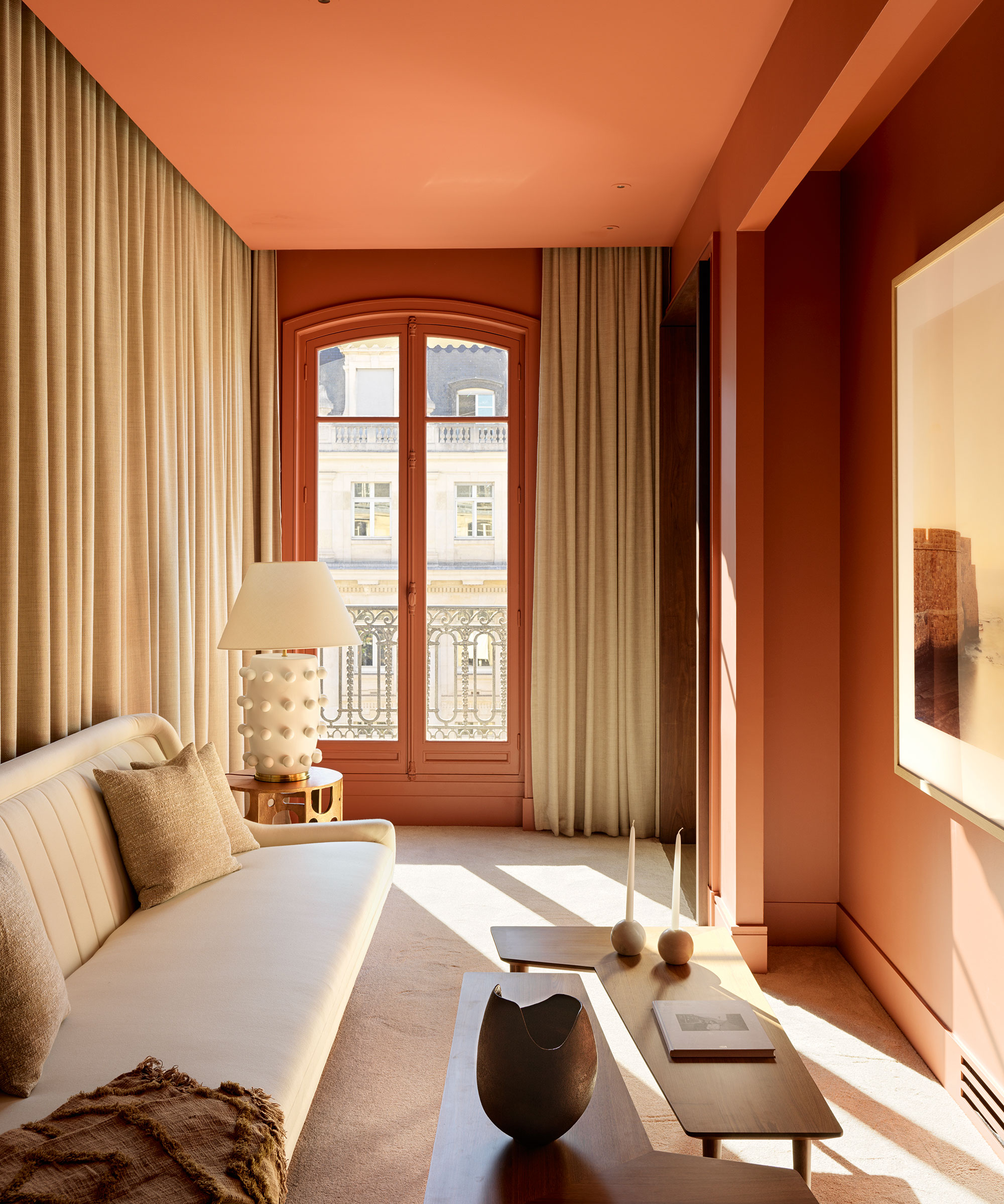
For a long time, painted walls in cool whites and grays have dominated interiors but warm color schemes are competing. Terracotta is spicing up living room interiors everywhere – its sunbaked and artisanal qualities ensure it's a favorite of the design set.
‘Rich shades of terracotta are surprisingly versatile. Ideal for creating welcoming yet sophisticated living rooms, these uplifting burnt oranges work brilliantly on their own or with everything from crisp whites to mustard yellows and deep reds,' says Colin Roby-Welford, creative director, of Fired Earth.
'In this small living room, the terracotta color allowed us to create a space offering a soft, warm light which captures the enveloping sensation of a sunset,' says Damien Langlois-Meurinne, interior designer and founder of Damien Langlois-Meurinne Studio, Paris.
8. Decorate with a gentle pink

Gentle yet somehow also a statement shade, soft pink is an evocative hue that has a wonderful sophistication, allowing it to work for both modern and classic living rooms.
‘Soft pink is our absolute favorite color to work with, and has become a popular living room color trend in recent years,' says Caroline Stemp, co-founder, of Sascal Studio. 'We often use it in living rooms and bedrooms. We don’t tend to use pale pink in darker rooms like WCs with no windows or north-facing rooms, as it can tend to look gray.’
This color errs on the side of androgynous, which is perfect when trying to balance tastes, too.
Our affinity towards certain living room color trends has a lot to do with our personalities, environment, and experiences, so it is always important to choose a color that resonates with you, and makes you happier at home, whether they are on-trend or not.


