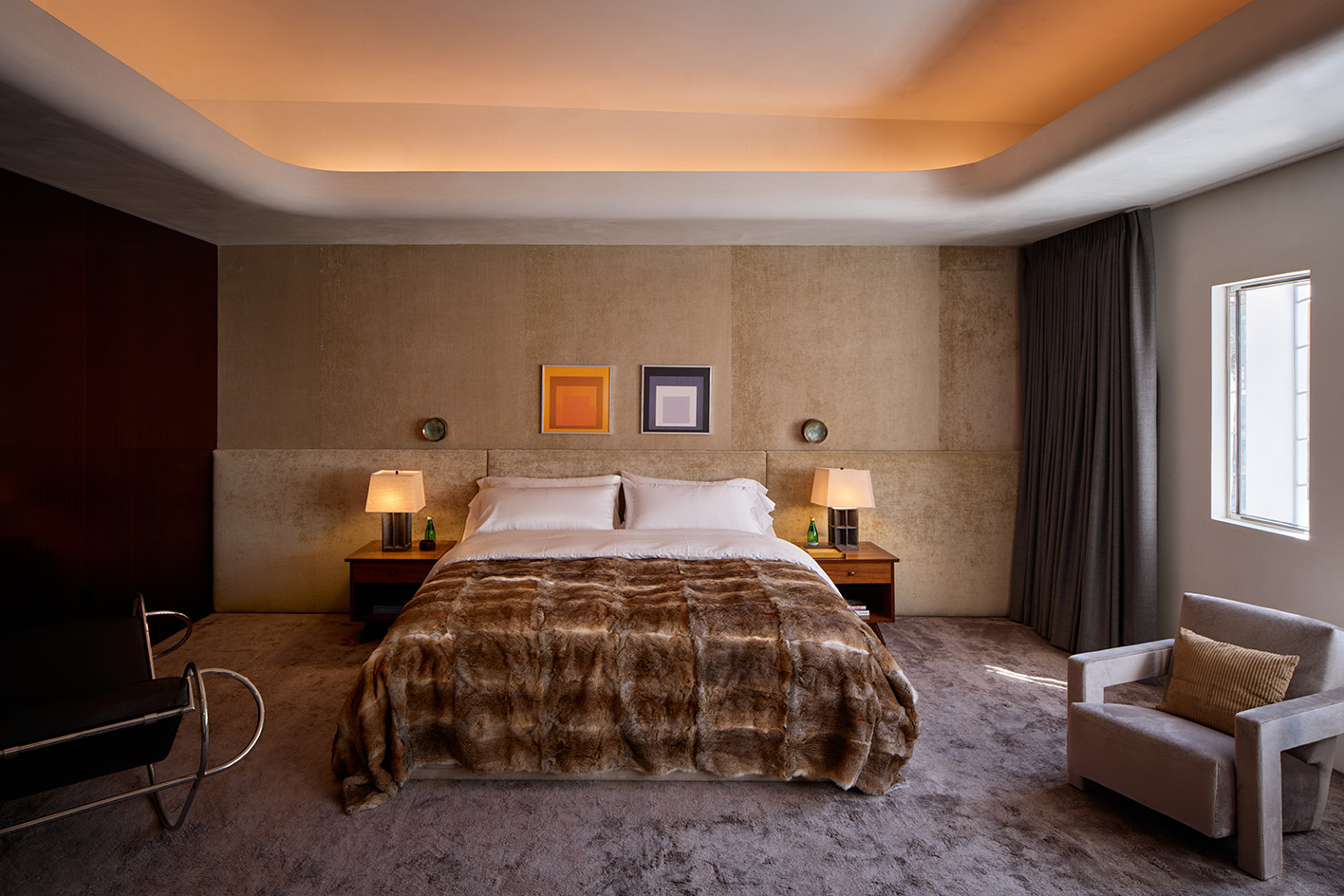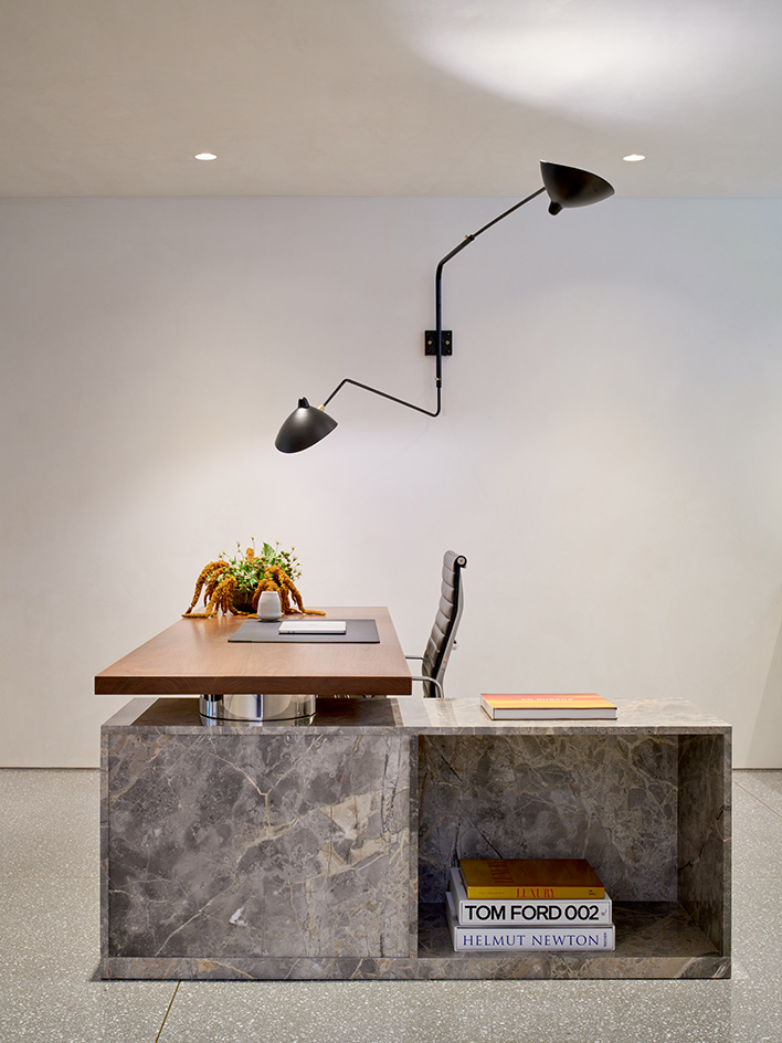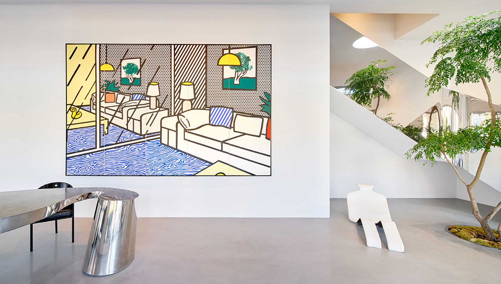
When California real-estate magnate Kurt Rappaport wanted to refresh a Beverly Hills classic, architect Dan Brunn was his go-to choice. The result was a truly collaborative project and a labour of love from both sides, as client and architect worked in sync to create a new space that blends art and architecture, luxury and minimalism, past and present.
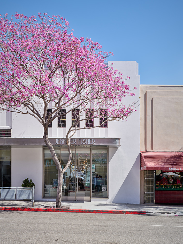
Dan Brunn and Kurt Rappaport: a fruitful collaboration
The site was in a 'quintessential Beverly Hills' building, sat on the corner of Santa Monica Boulevard and Canon Drive. The architect and his team at Dan Brunn Architecture (DBA), worked closely with Rappaport, who, being an avid art collector and expert in property and development, has extensive knowledge to draw on and a passion for architecture.
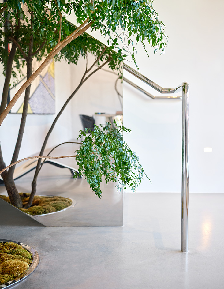
'Kurt is a tastemaker in life and work,' Brunn said. 'Everything here either has a provenance that carries a special meaning to him, or its an all new creation by DBA. It’s all very lush and filled with great artifacts and curiosities.'
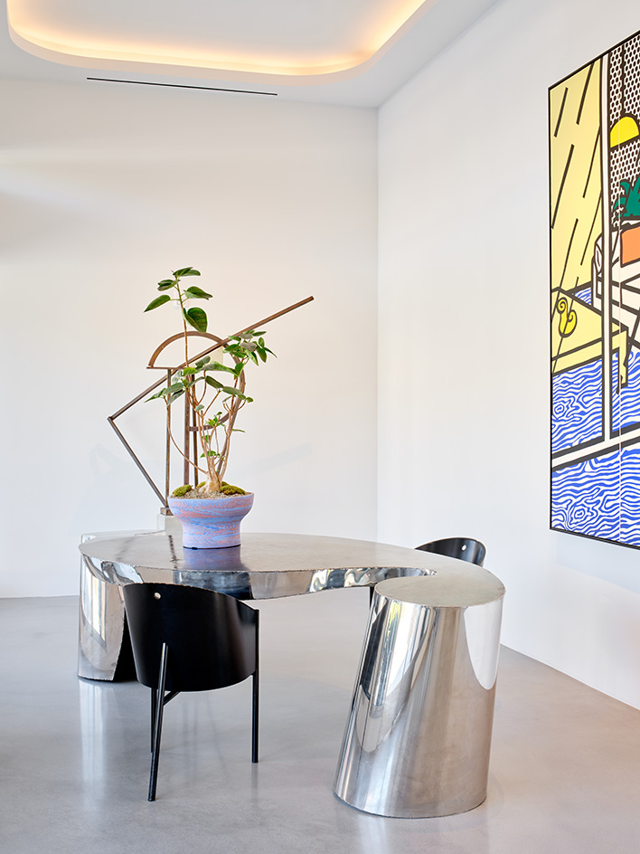
Restoring the building to its historical glory
Brunn redesigned the building's façade, as well as interiors, and brought the structure back to its original 1930s glory – infused with the architect's own modernist architecture influences, as well as 21st-century mod-cons. And while at first, the space was meant to be redesigned and leased out, Rappaport 'fell in love' with it during the process, and decided to move his own business in instead.
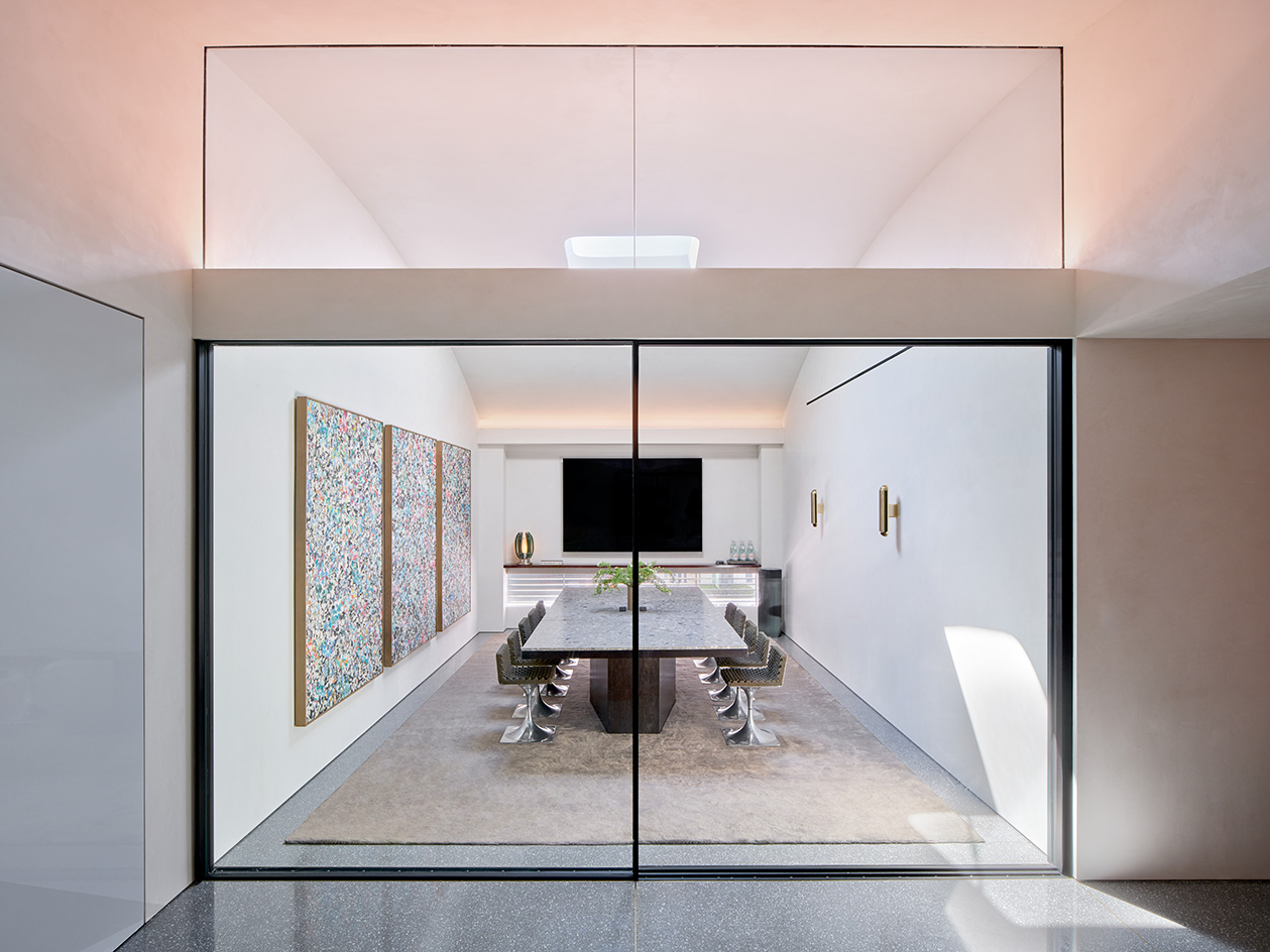
The building's historic bones were brought to the forefront and allowed to shine, revealing its elegant minimalism, both in the exterior and the extensive, clean, white interiors. These are dotted with their owner's collection in art and design, spanning from a Roy Lichtenstein painting, to a hanging Alexander Calder mobile, and vintage and contemporary furniture pieces by the likes of Charles and Ray Eames, Jean Prouvé and Ron Arad.
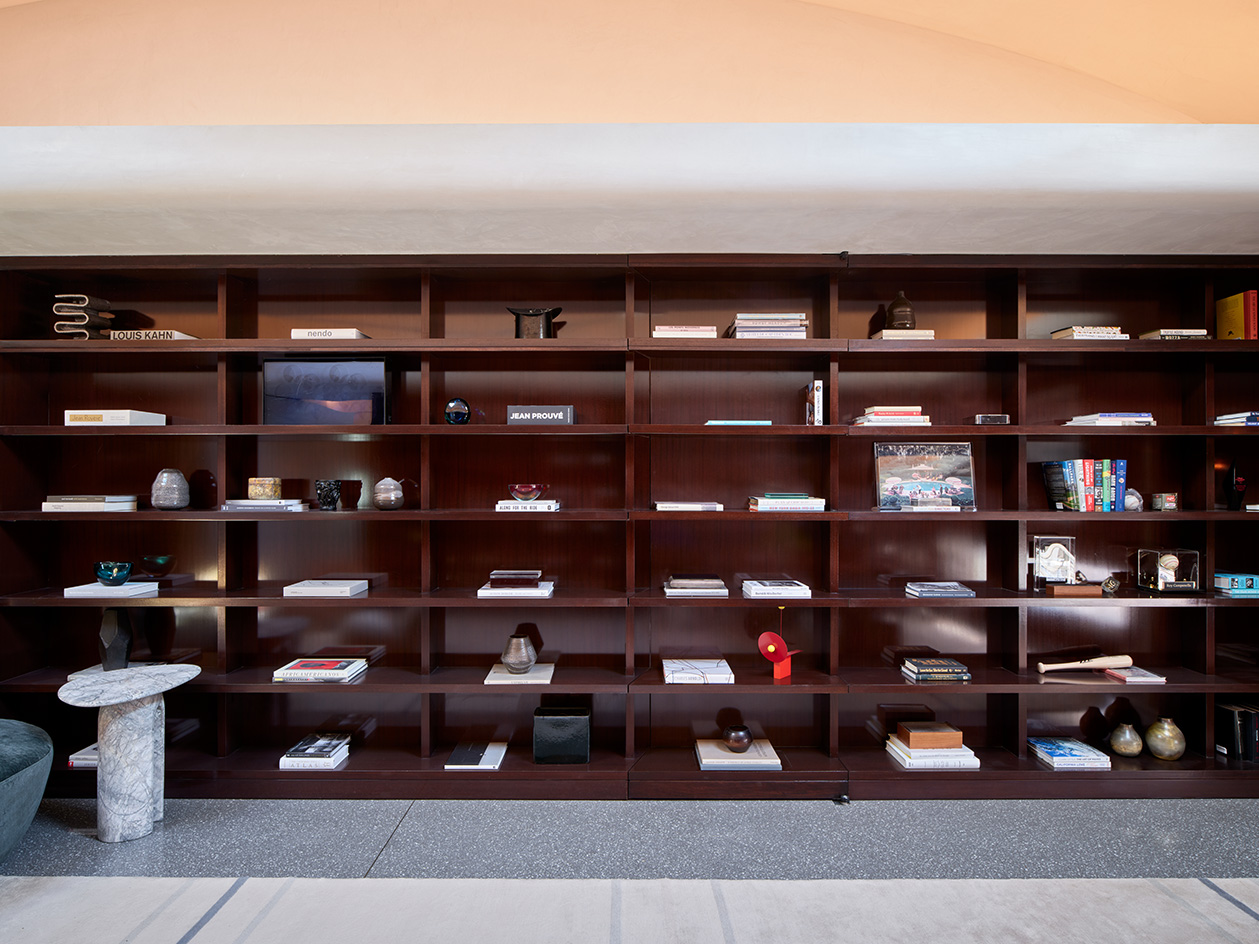
The sequence of spaces leads from the front-of-house, public areas, towards more private ones, such as executive offices and a guest suite. Strategically placed artwork illuminates the route through and creates corners of interest, punctuating the minimalist interior, wrapped in luxurious materials.
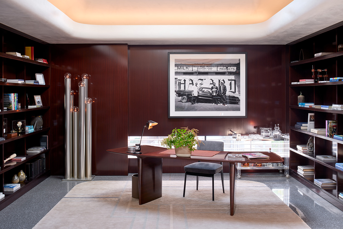
'The entire impression of moving through the structure,' Brunn said, 'is that of a single circular band unweaving from space to space, where the overlapping experiences of work and entertainment, business and relaxation transition naturally through a sensuous flow of movement and purposeful space.'
