Milkshake syrup brand Crusha has unleashed a deliciously retro new brand identity, mixing 50s Americana with contemporary flair. As a brand with an almost 70-decade legacy, the new identity is a celebration of past and present, bursting with personality and a distinct stylish flavour.
Nailing the reinvention of a packaging design with such heritage is no easy feat, yet Bristol-based design agency Outlaw has crafted a new look that carries a palpable nostalgia. With playful illustration, fresh typography and a revamped mascot, Crusha's new brand identity is a masterclass in playful and precise design.
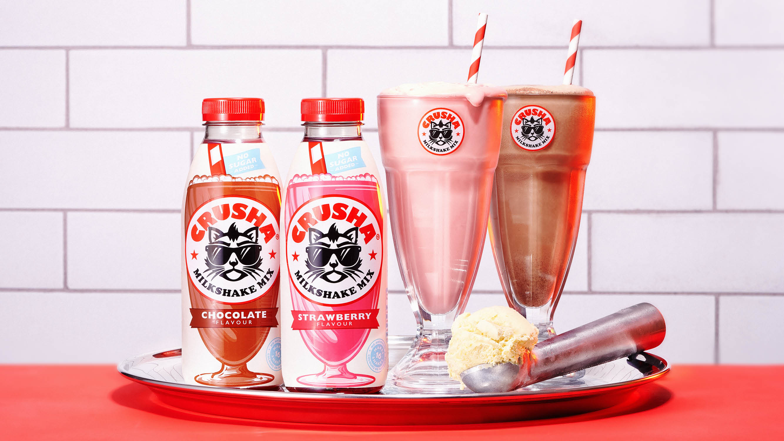
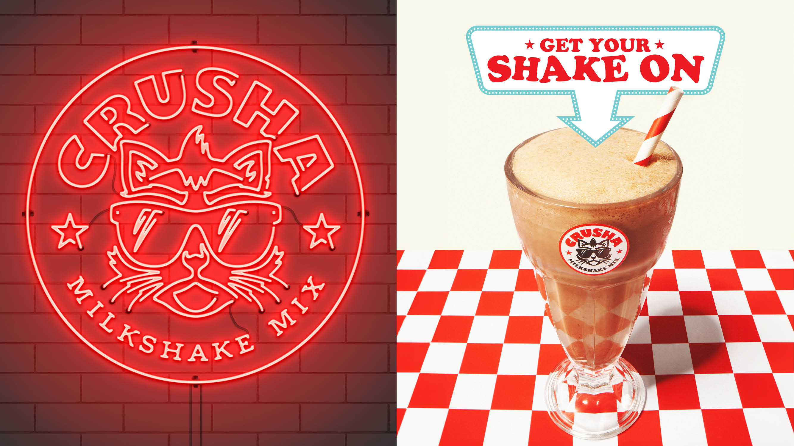
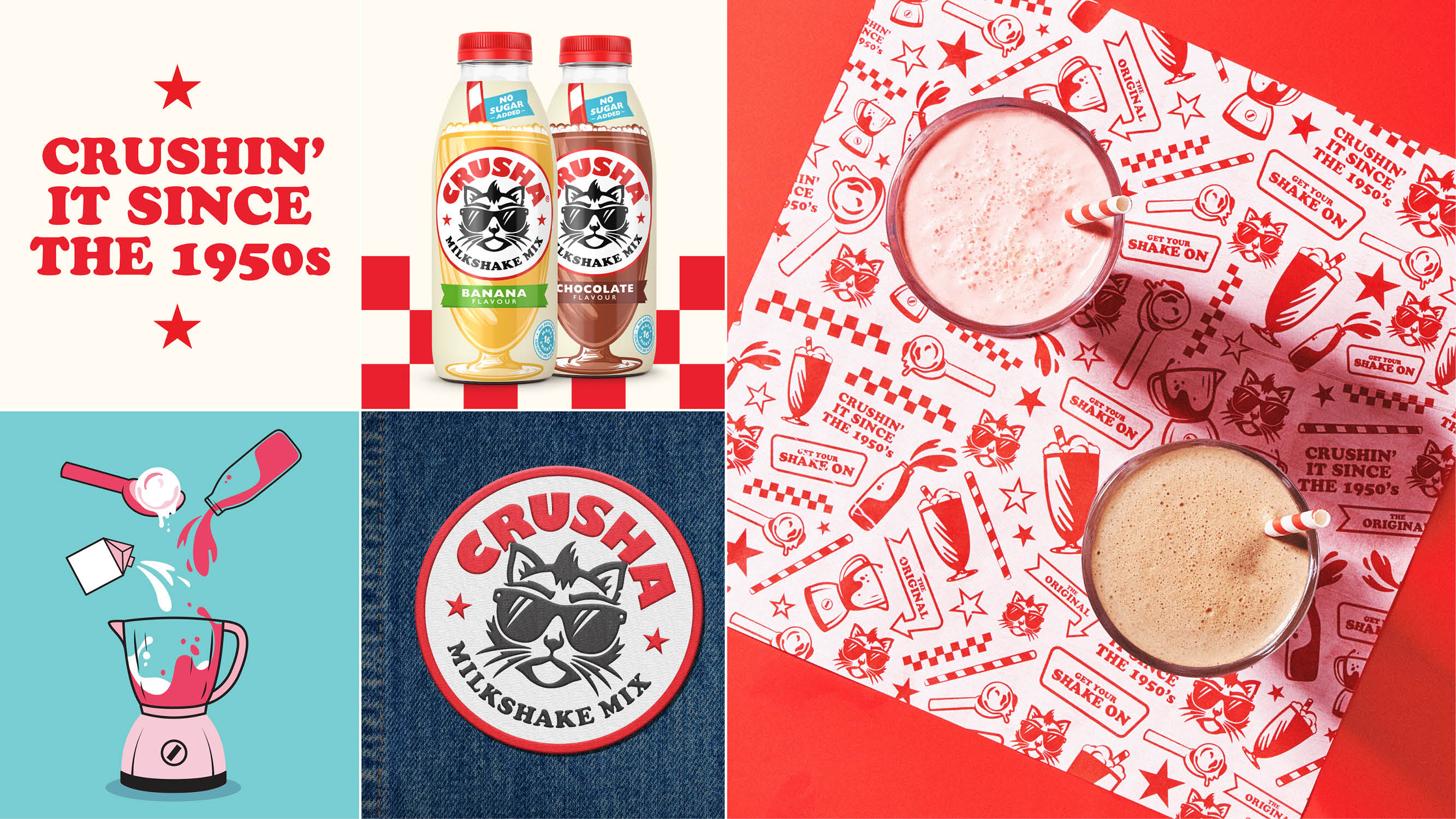
Part of The Silver Spoon Company, Crusha's legacy dates back to the 1950s. The rebrand takes inspiration from its roots, embodying a classic retro diner aesthetic that gestures to its origins with a sleek graphic twist. "The new look and feel boldly leverages visual codes such as milkshake silhouettes, stripy straws and red checks," explains Alex Rexworthy, Design Director at Outlaw. "By imagining the supermarket shelf as a bar at the dinner we are able to create fun brand blocking that disrupts a somewhat quiet aisle," he adds.
Along with the reimagined visual motifs came the revamping of Errol, the brand's faithful feline mascot. "He’d become too soft, infantile and playful in recent years" Alex explains, which led to his new, punchier design. "To achieve Errol's irreverent personality we were inspired by simple bold tattoo design. Small details in the illustration such as the nick out of the ear, the shape of the eyebrows and the mohawk all add up to a mascot that demands authority on the shelf," he continues.
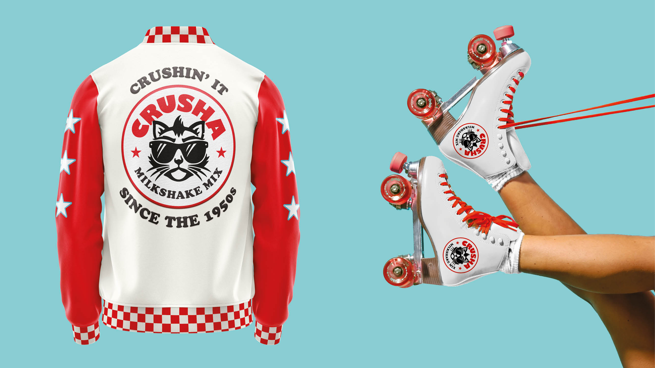
The confident new identity is offset by more playful touch points that add an extra layer of personality to the brand. When asked about his favourite element of the brand, Alex told Creative Bloq: "The varsity jacket is a great touch point for the brand, it’s a timeless piece of fashion that cues classic Americana. Combined with the Crusha roller skates you can start to see the versatility of the brand world."
As with all aesthetic overhauls, it wasn't a project without hurdles. "The most challenging part of the design was creating taste cues on the pack," Alex says. As a more abstract concept, he shares that it can be tricky to represent these flavour profiles in an original way that aligns with the brand. "We explored photography of fruit, chocolate and milk however the end result didn’t feel as progressive as the brand identity. We landed on a tasty illustration style for the glass, showcasing bubbles and thick wispy colourful lines in an abstract way showing the product mixing with the milk," he adds.
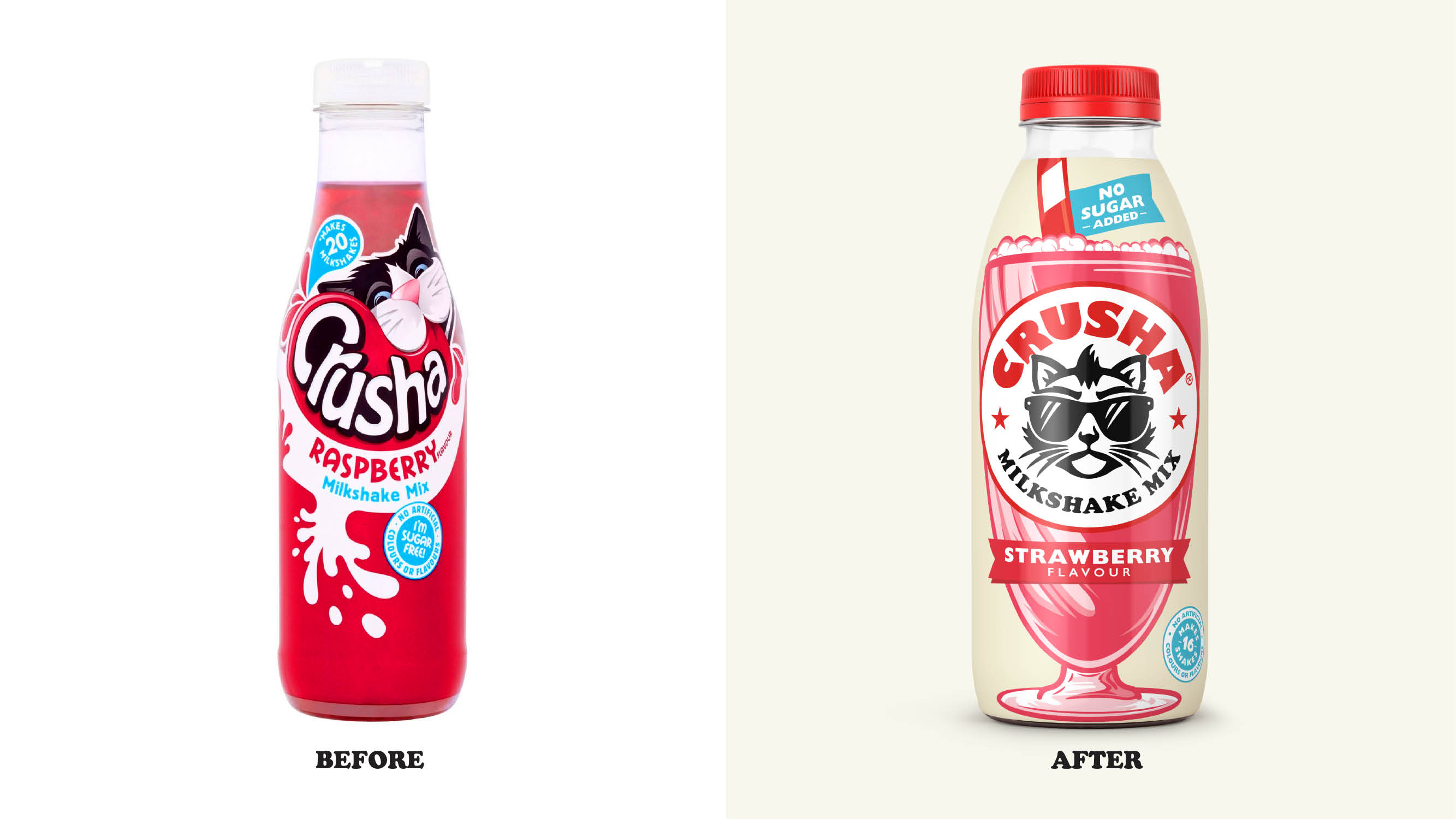
When asked about his favourite part of the design process, Alex shared: "The before and after shots are always the proudest moment – seeing the brand come to life with a new personality." Bringing the brand into a bright new playful era, Alex says the "design promises joy, to the very last slurp," creating a pervading and iconic identity that strikes a delightful blend of classic and contemporary.
If you're after more creative inspiration, check out these adorable milk carton designs that bring joy to the breakfast table. For more branding news, check out the stunning national park rebrand that's packed with natural symbolism.