
Whatever you were brought up believing about never mixing pink and red (it was a big no-no in my Mom's book), it's time to be more open-minded about this clashing color pairing, thanks to Jessie Buckley's strikingly bold yet feminine Oscars gown.
Just as she won over audiences in her Hamnet performance, she stunned at the Academy Awards ceremony – where she picked up the coveted Best Actress gong – in a Chanel gown that featured a sugary pink chiffon gown set off by an off-the-shoulder satin wrap in bright cherry red, inspired by the dress Grace Kelly wore to the 1956 Oscars. It's an unexpected color combination that we would never have predicted but instantly want to see more of.
When it comes to interiors, and what colors go with pink, red might not be your first thought, but when used sparingly, it can create a really effective accent shade. I've included some expert advice on how to balance Jessie's clashing combo, and I've rounded up some buys to help you bring them into your home with style.
The Pink and Red Edit
This contemporary piece will look really striking against a soft pink wall, whilst the sculptural shape brings tactile charm.
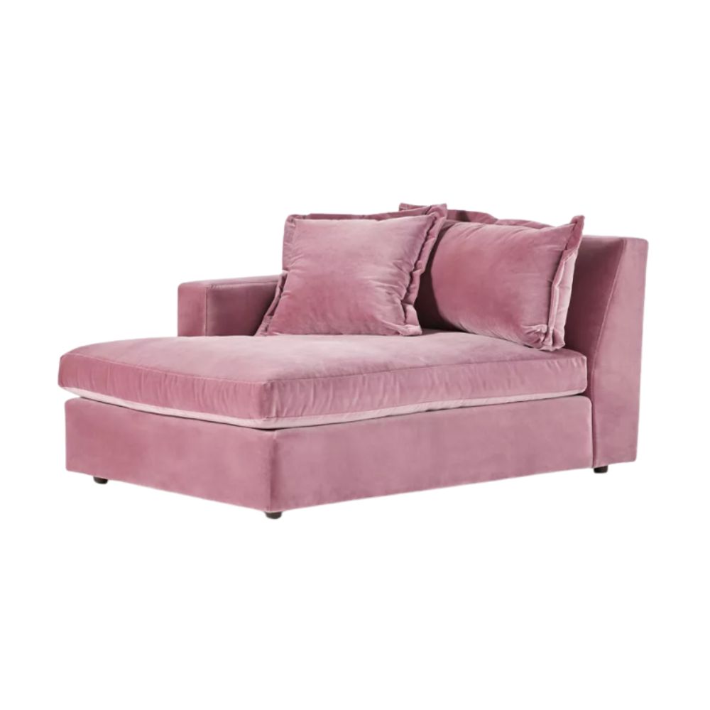
The combination of pink and velvet make this chaise look almost as elegant as Jessie Buckley's Oscar's dress. Add red throw cushions for contrast.

With its wavy red frame this contemporary mirror will bring and instant hit of red and point of interest to a millennial pink scheme.
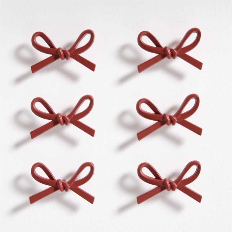
Add a fresh twist to a pink painted sideboard or wardrobe with these red bow knobs, which are sculptural and a little bit fun.
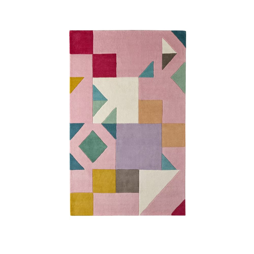
Using a pink and red palette doesn't have to mean forgoing other colors. We love this color block rug which picks out a bright crimson contrast.
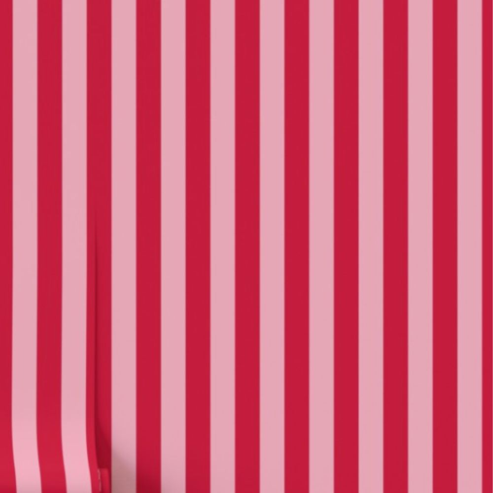
A bold pink and red stripe is a strong choice but on a single wall and balanced with soft pink elsewehere it will make a real statement.
Whilst we are often discouraged from using clashing colors in interiors for fear of creating a scheme that will look garish, childish, or chaotic, using red and pink together can actually bring more of a tonal look, but it's all in the balance, just like with Jessie Buckley's Oscars dress.
Adding red to a ballerina or candyfloss pink will read as modern, rather than girly. In addition, keep prints bold, and silhouettes contemporary. Forget frills and florals, think block color, stripes, and elegantly curved lines.
'If you use a soft powdery pink as your base color for your walls, upholstery, or a large area rug, for example, red can make a wonderful accent shade,' says Head of Interiors, Hebe. 'Opt for a bright hue of red and repeat it in a number of places for an intentional look, whether in picture frames, woodwork, vases, or other decorative accessories.'
This is where you can employ the unexpected red theory – the idea that one or more defining red moments can really uplift and make a room sing. A simple soft pink scheme will be instantly transformed with a few flashes of bold red, and will take the room from feeling flat to exciting and inspiring.
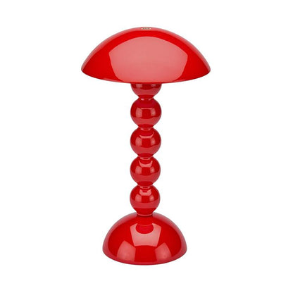
'You could paint a mantel, or your baseboards, in a bold red contrast with milennial pink walls,' says Hebe. Alternatively, you could bring in flashes of red through a wallpaper (like the pink and red striped wallpaper at Spoonflower), artwork, or statement lamp (like Addison Ross' iconic Bobbin lamp)
And it doesn't matter which room you try this pairing in. Red could bring a wonderfully playful interruption to a pink bathroom; add red accessories and cookware to a pink kitchen; or modernise a pretty pink bedroom with a bright red pinstripe on your bedding, or a bold bedside lamp. Be brave, and you won't regret the results.
Jessie Buckley's Oscars dress has given us pause for thought with respect to how to use clashing colors in our interiors. Just remember to employ that crucial element of balance to ensure it feels chic rather than jarring.
If you enjoy our celebrity news and interior design advice, why not sign up to our newsletter so you never miss the latest features.