
Japan Airlines has unveiled a sleek rebrand that aims to bring a global appeal to its visual identity. With tradition and heritage at its core, the revamped look encapsulates the brand's cultural origins while bringing a refreshed and streamlined appeal.
The best rebrands are often about strengthening an existing identity, rather than rewriting it – something that Japan Airlines' new look embodies. With a refined colour palette, fresh typography and a new design system, the reimagined brand identity is a classy contemporary evolution.
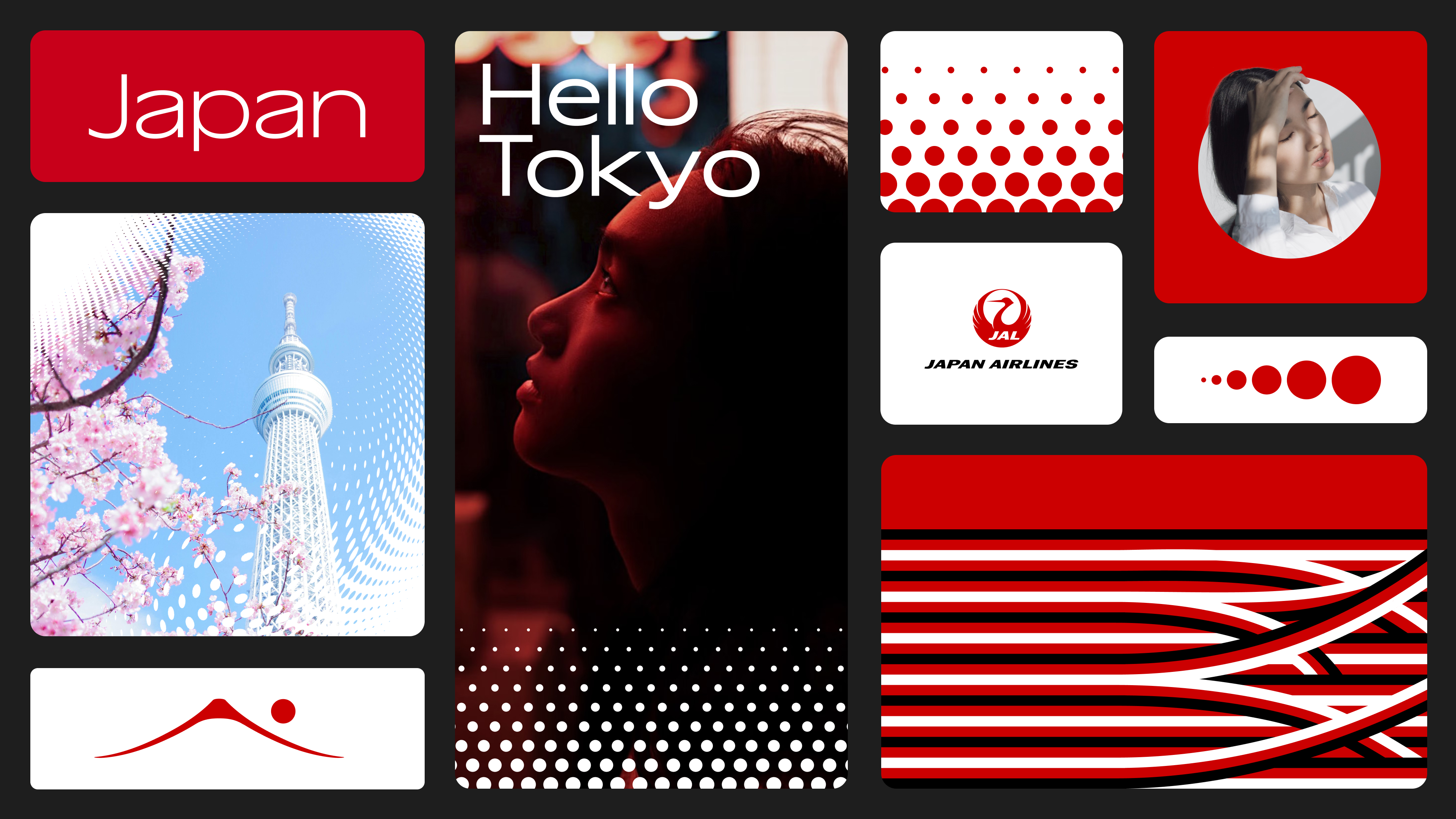
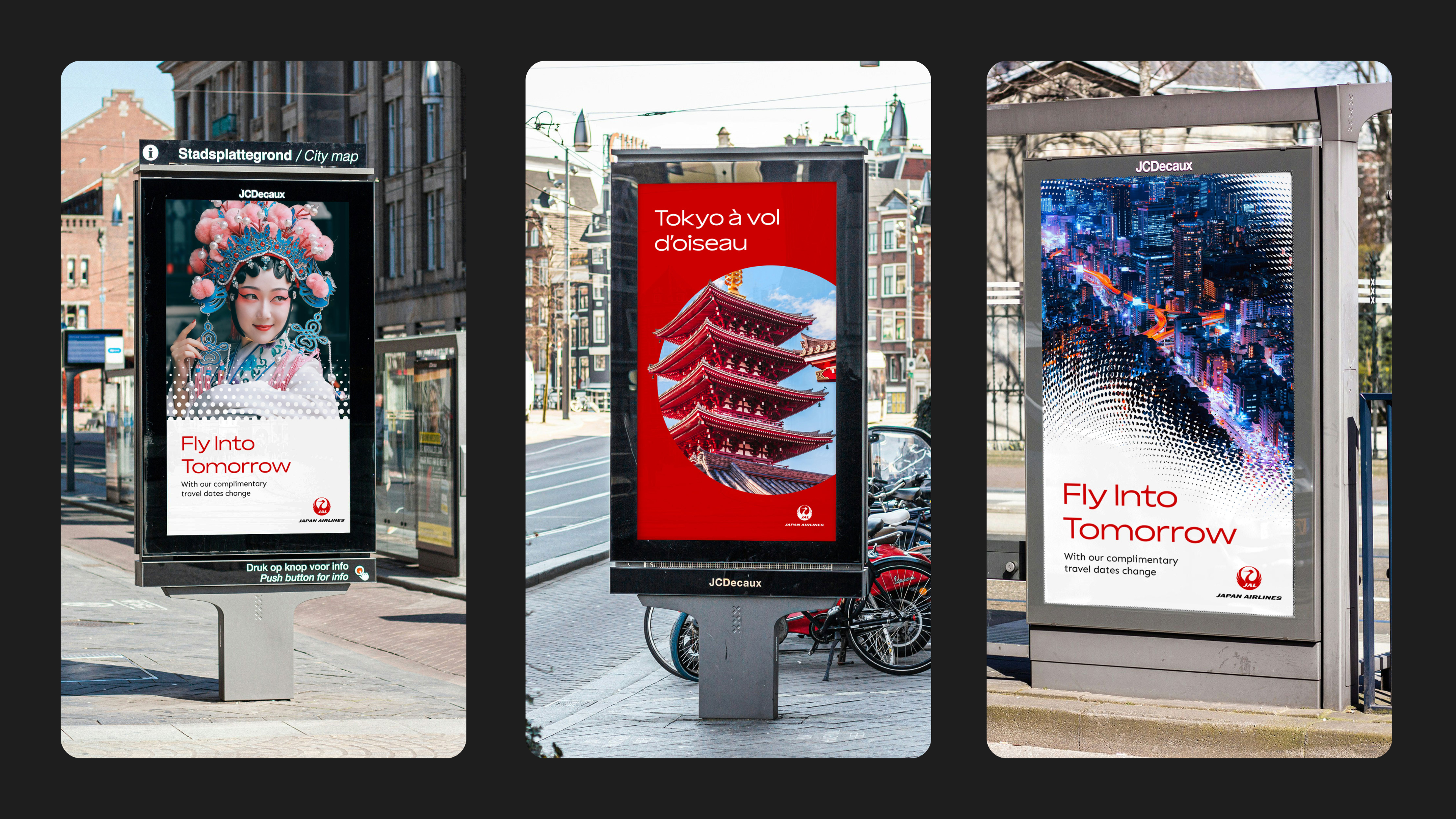
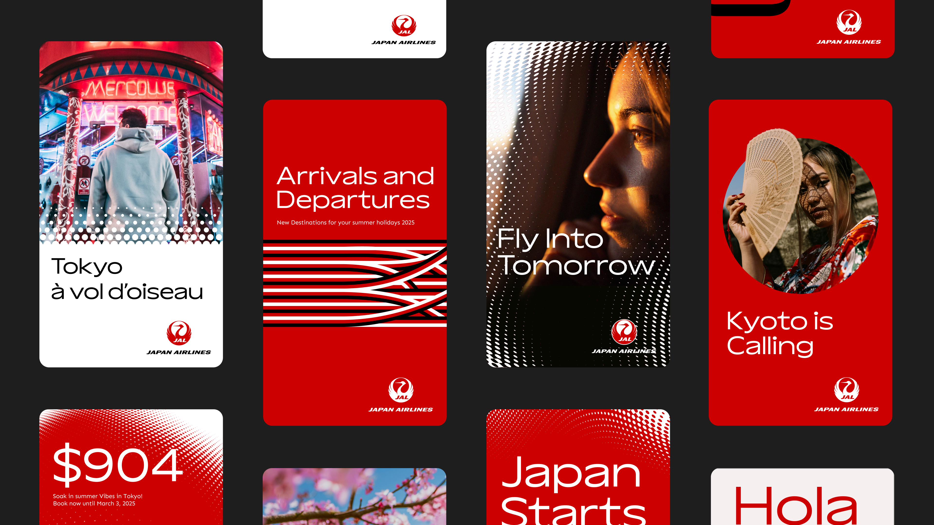
Created in collaboration with digital marketing business Jellyfish, Japan Airlines' new look aims to bring its traditional roots to a global audience. Central to the rebrand is a new design system introducing the new Japan Airlines dot pattern inspired by the airline’s iconic logo. Acting as a "mnemonic device", the dot motif brings a sense of fluidity, acting as a dynamic graphic feature throughout the rebrand.
Refreshed typography brings a contemporary flourish to the new look, reflecting the swooping motion of air travel and the brand's positive, progressive future. The brand-new typeface, Aksen, takes inspiration from the Tsurumaru (crane) logo – an iconic symbol representing the airline's traditional heritage.

Minako Kent, International Marketing MD, Japan Airlines, says: “Tradition and culture lie at the heart of our ethos, and we also recognize the importance of delivering a fresh, consistent look-and-feel for our customers." In line with this, nods to Japanese culture can be found in the new iconography and illustration elements, taking inspiration from the brush stroke forms of traditional calligraphy. Tied together by the refined colour palette honouring the red and whites of the Japanese flag, the identity has a clean and contemporary elegance that soars above the competition.
For David Heasty, design lead at Jellyfish, it was a "dream project" to collaborate with Japan Airlines on its new visual identity. "Each design element was carefully crafted to honour the legacy of Japan Airlines while infusing it with a fresh, contemporary energy that speaks to the spirit of innovation that is so core to the brand’s ethos. We embraced the challenge of reimagining the airline's visual identity and exploring new possibilities to create something truly timeless," he says.

Japan Airlines isn't the only brand embracing its heritage – check out Bose's new rebrand that honours its classic hand-drawn logo. For more creative inspiration, take a look at the adorable Wombles rebrand that's a cosy blast of childhood nostalgia.
