
Design agency Taxi Studio doesn't want to be forgotten. And instead of creating a retrospective of work to celebrate its 20th birthday like many of its peers, it decided to wait a year and celebrate its 21st instead, with a beautifully illustrated book complete with pop-ups, velcro and gorgeous print finishes.
As part of our How we made series where we discover the processes behind creative projects, I spoke to Taxi Studio's founder and CCO, Spencer Buck; Rebecca Sutherland, who illustrated the book and created the "paper mechanics"; and Fenton Smith from Printsmith Productions, who printed it.
How do you feel this book differs to other ‘brand agency celebrates a birthday’ books?
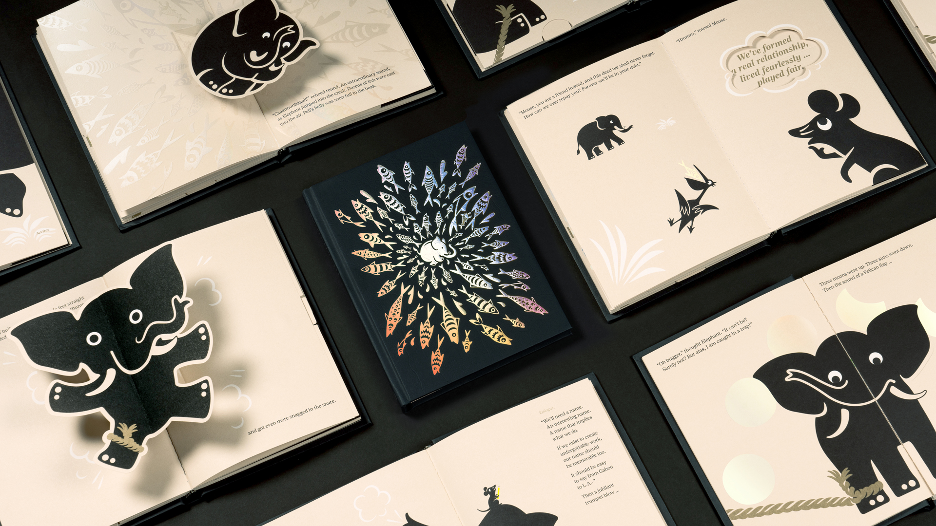
Spencer Buck: Cannonball! is a celebration of Taxi Studio’s 21st birthday in business. The reason we decided to make a fuss of our 21st (rather than our 20th) was a by-product of the way we think. Agency birthday milestones are typically celebrated with a retrospective of work. At Taxi Studio, we reject unremarkable thinking in favour of creating unforgettable work. So, we set out to celebrate our birthday milestone, agency rebrand, and B Corp accreditation by creating an unforgettable keepsake. Twenty-one was a fun number to play with, because aside from being the supposed weight of the human soul (in grams), it’s the universal age of adulthood too. So, we combined those two observations and came up with an idea to create a children’s style pop-up book for grown-ups that refuse to grow up.
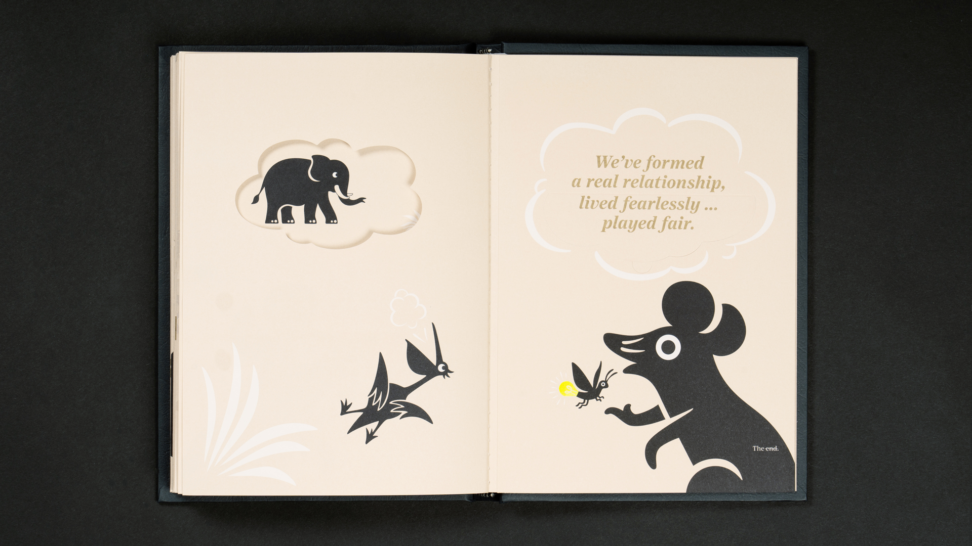
The result is a timeless tale of creativity, courage, and collaboration, written in a witty fabulist style (redolent of Aesop) beautifully illustrated by Rebecca Sutherland, who also took on the unenviable task of developing the tricky paper mechanics.
What is the story based on? Do the animals represent Taxi’s founders?!
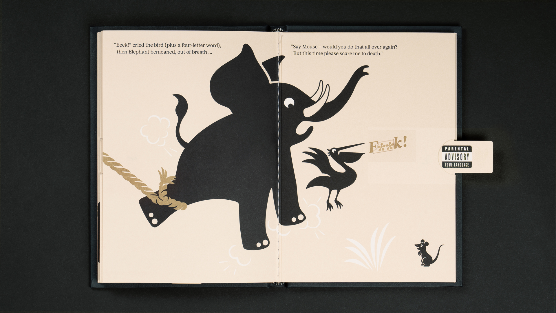
SB: The story was conceived with the ambition to set the record straight behind the reason for us naming ‘Taxi Studio’, demonstrate the power of our agency positioning, the strength of our company values and become cherished by those that receive it. The animals (Pelican, Elephant and Mouse) were chosen because of their individual strengths and weaknesses. All three creatures are vastly different regarding their genetics, personality, and attitude. In this regard, it’s no different to the differences between Alex, Ryan and I, Taxi Studio’s founders. We think the comparison stops there, however, I’m sure some of our colleagues and clients would disagree.
The book essentially sets out to demonstrate the power of problem solving and collaboration. Philosophically, Elephant represents the problem to solve, Pelican represents the client in need of help, and Mouse is the catalyst to the solution. But for Mouse’s grand plan to work, all three characters have a significant role to play.
How did you work together on the words/illustrations?
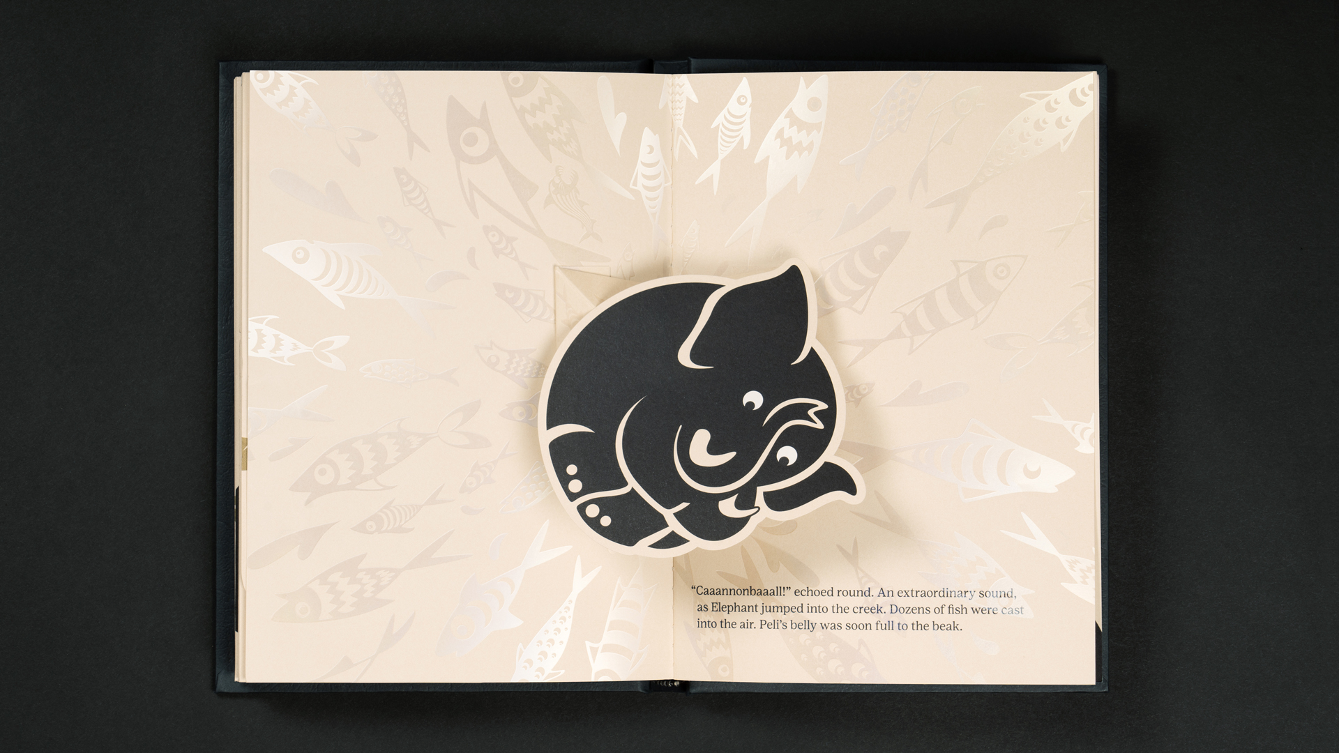
SB: I’ve wanted to work with Becky for years and was always looking out for the perfect opportunity. When I got in touch and talked through the project with her, her immediate enthusiasm for it made my heart soar. Becky is an exceptionally talented thinker, illustrator, and paper mechanic wizard. You know you’ve picked the right partner when they come to you with idea you never dreamed of. The cannonballing Elephant spread, for example, was one of Becky’s strokes of genius. I’m still slightly baffled by how she made a static image rotate, and how many trials and errors it took to get there. And I think every effort that went into the book is testament to her brilliance.
Rebecca Sutherland: Spencer came to me with the story fully written, along with a vision of how he wanted it to look. We spent time looking at visual references to get the right feel for the book. If I remember right, we tackled the image of the elephant as a cannonball marque first. Then when we had the style of that the other characters followed suit.
How did you decide on the print treatments?
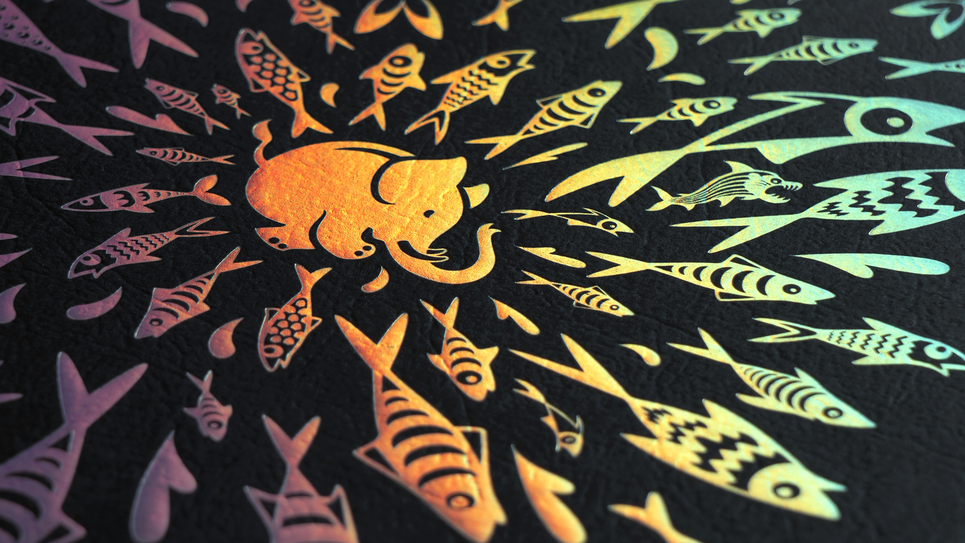
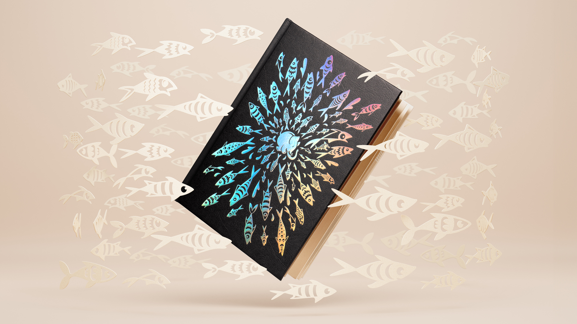
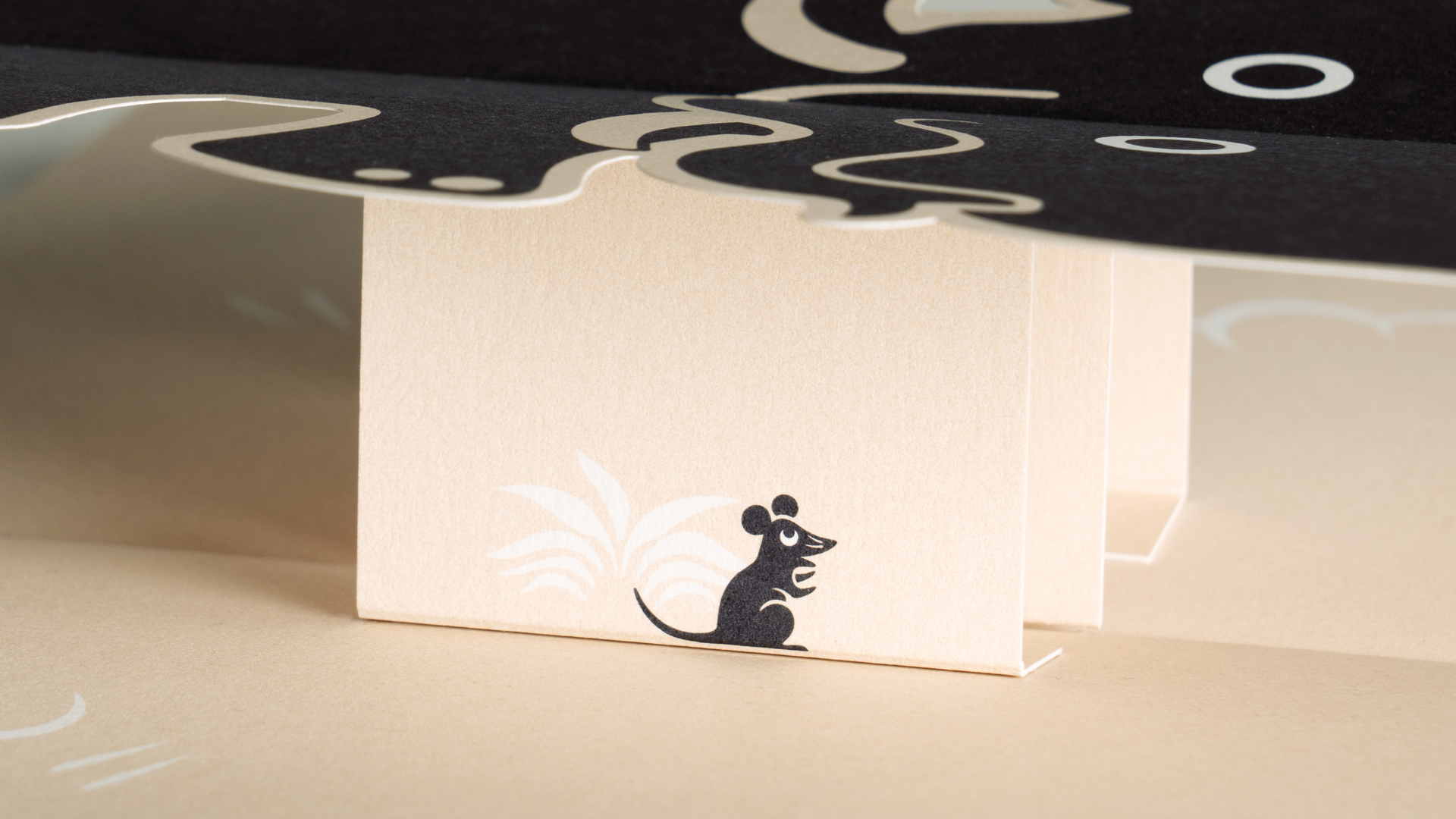
SB: I brought Fenton Smith onboard as soon as we had a rough plan of the book sorted, his reputation for producing beautiful print made him the no-brainer choice to help us bring it to life. The lovely thing is that Becky’s passion was matched by Fenton, and he spent a (very) long time working how we’d print ‘the damn thing’. It was an extremely complicated production, taking weeks upon weeks to perfect, and even more weeks to produce. Each book is hand finished to get the precise detailing and craft I was hoping to achieve. Fenton’s crowning glory in my opinion is the addition of Velcro dots to create the tearing sound of the rope as Elephant escapes the snare.
How did you decide where to put the pop-ups?
RS: The next stage was asking Spencer for a pagination that included all the moving parts of the book. I then began to literally stick pages with illustrations and pop-ups together with tape and glue and present them at each meeting. Then we’d discuss how to make improvements.
SB: The flow of the story and the pace in which we delivered the ‘moments’ took a lot of time, rewriting and experimentation to perfect. Julia Donaldson’s work provided a lot of inspiration, here. She’s the absolute master of rhyming story telling so I heavily borrowed from her. The pace and delivery of each element was precisely timed so there are surprises along the way.
What challenges did you come across while making the book?
SB: Lots. Fenton aged by 20 years for a start. But the main challenge for me was how to simplify this. There’s a lot going on in this book, and a lot of effort went on behind the scenes in the making of it, but I was determined to make it feel effortless, and hopefully we’ve achieved just that from a reader experience perspective.
RS: The trickiest part (for me) was getting the elephant to twist out as he cannonballed into the water. At some point I found a rotator mechanism that worked, and we had movement! I’m sure it was much harder for the production team to get it all working as a final piece.
Which part of the process did you enjoy most?
SB: I loved every bit of it, but especially working with Becky and Fenton, they both brought so much more to it, that I had originally imagined, in many ways the book’s story played out in the making of it, which is amusing.
What’s your favourite part of the finished work?
SB: The fact it’s finished! And seeing the incredible feedback we’ve received so far. Some of our clients and friends mentioned that they read it to their kids at night, which was so lovely to hear. Even our friends who don’t speak English as their first language understood the story and the moral, which just goes to show how universal storytelling can be.
Fenton Smith: Cannonball! epitomises the wonder of storytelling. Sometimes you get to work on a project that presents some real challenges, Cannonball! was such a project. It shows what can be achieved when using a real collaborative working methodology, ideas shared and included, aspirations achieved. The complex nature of this project required multiple mock ups to test the various pop ups and pull outs, this obviously took time and the time very much help develop and hone the ideas and the final product to its exceptional self. Really enjoyed working on this lovely book, made some friends on the way and proud to have been a part of the process.
RS: I think the favourite part for me is the end result. It’s always fascinating to go from what is essentially a text to a high-quality finished piece of work.
Find out more about Taxi Studio, Rebecca Sutherland and Printsmith Productions.

