Kitchens are all quite similar. Sure, there's great variety in colors, styles, and layouts but, generally speaking, they're all much the same. Almost every single one you step foot in will have a hob, a sink, a countertop, and - for the vast majority of us - that awkward space above the upper cabinets.
Unless you've opted for a trend like open shelving, you probably have upper cabinets in your modern kitchen, and you probably struggle to know what to do with the space above them. It's too high up to be convenient storage meaning they often end up gathering dust but, as interior designers point out, this wasted space can be the perfect place to display a curation of objet that marries practicality and style.
To find out how best to put that unused area of the home to good use, we asked interior designers what they would do with the negative space to see how to make it a little less unsightly. Here they offer four ideas to help you style the space, and they're easy enough to implement today.
1. Prints and pictures

If the area above your cabinets has enough clearance of the ceiling while still being relatively low, why not jazz it up with some fun prints?
'A collection of small wall hangings or paintings may be mounted above cabinets, creating an interesting arrangement,' says Artem Kropovinsky, interior designer and founder of Arsight. Adding a few prints or photos is a playful way to display more of your design personality and establish a gallery wall idea in your kitchen.
They needn't be expensive art works either. You can find vintage frames at reasonable prices, and prints online, like these botanical ones from Amazon. 'It's one of the easiest ways to make your space more personable,' Artem says.
2. Groups of three
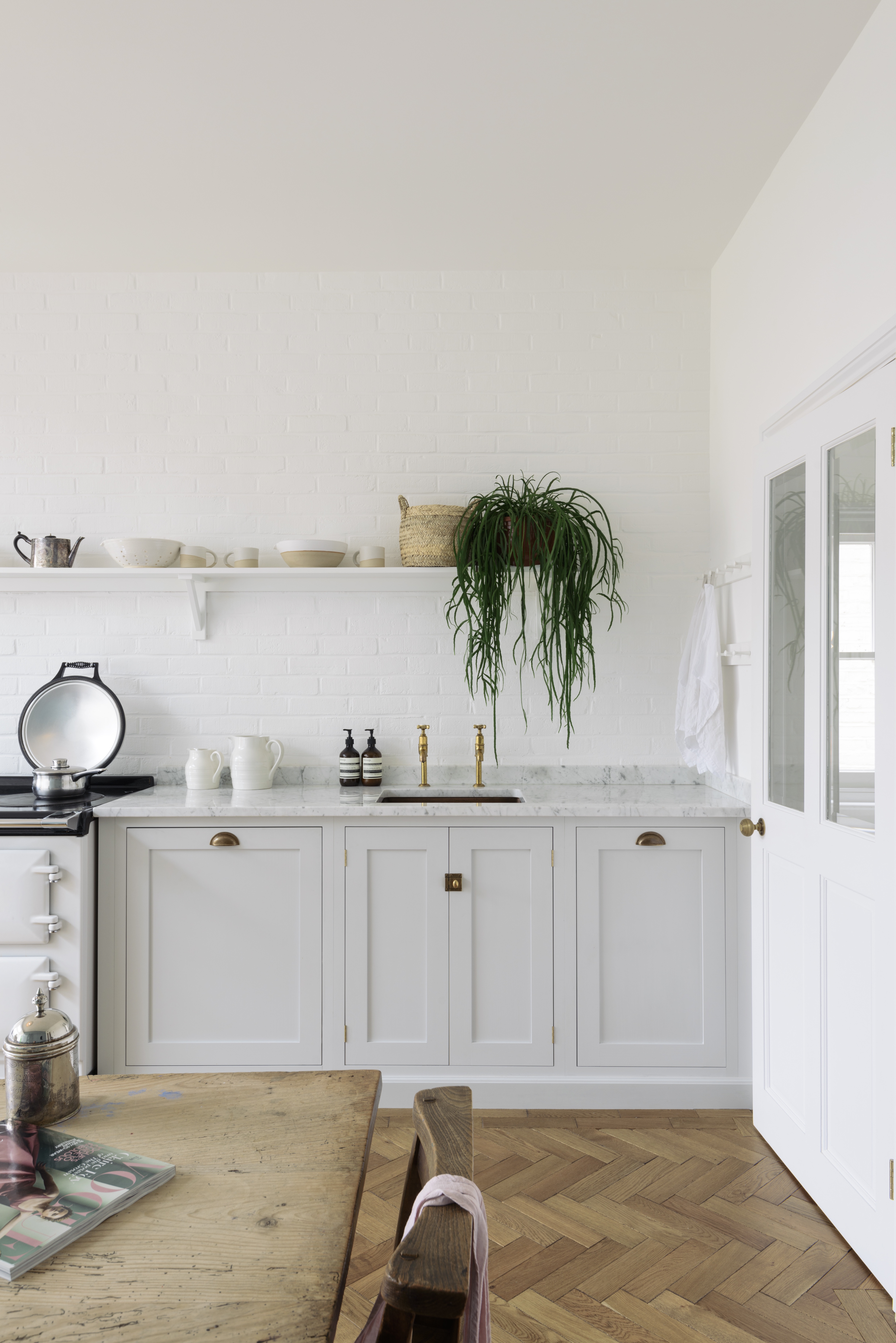
One rule to consider when styling the top of your kitchen cabinets is the rule of three. 'If your upper cabinetry feels unfinished and needs a glow-up, use some basic styling guidelines to help visually balance that awkward space,' says Nicole Cullum Interior Designer, Founder at Color Caravan. Styling deep shelves and long obscure places like the top of your cabinet is hard, so interior designers use a few general rules to tackle the project. 'Designers vary decor groupings by pairs, groups of three, or one large object,' Nicole says.
One thing you should never do, she warns, is use pairs. 'When styling your upper cabinetry, a beginner's mistake is to group decor into pairs to give a sense of symmetry,' she explains. 'This styling technique feels static and incomplete. Instead, style decor along the upper cabinet in the following groups; a group of three in the farthest corner, one large item centered in the middle, and then finish in the opposite end by pairing a tall item and low height item for a more visually interesting mix.'
3. Vintage pottery
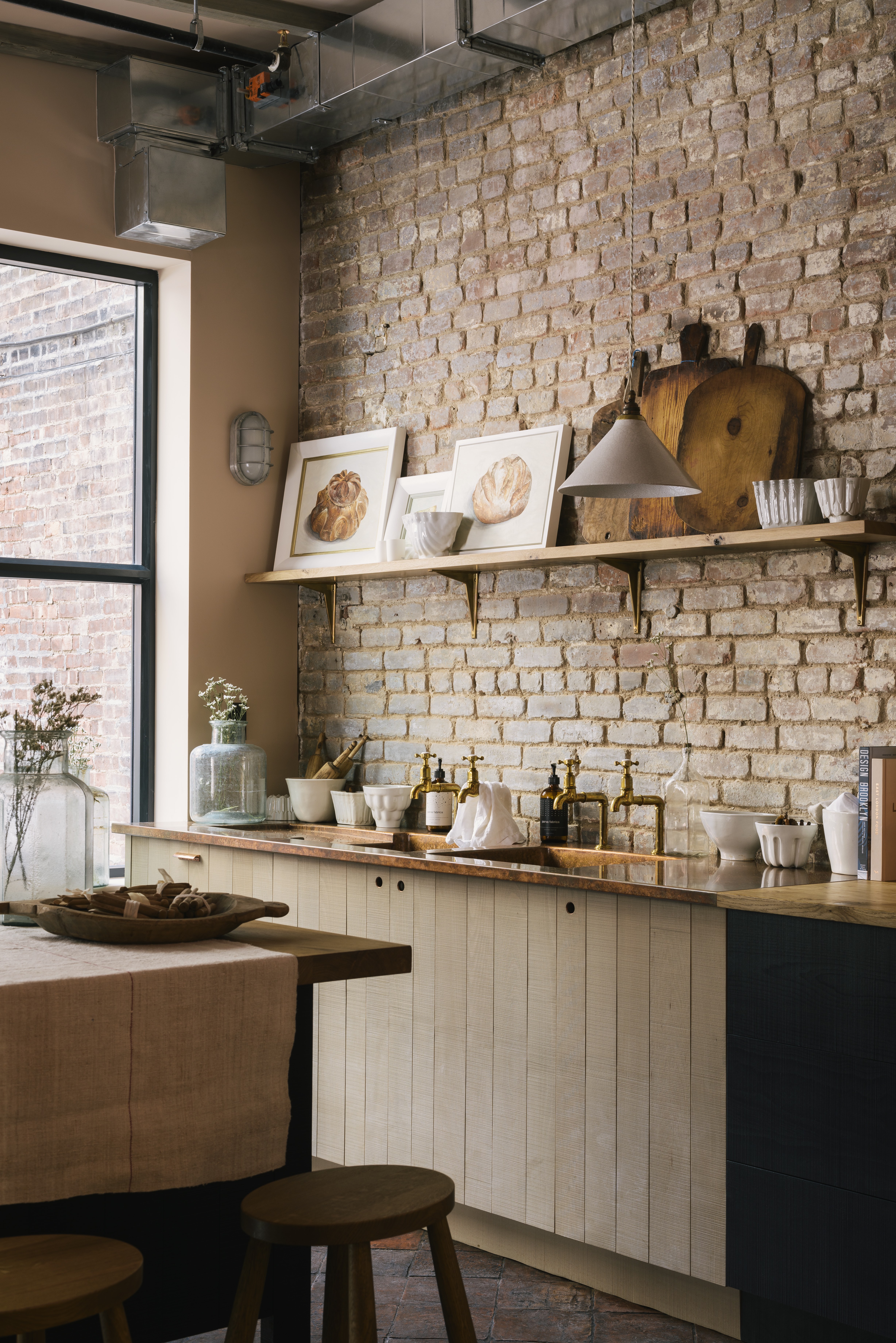
Mixing textures of items is a good way to add interest to a space, especially in the kitchen. One way Artem likes to do this is by mixing contemporary and vintage pieces. 'I like to use the space to display a collection and add a personal touch,' he says. 'Combining various vintage jars and potteries gives character.'
For a rustic kitchen feel, try putting something rough and unrefined on top of your sleek cabinets. We love the look of vintage stoneware and earthenware pots along with a decorative wooden chopping board.
4. Or, leave it empty
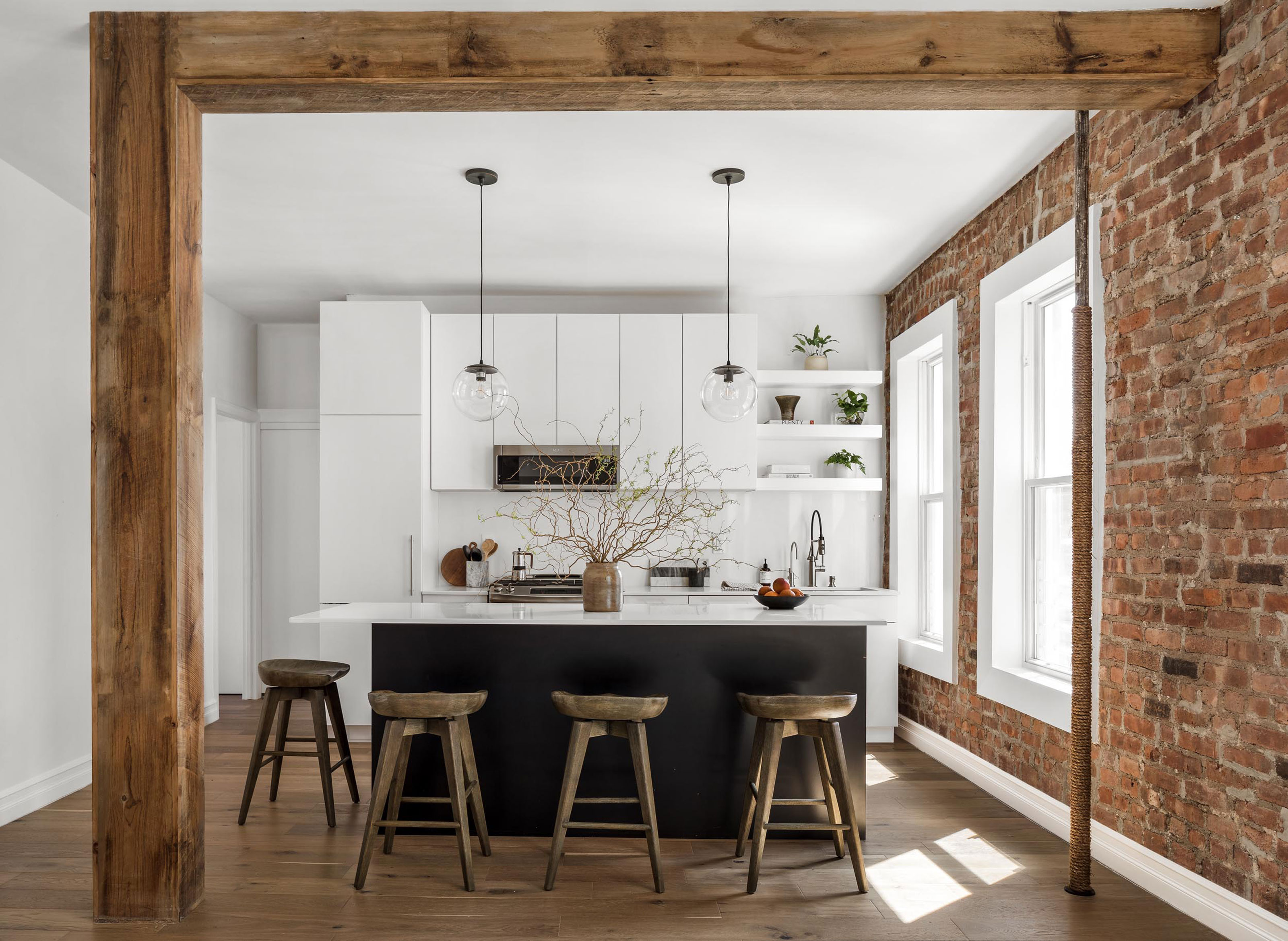
Although the space above the cabinet is awkward and you might be eager to fill it, there are times when it is better to leave it empty. Unless you're installing ways to make your high cabinets more reachable, or they're already low enough to reach, anything you need frequent access to will just be inconveniently placed.
'Decorating the tops of kitchen cabinets can be tricky but to get the right look all depends on how much space you have,' adds Lucy Small, founder of State and Season. 'If you have less than 12", don't do anything.' Some designers even recommend leaving the space alone entirely. 'I prefer to leave that awkward space empty,' says Nicole. 'Adding more decorative objects to a small, odd-shaped space draws the eye exactly to the area you don’t want guests to focus on. Styling decor above cabinets makes your kitchen look visually cluttered, and gives the impression that you’re adding stuff for stuff’s sake.'
Instead, ensure guests have something else to focus on like an interesting tablescape or floral arrangement. This keeps the eye centered on some focal point decor and not your upper cabinetry.
