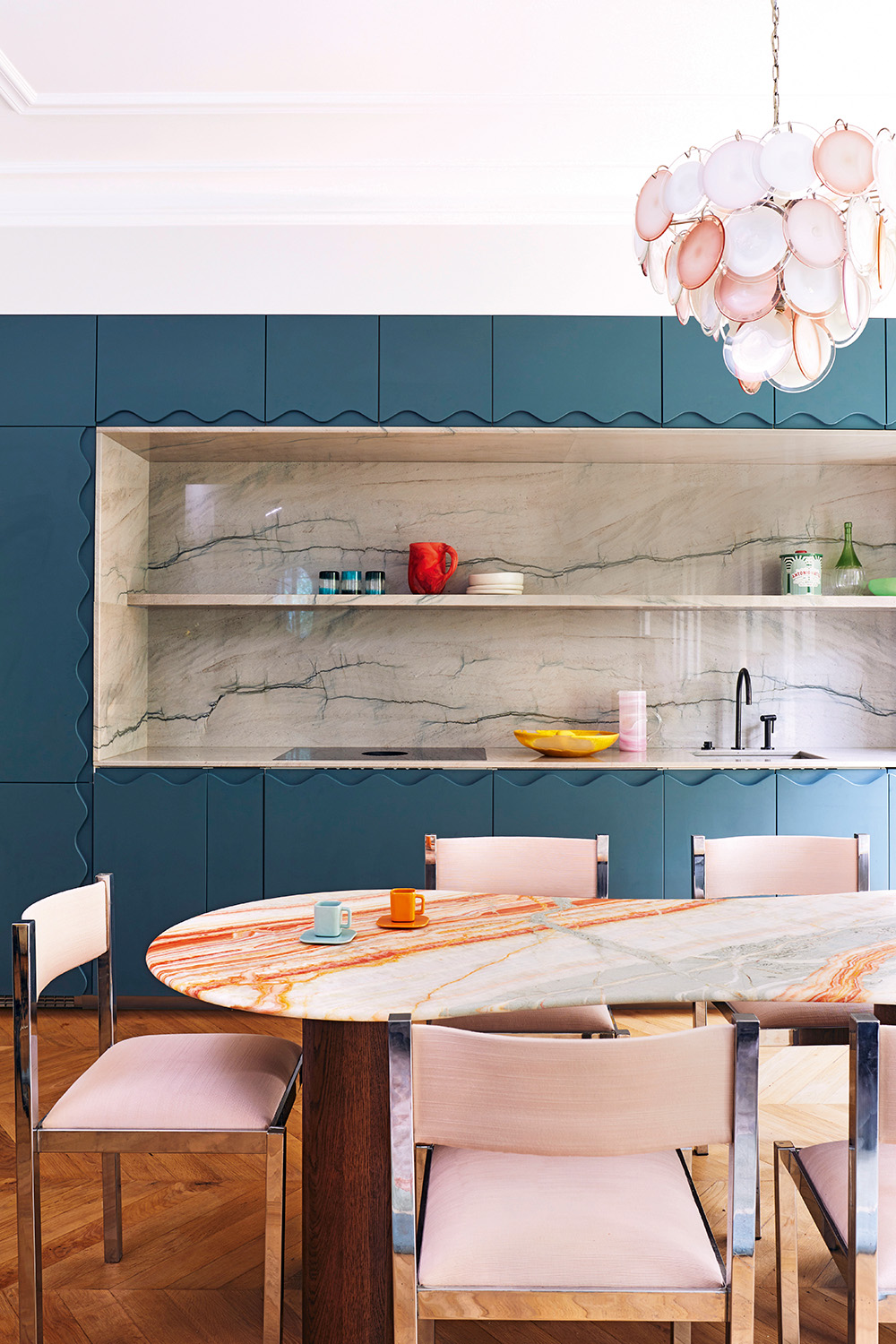
I would recommend making bright colors or vibrant tones less than 20 or 30 percent of the overall scheme
Ruth Mottershead

Pair the undertones

Pink and blue are understood to be at the opposite ends of the scale in terms of their temperature. Generally, pink is believed to be a warm color, and blue a much cooler tone – but of course, this isn’t always the case. There are warm blues which contain red, and cooler tones of pink that contain violet. Essentially, it all comes down to undertones and how each of these colors relate to one another.
The overall feeling of this modern kitchen scheme is one of contrast and tranquillity. This is brought about by the soft pink tones that add delicate accents to the space through the chairs, the lighting and glassware. In comparison, the blue is much bolder in color strength, but its muted tone means it sits comfortably next to the more subdued tones within the scheme. This particular shade contains both Cyan and Ultra Blue – pigments that give the colour its blueness – as well as violet, which provides its warmth and in turn its relationship with pink. It also contains umber, which gives the color its muted feeling and allowing the colour to sit back rather than stand out.
Blend the accent colors

The soft grey and green tones of the marble ensure that the kitchen backsplash gently sits back within the blue cabinetry. A marble containing a brighter coloration would have disrupted the balance between the pink and the blue, delivering too much contrast – the blue would have become the center of our attention. This can be seen in a smaller proportion where the blue cabinetry meets the bright white ceiling.
The orange marbling on the tabletop, in contrast, is reflected in the wood of the floor and the table legs: all have an inherent warmth , and the soft texture of the wood complements the hard surfaces of the scheme, providing a welcoming contrast. The orange marble acts as a complementary colour to the blue, making this a particularly harmonious combination. It also works as a positive and lively addition with the other warmer tones within the space – the pink, yellow and red. The marbling links these warmer, more vibrant tones within the scheme together.
Unite color, contrast texture
The chairs and the ceiling light are united by color, but they bring different textures to the interior. The kitchen lighting's harder, glossier finish relates to the marble backsplash and the table; its pearlescent effect also softens the intensity of the ceiling by creating a gentler tone of the white and providing a link to the other pinks. The chair upholstery, in contrast, provides a softer, flatter element that also links to the block colour of the blue. The coolness of their chrome frames brings the blue into the dining space, too.
The white ceiling provides a clean, contemporary contrast to the overall scheme, but primarily the blue of the cabinetry. Bright whites naturally combine well with blue because of the blue pigment used within their formulation. The white in this scheme does an excellent job of showcasing the true colors of the other elements within the scheme – the marble backsplash, for example, could otherwise easily be interpreted as white. Pure white in this situation is best used in smaller proportions: I would recommend making bright colors or vibrant tones less than 20 or 30 percent of the overall scheme.
Choose vibrant shades wisely

Vibrant tones are best incorporated into a scheme by using more saturated versions of existing tones. Here, the vibrant orange, yellow and blue in the accessories are similar hues to existing elements like the blue cabinetry and the orange marbling. The red is a much more powerful version of the pink, and the green tonally sits with the green marbling on the backsplash. Each bold tone adds an element of surprise as well as intrigue. Complementary colors or colors that sit opposite each other on the color wheel, (used in color theory), work very well as accents; just make sure they’re used in small proportions to create interest without appearing overpowering.


